Spring is here and the flowers are a-blooming in every shade and hue, or so they tell me.
It’s time for the latest FontStruct Competition, and this time our theme is color*.
For this competition, any FontStructor can design and enter up to three color FontStructions.
IMPORTANT: If you are NOT a patron, in order to access color, you must proactively enter this competition: Simply login and visit https://fontstruct.com/enter/color. Three empty color FontStructions will be created for you automatically. (Please do not create extra accounts in order to access additional color FontStructions. Such accounts will be deleted.)
To get an idea of how to work with color and layers, I recommend reading the original color blog post, and/or watch this amazing video by kassymkulov. Note that you can use a maximum of 8 different colors in a design.
The Brief
Very simple. We would like you to build one or more FontStructions which make good (creative/clever/appropriate) use of color. That’s it! You might want to take a look at our existing color fonts for inspiration.
When you’re done and ready to submit an entry, remember to tag it with “ColorComp”.
Competition Time Period
Thursday, 15th May 2025 – Friday 30th May, 2025
Competition Rules
You must be a registered FontStruct user.
Your submissions must make use of color/shade in some way
Your submission(s) must be posted and made “public” between 15th May 2025 and 10th June, 2025. Although you are encouraged to share your submission(s) at any time between these dates, your FontStruction submission(s) must be public (marked “share with everyone”) no later than 30th May, 2025 at 11pm PST. Additionally, your submission(s) must remain public at least until 10th June 2025 in order to give the judges enough time to review all qualifying entries.
Your submission(s) must be tagged with a “ColorComp” tag. (For fairness, during the competition time period, no FontStruction with the “ColorComp” tag will be awarded a “Staff Pick”.)
Your submission(s) must be downloadable. If your FontStruction cannot be downloaded, the submission will not be including in the judging.
Your submission must be a newly published FontStruction. Simply adding the “ColorComp” tag to an already published font is not allowed.
For each submission, you must post at least one sample image in the comments of the FontStruction.
FontStruct cloning is permitted but the judges will be looking for original work.
You may enter up to three FontStructions to the competition.
This is a friendly competition. Cheering, favoriting and fun banter is encouraged but cruel and uncivil behavior will not be tolerated.
No rules regarding licensing. You may choose any license you like for your FontStruction. (but it needs to be downloadable!)
Judging and announcing the winners
All qualifying FontStructions will by judged by FontStruct staff between May 30th and June 10th. (We are still looking for a celebrity judge.) Three prizewinners will be chosen.
One of these will be the FontStructors’ Favourite*. One winner will be a ‘newcomer’ – i.e. someone who has never won a FontStruction competition prize in the past.
One winner will be chosen as an overall winner (this overall winner could be either the “FontStructor’s Favourite” or the “Newcomer”.)
Winners will be announced in a FontStruct Blog post on Tuesday June 10th 2025.
Prizes
The three winners can choose to receive either a T-shirt printed with a FontStruction glyph of their choice, or one year’s free “patron” status on FontStruct.
*FontStructors’ Favourite
The valid entry with the highest number of legitimate favourites (yes we check!) at 11pm PST on 30th May 2025 will be the FontStructor’s Favorite and one of the three prizewinners.
Questions?
If you have questions just add them as comments to this post.
Happy FontStructing!
*I normally write colour on this blog, but to avoid confusion, it will be color (no ‘u’) for the duration of this competition.
FontStruct would like to heartily thank our principal sponsors Glyphs and FontSelf, and our many FS Patrons for supporting FontStruct.
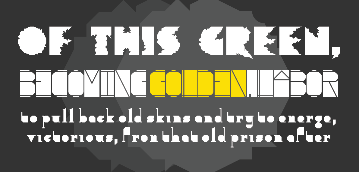
From top to bottom: tm Strokes by thalamic, Ploeg by four, Fat LCD Font by Frodo7*
Dear FontStructors,
I thought we had you this time. I thought we’d chosen a competition theme so fiendishly narrow, so intangible and niche, that you would surely struggle to deliver. How wrong, I was, how very wrong! With a record 82 entries and an extraordinary display of collective creativity, you blew the judges away.
As is always the case, there will be a large number of excellent typefaces – designs which might easily have won on another day – which will not be mentioned at all in this post. There are simply too many. Do not doubt that all of your efforts were admired. Congratulations to all participants!
Before we review a sample of the entries and finally reveal the winners, a special thanks to our judges: type designer, communicator and digital punchcutter Rainer Erich Scheichelbauer from our sponsors Glyphs App, and type designer and educator Ben Mitchell from the Fontpad. Thank you Rainer and Ben!
Now, let’s look at some of the entries.
Conceptual Approaches
Many designers came up with ingenious conceptual approaches to the “numbers” theme. D3C0DR by Gr4ftY (groan) for example is a simple but attractive pixel serif which replaces certain alphabetical letters with numbers and symbols. It’s a strong concept, rigorously pursued but not overdone:
D3C0DR by Gr4ftY (groan)
It took me a while to work out what was going on with Nonografia 6×6 by V. Sarela (Yautja) I didn’t know what nonograms are, but then I installed the font and started trying to fill out the grid in my image editor (sorry I wasn’t very precise with my yellow globs). Nonografia is an extremely clever take on the interface between FontStructing and puzzling, and great fun, almost like climbing inside the mind of a FontStructor at work. As thalamic put it, “This might be the best interpretation of number competition. It only contains numbers yet it contains the letters. Brilliant.”
Nonografia 6×6 by V. Sarela (Yautja)
A number of entries focused on the standard numerical encoding of digital letters. As-kee r0 by riccard0 is an elegant monospaced font which includes, miraculously, an attractive microcosmic metafont showing the ascii codes for upper and lower case as decimals and binaries. Comfortably Numbers by Peter Stanford (textgod) has a similar flavour and a more reduced and extreme concept. All glyphs, aside from the digits, are represented by their decimal codes. Beautiful work.
As-kee r0 by riccard0 (top) Comfortably Numbers by Peter Stanford AKA textgod (last three lines)
Only a few designers added numbers for non-latin scripts. Numerio by Bryndan W. Meyerholt (BWM) includes tamil, devanagari, some chinese numerals and many more. 11-Unbenummert by Aeolien meanwhile produced an interesting reverse take on the “letters as numbers” approach seen above, instead replacing her number glyphs with their full german names.
Numerio by Bryndan W. Meyerholt AKA BWM (first line) 11-Unbenummert by Aeolien (bottom)
Experimental Families
Two notable experimental families emerged from the competition: choruchor by jirinvk, and Stu by faux_icing. The dogged minimalist beauty of jiri’s variations will be familiar to many from his previous work. Beneath the superficial repetition lie complex, thoughtful variations.
Stu is an intriguing concept, documented in detail in this blog post which I thoroughly recommend reading. The designer states “[I wanted] to create a font family consisting of 3 styles: ‘Hi’ (all glyphs having only ascenders), ‘Mid’ (all glyphs to be strictly within x-height), and ‘Lo’ (all glyphs having only descenders)”. Great work.
choruchorAC18 by jirinvk, and Mx Stu Lo by faux_icing
Classical Finesse
There were a huge number of entries in the competition which were simply beautiful, balanced, inventive examples of FontStructive craft.
Below you can enjoy some sumptious digits from Thiny by Peter (Petruuccio), 2Minutes by frongile and fs dotout by moontr3. All three have larger character sets extending beyond these digits.
With 80+ designs to look at, the judges cannot download, install and try out every font in a design, but in truth it’s only when you do this that a font comes alive and you hope to understand it’s true qualities and potential. So, since I do need to install quite a few of the entries in order to make the samples for this post, I’m lucky. There’s always a rich hidden seam to discover in Beate’s fonts – alternate forms, original solutions to the conflict between the grid and the bricks and the challenges of a particular letterform – endless geometrical wit. Beate has 103 staff picks and it’s no wonder. Any one of her three entries (db Number Two, db Number Three or db Monuck) might have won on a different day:
From top to bottom: db Number Two by beate, db Number Three by beate, db Monuck by beate
fs numberceptionist by moontr3 consists only of digits, but they are extremely beautiful ones, with their high contrast curves and ball terminals. Very ingenious technique!
Deco Geometries
Ok, I’m not sure the first of these next two is really deco, but I’m struggling to categorize given the diversity of the entries, so please forgive me! numerical ext by AidenFont is a cute, chunky pixel design, with three grooves drawn up through the centre of each glyph. Beneath that you will find the wonderful hiero’s glyph by caterpillar’s.kimono, one of FontStruct’s deco cracks.
Future Display
More tenuous categorization ahead … Three extravagant, display fonts with some kind of sci-fi, retro-futuristic reference. zombriya eYe/FS by elmoyenique probably doesn’t really fit here, but it had to be included somewhere. As beate put it in the comments, “This font has the ability to bring a big smile to anyone’s face”.
Beneath zombriya we find STF_MARTIAN AMBASSADOR by Sed4tives, one of his three, exceptionally strong entries to the competition. I’m not entirely sure what kind of worlds are being conjured up by this typeface, but I think I’d like to visit them, or at least see the movie.
Last of the three is winder by Dmitriy Sychiov (Sychoff) A wide, futuristic, technoid typeface with some innovative dynamic, digit designs.
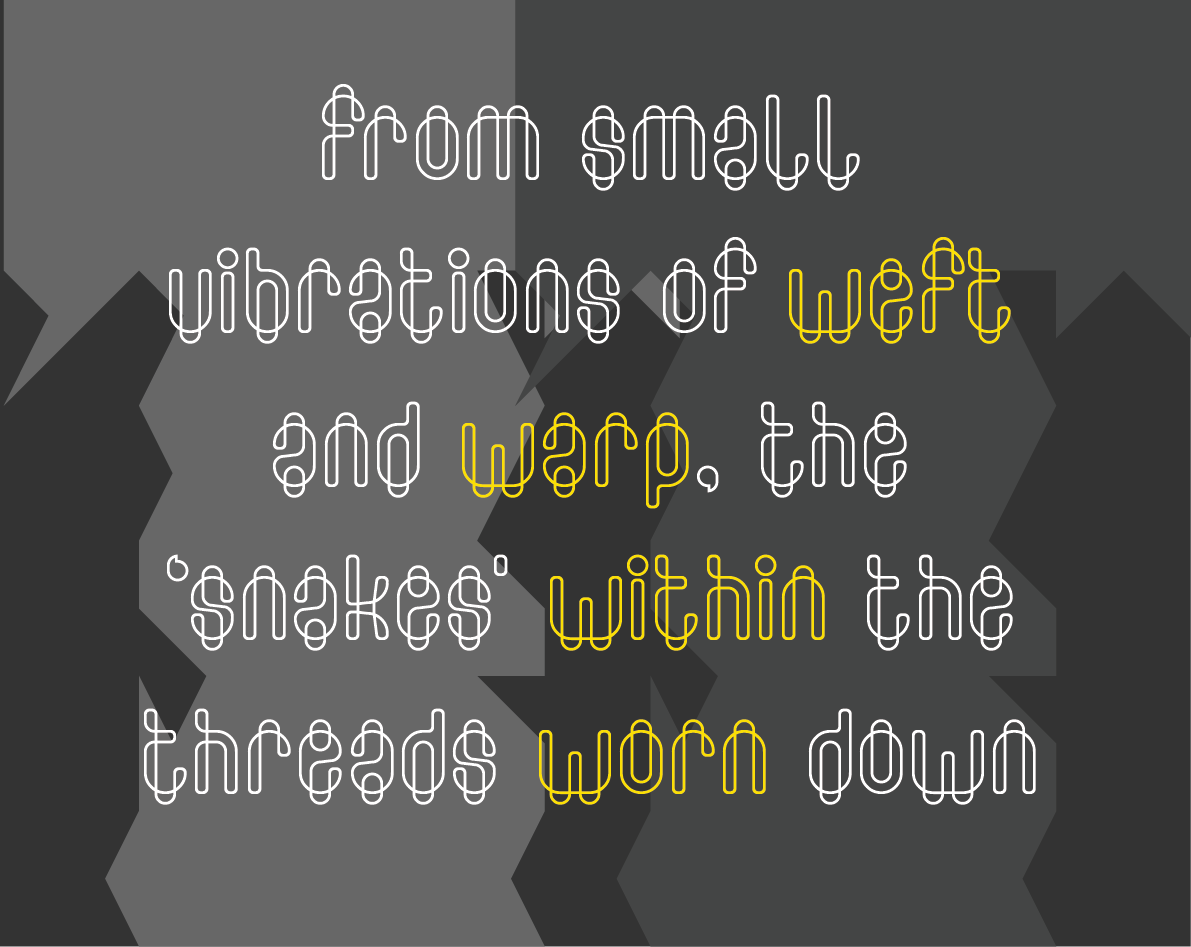
Color Entries
The intricate design of Solace in Geometry is the result of Frodo7’s lifelong fascination with aperiodic tiling patterns. The genesis of the design is described in detail here (multiple comments). This font reimagines the grid entirely. A brilliant tour de force.
The Winners
Overall winner, your FontStructor’s favourite, and also a first-time winner is tortoiseshell for skhematique. Skhematique is a unique Nouveau-tinged serif with a blueprint underlay and annotations in a characterful microcosmic font. I really can’t imagine how this was done with FontStruct. Each of the 99 glyphs is a distinct work of art, but the whole is nevertheless coherent. Congratulations tortoiseshell. You have a won a free license for Glyphs 3 worth 299€!
skhematique by tortoiseshell
Our second winner chosen by the judges is Outnumbered by four. Our jury said:
… we were impressed by the well-balanced use of the decorative element without compromising on the shape structures. A nicely executed blend of two concepts that must have been difficult to achieve …
the designer managed to juxtapose the stroboscopic psychedelia with a reduced geometric aesthetic. Clever diagonal interventions in a vertical stroke order replace the usual foreground-background structure of typographic shapes.
zrebmun eYe/FS by elmoyenique
Thank you!
Thanks again to everyone who took part. Thanks to whoever it was who categorized all the entries!
Thanks to our generous sponsors Glyphs App, the world’s leading desktop font editor for OSX. Glyphs continues to quietly and kindly support FontStruct in 2024.
Last but not least, thanks to our guest judges Rainer and Ben, for gifting us their time and expertise.
Have an idea for our next competition theme? Please add it in the comments.
Happy FontStructing!
*I added the image at the top of this post as an afterthought, having forgotten that it might be a good idea to start with an image. I wondered whether I could still find three top-notch designs among those not already mentioned in this blog post. It wasn’t hard at all – there was so much quality among the entries. The three designs with links: tm Strokes by thalamic, Ploeg by four and Fat LCD Font by Frodo7.
3-2-1 … FontStruct! It’s time for the latest FontStruct competition, supported this time around by our long-term sponsor GlyphsApp, the world-leading desktop font editor for the Mac.
We’re delighted to announce that type designer, digital punchcutter and communicator Rainer Erich Scheichelbauer from GlyphsApp will be joining us to help judge this competition. As well as his expert eyes, Rainer will bring with him a license for Glyphs 3 as a prize for the overall competition winner.
Scroll down beyond the image to see details of the competition brief, rules and prizes …
The Brief
We would like you to build one or more FontStructions which are somehow connected to our competition theme: “Numbers”.
As always, please do interpret the theme as loosely, literally or figuratively as you wish – it’s there only to inspire, not to confine, although we do expect all entries to contain glyphs representing the numerals 0,1,2,3,4,5,6,7,8 and 9. Also note that the image above is only for decorative purposes. It doesn’t indicate expectations, or prescribe a direction.
Competition Time Period
Thursday, 18th April 2024 – Friday 10th May, 2024
Competition Rules
You must be a registered FontStruct user.
Your submission must contain the digits 0,1,2,3,4,5,6,7,8 and 9.
Your submission(s) must be posted and made “public” between 18th April 2024 and 10th May, 2024. Although you are encouraged to share your submission(s) at any time between these dates, your FontStruction submission(s) must be public (marked “share with everyone”) no later than 10th May, 2024 at 11pm PST. Additionally, your submission(s) must remain public at least until 18th May 2024 in order to give the judges enough time to review all qualifying entries.
Your submission(s) must be tagged with a “NumbersComp” tag. (For fairness, during the competition time period, no FontStruction with the “NumbersComp” tag will be awarded a Staff Pick.)
Your submission(s) must be downloadable. If your FontStruction cannot be downloaded, the submission will not be including in the judging.
Your submission must be a newly published FontStruction. Simply adding the “NumbersComp” tag to an already published font is not allowed.
For each submission, you must post at least one sample image in the comments of the FontStruction.
FontStruct cloning is permitted but the judges will be looking for original work.
You may enter up to three FontStructions to the competition.
This is a friendly competition. Cheering, favoriting and fun banter is encouraged but cruel and uncivil behavior will not be tolerated.
No rules regarding licensing. You may choose any license you like for your FontStruction. (but it needs to be downloadable!)
Judging and announcing the winners
All qualifying FontStructions will by judged by FontStruct staff between May 11th and May 18th. Three prizewinners will be chosen.
One of these will be the FontStructors’ Favourite*. One winner will be a ‘newcomer’ – i.e. someone who has never won a FontStruction competition prize in the past.
One winner will be chosen as an overall winner (this overall winner could be either the “FontStructor’s Favourite” or the “Newcomer”.)
Winners will be announced in a FontStruct Blog post on Tuesday May 21st 2024.
Prizes
The overall winner will receive a full license for Glyphs 3.
The other two winners can choose to receive either a T-shirt printed with a FontStruction glyph of their choice, or one year’s free “patron” status on FontStruct.
*FontStructors’ Favourite
The valid entry with the highest number of legitimate favourites (yes we check!) at 11pm PST on 10th May 2024 will be the FontStructor’s Favorite and one of the three prizewinners.
Questions?
If you have questions just add them as comments to this post.
FontStruct on four.
Uno, due, tre, quattro …
FontStruct would like to heartily thank our principal sponsor Glyphs and our many FS Patrons for supporting FontStruct.
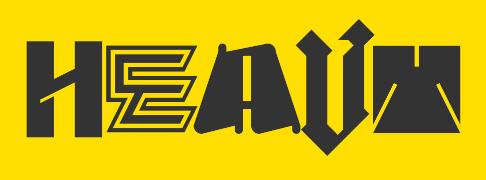
The “Heavy” competition has ended and, once again, the staff at FontStruct Towers were overwhelmed by your creativity. Sixty amazing entries! I hope that everyone had fun taking part, and took pleasure in designing and sharing your work. I’m only sorry that we will feature only a few FontStructions in this post.
With judging a more daunting prospect than ever, we sought and found the assistance of a genuine typographical heavyweight. As well as being the managing editor at Fonts in Use and founding partner of design agency Kaune & Hardwig, Florian Hardwig has been a FontStruct supporter since its earliest days. (Of our 2.1 million+ registrations, he is number 99!) He’s also used FontStruct as a tool in his teaching practice in the past, even smuggling FontStruct right into the Bauhaus Archive itself!
Without further ado, Florian’s favourites:
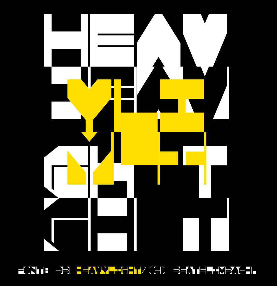
Winner #1 db HeavyLight by beate
Florian wrote:
I’m fond of FontStructions that embrace the limitations of the grid and explore an idea without dialing up the resolution endlessly. db HeavyLight is a great example. The square glyphs with their monospaced width and unconventional weight distribution seem to channel the lettering made by Chris Lebeau in the 1920s. In their playfulness, they also remind me of Ben Shahn’s work. The ingenious thing about db HeavyLight is that the lowercase holds alternate caps, shown white against black. By mixing positive and negative glyphs, one can unleash a fascinating play of figure and ground, of light and dark.
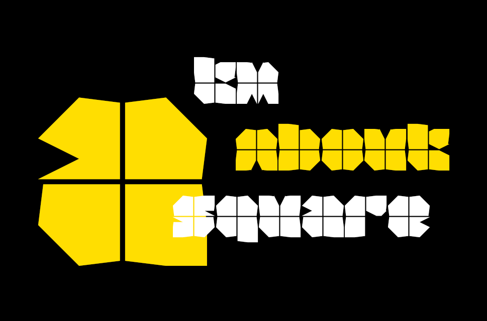
Winner #2 tm about a square by thalamic
Florian wrote:
Blocky typefaces of very heavy height tend to look clunky and boring. It helps to add a dash of white, to open up the black surface a little, and also to hint at counters and stem boundaries. One clever and minimalist way of doing so is to overlay the glyphs with fine lines. In True Cross Fire and Watzlcross, two film faces from the 1970s, this resembles cross hairs. In tm About a Square I see a more peaceful and pleasant analogy: each glyph looks like a gift, wrapped in paper and tied with a ribbon!
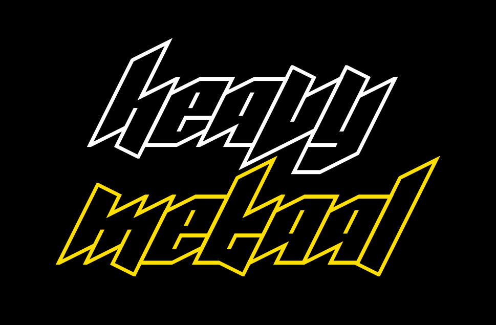
Winner #3 Metaal by four
Florian wrote:
I had a hard time deciding between Metaal and Zwaar, another compelling entry by the same contestant. In the end, Metaal’s fun and (seemingly) simple concept won me over. Basic letterforms defined by monolinear strokes for contours and counters, abutted against each other – just like we used to draw them on graph paper during lesson, while dreaming of the next festival weekend. What makes Metaal so cool is its steep angle. Together with the diagonal terminals that oscillate around the baseline and x-height, it yields a wicked look. This font is a machine for making instant band logos.
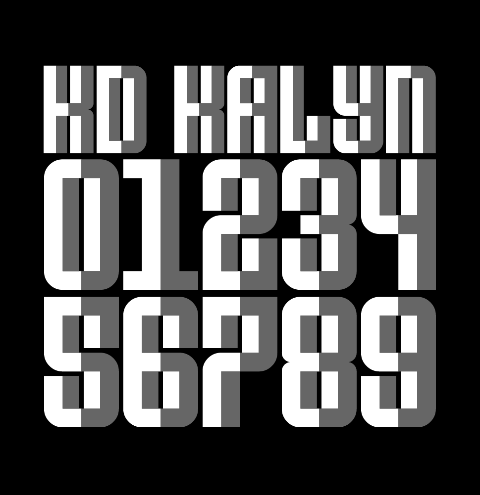
Colour Winner: KD Kalyn by architaraz
As it turned out, Florian’s choices were all monochromatic although he did admire the colour entries, picking out this one in particular. KD Kalyn by architaraz was also my favourite from among the polychromatics. It’s wonderful that it works, both as a plain single colour design, and as this chunky array of escheresque facets.
The People’s Choice
The People’s choice was Zwaar. So double well-done four!
Thanks to our generous sponsors Glyphs App, the world’s leading desktop font editor for OSX. Glyphs continues to quietly and kindly support FontStruct in 2022.
Last but not least, thanks to our guest judge Florian Hardwig, for gifting us his time and expertise.
Have an idea for our next competition theme? Please add it in the comments.
Dear FontStructors,
Finally! It’s time once more, to snatch up your finest bricklayer’s gauntlets. Prepare to grapple on the grid, and pit brick against brick, in friendly modular strife with your fellow FontStructors.
It’s time for the latest FontStruct Competition!
Brief:
We would like you to build one or more FontStructions which are somehow connected to our competition theme: “Heavy”
This theme has been suggested several times in the past, and FontStruct has always seemed to work well for all kinds of “heavy” fonts – whether in terms of simple weight, or metal.
Please do interpret the theme as loosely as you wish – it’s there only to inspire, not to confine. The image at the top of this post is there only for decoration. It does not indicate any expectations, or necessary direction.
If you’re struggling for ideas, you could have a browse through our curated set “Heavy”.
Competition Time Period
Thursday, 9th June 2022 – Friday 8th July, 2022
Competition Rules
You must be a registered FontStruct user.
Your submission(s) must be posted and made “public” between 9th June 2022 and 8th July, 2022. Although you are encouraged to share your submission(s) at any time between these dates, your FontStruction submission(s) must be public (marked “share with everyone”) no later than 8th July, 2022 at 11pm PST. Additionally, your submission(s) must remain public at least until 22nd July 2022 in order to give the judges enough time to review all qualifying entries.
Your submission(s) must be tagged with a “HeavyComp” tag. (For fairness, during the competition time period, no FontStruction with the “HeavyComp” tag will be awarded a Top Pick.)
Your submission(s) must be downloadable. If your FontStruction cannot be downloaded, the submission will not be including in the judging.
Your submission must be a newly published FontStruction. Simply adding the “HeavyComp” tag to an already published font is not allowed.
For each submission, you must post at least one sample image in the comments of the FontStruction.
No letters in each submission can be MORE THAN 48 grid squares high.
FontStruct cloning is permitted but the judges will be looking for original work.
You may enter up to three FontStructions to the competition.
This is a friendly competition. Cheering, favoriting and fun banter is encouraged but cruel and uncivil behavior will not be tolerated.
No rules regarding licensing. You may choose any license you like for your FontStruction. (but it needs to be downloadable!)
Judging and announcing the winners
All qualifying FontStructions will by judged by the FontStruct staff between July 8th and July 18th. Three prizewinners will be chosen. One of these will be the FontStructors’ Favourite. Winners will be announced in a FontStruct Blog post on Monday July 18th 2022.
Prizes
Each winner can choose a t-shirt printed with a FontStruction glyph of their choice.
FontStructors’ Favourite
The valid entry with the highest number of legitimate favourites (yes we check) at 11pm PST on 10th July 2022 will be one of the three prizewinners.
Questions?
If you have questions just add them as comments to this post.
Wow! That was amazing. I didn’t think it possible, but you have surpassed yourselves once again.
I’m sorry that it took an extra week to complete this blog post. One major difficulty was simply that there were so many competition entries worthy of recognition. Indeed, many entries merit a blog post all to themselves. I would encourage anyone reading this to browse all the entries directly because they simply cannot all be represented here.
Let’s have a look at a selection of the entries. You’ll find the prizewinners at the very end of the post, but everyone who entered is a champion. Well done!
– We start with four wonderful, intelligent designs, all of which were a delight to work with as installed fonts. I love the dot details in Codarte.
db Mangold leaves me speechless. I’m guessing the inspiration is Bernhard Antique but this seems to be a completely original and mature design that goes far beyond what I thought was possible with FontStruct. Amazing.
twentysomething is a lovely, light and playful thing which ended up being the FontStructor’s favourite this time around.
KD Dekorat with its maze-like panelling is a beautiful example of how diverse Deco typography can be.
I’m not sure what G1 Decoreus was inspired by, I’d love to know, but it certainly feels true to the architectural and decorative spirit of the 1920s. Stout and elegant at the same time. I love it.
KD Jermaine is an intricate and pretty multilined deco typeface, but note also the clever XX pun running right through the alphabet.
db Ventica: Um. What? How? ?? Another virtuoso re-FontStruction of an original ’20s typeface, this time, I believe, Fanfare. Amazing!
KD Xxies is yet another fine Deco typeface from architaraz. Note that although I have only used the caps here, there is also a lower case.
The inimitable jirinvk created an entire family of graphically strong bulbambuls for the competition, inspired by Gunta Stölzl (1897–1983), the Queen of Bauhaus. Note that the letters in the sample are rotated slightly from the original typeface.
TM RenMac, shown very much out of context here, cleverly takes the work of Charles Rennie Mackintosh, the Glaswegian Designer and Architect, and reinterprets it on the FontStruct grid. Thanks for this one miminum!
Caligari is a lovely, messy cutout design which inspired the sample as a whole, while Gilded Teatro forms another little family: A perfect articulation of deco style in two pixel fonts, both a pleasure to work with.
KEM Base is inspired by the work of designer Kem Weber. I enjoy the quirky asymmetry. For me the design is suggestive of early 20th century primitivism.
The beautiful leaf-like “briste” also has an organic character, belying the grid beneath, while right at the bottom you see the ambicase Moderto – a perfectly executed and very legible design inspired by Futura Display.
Some extravagant deco geometry in Baardusan, and then three FontStructions from elmoyenique. I really enjoyed the rich back story to his entries, connecting three art and design movements which marked the 1920s – Bauhaus, Deco and Contstructivism – with their three European capitals, and with three mysterious figures appearing in a series of period photos. When the novel comes out, I will read it. With Zandrine, as with beate’s entries we’re going back into typographic history, perhaps well beyond the 1920s in this case, to Rubens perhaps?
tm The XX caught the eye of our guest judge, Nick Sherman:
“I love type that pushes the boundaries of how type should work or how it even can be rendered with current digital rendering technology. This typeface does both of those things. In many typical typographic contexts of size and resolution, all the little details of the design turn to mush (the fact that there are specific instructions on how to zoom to see it properly on the FontStruct site is just one such example). But if you have the bravery to set it at gigantic sizes, you can really see how wonderfully bonkers it is. Between the underlying patterns and the variants of each letter, there is also all kinds of potential for cool effects with color and overlaid glyphs.”
Russian AG is an impeccable Rodchenko-inspired slab-serif with cyrillic support. Twenty-tmchty is a highly conceptual interpretation of the theme – a twenty-by-twenty grid and only twenty unique glyphs covering 66(?) different symbols. So for example, one glyph is used to represent l,u,v,L,U and V. Fascinating!
“This typeface occupies a spot among other halftone typefaces like Calypso, Tonal, and especially Process. I’ve always had a fondness for type that plays with halftones, and the fact that this one recreates the effect so effectively within the limitations of FontStruct is admirable. The play on the concept of 20/20 vision by creating a blurred effect is also a nice visual tie-in to the ‘twenties’ theme.”
He liked the “Mexico Olympics vibe” of db Questura and appreciated the full character set, and he also saw something special in NX Chaos:
“At first I was on the fence about including this typeface among the highlights of the ‘twenties’ competition. There were other designs that were executed with more skill, had more complete character support, etc. But I kept coming back to this one because it’s a rare embodiment of pure nihilism in the form of a typeface. It follows a style of glitchy digital graphics right to the brink of complete illegibility, as if to say: ‘Go to hell. I don’t even care if you can read this’. It’s like a font from a cyberpunk nightmare, and sometimes that’s the kind of energy you need when designing in the 2020s.”
To our guest judge for this competition: Nick Sherman. Nick runs HEX a typographic company that makes fonts and websites. He’s a founder and designer of v-fonts.com and Fonts In Use, and art director of the Typographics design festival. Nick is a graduate of the Type@Cooper Extended Program in typeface design and has served on the Type Directors Club board of directors, the Adobe Typography Customer Advisory Board, and the Hamilton Wood Type & Printing Museum artistic board.
To our patrons – those FontStructors who support the ongoing development of the project and help make events like this competition possible.
To our generous sponsors Glyphs producers of the world’s leading desktop font editor for OSX.
It’s been a while, too long, since we last raised the gates to unleash FontStructor versus FontStructor in mortal combat.
It’s also been a while since we had a competition, so
Let the bricks be levied!
Let the grid be burnished bright and the curtains drawn!
It’s time to compete.
Competition Brief
We would like you to build one or more FontStructions which are somehow connected to our competition theme.
The theme for this competition is “Twenties” (thank you beate!). We chose it from among many great suggestions, firstly because it’s suggestive of an exciting era in typography, but also because it can be interpreted in a much broader and abstract fashion.
So please interpret the theme as loosely as you wish – it’s there only to inspire, not to confine.
– You might well be inspired by the Art Deco and modernist typography of the 1920s, but you might also choose to work on a 20×20 grid, or you could look to any aspect of our own peculiar decade for inspiration. You could turn your thoughts to the 1820s, the 1720s, or even the first XXs CE.
So, the image at the top of this post is there only for decoration. It does not indicate any expectations or a given direction. You won’t be judged on how “twenties-ish ” your design is.
If you’re really struggling for ideas, you could explore some of our curated Sets, such as “Bauhaus Inspired”, or “Art Deco”.
Competition Time Period
Thursday, 25th March 2021 – Friday 9th April, 2021
Competition Rules
You must be a registered FontStruct user.
Your submission(s) must be posted and made “public” between 25th March 2021 and 9th April, 2021. Although you are encouraged to share your submission(s) at any time between these dates, your FontStruction submission(s) must be public (marked “share with everyone”) no later than 9th April, 2021 at 11pm PST. Additionally, your submission(s) must remain public at least until 17th April 2021 in order to give the judges enough time to review all qualifying entries.
Your submission(s) must be tagged with a “TwentiesComp” tag. (For fairness, during the competition time period, no FontStruction with the “TwentiesComp” tag will be awarded a Top Pick.)
Your submission(s) must be downloadable. If your FontStruction cannot be downloaded, the submission will not be including in the judging.
Your submission must be a newly published FontStruction. Simply adding the “TwentiesComp” tag to an already published font is not allowed.
For each submission, you must post at least one sample image in the comments of the FontStruction.
No letters in each submission can be MORE THAN 48 grid squares high.
FontStruct cloning is permitted but the judges will be looking for original work.
You may enter up to three FontStructions to the competition.
This is a friendly competition. Cheering, favoriting and fun banter is encouraged but cruel and uncivil behavior will not be tolerated.
No rules regarding licensing. You may choose any license you like for your FontStruction. (but it needs to be downloadable!)
Judging and announcing the winners
All qualifying FontStructions will by judged by the FontStruct staff and a guest judge* between April 10th and April 17th. Three prizewinners will be chosen. One of these will be the FontStructors’ Favourite. Winners will be announced in a FontStruct Blog post on Monday April 19th 2021.
*UPDATE: We’re delighted to confirm Nick Sherman as our guest judge for this competition. Nick runs HEX a typographic company that makes fonts and websites. He’s a founder and designer of v-fonts.com and Fonts In Use, and art director of the Typographics design festival. Nick is a graduate of the Type@Cooper Extended Program in typeface design and has served on the Type Directors Club board of directors, the Adobe Typography Customer Advisory Board, and the Hamilton Wood Type & Printing Museum artistic board.
Prizes
Each winner can choose a t-shirt printed with a FontStruction glyph of their choice.
FontStructors’ Favourite
The valid entry with the highest number of legitimate favourites (yes we check) at 11pm PST on 16th April 2021 will be one of the three prizewinners.
Questions?
If you have questions just add them as comments to this post.
Many thanks to all participants for another tremendous Structathon.
I hope everyone had as much enjoyment building their FontStructions as I did in seeing all your diverse and wonderful ideas land in the Gallery over the past few weeks.
There’s one thing I haven’t enjoyed so much: The judging. To those of you whose work is not mentioned in this post: I’m genuinely sorry! The selection included below is just a subjective sampling.
There were many, many other entries which could easily have won had the wind at FontStruct Towers swirled in a different direction on the day.
Anyway, let’s start with a review of some of the standout entries.
Alien Folk
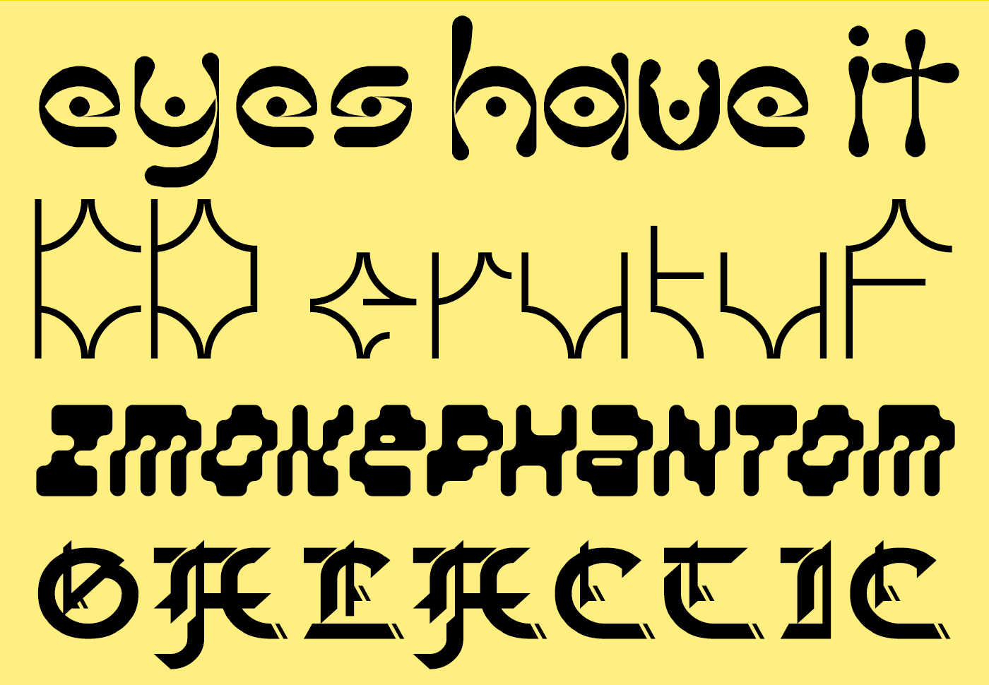
I love the psychedelic, folk-horror connotations of “The Eyes Have It” from jonrgrover. When I retire to roam the hollow ways in my spooky carnival wagon, I’ll be daubing these glyphs on the side.
KD erutuF from architaraz also teasingly marries the primitive and the futuristic. If that black obelisk from “2001: A Space Odyssey” had some runes carved into its base, I believe they would look exactly like this.
zmokephantom eYe/FS from elmoyenique is an oddball amongst oddballs, a bizarre rippling italic, perhaps the first FontStruction to actually melt the bricks, while Galactic Gothic from bluemon is an ingenious attempt to hack blackletter and technoid features into a single font.
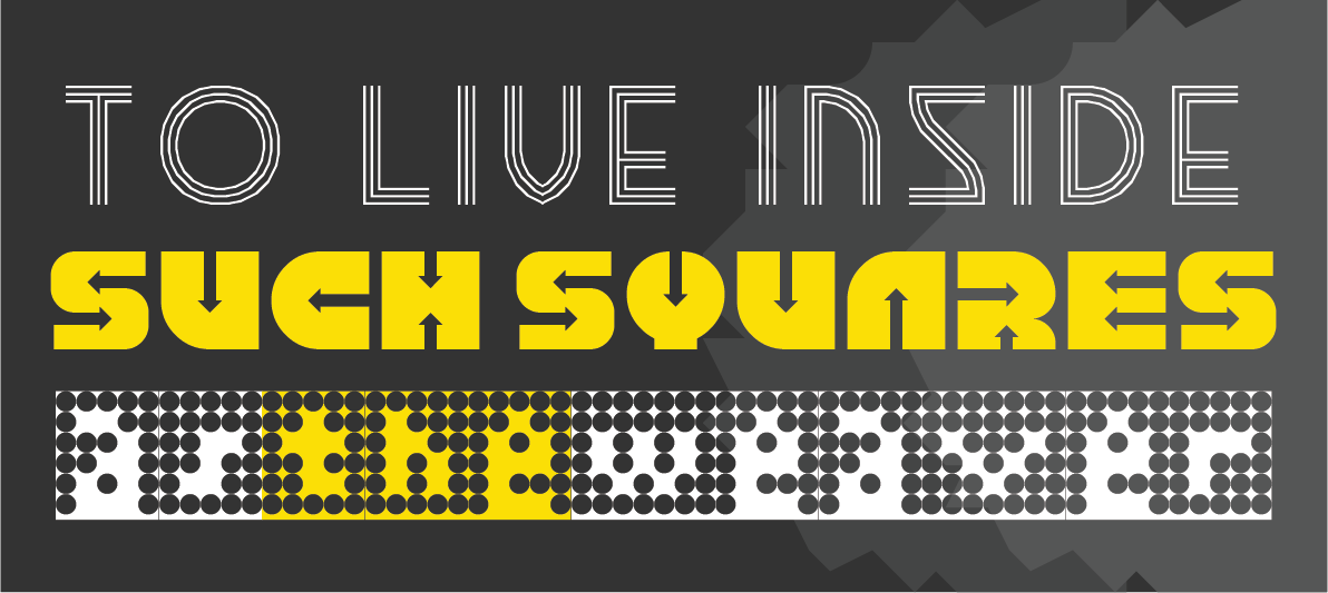
Techno Stencil
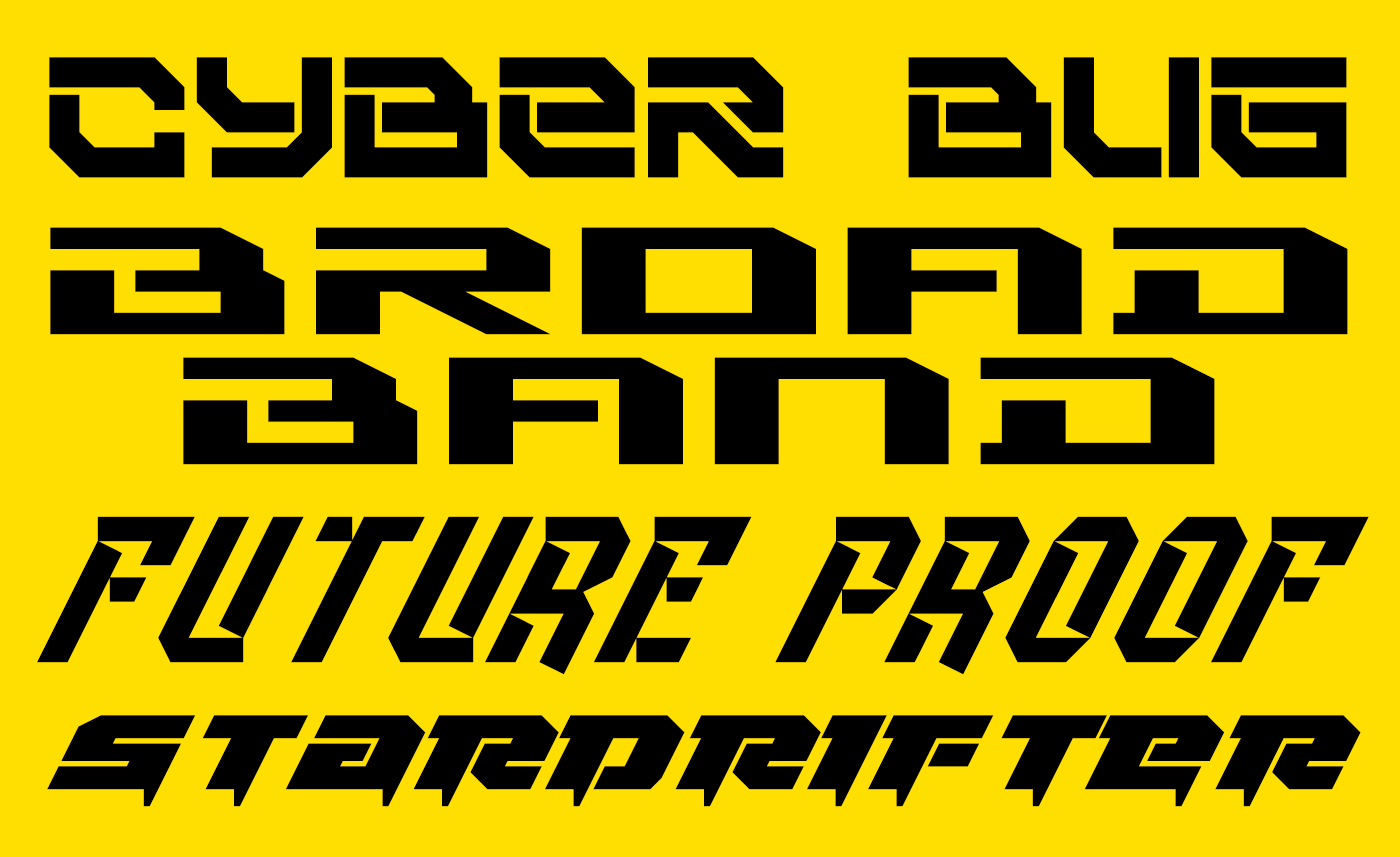
Quite a number of entries explored a classically technoid, futuristic trope with heavy, slabby designs – fonts all ready to be stencilled on the hull of a rusting, refurbished star-cruiser. Cyberbug from elzero, Broad Band Ultrawide from japanyoshi, Future Proof from four, Stardrifter, also from elzero and Rollerball_1 from JingYo are all examples for this genre and demonstrate the excitingly diverse possibilities within it.
Future Restraint
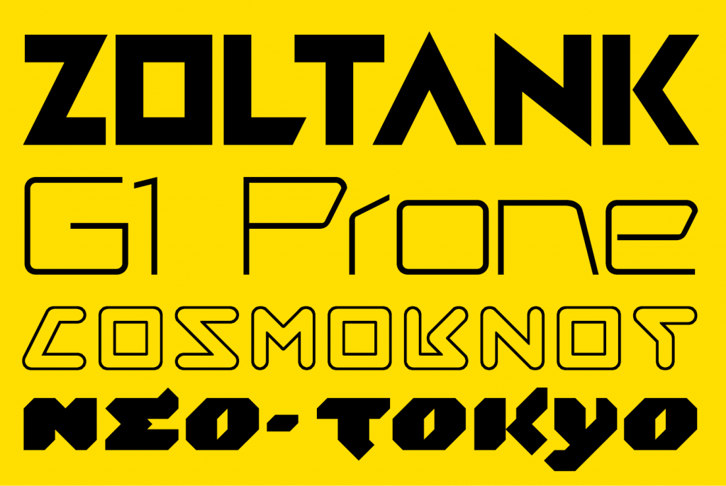
Some visions of the future were cleaner and more restrained.
Zoltank is a constructivist-flavoured, geometric display face from FontStruct’s long-time master of retro-futuristic typography, our very own Stanisław Lem, V.Sarela (I hope that’s a compliment. It’s intended as one).
Designed for “the future of Telerobotic medicine.” I recommend reading geneus1’s full explanation for the cool and elegant G1 Prone.
Like Zoltank, Cosmoknot by time.peace is expertly FontStructed and subtly complex. I believe it to be the only outline font among the entries. It’s full of fun glyph shapes, and makes a neat, oblique reference to the NASA worm.
I also really enjoyed Neo-Tokyo from Frodo7. Hints of flicking brushwork bring life to the otherwise technoid forms.
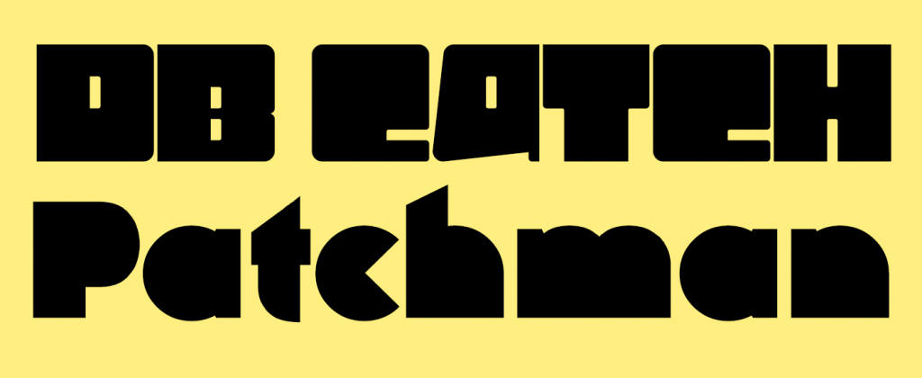
Catch and Patch
– Two leet entries from FontStructing legends. db Catch by beate has no obvious futuristic reference or connotation that I can see but it’s a fascinating and highly original entry. I love the internal dots on the i and j, and the umläute. Are they the “catch”?
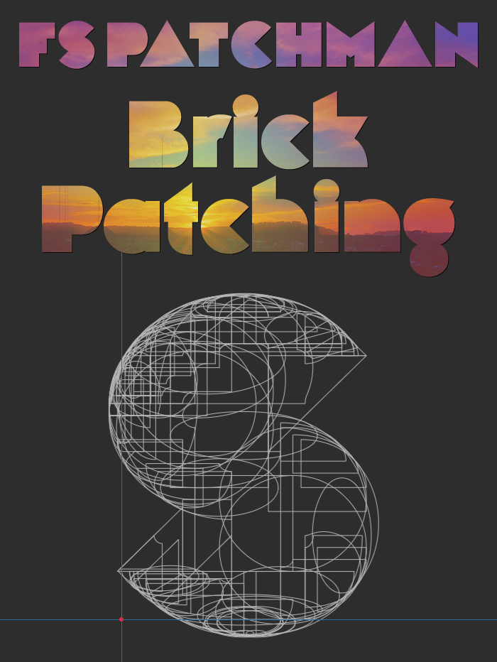
And then we come to the mysterious, the ominous FS Patchman.
From William Leverette, the designer who discovered and shared the original brick stack hack, we have the promise of a new technique called “brick patching”. This may not be the FontStruction of the future, but could it be the future of FontStructing? I’m mesmerised by the x-rayed ‘S’ in William’s sample:
The Prizewinners
– In no particular order, as chosen by you and by our guest judge Ivo Gabrowitsch. There are actually four rather than three prizewinners since I asked Ivo for one winner too many.
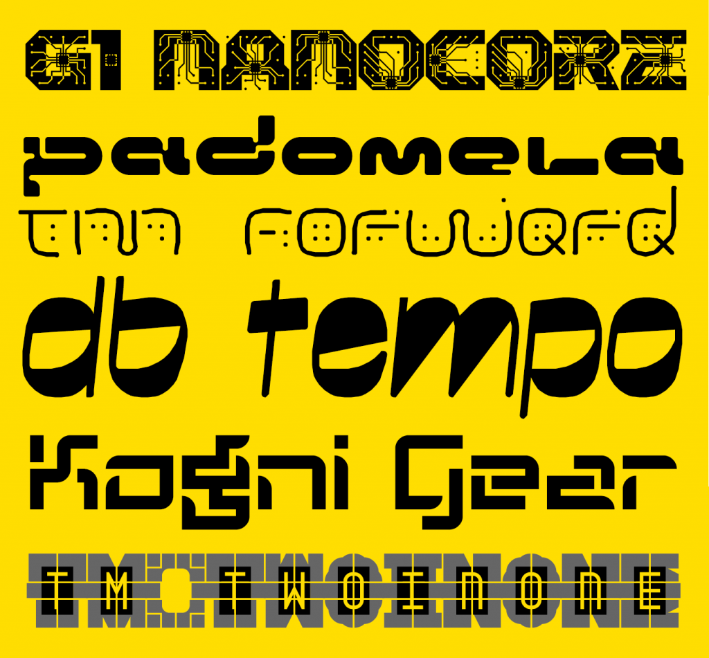
First up, “G1 Nanocore” by geneus1. Apparently inspired by certain whacky contemporary ideas, this is a really fun font and sensitive microscopes may reveal it to be in your bloodstream already. I recommend reading geneus1’s own description of his design.
Next, Padomela LDR from Neoqueto. This was actually Ivo’s number one choice – “the closest to my projection of the future.”
Thalamic wins twice over (only one prize though sorry!). Ivo chose tm Forward as a favourite (“I like the more organic projection of the future”) while the “people’s favourite” was the ingenious font-within-a-font “tm two in one”.
As with beate’s other entry, the relationship to the future is unclear, but Ivo could not resist the impressive qualities of db tempo.
Finally (number two on Ivo’s list) I’m really delighted that someone new has made it onto the podium for this competition. Congratulations to japanyoshi for kognigear – a simple but usable design, clearly addressing the theme with a well developed character set.
Prizewinners will be contacted by email over the next few days.
Watch this space!
We’ll be adding a few new features to FontStruct over the next couple of weeks, so please stay tuned for an announcement on that – or follow FontStruct on Twitter if that’s your kind of thing.
Thanks!
To Ivo Gabrowitsch for helping us out again with judging. Having worked for brands like FontShop, FontFont, MyFonts, Linotype, and Monotype, Ivo understands the type business like no other. His company Fontwerk is dedicated to help type designers and foundries making a living with their passion.
And, as always, thanks to our principal sponsor Glyphs.
Please remember that you can get 10% off the Glyphs desktop font editing software (OSX only) if you buy it from the FontStruct website. This is an exclusive offer and by taking it up, you will also help support the free FontStruct service.
Are you tired of looking to the past for inspiration? Feeling jaded by the present state of the world?
Perhaps it is time for something different; time to slip over into that unexplored and limitless country which borders happily on all of our heres and nows: The Future!
Let the bricks be levied …
Let the grid be burnished bright and the curtains drawn …
It is time for a new FontStruct competition.
Competition Brief
The theme of our competition is “Future”.
As always, feel free to interpret the term in any way you choose – literally, metaphorically, as tenuously as you dare … You could go sci-fi, sci-fact, techno, steam-punk, apocalyptic, retro-futuristic or utopian. Who knows what the future will bring?
If you’re struggling for ideas, you could try a FontStruct search, explore the Futuristic or Future Tags, or perhaps look at some of the curated Sets, such as “Techno”, or “Retro Computer”.
Competition Time Period
Friday, 10th April 2020 – Friday 1st May, 2020
Competition Rules
You must be a registered FontStruct user.
Your submission(s) must be posted and made “public” between 10th April 2020 and 1st May, 2020. Although you are encouraged to share your submission(s) at any time between these dates, your FontStruction submission(s) must be public (marked “share with everyone”) no later than 1st May, 2020 at 11pm PST. Additionally, your submission(s) must remain public at least until 8th May 2020 in order to give the judges enough time to review all qualifying entries.
Your submission(s) must be tagged with a “FutureComp” tag. (For fairness, during the competition time period, no FontStruction with the “FutureComp” tag will be awarded a Top Pick.)
Your submission(s) must be downloadable. If your FontStruction cannot be downloaded, the submission will not be including in the judging.
Your submission must be a newly published FontStruction. Simply adding the “FutureComp” tag to an already published font is not allowed.
For each submission, you must post at least one sample image in the comments of the FontStruction.
No letters in each submission can be MORE THAN 48 grid squares high.
FontStruct cloning is permitted but the judges will be looking for original work.
You may enter up to three FontStructions to the competition.
This is a friendly competition. Cheering, favoriting and fun banter is encouraged but cruel and uncivil behavior will not be tolerated.
No rules regarding licensing. You may choose any license you like for your FontStruction.
Judging and announcing the winners
All qualifying FontStructions will by judged by the FontStruct staff and guest judges between May 2nd and May 8th. Three prizewinners will be chosen. One of these will be the FontStructors’ Favourite. Winners will be announced in a FontStruct Blog post on Monday May 11th.
Prizes
Each winner can choose a t-shirt printed with a FontStruction glyph of their choice.
FontStructors’ Favourite
The valid entry with the greatest number of legitimate favourites at 11pm PST on 1st May 201820 will be one of the three prizewinners.
Questions?
If you have questions just add them as comments to this post.
Text from what some have called the first science-fiction novel – Lucian’s “True History”
FontStruct would like to heartily thank our principal sponsor: Glyphs .
Please remember that you can get 10% off the Glyphs desktop font editing software (OSX only) if you buy it from the FontStruct website. This is an exclusive offer and by taking it up, you will also help support the free FontStruct service.
Another fun-packed competition is complete, leaving us to celebrate a wonderful assembly of diversely-inspired and inspiring entries.
As so often in previous competitions, there are simply too many high-quality entries to give each and every one the attention which they merit, so I’d like to congratulate all participants on their creativity and skill, and encourage everyone to have a long look at all the entries to discover those many gems which are not featured in this post.
– I don’t entirely see how nocturnal addresses the “counter” theme, but, nevertheless, it’s a beautiful, clean design from FontStruct’s master of filigree, Art Deco design: time.peace.
architaraz’s KD Spaceband meanwhile is perhaps the most original and usable entry of all, cleverly exploring and reinventing the spaces enclosed within its glyphs.
Connect 42 by jonrgrover represents all those competitors who chose to explore the gaming counter metaphor, and it’s a simple but playful entry.
– I profoundly love the tattered geometry of zcrapedium. So much so, that you’ll find it lurking in the background of every sample within this post. The variants in the upper case are a great idea, and I can think of plenty of real-world applications for this one.
Below it: the mysterious N8Lite – but who is nightpegasus, its designer? I have my suspicions. Whoever they are, they demonstrate a highly idiosyncratic and expectation-confounding style, of which N8Lite is a great example – rule-bound yes, but how strange and elusive are those rules!
Serifia la printe represents a larger group of excellent, more “classical”, filled-counter entries. “Serifia” contains many surprising, and indeed inconsistent, design choices, but therein lies the strength of its oddball character.
– All three of these entries would likely have fared very well in the Inline Competition.
fs psyline and KD Hachure are examples of sophisticated and mature FontStructing – ready to be moved on into the character-set expansion phase and suitable for all kinds of design applications.
Below them. the charming and ingeniously entitled Owl Circle by Waturu Aiso has a more mannered, fantastical look.
Last, but not least, in this short and selective tour, we have a group of three diverse entries, beginning with NAL’s Zirconia – its glyphs like the aerial view of an extra-terrestrial base, revealing its intricate, bevelled construction only at larger point sizes.
Geometrica B&L turns out to be barely legible, so it’s probably best suited to a logo or short headline, but the patterns of its semaphore-like, cuneiform patternings are wonderful nevertheless.
And finally, geneus1 offered us an array of exceptional contributions to this competition– all expertly-crafted, things of beauty. You really have to install G1 Recoil and start playing with it, in order to fully appreciate the richness of its ornate strudel. Definitely a recommended download.
The Winners:
“breach” by four is a standout winner and the “FontStructor’s favourite” for the “Counter” competition. An ingenious warping and rupturing of the boundaries between interior and exterior space, it’s a thought-provoking work of art in itself, and invites extended contemplation.
UPDATE: Some twitter users have pointed out a similarity between “breach” and the very beautiful commercial release “Clip” from Setup (previously Urtd). Personally I suspect and see coincidental inspiration rather than imitation, but please visit the Setup site and make the comparison for yourself.
O yes! This was love at first sight. Starbird by V.Sarela (Yautja) is a perfect example of what one might call “groovy deco”, and I can easily imagine it gracing the worn cover of some favourite ’70s sci-fi paperback. The contrast of the fine circle with the smooth and heavy fill beneath it is quite sumptuous.
Elmoyenique’s zykowarfare reminds me of plastic letter stencils – incorrectly yet playfully filled out perhaps, at the back of a classroom on a hot afternoon. There are scores of intriguing nuggety forms to discover in this one, hidden away amongst its self-interlocking glyphs .
Thanks!
That’s it! Congratulations to all our winners and everyone who took part!
Winners will be contacted regarding their prizes over the next few days. But right now, I have an inexplicable urge to go and remodel the kitchen …