Posts filed under “Competitions”
Dear FontStructors,
Who says referendums are a threat to true democracy? In the perfect world of FontStruct, they work beautifully. Before we’ve even started, we have a winner!
The results of our recent Twitter poll:
Counter it is …
Competition Brief

Our theme is Counter: “the area of a letter that is entirely or partially enclosed by a letter form or a symbol (the counter-space/the hole of)” as wikipedia describes it.
What goes on within those little pools of nothingness inside your letters? Are they empty, or filled? Does their surface swallow all light, or shimmer or glow?
Of course you can choose any other sense of “Counter“ (arithmetical, political, military etc) if you wish. – You don’t have to pursue the typographic angle.
Potential sources of inspiration could be our sets: “Filled Counter”, or “Pattern Fill”.
Competition Time Period
Wednesday, 8th May 2018 – Saturday 1st June, 2018
Competition Rules
- You must be a registered FontStruct user.
- Your submission(s) must be posted and made “public” between 8th May 2018 and 1st June, 2018. Although you are encouraged to share your submission(s) at any time between these dates, your FontStruction submission(s) must be public (marked “share with everyone”) no later than 1st June, 2018 at 11pm PST. Additionally, your submission(s) must remain public at least until 10th June 2018 in order to give the judges enough time to review all qualifying entries.
- Your submission(s) must be tagged with a “CounterComp” tag. (For fairness, during the competition time period, no FontStruction with the “CounterComp” tag will be awarded a Top Pick.)
- Your submission(s) must be downloadable. If your FontStruction cannot be downloaded, the submission will not be including in the judging.
- Your submission must be a newly published FontStruction. Simply adding the “CounterComp” tag to an already published font is not allowed.
- For each submission, you must post at least one sample image in the comments of the FontStruction.
- No letters in each submission can be MORE THAN 48 grid squares high.
- FontStruct cloning is permitted but the judges will be looking for original work.
- You may enter up to three FontStructions to the competition.
- This is a friendly competition. Cheering, favoriting and fun banter is encouraged but cruel and uncivil behavior will not be tolerated.
- No rules regarding licensing. You may choose any license you like for your FontStruction.
Judging and announcing the winners
All qualifying FontStructions will by judged by the FontStruct staff and guest judges between June 2nd and June 9th. Three prizewinners will be chosen. One of these will be the FontStructors’ Favourite. Winners will be announced in a FontStruct Blog post on Monday June 11th.
Prizes
Each winner can choose a t-shirt printed with a FontStruction glyph of their choice.
FontStructors’ Favourite
The valid entry with the greatest number of legitimate favourites at 11pm PST on 8th June 2018 will be one of the three prizewinners.
Questions?
If you have questions just add them as comments to this post.
May the best FontStruction win.
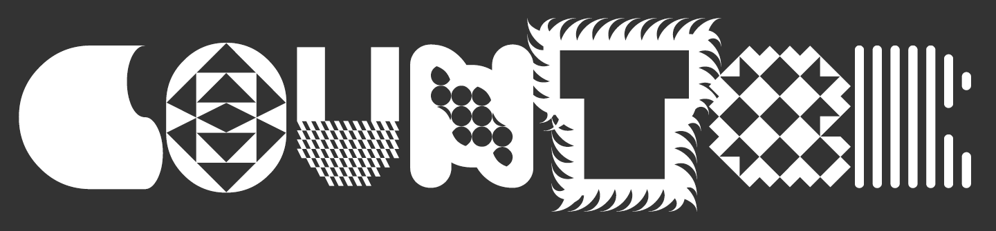
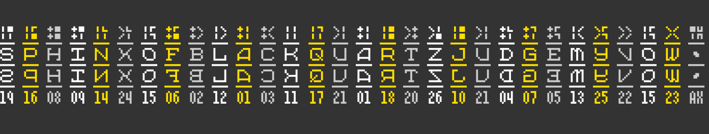
Fontstructions used in the image above, from left to right: zyrup eYe/FS by elmoyenique, the pattern exchange by four, Masthead Black by oliviajohnson, tm Bulba by thalamic, Dizz by geneus1, Sleepless by four, and soundwave by escaphandro.
FontStruct would like to thank our current principal sponsor: Google Fonts
Oh FontStructors,
Will you ever disappoint? This time you were faced with what seemed, at first glance, a relatively staid and technical theme: “serif”. Nevertheless you rose to the challenge, with your inimitable imagination and energy – endlessly riffing, playing and transmogrifying to produce a magnificently rich and diverse array of 58 entries – a record haul for a FontStruct competition. Many thanks and congratulations to everyone who entered.
Judging was more difficult than ever, but, thanks to the excellent input of our guest judge beate, we finally reached consensus.
First up, and in no particular order, the four winning entrants:

G1 Radia was a unanimous choice of the judges. With it’s high-contrast strokes, ball-terminals and discreet little serifs this FontStruction genuinely radiates a curvesome beauty, although on closer inspection one also sees intriguing traces of its cruder, modular roots.
All four winners actually made multiple high-quality entries, some of which we couldn’t resist including in the samples, so below G1 Radia you can also marvel at the monumental G1 Valora – one of the serifiest serifs this side of the Pecos.
2. Hoek by four (shown in red)

Hoek was elected by the FontStruct community as the “people’s favorite” . It obviously stems from a clear and precise concept for a bevelled slab, thoughtfully executed in every perfect detail.
In fact, the judges were even more excited by the highly-inventive “elza” (the second design featured above) in which wiry strokes terminate in a questioning hook-shape rather than a traditional serif or terminal. Planetarium, also shown above, was another strong and popular slab entry.

The judges were enchanted by Cembrel B: a subtle, attractive, and eminently-usable, high-contrast serif, part of a developing new family. Nouveaumbre was another really excellent entry from yautja.
And last but not least …

A classifier’s nightmare: a slab serif concealed inside a sans! – what an innovative interpretation of the theme. Beyond the high concept, architaraz also succeeds in delivering a coherent and attractive typeface. Beneath AT Bals you can see the elegant inline ”AT Migdalia” with it’s hairline serifs.
Many, many congratulations to our four prizewinners.
Some Honorable Mentions:
– A classic serif with an unusual calligraphic twist, created on a pin-board matrix.

– A convivial, super-chunky slab-serif, given added character by the idiosyncratic snips in certain letter-tops.

– Actually I’m not sure whether this is (at least in any sense known to me) a serif, but a strong, clear design nevertheless.

– One of three strong entries from the master of the dotted font. Some really charming glyphs in this one.

– Ultra-high-contrast strokes and serifs in a stencil-flavoured entry.

– Calculated, cutout crudity. Shamelessly modular and yet also wonderfully imperfect.

This brutal disfiguration of an existing design by Sychoff came very close to a prize. Although tagged as punk, there’s also something quite primitive and ancient going on here. I can see these glyphs scratched into the base of an amphora, or perhaps arranged in the border of a mosaic. Compare the Jekyll to this Hyde.
Congratulations again to all winners, who will be contacted about their prizes in the next few days; thanks to our judges; and, most of all, thanks to everyone who took part. I look forward to our next competition.
Happy FontStructing!
Rob
FontStruct would like to thank our sponsor: Creative Fabrica – your number #1 source for premium design elements.
Dear FontStructors,
It’s time for our second competition of the year, this time on the theme of “serif”.
Competition Brief
Our theme is the serif: “a small line attached to the end of a stroke in a letter or symbol” as wikipedia describes it – so your designs should focus on these strokes in some way or form. Serifs come in various shapes – Old-style, Didone, Slab and others. You can use any type(s) of serif you wish in your competition entries. Perhaps you could even devise a new serif form of your own.

FontStructors specialize in extravagant and experimental display fonts, so feel free to place your serifs in the foreground – they don’t have to be small as wikipedia suggests.
For typographic inspiration, please take a look at our Serif and Slab Serif category pages.
Competition Time Period
Wednesday, 8th November 2017 – Saturday 2nd December, 2017
Competition Rules
- You must be a registered FontStruct user.
- Your submission(s) must be posted and made “public” between 8th November 2017 and 2nd December, 2017. Although you are encouraged to share your submission(s) at any time between these dates, your FontStruction submission(s) must be public (marked “share with everyone”) no later than 2nd December, 2017 at 11pm PST. Additionally, your submission(s) must remain public at least until 9th December 2017 in order to give the judges enough time to review all qualifying entries.
- Your submission(s) must be tagged with a “Serifcomp” tag. (For fairness, during the competition time period, no FontStruction with the “Serifcomp” tag will be awarded a Top Pick.)
- Your submission(s) must be downloadable. If your FontStruction cannot be downloaded, the submission will not be including in the judging.
- Your submission must be a newly published FontStruction. Simply adding the “Serifcomp” tag to an already published font is not allowed.
- For each submission, you must post at least one sample image in the comments of the FontStruction.
- No letters in each submission can be MORE THAN 48 grid squares high.
- FontStruct cloning is permitted but the judges will be looking for original work.
- You may enter up to three FontStructions to the competition.
- This is a friendly competition. Cheering, favoriting and fun banter is encouraged but cruel and uncivil behavior will not be tolerated.
- No rules regarding licensing. You may choose any license you like for your FontStruction.
Judging and announcing the winners
All qualifying FontStructions will by judged by the FontStruct staff and guest judges between December 2nd and December 9th. Three prizewinners will be chosen. One of these will be the FontStructors’ Favourite. Winners will be announced in a FontStruct Blog post on Monday December 11th.
Prizes
Each winner can choose a t-shirt printed with a FontStruction glyph of their choice.
FontStructors’ Favourite
The valid entry with the greatest number of legitimate favourites at 11pm PST on 9th December 2017 will be one of the three prizewinners.
Questions?
If you have questions just add them as comments to this post.
May the best FontStruction win.
FontStructions in header image are clockwise from the top left: db Boxer Slab by beate, Manuale Neue Bold by laynecom, one-horse town by four, zeamróg-eYe/FS by elmoyenique, Unknownim by architaraz and RM Victoriana by p2pnut.
FontStruct would like to thank our sponsor: Creative Fabrica – your number #1 source for premium design elements.
What a wonderful competition.
Yet again the FontStruct community has demonstrated its unbounded creativity in interpreting a difficult theme in diverse and original ways. I would encourage everyone to have a close look at each of the entries, many of which really only reveal their conceptual secrets and precious details upon closer examination.
While the winners are doubtlessly worthy ones, there could easily have been many, many more, so don’t be too downhearted if you didn’t win, and please pity the judges their impossible task.
Before we announce the winners,
Some Honorable Mentions:

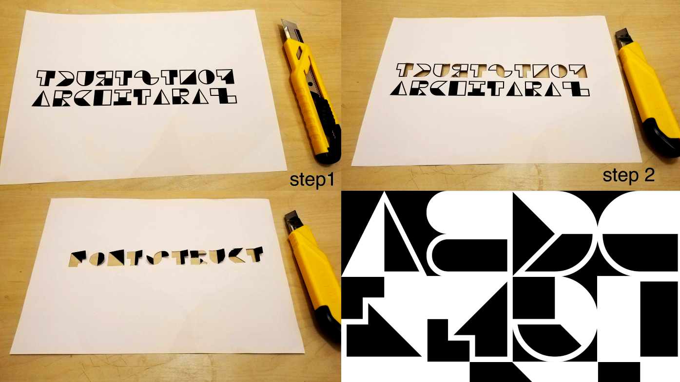
A number of designers decided to explore reversal in the sense of symmetry. ben17’s reflection for example (above), which despite the high concept manages to be legible and strikingly attractive, or architaraz’s similarly practical and well-formed AT Imago Reversed which is also an ingenious mirroring stencil:


Also playing with symmetry and continuing a distinctive FontStruct tradition of esoteric, decorative glyph sets is “Charm Spells” by Aeolien: Every glyph a mystery, like ancient lines scratched in the desert:

“tm up dn” by thalamic is an ingenious attempt to build a usable letter set by rotating or flipping other glyphs – both a crazy catalogue of intentional mistakes, and a clever way to explore new forms:
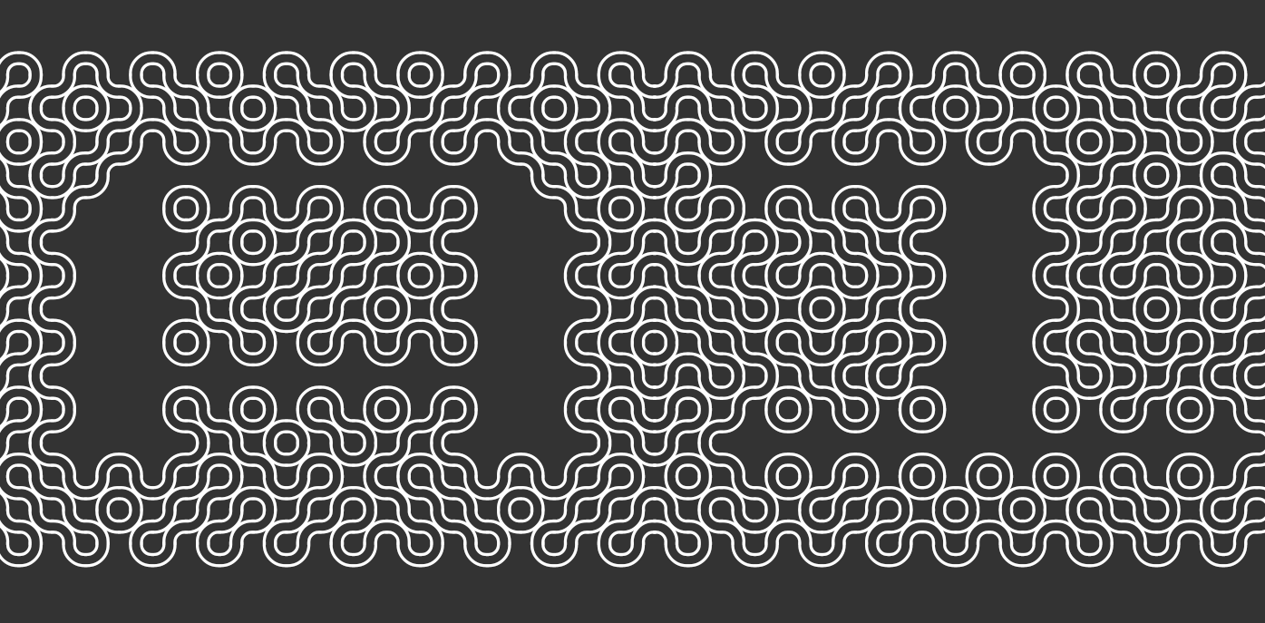
geneus1 gave us, as so often before, several strong and original entries, including the intricately woven G1 Trushae. Chainmail? alien circuitry? noodles? I’m not sure which it reminds me of more, but everyone is invited to lose themselves in the artistry:

With “SbB Codebreaker”, Sketchbook B demonstrates that it’s possible to execute an original concept using only the simplest of materials – the pixel brick. It’s a strange and very technical FontStruction but as the designer himself notes, it has a pleasing and distinctive texture:

There were so many other great entries, equally deserving of mention, but at some point we must move on to …
The Winners
The FontStructor’s Favourite was AT Esrever by architaraz. A clear and clever concept, perfectly executed and the favourite of our community:
A favourite of both judges was the cleverly named counter culture by four which opens an intriguing orthographic window on negative space. The dot-screen shading is a lovely detail.

zelbod eYe/FS by elmoyenique is a good example of a FontStruction which doesn’t reveal its full quality at the standard sizes used to display it in the Gallery and elsewhere on FontStruct.
zelbod has to be seen at a large point size in order for the unique folding concept and fine shading pattern to reveal their beauty:
Finally, I forgot, again, to invite beate to join the judging panel for this competition, and so, with three more spectacular entries, a prize is once more heading in her direction. We chose the elegantly carved db Jojo as our favourite:

Congratulations to each of the prizewinners; you will be contacted regarding your prizes shortly.
Congratulations also to EVERYONE who participated. It’s truly a great pleasure to see all your work appearing and growing on the site.
Special Thanks
To our guest judge, Stephen Coles of LetterForm Archive, Fonts In Use, Typographica, and on fortunate occasions such as this, FontStruct.
Now it’s time to wipe off our trowels and return to our hods. There are bricks to be laid.
Happy FontStructing!

“When I am drawing letters, I use the same approach. I am drawing the white shapes not the black strokes.”
– Cyrus Highsmith in “Eye Magazine”
Dear FontStructors,
Peace, love and fair bricks to you all.
By popular demand, and with all the additional bricks and other improvements in the HTML5 FontStructor, it’s high time for a new competition.
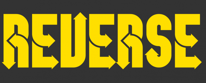
The theme this time around is “Reverse” which you are welcome to understand in any sense e.g. inverted, backwards, opposite, negative, or however else you wish to interpret it – literally or metaphorically.
Remember to tag your entry with “Reversecomp” before the 8th of July and don’t forget to upload a sample image.
Before starting, please read the rules below carefully, even if you are a frequent FontStructor.
Competition Time Period
Monday, 19th June 2017 – Saturday 8th July, 2017
Competition Rules
- You must be a registered FontStruct user.
- Your submission(s) must be posted and made “public” between 19th June 2017 and Saturday 8th July, 2017. Although you are encouraged to share your submission(s) at any time between these dates, your FontStruction submission(s) must be public (marked “share with everyone”) no later than 8th July, 2017 at 11pm PST. Additionally, your submission(s) must remain public at least until 15th July 2017 in order to give the judges enough time to review all qualifying entries.
- Your submission(s) must be tagged with a “Reversecomp” tag. (For fairness, during the competition time period, no FontStruction with the “Reversecomp” tag will be awarded a Top Pick.)
- Your submission(s) must be downloadable. If your FontStruction cannot be downloaded, the submission will not be including in the judging.
- Your submission must be a newly published FontStruction. Simply adding the “Reversecomp” tag to an already published font is not allowed.
- For each submission, you must post at least one sample image in the comments of the FontStruction.
- No letters in each submission can be MORE THAN 48 grid squares high.
- FontStruct cloning is permitted but the judges will be looking for original work.
- You may enter up to three FontStructions to the competition.
- This is a friendly competition. Cheering, favoriting and fun banter is encouraged but cruel and uncivil behavior will not be tolerated.
- No rules regarding licensing. You may choose any license you like for your FontStruction.
Judging and announcing the winners
All qualifying FontStructions will by judged by the FontStruct staff and guest judges, July 8th–15th. Three prizewinners will be chosen. One of these will be the FontStructors’ Favorite. Winners will be announced in a FontStruct Blog post on Monday July 17th.
Prizes
Each winner can choose a t-shirt printed with a FontStruction glyph of their choice.
FontStructors’ Favorite
The valid entry with the greatest number of legitimate favorites at 11pm PST on 15th July 2017 will be one of the three prizewinners.
Questions?
If you have questions just add them as comments to this post.
May the best FontStruction win.
FontStructions in header image are, from left to right, fs Unstruct by William Leverette (will.i.ૐ), Negative Shadow by Kai Harrison, zouvenir2U eYe/FS by elmoyenique, Upside Down by cmunk, paper cut by ben17, inverted by cmunk and Bloxed by cayo.
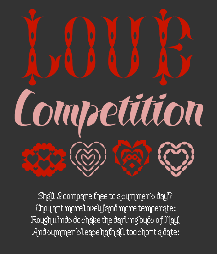
This was a really challenging competition thematically, but the FontStruct community once again proved their inventiveness, humour and skill in producing over 40 diverse FontStructions somehow related to the idea of “Love”. Yes, there were a lot of heart shapes, but they were almost always used in an original way or as part of a more complex idea. Congratulations to everyone who took part. You’re all winners!
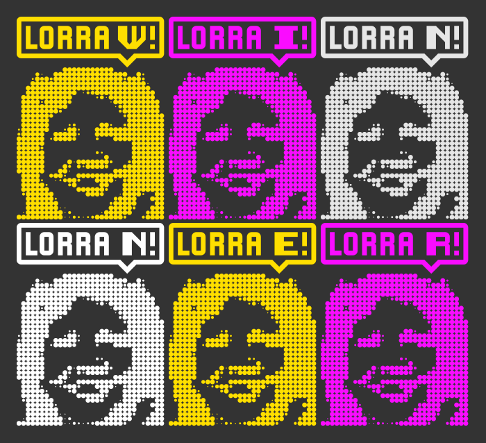
Lorra Lorra Dates! (shown above), one of two strong entries by NAL, was one of the most conceptually surprising submissions and certainly put a smile on my face. Other conceptually clever entries were fs pixel heart by opipik, heartbeat by ben17, and Lovers morse code by wicci. – Each either barely legible or downright cryptic, they would all lend themselves to secretive exchanges of billets-doux.
The Prizewinners
Given the high quality and diversity of the entries for this competition, there are four prizewinners. So, in no particular order, here they are:

jirinvk has been creating idiosyncratic, minimalistic FontStructions and using them in their design work for many years. Their three complementary entries are vaguely floral assemblages of amoeba-like modules. Superficially simple and restrained, The floriituta series is a great reminder of how it’s still possible to create original and attractive designs on a small grid.
Note to self: Remember to invite beate to be on the judging panel for the next competition so others have a chance of a prize.
“db for you” is yet another display of spectacular technical skill and design sensitivity from one of our leading FontStructors. A clear, expressive script, perfect for everyone’s annual declarations of affection.
geneus1 has been spectacularly generous on FontStruct of late: sharing gems from his secret back catalogue on an almost daily basis. He made three strong entries to this competition, any of which could have won, but this one was the people’s favorite, with the most Favorites at the deadline. G1 Lovelines is a sumptuous piece of gothic hyperbole. The carefree, heady excesses of love are well represented here.
A number of FontStructors looked to the decades of love-ins and the “summer of love” for inspiration – love peace happiness by four and G1 paloma by geneus1 for example. You could argue about the legibility of this entry from elmoyenique, but the extravagant psychadelic curls make each glyph a wonderful trip in itself.
Prizewinners will be contacted soon about their prizes.
Congratulations and thanks to everyone who took part, and Happy FontStructing,
Rob
Happy new year FontStructors!
As promised in our last post, we’re starting the new year with a new competition, this time with an amorous theme in time for Valentine’s day.
For the new FontStruct competition we’d like you to design a FontStruction on the theme of “Love”. You can interpret the theme as broadly as you’d like, as long as you can somehow relate it to the word “Love”. You could explore the iconography of love, design the perfect modular font for a Valentine’s card, or explore an associated abstraction (peace, friendship, animosity …). You can be literal, but don’t need to be. Keep it decent though please!
Remember to tag your entry with “Lovecomp” before the 6th of February and don’t forget to upload a sample image.
Before starting, please read the rules below carefully, even if you are a frequent FontStructor.
Competition Time Period
Wednesday, Thursday 7th 2016 – February 6th, 2016
Competition Rules
- You must be a registered FontStruct user.
- Your submission(s) must be posted and made “public” between 7th January and 6th February 2016. Although you are encouraged to share your submission(s) at any time between these dates, your FontStruction submission(s) must be public (marked “share with everyone”) no later than February 6th at 11pm PST. Additionally, your submission(s) must remain public until February 14th 2016 in order to give the judges enough time to review all qualifying entries.
- Your submission(s) must be tagged with a “Lovecomp” tag. (For fairness, during the competition time period, no FontStruction with the “Lovecomp” tag will be awarded a Top Pick.)
- Your submission(s) must be downloadable. If your FontStruction cannot be downloaded, the submission will be disqualified.
- Your submission must be a newly published FontStruction. Simply adding the “Lovecomp” tag to an already published font is not allowed.
- For each submission, you must post at least one sample image in the comments of the FontStruction.
- No letters in each submission can be MORE THAN 48 bricks high.
- FontStruct cloning is permitted but the judges will be looking for original work.
- You may enter up to three FontStructions to the competition.
- This is a friendly competition. Cheering, favoriting and fun banter is encouraged but cruel and uncivil behavior will not be tolerated.
- No rules regarding licensing. You may choose any license you like for your FontStruction.
Judging and announcing the winners
All qualifying FontStructions will by judged by the FontStruct staff and guest judges, February 6th–11th. Three prizewinners will be chosen. One of these will be the FontStructors’ Favorite. Winners will be announced in a FontStruct Blog post on February 12th.
Prizes
Each winner can choose either a) a t-shirt printed with a FontStruction glyph of their choice OR b) a signed and numbered copy of the FontStruct poster
FontStructors’ Favorite
The valid entry with the greatest number of legitimate favorites at 11pm PST on February 11th, 2016 will be one of the three prizewinners.
Questions?
If you have questions just add them as comments to this post.
May the best FontStruction win.
Another fantastic competition is over, and the FontStructing community has once more surpassed itself in energy and invention.
Congratulations to everyone who took part. I hope it was as much fun to participate as it was to watch.
Judging was a pleasure, but also a painful process since we can only have three winners. Here they are.
The Prizewinners
1) fs lost by EthProductions
This was a clear winner for all judges, and also the “people’s favourite” as chosen by the community.

“[this was] my favorite … on all levels: creativity, execution, usability, and that x-factor: pure delight.” wrote Stephen Coles, while Paul Bokslag went into more detail:
There have been other maze-based fontstructions, such as zlabyrinths eYe/FS by elmoyenique and Mazey by lldaddy, but in fs lost ETHproductions has not only made a set of beautiful and interesting glyphs, reminiscent of seventies multiline fonts, he has also managed to create a very useable font for puzzle sections of magazines, newspapers and themed publications. Each glyph connects to the next, making it possible for editors to instantly generate unique customised mazes, every word being a new challenge.
2) Fraline by Upixel

Exquisite and coherent attention to detail attracted the judges to this gothic gem. Stephen Coles wrote:
I’ve seen a lot of Blackletter on FontStruct because the angled bricks are so well-suited for Fraktur construction, but Fraline is one of the few beauties that takes the suitability of the tool to another level.
3) NCD Deconium SC Black Serif Inlines by djnippa

djnippa strikes a perfect jazz-age chord in this glimpse of a larger family. Stephen Coles wrote:
This is an excellent example of a historical typographic style (the Art Deco shaded inline) that is ideal for the FontStruct environment. Nothing is too forced here, and I like that.
Congratulations to all three prizewinners! They will be contacted about their prizes shortly.
Honorable Mentions
All the judges had very long shortlists and well over 20 other FontStructions were pushing hard for a place in the top 3. There will be many inline top picks in the coming weeks.
All the judges praised db TwoLines by beate. Paul Bokslag wrote:
The inline in this font is certainly not an afterthought that simply follows the shape of the glyph. Letterform and inline are two separate voices, each singing their own individual melody, but in perfect harmony with each other. This synthesis and the script-like character of the inline that connects certain glyphs, give this font a playful dynamic unlike any other and the samples illustrate that really well.
G1 Explo by geneus1, ztainless eye/FS by elmoyenique, RM Celtic Inline by p2pnut and AT Steglo by architaraz also all featured prominently in the judges’ feedback. Here is a collective showing of some of the judges’ favorites:

You can also download a printable version here.
The Judges
Stephen Coles is an honorary FontStruct staff member, writer, typographer. Editor of Fonts In Use, Typographica, and The Mid-Century Modernist. He lives in Oakland & Berlin.
Paul Bokslag is a Dutch-born artist living and working in Ireland. He specializes in papercuts and you can learn more about his fascinating work, including his use of FontStructions, on his website: paulbokslag.com. Paul is also known as the fontstructor four.
Rob Meek designs, develops and runs FontStruct. He is also the lead developer for Fonts In Use.
What Now?
I’m looking forward to the next competition already. As always, theme suggestions in the comments are welcome.
Time for our first competition of 2014, with the theme “inline”.
An inline font is one which is characterized by one or more white lines or spaces running inside its strokes. These white interior spaces provide decoration and depth, and they’re often associated with engraved or otherwise hand-tooled letters. Multilinear or polyline fonts can also be described as “inline”.
For this competition we’d like you to design an inline FontStruction.
If you’re unsure what an inline font is there’s a great page linking to categorized examples of inline fonts over at FontShop. And here are a few examples of existing inline FontStructions to help you get the idea:

Credits: From top, wavelength by four, blinker by four, Snowcat by four, “in the queue” (five years later I finally got the pun) by CommandZed , “Field Day” by four, signo by kix, AT Liniya by architaraz, “White Knight” by four, chozen by ishoppejon, Spacerock Biline by LexKominek and “Toothpaste OF” by funk_king)
Remember to tag your entry with “Inlinecomp” before the 7th of February and don’t forget to upload a sample image.
Please read the competition rules below carefully.
Competition Time Period
Tuesday, January 14th 2014 – February 7th, 2014
Competition Rules
- You must be a registered FontStruct user.
- Your submission must be an “inline” FontStruction i.e. be characterized by one or more lines interior to the strokes of most of the letters.
- Your submission(s) must be posted and made “public” between January 14th – February 7th 2014. Although you are encouraged to share your submission(s) at any time between these dates, your FontStruction submission(s) must be public (marked “share with everyone”) no later then February 7th at 11pm PST. Additionally, your submission(s) must remain public until February 16th 2014 in order to give the judges enough time to review all qualifying entries.
- Your submission(s) must be tagged with a “Inlinecomp” tag. (For fairness, during the competition time period, no FontStruction with the “Inlinecomp” tag will be awarded a Top Pick or be available for a Featured FontStruction pick.)
- Your submission(s) must be downloadable. If your FontStruction cannot be downloaded, the submission will be disqualified.
- Your submission must be a newly published FontStruction. Simply adding the “Inlinecomp” tag to an already published font is not allowed.
- For each submission, you must post at least one sample image in the comments of the FontStruction.
- No letters in each submission can be MORE THAN 48 bricks high.
- FontStruct cloning is permitted but the judges will be looking for original work.
- You may enter up to three FontStructions to the competition.
- This is a friendly competition. Cheering, favoriting and fun banter is encouraged but cruel and uncivil behavior will not be tolerated.
- No rules regarding licensing. You may choose any license you like for your FontStruction.
Judging and announcing the winners
All qualifying FontStructions will by judged by the FontStruct staff and guest judges, February 8–16th. Three prizewinners will be chosen. One of these will be the FontStructors’ Favorite. Winners will be announced in a FontStruct Blog post on February 18th.
UPDATE 17.01.2014 The judging panel will be: Stephen Coles from Typographica, Fonts in Use and countless other exciting places; Papercut artist and inline Fontstructor extraordinary Paul Bokslag AKA “four”; and FontStruct creator Rob Meek.
Prizes
Each winner will receive
In addition, all winners will have their winning FontStructions posted as Featured FontStructions for two weeks after the winners are announced.
FontStructors’ Favorite
The valid entry with the greatest number of legitimate favorites at 11pm PST on February 7th, 2014 will be one of the three prizewinners.
Spread the Word
Tell your friends. The  button floating above every FontStruction is a really quick and easy way to point your friends and followers to your work. Maybe you can drum up some more
  s for your entry in that way, or entice some novice FontStructors into the game.
Questions?
If you have questions just add them as comments to this post.
Let’s get FontStructing!
Last month, when we challenged you to emulate handwritten scripts using only the grid and bricks of FontStruct, it could be argued that we contradicted the very nature of modular type. But we’ve learned through experience — and four other competitions — that this tool is limited only by the imagination of our FontStructors. As we expected, many of you rose to this difficult challenge. It was tricky for the judges, Rob Meek and myself, to pick winners from the 56 entries, many of which were quite innovative, original, and appealing. But after comparing notes (and a bit of cheerleading here and there) we agreed on three clear champions in the Connected Script Competition.
And the winners are…

Each of our three selections answered the “Connected Script” call in their own unique way, and they demonstrated skill and creativity above and beyond the other entries. Without further ado, let’s look at each of these FontStructed scripts in more detail.

Michel Troy (Upixel) strikes a self-deprecating note when he describes his entry as a “very rough script” with glyphs that are “very unsightly”. But he acknowledges that, when its letters are combined to form words, Stiff Script has an undeniable charm. The judges recognized that on very first glance. Its pieces are linked with a very simple 45-degree stroke, yet Stiff Script manages a very even, handwritten flow despite the inherent rigidity of its forms. The sprightly, angular effect is reminiscent of the lively lettering found in mid-century advertising, logos, and signage. Still, the overall feeling of this design isn’t necessarily retro, as observed by four, a fellow Scriptcomp champion. The character set is essentially lowercase only, which freed up the uppercase slots for alternate “initial” forms that can be used to start words in a cleaner, more natural way.

Over his last couple of years on FontStruct, the Kazakhstan-born, Shanghai-based Zhalgas Kassymkulov (architaraz) has gained a reputation for creating inventive lettershapes and building fonts with an organic flow. So it’s no surprise that he excelled in the Script Competition. From a purely typographic perspective, Jalgas is the most imaginative design in the competition, with many glyphs that, while still legible, are entirely new. Despite a slightly irregular rhythm, words cascade gracefully across the screen. Zhalgas even noted that his design can survive (maybe even thrive?) with a faux italic skew. There is a lot to praise about Jalgas — more than we have space to detail here — so I’ll just finish off with the astute comments of will.i.ૐ:
Wickedly stylish. I love your use of propeller bricks in the connections and the implied dimensionality of the bridged loops. Script and stencil. Nice!

Among the handful of finalists under consideration by the judges, lupo generated the most discussion and controversy. If this font were to stand on its own, outside the context of the competition, no typographer would classify it as a “script” typeface. Still, we cannot deny the sheer ingenuity displayed by Paul Bokslag (four) in his response to the core requirement of the challenge: connections. Each glyph is wider than its sidebearings and features a gap, like an open circuit, that is closed only when another letter follows and overlaps its neighbor. Every word creates a continuous line that runs over the top and bottom of letters, looping at their connections. But lupo isn’t just a gimmick. The shapes of the letters themselves are interesting — bulbous and bold, the kind of friendly, engaging design that could be put to good use on product packaging or a children’s book.
In my brief for the Connected Script Competition I was painfully vague about the definition of script. So, as if in open defiance of that term, Bokslag focused on a connection scheme so brilliant it simply must be rewarded. Well done, sir.
lupo was incidentally also the “People’s choice” with the most number of favorites when the deadline passed.
Honorable mentions
There were so many strong and prizeworthy entries, we can’t mention them all, but FontStructions which were discussed in the latter stages of judging included:
db Lineo by beate – interesting, useful and attractive. A winner on another day.
Artificial Script by 1saac – part of an impressive, coherent and growing family.
The Ugly Script by cablecomputer – finely-crafted crudity. Not ugly at all.
Neonic by CMunk – “The letters connect to each other, even though they are unconnected to themselves”. Profoundly metaphysical FontStructing!
Djangogh Unpenned by will.i.ૐ – the FontStructing pioneer exhibits his wonderful, unique style and astonishing attention to detail.
Emblazoned by aphoria – A top-drawer “connected chrome” script. I can’t wait to see this one cast in metal.
and zelemin eYe/FS by elmoyenique – entering four competitions at once. It’s an outline, a stencil, an italic, and a script font. And it works!
Thanks!
Winners will be contacted by email to be faced with the choice of either a signed and numbered FontStruct poster, or a signed copy of the book The Geometry of Type. Thanks to all entrants and bantering bystanders for another great competition. FontStruct is in many ways a collaborative community and we were especially heartened by the way so many participants commented on the entries of others, lending technical support, design feedback, and sincere well wishes.