


Gridfolk: Interview with V. Sarela (Yautja)
Focus on FontStructors | Ata Syed | August 2nd, 2021
This is a guest post from Ata Syed AKA thalamic and minimum, the second in a summer series, continuing the “Focus on Fontstructors” tradition of interviews with members of FontStruct’s designer community. Ata has been FontStructing since 2008.
Psychologists may have a definitive answer to the question, “why do we like anything?” Or not. I do not know. It goes without saying I am no psychologist. Will that prevent me from answering the question…without research? Absolutely not. Read on to find out how many ways I get that wrong. :-)
In between spouting psychological hearsay, what I hope to get right in this second interview of Gridfolk 2021 is the work, life, and times of Mr. V. Sarela, better known—to those of us who have been around FontStruct since the early days—as Yautja.

Memogo by Yautja
Born in 1989, Mr. V. Sarela hails from Raahe, Finland but calls “Oulu, Finland” home, “where I’ve lived for most of my life.” This is why it is completely easy to accept when he says, “I speak Finnish and English fluently, and a little bit of Swedish. My thoughts are half Finnish, half English. Been trying to learn Japanese lately.”
On his educational background, he explains, “In 2010, I graduated from Lybecker Institute of Crafts and Design, with a vocational qualification in audiovisual communication. That encompasses many kinds of multimedia fields, including graphic design.” As we all need to earn a living, for work, Yautja says, “I have my own small business, through which I do music production and graphic design. It’s the field that I most enjoy, but clients are scarce. Hopefully, I can also sell fonts in the future.”
Whether now or later, to sell fonts you have to make them first. Yautja discovered FontStruct.com “simply by looking for free font editors when I was itching to design my own fonts.” The need to create fonts was the driving force. Time flies and “recently I passed my ten-year anniversary, as I started in 2011!” and yet after all this time “I visit [FontStruct.com] pretty much every day.” These daily visits must mean something. So why does he keep coming back to FontStruct? “The friendly community and the wide variety of interesting fonts are very welcoming! I like to see what new designs people have come up with.” And of those friendly people, does he admire any other FontStructors? “There are many very skilled FontStructors, who have made amazing designs that either fit neatly into the grid or push the limits of what’s possible – beate for example has made many beautiful designs that I admire.” His reason for creating fonts is one that perhaps resonates with a lot of us as “making fonts is a good way to express creativity. It’s fun and relaxing. And seeing your idea take form is very rewarding.”
Rewarding and fun it must have been as creating two hundred and twenty-five fonts is no easy task. Quantity aside, his 126 Staff Picks is a testament to the quality of his work as well. 225 fonts are not a casual activity even to scroll through—imagine what it took to create, let alone visualize them! Impressive indeed.
While few of us would say they do not enjoy music, have you ever noticed how dependent any contemporary music is on the technology of the day? When you hear synth music or the saxophone in a song or the Gated Reverb audio effect which gave rise to the iconic snare drum sound, the 1980s come to mind; you think the 90s when you hear a particular kind of electronic music; hearing the Auto Tune sound effect calls to mind the music of the 2000s; etc. The examples are endless. The technology or technique used identifies the era to those who are paying attention.

Meco by Yautja
This long preamble does have a point. Going through all of Yautja’s FontStructions—all 7 pages of them—some fonts stand out as being striking in their appearance such as Chrominca (2015), or Evogativ (2017), or Meco (2013), or Siberiada (2013) to name but a few. Some have contemporary feel to them, others are retro-futuristic in appearance. Some fonts break the mold, but some fonts are distinctly FontStruct. It is the distinctly FontStruct fonts that are evocative of the technology behind them. The reason for this might be as Yautja says, “generally, when I have an idea, I just jump directly into the FontStructor, as it’s an efficient way to put my ideas down.” While we are affecting the FontStructor to do our bidding, the FontStructor is pulling its own strings. The synergy between the designer and the FontStructor is important to get the desired result. Sometimes you get what you want. Yet, “occasionally I’ll sketch something on paper, or if I have ideas for fonts that aren’t possible to make in FS, I’ll draw them in Inkscape.” It takes a skilled designer to know which tool is needed for the job at hand.
The better the tool, the more you want to engage with it. “FontStruct’s intuitive interface and ease of use makes me want to keep going.” The thought that occurs to him is, “I’ve done the letters here, might as well make the numbers now, why not the punctuation as well….” Speaking of the act of FontStructing, Yautja admits, “It’s very addictive!” I think most of us would agree.

Chromadeus by Yautja
FontStruct addiction aside, as nothing is perfect, FontStructor has its limitation too. FontStruct was specifically designed for modular, grid-based fonts. Thanks to the continuous dedication and effort of its creator—Rob Meek—it has evolved considerably since its inception, but one limitation persists, “generally regarding curves, which can be hard to get around.” As Yautja says, “I’ll keep [those limitations] in mind when I start designing, and I’ll try to keep the designs easily FontStructable.” To counter those limitations, Yautja says that “composites, nudging and 2×2 filters are the best tools for me.” Couldn’t agree more.
Speaking of limitations, a thought occurs: are limitations really a bad thing? When asked if he finds the grid-based brick setup of FontStruct limiting, he said, “No, [FontStruct] just clicked with me and seemed like an easy way to start making the kind of fonts I like. And limitations often feed creativity.” That limitations are not something to be upset by is a lesson we all need to understand…especially in design. When possibilities are infinite, making a decision can be daunting. With limited choices, the field of solutions come down to a manageable level. Output happens.

Rephyze by Yautja
Limitations notwithstanding, on what things would help improve FontStruct, Yautja thinks, “I have many ideas for the FontStructor that I’d like to see, most useful would probably be 3×3 circles. For the site itself, perhaps more ways to have active interactions, like more frequent competitions. I did help develop the unofficial forum and FontOuts!” Despite all the limitations of FontStruct, Yautja says, “I’d like to expand to other font editors, but I have yet to find one that feels as intuitive to me as FS.” Now that is an endorsement!
This brings us back to the question, “why do we like anything?” Perhaps the environment one grows up in influences it, or maybe it is genetic in nature, or our personality traits may tilt our likes towards one thing or another. When asked why he chooses to continue making fonts, Yautja says, “it’s something that I enjoy doing—I like to practice my designing skills, and it’s nice to create something that might be useful to people.” All of which makes sense, because why engage in an activity of your own volition if it is not pleasurable; and why not try and improve in ability whether theoretical or practical while you are at it; and then knowing that what you create (fonts!) is something others will use to produce yet other things is definitely a positive factor. The element of enjoyment and satisfaction are present in all three. I suspect we will see other FontStructors give similar reasons to this question.

Proma Rei by Yautja
Making fonts is not the only creative outlet for Yautja. “I have been making music for 17 years now, mostly working on a computer, but I also play keyboard and drums. Music is important to me, and I listen to a lot of different kinds. Mostly electronic, but also disco, funk, rock, metal, and soundtrack music. I have almost constantly something playing, if not out loud then in my head. It keeps me going.” Same, brother. Same. Furthermore, “I’ve been dabbling with photography, and I’ve been drawing since I was little—not much these days—but I have some ideas for comics that would be nice to actualize.” Which begs the question, which does he prefer, Marvel or DC? “Neither actually. I’m more interested in Japanese and European comics.” And of those, which aspect is more enticing, stories or the artwork? “Both are a big part. There’s a lot of variety in stories and art styles.” Speaking of his favorite artists, he says, “I really love Don Rosa’s Donald Duck comics, and Junji Ito’s horror manga.”

80s inspired illustration by Yautja
Does what we like, or even why we like it, somehow form the basis of our creative inspiration? Yautja says, “I take a lot of inspiration from the 80s and from sci-fi, in both fonts and music. It’s also apparent in my taste in fashion I guess.” And do those inspirations make it into his fonts? “My fonts and music definitely have a lot of retro-futuristic aesthetics from 80s sci-fi and such, which I love.”

Video Font System by Yautja
Looking at the artwork for Yautja’s albums on Bandcamp and the stuff on his Behance page, a lot of it seems to have a clear 80s influence, even though he did not live through that era. Speaking of what attracts him to that aesthetic style, he says, “A lot of 80s stuff was still around when I was a kid, so it’s partly nostalgia. I used plenty of cassette tapes, VHS, and floppy disks, and I watched many 80s movies. I started to listen to more 80s music and just fell in love with the style. Things were still analog, and not digitally perfect. The recent outrun/retrowave scene has further fueled the interest.” On an unrelated-yet-related note, we have probably all wondered if “Yautja” means anything…to which he says, “It is the name of the Predator* alien species.” The consistent thematic continuation is certainly an inspirational quality.
*Predator, the movie, 1987
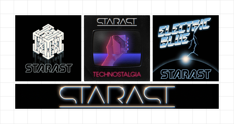
Album covers of Starast by Yautja
Speaking of personal preferences, which of his own fonts does he like the most, he said, “Looking at my favorites of my own fonts: Modern Vision is one of the earliest ones I made, a revival of an older font that hasn’t been digitized. The first versions were pretty bad, but after updates it’s become one I’m proud of. Same with Future Earth—both were inspired by The Terminator, one of my favorite movies. I became kinda obsessed with the typography used in it, and I started researching those typefaces, which haven’t been properly digitized. That fueled my interest in making my own fonts. Other favorite fonts include Karakteristika, Rephyze, and Stratus, which are just designs that I really like.”
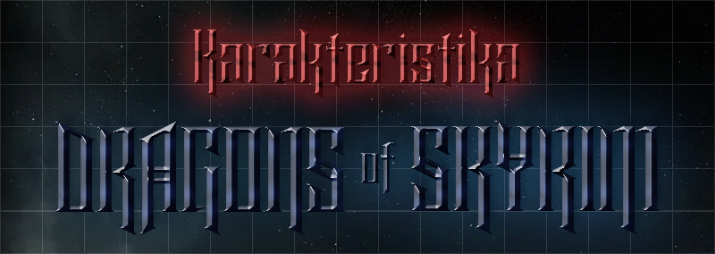
Karakteristika by Yautja
Others have liked his fonts too. Going through his own fonts, is he amazed at all that he has accomplished? “Yeah, I’m surprised how much I’ve actually done, and I’m glad they’ve been received well. And there are even more unpublished ones. I guess when I discovered FS it opened-up new possibilities for creative expression that I hadn’t even considered before.” Favorites aside, does he now find some of his own fonts that haven’t stood the test of time? “There are some that aren’t as good as they could be, especially older ones. I’ve updated some, hidden some, and left some just as a product of their time. I don’t really hate any. Some would need to be redesigned outside FS to get to their full potential.”
Of all Yautja’s work, the one that stands out the most for me is the album art font he created for his X.O.X. album. Speaking of the creative idea behind it, he said, “Yes, that one is pretty different since it’s not really a font. Originally it was inspired by an earlier illustration I had made just for fun, using a font called Recognition. I took that idea further and made the cover with that. Originally the album was released under the name Van Saarland, with a custom logo, but I renamed my music project to Starast and updated the cover with a logo based on my font Kiova Captura.” He was kind enough to provide the animation below which illustrates the layers of glyphs it took to create the final artwork. What’s most remarkable is the vision it took to imagine what each glyph should be like and what function it will play in the final output. Incredible achievement indeed.

The intricate process of creating the album cover of X.O.X. by Starast, originally published under the name Van Saarland by Yautja
Having discovered his music in 2013, his track Fractal Flow became an instant favorite of mine and I’ve listened to it at least a couple of hundred times. Upon learning this, Yautja said, “Thanks for listening. I didn’t really think much of that track, it’s funny how an artist and the audience often like different aspects of their work.” This brings up another related curiosity: Sometimes, the fonts I work really hard on and think I’ve done a good job on…generally gets ignored, and some fonts that I do out of boredom without much effort, people like a lot. Why is that, Yautja? “Yeah, that happens. But it’s good to know that anything you make can find its audience,” which is a comforting thought. “If you build it, they will come”* sorta thing.
*from the movie Field of Dreams, 1989
Speaking of building, does Yautja create samples for his FontStructions and what is that process like? “I make samples sometimes, if I have an idea or if it’s something I specifically want to show off. Generally, I like to keep to a square shape and try to fit text in a pleasing way, maybe add some simple shapes or illustrations. I have a bunch of color combinations that I like to use, mostly retro inspired.”
The word “retro” has a built-in element of the present. Any time of now has the added benefit of updated, improved, and new technology. Does this enhancement affect his creative output? “Technology is definitely important to what I do. I couldn’t live without it. I’m glad we have what we have now. But you can still do much with just pen and paper. [As for music] I use FL Studio as my main DAW [Digital Audio Workstation software], which I’ve been using since 2005. Occasionally I use Garageband for additional work. I also have a few hardware synths, which are fun to play with, but mostly I’m using software as it’s just faster to get the work done. I can do pretty much what I want with what I have now, though I’d like to use more guitars in my tracks. I don’t play guitar, which is the biggest limitation—I’ve been getting by with virtual guitars, but they’re not as good. Putting down ideas is fast but making them into complete tracks is harder and can take years. I have hundreds of unfinished tracks that I’m not sure what to do with. For fonts, it’s just FontStruct and Inkscape for now. Creating fonts by hand without precise digital tools would have at least annoyed the perfectionist in me, and would have been much more time-consuming. I like the freedom of creating vector shapes with Inkscape, but I still have to figure out how to make them into proper fonts.” Technology wins. Though that idea brings up this point of technology being mere tools. What we do with them is—still—user/craftsman/artist dependent. Intelligence is yet a human domain.

Tech Noir by Yautja
Of his three creative outlets of font making, music making, and graphic designing, which does he enjoy the most? “I enjoy making fonts and music equally much. Font design is easier and could be more suited to make as a job, if I had to choose one.” Making fonts for commercial use will require a more full-featured font creation software such as Glyphs or FontLab Studio. Has he experimented with them? “I’d like to make fonts outside of FontStruct, but I’ve yet to find a font editor that suits my workflow as well as FS. I’ve briefly tried a few free ones (on Windows), but they just don’t seem as intuitive, and would take some getting used to.” What about collaborating with someone to make fonts commercially? “Haven’t really thought about that, I think making fonts is well suited for solitary work, but I would be happy to try collaborating with someone.”
Font making is certainly a solitary work. I am, but does he think most FontStructors are introverts? “Same here. Don’t know if most people are, but I guess this sort of work suits introverts well.” Introverts are fine on their own most of the time, but even they need some social interactions. Should there be a fs WhatsApp group (or something similar) for occasional interactions? “That could be nice if people are interested. You could ask the other people you’re interviewing.” I suppose I just did. :-) Any name suggestion for this hypothetical group?
Regarding naming things, how does Yautja decides what to call his fonts? “I actually find naming the fonts the hardest part of the process, or the most time consuming. A lot of good names are already taken so you have to get creative. I keep a list of interesting words and names that I’ve come across or come up with and look at that for inspiration. Most of the names end up being something pretty unique, they almost make up their own language now. That has actually gotten me more interested in languages,” thereby learning Japanese, for instance. そうですね. So, is creating song titles easier than naming fonts? “Song names are easier, as they can have a wider variety and I already have a list of several ready to use names that I want to use, and it’s not as bad if they’re already taken.”
Speaking of song, what music does he currently listen to? Top three songs from his current playlist? “[How about] three songs that have influenced my font names: Edouard Artemiev’s La mort du héros (from Siberiade, which I named a font after), Ladytron’s High Rise, and Cerrone’s Supernature.” Not to forget Front Line Assembly’s Modus Operandi.

Waltraud by Yautja
Answering where he sees himself in the future, Yautja says, “Hopefully doing the same things as now, but as a full-time job.” And for the things he created, does he want to be recognized for them? “I don’t care to be famous, but I’d like for my works (my music and fonts) to be remembered.”
There’s that word ‘like’ again. As a final speculation to the question, “why do we like anything?”, let’s let Yautja have the last word. “My philosophy in life is that no matter what you do, there are people who like it and people who don’t.” So, it seems I have been asking the wrong question all along. Maybe it doesn’t matter why or how we have acquired our likes. What matters is what they are. There is no point in debating why we like anything as long as we are aware of what they are…and pursue the ethical ones. Progress will happen. Well done, Yautja. Carry on!
Yautja can be contacted through his website, Vignette Studio for music production or graphic design needs.
Thank you once more, Ata!
Two interviews in within one month? Great efforts, Ata Syed…
– BWM — August 2, 2021 #
Fantastic interview! I’m really enjoying this summer with Gridfolk ?. Thank you both, Ville and Ata!
– elmoyenique — August 2, 2021 #
Once again, another wonderful FontStructor interview! Congratulations to both V. Sarela (Yautja) and Ata (Thalamic & Minimum). Eagerly awaiting the next installment. :^)
– Goatmeal — August 2, 2021 #
A lovely continuation in this series~
– time.peace — August 3, 2021 #
Lovely interview with a very versatile and interesting person. Your fonts are awesome with a huge commercial potential.
– architaraz — August 6, 2021 #