


Gridfolk: Interview with Tibor Lantos (Frodo7)
Focus on FontStructors | Ata Syed | September 19th, 2021
This is a guest post from Ata Syed AKA thalamic and minimum, the sixth in a series continuing the “Focus on Fontstructors” tradition of interviews with members of FontStruct’s design community. Ata has been FontStructing since 2008.
0 Point (Introduction)
Technically speaking, a point has no dimension. However, in layman’s terms, a point is a dot; the smallest visible thing.
In his book, “Astrophysics for People in a Hurry”, Neil deGrasse Tyson begins by imagining the origin of the universe. The infinitesimally small point of all energy —that was about to become the universe— explodes and, in a microsecond (i.e., a millionth of a or 0.000001 second), it had expanded to a size larger than our solar system. In that brief span of time, or perhaps even before, all the rules of physics that there ever will be came into being because space, time, and physical particles had been generated and something had to govern them. The rules of physics were written in the language of mathematics. Try if you must, but there is no getting away from physics or mathematics. Of course, both physics and mathematics are human constructs developed to understand the universe. While understanding the universe is slightly beyond the scope of this article, the love of knowledge and use of mathematics and geometry, as you shall see, are not.
Calm, meticulous, and erudite are the fundamental qualities of the sixth FontStructor that we focus on in this Gridfolk 2021 series: Tibor Lantos (Frodo7). Let’s see how.

Neo-Tokyo, background: Quasiperiodic Tiling
1 Line (Background)
A line is a continuously connected series of points. While lines have no beginning or end, what we think of a line is actually a line-segment — some specific portion of a line. Since a point has no dimension, a straight line is one-dimensional, which is to say it only extends in one direction. A line can be curved as well, in which case it occupies two dimensions.
Tibor was born in Budapest, Hungary in 1963. Though he was away for many years while working in England and France, he has returned to live in Hungary again. He is a medical doctor by training and used to teach anatomy and histology at the Semmelweis University Medical School. His field of research was in neuroscience. Currently, he works as a physician and provides emergency care for people in a small town and the nearby villages. He works long hours. In his own words, “I like what I’m doing. I like my little patients (kids, toddlers, babies); I like my elderly patients. It feels good to know I can help them; I can make a difference in their life. In many cases, they simply would not survive without timely medical intervention.” Beyond FontStruct, Tibor has a presence on Twitter, where he follows only a few topics: typeface design, pixel art, watches, and Bitcoin. On Pinterest, he has boards and pins reflecting a larger gamut of his interests. On Tumblr, he shows samples of his original works.
Regarding fonts, this is how Tibor describes himself: “I’m an amateur typeface designer. I have no formal education in typeface design or graphic design. I learned everything from Computer Arts magazines, books, online tutorials, blogs, and YouTube videos. Online courses helped me to take my skills (with Glyphs) to the next level.
I’ve been designing letters since 2003. My early fonting endeavors were met with puzzlement, misunderstanding, and ridicule. Creating fonts was definitely not cool in the eyes of muggles. It didn’t matter; my enthusiasm remained steady. For inspiration, I took long walks in the forest and listened to old albums of Emerson Lake and Palmer. The rich music lifted my spirit.
Being an amateur designer has several advantages. I create letters out of love and passion. My career, my income doesn’t depend on my creative output. I don’t care about money, fame, and success. I can freely experiment with ideas. I can afford to make mistakes or fail completely. It’s part of my learning process. I keep learning new things at every turn. In the course of the first five years, I spent well over 10,000 hours with FontStruct, pushing bricks, making fonts every day.”

Eomer (quote from Monty Python’s Life of Brian, 1979)
2 Angle & Circle (FontStruct)
Place a perfectly vertical line-segment somewhere and anchor the bottom end. Revolve the line-segment at the pivot. Some revolution change between the initial and final revolved state is called the angle between the two. When the line-segment is revolved so much that the starting angle is also the ending angle, the shape the non-pivoted end of the line-segment traces is called a circle. The line-segment is now the radius of this circle. Placing 359 line-segments at equal angles from the pivot point will divide the circle into 360 pie wedges. The change in revolution from one straight edge of the wedge to the other is termed 1 degree. There are 360 degrees in a circle. A perfect circle is one in which the distance from the center point (the pivot) to the outer edge is same at every angle.
Tibor has been an active member of the FontStruct community since May 2009. He has shared 150+ meticulously created fonts and has made 2400 encouraging comments. Regarding how often he visits fontstruct.com, he says, “FontStruct is always open in my browser. I check a few times a day what’s going on even if I’m not building anything. I like the tool, the FontStructor software, and I like the community around the site. The FontStruct community was very supportive of my learning process. The ‘older’ members were very kind and patient. I am grateful to them.”
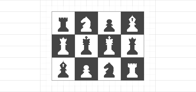
French Defence: chess dingbats.
When asked if he admires any other FontStructors, he replied, “Let me answer this without giving a particular list of names. I really don’t want to hurt anyone’s feelings. However, my Favorites [on FontStruct] are open to the public if someone is interested who’s works I valued the most. I closely follow other members’ activities and collect their best works (as permitted). These are extraordinary men and women, a few of them are professional artists. They create elegant typefaces effortlessly with new techniques the way I simply couldn’t do. Super intelligent, insightful people from different cultural backgrounds who taught me a lot. Exchanging ideas, opinions with them is always a delight.”
3 Triangle (Making fonts)
Connect any one end of any two line-segments to a single point at any two different angles. Connect the unconnected ends of the two line-segments with a third line-segment. The resulting shape is called a triangle. It is the simplest shape with distinct sides that contains an area.
What compels you to create fonts?
In the beginning, I thought making fonts was a quiet and peaceful hobby like writing poems, playing the guitar, painting, gardening, or angling. You find a way to express yourself, you don’t disturb others, and the whole world should leave you alone. Years later I realized that creating fonts was way more important. We are akin to fashion designers. We’ve been dressing up the same Latin letters for more than five centuries to exert influence on the reader. The straight lines, fine curves, tension, and balance convey a second layer of information on top of the literal one. It could be about anything: playfulness, joy, abundance, simplicity, strength, sophistication, elegance, sheer efficiency, or decay. We design costumes for the letters to make a visual impact.
Describe for us your general font-making process behind a shared font?
It starts with an idea, an early concept. I am deeply immersed in today’s turbulent culture. I see a lot of typography every day. Sometimes I see an interesting typeface, a logo, or just a single letter that makes me pause. I start thinking about whether I could make it better, turn it into something different, or build a whole character set around it. At this early stage, I make decisions about the scope and purpose of the project: who are the potential users, and what may be the function of the new font. I often make sketches on square paper or graph paper. Drawing by hand forces my brain to think differently. I can’t really explain why, but it feels different from working on a computer screen. It is this important phase when the overall size and proportions are determined.
The next stage, prototyping, takes place in the FontStructor. Usually, I start with the lower case, and with the most challenging letter: ‘s’. If I can’t fit a double curve into the given x-height I have to rework the whole concept. I build the basic character set and test it with text samples. I modify, squeeze, prune the letters until they work nicely together.
A good typeface is more than the collection of its characters. The letters, numbers, punctuation marks, and spaces have to work in concert so as to render the text legible and aesthetically pleasing. The printed text has an internal rhythm, it breathes, it has balance and symmetry. And this is the ultimate reason I keep making fonts: to find beauty, harmony, and balance in my letters.
I work slowly. Usually, it takes weeks or months to complete a project. I’m a perfectionist. Some fonts are never finished; I revisit them time and time again, and make small improvements. In case I can’t find a good design solution, I shelve the project for years. Later with a fresh look, and with help of new Fontstruct features, I can work out the problems easily. I don’t work under the influence of some sort of creative frenzy. Creativity is not a constant flow of ideas for me. It has ups and downs. I try to use the good periods the best I can, and just wait out the doldrums.
When I use the FontStructor, I try to keep things simple. I don’t attempt to make faux Bézier curves using a series of tricks and bespoke bricks. No. I’d rather build something coarse and rugged, using simple geometry, and take advantage of FontStruct’s real strength. Letters with polygonal contours have a rustic feel: they appear as being chiseled out of solid rock. (On the other hand, I admire those who are able to make sublime curves with FontStruct.)
The last stage is production. The final assembly, kerning, etc. takes place in Glyphs. I still have a lot to learn about this application, but I enjoy the ease I can add OpenType features, or handle diacritical marks with. Glyphs is a very powerful tool with lots of scripts, plug-ins to cater to all aspects of type design.

Esgaroth: a heavy slab serif.
While making a font, what frustrations do you face and how do you overcome them?
In the early days of Fontstruct, I faced technical problems on a daily basis. While working on large fontstructions, the system was sluggish, it often froze. My computer screen didn’t have enough horizontal and vertical space; I had to do a lot of scrolling so as to move around parts. A few times I lost my entire work due to some glitch. I was not happy, but it was part of the challenge. Those days are long gone. Rob Meek has done an excellent job by constantly upgrading and extending the program. The transition from Flash/ActionScript to HTML5 was very smooth. People don’t talk about it, yet it was a major achievement. And the new features are superb. Nowadays, I feel limitless; building a font feels like flying on wings.
4 Square (Portfolio)
Draw a line-segment from the very top of a perfect circle to the very bottom. Similarly, draw another line-segment on the same circle from the very left point to the very right. Both of these line-segments will intersect at the center of the circle, which will be divided into four pieces. Rotate the circle exactly 45 degrees. Leave the line-segments and remove the circle. Connect the open ends of the overlapping line-segments with new line-segments on the top, bottom, left, and the right end points. The resulting shape is called a square. The angle between any two connected edges is always 90 degrees and the length of each side is equal to any other.
If you had to categorize your fonts, what would they be?
My fonts tend to fall into a few categories: regular fonts, stencil fonts, pixel fonts, display fonts based on fractal patterns and geometric properties (e.g. isometric or other perspectives), other fonts (patterns, dingbats, chess). In terms of scripts, I focus on the Latin alphabet, where I feel at home. I also create Cyrillic sets when it seems practical. I’m very fond of Cyrillic letters and the cultural heritage they represent.
Stencil fonts are stunning, especially the heavy ones. They display brute force, masculinity, and utter disregard of classical propriety. (As we all know, typeface design is about tradition and rule-breaking at the same time.) When I create one, I try to reflect these qualities. I imagine my stencils sprayed over heavy machinery, large wooden containers, or rugged concrete walls.

Thorin Stencil (quote from Heartbreak Ridge, 1986)
I’m also a pixel font enthusiast. Pixels are still relevant, especially in the retro gaming world. What would we do without nostalgia? Last year during the pandemic I experimented with pixel fonts. I set out to learn more about symmetry, proportions, rhythm, and harmony in typography. Pixel fonts are ideal subjects for such experiments: they are simple, easy to create, and easy to test. You can modify them quickly by adding or subtracting single pixels, make slightly different versions, and see how they work with the sample text. I ended up with 20+ similar-looking fonts, not tremendously original ones, I should say, but all of them performed well in terms of balance and harmony. The humble pixel creations taught me a lot about the inner workings of typefaces, big and small.
Enlighten us with your source of inspiration.
I get plenty of inspiration (and solace) from nature. Geometry and chaos (fractal symmetry) are constant sources of my new ideas. Several works of mine are based on simple polygons, isometric projection, or optical illusions. I also designed a series of display fonts based on fractal patterns. Some color versions of these are still under construction in my digital workshop.
Needless to say, classic and contemporary typefaces have a great influence on my works (Atomic Media, Büro Destruct, Device, Emigre, Identical, T-26, Typotheque, to name a few). This brings us to the topic of originality. I’m not afraid of borrowing ideas from others. It’s part of the creative process. No artist works in a vacuum. We are all influenced by previous creative ideas, stimulated by the design community. Truly groundbreaking designs are rare.
The renaissance masters copied the works of antiquity. That’s how they learned sculpture, painting, and architecture. They’ve improved on classic Greek and Roman art by adding new knowledge of anatomy, perspective, and engineering (among other things). The history of type design tells a similar story. The first typefaces were designed to mimic the handwriting of scribes, carrying the long tradition of penmanship into the age of movable type. Likewise, Helvetica (a.k.a. Neue Haas Grotesk) did not come out of thin air. There was a line of sans serifs leading to it, each one bringing barely perceptible, small changes. Today the whole sans serif arena is so crowded and so competitive, even an expert has trouble distinguishing the countless nearly identical typefaces. The term original design means very little indeed from this perspective. Thus, we should embrace the cross-pollination of ideas, remix and reuse them, and add our own creative bits to move forward. (Nota bene, I was talking about creative ideas, not wholesale copying of finished works and releasing them under your name. That’s called rip-off. It has nothing to do with creativity.)

Mirkwood 3rd Iteration (unpublished). A pixel font showing self-similarity.
3 Dimension (Creativity)
Because humans possess intelligence and occupy a multi-dimension existence, dimensionality is not difficult to understand. Stand somewhere and extend your arms away from your body at shoulder height. The left-right extension of the arms is one dimension and is usually called the x-axis. The vertical aspect of you up and down is considered the y-axis. Perpendicular (a 90-degree angle) to this, looking straight ahead, the line of sight is termed the z-axis. If you consider your stomach as the origin of this dimensional space, every point to the left of this origin is the negative x-axis and positive to the right side; every point above this origin is positive y-axis and below as negative y-axis; every point in front of this imaginary point of origin is the positive z-axis and behind as negative z-axis;. This gives four quadrants in the positive y-axis and four in the negative y-axis for a total of eight octants. All shapes and forms imaginable (!) can be fit into and be represented in any combinations of these octants.

Sierpinski Black Initials: a font based on the Sierpiński triangle.
How does the current technology affect your creative output?
Technology is liberating. It has given me fantastic tools in my hands. I remember the time before we had computers, digital cameras, and laser printers. It was a great deal to put together a manuscript with photos and illustrations for (scientific) publication. I spent hours in the darkroom with a professional photographer to get my pictures right. Simple illustrations, diagrams were drawn by hand on tracing paper with black ink and technical pen. After the typewriter, selecting fonts, using bold and Italic, printing text at different sizes was a huge leap forward. When Photoshop 2.5 arrived in the early nineties, it came in a box with more than two dozen floppies for installation. Accessing information on the internet (before the Web was invented) was cumbersome and tedious.
Things have changed dramatically. Today I am infinitely more powerful and capable than kings were before the modern age. We have access to all information anytime, anywhere in the world for the first time in history. Modern software tools help me to write an essay, edit images and video, compose music, or design a typeface. Yes, we can create our own typefaces; that was unheard of just fifty years ago. Well, I could even start my own YouTube channel if I want to. I don’t have to go to university to learn new skills. All the knowledge, detailed tutorials are available online. The digital age is full of good news: everything is getting faster, better, and cheaper. Awesome. I am thrilled to live in this crucial period of time.
What are your thoughts on the popularization of typeface design?
Typography is still the dominant form of visual communication. Once belonged exclusively to professionals (punchcutters, printers, designers), today font creation is very popular among amateurs. One would rightfully ask: is it fitting to give all power to the masses? Allow them to mess with the sacred art of letters? Could any good come out of the democratization of type design? My answer is a big yes. After all, that’s exactly what FontStruct is about: it’s a simple tool that runs in the browser and brings the wonder of making fonts close to everybody. No previous training or experience is required. The learning curve is gentle. FontStructing is fun.
Not all FontStructions are masterpieces. The vast majority have plenty of room for improvement. Still, there was no harm done by creating less than perfect fonts. They may serve as stepping stones towards prowess, or as bad examples. At the same time, there are true gems among them. For those gems, it was already worth it (opening up typeface design). There are many examples in history when fresh ideas and change came from outside of the circle of professionals. Creativity could certainly flourish ‘unspoiled’ by education, doctrine, and tradition; unaffected by the rigidity of thought.

Could you explain the purpose and process of font samples?
Yes. Samples are very good to promote my new fonts. In a simple case, I make screenshots from the preview window. On special occasions, I take my time and create demo posters. This involves brainstorming, making pencil sketches, and using professional software (Adobe Illustrator, Photoshop, or lately Affinity Designer).
Is your creative output more artistic or commercial? Why?
This question implies that artistic and commercial qualities are the opposite, or mutually exclusive. I think they usually go very well together. For centuries almost all works of art were commissioned and paid for: paintings, sculptures, great buildings, compositions of music, and literary works. The most important patron was the Church, followed by kings and rulers, members of the aristocracy, and wealthy citizens. We have only to add the large and small corporations to the list to describe the present situation.
My whole portfolio is ‘artistic’. I’m yet to sell my first font. I never really had time to develop and refine my works to the level of professional typefaces. This is about to change when I retire. I’ve already made preparations to work full time on my fonts. A selection will go on sale next year on MyFonts.com.
Selling my fonts is important for one reason. It is the ultimate test of quality if people actually buy my work. I don’t really depend on that income. Yet, giving away them for free seems to be inappropriate. People don’t appreciate things that are free. Those works have virtually zero value.

Hommage à Escher, asterisks (*). The sample is rendered on the Poincaré hyperbolic disk.
2 Geometry (& Mathematics)
Geometry is the branch of mathematics that deals with points and lines, shapes and forms, angles and dimensions. It describes the rules governing their existence and interaction. It can be used to depict simple visualization or bewildering complexity without ever breaking even a single rule. It has the potential to describe the entire universe.
Your fonts usually are geometrically precise. What kind of mathematics/geometry education and training have you had?
Well, I had a very good math teacher in secondary school. I was very lucky to be a student in one of the best grammar schools in my country. It was a boarding school for boys only, and our teachers were Franciscan monks. We also had a math club there on Sundays. Our teachers planted the seeds of love for mathematics, physics, literature, history, and art in our young fertile brains. We were told many times: the only proper relationship with science was love.
Have you continued to learn more about mathematics since your formal education ended? If yes, how?
Yes. My university years started straight after the Rubik’s cube frenzy. It was a vibrant period of math puzzles and popular science. I read all the math and physics-related articles in Scientific American and several popular mathematics books (by Ian Steward, Martin Gardner, and others). I’ve learned a few missing chapters of math on my own: graph theory, polytopes, tilings. I designed a series of 3D puzzles too. Later I learned about chaos theory and fractals; later still about hyperbolic geometry. I’m not a mathematician, nor a geometer. My understanding of math is at the level of amateur enthusiasts. I consider mathematics to be the rulebook behind the beauty of nature. When I see a broccoli or cauliflower, I see the fractal symmetry in them. In the case of fresh salad, I consider the hyperbolic geometry of the green curvy leaves.
How did you visualize and work out the intricacies of the fractal fonts you have designed?
Fractals have the strange property of self-similarity: the same pattern is repeated at an ever-smaller scale. I work out the small details by trial and error. I also make pencil drawings. In the end, everything looks nice and tidy. Nobody can see the experimentation and false starts behind the scenes. I still have a fractal font with missing parts waiting to be finished. Because that particular pattern was so complex, I used Illustrator to make ‘sketches’ and experiment with them.

Sierpinski Chromatic: a color font based on an isometric fractal pattern.
Speaking of patterns, why do you think we find them pleasing and soothing?
A few months ago I saw a collection of art nouveau wallpaper designs of William Morris, and asked the same question myself. There must be something special, mesmerizing about patterns that people want to line their entire home with them. Patterns are based on some sort of symmetry and repetition. There are many patterns in nature that can be described using simple mathematical formulas, ratios, or a sequence of numbers (e.g. Fibonacci). Our brain has evolved to deal with all sorts of patterns. There are specialized neuronal networks for processing visual, auditory, tactile, kinetic, and other stimuli. Pattern recognition is a fundamental task of the cerebral cortex. Our very survival depends on it. It seems that we are hard-wired for natural patterns. We tend to find them pleasing or harmonious if they show mathematical proportions.
The best way to illustrate this is with music theory. Musical tones comprise a fundamental (frequency) and overtone series/harmonic series. The frequency of harmonics are integer multiples – 2×, 3×, 4×, … – of a tone’s fundamental. The harmonics are pure sine waves; they have no overtones. A scale is a set of musical notes ordered by fundamental frequency or pitch. The interval between two notes can be measured by the ratio of their frequencies. In the case of an octave, it is 2:1; that means, if one note has a frequency of 220 Hz, the note one octave above is at 440 Hz. Likewise, other intervals commonly used in Western music can be described by simple ratios of small integers: 3:2 (perfect fifth), 4:3 (perfect fourth), 5:4 ( major third), etc. It seems, what notes we find pleasing, and what notes go well together have been determined before us, before music and human culture were established, by the rules of nature. When we listen to music our brain just doing math.
You have also created fonts that are optical illusionary in nature. It seems to me your insight into how the brain works helps you create those. Tell us a bit about them.
Well, it’s tempting to give a retrospective explanation like that, but the reality is a lot more simple. I was captivated by some twentieth century op-art works. Is it possible, I wondered, to use the same optical tricks for making display fonts? After experimenting with the most promising effects in FontStruct, I created the first version of Optill. The optical illusion worked, but the font left much to be desired. Today I have its fourth version, called Slanted Type. Other sorts of optical illusions include isometric shapes with impossible geometry or double perspective – inspired by the works of M.C. Escher. It’s fascinating as our brain flip-flops between the two perspectives and tries to make sense of it. I also designed an op-art font based on the artworks of Victor Vasarely, using arrays of squares and rhombi (see Vasarely Squares). Op-art fonts, if carefully crafted, can make an exquisite visual punch.

Elendil Inverse (unpublished version of Elendil).
1 Algebra (Future)
While it gives people anxiety when algebra is mentioned, it is a branch of mathematics that helps in figuring out something unknown based on some other known things. Basic familiarity with algebra is the first step in uncovering the hidden.
Are there any changes you wish to see happen at fontstruct.com and in the FontStructor?
Only minor things. I’d like to see the Menu hierarchy flattened, so as to get easy access to deeply buried functions, such as Nudge Up, Rotate Right, etc.; Kerning: the same settings to be automatically applied to all accented versions of the letter; Layers: copy and paste between layers, duplicate layers. Most of the things I wished for have been already implemented.
Do you have any advice for the people just starting out in typeface design?
Yes. If you are new to font design, there are a few points to consider. We are not about making fancy stand-alone glyphs, but to devise legible smooth text. (Except for logotype, of course.) Our focus should always be on the reader. After creating the character set, your job is only half done. To make the characters work together takes the same amount of work, if not more. Please, test your new font in the preview window with different text samples. Don’t forget to set the space – the only invisible character – properly. Take your time and modify your letters until the text flows naturally. Use gimmicks in moderation. And don’t give up if your font is not an instant hit. Keep working, keep learning.

At some distant future, what would you like to be remembered for?
I have no illusions about the future. After three generations nobody will remember that I ever existed. This is how it goes. The memory span of humans is notoriously short. Besides, I’m not very important. After only four decades very few remember who Max Miedinger was. (He designed Helvetica.) Our memory will be buried by mountains of new information. In the 25th century, Fontstruct may be an obscure research project of digital archeology. Loss of information is all but ensured in thermodynamics.
The same applies to our precious type designs. Fonts are – like the latest fashion – ephemeral creations. As the world changes faster and faster, their lifespan becomes even shorter. There is nothing we can do about it. We have to accept transience. (If you can’t, you’d better start building your pyramid, now.) Thinking about the future and you realize everything changes so swiftly. Already, there are programs or plug-ins for fully automated kerning. That’s a great relief and a time saver for many designers. With variable fonts, we are able to generate a desired weight in an instant. Previously, it took years to develop a series of weights for a typeface. Artificial intelligence and machine learning could take over typeface design in the coming decades. Digital fonts are basically software. Every step of font creation can be easily automated and done faster and better by computers. Machine learning will surpass human designers, and it will be cheaper too. Perhaps, we are the last generation of natural human designers. It sounds scary.
I’m sorry for not giving a cheerful, uplifting answer. Sadly, I’m totally devoid of positive bias. However, (according to Martin J. Rees, British cosmologist) being pessimistic about the future is no reason to be gloomy.

That might be too far flung. Where do you see yourself in the next year? Next five years?
I am to retire early at the end of this year. I have enough savings and investments to afford a comfortable life without waiting for the state pension. I’d like to travel more, eat local food, do silly walks, and learn new languages. I plan to finish a couple of books I never had time for. There will be more time for creating new fonts, of course. I’m going to experiment with color/layer fonts and learn more about variable fonts. Learning Python is also on my list. Finally, I’d like to return to an old pastime, linocut: improve my skills, and make a lot of nice prints.
Those are certainly admirable goals. Have fun achieving them, Tibor.

Elbereth (letter O; unfinished work).
∞ Understanding (Postscript)
There are five levels of understanding (of anything): Simple, Complicated, Complex, Chaos, and Disarray. At Simple level, almost no conscious thought is required to understand it. Complicated information requires some active thought to comprehend. Complex stimulus needs deep and careful consideration to grasp its meaning. Chaos requires the perspective of distance to see the pattern that make up the whole. Disarray provides no discernable information and is beyond human comprehension.
If you take the time to look at Tibor’s shared FontStructions carefully, it will become clear very quickly that his portfolio of work embodies the qualities of good fonts he has described in this interview. The legibility of the glyphs, the evenness of the gray of a block of text, the sprinkling of uniqueness, etc. This aligns well with what Frederic Goudy said: “When a type design is good it is not because each individual letter of the alphabet is perfect in form, but because there is a feeling of harmony and unbroken rhythm that runs through the whole design, each letter kin to every other and to all.” We would all do well in designing typefaces if we are cognizant of this.
Thanks once more Ata and Tibor!
Once agin, another wonderful interview! Congratulations to both Tibor Lantos (Frodo7) and Ata (Thalamic & Minimum). I hope this “summer” series gets held over at least until the fall/autumn.
– Goatmeal — September 20, 2021 #
i like many things that has been said above!
– jirinvk — September 20, 2021 #
Such an interesting read, the well calculated approach has led to beautiful fonts~
– time.peace — September 20, 2021 #
Thanks a million, dear Master Tibor and Ata, for giving us this new installment of our favorite series. Gridfolk is making me enormously happy this summer (which will unfortunately end the day after tomorrow) because I am seeing my most admired colleagues and friends at FontStruct on these pages. This series is being very special for me because I am getting opinions and passionate thoughts about those great people that, despite all these years in FS, I see that only I had begun to know. Thanks again. I eagerly hope that it does not end here and that there will be another chapter, dear Ata.
– elmoyenique — September 20, 2021 #
Congrats to both Ata and Frodo! I wonder who the seventh will be?
– BWM — September 20, 2021 #
Fantastic illustrations, btw.
– elmoyenique — September 21, 2021 #
Thanks for another great interview, it is wonderful to learn a bit more about my fellow fontstructors.
– four — September 21, 2021 #