Posts from Rob Meek (meek)
Dear FontStructors,
Many congratulations to all those who participated in another amazing and record-breaking competition. With almost 100 entries, this was our most popular competition ever. I hope everyone had as much fun designing as I did watching the FontStruct gallery flood with color*.
Unfortunately it’s not possible, within a single blog post, to mention every design which deserves inclusion. In this short post, we can only hope reflect on some recurrent themes, show a few of the designs which caught the judges’ eyes, and announce the lucky prizewinners – I can only curse the fiendish and unrelenting creativity of the FontStruct Community (that’s you!) for this sad state of affairs. I encourage everyone who reads this post to survey ALL of the entries, many of which are enhanced in their descriptions and comments by samples and intriguing backstories.
The Geometrics
A number of competition entries had a very clear geometrical focus, inspired by Bauhaus or classical modernism more generally. Lessons in Composition, Vol. 1 by elysian7403 for example, the second FontStruction shown below, made a strong impression with its exploration of the interplay between negative space and color.
Color Shifts
Another theme recurring throughout the competition was color shifts – FontStructions with flimmering polychromatic edges, shifting laterally, or vertically as in the case of zandia eYe/FS:
Plain Pixels
As always, there were many entrants who chose to dip just the one brick, the first and the plainest of all, into their pots of color. There are manifold bricks in our palettes, and often it seems that fonts with pure pixel aesthetics don’t get the attention or praise they deserve (spoiler alert: we do have a pixel font winner this time around). Our guest judge, Joe Stitzlein, particularily admired Discoshar (shown in the first two lines of text below) with it’s crazy explosion of pixel bling in the lower case and it’s extensive character set, including cyrillic.
Honorable Mentions
As noted above, every competition entry was honorable (I think!) and many, many are worthy of mention, so the following selection is only a subjective sample …
s’more by tortoiseshell, is an expertly-executed fun work, which certainly made the judges’ mouths water:

There weren’t many script entries – always a tricky genre – and Joe Stitzlein was especially impressed by Prepper’s Tecodanthe –with it’s quirky assembly of pyramidal studs:

Gob Pixi by faux_icing is a unique and serious experimental work created through a fascinating bespoke process (described in more detail on the FontStruction page) involving FontStruct, Adobe Photoshop and Illustrator. The judges talked about this one for a long time. Could easily have been a winner on another day.

Personally I love this last-minute entry. G1 BattleGraf: Yet another masterwork from the godfather of the ’struct – geneus1. G1 BattleGraf is incredibly fun to type with – it immediately makes the humble keyboard-slapper feel like an artist.

Softstruct from Frodo7 was one of Joe Stitzlein’s clear favourites. It stood out for him straightaway as a strong and playful concept, ingeniously executed. It also came within a whisker of winning the popular vote.

The Winners
Outstructing the strongest of competition, not least from his other entries, the first of our winners is kassymkulov with Penzl KD: A clever, witty concept, perfectly extrapolated through the lower-case variants and the punctuation. Joe noted the engineering intelligence of the design: the smart and funny solutions found for the unique challenges of each glyph form.

Our first-time winner is a pixel font! – AJN Jellybean from AidenFont. Again Joe’s expert eyes were immediately drawn to the sweet charms of this gelatinous design. He admired AidenFont’s attention to detail, color-choices and his ability to understand and give depth to the overlapping, bulbous forms.

Finally, The FontStructors Favorite, chosen by popular vote, is Memphisette from V. Sarela (Yautja). There was actually a tie with Softstruct by Frodo7 and Playfully by The Dab Master, so we used the balanced rating as a tie-breaker. Memphisette is a brave typographical foray into the color palette and formal language of 1980s design. I don’t think I’ve seen anyone else attempt this on FontStruct before. A clever, thoughtful homage to a moment of postmodern weirdness:

That’s it! Prizewinners will be contacted in the coming days.
Thanks as always to our Patrons who continue to support FontStruct financially (you can too!), and to our main sponsors GlyphsApp and FontSelf.
Many thanks to our guest judge Joe Stitzlein who gave us a generous amount of his time and expertise for free.

Joe Stitzlein, and on the right, one version of his font Hamster, released by Fontwerk.
– Joe’s is a typeface designer and Executive Creative Director of Stitzlein Studio, a brand identity and digital design practice in the Bay Area. He’s created custom type for Meta in thousands of languages and designed iconic identities for Netflix, Dwell, and Lilly. Previously, Joe led global brand design at Google, partnered with Steve Jobs at Apple, and launched campaigns for Nike and the Obama White House. Learn more at https://stitzstudio.com and https://www.instagram.com/stitzstudio
Congratulations again to all who took part.
Until the next competition, Happy FontStructing!
*color will get its ‘u’ back after this post.
Dear FontStructors,
Spring is here and the flowers are a-blooming in every shade and hue, or so they tell me.
It’s time for the latest FontStruct Competition, and this time our theme is color*.
For this competition, any FontStructor can design and enter up to three color FontStructions.
IMPORTANT: If you are NOT a patron, in order to access color, you must proactively enter this competition: Simply login and visit https://fontstruct.com/enter/color. Three empty color FontStructions will be created for you automatically. (Please do not create extra accounts in order to access additional color FontStructions. Such accounts will be deleted.)
To get an idea of how to work with color and layers, I recommend reading the original color blog post, and/or watch this amazing video by kassymkulov. Note that you can use a maximum of 8 different colors in a design.
The Brief
Very simple. We would like you to build one or more FontStructions which make good (creative/clever/appropriate) use of color. That’s it! You might want to take a look at our existing color fonts for inspiration.
When you’re done and ready to submit an entry, remember to tag it with “ColorComp”.
Competition Time Period
Thursday, 15th May 2025 – Friday 30th May, 2025
Competition Rules
- You must be a registered FontStruct user.
- Your submissions must make use of color/shade in some way
- Your submission(s) must be posted and made “public” between 15th May 2025 and 10th June, 2025. Although you are encouraged to share your submission(s) at any time between these dates, your FontStruction submission(s) must be public (marked “share with everyone”) no later than 30th May, 2025 at 11pm PST. Additionally, your submission(s) must remain public at least until 10th June 2025 in order to give the judges enough time to review all qualifying entries.
- Your submission(s) must be tagged with a “ColorComp” tag. (For fairness, during the competition time period, no FontStruction with the “ColorComp” tag will be awarded a “Staff Pick”.)
- Your submission(s) must be downloadable. If your FontStruction cannot be downloaded, the submission will not be including in the judging.
- Your submission must be a newly published FontStruction. Simply adding the “ColorComp” tag to an already published font is not allowed.
- For each submission, you must post at least one sample image in the comments of the FontStruction.
- FontStruct cloning is permitted but the judges will be looking for original work.
- You may enter up to three FontStructions to the competition.
- This is a friendly competition. Cheering, favoriting and fun banter is encouraged but cruel and uncivil behavior will not be tolerated.
- No rules regarding licensing. You may choose any license you like for your FontStruction. (but it needs to be downloadable!)
Judging and announcing the winners
All qualifying FontStructions will by judged by FontStruct staff between May 30th and June 10th. (We are still looking for a celebrity judge.)
Three prizewinners will be chosen.
One of these will be the FontStructors’ Favourite*.
One winner will be a ‘newcomer’ – i.e. someone who has never won a FontStruction competition prize in the past.
One winner will be chosen as an overall winner (this overall winner could be either the “FontStructor’s Favourite” or the “Newcomer”.)
Winners will be announced in a FontStruct Blog post on Tuesday June 10th 2025.
Prizes
The three winners can choose to receive either a T-shirt printed with a FontStruction glyph of their choice, or one year’s free “patron” status on FontStruct.
*FontStructors’ Favourite
The valid entry with the highest number of legitimate favourites (yes we check!) at 11pm PST on 30th May 2025 will be the FontStructor’s Favorite and one of the three prizewinners.
Questions?
If you have questions just add them as comments to this post.
Happy FontStructing!
*I normally write colour on this blog, but to avoid confusion, it will be color (no ‘u’) for the duration of this competition.
FontStruct would like to heartily thank our principal sponsors Glyphs and FontSelf, and our many FS Patrons for supporting FontStruct.
Dear FontStructors,
A small, tardy birthday gift to celebrate FontStruct’s recent 17th birthday: Today we’re adding support for two new download formats to FontStruct: WOFF2 – the current standard webfont format – and COLR v0 – the colour font format with the broadest software support, much broader than SVG Truetype, which was all we offered until now.
The headline for this blog post is not a GIF. It’s a font! (kd loopin by kassymkulov): a WOFF2 webfont with COLR. You’ll notice that it’s possible to customize the font colours with COLR fonts. You can even animate the palettes. Also, because it’s a webfont, you can embed it and try it out directly in your browser. Click on the headline and give it a go!
You’ll find the new download formats on the download page for each FontStruction e.g. zeeventeen eye/FS. (COLR only for colour fonts obviously).
Creating colour fonts will remain patron-only for the forseeable future, BUT we will soon run a colour competition for which all FontStructors will be able to design in colour.
Special thanks as always to our patrons who support work on new features such as this one, as well as the costs of running and maintaining FontStruct. And many thanks also to our two generous sponsors Glyphs and Fontself – wonderful people creating excellent and unique font creation software.
Happy FontStructing!

Random samples from the Game Recreations set.
Dear FontStructors,
The “Game Recreations” set, curated by Patrick Lauke (redux) and goatmeal has proved itself an astounding success, thanks to its enthusiastic and dedicated curators. It now contains over 2.3K designs! The largest staff-curated set “Dot Matrix” in comparison contains only about 100. This suggests to me that community curation of sets could and should be expanded if possible.
So. Is anyone out there interested in curating an existing, or a new Set?
You can find a list of all current, public Sets here. More can be added e.g. Conlang, Public Transport, Lift displays …
What is a Set?
The main idea behind Sets is that they provide a consistent classification of FontStructions – the consistency coming from the vision of a limited group of curators. Tags are great, but they tend to be more ambigious and applied inconsistently, reflecting the diversity of individual outlooks. (Most) Sets also include only higher quality designs – not necessarily Staff Picks, but coherent designs with a decent-sized character set.
Becoming a Set Curator
To curate a set you need to be.
- 18 or over.
- A regular visitor to the site – say, once every couple of weeks.
- Able to demonstrate a reasonable understanding of the Set you are curating – e.g. if you had created a range of Art Deco FontStructions, you would likely be well qualified to curate the Art Deco set. Maybe you are an experienced user or designer of Type who has a good understanding of specific genres and styles. Or maybe you just have a long-held fascination with one particular kind of font.
Ideally you will also have a record of friendly (at least not unfriendly) and trustworthy activity on FontStruct.com.
Curating a set is an entirely voluntary rôle for people who feel passionate about a particular style or aspect of the FontStruct world.
If you’re interested, let us know.

From top to bottom: tm Strokes by thalamic, Ploeg by four, Fat LCD Font by Frodo7*
Dear FontStructors,
I thought we had you this time. I thought we’d chosen a competition theme so fiendishly narrow, so intangible and niche, that you would surely struggle to deliver. How wrong, I was, how very wrong! With a record 82 entries and an extraordinary display of collective creativity, you blew the judges away.
As is always the case, there will be a large number of excellent typefaces – designs which might easily have won on another day – which will not be mentioned at all in this post. There are simply too many. Do not doubt that all of your efforts were admired. Congratulations to all participants!
Before we review a sample of the entries and finally reveal the winners, a special thanks to our judges: type designer, communicator and digital punchcutter Rainer Erich Scheichelbauer from our sponsors Glyphs App, and type designer and educator Ben Mitchell from the Fontpad. Thank you Rainer and Ben!
Now, let’s look at some of the entries.
Conceptual Approaches
Many designers came up with ingenious conceptual approaches to the “numbers” theme. D3C0DR by Gr4ftY (groan) for example is a simple but attractive pixel serif which replaces certain alphabetical letters with numbers and symbols. It’s a strong concept, rigorously pursued but not overdone:

D3C0DR by Gr4ftY (groan)
It took me a while to work out what was going on with Nonografia 6×6 by V. Sarela (Yautja) I didn’t know what nonograms are, but then I installed the font and started trying to fill out the grid in my image editor (sorry I wasn’t very precise with my yellow globs). Nonografia is an extremely clever take on the interface between FontStructing and puzzling, and great fun, almost like climbing inside the mind of a FontStructor at work. As thalamic put it, “This might be the best interpretation of number competition. It only contains numbers yet it contains the letters. Brilliant.”

Nonografia 6×6 by V. Sarela (Yautja)
A number of entries focused on the standard numerical encoding of digital letters. As-kee r0 by riccard0 is an elegant monospaced font which includes, miraculously, an attractive microcosmic metafont showing the ascii codes for upper and lower case as decimals and binaries. Comfortably Numbers by Peter Stanford (textgod) has a similar flavour and a more reduced and extreme concept. All glyphs, aside from the digits, are represented by their decimal codes. Beautiful work.

As-kee r0 by riccard0 (top) Comfortably Numbers by Peter Stanford AKA textgod (last three lines)
Only a few designers added numbers for non-latin scripts. Numerio by Bryndan W. Meyerholt (BWM) includes tamil, devanagari, some chinese numerals and many more.
11-Unbenummert by Aeolien meanwhile produced an interesting reverse take on the “letters as numbers” approach seen above, instead replacing her number glyphs with their full german names.

Numerio by Bryndan W. Meyerholt AKA BWM (first line) 11-Unbenummert by Aeolien (bottom)
Experimental Families
Two notable experimental families emerged from the competition: choruchor by jirinvk, and Stu by faux_icing. The dogged minimalist beauty of jiri’s variations will be familiar to many from his previous work. Beneath the superficial repetition lie complex, thoughtful variations.
Stu is an intriguing concept, documented in detail in this blog post which I thoroughly recommend reading. The designer states “[I wanted] to create a font family consisting of 3 styles: ‘Hi’ (all glyphs having only ascenders), ‘Mid’ (all glyphs to be strictly within x-height), and ‘Lo’ (all glyphs having only descenders)”. Great work.

choruchorAC18 by jirinvk, and Mx Stu Lo by faux_icing
Classical Finesse
There were a huge number of entries in the competition which were simply beautiful, balanced, inventive examples of FontStructive craft.
Below you can enjoy some sumptious digits from Thiny by Peter (Petruuccio), 2Minutes by frongile and fs dotout by moontr3. All three have larger character sets extending beyond these digits.

With 80+ designs to look at, the judges cannot download, install and try out every font in a design, but in truth it’s only when you do this that a font comes alive and you hope to understand it’s true qualities and potential. So, since I do need to install quite a few of the entries in order to make the samples for this post, I’m lucky. There’s always a rich hidden seam to discover in Beate’s fonts – alternate forms, original solutions to the conflict between the grid and the bricks and the challenges of a particular letterform – endless geometrical wit. Beate has 103 staff picks and it’s no wonder. Any one of her three entries (db Number Two, db Number Three or db Monuck) might have won on a different day:

From top to bottom: db Number Two by beate, db Number Three by beate, db Monuck by beate
fs numberceptionist by moontr3 consists only of digits, but they are extremely beautiful ones, with their high contrast curves and ball terminals. Very ingenious technique!

Deco Geometries
Ok, I’m not sure the first of these next two is really deco, but I’m struggling to categorize given the diversity of the entries, so please forgive me! numerical ext by AidenFont is a cute, chunky pixel design, with three grooves drawn up through the centre of each glyph. Beneath that you will find the wonderful hiero’s glyph by caterpillar’s.kimono, one of FontStruct’s deco cracks.

Future Display
More tenuous categorization ahead … Three extravagant, display fonts with some kind of sci-fi, retro-futuristic reference. zombriya eYe/FS by elmoyenique probably doesn’t really fit here, but it had to be included somewhere. As beate put it in the comments, “This font has the ability to bring a big smile to anyone’s face”.
Beneath zombriya we find STF_MARTIAN AMBASSADOR by Sed4tives, one of his three, exceptionally strong entries to the competition. I’m not entirely sure what kind of worlds are being conjured up by this typeface, but I think I’d like to visit them, or at least see the movie.
Last of the three is winder by Dmitriy Sychiov (Sychoff) A wide, futuristic, technoid typeface with some innovative dynamic, digit designs.

Color Entries
The intricate design of Solace in Geometry is the result of Frodo7’s lifelong fascination with aperiodic tiling patterns. The genesis of the design is described in detail here (multiple comments). This font reimagines the grid entirely. A brilliant tour de force.

The Winners
Overall winner, your FontStructor’s favourite, and also a first-time winner is tortoiseshell for skhematique. Skhematique is a unique Nouveau-tinged serif with a blueprint underlay and annotations in a characterful microcosmic font. I really can’t imagine how this was done with FontStruct. Each of the 99 glyphs is a distinct work of art, but the whole is nevertheless coherent. Congratulations tortoiseshell. You have a won a free license for Glyphs 3 worth 299€!

skhematique by tortoiseshell
Our second winner chosen by the judges is Outnumbered by four. Our jury said:
… we were impressed by the well-balanced use of the decorative element without compromising on the shape structures. A nicely executed blend of two concepts that must have been difficult to achieve …

Outnumbered by four
Finally, our third winner is zrebmun eYe/FS by elmoyenique. Our jury said:
the designer managed to juxtapose the stroboscopic psychedelia with a reduced geometric aesthetic. Clever diagonal interventions in a vertical stroke order replace the usual foreground-background structure of typographic shapes.

zrebmun eYe/FS by elmoyenique
Thank you!
Thanks again to everyone who took part. Thanks to whoever it was who categorized all the entries!
Thanks to our generous sponsors Glyphs App, the world’s leading desktop font editor for OSX. Glyphs continues to quietly and kindly support FontStruct in 2024.
Last but not least, thanks to our guest judges Rainer and Ben, for gifting us their time and expertise.
Have an idea for our next competition theme? Please add it in the comments.
Happy FontStructing!
*I added the image at the top of this post as an afterthought, having forgotten that it might be a good idea to start with an image. I wondered whether I could still find three top-notch designs among those not already mentioned in this blog post. It wasn’t hard at all – there was so much quality among the entries. The three designs with links: tm Strokes by thalamic, Ploeg by four and Fat LCD Font by Frodo7.
Dear FontStructors,
3-2-1 … FontStruct! It’s time for the latest FontStruct competition, supported this time around by our long-term sponsor GlyphsApp, the world-leading desktop font editor for the Mac.
We’re delighted to announce that type designer, digital punchcutter and communicator Rainer Erich Scheichelbauer from GlyphsApp will be joining us to help judge this competition. As well as his expert eyes, Rainer will bring with him a license for Glyphs 3 as a prize for the overall competition winner.
Scroll down beyond the image to see details of the competition brief, rules and prizes …

The Brief
We would like you to build one or more FontStructions which are somehow connected to our competition theme: “Numbers”.
As always, please do interpret the theme as loosely, literally or figuratively as you wish – it’s there only to inspire, not to confine, although we do expect all entries to contain glyphs representing the numerals 0,1,2,3,4,5,6,7,8 and 9. Also note that the image above is only for decorative purposes. It doesn’t indicate expectations, or prescribe a direction.
Competition Time Period
Thursday, 18th April 2024 – Friday 10th May, 2024
Competition Rules
- You must be a registered FontStruct user.
- Your submission must contain the digits 0,1,2,3,4,5,6,7,8 and 9.
- Your submission(s) must be posted and made “public” between 18th April 2024 and 10th May, 2024. Although you are encouraged to share your submission(s) at any time between these dates, your FontStruction submission(s) must be public (marked “share with everyone”) no later than 10th May, 2024 at 11pm PST. Additionally, your submission(s) must remain public at least until 18th May 2024 in order to give the judges enough time to review all qualifying entries.
- Your submission(s) must be tagged with a “NumbersComp” tag. (For fairness, during the competition time period, no FontStruction with the “NumbersComp” tag will be awarded a Staff Pick.)
- Your submission(s) must be downloadable. If your FontStruction cannot be downloaded, the submission will not be including in the judging.
- Your submission must be a newly published FontStruction. Simply adding the “NumbersComp” tag to an already published font is not allowed.
- For each submission, you must post at least one sample image in the comments of the FontStruction.
- FontStruct cloning is permitted but the judges will be looking for original work.
- You may enter up to three FontStructions to the competition.
- This is a friendly competition. Cheering, favoriting and fun banter is encouraged but cruel and uncivil behavior will not be tolerated.
- No rules regarding licensing. You may choose any license you like for your FontStruction. (but it needs to be downloadable!)
Judging and announcing the winners
All qualifying FontStructions will by judged by FontStruct staff between May 11th and May 18th.
Three prizewinners will be chosen.
One of these will be the FontStructors’ Favourite*.
One winner will be a ‘newcomer’ – i.e. someone who has never won a FontStruction competition prize in the past.
One winner will be chosen as an overall winner (this overall winner could be either the “FontStructor’s Favourite” or the “Newcomer”.)
Winners will be announced in a FontStruct Blog post on Tuesday May 21st 2024.
Prizes
The overall winner will receive a full license for Glyphs 3.
The other two winners can choose to receive either a T-shirt printed with a FontStruction glyph of their choice, or one year’s free “patron” status on FontStruct.
*FontStructors’ Favourite
The valid entry with the highest number of legitimate favourites (yes we check!) at 11pm PST on 10th May 2024 will be the FontStructor’s Favorite and one of the three prizewinners.
Questions?
If you have questions just add them as comments to this post.
FontStruct on four.
Uno, due, tre, quattro …
FontStruct would like to heartily thank our principal sponsor Glyphs and our many FS Patrons for supporting FontStruct.

Dear FontStructors,
Over the past decade and a half, many millions of our bricks have been arranged across the world. I found the ones pictured above last Summer, shining through the drizzle in the small Irish town of Callan while looking for their designer who unfortunately was away at the time. There is no sight more magical for me than FontStructions glimpsed out in the wild like this.
So Happy Birthday! FontStruct was launched 16 years ago today on April 1st 2008. Since then we’ve welcomed 2.2 million FontStructors to the grid, and about 2.4 million designs have been started. 77,000 FontStructions have been shared publicly in our Gallery.
Thanks to everyone who has contributed to our site over the past 16 years, especially to those of you who have created and shared your original designs here.
An extra-special thanks to each of our 30 or so Patrons, who make a tangible and vital contribution to the site.
Thanks also to Rainer and Georg of the Glyphs project, creators of the wonderful Glyphs 3 font editor. Glyphs is our main sponsor and they continue to generously support modular typography on FontStruct in 2024, having done so now for over 10 years!
Here, as a small, sweet birthday delight, are a selection of 256 “P”s designed on FontStruct in recent years. (P is the 16th letter of the latin alphabet).

What’s Next
There will be another competition starting soon. Hopefully within the next two weeks. Watch this space!
Happy FontStructing!
Dear FontStructors,
For our latest interview we ventured to the outer fringes of ’Structia – a zone where the bricks are strewn sparsely, the grid is overgrown, and the woods begin to thicken. Here we encountered a man in a broad-brimmed hat answering to the name of Zephram.
While quiet of late, between 2018 and 2019 Zephram was an extremely prodigious and influential contributor to FontStruct, publishing a total of over 700 FontStructions to date.
His ouevre is extremely diverse – from pixel designs, through all kinds of geometric experiments, to the occasional, seemingly-reserved, sans-serif – but in each FontStruction you will recognise the distinctive, confident signature of the well-practised artist. While there is plenty of quirky detail to discover in each design, when you take a step back you will see the coherence and balance of the whole.
We waylaid this mysterious character from the fringes. We plied him with unfamiliar and exotic bricks from distant regions, and eventually he agreed to satisfy our curiosity and answer some of our questions about his FontStructive life.
How did you get interested in typography?
I was often bored in school and doodled a lot. This began with classics like the bubble letters and the cool S which just about everyone has seen before. Later, in my early teenage years, I got a calligraphy set from a mail-order catalogue. Since I’m left-handed, many of the strokes were impractical to perform, so I had to invent my own system. I don’t remember how it worked or looked though, because the ink cartridges ran out quickly, and that was over 20 years ago.
In early adulthood, I began doing digital art using Photoshop 7. This led to me following–and then making–a number of styled text techniques. These involved things like making letters look as if they were made of gold and encrusted with jewels (an idea that had a bit of a resurgence with Disco Bling), making glyphs look like gems or engravings, and so on. I spent a lot of time on this, so I guess my background is really in typesetting and graphic design more so than typography.
After that, I hardly did anything with text for a while, until I began doing pixel art, which eventually led me to FontStruct.
How have you used the fonts which you have created?
They’ve been used in album covers, book covers, games, chat clients, browsers, terminals, and a bunch of other things that I’m not even aware of.
My first uses of them were in pixel comics, IRC, Multi-User Dungeons/MUDs, and the like. Most of these have fairly intricate text protocols. Text can be colorized, stylized, and so on. Think of it like a version of HTML, except code tags are replaced with invisible control characters that you usually enter by typing Ctrl+[Key] in your IRC or MUD client. I developed some MUDs of my own, including DSRPG, which used the block characters ▀, ▄, and █ to create an ASCII version of pixel art. This was later combined with traditional ASCII art to create a hybrid art style. I’ve also used tools such as PLAYSCII to generate textmode art which is a combination of raster color backgrounds and glyphs from a user-defined character set. This is very similar to the IRC/MUD art.
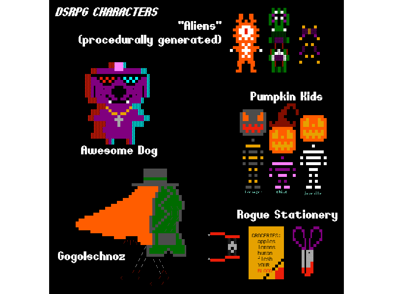
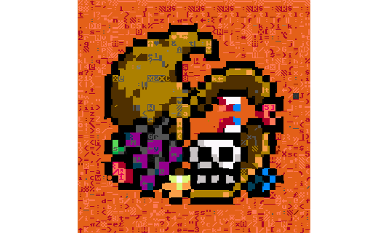
ASCII pixel art creatures from DSRPG. Text set in Cartoon Riot
Since most networks and clients only allowed you about 16 colors, you really had to make the most of them. Font choice, and color choice, played heavily into the aesthetic theming of something. One nice thing was that you could define both a foreground and background color. This allowed for the building-up of rather complex art.
Zephram’s avatar converted into textmode art via PLAYSCII
When and how did you discover FontStruct.com?
I found Fontstruct while looking for a way to turn my bitmap fonts into usable TTF files. It was probably a search for “online font creator” or similar.
What attracted you to the FS platform initially? And what has made you stay?
I was initially attracted to the FS platform by its ease-of-use and its ability to export TTFs. Getting to see my own fonts being used in IRC clients, Notepad apps, browsers, etc. was great. I didn’t have to settle for the stock look or go around hunting for someone else’s design to put on there. I could just make it how I wanted it, down to the pixel. After this novelty wore off, I found more. I realized I could make fonts that were really small, and thereby make pixel comics which were accompanied by proper text. I decided to see just how small a design could be while retaining its legibility and a decent character set, and that led to the main body of experiments which got me addicted to FS. As the designs got bigger, they were able to get more interesting as well.
What are your thoughts on the tool that is FontStruct and the creativity of its community?
The creativity of the user base is incalculable, as is the range of possibilities that can be achieved within FS. Each design is like a crystal. Two of them may be of the same mineral species, but the fine details and inclusions almost always show a great degree of variation. FS includes enough brick types and a big enough grid for an astronomically large range of variations to exist even within highly standard forms of type. This makes evident the great design principles of the FS engine. It keeps all the doors open and leaves it to the user to decide when and how to close them. Eventually, enough decisions are made, and enough material placed onto the canvas, that a design emerges. Because this medium is digital, whatever you publish looks like it was always that way. It lends a sense of conviction to the work. It’s not like a drawing where you see the sketch and the errors which were erased. Digital creation leaves no trace of one’s errors or iterations except when one allows it.
The mantra of “The right tool for the right job” focuses on the importance of the tool but underplays the creativity of the craftsperson using it. Do you agree?
Using the right tool is usually a matter of saving effort. There are very few jobs which can only be done with one kind of tool, and I don’t think many such jobs exist within the realm of digital typography. Digital is wide-open by nature.
There’s also a balance to be struck between achieving the original vision and allowing the thing to become the best it can. Forcing everything into the mold of a vision is a great way to ensure you’ll worry far too much about things others will never see/hear while also accelerating your own burnout. Some do manage to both enforce their vision and avoid burnout, though I don’t know whether this is due to talent or neurosis.
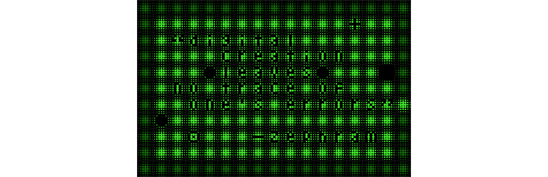
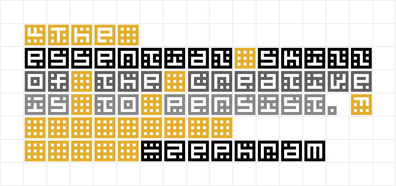
Sometimes in the process of creating, you discover more possibilities, and they strike your fancy far more than your original idea does. And sometimes, you see possibilities which can be more ideally rendered with the tools you have at your disposal. A creative sees those latter cases and takes advantage. It plays to its strengths more than it endeavors to reinforce its weaknesses. These strengths are developed largely in the absence of the perfect tools or ideas, which leads rather nicely into my main point: The essential skill of the creative is to persist. Whether afforded the perfect tool for the job or not, a creative makes the best of things, and never throws its work away it can help it. There’s knowledge to be gained even from the most frivolous and abortive of attempts. Keep working on something long enough and it will eventually become good – even when you have no idea why!
With digital creations, do you see the lack of evidence of past “mistakes” or experimentation as a positive?
I find it to be helpful, but this really depends on the software environment and workflow. When making digital art, I will often find a combination of layers and layer blending modes which looks cool but requires every layer in the document to have a particular order and blending mode. In these cases, I’ll just save a copy of the project . This preserves the modularity of each design variant.
Thanks to copies/clones, everything can be customized or replaced without disturbing the other bodies of work. So, for people who are content to see their experiments branch out into multiple forms, the neatness of digital can be very encouraging.
There’s also the option of using a method that is not the neatest (for instance, making a digital painting using only one layer, or not allowing yourself to use Undo). One can choose a degree of neatness that lies anywhere between traditional art and digital art. So even digital art styles can tell their own history, and reveal mistakes and corrections made, if that’s desired.
You have created tutorials on FS about FS that are very helpful for beginners. What made you decide to do them? How do you select what topics to tackle in them?
It’s a rare case where things can be reduced to principles of operation. Art is open-ended, but on FS, certain methods simply have to be followed to do certain things. FS exists in a sort of transitional space between what I’ll call “freehand art” and pixel art. This allows some aspects of the process to be approached methodically or intellectually rather than artistically. I think this is part of why FS appeals to so many programmers, neurodivergent people, and the like.
The barrier of entry on FS also seemed quite high. A lot of the knowledge is worked out through trial and error. It also seems that a lot of new users are reluctant to post comments or ask questions. They need knowledge they can get right when they have the idea to try FS. So, the tutorial knowledge needed to be seized from the mists and brought out into the open. Hopefully, this saves people time in discovering what FS is capable of, at least on a technical level. You’d need to look to more proficient users to find out what kinds of art FS can make. I would recommend the likes of jirinvk, four, elmoyenique, geneus1, Frodo7 and so on.
What inspires you to create your fonts?
I made most of them just to have something to do on a given day and to train some skill or another. When I started on FS, I didn’t know many fellow creative people, so when I wanted inspiration, I had to make it myself. Making fonts was one of my ways of acting on ideas rather than keeping them captive in my head.
Most of the fonts are doodles. I open FS, pick a letter, draw a basic form of that, and then try out bricks and ideas until I see something I haven’t made before. Sometimes I get a design which I can use to template all the other glyphs, but usually I have to adapt a lot of them. The adaptations made tend to have a strong bearing on how a design looks. So I’d say the inspiration comes half from messing around, half from reacting to it. A lot of my creative output exists only because I created something ridiculous, it made me laugh, and that amusement made me continue working on it.
How would you compare creating fonts with other creative processes. Is the ability to, say, paint or create music a help or hindrance in making fonts?
I had experience in making pixel art before I started making fonts. That one’s sort of easy mode for purposes of answering your question since it is just like using FS with only the square brick. Having that previous experience did help, not only with pixel fonts but high-res ones as well. Practicing pixel art causes one to develop a number of principles, such as how big to make something in order to have the desired amount of detail in it. All of this translates rather nicely into making fonts.
As for the musical side of things (my main hobby), I can say that I have entered many situations where I was making a cover image for a song, needed a distinctive font, and then set out to make that font. This is also helpful because much of the esthetic sense is already established. By the time I’m making the font, I already know the mood of the piece and how I want to portray it through text and imagery. So, there are far less questions to answer when it comes to actually making the font and deciding whether it fits.
Different strains of creativity can build upon one another and even force each other into being. I almost always find this to be helpful. Even when the extra information yielded from this process is of no use, it’s still interesting, and thinking about interesting things is certainly among the best ways to cultivate a creative mindset.
You mentioned music creation and production is your main hobby. Can you tell us something about that? Is there some place where we can go and hear some of your music?
I have a SoundCloud: Sonic Kitchen
Most of the material on there was made between Summer 2021 and now. The picture you’ll get from SC is vast, but still incomplete. I have a small wall made of lunch boxes full of hard drives and archival CD-ROMs of all my own music, video games (it’s mostly Klik&Play, Multimedia Fusion, Flash, RPG Maker, Game Maker Studio, and similar), and other projects, because it’s just too laborious and expensive to host ALL the stuff online. There’s a lot of variety on the SC, but of course that means some of it is weird. No sense downplaying that part.
No FontStructor is an island: Besides music and pixel art, are you involved in things beyond FontStruct, music and pixel art? – e.g. other hobbies or passions?
I’m retired from the Navy, so my schedule is wide open. I occasionally start art or musician groups, but always become disenchanted with them and leave them before long. I have been an island and seen many other islands. They aren’t as impossible or as astronomically rare as people think. People are predisposed to create associations where none exist, and this causes them to assume influence where in fact there was independent original thought. This mindset estranges those who actually come up with things themselves. The global interconnectedness many enjoy is still an opt-in sort of thing and many of us choose not to opt in because we hate to see the homogenization of culture. Islands are becoming proportionally more common than ever.
Where do you FontStruct?
I do all my PC stuff at a giant desk I built. The studio is a cabin out in the woods.
Favourite Book(s)?
I don’t read many books because cults of personality tend to form around authors. I would rather create my own culture from scratch than siphon off someone else’s. But I can say that I once liked authors such as Spider Robinson, Cixin Liu, Elisabeth Vonarburg, and so on. Most of the media I do consume now is on YouTube. It’s much more interactive than traditional books or TV, and people there are very good at teaching skills in a concise way
Many would-be creatives find themselves struggling in internal psychological mires. They suffer self-doubt, transient motivation, or other anxieties. They find that they cannot sustain or even begin their creative practice.
It is a big problem, for a multitude of reasons beyond the scope of the interview, but so few people are talking about these issues, they must have become desensitized to them.
First, we have the I don’t have time argument. Modern people busy themselves a great deal. They try to go everywhere, do everything, and make use of every opportunity, but end up understanding and appreciating very little of it. It’s an oversaturated, busybodied, neurotic way of living, more fit for ants than for human beings. A creative makes time, ensures time can be made, and tries not to blame tools or circumstances.
Second, we have the What is the point of doing this? question. Why keep drawing, why keep designing? Someone who needs to ask this question just doesn’t get it, and only that someone can ever resolve that problem…
Third, we have the I’ll never be as good as X argument, where people shoot the metaphorical ship down before it can ever get off the ground, because they have forgotten the joys of flying. You can’t let thinking like this stop you from doing anything. Your mind is your domain and your place of sovereign power. The work of X, who you admire, does not exist there. You are the captain, not a passenger!
The key to motivation is to relinquish all need for motivation. Do the cool stuff just because, do it out of second nature, do it just because that’s the sort of creature you want to be. Do it the same way you get out of the bed, take the breaths, eat the food, and drink the water. Do anything other than falling into this goal-oriented, reward-center-stimulating, addict-like rigmarole that successful people insist on. They only know how to hoard things and then sit atop their hoards like dragons. If I relied on motivation, I would never get to make anything.
A creative runs at any speed and never thinks about time or money or motivation. That is why creatives keep living, and keep creating, while others are condemned to sit on the sidelines. It doesn’t matter if this makes money or fame. It will always make us happy, and we can keep doing it forever.
Do your creative work in a mindset which is immune to ruination. Avoid direct comparisons when possible; they make everyone’s work feel belittled and reduced. If you see a style that reminds you of a great Impressionist painter’s work, talk about Impressionism, or the use of color/technique, not the other painter. And, do your best to appreciate things for what they are, not what you want them to be.
If your design looks good, it IS good!
Thank you Zephram!
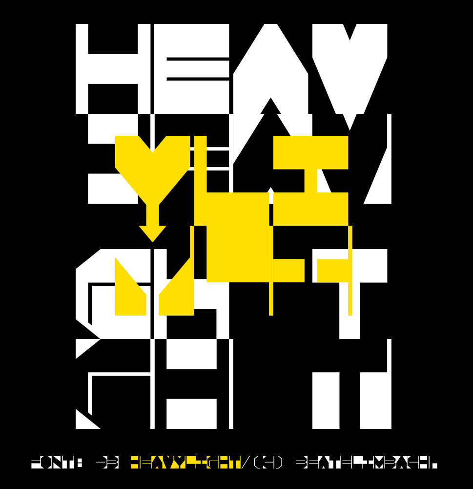
Dear FontStructors,
The “Heavy” competition has ended and, once again, the staff at FontStruct Towers were overwhelmed by your creativity. Sixty amazing entries! I hope that everyone had fun taking part, and took pleasure in designing and sharing your work. I’m only sorry that we will feature only a few FontStructions in this post.
With judging a more daunting prospect than ever, we sought and found the assistance of a genuine typographical heavyweight. As well as being the managing editor at Fonts in Use and founding partner of design agency Kaune & Hardwig, Florian Hardwig has been a FontStruct supporter since its earliest days. (Of our 2.1 million+ registrations, he is number 99!) He’s also used FontStruct as a tool in his teaching practice in the past, even smuggling FontStruct right into the Bauhaus Archive itself!
Without further ado, Florian’s favourites:
Winner #1 db HeavyLight by beate
Florian wrote:
I’m fond of FontStructions that embrace the limitations of the grid and explore an idea without dialing up the resolution endlessly. db HeavyLight is a great example. The square glyphs with their monospaced width and unconventional weight distribution seem to channel the lettering made by Chris Lebeau in the 1920s. In their playfulness, they also remind me of Ben Shahn’s work. The ingenious thing about db HeavyLight is that the lowercase holds alternate caps, shown white against black. By mixing positive and negative glyphs, one can unleash a fascinating play of figure and ground, of light and dark.
Winner #2 tm about a square by thalamic
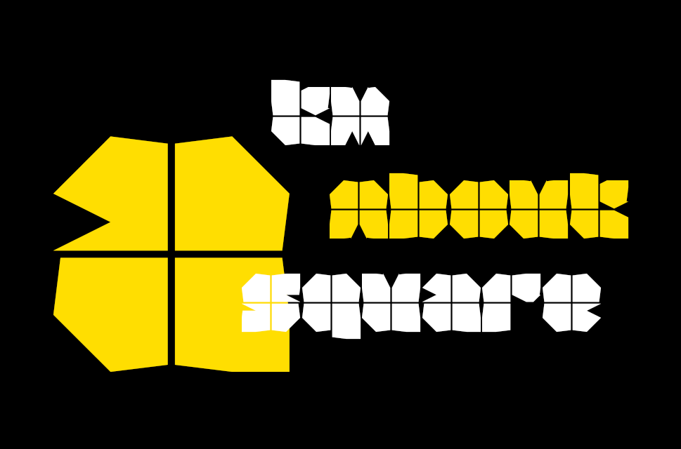
Florian wrote:
Blocky typefaces of very heavy height tend to look clunky and boring. It helps to add a dash of white, to open up the black surface a little, and also to hint at counters and stem boundaries. One clever and minimalist way of doing so is to overlay the glyphs with fine lines. In True Cross Fire and Watzlcross, two film faces from the 1970s, this resembles cross hairs. In tm About a Square I see a more peaceful and pleasant analogy: each glyph looks like a gift, wrapped in paper and tied with a ribbon!
Winner #3 Metaal by four
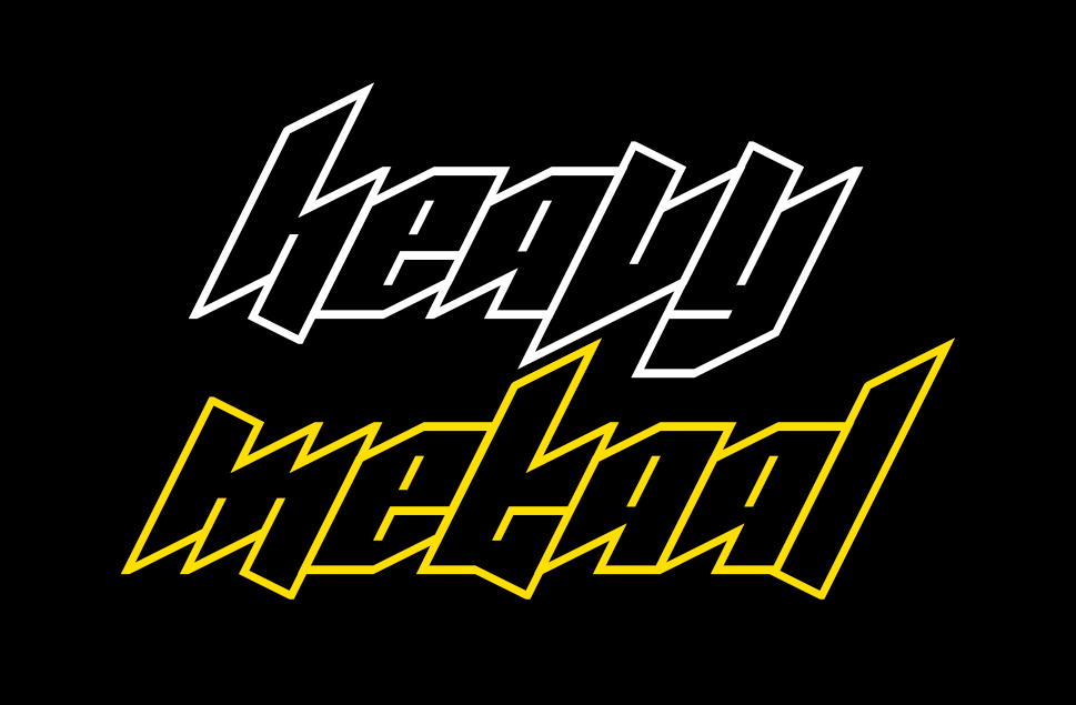
Florian wrote:
I had a hard time deciding between Metaal and Zwaar, another compelling entry by the same contestant. In the end, Metaal’s fun and (seemingly) simple concept won me over. Basic letterforms defined by monolinear strokes for contours and counters, abutted against each other – just like we used to draw them on graph paper during lesson, while dreaming of the next festival weekend. What makes Metaal so cool is its steep angle. Together with the diagonal terminals that oscillate around the baseline and x-height, it yields a wicked look. This font is a machine for making instant band logos.
Colour Winner: KD Kalyn by architaraz
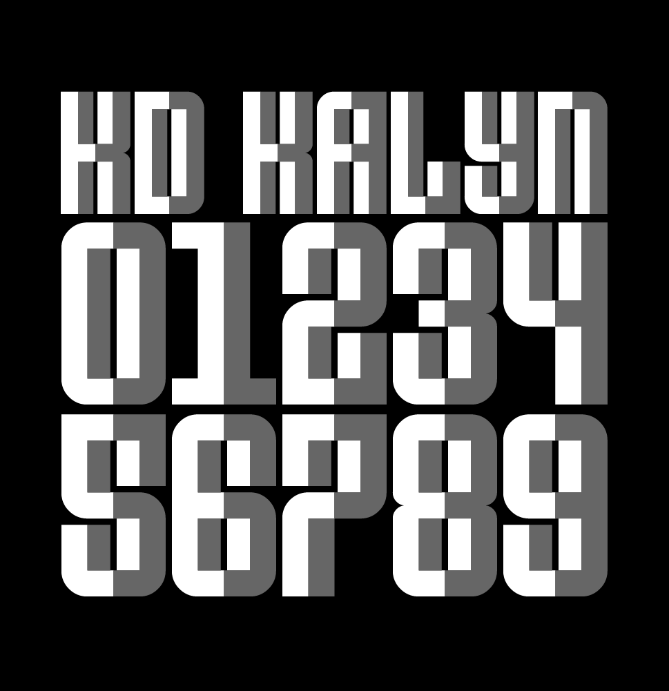
As it turned out, Florian’s choices were all monochromatic although he did admire the colour entries, picking out this one in particular. KD Kalyn by architaraz was also my favourite from among the polychromatics. It’s wonderful that it works, both as a plain single colour design, and as this chunky array of escheresque facets.
The People’s Choice
The People’s choice was Zwaar. So double well-done four!
Honorable Mentions
I seriously recommend that everyone takes a close look at each and every entry – ideally download them and try them out. But here are a few more which I particularily enjoyed:
G1 Defkhan by geneus1, cicmankaputAB4028ii by jirinvk, Moon Machine A by V. Sarela (Yautja), Tennessine Slab by Frodo7, corpus opulentia by tortoiseshell, Ailurophilia FS by Haley Wakamatsu.
Thank you!
Thanks again to everyone who took part.
Thanks to our generous sponsors Glyphs App, the world’s leading desktop font editor for OSX. Glyphs continues to quietly and kindly support FontStruct in 2022.
Last but not least, thanks to our guest judge Florian Hardwig, for gifting us his time and expertise.
Have an idea for our next competition theme? Please add it in the comments.
Happy FontStructing!
Dear FontStructors,
Finally! It’s time once more, to snatch up your finest bricklayer’s gauntlets. Prepare to grapple on the grid, and pit brick against brick, in friendly modular strife with your fellow FontStructors.
It’s time for the latest FontStruct Competition!
Brief:
We would like you to build one or more FontStructions which are somehow connected to our competition theme: “Heavy”
This theme has been suggested several times in the past, and FontStruct has always seemed to work well for all kinds of “heavy” fonts – whether in terms of simple weight, or metal.
Please do interpret the theme as loosely as you wish – it’s there only to inspire, not to confine. The image at the top of this post is there only for decoration. It does not indicate any expectations, or necessary direction.
If you’re struggling for ideas, you could have a browse through our curated set “Heavy”.
Competition Time Period
Thursday, 9th June 2022 – Friday 8th July, 2022
Competition Rules
- You must be a registered FontStruct user.
- Your submission(s) must be posted and made “public” between 9th June 2022 and 8th July, 2022. Although you are encouraged to share your submission(s) at any time between these dates, your FontStruction submission(s) must be public (marked “share with everyone”) no later than 8th July, 2022 at 11pm PST. Additionally, your submission(s) must remain public at least until 22nd July 2022 in order to give the judges enough time to review all qualifying entries.
- Your submission(s) must be tagged with a “HeavyComp” tag. (For fairness, during the competition time period, no FontStruction with the “HeavyComp” tag will be awarded a Top Pick.)
- Your submission(s) must be downloadable. If your FontStruction cannot be downloaded, the submission will not be including in the judging.
- Your submission must be a newly published FontStruction. Simply adding the “HeavyComp” tag to an already published font is not allowed.
- For each submission, you must post at least one sample image in the comments of the FontStruction.
- No letters in each submission can be MORE THAN 48 grid squares high.
- FontStruct cloning is permitted but the judges will be looking for original work.
- You may enter up to three FontStructions to the competition.
- This is a friendly competition. Cheering, favoriting and fun banter is encouraged but cruel and uncivil behavior will not be tolerated.
- No rules regarding licensing. You may choose any license you like for your FontStruction. (but it needs to be downloadable!)
Judging and announcing the winners
All qualifying FontStructions will by judged by the FontStruct staff between July 8th and July 18th. Three prizewinners will be chosen. One of these will be the FontStructors’ Favourite. Winners will be announced in a FontStruct Blog post on Monday July 18th 2022.
Prizes
Each winner can choose a t-shirt printed with a FontStruction glyph of their choice.
FontStructors’ Favourite
The valid entry with the highest number of legitimate favourites (yes we check) at 11pm PST on 10th July 2022 will be one of the three prizewinners.
Questions?
If you have questions just add them as comments to this post.
May the best FontStruction win.
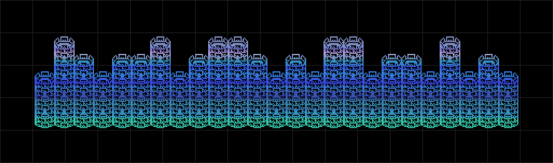
FontStructions in the image at the top, from left to right: Horse Power Nick by Wataru (Wataru Aiso), Vampire Nation by zephram, db cache-cache by beate, zinople eye/FS by elmoyenique and Znipped by graphicfever.
FontStruct would like to heartily thank our principal sponsor: Glyphs and our many FS Patrons for supporting FontStruct.