


Gridfolk: Interview with tortoiseshell (formerly time.peace)
Focus on FontStructors | Ata Syed | August 13th, 2021
This is a guest post from Ata Syed AKA thalamic and minimum, the third in a summer series, continuing the “Focus on Fontstructors” tradition of interviews with members of FontStruct’s designer community. Ata has been FontStructing since 2008.
In the pursuit of perfection there are no winners—the universe doesn’t allow it. It is an unattainable myth. Does that mean it is best not to seek it? This bears further exploration. Read on to find out why this odd intro makes sense.
The Fontstructor we focus on this third time around in the series “Gridfolk 2021” is the highly selective and consistently focused C. Jorgensen, better known around FontStruct as time.peace.

blueberry by time.peace
The global reach of FontStruct is undeniable. For example, this article was written in Pakistan; related to a website based in Germany; housed on some server who knows where—might as well be Antarctica; about a person (time.peace) from USA who currently lives in South Korea. Whew! And this is just one instance. FontStruct has users from all over the world [more on that in another interview down the road].
Regarding educational background, time.peace has a “BA in Hutchins, multiple subject teaching credential, TESOL teaching certification and TEFL teaching certification”. This explains why they live in S. Korea, where they are “currently working…as an English teacher.” What kind, I asked? “Definitely an energetic teacher. In the classroom I do my best to match energy with the students.” However, they further explained that “the teaching style at the moment is something not too unlike a wild-mouse roller coaster. It’s energetic, fun and just a little chaotic. Despite the chaotic energetic nature, there are clear boundaries and expectations. If those are broken in someway, things need to stop so they can be fixed. Similar to the wild mouse, this way of teaching is something that isn’t for everyone, but it’s something that’ll continue to be signed up for on behalf of myself. At this point in life, still being relatively young (only graduating a couple years ago) it seems important to use that energy while it’s still there.” Sounds like quite the commitment; the whole wrapped in an aura of perfection. If time.peace is so demanding of themselves, what do they expect of the students? “One major expectation is that students can be as imaginative as they want. Students should know that there’s nothing wrong with thinking outside the box. If the essay prompt is about their ideal vacation spot, they should have to option to write honestly about whatever that may be. They could write about time traveling to ancient Egypt, or exploring magic castles or just a relaxing time at home, it’s up to their imaginations. These ideas step outside the normal expectations of an ideal vacation spot but students should know that they have the creative freedom to write about whatever the prompt leads them to.” Gazing back into the haze of time, was being a teacher what they dreamed of becoming? “The goal from university was to become a teacher and that box has been checked off the list. All that’s left is to see what else the universe has to offer and explore whatever that may be.”

anubis by time.peace
It’s flashback backstory time. “Growing up in Generation Z, with parents who were both teachers, there was a strong connection made with books, specifically Harry Potter and Percy Jackson. Both offered such interesting worlds that they grabbed hold of the imagination. Old radio programs and jazz were played on cassette tapes which led to an odd childhood when compared to that of classmates. It was a cozy style though, the idea of being wrapped up in a book while some old, all-but-forgotten comedian tells jokes on a radio in the other room. It really did make for a bizarre mix of the vintage and modern. It’s that mix that led to the interest in swing punk and electro swing music. Coincidentally, the era of music and radio programs being listened to were not too far removed from the Art Deco era.”
In the story of getting to know time.peace, we’ve just learned of a key driving-force that impacts their life. After that build-up, if you were listening to a contemporary song, you would expect the drop to occur right about now. But no, here comes the bridge.
Just as the invention of photography did away with the need for realism in art (such as it was back then) and gave rise to the impressionism movement, similarly the end of WWI in the early part of the 20th century brought about the desire to get rid of the past and move forward. The dominant art style pre-war was Art Nouveau with its characteristic uses of stylized curves depicting nature. That had to go. What was needed was to show the future that embodied progress; to show a fast movement towards advancement; to show rebirth replete with possibilities. This was accomplished by replacing curves with straight lines, nature with geometry, asymmetry with symmetry, and—most importantly—ornate predilection with organized perfection. Although the term Art Deco didn’t really gain common acceptance until the 1960s—well beyond the end of the movement—its essence had permeated into every aspect of life. It certainly has had a profound impact on time.peace. As an aside, it should be noted here that the mid-century modernist movement was in full swing in the 60s, but that is a history lesson for another time. For now, think Art Deco.

night-lyfe by time.peace
As will become evident later, I suggested the title for this article as “The Pursuit of Perfection”. After a thoughtful pause, time.peace offered an alternative title of “West Egg, Looking East” as a “jumping off your suggestion about striving for perfection among the established FontStructors, just out of reach, while also connecting to Art Deco, and—being a bit of a former bookworm—a literary reference [as well].” Unsure what that meant, time.peace further explained, “It’s an allusion to the Great Gatsby. West Egg was where Gatsby lived, an area usually reserved for new wealth and East Egg was the area where the old money lived. Throughout the novel that East Egg idea is something that he’s reaching towards, symbolized as a green light [in the sample below].” Great Gatsby, as we know, is drenched with Art Deco imagery. Their suggested title is thoughtful and stylistically consistent. Like.

strawberry font and (inner) illustration by time.peace
Let’s talk fonts. What influences makes it into their fonts? “The big one is Art Deco, obviously. So many of its aspects are beautiful and have a multitude of ways to be incorporated in fonts.” Age undisclosed, but from the profile picture and bio above, you know time.peace is still a young person. How do they come to be influenced by an art movement a century removed from themselves? How would they describe themselves then? “The person behind time.peace is an eclectic amalgamation of Art Deco intrigue and imagination. Never afraid to fail, and always happy to better a font until it is—to quote Mary Poppins—practically perfect in every way.”

boxcar by time.peace
There’s that word perfect again. Clearly, the pursuit of perfection is strong with time.peace. What do they have to say about it? Does it have childhood roots? “Perfection wasn’t really demanded, but there was a hardworking mentality and the idea of taking pride in what you do. Perfection is something that will perpetually be out of reach, and there’s absolutely nothing wrong with being imperfect. There’s something to be said about loving imperfections. It’s more of a goal, an idea to work towards, using it to improve where you see fit.” Interesting. This coincides with what Vince Lombardi, the famous American football coach said, “Perfection is not attainable, but if we chase perfection, we can catch excellence.” Perhaps it is this desire to achieve excellence that is the driving force behind time.peace’s work.
With the perfection mystery solved, it brings us to this central question: Why does time.peace create fonts? “Fonts are just fun in their own bizarre little way. They are little projects that allow you to be as detail oriented and intricate as you see fit, with a ridiculous amount of endless possibilities.” So how do they go about making a font generally? Is the process always the same or do they sometime deviate from it? “The process is fairly random, tending to start with the more straight edged uppercase, then to the letters with more twists and turns, jumping around to different glyphs, often without much rhyme or reason. This process can often be thrown out the window depending on the intricacies of the font however.” And once started creating a font, what keeps them going? “Simply wanting to create an end product that is (optimistically) both visually appealing and functional.” Do they sometime get frustrated while making a font and what do they do to overcome those frustrations? “Eliminating imperfections is continually the most frustrating aspect. Many early fonts were riddled with imperfections and they are slowly but surely being fixed. It seems like the best way to overcome the frustrations is simply to be patient and keep trying new things.” It also seems that no obstacle is great enough in the pursuit of perfection excellence.
How does FontStruct help time.peace in this regard? “There’s always been in an interest in little things. FontStruct offered that so perfectly, combining both the familiar—of small meticulously crafted projects, previously explored through those small toys growing up—with the unfamiliar new realm of typography. That unfamiliarity with typography soon became familiar and led to the want to improve and get better and emulate the established FontStructors.”
pacific voyage by time.peace
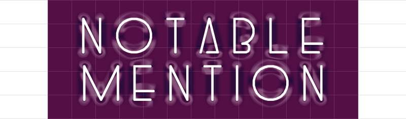
Which of their own fonts are their favorites? “blueberry, anubis, and strawberry are some of my personal favorites. For anubis, it’s a font that kind of took anything goes Art Deco mindset and mixing in science fiction, possibly to see what Martian jazz may have looked like. blueberry is a favorite due to it’s shading. It takes the same Art Deco elements and mixes them with a style that reminds me of handwritten invitations for some reason. The design is something that I’ll often use when hand-drawing posters for projects or whatnot. strawberry is a favorite for its use of the [FontStruct’s] Twenties competition idea. The uppercase measuring twenty bricks tall, the lowercase measuring five bricks tall by four bricks wide, to multiply out to twenty, and the whole font incorporates exactly twenty different glyphs, while also incorporating Art Deco themes. Also, for strawberry, I’m proud of how well it did in the competition. While it didn’t win, the little notable mention was highly prized. It is interesting to see some clear similarities between blueberry and strawberry and how those end up as favorites.”
Any favorite fonts from some other FontStructors? “Tomorrow Never Comes by four and db Soda by beate are both mindboggling intricate and beautiful. G1 Decoreus by genius1 is such a unique take on the themes of Art Deco, actually incorporating the architecture stylings into the font with a magnificent end product. dm Eiros/aliens by demonics is such an odd yet endearing design that was a favorite of their dm Eiros series. zpacekowboy eYe/FS by elmoyenique mixed two genres to perfection the idea of a cowboy on the moon is a fantastic idea encapsulated in this beautiful font.”
Are there any interesting stories you can share about some of your fonts? “paper crane is font that has a rather interesting back story. [It] was a font that had been created back in 2014, but as with many other old fonts it was riddled with imperfections and got deleted. Paper folding is something that I found back in elementary school and became a rabbit hole that was then fully tumbled down. Specifically, the paper crafts were another small thing to create. Since that discovery, several thousand tiny cranes have been folded, scattered around houses, classrooms and university libraries with the added bonus of having a handful of spare wishes, if needed. Paper Crane was also the only font to be selected as a featured FonStruction—a little badge of honor, something I thought only the established FontStructors could achieve.”

paper crane by time.peace
If you scrolled up and reread the part where time.peace talks about their students, you will realize the importance they place on imagination. Like any self-respecting person, it seems their expectations of self are no less. Looking through the fonts time.peace has shared, the Art Deco influences are clear, yet the elements of imagination and creativity are also clear. Just look at the diversity of the fonts such as astro queen vs. twisted yarn; mad hatter vs. circuit breaker—all wrapped up in excellence.

astro queen & twisted yarn by time.peace
Once all the work is done and made public, does time.peace think recognition as important? “It would be a lie to say that recognition isn’t exciting, however it is far from important. Simply being able to create something that you are happy with, regardless of who sees it, would seem to be leaps and bounds more important. Some of the fonts that flew under the radar were some favorites, but that has done little to dampen the joy their little forgotten designs bring.” Quite the definition of an artist, that is.
Anything else that time.peace would like to say? “Thanks for including me in the series, it’s quite an honor.”
The honor is ours, time.peace. FontStructors who strive for excellence deserve recognition. You fit the bill perfectly.
Postscript
I thought I was done writing this article and was working on the samples, yet some nagging thought kept telling me that I have forgotten something. This is why I need to add a story here.
We live mere blocks from the beach. During the monsoon season, which is now, the wind picks up and displaces truckloads of fine, powdered, quartz-y beach sand and blows it inland. Buckets of this lands on the tiled space around our house. Daily cleanings become a necessity. About an hours worth of sweeping required. Normally I have music on headphones if I’m doing it, but not this morning. Mindless work and nothing to occupy itself, the mind wandered. Fragments of what time.peace said kept coming back to me. “emulating the established FontStructors”, “eliminating imperfections”, “meticulously crafted projects”, “improve where you see fit”, etc. Then it dawned on me what time.peace was really telling me. If we all strive towards excellence in whatever we do—and everyone does something different anyway “things can only get better” as Howard Jones said. Everywhere. In everything. We just need to take care of our little bit. How’s that not a philosophy to live by‽
Thank you for teaching me this, time.peace.
Thank you once more, Ata and time.peace!
Another great interview. Is fantastic to know some little-big pieces from the life and work of these fabulous fonstructors (and pals). Thanks again for this wonderful Gridfolk serie!
– elmoyenique — August 13, 2021 #
Great set of illustrations too, as usual.
– elmoyenique — August 13, 2021 #
I wonder who Ata’ll do an interview with?
– BWM — August 13, 2021 #
Another wonderful interview!
– Yautja — August 13, 2021 #
Yet another fantastic interview! Congratulations to both C. Jorgensen (Time.Peace) and Ata (Thalamic & Minimum). For this summer series, I hope summer never ends.
– Goatmeal — August 13, 2021 #
What a humble and interesting individual. Not sure who you’re referring to as an established fontstructor, becasue you’re it too ;) Keep it up and best wishes in your future endeavours.
– architaraz — August 13, 2021 #
Thanks for sharing Ata and C. Jorgensen!
– four — August 16, 2021 #