


Gridfolk: Interview with architaraz
Focus on FontStructors | Ata Syed | August 30th, 2021
This is a guest post from Ata Syed AKA thalamic and minimum, the fifth in a summer series, continuing the “Focus on Fontstructors” tradition of interviews with members of FontStruct’s designer community. Ata has been FontStructing since 2008.
Zhalgas Kassymkulov—better known as architaraz around FontStruct—is a freelance graphic designer and lives in Almaty, Kazakhstan with his wife and two children. He has multiple qualification as a Chemical Engineer (2004 – Kazakh British Technical University), Chinese Language (2005 – Beijing Foreign Studies University), and Architecture (2011 – Shanghai Tongji University).

AT Esrever by architaraz
Organically speaking, design has always existed. What? Yes! What isn’t designed by intention is designed by incident. There’s no getting around it. We’ll get into what this means a little further on. To start with, it is sufficient to know that the entire process of getting an output right has a minimum of these steps: Ideate, Design, Create, Evaluate. Let’s see how these steps relate to architaraz.
Ideate
What is your daily life like?
“Routine :-) With kids it’s just a little different.”
What kind of music do you listen to you? How often? Why?
“Electronic/House/Trance (e.g., ASOT). Regularly. I like hearing synthesized sounds. And when you’re working you really need that extra energy that comes from listening to music.”
Apart from making fonts, what other creative/artistic things do you practice?
“Logo Design.”
Do you enjoy your work? Is it your ideal choice for work? If not, what would you like to be doing for earning a living?
“Yes, I enjoy my work. It’s an ideal choice for work because I don’t have a boss yelling at me to do things for him/her. I work for myself now, make my own decisions, and take full responsibility for my actions.”
What inspires you? How do the things that inspire you make it into your creative output?
“Minimalism, precision/accuracy, and geometry are things that inspire me so if you can see it in my works then that could be considered as an [inspired] output.”
 KD Anniversary X by architaraz
What do you dream of becoming?
“I dream of becoming someone like Paul Rand, Saul Bass or Rob Janoff.”
Have you already achieved it?
“Nope…”
Is recognition important to you?
“I will be lying if I say no. :-) For me recognition is like justice. It would be just (justice) to be recognized. But, one has to truly deserve it.”
What are some of the most significant aspects of your life these days?
“Family. I have two children (boys) who are not babies anymore (five and eight years old), so it’s all about them now. Kindergarten, school, courses, etc.
Work. I switched to freelance design in 2018 and I am still freelancing. Due to obvious reasons it’s remote work, work from home, etc., but I like it. It seems I finally have time to start some projects, e.g., a YouTube channel.
Reconnecting with friends. I went to China after graduation, got my bachelor’s degree in architecture there and worked in different jobs from sales manager to designer. Now that I am back in my homeland—Kazakhstan—I am reconnecting with friends and relatives.”

AT Ribbon by architaraz
I was reading the Kazakhstan article on Wikipedia. It seems that there has been a lot of Russian influence on your country in the past century. So, I’m guessing one of the five languages you speak is Russian. What are the other four?
“Kazakh, English, Chinese, Turkish.”
Which is the most interesting? Which is the most different?
“Well as a designer, I guess it’s Chinese because every letter comes from a drawing. Every character. And because it is not like any other language—no alphabet—so you kinda have to memorize every existing word.”
Ever think of doing a Chinese font? I know it is quite a challenge. At least with Japanese you can just do the hiragana and katakana and be reasonably done.
“Yes, I’d really like to design one, specifically because it’s one hell of a challenge.”
What does it mean to ‘design’ something? Surprisingly, a clear, precise, and universal definition of design does not exist. What? How can that be? Don’t know how, but it so be. If you look up the meaning of the word ‘love’, you will find something—and it will be correct as well—but it won’t be definitive. Someone else may choose to define ‘love’ some other way which may also be correct. Similarly, ‘design’ can be defined a number of different ways. I choose to define ‘design’ as the process of finding a solution to a problem, provided—at a minimum—it fulfills its purpose, satisfies the target market/audience, and stays within the imposed, implied, or assumed limitations.
Design, being the process, is over once a solution is realized. The output can said to be designed, but never the design itself. Since nothing can be accomplished without some process, therefore nothing does not go through design. Furthermore, the trifecta of purpose + target market/audience + limitations cannot be bypassed. What is design, then? Everything.
Two Interesting thing to realize are: 1. A problem is not an insurmountable obstacle, rather merely something that hasn’t been solved so far. 2. The use of the word finding. To find something, it first must exist. Finding a solution implies that the solution already exists even if the problem has not yet been identified. Therefore, everything is solvable.
Design
Architecture seems the most directly connected degree to your profession. What made you work as a graphic designer?
“Well, that’s life, you know. Most people I know are not working by their university degree. The second year of studying architecture, I worked on a small book for a friend of mine and that’s when I think something clicked. Just before graduation I was an intern at an architectural firm in Shanghai, China, but I found that it was boring to work on a software I have already been working for the previous two years, so I just chose to learn something new, like Photoshop and Illustrator. And I loved it. Only later I learned that it was connected to a different major called Graphic Design. But then after graduation I worked as a sales manager using my language skills (I speak five languages) for something like six years for different companies and different industries. It was during this time when I started FontStructing. Afterwards, I did work as a senior graphic designer for a home décor company—it was only for six months—but it was enough to understand what it was all about.”
Going through your fonts, I noticed that they are always very few bricks tall, like a challenge you create for yourself to do the most stylistically consistent font with as few bricks as possible? Which comes first for you, the idea of a font or experimentation to see what other font can be created with the available bricks?
“I use few bricks for different reasons, but I guess it’s just fun, and I enjoy it. I don’t think I would enjoy using Bezier curves. I almost never think of a font letter shapes beforehand; all shapes come from experimenting. There are rare cases when, for example, I take J of Juventus FC and build a font out of it (available on dafont) but all other font shapes are a result of experimentation. FontStructor is a great tool for experiments.”

AT Extrema by architaraz
It seems creating fonts is your fun graphic designing activity. I was going through the logos you have on your website. They did not seem like results of experimentation. Tell us about how you got to be a logo designer.
“Sometime in 2018, after working mainly as a sales manager, [I reached] a turning point in my life where I decided to (or had to) say no to having a salary and say no to having a boss who would tell me what to do. I was on my own then. I decided to pursue a (freelance) design career. Did I have much experience? No, but the fonts I created in FontStruct were a sign to me that I had at least something. I also made some simple logos for my friends, where one of them was actually a font. I just sent the font file to him and told him to install it and type out their company name because those were the only letters that font had and it was of course a vector, so why not?
So, starting as a freelancer I had to start earning money and font design was not an option because let’s face it, my fonts are no Proxima Nova. That’s when I took a shot at logos. Why logos? Because I kept seeing people sharing some letter logos they made for clients on Instagram and I thought that not only can I make those type of letters, I can also make the whole alphabet, if need be.
I came across 99designs.com and decided to participate in a logo contest. Fate was on my side I guess, and I won it. I took it as a sign. It’s still a very good platform, I am branded as a Top Level designer there and I visit it from time to time to see if I see something that interests me. To the reader: If you’re talented, experienced, and have a unique style, you should go for it. No doubt you’ll succeed there.

Some logos by architaraz
In 2019, I discovered logoground.com. I was sceptic about this platform at first because it didn’t seem like a good idea to share a unique unsold logo for everybody to see. Then I learned about copyright and how we can protect ourselves. Especially now that most social media platforms and hosting providers honor DMCA and help you protect your work if it gets stolen. Technology is constantly evolving and platforms like Yandex are really helpful when it comes to finding copyright infringements. It’s been two years and I am now branded as a Platinum Designer there, making sales both on and off site. It’s better than contest websites, if you see something you like just buy it. Simple as that. It’s just that there are so many ideas in my (or any other designer’s head) and it’s just hard to find someone who I could sell it to. Platforms like LogoGround help you do that. Just like I use FontStruct to get the idea out there.”
This is nice. It’s encouraging to those who will read it. Now can you talk about how you come up with the idea for a logo, what steps you take to get it to final stage, etc.? The designing aspect of it.
“With the logos, it’s almost always idea first in my head and then the design process. At first I would have an idea and then go straight to some digital creation platform. With time I started drawing because you can’t always simply imagine visual ideas. So, if it’s an iconic logo idea, I go straight to digital. If it’s a monogram, I brainstorm (explore) with pen and paper. The digital version almost always doesn’t look like the sketch.
AT Archaus.2 by architaraz
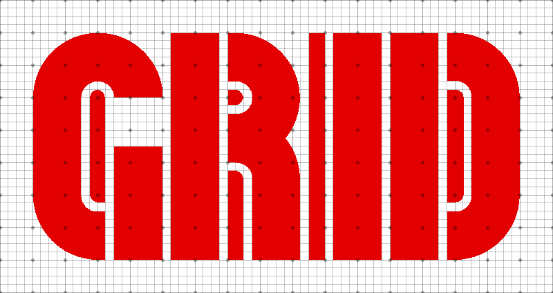
I love grids and most of my logos use some sort of a grid. Isometric grid is my favorite though. [Adobe] Illustrator is my choice of software for logo design. There are cases when I used SketchUp or Dimension for some 3D logos, but mostly it’s just Illustrator. Some ideas come to me when I’m outside looking at the surroundings. I think you can always come up with some sort of idea this way. Sometimes I surf the internet and see something and I get inspired by it. Now and then I look at logos other designers have created and this also generates ideas. For example, I randomly look at Logo Modernism book’s pages and get an idea for myself. I created a whole new YouTube series where I try to teach others how to draw a certain shape in an interesting way.” I think I need to watch that.
Can you please tell me more about the usage of grid in your design work?
“While studying architecture we didn’t use grids much, in AutoCAD and SketchUp or 3dsMax; you draw things pretty much in the air. I started using them regularly after [getting acclimated with] FontStruct. Grid is modularity and modularity is something that I apparently love. Once you get used to it, it is hard to let it go. In most cases, grid is enabled in my Illustrator (128px with 4 subdivisions). There are other grids like golden ratio, but I don’t use it ’cause I think it’s overrated. My current favorite grid is isometric grid because I like how the three axes have the same length and you can draw a 3D design immediately even if the perspective is not true. And it’s a perfect grid for logo design too. On Instagram, I draw famous logos that use isometry so as to show people to not get obsessed with golden ratio. I couldn’t find a sketchbook with isometric grid (they’re all either blank, dots, or squares) so had to custom order it at a nearby printshop.” I think I want that too.

Custom isometric grid notebook by architaraz
You mentioned Paul Rand and Saul Bass as someone you want to emulate. What it is about their work that is so inspirational to you?
“I guess simplicity. I like how shapes are simplified to their limits and still communicate a lot of things. These designers created many famous logos and for a reason. When it comes to fonts, there are just too many designers to mention, but off the top of my head I would mention Othmar Motter. Tom Hultgren’s Traffic is still one of my favs, and whoever designed the US Army Stencil typeface is a genius.
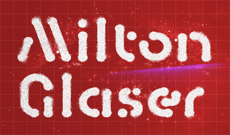
I like how Paul Rand told Steve Jobs that he will create only one logo version for his company, and that was it. You like it, you take it. Don’t like it? Go find someone else. In my experience, clients always want to see some alternative versions. Milton Glaser’s I♥NY logo and his Glaser Stencil font are some other favorites. I love how he created NY’s logo as a present for the city which says a lot about him. In fact, I don’t know, but something about stencil fonts gets to me. Even the first FontStruction I made was called Sliced. It’s a bad logo but it was stencil. And many more of my fonts are stencils. I can’t explain why, but I love that style.”
AT Baktera by architaraz
I get what you mean by being enamored by stencil fonts. I like them too. Probably something to do with the first introduction to fonts as a child and getting those cheap plastic sheets with letters cutout of them, which had to be stencil by necessity.
“Exactly! Maybe that’s how we were introduced to letter drawings.”
The Army stencil font is quite the definitive example of Form Follows Function. Are you a believer of the Bauhaus ideology?
“Well, I wouldn’t say a believer. I believe what Milton Glaser said: Art is whatever. Though I love that Bauhaus font.”
Bauhaus was more of a design school than art though.
“Well, I didn’t study Bauhaus that deep. We had it in my architecture classes, but it was something like 13 years ago :-) All I remember is there was this DVD of six disks about Bauhaus and architecture and I prepared sort of a small essay for which the teacher praised me. It’s just a big topic to discuss. Though anyone who can design a font like Bauhaus can consider himself a success, that I am sure of. It’s flawless.
Right now I don’t try to do what others have already done. I’m just discovering my own style. It may be with the fonts or with the logos. It’s a very hard thing to achieve—something unique—and there is still a long way ahead of me. What I really need to do is FINISH my fonts. :-) Currently they’re all like demos. Except for the ones I published commercially. Those ones I consider to be finished—a period [full stop] at the end of a sentence. Surely, font design is about perfection and no font can ever be finished, but I take that into account and stop at some point. I have to.”
So what would you say that your creative output is more artistic or commercial? Why?
“I think it’s more commercial because artist for me is like being Da Vinci. I’m a designer.”
As are you. A designer is someone who carries out a process with thought and intention while a non-designer’s intent is merely getting to the output, whatever that may be. Design happens in both situations. Who then is a designer? You and I. Him and her and them. Everyone is a designer. Anyone who pays heed to purpose, limitations and the person or group of people the output will affect—among other variables—is a designer.
Of course, we all design different things. Being a teacher, I design classes, courses, curriculum; being a graphic designer, I design fonts, posters, books, etc.; being alive and having weird dietary constraints, I design food; etc. As do you. Perhaps not courses, but maybe cars or curbs or cakes or camouflage or convenience or continuation or…. If a process is involved, design is taking place. And since we are all doing something with active thought and getting-the-correct-output intention—which can be said to the definition of ‘designing’—we are all designer of something or other.
Create
Why do you create fonts?
“This is a hard question that I don’t think I fully know the answer to. I guess I just love it, love the process of it and I could stare at the result indefinitely. Also, at this point certainly not for commercial reasons. I remember how I first got interested in typography – in my 2nd term at the university studying architecture I was commissioned to create a small book for students that mostly involved working with typography. That was when I had my first spark. In my last year at the university, while an intern in a local architecture firm, I put my focus not on architecture but on some other stuff. I then learned that other stuff had a name…and it was called graphic design. :-)”

AT Tugan by architaraz
What is your general font making process? What causes you to deviate from this process?
“The process keeps changing but it almost always starts from FontStruct. Before I switched to MacOS, I would redraw my FontStruct font in Font Creator Pro, either directly or with the help of Adobe Illustrator. After I switched to MacOS I would still take my font from FontStruct but this time I would use Glyphs. There are, of course, cases when I would create a font directly in Glyphs. For some reason I never sketch fonts by hand—it’s always a digital process for me. I wouldn’t use additional software, but FontStruct still needs additional features if one wants to create a professional font.”
Once you start creating a font, what keeps you going?
“Modularity. I think I can see a letter in any shape and I just develop other letters from it. And I want them to be geometric and not have many (better none) optical corrections because I don’t want my fonts to be used in text – they’re meant to be for display and for short words only.”
While making a font, what frustrations do you face and how do you overcome them?
“I want to stay true to modularity. Not finding consistencies is what frustrates me or maybe it’s that perfectionist syndrome. When it happens, I take a little time off. After that I come back and try to make a deal with modularity. I call that deal a compromise and try to control the urge for perfection that exists in every graphic designer.”
Why do you continue to make fonts?
“Not sure. Maybe ’cause it’s fun or maybe ’cause ideas keep coming and I just have to let them out. But once again, at this point, certainly not for commercial reasons. Hope it changes someday.”
How did you discover FontStruct?
“I remember asking my friend Kuanysh who is an IT geek if he knew how one can create a font. He suggested FontStruct. I don’t remember now why I needed to create a font then especially when I was working as a sales manager for a plastic pipes company. I’m just glad I did.”
How long have you been FontStructing?
“Since 2011 but I did take some time off due to…well, life. :-)”
How often do you visit fontstruct.com?
“There were times when I visited it every hour; there were times when I didn’t visit it for weeks. My activity there aren’t constant, but it is always in the back of my head.”
What keeps you coming back to FontStruct?
“The community. Internet is so cruel, but FontStruct is something else.”

Laffa by architaraz
Are there any changes you wish to see happen at fontstruct.com and in the FontStructor?
“Oh, there are many. :-) The ability to sell a font directly through the website; basic OpenType features; composite letters so that if we change a letter all its variants change automatically; kerning groups; customizable bricks; and many more. These are just to give you an idea. But, FontStruct has already come a long way and has many great features (e.g., color fonts now). It’s awesome and I truly believe in its future.”
Whether intentional or incidental, design will happen. Incidental design may even provide a perfectly reasonable output. What it lacks is the ability to eliminate the possibility of getting it wrong. Not that intentional design cannot also result in a fiasco. It can. The chances are lower though. Designing is a game of percentage of time you can be sure of creating the correct solution.
Evaluate
Do you admire any other FontStructors? Who and why?
“Of course! When my friend suggested this website, I went through it and one designer’s works caught my eye—it was Elmoyenique. You can say it was he who inspired me. There are plenty of others I admire including four, will.i.ૐ, thalamic, funk_king, geneus1, and Frodo7 to name a few. Why? Because their works are awesome. ;-)
However, specifically as a thank you to Elmoyenique, I approached him and I proposed that we create a commercial font together. I would take one of his fonts and edit it in Glyphs and make it suitable for commercial release. The font was finished but well life gets in the way, and we never got it published. It’s nothing great, but I liked the idea that we could do it. It’s his font Ziberia. It’s not over yet though. I have a surprise waiting for him.”
I’m sure Elmoyenique will be please to read this. Is there anything you wish to say that I haven’t asked?
“My website is a little outdated but my Instagram is most definitely up-to-date. I am constantly updating it and creating various stuff because I want to share my experience. Also, on my YouTube channel, I share logo design techniques. More font related content will be added to YouTube too (hopefully). It’s just that font design is much more complex and time consuming than logo design. ;-)”
OK, last three question: Where do you see yourself in the next year? Next five years? Next ten years?
I hope things will be little different for me next year because some projects of mine need time but are near completion. Next 5 to 10 years? That’s hard to say because 2020 showed us that we’re [all] vulnerable.
True. Vulnerabilities notwithstanding, be well, everyone. Take care.
Thank you once more, Ata and Zhalgas!
KD knows Chinese (and Turkish)? I didn’t know that until now…
– BWM — August 31, 2021 #
Incredible, wonderful and ready-not-forgetting the fifth installment of this fascinating summer series. A very tasty interview full of experiences about graphic design and life. Thank you, Zhalgas for your sincerity and openness, and thank you Ata for being the architect of it. I have really enjoyed this summer with this great series (and I hope to continue doing so, because I am looking forward to more interviews). Waiting -hehehe- for the promised surprise from architaraz about “ziberia”. Tomorrow I’ve to go back to work. Thanks, compañeros, you’re great!
– elmoyenique — August 31, 2021 #
Another lovely read. It’s continuing to be so interesting reading about such intriguing Fontstructors!
– time.peace — August 31, 2021 #
Another wonderful interview! Congratulations to both Zhalgas Kassymkulov (Architaraz) and Ata (Thalamic & Minimum). Looking foward to the next interview.
– Goatmeal — August 31, 2021 #
Thank you everybody, especially Ata. It was nice having this conversations with you :)
@Elmoyenique Well, as you remember I did finish the font some years ago but never got to publishing it. And this seemed like a perfect time to do it so there it goes:
https://creativemarket.com/kassymkulov/6464220-KD-Ziberia-Display-Font
Today I will submit it to MyFonts too and if passes the review, it should be online next week.
– architaraz — August 31, 2021 #
Thanks for sharing this wonderful interview with us to both Ata and Zhalgas! Great to read about your excellent logos, your career as a designer and the beginnings of that in FontStruct.
– four — September 1, 2021 #
I’m enjoying these interviews very much!
– zephram — September 1, 2021 #