


Reverse Competition Results
Competition Results, Competitions, News | Rob Meek (meek) | July 18th, 2017
What a wonderful competition.
Yet again the FontStruct community has demonstrated its unbounded creativity in interpreting a difficult theme in diverse and original ways. I would encourage everyone to have a close look at each of the entries, many of which really only reveal their conceptual secrets and precious details upon closer examination.
While the winners are doubtlessly worthy ones, there could easily have been many, many more, so don’t be too downhearted if you didn’t win, and please pity the judges their impossible task.
Before we announce the winners,
Some Honorable Mentions:

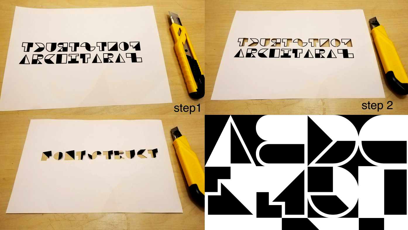
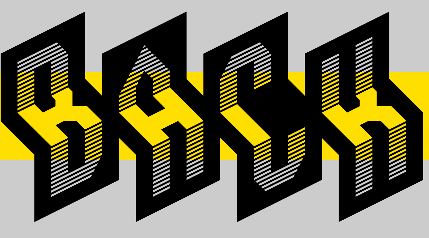
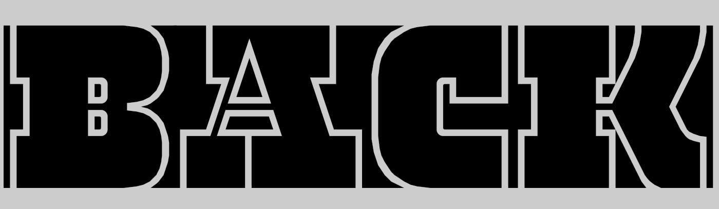
A number of designers decided to explore reversal in the sense of symmetry. ben17’s reflection for example (above), which despite the high concept manages to be legible and strikingly attractive, or architaraz’s similarly practical and well-formed AT Imago Reversed which is also an ingenious mirroring stencil:

Also playing with symmetry and continuing a distinctive FontStruct tradition of esoteric, decorative glyph sets is “Charm Spells” by Aeolien: Every glyph a mystery, like ancient lines scratched in the desert:

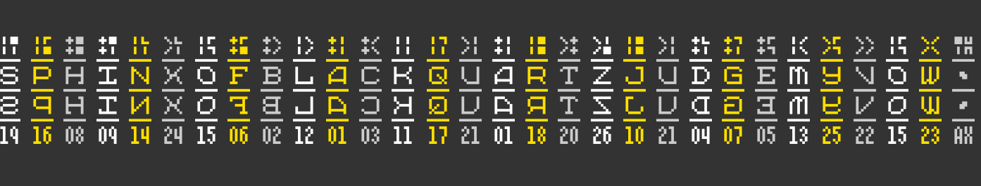
“tm up dn” by thalamic is an ingenious attempt to build a usable letter set by rotating or flipping other glyphs – both a crazy catalogue of intentional mistakes, and a clever way to explore new forms:

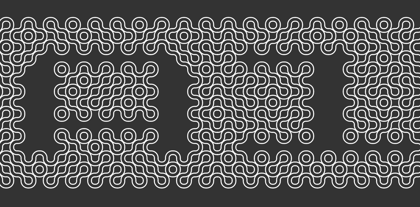
geneus1 gave us, as so often before, several strong and original entries, including the intricately woven G1 Trushae. Chainmail? alien circuitry? noodles? I’m not sure which it reminds me of more, but everyone is invited to lose themselves in the artistry:
With “SbB Codebreaker”, Sketchbook B demonstrates that it’s possible to execute an original concept using only the simplest of materials – the pixel brick. It’s a strange and very technical FontStruction but as the designer himself notes, it has a pleasing and distinctive texture:
There were so many other great entries, equally deserving of mention, but at some point we must move on to …
The Winners
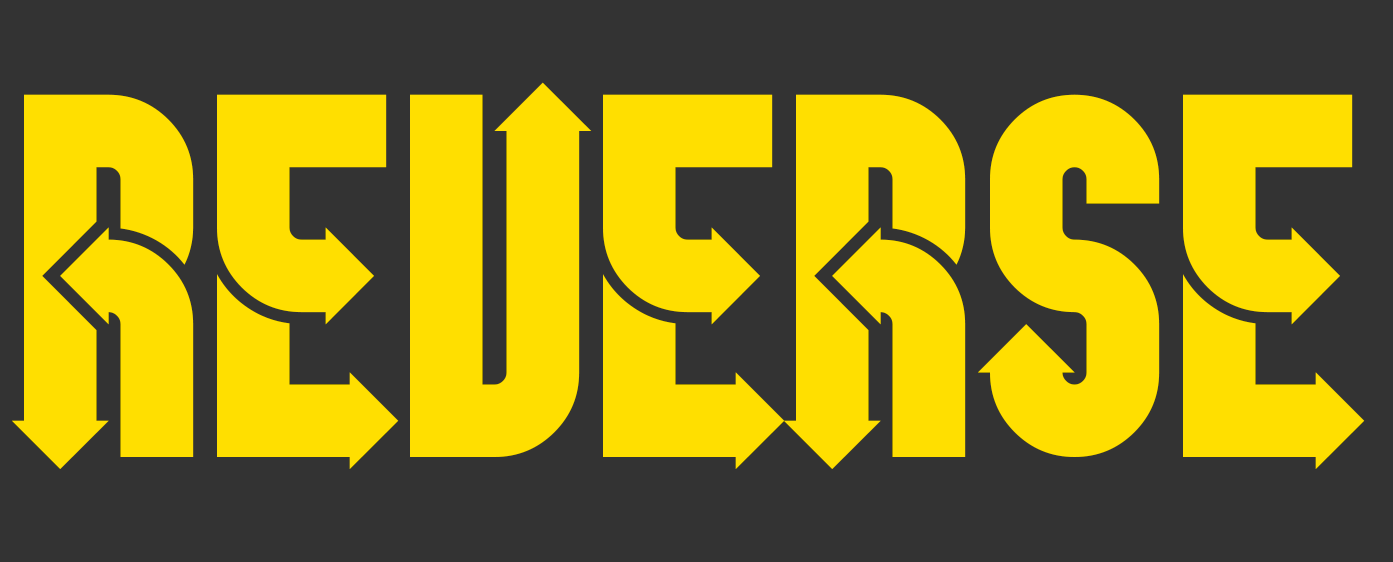
The FontStructor’s Favourite was AT Esrever by architaraz. A clear and clever concept, perfectly executed and the favourite of our community:
A favourite of both judges was the cleverly named counter culture by four which opens an intriguing orthographic window on negative space. The dot-screen shading is a lovely detail.

zelbod eYe/FS by elmoyenique is a good example of a FontStruction which doesn’t reveal its full quality at the standard sizes used to display it in the Gallery and elsewhere on FontStruct.
zelbod has to be seen at a large point size in order for the unique folding concept and fine shading pattern to reveal their beauty:
Finally, I forgot, again, to invite beate to join the judging panel for this competition, and so, with three more spectacular entries, a prize is once more heading in her direction. We chose the elegantly carved db Jojo as our favourite:
Congratulations to each of the prizewinners; you will be contacted regarding your prizes shortly.
Congratulations also to EVERYONE who participated. It’s truly a great pleasure to see all your work appearing and growing on the site.
Special Thanks
To our guest judge, Stephen Coles of LetterForm Archive, Fonts In Use, Typographica, and on fortunate occasions such as this, FontStruct.
Now it’s time to wipe off our trowels and return to our hods. There are bricks to be laid.
Happy FontStructing!
What about my entry?
– Brynda — July 18, 2017 #
Thank you judges and Fontstruct community for surprisingly favoring my work, really glad to take unexpected Fontstructor’s Favorite award!
Congratulations to all who found time to participate, this comp, as the ones before, really brought some good fontstrictions to website’s portfolio.
– architaraz — July 18, 2017 #
Congratulations to Everybody. The reversecomp theme was exciting, the designs we saw were surprisingly diverse. Entries show that we haven’t lost our sense of wonder, ability to explore, courage to experiment. Thank you Meek, team and members :)
– Aeolien — July 19, 2017 #
I am whith Aeloien. Congratulations to all who have participated! It is always a very creative competition. Like any competition at Fontstruct, impressive fonts have been created by many stunningly fascinating approaches.
My thanks go to the jury and to my fair colleagues. Once again, it was a great pleasure to be able to participate. db
– beate — July 19, 2017 #
A big thank you to Rob and Stephen for taking on the difficult task to judge so many inventive and strong entries. These competitions really challenge us to explore new avenues with surprising and beautiful results. Yes, it is a pleasure to be part of that.
– four — July 19, 2017 #
Brynda, you were courageous and worked for your first competition, don’t be upset that you weren’t mentioned. Experiment with brick combinations, tools, designs ;) to prepare for next year :)
– Aeolien — July 19, 2017 #
Congratulations, everyone! It was a nice contest again.
– Yautja — July 19, 2017 #
Congratulations to the worthy winners and kudos to each of the creative fonstructors contributing to the challenge. Thanks Rob, for the opportunity to once again stretch creative muscles purposely focused on a single concept. I always look forward to pushing the boundaries defined in each competition. :-)
– geneus1 — July 19, 2017 #
Congratulations and thank you to all who took part and added exciting and inspiring designs, all give ideas to explore and develop. The reversecomp was an enjoyable challenge, thank you Meek and team for this competition idea and the work of judging.
– nightpegasus — July 20, 2017 #
Meek should add a vertical slider for the entire font
– Brynda — July 29, 2017 #
Congratulations on everyone who entered!
– mahir — July 31, 2017 #