

Browse and find FontStructions
Display
Creative Common
- Any License
- Commercial Use
- Downloadable
- Cloneable
- All Rights Reserved
- Creative Commons Attribution Non-commercial No Derivatives
- Creative Commons Attribution Non-commercial Share Alike
- Creative Commons Attribution Non-commercial
- Creative Commons Attribution No Derivatives
- Creative Commons Attribution Share Alike
- Creative Commons Attribution
- FontStruct Non-Commercial License
- FontStruct License
- Creative Commons CC0 Public Domain Dedication
- Open Font License
Sort: Downloads
Show:
- Staff Picks (224)
- All (486)
Typio N°1 Light
by Alfred Nerstu (A83)5.80
Click on the stars to rate this FontStruction.
Balanced Rating: 5.80
Average Rating: 5.38
Click for more information about this rating. 21 votes You voted ? for this FontStruction. You may change your vote at any time.
Balanced Rating: 5.80
Average Rating: 5.38
Click for more information about this rating. 21 votes You voted ? for this FontStruction. You may change your vote at any time.

Agora 3D
by Stelios Constantinides (sconstantinides)8.29
Click on the stars to rate this FontStruction.
Balanced Rating: 8.29
Average Rating: 8.36
Click for more information about this rating. 22 votes You voted ? for this FontStruction. You may change your vote at any time.
Balanced Rating: 8.29
Average Rating: 8.36
Click for more information about this rating. 22 votes You voted ? for this FontStruction. You may change your vote at any time.
Zombies Are The New Black
by afrojet7.10
Click on the stars to rate this FontStruction.
Balanced Rating: 7.10
Average Rating: 7.00
Click for more information about this rating. 32 votes You voted ? for this FontStruction. You may change your vote at any time.
Balanced Rating: 7.10
Average Rating: 7.00
Click for more information about this rating. 32 votes You voted ? for this FontStruction. You may change your vote at any time.
Big Fat Vibrate
by LexKominek7.13
Click on the stars to rate this FontStruction.
Balanced Rating: 7.13
Average Rating: 6.94
Click for more information about this rating. 16 votes You voted ? for this FontStruction. You may change your vote at any time.
Balanced Rating: 7.13
Average Rating: 6.94
Click for more information about this rating. 16 votes You voted ? for this FontStruction. You may change your vote at any time.
32725523
Published: 27th February, 2009
Last edited: 16th June, 2009
Created: 25th February, 2009
Use the Big Fat fonts with each other in different colours for awesome chromatic effects. Inspired by the award winning Optica by Manuel Guerrero, this is Big Fat Shaded's big sister. Same letter shapes but with a more vibratory, well, vibe. Great for drop caps. The two-tone effect still works - just set one layer in uppercase, one in lowercase. A blank vibrating square can be found at "-" and space, and the uppercase is at "_".This is a clone of Big Fat Shaded
LOUD
by KM.Teo8.71
Click on the stars to rate this FontStruction.
Balanced Rating: 8.71
Average Rating: 8.89
Click for more information about this rating. 19 votes You voted ? for this FontStruction. You may change your vote at any time.
Balanced Rating: 8.71
Average Rating: 8.89
Click for more information about this rating. 19 votes You voted ? for this FontStruction. You may change your vote at any time.
Nollaig Shona
by four8.67
Click on the stars to rate this FontStruction.
Balanced Rating: 8.67
Average Rating: 8.82
Click for more information about this rating. 22 votes You voted ? for this FontStruction. You may change your vote at any time.
Balanced Rating: 8.67
Average Rating: 8.82
Click for more information about this rating. 22 votes You voted ? for this FontStruction. You may change your vote at any time.
Pullchain Bold
by dcsudweeks7.73
Click on the stars to rate this FontStruction.
Balanced Rating: 7.73
Average Rating: 7.70
Click for more information about this rating. 20 votes You voted ? for this FontStruction. You may change your vote at any time.
Balanced Rating: 7.73
Average Rating: 7.70
Click for more information about this rating. 20 votes You voted ? for this FontStruction. You may change your vote at any time.
Digi3D
by Dominik Kaisers (phate888)8.56
Click on the stars to rate this FontStruction.
Balanced Rating: 8.56
Average Rating: 8.65
Click for more information about this rating. 34 votes You voted ? for this FontStruction. You may change your vote at any time.
Balanced Rating: 8.56
Average Rating: 8.65
Click for more information about this rating. 34 votes You voted ? for this FontStruction. You may change your vote at any time.
Imprinted
by Stelios Constantinides (sconstantinides)7.94
Click on the stars to rate this FontStruction.
Balanced Rating: 7.94
Average Rating: 7.95
Click for more information about this rating. 22 votes You voted ? for this FontStruction. You may change your vote at any time.
Balanced Rating: 7.94
Average Rating: 7.95
Click for more information about this rating. 22 votes You voted ? for this FontStruction. You may change your vote at any time.
278410124
Published: 16th March, 2009
Last edited: 23rd June, 2009
Created: 12th March, 2009
Some alternates in the caps. Mainly more space on the right to prevent some letters from crashing into punctuation like in the sample above :) Can also be used at the end of words or just to mix it up.
Based the g and y off of Basic Light ltd
Last edited: 23rd June, 2009
Created: 12th March, 2009
Some alternates in the caps. Mainly more space on the right to prevent some letters from crashing into punctuation like in the sample above :) Can also be used at the end of words or just to mix it up.
Based the g and y off of Basic Light ltd
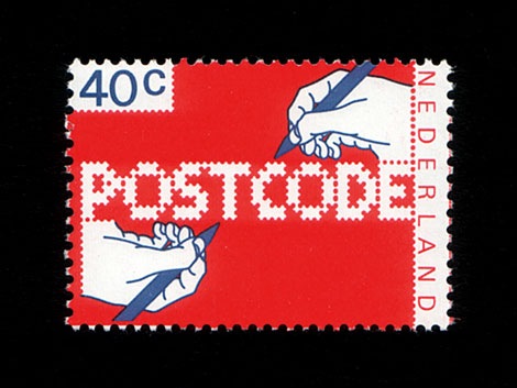
POSTCODE
by nitrada7.55
Click on the stars to rate this FontStruction.
Balanced Rating: 7.55
Average Rating: 7.50
Click for more information about this rating. 26 votes You voted ? for this FontStruction. You may change your vote at any time.
Balanced Rating: 7.55
Average Rating: 7.50
Click for more information about this rating. 26 votes You voted ? for this FontStruction. You may change your vote at any time.
271158713
Published: 6th June, 2008
Last edited: 4th January, 2009
Created: 6th June, 2008
This is still work in progress, a lot of characters missing. There are only UPPERCASE characters available, I filled the lowercase letters with random symbols/patterns. The design is based on this stamp design from 1978 by Gert Dumbar. Use font sizes 64, 128 or 256px. Set leading to 24 (for font size 64), 48 (for 128) and 96 (for 256). More information
Bubblemania
by LexKominek8.11
Click on the stars to rate this FontStruction.
Balanced Rating: 8.11
Average Rating: 8.14
Click for more information about this rating. 29 votes You voted ? for this FontStruction. You may change your vote at any time.
Balanced Rating: 8.11
Average Rating: 8.14
Click for more information about this rating. 29 votes You voted ? for this FontStruction. You may change your vote at any time.
2692017889
Published: 22nd February, 2010
Last edited: 22nd February, 2010
Created: 15th August, 2009
Bubblemania! Named after a bubble tea/wing restaurant in Calgary. It's been on the back burner for a while. I wanted to fill out the "More Latin" set a little more, but I think it's ready to be released. If I have time, I'll add more characters. Also, it's quite pixel-friendly. Check it out. "Construction Kit" available on the swung dash (~) so you can make your own bubbles :)
Linea
by Stelios Constantinides (sconstantinides)7.89
Click on the stars to rate this FontStruction.
Balanced Rating: 7.89
Average Rating: 7.89
Click for more information about this rating. 19 votes You voted ? for this FontStruction. You may change your vote at any time.
Balanced Rating: 7.89
Average Rating: 7.89
Click for more information about this rating. 19 votes You voted ? for this FontStruction. You may change your vote at any time.
Typio N°5
by Alfred Nerstu (A83)5.80
Click on the stars to rate this FontStruction.
Balanced Rating: 5.80
Average Rating: 5.38
Click for more information about this rating. 21 votes You voted ? for this FontStruction. You may change your vote at any time.
Balanced Rating: 5.80
Average Rating: 5.38
Click for more information about this rating. 21 votes You voted ? for this FontStruction. You may change your vote at any time.
AT Sudoku +
by kassymkulov8.50
Click on the stars to rate this FontStruction.
Balanced Rating: 8.50
Average Rating: 8.60
Click for more information about this rating. 25 votes You voted ? for this FontStruction. You may change your vote at any time.
Balanced Rating: 8.50
Average Rating: 8.60
Click for more information about this rating. 25 votes You voted ? for this FontStruction. You may change your vote at any time.
Frucktur
by _stefan8.35
Click on the stars to rate this FontStruction.
Balanced Rating: 8.35
Average Rating: 8.42
Click for more information about this rating. 26 votes You voted ? for this FontStruction. You may change your vote at any time.
Balanced Rating: 8.35
Average Rating: 8.42
Click for more information about this rating. 26 votes You voted ? for this FontStruction. You may change your vote at any time.
INVASION BLOCK
by Michel Troy ~UrbanPixel~ (Upixel)8.42
Click on the stars to rate this FontStruction.
Balanced Rating: 8.42
Average Rating: 8.56
Click for more information about this rating. 16 votes You voted ? for this FontStruction. You may change your vote at any time.
Balanced Rating: 8.42
Average Rating: 8.56
Click for more information about this rating. 16 votes You voted ? for this FontStruction. You may change your vote at any time.
246187035
Published: 22nd November, 2014
Last edited: 2nd December, 2014
Created: 4th November, 2014
This is an false pixel font in 3d with a right lateral light. This is the first thing come to my mind when thinking of retro gaming. took me more time than I expect, so I only push one font for the Gamecomp.
Last edited: 2nd December, 2014
Created: 4th November, 2014
This is an false pixel font in 3d with a right lateral light. This is the first thing come to my mind when thinking of retro gaming. took me more time than I expect, so I only push one font for the Gamecomp.
Paul Was Here
by Stelios Constantinides (sconstantinides)6.99
Click on the stars to rate this FontStruction.
Balanced Rating: 6.99
Average Rating: 6.84
Click for more information about this rating. 25 votes You voted ? for this FontStruction. You may change your vote at any time.
Balanced Rating: 6.99
Average Rating: 6.84
Click for more information about this rating. 25 votes You voted ? for this FontStruction. You may change your vote at any time.
kabog
by Michel Troy ~UrbanPixel~ (Upixel)8.43
Click on the stars to rate this FontStruction.
Balanced Rating: 8.43
Average Rating: 8.52
Click for more information about this rating. 27 votes You voted ? for this FontStruction. You may change your vote at any time.
Balanced Rating: 8.43
Average Rating: 8.52
Click for more information about this rating. 27 votes You voted ? for this FontStruction. You may change your vote at any time.
242159486
Published: 21st August, 2010
Last edited: 21st April, 2011
Created: 17th August, 2010
variation on a theme. =========================================== Everything star with characters d and g witch are a remodel or a variation of the fonstruct logo font. I wanted it readable without the white stripes witch permit me to add smoothness inside the glyph ================================== I did'nt went trought all FS searching if an another font like this one already exist, I think no. If you find one, tell me. =========================================== I still have to play with diatrics, not quite happy yet. Voilà! as always be welcome with constructive crits. I've to do something with the 3, my brain is dead for now ============================================ Congrats to pauldhunt witch made a great job with Structurosa. Before creating this font I especially did'nt want to look at his fonts for not interfered with the concept I had in my head. One exception,the x witch I had no good idea so I took it from him. Merci Paul.
Bloc
by lnheinz7.45
Click on the stars to rate this FontStruction.
Balanced Rating: 7.45
Average Rating: 7.38
Click for more information about this rating. 24 votes You voted ? for this FontStruction. You may change your vote at any time.
Balanced Rating: 7.45
Average Rating: 7.38
Click for more information about this rating. 24 votes You voted ? for this FontStruction. You may change your vote at any time.
Figaro
by Ixel6.94
Click on the stars to rate this FontStruction.
Balanced Rating: 6.94
Average Rating: 6.69
Click for more information about this rating. 16 votes You voted ? for this FontStruction. You may change your vote at any time.
Balanced Rating: 6.94
Average Rating: 6.69
Click for more information about this rating. 16 votes You voted ? for this FontStruction. You may change your vote at any time.
BlockOut
by laynecom7.84
Click on the stars to rate this FontStruction.
Balanced Rating: 7.84
Average Rating: 7.83
Click for more information about this rating. 23 votes You voted ? for this FontStruction. You may change your vote at any time.
Balanced Rating: 7.84
Average Rating: 7.83
Click for more information about this rating. 23 votes You voted ? for this FontStruction. You may change your vote at any time.
Hectic Outline
by elltee6.85
Click on the stars to rate this FontStruction.
Balanced Rating: 6.85
Average Rating: 6.67
Click for more information about this rating. 24 votes You voted ? for this FontStruction. You may change your vote at any time.
Balanced Rating: 6.85
Average Rating: 6.67
Click for more information about this rating. 24 votes You voted ? for this FontStruction. You may change your vote at any time.
Mosaic4way
by fuzzyjay6.79
Click on the stars to rate this FontStruction.
Balanced Rating: 6.79
Average Rating: 6.50
Click for more information about this rating. 16 votes You voted ? for this FontStruction. You may change your vote at any time.
Balanced Rating: 6.79
Average Rating: 6.50
Click for more information about this rating. 16 votes You voted ? for this FontStruction. You may change your vote at any time.
22451949
Published: 19th November, 2008
Last edited: 16th June, 2009
Created: 18th November, 2008
This font is designed for mosaic knitting, a two-color technique that uses only one color yarn at a time. It's called 4way because you can knit it from top, bottom, left, or right. Use the underscore character for a space between words, and use the tilde character for a thinner space.
Chesterfield King
by afrojet7.57
Click on the stars to rate this FontStruction.
Balanced Rating: 7.57
Average Rating: 7.50
Click for more information about this rating. 20 votes You voted ? for this FontStruction. You may change your vote at any time.
Balanced Rating: 7.57
Average Rating: 7.50
Click for more information about this rating. 20 votes You voted ? for this FontStruction. You may change your vote at any time.
222101618
Published: 16th September, 2008
Last edited: 16th December, 2008
Created: 14th September, 2008
The Chesterfield Royal Family was formed from my desire to add new weights to the original Chesterfield typeface. In the process of drawing these new weights, I began modifying some of the forms of the new glyphs away from the original Chesterfield glyphs in order to build a more flexible brick/grid structure for the development of various weights. The most noticeable difference between these three new faces and the original is the lowered x-height. That said, there are still some compromises between the different weights and because of that I've given them these royalty names instead of the normal practice of light, regular, and bold weight names. One of the biggest compromises occurs in the Prince weight, where I was unable to add the notch where bowls and shoulders meet stems (see King and Queen weights) without adding too much extra black weight to those parts of the glyph.
A work in progress for sure. Any help/thoughts/repulsions/bile appreciated.
See also: Chesterfield Queen and Chesterfield Prince
Curved 16 Segment
by Goatmeal6.75
Click on the stars to rate this FontStruction.
Balanced Rating: 6.75
Average Rating: 6.22
Click for more information about this rating. 9 votes You voted ? for this FontStruction. You may change your vote at any time.
Balanced Rating: 6.75
Average Rating: 6.22
Click for more information about this rating. 9 votes You voted ? for this FontStruction. You may change your vote at any time.
2171010010
Published: 21st September, 2015
Last edited: 21st September, 2015
Created: 15th September, 2015
After looking at several examples, this is my interpretation of a 16 Segment alphabet, an expansion of my Curved Seven Segment experiment. Hopefully a little more elegant than the traditional "sharp-angled" versions. The interior diagonals are not as nice as I would like, but suitable for this project.
Light Speed
by deshzx7.06
Click on the stars to rate this FontStruction.
Balanced Rating: 7.06
Average Rating: 6.92
Click for more information about this rating. 26 votes You voted ? for this FontStruction. You may change your vote at any time.
Balanced Rating: 7.06
Average Rating: 6.92
Click for more information about this rating. 26 votes You voted ? for this FontStruction. You may change your vote at any time.
Konstruct
by afrojet7.22
Click on the stars to rate this FontStruction.
Balanced Rating: 7.22
Average Rating: 7.00
Click for more information about this rating. 13 votes You voted ? for this FontStruction. You may change your vote at any time.
Balanced Rating: 7.22
Average Rating: 7.00
Click for more information about this rating. 13 votes You voted ? for this FontStruction. You may change your vote at any time.
Breakout
by afrojet7.31
Click on the stars to rate this FontStruction.
Balanced Rating: 7.31
Average Rating: 7.14
Click for more information about this rating. 14 votes You voted ? for this FontStruction. You may change your vote at any time.
Balanced Rating: 7.31
Average Rating: 7.14
Click for more information about this rating. 14 votes You voted ? for this FontStruction. You may change your vote at any time.
20559811
Published: 28th October, 2008
Last edited: 19th November, 2008
Created: 28th October, 2008
This Fontstruction was produced after plugging in the Atari 2600 the other night and falling in love all over again with the minimalist simplicity of the game Breakout.
A little Jobs/Wozniak drama from the development story of the game Breakout:
"Breakout, a discrete logic (non-microprocessor) game, was conceptualized by Nolan Bushnell and Steve Bristow, after the latter had "rejoined" Atari after the merge of Atari subsidiary Kee Games.
"Al Alcorn was assigned as the project manager, and began development with Cyan Engineering in 1975. The same year, Alcorn assigned Steve Jobs to design a prototype. Jobs was offered USD$750, with an extra $100 each time a chip was eliminated from the prospected design. Jobs promised to complete a prototype within four days. Jobs noticed his friend Steve Wozniak—employee of Hewlett-Packard—was capable of producing designs with a small number of chips, and invited him to work on the hardware design with the prospect of splitting the $750 wage.
"The original deadline was met after Wozniak didn't sleep for four days straight. In the end 50 chips were removed from Jobs' original design. This equated to a $5000 USD bonus, which Jobs kept secret from Wozniak, instead only paying him $375."
-from Wikipedia
Pop Drops
by afrojet6.62
Click on the stars to rate this FontStruction.
Balanced Rating: 6.62
Average Rating: 6.27
Click for more information about this rating. 15 votes You voted ? for this FontStruction. You may change your vote at any time.
Balanced Rating: 6.62
Average Rating: 6.27
Click for more information about this rating. 15 votes You voted ? for this FontStruction. You may change your vote at any time.
20346210
Published: 1st July, 2008
Last edited: 22nd June, 2009
Created: 1st July, 2008
Inspired by the saccharine sounds of the ice cream truck, which has been making the late evening loop around these parts. Upper and lowercase letters enjoy getting all mixed up with one other like a melting Neapolitan ice cream bar. Enjoy.This is a clone of Pop Blox
Fungal Rounded
by LexKominek8.17
Click on the stars to rate this FontStruction.
Balanced Rating: 8.17
Average Rating: 8.27
Click for more information about this rating. 11 votes You voted ? for this FontStruction. You may change your vote at any time.
Balanced Rating: 8.17
Average Rating: 8.27
Click for more information about this rating. 11 votes You voted ? for this FontStruction. You may change your vote at any time.
20267718
Published: 14th November, 2010
Last edited: 14th November, 2010
Created: 17th October, 2010
A unicase stovepipe sans. Also see the sharp version.This is a clone of Fungal Sharp
Last edited: 14th November, 2010
Created: 17th October, 2010
A unicase stovepipe sans. Also see the sharp version.This is a clone of Fungal Sharp
Pixel Reto
by gabrielfigueiredo8.43
Click on the stars to rate this FontStruction.
Balanced Rating: 8.43
Average Rating: 8.64
Click for more information about this rating. 11 votes You voted ? for this FontStruction. You may change your vote at any time.
Balanced Rating: 8.43
Average Rating: 8.64
Click for more information about this rating. 11 votes You voted ? for this FontStruction. You may change your vote at any time.
Am I see are you pee see, eh?
by LexKominek5.90
Click on the stars to rate this FontStruction.
Balanced Rating: 5.90
Average Rating: 5.59
Click for more information about this rating. 27 votes You voted ? for this FontStruction. You may change your vote at any time.
Balanced Rating: 5.90
Average Rating: 5.59
Click for more information about this rating. 27 votes You voted ? for this FontStruction. You may change your vote at any time.
19904112
Published: 1st May, 2008
Last edited: 18th October, 2008
Created: 1st May, 2008
Finally, a font that combines MICR with UPC-A* To use, A-J is 0-9 start digit, 0-9 is 0-9 left of the guard bars, - is the guard bars, )!@#$%^&*( are 0-9 right of the guard bars, and a-j is 0-9 in the check digit. For instance to encode the UPC for Adobe Photoshop CS3 (883919080222) you would type: I83919-)*)@@c I hope that's clear :-) *Note: Font may not actually work with either MICR or UPC systems, although it will work as an awesome futuristic machine prison camp tattoo.