

POSTCODE
Share:
-
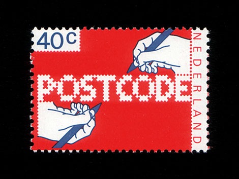
 This is still work in progress, a lot of characters missing. There are only UPPERCASE characters available, I filled the lowercase letters with random symbols/patterns. The design is based on this stamp design from 1978 by Gert Dumbar. Use font sizes 64, 128 or 256px. Set leading to 24 (for font size 64), 48 (for 128) and 96 (for 256). More information
 -
Info:Created on 6th June 2008. Last edited on 4th January 2009.
-
License:
-
Categories:
-
Sets:
-
Tag:
15 Comments
To see the font in action is worth more than description.
Even if the concept may not be 100% original, it is laid out with an amazing consistency!
As you say in the description, the concept is from Dumbar's stamp design, that's why I said that your concept was not 100% original.
But I really like the way you created a font set with huge personality starting from that concept.
@nitrada: FontStruct in use!
Please sign in to comment.