

Fontstructions tagged with “Display”
Searching for more “Display” fonts?
Buy and download “Display” fonts at MyFonts.
Display
Creative Common
- Any License
- Commercial Use
- Downloadable
- Cloneable
- All Rights Reserved
- Creative Commons Attribution Non-commercial No Derivatives
- Creative Commons Attribution Non-commercial Share Alike
- Creative Commons Attribution Non-commercial
- Creative Commons Attribution No Derivatives
- Creative Commons Attribution Share Alike
- Creative Commons Attribution
- FontStruct Non-Commercial License
- FontStruct License
- Creative Commons CC0 Public Domain Dedication
- Open Font License
Sort: Favorite Count
Show:
- Staff Picks (35)
- All (56)
Djangogh 2x
by William Leverette (will.i.ૐ)8.65
Click on the stars to rate this FontStruction.
Balanced Rating: 8.65
Average Rating: 8.69
Click for more information about this rating. 71 votes You voted ? for this FontStruction. You may change your vote at any time.
Balanced Rating: 8.65
Average Rating: 8.69
Click for more information about this rating. 71 votes You voted ? for this FontStruction. You may change your vote at any time.

Pullchain
by dcsudweeks7.93
Click on the stars to rate this FontStruction.
Balanced Rating: 7.93
Average Rating: 7.93
Click for more information about this rating. 29 votes You voted ? for this FontStruction. You may change your vote at any time.
Balanced Rating: 7.93
Average Rating: 7.93
Click for more information about this rating. 29 votes You voted ? for this FontStruction. You may change your vote at any time.
fs Pythagoras
by William Leverette (will.i.ૐ)8.52
Click on the stars to rate this FontStruction.
Balanced Rating: 8.52
Average Rating: 8.71
Click for more information about this rating. 14 votes You voted ? for this FontStruction. You may change your vote at any time.
Balanced Rating: 8.52
Average Rating: 8.71
Click for more information about this rating. 14 votes You voted ? for this FontStruction. You may change your vote at any time.

Out of Context Redux
by Friedrich Hartmann (@mxfh) (diskurs)7.39
Click on the stars to rate this FontStruction.
Balanced Rating: 7.39
Average Rating: 7.23
Click for more information about this rating. 13 votes You voted ? for this FontStruction. You may change your vote at any time.
Balanced Rating: 7.39
Average Rating: 7.23
Click for more information about this rating. 13 votes You voted ? for this FontStruction. You may change your vote at any time.
1151534418
Published: 2nd May, 2024
Last edited: 15th June, 2009
Created: 7th July, 2008
Derived from «Out of Context». Just stripped the Capitals. Intended to be used mainly in lower case. Based upon a context-free-design-grammar-font (cfdg) I made earlier for «Context Free».This is a clone of Out of Context
Last edited: 15th June, 2009
Created: 7th July, 2008
Derived from «Out of Context». Just stripped the Capitals. Intended to be used mainly in lower case. Based upon a context-free-design-grammar-font (cfdg) I made earlier for «Context Free».This is a clone of Out of Context
AT Quba
by kassymkulov8.78
Click on the stars to rate this FontStruction.
Balanced Rating: 8.78
Average Rating: 9.00
Click for more information about this rating. 17 votes You voted ? for this FontStruction. You may change your vote at any time.
Balanced Rating: 8.78
Average Rating: 9.00
Click for more information about this rating. 17 votes You voted ? for this FontStruction. You may change your vote at any time.
Underground
by Magic Sam7.64
Click on the stars to rate this FontStruction.
Balanced Rating: 7.64
Average Rating: 7.55
Click for more information about this rating. 11 votes You voted ? for this FontStruction. You may change your vote at any time.
Balanced Rating: 7.64
Average Rating: 7.55
Click for more information about this rating. 11 votes You voted ? for this FontStruction. You may change your vote at any time.
921610617
Published: 4th September, 2009
Last edited: 11th September, 2009
Created: 3rd September, 2009
If you want to create cool Letterings, try Underground! This was inspired by Pincoya Black Type by Daniel Hernandez. You can write letter by letter using the Uppercase or you can connect every character using the alternates. Please take a look at the example, then you´ll understand the idea! Lowercase are alternates of the same letter or a different letter. >=alt.B, <=alt.D, @=alt.T Underline:=+, Overline=*, Filter: 1,6.
Grande
by Sketchbook B7.94
Click on the stars to rate this FontStruction.
Balanced Rating: 7.94
Average Rating: 7.95
Click for more information about this rating. 22 votes You voted ? for this FontStruction. You may change your vote at any time.
Balanced Rating: 7.94
Average Rating: 7.95
Click for more information about this rating. 22 votes You voted ? for this FontStruction. You may change your vote at any time.
Figaro
by Ixel6.94
Click on the stars to rate this FontStruction.
Balanced Rating: 6.94
Average Rating: 6.69
Click for more information about this rating. 16 votes You voted ? for this FontStruction. You may change your vote at any time.
Balanced Rating: 6.94
Average Rating: 6.69
Click for more information about this rating. 16 votes You voted ? for this FontStruction. You may change your vote at any time.
Pullchain Bold
by dcsudweeks7.73
Click on the stars to rate this FontStruction.
Balanced Rating: 7.73
Average Rating: 7.70
Click for more information about this rating. 20 votes You voted ? for this FontStruction. You may change your vote at any time.
Balanced Rating: 7.73
Average Rating: 7.70
Click for more information about this rating. 20 votes You voted ? for this FontStruction. You may change your vote at any time.
Futuristic Terminal Display
by Goatmeal7.10
Click on the stars to rate this FontStruction.
Balanced Rating: 7.10
Average Rating: 6.86
Click for more information about this rating. 14 votes You voted ? for this FontStruction. You may change your vote at any time.
Balanced Rating: 7.10
Average Rating: 6.86
Click for more information about this rating. 14 votes You voted ? for this FontStruction. You may change your vote at any time.
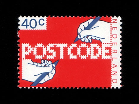
POSTCODE
by nitrada7.55
Click on the stars to rate this FontStruction.
Balanced Rating: 7.55
Average Rating: 7.50
Click for more information about this rating. 26 votes You voted ? for this FontStruction. You may change your vote at any time.
Balanced Rating: 7.55
Average Rating: 7.50
Click for more information about this rating. 26 votes You voted ? for this FontStruction. You may change your vote at any time.
271158713
Published: 6th June, 2008
Last edited: 4th January, 2009
Created: 6th June, 2008
This is still work in progress, a lot of characters missing. There are only UPPERCASE characters available, I filled the lowercase letters with random symbols/patterns. The design is based on this stamp design from 1978 by Gert Dumbar. Use font sizes 64, 128 or 256px. Set leading to 24 (for font size 64), 48 (for 128) and 96 (for 256). More information
Pop Drops
by afrojet6.62
Click on the stars to rate this FontStruction.
Balanced Rating: 6.62
Average Rating: 6.27
Click for more information about this rating. 15 votes You voted ? for this FontStruction. You may change your vote at any time.
Balanced Rating: 6.62
Average Rating: 6.27
Click for more information about this rating. 15 votes You voted ? for this FontStruction. You may change your vote at any time.
20346210
Published: 1st July, 2008
Last edited: 22nd June, 2009
Created: 1st July, 2008
Inspired by the saccharine sounds of the ice cream truck, which has been making the late evening loop around these parts. Upper and lowercase letters enjoy getting all mixed up with one other like a melting Neapolitan ice cream bar. Enjoy.This is a clone of Pop Blox
Shadow
by Magic Sam8.19
Click on the stars to rate this FontStruction.
Balanced Rating: 8.19
Average Rating: 8.29
Click for more information about this rating. 14 votes You voted ? for this FontStruction. You may change your vote at any time.
Balanced Rating: 8.19
Average Rating: 8.29
Click for more information about this rating. 14 votes You voted ? for this FontStruction. You may change your vote at any time.
701011010
Published: 8th August, 2009
Last edited: 2nd October, 2009
Created: 3rd August, 2009
Don´t trust the preview, take a look at the Example! Dedicated to the marvellous DJ Shadow. This is another contemporary Display-Font I created using the Brick-Size-Filters (adjusted at 1.75). It´s not a 3D-Font, or a puzzle or a construction plan, but I think it´s a very consistent typeface:-) Hope you like it, please write a comment if you have any suggestions. More letters to come.
Curved 16 Segment
by Goatmeal6.75
Click on the stars to rate this FontStruction.
Balanced Rating: 6.75
Average Rating: 6.22
Click for more information about this rating. 9 votes You voted ? for this FontStruction. You may change your vote at any time.
Balanced Rating: 6.75
Average Rating: 6.22
Click for more information about this rating. 9 votes You voted ? for this FontStruction. You may change your vote at any time.
2171010010
Published: 21st September, 2015
Last edited: 21st September, 2015
Created: 15th September, 2015
After looking at several examples, this is my interpretation of a 16 Segment alphabet, an expansion of my Curved Seven Segment experiment. Hopefully a little more elegant than the traditional "sharp-angled" versions. The interior diagonals are not as nice as I would like, but suitable for this project.
fs Unlucky
by user-juli8.53
Click on the stars to rate this FontStruction.
Balanced Rating: 8.53
Average Rating: 8.80
Click for more information about this rating. 10 votes You voted ? for this FontStruction. You may change your vote at any time.
Balanced Rating: 8.53
Average Rating: 8.80
Click for more information about this rating. 10 votes You voted ? for this FontStruction. You may change your vote at any time.
Konstruct
by afrojet7.22
Click on the stars to rate this FontStruction.
Balanced Rating: 7.22
Average Rating: 7.00
Click for more information about this rating. 13 votes You voted ? for this FontStruction. You may change your vote at any time.
Balanced Rating: 7.22
Average Rating: 7.00
Click for more information about this rating. 13 votes You voted ? for this FontStruction. You may change your vote at any time.
She Stole the Night
by Neoqueto8.74
Click on the stars to rate this FontStruction.
Balanced Rating: 8.74
Average Rating: 9.33
Click for more information about this rating. 6 votes You voted ? for this FontStruction. You may change your vote at any time.
Balanced Rating: 8.74
Average Rating: 9.33
Click for more information about this rating. 6 votes You voted ? for this FontStruction. You may change your vote at any time.
kaputt
by alziro5.84
Click on the stars to rate this FontStruction.
Balanced Rating: 5.84
Average Rating: 5.56
Click for more information about this rating. 31 votes You voted ? for this FontStruction. You may change your vote at any time.
Balanced Rating: 5.84
Average Rating: 5.56
Click for more information about this rating. 31 votes You voted ? for this FontStruction. You may change your vote at any time.
Hectic Outline
by elltee6.85
Click on the stars to rate this FontStruction.
Balanced Rating: 6.85
Average Rating: 6.67
Click for more information about this rating. 24 votes You voted ? for this FontStruction. You may change your vote at any time.
Balanced Rating: 6.85
Average Rating: 6.67
Click for more information about this rating. 24 votes You voted ? for this FontStruction. You may change your vote at any time.
pxlNotSqr
by cayo7.28
Click on the stars to rate this FontStruction.
Balanced Rating: 7.28
Average Rating: 7.00
Click for more information about this rating. 9 votes You voted ? for this FontStruction. You may change your vote at any time.
Balanced Rating: 7.28
Average Rating: 7.00
Click for more information about this rating. 9 votes You voted ? for this FontStruction. You may change your vote at any time.
15761598
Published: 24th March, 2009
Last edited: 16th June, 2009
Created: 18th March, 2009
A minimalistic font: My first public fontstruction that is not pixel optimized,(but only uses) it originally only used the triangular bricks plus the classic square one, now it also uses the squares with the triangle cut at a side.
I intended it to be all caps, but lowercase was possible within the designRule(:P) so I added them too (though only lowercase spanish accents, ü, µ, @ and some basic punctuation gliphs are included for the moment being).
25.03.09 grid tripled. I also added more accents and symbols :P
26.03.09 T,X,x and 9 totally modified.
29.03.09 B redesigned
21.04.09 All Yy reshaped
11.05.09 Ampersand and Currency Symbols added.
29.05.09 ß added.
Last edited: 16th June, 2009
Created: 18th March, 2009
A minimalistic font: My first public fontstruction that is not pixel optimized,
25.03.09 grid tripled. I also added more accents and symbols :P
26.03.09 T,X,x and 9 totally modified.
29.03.09 B redesigned
21.04.09 All Yy reshaped
11.05.09 Ampersand and Currency Symbols added.
29.05.09 ß added.
AGRAR Unicase
by Ixel6.75
Click on the stars to rate this FontStruction.
Balanced Rating: 6.75
Average Rating: 6.38
Click for more information about this rating. 13 votes You voted ? for this FontStruction. You may change your vote at any time.
Balanced Rating: 6.75
Average Rating: 6.38
Click for more information about this rating. 13 votes You voted ? for this FontStruction. You may change your vote at any time.
hack.ed
by Midnighte8.50
Click on the stars to rate this FontStruction.
Balanced Rating: 8.50
Average Rating: 8.78
Click for more information about this rating. 9 votes You voted ? for this FontStruction. You may change your vote at any time.
Balanced Rating: 8.50
Average Rating: 8.78
Click for more information about this rating. 9 votes You voted ? for this FontStruction. You may change your vote at any time.
Qwerty Revisited
by geniaal6.10
Click on the stars to rate this FontStruction.
Balanced Rating: 6.10
Average Rating: 5.80
Click for more information about this rating. 25 votes You voted ? for this FontStruction. You may change your vote at any time.
Balanced Rating: 6.10
Average Rating: 5.80
Click for more information about this rating. 25 votes You voted ? for this FontStruction. You may change your vote at any time.
Out of Context
by Friedrich Hartmann (@mxfh) (diskurs)5.85
Click on the stars to rate this FontStruction.
Balanced Rating: 5.85
Average Rating: 5.00
Click for more information about this rating. 10 votes You voted ? for this FontStruction. You may change your vote at any time.
Balanced Rating: 5.85
Average Rating: 5.00
Click for more information about this rating. 10 votes You voted ? for this FontStruction. You may change your vote at any time.
Fat Tek Brush
by TobiasMik8.21
Click on the stars to rate this FontStruction.
Balanced Rating: 8.21
Average Rating: 8.38
Click for more information about this rating. 8 votes You voted ? for this FontStruction. You may change your vote at any time.
Balanced Rating: 8.21
Average Rating: 8.38
Click for more information about this rating. 8 votes You voted ? for this FontStruction. You may change your vote at any time.
1090655
Published: 8th April, 2008
Last edited: 16th January, 2009
Created: 8th April, 2008
A techno style typeface with a calligraphic twist (or calligraphic with a tech-twist!!) I've explored the rounded brushstrokes against straight lines and got a nice dynamic result. – with cool lowercase numbering
Last edited: 16th January, 2009
Created: 8th April, 2008
A techno style typeface with a calligraphic twist (or calligraphic with a tech-twist!!) I've explored the rounded brushstrokes against straight lines and got a nice dynamic result. – with cool lowercase numbering
Rimski
by Ixel7.38
Click on the stars to rate this FontStruction.
Balanced Rating: 7.38
Average Rating: 7.25
Click for more information about this rating. 16 votes You voted ? for this FontStruction. You may change your vote at any time.
Balanced Rating: 7.38
Average Rating: 7.25
Click for more information about this rating. 16 votes You voted ? for this FontStruction. You may change your vote at any time.
AGRAR Unicase Black
by Ixel6.13
Click on the stars to rate this FontStruction.
Balanced Rating: 6.13
Average Rating: 5.45
Click for more information about this rating. 11 votes You voted ? for this FontStruction. You may change your vote at any time.
Balanced Rating: 6.13
Average Rating: 5.45
Click for more information about this rating. 11 votes You voted ? for this FontStruction. You may change your vote at any time.
8802874
Published: 23rd April, 2008
Last edited: 16th June, 2009
Created: 23rd April, 2008
Clone of AGRAR Unicase.This is a clone of AGRAR Unicase
Last edited: 16th June, 2009
Created: 23rd April, 2008
Clone of AGRAR Unicase.This is a clone of AGRAR Unicase
Summer Grillz
by afrojet6.88
Click on the stars to rate this FontStruction.
Balanced Rating: 6.88
Average Rating: 6.60
Click for more information about this rating. 15 votes You voted ? for this FontStruction. You may change your vote at any time.
Balanced Rating: 6.88
Average Rating: 6.60
Click for more information about this rating. 15 votes You voted ? for this FontStruction. You may change your vote at any time.
19741084
Published: 24th June, 2008
Last edited: 3rd November, 2008
Created: 24th June, 2008
More gangster than Gill with more gold than Garamond, Summer Grillz is type jewelry for your mouth. All letterforms are diamond-kut using the finest type constructing software on the market today. Customize your grill with different fills. For extra bling and total street-hustle krunk, layer the star fill on top of the base pave set. Color that s#it gold, son. Put your type where your mouth is. Note: kerning subject to da gaps yo teef.
Pulgo 2.0
by Ixel6.65
Click on the stars to rate this FontStruction.
Balanced Rating: 6.65
Average Rating: 6.41
Click for more information about this rating. 22 votes You voted ? for this FontStruction. You may change your vote at any time.
Balanced Rating: 6.65
Average Rating: 6.41
Click for more information about this rating. 22 votes You voted ? for this FontStruction. You may change your vote at any time.
Criss Cross
by Magic Sam7.90
Click on the stars to rate this FontStruction.
Balanced Rating: 7.90
Average Rating: 7.90
Click for more information about this rating. 10 votes You voted ? for this FontStruction. You may change your vote at any time.
Balanced Rating: 7.90
Average Rating: 7.90
Click for more information about this rating. 10 votes You voted ? for this FontStruction. You may change your vote at any time.
2361074
Published: 2nd September, 2009
Last edited: 1st October, 2009
Created: 31st August, 2009
The Cross-spider-Font! Another Filter-Fontstruction (1.7). The intention was to create a modern, geometric headline-font with a unique touch. At the beginning only a few letters (like A, D, O) had the cross on them, but then I decided to use this element for the whole font. Hope you like it, take a look at the example. Please write a comment if you have any suggestions!
Waltz Away
by frongile8.63
Click on the stars to rate this FontStruction.
Balanced Rating: 8.63
Average Rating: 9.67
Click for more information about this rating. 3 votes You voted ? for this FontStruction. You may change your vote at any time.
Balanced Rating: 8.63
Average Rating: 9.67
Click for more information about this rating. 3 votes You voted ? for this FontStruction. You may change your vote at any time.
82984
Published: 1st June, 2022
Last edited: 1st June, 2022
Created: 1st June, 2022
Last edited: 1st June, 2022
Created: 1st June, 2022
inspired by the letterforms of apoc revelations italic and nikita
This is a clone of fs ecnadwols