

Browse and find FontStructions
Any Category
Any License
- Any License
- Commercial Use
- Downloadable
- Cloneable
- All Rights Reserved
- Creative Commons Attribution Non-commercial No Derivatives
- Creative Commons Attribution Non-commercial Share Alike
- Creative Commons Attribution Non-commercial
- Creative Commons Attribution No Derivatives
- Creative Commons Attribution Share Alike
- Creative Commons Attribution
- FontStruct Non-Commercial License
- FontStruct License
- Creative Commons CC0 Public Domain Dedication
- Open Font License
Sort: Last Edit
Show:
- Staff Picks (4705)
- All (77899)
we like sheep
by vanielle7.38
Click on the stars to rate this FontStruction.
Balanced Rating: 7.38
Average Rating: 7.29
Click for more information about this rating. 24 votes You voted ? for this FontStruction. You may change your vote at any time.
Balanced Rating: 7.38
Average Rating: 7.29
Click for more information about this rating. 24 votes You voted ? for this FontStruction. You may change your vote at any time.

EZMonoF
by fontcollector6.19
Click on the stars to rate this FontStruction.
Balanced Rating: 6.19
Average Rating: 5.00
Click for more information about this rating. 6 votes You voted ? for this FontStruction. You may change your vote at any time.
Balanced Rating: 6.19
Average Rating: 5.00
Click for more information about this rating. 6 votes You voted ? for this FontStruction. You may change your vote at any time.
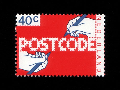
POSTCODE
by nitrada7.55
Click on the stars to rate this FontStruction.
Balanced Rating: 7.55
Average Rating: 7.50
Click for more information about this rating. 26 votes You voted ? for this FontStruction. You may change your vote at any time.
Balanced Rating: 7.55
Average Rating: 7.50
Click for more information about this rating. 26 votes You voted ? for this FontStruction. You may change your vote at any time.
271158713
Published: 6th June, 2008
Last edited: 4th January, 2009
Created: 6th June, 2008
This is still work in progress, a lot of characters missing. There are only UPPERCASE characters available, I filled the lowercase letters with random symbols/patterns. The design is based on this stamp design from 1978 by Gert Dumbar. Use font sizes 64, 128 or 256px. Set leading to 24 (for font size 64), 48 (for 128) and 96 (for 256). More information
big blue
by David Neustadt (saberrider)7.51
Click on the stars to rate this FontStruction.
Balanced Rating: 7.51
Average Rating: 7.38
Click for more information about this rating. 13 votes You voted ? for this FontStruction. You may change your vote at any time.
Balanced Rating: 7.51
Average Rating: 7.38
Click for more information about this rating. 13 votes You voted ? for this FontStruction. You may change your vote at any time.
Dairy
by Nate Cox (nathancox)6.04
Click on the stars to rate this FontStruction.
Balanced Rating: 6.04
Average Rating: 5.68
Click for more information about this rating. 22 votes You voted ? for this FontStruction. You may change your vote at any time.
Balanced Rating: 6.04
Average Rating: 5.68
Click for more information about this rating. 22 votes You voted ? for this FontStruction. You may change your vote at any time.
Aksara Jawa
by addienne8.04
Click on the stars to rate this FontStruction.
Balanced Rating: 8.04
Average Rating: 8.13
Click for more information about this rating. 8 votes You voted ? for this FontStruction. You may change your vote at any time.
Balanced Rating: 8.04
Average Rating: 8.13
Click for more information about this rating. 8 votes You voted ? for this FontStruction. You may change your vote at any time.
JKF Rotori Regular
by jklikesfonts6.90
Click on the stars to rate this FontStruction.
Balanced Rating: 6.90
Average Rating: 6.44
Click for more information about this rating. 9 votes You voted ? for this FontStruction. You may change your vote at any time.
Balanced Rating: 6.90
Average Rating: 6.44
Click for more information about this rating. 9 votes You voted ? for this FontStruction. You may change your vote at any time.
Strontium
by intaglio6.49
Click on the stars to rate this FontStruction.
Balanced Rating: 6.49
Average Rating: 6.00
Click for more information about this rating. 12 votes You voted ? for this FontStruction. You may change your vote at any time.
Balanced Rating: 6.49
Average Rating: 6.00
Click for more information about this rating. 12 votes You voted ? for this FontStruction. You may change your vote at any time.
Beft
by adept6.90
Click on the stars to rate this FontStruction.
Balanced Rating: 6.90
Average Rating: 6.44
Click for more information about this rating. 9 votes You voted ? for this FontStruction. You may change your vote at any time.
Balanced Rating: 6.90
Average Rating: 6.44
Click for more information about this rating. 9 votes You voted ? for this FontStruction. You may change your vote at any time.
VieilleGare
by cam.ill6.32
Click on the stars to rate this FontStruction.
Balanced Rating: 6.32
Average Rating: 5.73
Click for more information about this rating. 11 votes You voted ? for this FontStruction. You may change your vote at any time.
Balanced Rating: 6.32
Average Rating: 5.73
Click for more information about this rating. 11 votes You voted ? for this FontStruction. You may change your vote at any time.
Chesterfield King
by afrojet7.57
Click on the stars to rate this FontStruction.
Balanced Rating: 7.57
Average Rating: 7.50
Click for more information about this rating. 20 votes You voted ? for this FontStruction. You may change your vote at any time.
Balanced Rating: 7.57
Average Rating: 7.50
Click for more information about this rating. 20 votes You voted ? for this FontStruction. You may change your vote at any time.
222101618
Published: 16th September, 2008
Last edited: 16th December, 2008
Created: 14th September, 2008
The Chesterfield Royal Family was formed from my desire to add new weights to the original Chesterfield typeface. In the process of drawing these new weights, I began modifying some of the forms of the new glyphs away from the original Chesterfield glyphs in order to build a more flexible brick/grid structure for the development of various weights. The most noticeable difference between these three new faces and the original is the lowered x-height. That said, there are still some compromises between the different weights and because of that I've given them these royalty names instead of the normal practice of light, regular, and bold weight names. One of the biggest compromises occurs in the Prince weight, where I was unable to add the notch where bowls and shoulders meet stems (see King and Queen weights) without adding too much extra black weight to those parts of the glyph.
A work in progress for sure. Any help/thoughts/repulsions/bile appreciated.
See also: Chesterfield Queen and Chesterfield Prince
FunToMass
by kazus_kami6.68
Click on the stars to rate this FontStruction.
Balanced Rating: 6.68
Average Rating: 6.11
Click for more information about this rating. 9 votes You voted ? for this FontStruction. You may change your vote at any time.
Balanced Rating: 6.68
Average Rating: 6.11
Click for more information about this rating. 9 votes You voted ? for this FontStruction. You may change your vote at any time.
Pointersoft
by aaronamar8.22
Click on the stars to rate this FontStruction.
Balanced Rating: 8.22
Average Rating: 8.31
Click for more information about this rating. 16 votes You voted ? for this FontStruction. You may change your vote at any time.
Balanced Rating: 8.22
Average Rating: 8.31
Click for more information about this rating. 16 votes You voted ? for this FontStruction. You may change your vote at any time.
Bala
by bauermc6.49
Click on the stars to rate this FontStruction.
Balanced Rating: 6.49
Average Rating: 6.00
Click for more information about this rating. 12 votes You voted ? for this FontStruction. You may change your vote at any time.
Balanced Rating: 6.49
Average Rating: 6.00
Click for more information about this rating. 12 votes You voted ? for this FontStruction. You may change your vote at any time.
mary john
by crisbellei6.83
Click on the stars to rate this FontStruction.
Balanced Rating: 6.83
Average Rating: 6.62
Click for more information about this rating. 21 votes You voted ? for this FontStruction. You may change your vote at any time.
Balanced Rating: 6.83
Average Rating: 6.62
Click for more information about this rating. 21 votes You voted ? for this FontStruction. You may change your vote at any time.
DEFCON
by RadicalOne5.85
Click on the stars to rate this FontStruction.
Balanced Rating: 5.85
Average Rating: 5.31
Click for more information about this rating. 16 votes You voted ? for this FontStruction. You may change your vote at any time.
Balanced Rating: 5.85
Average Rating: 5.31
Click for more information about this rating. 16 votes You voted ? for this FontStruction. You may change your vote at any time.
Glockenwerk - Uhrzeit
by Christian Munk (CMunk)7.64
Click on the stars to rate this FontStruction.
Balanced Rating: 7.64
Average Rating: 7.55
Click for more information about this rating. 11 votes You voted ? for this FontStruction. You may change your vote at any time.
Balanced Rating: 7.64
Average Rating: 7.55
Click for more information about this rating. 11 votes You voted ? for this FontStruction. You may change your vote at any time.
66410517
Published: 21st November, 2008
Last edited: 6th December, 2008
Created: 20th November, 2008
All half quarters of the day.This is a clone of Glockenwerk
Last edited: 6th December, 2008
Created: 20th November, 2008
All half quarters of the day.This is a clone of Glockenwerk
pixel_st_8px_ru
by Revers5.92
Click on the stars to rate this FontStruction.
Balanced Rating: 5.92
Average Rating: 5.10
Click for more information about this rating. 10 votes You voted ? for this FontStruction. You may change your vote at any time.
Balanced Rating: 5.92
Average Rating: 5.10
Click for more information about this rating. 10 votes You voted ? for this FontStruction. You may change your vote at any time.
Tube Station
by James Richardson (Type_of_its_own)6.40
Click on the stars to rate this FontStruction.
Balanced Rating: 6.40
Average Rating: 6.06
Click for more information about this rating. 18 votes You voted ? for this FontStruction. You may change your vote at any time.
Balanced Rating: 6.40
Average Rating: 6.06
Click for more information about this rating. 18 votes You voted ? for this FontStruction. You may change your vote at any time.
TallDarkStrangerMono
by fontcollector5.59
Click on the stars to rate this FontStruction.
Balanced Rating: 5.59
Average Rating: 5.06
Click for more information about this rating. 18 votes You voted ? for this FontStruction. You may change your vote at any time.
Balanced Rating: 5.59
Average Rating: 5.06
Click for more information about this rating. 18 votes You voted ? for this FontStruction. You may change your vote at any time.
peter's chess pieces
by ecaGraphics7.04
Click on the stars to rate this FontStruction.
Balanced Rating: 7.04
Average Rating: 6.80
Click for more information about this rating. 15 votes You voted ? for this FontStruction. You may change your vote at any time.
Balanced Rating: 7.04
Average Rating: 6.80
Click for more information about this rating. 15 votes You voted ? for this FontStruction. You may change your vote at any time.
Klean
by gfresh6.00
Click on the stars to rate this FontStruction.
Balanced Rating: 6.00
Average Rating: 5.50
Click for more information about this rating. 16 votes You voted ? for this FontStruction. You may change your vote at any time.
Balanced Rating: 6.00
Average Rating: 5.50
Click for more information about this rating. 16 votes You voted ? for this FontStruction. You may change your vote at any time.
Conduits
by Dr_McQueen6.64
Click on the stars to rate this FontStruction.
Balanced Rating: 6.64
Average Rating: 6.42
Click for more information about this rating. 24 votes You voted ? for this FontStruction. You may change your vote at any time.
Balanced Rating: 6.64
Average Rating: 6.42
Click for more information about this rating. 24 votes You voted ? for this FontStruction. You may change your vote at any time.
365811
Published: 5th November, 2008
Last edited: 23rd November, 2008
Created: 8th October, 2008
Everyday, electricians bend aluminum conduits to run electrical wiring through. When these electricians are bending conduits, they are unintentionally creating amazing forms and shapes. They are inadvertently creating art. This typeface is an emulation of those forms, and the undiscovered art that is created everyday by hard working labor men. Best used with +10 tracking and a bit of kerning on obvious letters.
circleplay
by intaglio6.98
Click on the stars to rate this FontStruction.
Balanced Rating: 6.98
Average Rating: 6.64
Click for more information about this rating. 11 votes You voted ? for this FontStruction. You may change your vote at any time.
Balanced Rating: 6.98
Average Rating: 6.64
Click for more information about this rating. 11 votes You voted ? for this FontStruction. You may change your vote at any time.
In the Queue
by CommandZed7.12
Click on the stars to rate this FontStruction.
Balanced Rating: 7.12
Average Rating: 7.07
Click for more information about this rating. 58 votes You voted ? for this FontStruction. You may change your vote at any time.
Balanced Rating: 7.12
Average Rating: 7.07
Click for more information about this rating. 58 votes You voted ? for this FontStruction. You may change your vote at any time.
blackline
by patricknas6.21
Click on the stars to rate this FontStruction.
Balanced Rating: 6.21
Average Rating: 5.50
Click for more information about this rating. 10 votes You voted ? for this FontStruction. You may change your vote at any time.
Balanced Rating: 6.21
Average Rating: 5.50
Click for more information about this rating. 10 votes You voted ? for this FontStruction. You may change your vote at any time.
SymmetronoMono
by fontcollector6.46
Click on the stars to rate this FontStruction.
Balanced Rating: 6.46
Average Rating: 5.91
Click for more information about this rating. 11 votes You voted ? for this FontStruction. You may change your vote at any time.
Balanced Rating: 6.46
Average Rating: 5.91
Click for more information about this rating. 11 votes You voted ? for this FontStruction. You may change your vote at any time.
Breakout
by afrojet7.32
Click on the stars to rate this FontStruction.
Balanced Rating: 7.32
Average Rating: 7.14
Click for more information about this rating. 14 votes You voted ? for this FontStruction. You may change your vote at any time.
Balanced Rating: 7.32
Average Rating: 7.14
Click for more information about this rating. 14 votes You voted ? for this FontStruction. You may change your vote at any time.
20659811
Published: 28th October, 2008
Last edited: 19th November, 2008
Created: 28th October, 2008
This Fontstruction was produced after plugging in the Atari 2600 the other night and falling in love all over again with the minimalist simplicity of the game Breakout.
A little Jobs/Wozniak drama from the development story of the game Breakout:
"Breakout, a discrete logic (non-microprocessor) game, was conceptualized by Nolan Bushnell and Steve Bristow, after the latter had "rejoined" Atari after the merge of Atari subsidiary Kee Games.
"Al Alcorn was assigned as the project manager, and began development with Cyan Engineering in 1975. The same year, Alcorn assigned Steve Jobs to design a prototype. Jobs was offered USD$750, with an extra $100 each time a chip was eliminated from the prospected design. Jobs promised to complete a prototype within four days. Jobs noticed his friend Steve Wozniak—employee of Hewlett-Packard—was capable of producing designs with a small number of chips, and invited him to work on the hardware design with the prospect of splitting the $750 wage.
"The original deadline was met after Wozniak didn't sleep for four days straight. In the end 50 chips were removed from Jobs' original design. This equated to a $5000 USD bonus, which Jobs kept secret from Wozniak, instead only paying him $375."
-from Wikipedia
6by6
by julyaya6.32
Click on the stars to rate this FontStruction.
Balanced Rating: 6.32
Average Rating: 5.73
Click for more information about this rating. 11 votes You voted ? for this FontStruction. You may change your vote at any time.
Balanced Rating: 6.32
Average Rating: 5.73
Click for more information about this rating. 11 votes You voted ? for this FontStruction. You may change your vote at any time.
Futoni
by Stelios Constantinides (sconstantinides)6.71
Click on the stars to rate this FontStruction.
Balanced Rating: 6.71
Average Rating: 6.00
Click for more information about this rating. 7 votes You voted ? for this FontStruction. You may change your vote at any time.
Balanced Rating: 6.71
Average Rating: 6.00
Click for more information about this rating. 7 votes You voted ? for this FontStruction. You may change your vote at any time.
Spiderfont
by Crosspider7.69
Click on the stars to rate this FontStruction.
Balanced Rating: 7.69
Average Rating: 7.60
Click for more information about this rating. 10 votes You voted ? for this FontStruction. You may change your vote at any time.
Balanced Rating: 7.69
Average Rating: 7.60
Click for more information about this rating. 10 votes You voted ? for this FontStruction. You may change your vote at any time.
Barber Shop
by funk_king6.91
Click on the stars to rate this FontStruction.
Balanced Rating: 6.91
Average Rating: 6.50
Click for more information about this rating. 10 votes You voted ? for this FontStruction. You may change your vote at any time.
Balanced Rating: 6.91
Average Rating: 6.50
Click for more information about this rating. 10 votes You voted ? for this FontStruction. You may change your vote at any time.
All Rights Reserved. No download available.