

Browse and find FontStructions
Any Category
Creative Common
- Any License
- Commercial Use
- Downloadable
- Cloneable
- All Rights Reserved
- Creative Commons Attribution Non-commercial No Derivatives
- Creative Commons Attribution Non-commercial Share Alike
- Creative Commons Attribution Non-commercial
- Creative Commons Attribution No Derivatives
- Creative Commons Attribution Share Alike
- Creative Commons Attribution
- FontStruct Non-Commercial License
- FontStruct License
- Creative Commons CC0 Public Domain Dedication
- Open Font License
Sort: Last Edit
Show:
- Staff Picks (369)
- All (4216)
djx Pixely
by doujoux5.75
Click on the stars to rate this FontStruction.
Balanced Rating: 5.75
Average Rating: 5.00
Click for more information about this rating. 12 votes You voted ? for this FontStruction. You may change your vote at any time.
Balanced Rating: 5.75
Average Rating: 5.00
Click for more information about this rating. 12 votes You voted ? for this FontStruction. You may change your vote at any time.

Negatron Fill
by LexKominek6.21
Click on the stars to rate this FontStruction.
Balanced Rating: 6.21
Average Rating: 5.50
Click for more information about this rating. 10 votes You voted ? for this FontStruction. You may change your vote at any time.
Balanced Rating: 6.21
Average Rating: 5.50
Click for more information about this rating. 10 votes You voted ? for this FontStruction. You may change your vote at any time.
770892
Published: 8th April, 2008
Last edited: 8th April, 2008
Created: 8th April, 2008
The fill version of Negatron.This is a clone of Negatron Solid
Last edited: 8th April, 2008
Created: 8th April, 2008
The fill version of Negatron.This is a clone of Negatron Solid
Ficus Stencil Condensed
by LexKominek6.17
Click on the stars to rate this FontStruction.
Balanced Rating: 6.17
Average Rating: 5.62
Click for more information about this rating. 13 votes You voted ? for this FontStruction. You may change your vote at any time.
Balanced Rating: 6.17
Average Rating: 5.62
Click for more information about this rating. 13 votes You voted ? for this FontStruction. You may change your vote at any time.
DConKit
by leilei5.99
Click on the stars to rate this FontStruction.
Balanced Rating: 5.99
Average Rating: 5.00
Click for more information about this rating. 8 votes You voted ? for this FontStruction. You may change your vote at any time.
Balanced Rating: 5.99
Average Rating: 5.00
Click for more information about this rating. 8 votes You voted ? for this FontStruction. You may change your vote at any time.
481983
Published: 10th May, 2008
Last edited: 10th May, 2008
Created: 10th May, 2008
What were you doing in 1994/95? What I was doing was spending all night using the Doom Construction Kit (DCK unfortunately, for short) coming up with lots of random Doom maps and then this typeface was burned into my face for quite the extended time. Fast forward to now and although DCK is hard to run and execute on today's modern systems (even in the latest DOSBox) its legacy still lives on via this typeface. Note that this is NOT the DCK3.x typeface, which is completely different, and looks similar to Chicago anyway. This is my first fontstruct font ever. There may be changes made to this font in the near future but when I 'figure it out' I will definitely update this thing. Basic latin only. :( Also not fixed width unfortunately, so some characters squeeze together and ASCII art doesn't look lined up.
Fuddle
by crixtux7.30
Click on the stars to rate this FontStruction.
Balanced Rating: 7.30
Average Rating: 6.80
Click for more information about this rating. 5 votes You voted ? for this FontStruction. You may change your vote at any time.
Balanced Rating: 7.30
Average Rating: 6.80
Click for more information about this rating. 5 votes You voted ? for this FontStruction. You may change your vote at any time.
Morse Code Alphabet (International)
by Mew_Wins6.06
Click on the stars to rate this FontStruction.
Balanced Rating: 6.06
Average Rating: 5.30
Click for more information about this rating. 10 votes You voted ? for this FontStruction. You may change your vote at any time.
Balanced Rating: 6.06
Average Rating: 5.30
Click for more information about this rating. 10 votes You voted ? for this FontStruction. You may change your vote at any time.
6021092
Published: 17th May, 2008
Last edited: 31st May, 2008
Created: 17th May, 2008
An accurate Morse code alphabet, I've checked it with multiple sources. It was made for myself but I'm sure it would be great for someone else learning. It has the correct spacing between letters, dots and dashes, and has most of the common special characters, The only problem is spacing between words. NOTE: The little thing in the top left hand corner at the start of each letter is there so the spacing works correctly, at the moment it works fine on the website but when downloaded, it didn't space the individual letters as they should have been, this will probably be temporary, but its not even noticeable in the downloaded version anyway. Enjoy :)
Leiria Bad Sans Informal
by rubendmarques6.26
Click on the stars to rate this FontStruction.
Balanced Rating: 6.26
Average Rating: 5.80
Click for more information about this rating. 15 votes You voted ? for this FontStruction. You may change your vote at any time.
Balanced Rating: 6.26
Average Rating: 5.80
Click for more information about this rating. 15 votes You voted ? for this FontStruction. You may change your vote at any time.
Project XD
by gmg5106.19
Click on the stars to rate this FontStruction.
Balanced Rating: 6.19
Average Rating: 5.00
Click for more information about this rating. 6 votes You voted ? for this FontStruction. You may change your vote at any time.
Balanced Rating: 6.19
Average Rating: 5.00
Click for more information about this rating. 6 votes You voted ? for this FontStruction. You may change your vote at any time.
15 Square
by 15shapes6.12
Click on the stars to rate this FontStruction.
Balanced Rating: 6.12
Average Rating: 5.50
Click for more information about this rating. 12 votes You voted ? for this FontStruction. You may change your vote at any time.
Balanced Rating: 6.12
Average Rating: 5.50
Click for more information about this rating. 12 votes You voted ? for this FontStruction. You may change your vote at any time.
Stackt
by LadyKilla6.93
Click on the stars to rate this FontStruction.
Balanced Rating: 6.93
Average Rating: 6.43
Click for more information about this rating. 8 votes You voted ? for this FontStruction. You may change your vote at any time.
Balanced Rating: 6.93
Average Rating: 6.43
Click for more information about this rating. 8 votes You voted ? for this FontStruction. You may change your vote at any time.
Balder
by typerider6.68
Click on the stars to rate this FontStruction.
Balanced Rating: 6.68
Average Rating: 5.83
Click for more information about this rating. 6 votes You voted ? for this FontStruction. You may change your vote at any time.
Balanced Rating: 6.68
Average Rating: 5.83
Click for more information about this rating. 6 votes You voted ? for this FontStruction. You may change your vote at any time.
Massive Hero
by Hiperhero6.05
Click on the stars to rate this FontStruction.
Balanced Rating: 6.05
Average Rating: 5.46
Click for more information about this rating. 13 votes You voted ? for this FontStruction. You may change your vote at any time.
Balanced Rating: 6.05
Average Rating: 5.46
Click for more information about this rating. 13 votes You voted ? for this FontStruction. You may change your vote at any time.
Robot Butler Open
by LexKominek6.67
Click on the stars to rate this FontStruction.
Balanced Rating: 6.67
Average Rating: 6.25
Click for more information about this rating. 12 votes You voted ? for this FontStruction. You may change your vote at any time.
Balanced Rating: 6.67
Average Rating: 6.25
Click for more information about this rating. 12 votes You voted ? for this FontStruction. You may change your vote at any time.
Brooklyn
by T0105.84
Click on the stars to rate this FontStruction.
Balanced Rating: 5.84
Average Rating: 5.27
Click for more information about this rating. 15 votes You voted ? for this FontStruction. You may change your vote at any time.
Balanced Rating: 5.84
Average Rating: 5.27
Click for more information about this rating. 15 votes You voted ? for this FontStruction. You may change your vote at any time.
Robot Butler Solid
by LexKominek6.39
Click on the stars to rate this FontStruction.
Balanced Rating: 6.39
Average Rating: 5.82
Click for more information about this rating. 11 votes You voted ? for this FontStruction. You may change your vote at any time.
Balanced Rating: 6.39
Average Rating: 5.82
Click for more information about this rating. 11 votes You voted ? for this FontStruction. You may change your vote at any time.
340753
Published: 24th May, 2008
Last edited: 10th July, 2008
Created: 24th May, 2008
The bottom layer of the Robot Butler series.This is a clone of Robot Butler Open
Last edited: 10th July, 2008
Created: 24th May, 2008
The bottom layer of the Robot Butler series.This is a clone of Robot Butler Open
I Love U joined
by hisham44446.77
Click on the stars to rate this FontStruction.
Balanced Rating: 6.77
Average Rating: 6.30
Click for more information about this rating. 10 votes You voted ? for this FontStruction. You may change your vote at any time.
Balanced Rating: 6.77
Average Rating: 6.30
Click for more information about this rating. 10 votes You voted ? for this FontStruction. You may change your vote at any time.
Hectic
by elltee6.51
Click on the stars to rate this FontStruction.
Balanced Rating: 6.51
Average Rating: 6.21
Click for more information about this rating. 19 votes You voted ? for this FontStruction. You may change your vote at any time.
Balanced Rating: 6.51
Average Rating: 6.21
Click for more information about this rating. 19 votes You voted ? for this FontStruction. You may change your vote at any time.
991932
Published: 29th May, 2008
Last edited: 3rd August, 2008
Created: 29th May, 2008
This is a clone of Hectic Outline
Last edited: 3rd August, 2008
Created: 29th May, 2008
This is a clone of Hectic Outline
Swordplay
by strawberrymilk6.47
Click on the stars to rate this FontStruction.
Balanced Rating: 6.47
Average Rating: 6.16
Click for more information about this rating. 19 votes You voted ? for this FontStruction. You may change your vote at any time.
Balanced Rating: 6.47
Average Rating: 6.16
Click for more information about this rating. 19 votes You voted ? for this FontStruction. You may change your vote at any time.
BopCloser
by typerider6.77
Click on the stars to rate this FontStruction.
Balanced Rating: 6.77
Average Rating: 6.30
Click for more information about this rating. 10 votes You voted ? for this FontStruction. You may change your vote at any time.
Balanced Rating: 6.77
Average Rating: 6.30
Click for more information about this rating. 10 votes You voted ? for this FontStruction. You may change your vote at any time.
Am I see are you pee see, eh?
by LexKominek5.90
Click on the stars to rate this FontStruction.
Balanced Rating: 5.90
Average Rating: 5.59
Click for more information about this rating. 27 votes You voted ? for this FontStruction. You may change your vote at any time.
Balanced Rating: 5.90
Average Rating: 5.59
Click for more information about this rating. 27 votes You voted ? for this FontStruction. You may change your vote at any time.
19904112
Published: 1st May, 2008
Last edited: 18th October, 2008
Created: 1st May, 2008
Finally, a font that combines MICR with UPC-A* To use, A-J is 0-9 start digit, 0-9 is 0-9 left of the guard bars, - is the guard bars, )!@#$%^&*( are 0-9 right of the guard bars, and a-j is 0-9 in the check digit. For instance to encode the UPC for Adobe Photoshop CS3 (883919080222) you would type: I83919-)*)@@c I hope that's clear :-) *Note: Font may not actually work with either MICR or UPC systems, although it will work as an awesome futuristic machine prison camp tattoo.
I Love U Black
by hisham44446.58
Click on the stars to rate this FontStruction.
Balanced Rating: 6.58
Average Rating: 5.67
Click for more information about this rating. 6 votes You voted ? for this FontStruction. You may change your vote at any time.
Balanced Rating: 6.58
Average Rating: 5.67
Click for more information about this rating. 6 votes You voted ? for this FontStruction. You may change your vote at any time.
no15a
by 15shapes5.99
Click on the stars to rate this FontStruction.
Balanced Rating: 5.99
Average Rating: 5.11
Click for more information about this rating. 9 votes You voted ? for this FontStruction. You may change your vote at any time.
Balanced Rating: 5.99
Average Rating: 5.11
Click for more information about this rating. 9 votes You voted ? for this FontStruction. You may change your vote at any time.
Chesterfield Queen
by afrojet7.69
Click on the stars to rate this FontStruction.
Balanced Rating: 7.69
Average Rating: 7.65
Click for more information about this rating. 17 votes You voted ? for this FontStruction. You may change your vote at any time.
Balanced Rating: 7.69
Average Rating: 7.65
Click for more information about this rating. 17 votes You voted ? for this FontStruction. You may change your vote at any time.
16119814
Published: 16th September, 2008
Last edited: 3rd November, 2008
Created: 14th September, 2008
The Chesterfield Royal Family was formed from my desire to add new weights to the original Chesterfield typeface. In the process of drawing these new weights, I began modifying some of the forms of the new glyphs away from the original Chesterfield glyphs in order to build a more flexible brick/grid structure for the development of various weights. The most noticeable difference between these three new faces and the original is the lowered x-height. That said, there are still some compromises between the different weights and because of that I've given them these royalty names instead of the normal practice of light, regular, and bold weight names. One of the biggest compromises occurs in the Prince weight, where I was unable to add the notch where bowls and shoulders meet stems (see King and Queen weights) without adding too much extra black weight to those parts of the glyph.
A work in progress for sure. Any help/thoughts/repulsions/bile appreciated.
See also: Chesterfield King and Chesterfield Prince.
Eclat Weave Rounded White
by afrojet6.61
Click on the stars to rate this FontStruction.
Balanced Rating: 6.61
Average Rating: 6.17
Click for more information about this rating. 12 votes You voted ? for this FontStruction. You may change your vote at any time.
Balanced Rating: 6.61
Average Rating: 6.17
Click for more information about this rating. 12 votes You voted ? for this FontStruction. You may change your vote at any time.
17712614
Published: 11th September, 2008
Last edited: 3rd November, 2008
Created: 11th September, 2008
Clone of Eclat Weave.This is a clone of Eclat Weave
Last edited: 3rd November, 2008
Created: 11th September, 2008
Clone of Eclat Weave.This is a clone of Eclat Weave
Summer Grillz
by afrojet6.88
Click on the stars to rate this FontStruction.
Balanced Rating: 6.88
Average Rating: 6.60
Click for more information about this rating. 15 votes You voted ? for this FontStruction. You may change your vote at any time.
Balanced Rating: 6.88
Average Rating: 6.60
Click for more information about this rating. 15 votes You voted ? for this FontStruction. You may change your vote at any time.
19741084
Published: 24th June, 2008
Last edited: 3rd November, 2008
Created: 24th June, 2008
More gangster than Gill with more gold than Garamond, Summer Grillz is type jewelry for your mouth. All letterforms are diamond-kut using the finest type constructing software on the market today. Customize your grill with different fills. For extra bling and total street-hustle krunk, layer the star fill on top of the base pave set. Color that s#it gold, son. Put your type where your mouth is. Note: kerning subject to da gaps yo teef.
Eclat Weave Rounded Black
by afrojet7.57
Click on the stars to rate this FontStruction.
Balanced Rating: 7.57
Average Rating: 7.45
Click for more information about this rating. 11 votes You voted ? for this FontStruction. You may change your vote at any time.
Balanced Rating: 7.57
Average Rating: 7.45
Click for more information about this rating. 11 votes You voted ? for this FontStruction. You may change your vote at any time.
14512612
Published: 11th September, 2008
Last edited: 3rd November, 2008
Created: 11th September, 2008
Clone of Eclat Weave Rounded White.This is a clone of Eclat Weave Rounded White
Last edited: 3rd November, 2008
Created: 11th September, 2008
Clone of Eclat Weave Rounded White.This is a clone of Eclat Weave Rounded White
Konstruct
by afrojet7.22
Click on the stars to rate this FontStruction.
Balanced Rating: 7.22
Average Rating: 7.00
Click for more information about this rating. 13 votes You voted ? for this FontStruction. You may change your vote at any time.
Balanced Rating: 7.22
Average Rating: 7.00
Click for more information about this rating. 13 votes You voted ? for this FontStruction. You may change your vote at any time.
Futoni
by Stelios Constantinides (sconstantinides)6.71
Click on the stars to rate this FontStruction.
Balanced Rating: 6.71
Average Rating: 6.00
Click for more information about this rating. 7 votes You voted ? for this FontStruction. You may change your vote at any time.
Balanced Rating: 6.71
Average Rating: 6.00
Click for more information about this rating. 7 votes You voted ? for this FontStruction. You may change your vote at any time.
Breakout
by afrojet7.31
Click on the stars to rate this FontStruction.
Balanced Rating: 7.31
Average Rating: 7.14
Click for more information about this rating. 14 votes You voted ? for this FontStruction. You may change your vote at any time.
Balanced Rating: 7.31
Average Rating: 7.14
Click for more information about this rating. 14 votes You voted ? for this FontStruction. You may change your vote at any time.
20559811
Published: 28th October, 2008
Last edited: 19th November, 2008
Created: 28th October, 2008
This Fontstruction was produced after plugging in the Atari 2600 the other night and falling in love all over again with the minimalist simplicity of the game Breakout.
A little Jobs/Wozniak drama from the development story of the game Breakout:
"Breakout, a discrete logic (non-microprocessor) game, was conceptualized by Nolan Bushnell and Steve Bristow, after the latter had "rejoined" Atari after the merge of Atari subsidiary Kee Games.
"Al Alcorn was assigned as the project manager, and began development with Cyan Engineering in 1975. The same year, Alcorn assigned Steve Jobs to design a prototype. Jobs was offered USD$750, with an extra $100 each time a chip was eliminated from the prospected design. Jobs promised to complete a prototype within four days. Jobs noticed his friend Steve Wozniak—employee of Hewlett-Packard—was capable of producing designs with a small number of chips, and invited him to work on the hardware design with the prospect of splitting the $750 wage.
"The original deadline was met after Wozniak didn't sleep for four days straight. In the end 50 chips were removed from Jobs' original design. This equated to a $5000 USD bonus, which Jobs kept secret from Wozniak, instead only paying him $375."
-from Wikipedia
mary john
by crisbellei6.83
Click on the stars to rate this FontStruction.
Balanced Rating: 6.83
Average Rating: 6.62
Click for more information about this rating. 21 votes You voted ? for this FontStruction. You may change your vote at any time.
Balanced Rating: 6.83
Average Rating: 6.62
Click for more information about this rating. 21 votes You voted ? for this FontStruction. You may change your vote at any time.
Chesterfield King
by afrojet7.57
Click on the stars to rate this FontStruction.
Balanced Rating: 7.57
Average Rating: 7.50
Click for more information about this rating. 20 votes You voted ? for this FontStruction. You may change your vote at any time.
Balanced Rating: 7.57
Average Rating: 7.50
Click for more information about this rating. 20 votes You voted ? for this FontStruction. You may change your vote at any time.
222101618
Published: 16th September, 2008
Last edited: 16th December, 2008
Created: 14th September, 2008
The Chesterfield Royal Family was formed from my desire to add new weights to the original Chesterfield typeface. In the process of drawing these new weights, I began modifying some of the forms of the new glyphs away from the original Chesterfield glyphs in order to build a more flexible brick/grid structure for the development of various weights. The most noticeable difference between these three new faces and the original is the lowered x-height. That said, there are still some compromises between the different weights and because of that I've given them these royalty names instead of the normal practice of light, regular, and bold weight names. One of the biggest compromises occurs in the Prince weight, where I was unable to add the notch where bowls and shoulders meet stems (see King and Queen weights) without adding too much extra black weight to those parts of the glyph.
A work in progress for sure. Any help/thoughts/repulsions/bile appreciated.
See also: Chesterfield Queen and Chesterfield Prince
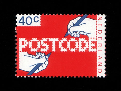
POSTCODE
by nitrada7.55
Click on the stars to rate this FontStruction.
Balanced Rating: 7.55
Average Rating: 7.50
Click for more information about this rating. 26 votes You voted ? for this FontStruction. You may change your vote at any time.
Balanced Rating: 7.55
Average Rating: 7.50
Click for more information about this rating. 26 votes You voted ? for this FontStruction. You may change your vote at any time.
271158713
Published: 6th June, 2008
Last edited: 4th January, 2009
Created: 6th June, 2008
This is still work in progress, a lot of characters missing. There are only UPPERCASE characters available, I filled the lowercase letters with random symbols/patterns. The design is based on this stamp design from 1978 by Gert Dumbar. Use font sizes 64, 128 or 256px. Set leading to 24 (for font size 64), 48 (for 128) and 96 (for 256). More information