Dear FontStructors,
Picking up the baton from Ata, who is taking a well-earned rest after an epic and insightful series of interviews, I thought I would try and find out more about one of FontStruct’s most enigmatic characters: Jiri Novak AKA jirinvk – the creator of multiple extensive series of highly idiosyncratic FontStructions.
Avowedly modular, graphically powerful, decorative and always playing at the fringes of the legible, Jiri’s designs are worked and re-worked through systematic variations determined by some elusive, cryptic logic. Is it possible to divine the nature of this logic? Can we discover its origins? Who is this Jiri Novak? We sent letters East, to Bohemia, in an effort to find out …
The following interview was conducted via email.
Where do you come from?
I was born in 1973 in Litomysl (Eastern Bohemia). Litomysl is a UNESCO heritage site due to the presence of a renaissance castle. The castle is extensively decorated with sgraffito — mostly in the form of envelope-like “letters” consisting of a uniform frame and unique central areas. There are approximately 8000 such sgraffito-letters covering the façade. Perhaps being exposed to this at an early age contributed to my mania for iterations with slight variations.
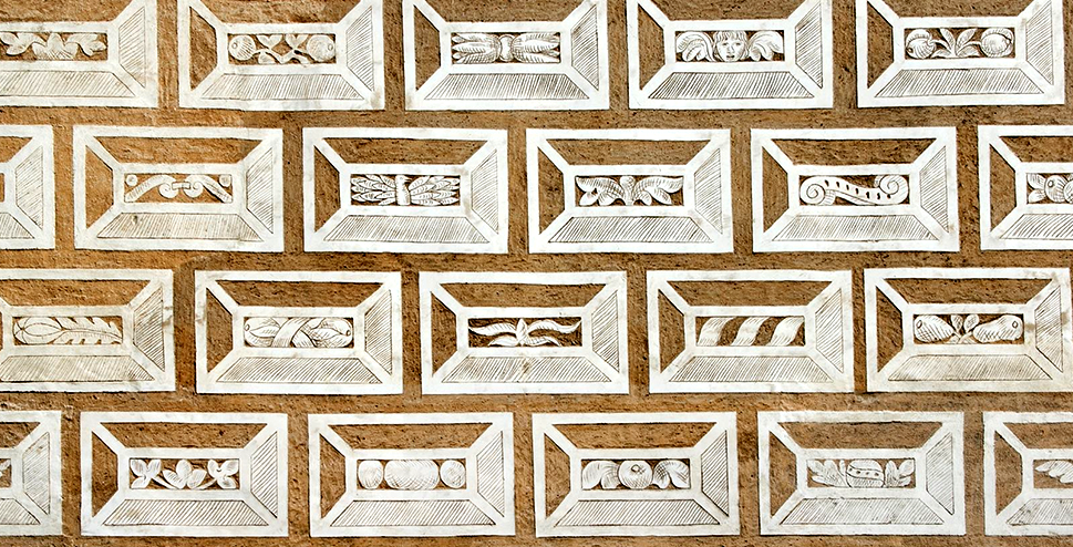
Sgraffitos from Litomyšl Castle façade
Where are you now?
I live in Prague now, but I inherited a small house where my grandparents used to live, in a village near my hometown, and so I regularly go there in my spare time.
In the countryside I have no internet. I can enjoy being disconnected and doing some gardening. I expect to spend my retirement there one day. So, basically I am split between (online, busy) Prague and (offline, lazy) East Bohemian countryside (I like contradictions).
Your designs have architectural qualities. Where do they come from?
I studied architecture at the Technical University in Prague. I left after 3 years, without graduating.
I am still very interested in architecture but I have zero interest in making a living as an architect (and thus I don’t regret not graduating). Finding FontStruct and designing alphabets was a kind of substitute for abandoning designing houses.
What do you do for a living?
After I terminated the phase of my education I had no permanent job for nearly a decade.
I embraced the life of an aimless drifter and was preoccupied with useless activities (e.g. making ornaments, which I am recreating on FontStruct at the moment).
After this irresponsible phase I settled in a menial job in the polygraphic industry (I was operating a folding machine — A machine that folds sheets of paper).
I did this for quite a long time.
At the moment I make my living by selling paints (Selling “colors” — i am quite a chromophiliac, so in a way i enjoy this dull commercial activity).
Chromophilia? You work with colour perhaps more than any other
FS Patron …
If exposed to a complex combination of colors (be it a piece of colorist art, a colorful ornament, or colorful natural phenomena), it (usually) has a strong impact on me. For example, when I attended an exhibition of Raquib Shaw and saw his big format paintings, abundant with colors (nearly kitschy excess of color) I was completely out of my mind, was probably never closer to Stendhal Syndrom then, was almost mildly “tripping”.
Most of the people respond positively to colors (nothing unusual) — I can be (at times) jinxed/mesmerized.
Btw, while doing colorful ornaments on FontStruct I don’t really strive for a mesmerizing combination of colors.
In those ornaments, i use colors rather arbitrarily (color No.1, color No. 2., color No. 3, color No.4) — i.e. an ornament consisting of 4 colors, or of 3 colors, or of 5 colors, etc, etc.
I am doing just a template and expect that everyone will re-colorize those ornaments according to his/her likings.
Do you enjoy your work?
I try to strictly separate my passions and my occupation. I prefer to do as an occupation something that is not mentally engaging (Something I can do on autopilot — with not much mental endeavor) and spare my mental/creative powers for hobbies (I have plenty of hobbies).
I have zero interest in designing something for a client. I have zero interest in aiming at a larger target group and thus making the fruits of my creative efforts sellable — Thus I am absolutely avoiding “creative jobs” within the framework of capitalism.
Please tell us about your hobbies and interests, how they feed into your font design and FontStruct.
Besides making fonts on FontStruct, I am a passionate cinephile. I edit a film database “
Kinometer” (conceived and started by my cinephile friend) and I’m a regular on the
SCFZ cinephile forum. Occasionally I do English subtitles for Czech films. I guess watching a lot of experimental films has an impact on the way I create fonts (multiple-exposure techniques, the insertion of blank frames in structuralist films, etc.)
I am also a fervent visitor of art exhibitions (I am fond of
art brut) and the collages of
Jiří Kolář have had a substantial influence on some of my fonts (and the way I am cutting them into stripes, tearing them up, reassembling them, etc.) Kolář invented or helped to develop multiple new collage techniques – of confrontage, froissage, rollage, chiasmage etc.
I am interested in literature. I actually even compiled
a book (it is in Czech but I
translated the contents into English). In cinema terms, it is a “found footage” (I found the scribbles of a certain lady — viz the noteworthy handwriting — arranged everything into chapters, writing some fragments myself to make the whole story smooth). I also have a great interest in
asemic writing. I would love to make more fonts on the margin between readable and asemic. I wish my fonts to be readable but not with ease.
– I guess all of this is me in nutshell :))
Tell us about your gardening practice.
I try to approach gardening (and also my other activities) with a great deal of irony, I would even say “
romantic irony” (which is a part of “romantic aesthetics” which appeal to me).
I have written about
blackcurrant and
hazelnut harvests in my garden on the cinephile forum I mentioned before – these accounts are allusions to “
Ogawa Productions” such as the
Red Persimmons documentary.
Are you involved in broader creative discourse outwith FontStruct?
I am not really a social animal. I would even say I have certain misanthropic leanings.
However, despite my mild misanthropy, there are of course some people whom I do take pleasure to communicate with.
In such a cases, I tend to chat a lot about films (among my dear ones, cinephiles prevail.)
I am also not completely out of architectural discourse (my nephew is an architect).
But I don’t know any type-designer in real-life, and know only one person who is working as a graphic designer (he occasionally uses some of my fonts in his projects).
My attitude to graphic design is highly ambivalent (almost dismissive) because I perceive it as closely related to marketing (which I despise).
My fonts are thus not rooted in the discourse (or needs) of the graphic designers’ community.
I make font families as if making herbarium, or as if filling frames of a film strip (and I am unconcerned whether any graphic designer will find my fonts useful).
This relates to another outcome of my mild misanthropy: I am strongly self-motivated.
Of course it’s pleasing when somebody likes what i do, but I don’t need positive feedback as a stimulus for further work.
Generally speaking, is your mind at peace or hyperactive?
Whenever I am supposed to choose “either A, or B” I feel that both A and B are valid/relevant.
My mind is very often very busy, but I am also able to switch off (turn on, tune in, drop out) and be at peace.
I am a man of contradictions (I cherish contradictions).
I also have to say that due to my mind being very often very busy I am hardly ever bored.
Even when I am within a situation that could be easily described as boring, being busy in my mind, I don’t feel bored.
On the other hand, in an overly stimulating situation, I can easily get irritated — because those excessive external stimuli might interfere with my bursting inner thoughts.
Thus I tend to avoid situations that might be generally perceived as exciting, and I tend to delight in situations that might be generally perceived as boring (from an external point of view).
Thank you Jiri!
This is a guest post from Ata Syed AKA thalamic and minimum. Ata has been FontStructing since 2008.
For the ninth (and the last) interview in this series, the FontStructor on focus is Aeolien. I shall refrain from saying anything else here except go make yourself a cup of tea (or a beverage of your choice), sit back, relax, and read…because you guys are in for a treat.

Romeao Basel by Aeolien

Tell us your background. Where were you born? Where do you live? What qualification(s) do you have? What do you do? (You can wax poetic if you like)
I was born in Germany, eldest child of a mother who liked to create decorative and useful things, and a father who worked in court until he had to take over his dad’s engineering and manufacturing business. So, I grew up learning about sorting and counting items produced in the family’s factory and later working on the shop floor, and building less functional more decorative structures with a metal construction set. This was great for my kindergarten years as other kids knew usual kids’ games which I didn’t, so we all learned from each other. This development was much to the chagrin of the supervisors who apparently complained to my parents about me being too often in the book corner with technical looking books probably aimed at older boys’ interests, rarely joining dress-up games designed for girls, and for preferring construction toys and train sets. *lol, liberated feminism would have been frowned upon had it been known then* I also learned knitting when I was 4, made paper and card clothes for my doll, constructing her a sitting/dining room inside a huge (for the eyes of a 4-year old) cardboard box for which I built and decorated cardboard furniture and made paper-mâché and plasticine and fabric objects. At the same time, learning letters and numbers and their meaning came easily to me as I liked those shapes and their decorative aspects were perfect for decorating my doll’s house and our dining room with friezes of letter and number shapes.
After a physical accident, these manual activities became an essential part of my physical therapy. Having enjoyed creative thinking and doing for 7 years, I managed to focus on the pleasure of these activities, to push discomfort more into the background which helped me to learn how to overcome frustrating limitations more effectively; finding solutions when an activity was difficult because movements or enabling equipment were lacking, etc. This led me to realise that this new me is like the old one but interested to find workable solutions to problems.
Before the accident I had wanted to become a plastic surgeon — a choice based on wanting to ease the distress and pain I heard discussed and saw during visits of my dad’s friend and his family, people for whom the war (?) continued on a different level. I could see how this man’s life could be less painful, stressful, and lonely with less disfigurement and I planned to help him and all those I saw in a similar situation.
After my accident I also discovered how cruel people can be with someone who has a visible disability. My limitations showed me that I needed a less physical job, but I didn’t want to give up the part of my dream about helping people suffering from this kind of discrimination. I decided to become a teacher and obtained a place at a grammar school. The art lessons were liberating. We all were on the same level of discovery and each work was important to everybody. Art was and is a great leveler, allowing people to expand their minds and stretch boundaries while learning to be open-minded and respectful. I decided to teach art subjects as this kind of self-expression needs intellectual, practical, and emotional tools which are learned and applied more easily and pleasantly in relaxing entertaining art lessons.

Jardin by Aeolien
I started my teacher training at the Ruhruniversität in Dortmund (Rob Meek gave an interview there once). There I met a visionary art student during a student exchange with Liverpool university, married this student of art education, and gave up studies in Germany as their diploma would not have been accepted in the UK. We moved to the UK and I restarted my studies there, which I had to give up just before the end of the course as I was unable to find part-time jobs allowing me to finance increasing course contents, required equipment and materials, travelling to training and teaching locations, and contributing to our living expenses. After operations (surgeries) to reduce my disability, I decided to find a job, save some money, and finance the family we were starting, until my husband could take over.
I became the supervisor of a sheltered printing workshop (ohh the memories!). There I was engaged in preparing and listening to inks and feeling their texture, darkroom work, designing and illustrating booklets and stationery, cleaning up and doing small repairs. Every day had inspiring contacts with the trainees who developed work and social skills at their own speed for their future. Later I opened a shop selling art and craft supplies, gave talks and demonstrations, ran workshops to teach people the use of products and tools.

Kerris by Aeolien
Then we moved to France to help our family on their farm. At first, I had problems adjusting to a very different lifestyle. Nights were filled with sounds I hadn’t heard since my childhood at the edges of Sauerland forests, and after years of living next to a busy road that didn’t rest, I had to relearn seeing real star-lit darkness. My lack of useful French was a barrier. Work was physical which put me at a disadvantage as did not understanding problems with our animals, field work and machinery. I missed our family’s relaxed weekend activities, visiting other family members, familiar sounds. Thankless customers and unpredictable weather increased the stress. But after I had adjusted, I discovered perfect bliss: enjoying a more sustainable natural lifestyle as well as saving a lot of money by not owning the usual numerous—and not always essential—refined, luxurious, wasteful products we took for granted. Great village communities; friendly support and contacts; being with interesting knowledgeable people, meeting no prejudices; clean air and environment; real food grown in the garden and on every windowsill and surface close to the windows; animals in stables and meadows that trusted us; being as eco-responsible as we always thought necessary for Gaia and thus for all humans/animals/plants/water/air. What a precious time for each other is in life, appreciating the time available for hobbies like painting, sculpture, printing, weaving, sewing, and using their products to supplement income.
In short, a dream I didn’t know I had came true in this new social and natural environment. I’m happy that we’re still here, still enjoying this life and the people, even though we’re no longer professional farmers and our families live abroad.
As I had learned French at school (of which I had retained only basic words and grammar *blushing at this admission* resulting in the most important job interview of my life being conducted mostly in English and German) I found employment in a day activity and training centre for adults with quite severe intellectual, social, and occasionally physical, impairments. My own disability gave me the advantage to understand the depth of the problems the participants and their families faced which enabled me to find many personalised solutions. I was employed to help people develop through creative activities: to improve manual and social skills, to gain respect from others and be respectful, to develop self-confidence and pride in who they were, of what they achieved. Most of them, and their families too, had spent their lives in the shadow—similar to what my father’s friend and his family had experienced—and what my own family discovered when they heard about bullies at my school and on the walk there and back home. But this time I could make a difference for the people in my groups and their families.
I did get a diploma in the end, in France; not as a teacher but as state-registered medical-psychological educator in the social-educational sector. I discovered that reducing anger and frustration through art and other creative activities worked for everybody (even my colleagues occasionally joined with their groups when group behaviour became unstable). Helping to exteriorise feelings they couldn’t talk about, creative activities relaxed people and disarmed risky situations. Over the years most had learned that when stressed they could retreat into an unoccupied art room, work through their crisis with items they chose until they felt ready to re-join their group.

Architechdoor by Aeolien
I used what I had learned as an art student and future teacher, to build pride in who they were, to show that each person has something special and beautiful to share with others, to give self-confidence in their abilities. Without teaching literacy (that wasn’t my brief) people learned to recognise their own name—often even when written small—and sometimes when I used different lettering styles. I drew unadorned simple outline letters of a person’s name on card which they coloured in according to their wishes. They discovered the aspect of I’m a beautiful person after having decorated the letters of their name, which I cut out, with items they chose from our feel-and-dream treasure chest filled with a vast collection of decorative smaller materials and objects. The name is the person and a beautiful name (in this case a cut-out decorated set of letters) shows a beautiful person.
As our staff office had a computer, and my family had computers, I had a large collection of font styles on cassettes, large floppy disks and later diskettes (Remember them? They made a strange click and sliding sound when the computer’s reader opened the protective metal cover on the housing) and I used many different fonts not for distributing information but as decorative elements for art and other (creative) activities.
After an accident due to an unstable crutch, I had to retire from the work I loved long before I had expected to take my artistic interests and creative work to the next level in my retirement.
To help me deal with this drastic change in circumstances I wanted to do something creative that could express my current situation and interests, new experiences. I remembered the importance of the decorated letter/name work to build people’s self-confidence and pride to be as they are. Thus, I returned to my computer font collections and made A4 size lists to look like posters or drawings, arranging items linked to daily changing aspects of my life, things that pleased or worried me, to assemble into an area of shading that created an interesting, attractive image containing things I was grateful for and things I had to deal with. But I soon tired of these computer fonts which didn’t really look like they had a link with what I wanted to express or were relevant.
So, I decided to make my own fonts. The internet took me to many sites that sold programs I couldn’t afford or programs that looked too complicated to be inviting. I then discovered sites that allowed font design online, but almost all were too rigid or too simplistic, not allowing me the flexibility I needed for the shapes I made with these image-lists of words. Trying these many sites, I finally discovered one that looked simple to use yet allowed thousands of possible shapes with which I could communicate. FontStruct entered my life and has never left.
Wow, Aeolien. What a difficult journey you’ve had through life. Your perseverance is inspirational though. I think we all need a little breather after hearing your story.
When designing fonts, what process does it take for you? Does it change from font to font?
Every font I make has a reason. Sometimes because I was asked for a special font, but usually there is an event whose feeling or nature or importance to me or my family I want to express, or there might have been an idea I need to illustrate by way of working through its impact on my or my family’s life. Sometimes I want to make a very personal present for somebody, and I’ve even made fonts based on just a few glyphs I liked (Petit Biscuit).
When my font has to have a specific structure (a font of a specific style was asked for, whether it’s for someone or to sell; or I want to take part in a FS competition) I consider the information I was given to be visible/transmitted by the font. When the font is for someone, I do some online research regarding a specific theme I might have to work to, then I sketch the letters for the well-known Handgloves which I show to the person (or client). I do many sketches to get the desired look, then I sketch the complete alphabet and numerals, to be discussed and refined when necessary. When the design is accepted I start work in the FontStructor.

Charm Spell by Aeolien
When a font is based on an event my family or I want to express I usually work directly in the FontStructor with the basic bricks collection, often redesigning lines or shapes until they fit the event or situation, as I might have just one or two trampoline glyph shapes to inspire and guide the whole font.
This same method applies to fonts that clearly or obscurely illustrate something I experienced, something that moved me. However, such a font is less refined in shape and line, more sharp, raw, and it tends to have only the necessary glyphs for English text.
Creating a font is a highly personal, even emotionally involved, process when it is for my family, friends, myself. When creating a font for someone else I’m quite objective, less attached, and the font is more neutral to suit ordinary informative text.
How does designing font help you? What frustrations do you face during the process? How do you overcome them?
Whatever the reason for creating a font, most of the time I find it relaxing to immerse myself in the arrangement of bricks, transporting an idea or feeling into a structured grid system, and to experiment with various shapes until some combine to give the right edge and surface to a glyph. Creating different glyphs, especially those whose shape can’t be copied and slightly manipulated into a new glyph, is almost like meditating, stepping outside of myself and experiencing a kind of existence of a brick, of the line I create.
Giving visible shape to an idea or feeling is quite amazing—even though such personal, even private, expression of something ethereal or esoteric leaves the creator vulnerable. I assume this is the result of working from an art rather than a utility base.
Designing fonts, whatever their style and reason, is my instant-creative-activity. I often feel an inner tension, a deep need to be creative like there is an energy that needs to get out. That’s especially noticeable when I have many things that need concentration. FontStruct being modular allows me to place and move a brick shape—watching it doesn’t add stress, assembling several usually has a calming effect—and after an hour or so I have the makings of a font. I FontStruct the stress out of my system.

Circle2Ribbon by Aeolien
But too often I have neither the time nor the environment to use a complex technique to create something that hasn’t existed before.
Setting up a weaving loom, preparing a sewing project, is time consuming. Drawing, painting, printing, paper crafts have their own challenges and need preparation and the correct environment. Often this reduces spontaneity and adds analysis which I learned first-hand can reduce a good idea to dust, even when there were precise inspiration and necessary skill.
Creating a font can be prepared quite easily using a computer and can be done at any time day or night, whether alone or in presence of people.
Occasionally I’m inspired by an image, an object (like an every-day traditional French Biscuit which suddenly becomes intriguing…), a piece of music or a memory (Emlék). I don’t often use a note pad or sketch book where a doodle or description inspire a design.
The font’s name is Hungarian, it translates as memory or souvenir or remembrance.

Gift for Aeolien’s mother by a Hungarian doctor (Emlék by NightPegasus —not shown)
This folder was made for my mother who worked in the reception offices of a soldiers’ first treatment institution and therapy hospital during the war, in the town of Eickelborn; she was being trained, supervised and encouraged to be a typist and office organiser by a Hungarian doctor who was a prisoner of war and who acted as a nursing auxiliary and a translator, apparently he actively protected her against aggressive patients and abusive superiors/administrators. My mother had problems coping with the stress of seeing and hearing the many physical and mental problems of the soldiers and observing as well as suffering herself from awful behaviour by some of the high-ranking officers who administered the hospital.
The folder was made by this doctor to thank my mother for her support of the more badly injured soldiers and for sharing food, clothing, objects, her free time and needlework trained hands, to help the soldiers and the prisoners.
The folder also was meant to remind my mother that human kindness, an open mind, willingness to listen and learn, caring for Life in general, are so easy to give and are needed to survive specially when the environment is filled with danger and negativity.
She said that she survived this awful war time, some terrifying hospital administrators, the sadness of being unable to help those in great need of support and health, because this doctor gave her the courage to keep on living …
She used the folder for her correspondence and to keep her favourite family photos and mementos, until she had to give up her house and move into a medical care home last year. I asked my siblings for this folder after my mother died, as for my mother it meant strength and survival in difficult times, build a good future on what was good in your past.
This folder reminds me of my mother, and of the person who helped her to survive.
Compared to my other creative hobbies I find creating a font gives more wide-ranging possibilities, and I can enjoy planning and creating even when I need bedrest. Features like nudging made glyph shapes possible that I have carried in my mind for ages, brick stacking and composites give fabulous effects to otherwise run-of-the-mill fonts.
Frustrations? Oh yes, I have those. Mostly they are based on the look of a font or my manipulation of the building bricks (subjective). And occasionally based on what I find to be missing practically (objective) for my comfort (I sometimes wonder if that’s a sign of impatience or lack of understanding a glyph or simple laziness)
Many if not most of my fonts have a normal structure because they were made for (slightly decorative) information or conversation texts, so there are frustrations based on being slow to find the most suitable style for my needs while maintaining one specific quirk or decorative addition; or I can’t achieve the desired look with filters even after testing ideas and inserting stacked or composite bricks. In fact I may have just two fonts that use filters: I can’t get to grips with this feature and am always dissatisfied with the outcome after investing time, thought, patience and many cups of tea.
Sometimes it’s tiring to move or remove bricks that are in the wrong place, specially if I hadn’t seen this problem before multiplying such a mis-construction. It’s a break in concentration, and if I have too many badly placed/chosen bricks I tend to stop for a day or even a month, gain distance, hopefully discovering a solution and recharging the creative batteries if my life while far from FontStruct and doing the washing-up, shopping, weaving, inventing my next dress or plastering a wall…and then I have enough distance from the frustration of seeing this bad area and I can start working on improving it (yes, I detach myself from the font to be more objective, more efficient in the search for a solution, more open to untested alternatives, less frustrated by my lack of attention).
Occasionally these new shapes, lines or areas are different in look and message from what I had started out with, and I copy them into a font my alter-ego clones to work with.
Any other frustrations are based on the program, or bricks/stacks/composites which I can’t get to look right along an edge. Or I unknowingly slipped away from my design brief which makes the font look untidy with incoherent glyph shapes – this takes a long time to correct and I don’t always have the time nor the patience to work out some alternative. Extra frustration comes along if I wanted to use the font just after making it for a special project and this developmental problem stops me using it, slowing down whatever work I should have or wanted to do.
On some occasions my frustration is based on not being able to erase a single diagonal line of wrong bricks inside an area of wanted ones. Recently I was frustrated by the 4×4 base for composites as I would have liked 5×5 squares.
Another frustration is linked to the kerning. I can kern Basic Latin and More Latin glyphs; anything on the other Latin-based bands is out of scope as I rarely have those glyphs available in the computer’s font list. To get one of those glyphs I would have to type the U+**** code which in the font preview panel (for kerning purposes) gives either nothing or a normal Latin letter.
Life and FontStructing would be easier if any kerning instruction on the Basic band could be copied with the relevant glyph(s) and attached kerning values, into another Latin-based band.
What are your thoughts on the FontStruct community?
People like Frodo, P2Pnut, Elmo were the first ones to carry me along on a wave of encouragement and praise for the strange things I published at the beginning when I simply enjoyed messing about with bricks and having something fun to show for the time and effort I invested. Their gentle pushing me forward with comments and advice made me want to create more, be more adventurous, get familiar with advanced functions and features. And I was, still am, surprised and impressed when one of our many experienced members sees a rule I apply inside my font according to my design brief, and can indicate where a change to a line, position of a brick or tweaking of a whole glyph might add to the impression the font gives and to the pleasure of seeing or reading the whole font, without breaking the feeling of the Whole.
Many other people, too, are willing to share knowledge, discuss problems and solutions, exchange useful information. From the “old” group I remember p2pnut who had amusing comments as well as gave gentle coaching when he thought something wouldn’t translate to successful off-set use (possibly because we had a lot of work experience and skills in common); a lot of useful information from TCWhite clarified glyphs and allowed me to add correct glyphs for African and Native American languages; Winty5 made me smile with upbeat comments and enthusiastic fonts; Goatmeal inspired some of my pixel fonts (Aelies, Gameao halb); jirivnk’s experiments with overlays in his fonts are inspiring in their complexity and invite pure decorative modular shapes (although Floraeolien is far from his controlled shapes).
Some newer members impress me with their patience, enthusiastic help and fonts. Dmitriy Sychiov (valuable advice for my Cyrillic glyphs) who adds Cyrillic support to many Latin-based fonts created by members, adheres completely to the original design brief; Echo Heo (bluemon) doesn’t shy away from unusual shapes; Greenstar967 shows tenacity and great Unicode knowledge; Zephram shares quirky designs that are occasionally the starting point for one of my more decorative fonts.
In short: FontStructors are people who like to help, encourage, and enjoy sharing technical knowledge and discoveries as much as using wild phantasy to astound. The open feed is a showcase of how a great community supports its members, personal messages tend to be informative and equally respectful of members’ personal situation, knowledge or need of advice.
I wouldn’t be as present nor as courageous with fonts and observations etc. if our community was disinterested, exclusive or unpleasant. I’m here because I feel that I have something worthwhile to contribute and that people appreciate my few contributions.

Lineabox by Aeolien
Thank you for your honesty, openness and insights. I, for one, feel richer in my outlook having gone through your interview. I am sure others will have similar responses. It is good to have you around FontStruct, Aeolien.
Thank you Jutta, and Ata, for another fascinating interview!
This is a guest post from Ata Syed AKA thalamic and minimum, the eighth in a series continuing the “Focus on Fontstructors” tradition of interviews with members of FontStruct’s design community. Ata has been FontStructing since 2008.
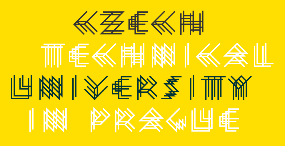
Our eighth FontStructor is one who needs no introduction. We are all here because Rob Meek had the vision and wherewithal to establish FontStruct, back when Flash was the website king. It is the fruits of his labor we enjoy oh-so often. Without him none of this would be possible.

FontStruct logo by Rob Meek; Rob Meek picture FontStruction (tm Meek)
Where were you born? Where do you live? Is that your ideal place to live? Why?
I was born in exile, in a house on an island drifting off the coast of Europe, the youngest of four siblings.
Now I live in a flat in Berlin in Germany. I don’t know whether it’s ideal, but I feel lucky to be able to live where I live.
What is your educational background?
All my formal education was in Scotland. I studied English Literature and Film at Glasgow University, then later a post-graduate course in Electronic Imaging at the Art School in Dundee.
How did you get involved in programming?
I was fascinated by computers from an early age. In my mid-teens I inherited a small amount of money and used it to buy a BBC Micro Model A – a wonderful 8-bit computer of a type which inspired an entire generation of UK programmers. I still have it sitting on my shelf. It was my first, perhaps my only, profound hardware love. It had 16K of RAM, 8-bit colour and storage was on cassette tapes. You had to solder your own cable to connect computer and tape recorder. At that time, there was very little software available. You could buy a magazine and type-in programmes yourself, or write them yourself from scratch, which is what I did.
How many languages do you speak? How many languages do you speak if you include programming languages in the mix?
I speak English and German, and meagre smatterings of a few other European languages. I don’t have any innate linguistic talent. Like many people from the UK I came out of school with very little apart from a fear of speaking French, but I really love trying to learn new languages now – I’m currently doing a night-class in Latin. Best night of the week!
I’ve used many different programming languages over the years. I couldn’t really count them. I think it’s enriching to experience the world through the filter of different grammars and vocabularies, in both domains: human and programming languages.
How did you get involved with typefaces?
I didn’t have the slightest clue about typefaces or graphic design when I first came to Berlin in the late 1990s. I got a job working as a developer at a multimedia agency and quickly realised that I wanted to sit with the designers. I didn’t see myself as an engineer, and the designers just looked cooler. Also, they always seemed to get the best seats in the building – at the top, nearest the light – as if they needed sunlight for screen design.
Once I’d made the move, and I saw what the trained designers around me were doing, slowly it dawned on me how central this typography thing was to graphic design. For the first time, I also encountered people who actually made their own typefaces, and I had my first encounter with font-creation software in the form of Macromedia Fontographer. Pixel typefaces were also very big at that time, and I was drawn to them, to their systematic nature, and to grids, matrices and modular typefaces generally.
In 2001 I made the first of a series of typographic software synthesizers for modulating matrix-based fonts as if they were sounds, using an array of virtual knobs in a synth-inspired GUI. I’ve done other things over the years as well, but there’s quite a direct line from this synth series to FontStruct.
Can you tell us the story behind how you came up with the idea for fontstruct and what it took to deploy it as fontstruct.com?
The MEEK series of typographic synthesisers which I created between 2001 and 2007 were fun experiments, but ultimately, they were artworks and playthings. They were a bit like an extreme version of the filters palette from the FontStructor. You could filter and play around with existing fonts (and even create sounds with them in the case of the last version of MEEK FM), but you could not use them to create complete original designs. Part of the motivation for creating FontStruct was the wish to go beyond experimental toys, and to develop a genuine, creative tool for creating matrix-based fonts from scratch.
I also sensed the potential for a cloud-based digital font design platform. In the mid-2000s a first wave of browser-based design software was appearing: attempts to reproduce Photoshop and Illustrator in the cloud. Most of these ambitious projects failed and disappeared over the next few years, but I thought that font design, due to its relatively constrained nature and the small data payloads involved had more potential for success in the cloud.

An image from the original FontStruct proposal by Rob Meek
Further inspiration for FontStruct came from existing projects, such as Büro Destruct’s Designer software, and later I also discovered BitFontMaker which had related ambitions.
The final, crucial ingredient was my relationship with FontShop International and the people there. FSI has since been taken over and what remains of the company is barely recognisable, but they really were a very special organisation, founded and led by people with a real passion for design and typography. Every type business, indeed most businesses, will claim to be somehow driven by passion but in the case of FSI this was absolutely genuine.
I’d already worked on several projects for FSI, as a freelance developer and designer, and in 2007, after months of deliberations, I finally developed the FontStruct concept and pitched it to the FSI Type Board, which included Erik and Joan Spiekermann, Erik van Blokland, Stephen Coles and Petra Weitz. They green-lighted it almost immediately, and I will always be very grateful for that.
It would be great if you can talk of the programming aspect of getting FS going, how the UX/UI decisions were made, what functionality to add or leave out choices, etc.
I’ve written about some of the more unusual technical aspects of FontStruct – especially our use of the niche programming language Haxe elsewhere. Aside from that we use fairly conventional and unglamorous web technologies. FontStruct has certainly improved, technically, over the years but the budget is very, very low so we have to be pragmatic and patient, which can mean tolerating minor bugs and flaws for a long time.

MEEK FM synth series project on vimeo
In terms of UX and UI, the primary goal was always to keep things as simple as possible. Professional font design can be extremely technical, and desktop font design software intimidating – that was certainly my experience when I first tried using Fontographer, for example. With FontStruct, I wanted to enable users to simply build letters on virtual squared paper, without seeing or needing to understand specialist terms such as em square, postscript, character map, right side bearing or even Unicode – These are important terms and concepts for professional designers, but I wanted to protect beginners and just let them make letters.
As we’ve added more features over the years, I’ve tried to keep the focus on simplicity, and hide the more advanced functionalities, at least until the user presses the Expert switch. Sometimes I wonder whether the Expert button needs to be rethought, and a Guru level added with the most technical stuff in it. I don’t know. A lot of hesitancy about adding new features has been to do with this wish to keep things simple.
One feature which is regularly requested but which I have intentionally not implemented is any form of import, or auto-tracing functionality. It’s really great to know that all the designs on FontStruct originate entirely on FontStruct. This means fewer worries about licensing or copyright issues.
I know it is not your style to toot your own horn, but I think most of us would appreciate it if you uncovered some of the struggles keeping FontStruct going.
You’re right, I’m not an eager horn tooter – like you I think! But so far, it’s really not been a great struggle to keep the project running. Of course, when the site first launched, we had a proper budget, and other great people were helping out, such as Stephen Coles, Gustavo Ferreira, John Skelton and others, so it was a bit of a shock when FontShop reduced their involvement, and then later Monotype also. But that was more of a personal problem: the sudden need to find new ways to pay the bills. I’ve never felt that FontStruct itself was under any kind of existential threat.
The code behind FontStruct is reasonably efficient and stable. In the early days, perhaps you remember, things were constantly at breaking point, but now the site very rarely goes down of its own accord. The baseline running costs are really quite low, so we can survive with very little revenue. We have some steady income from advertising, a generous sponsor (GlyphsApp), and of course, starting this year, we also have the contributions from our wonderful patrons. All of this covers the server and storage costs, and there’s even some left over for actually doing work on the site. It would be great to have more cash of course, and to be able to employ or contract others – a UX designer for example! – and maybe develop some things more quickly, but generally I like the pace of things as they are.
Not only going, but growing FontStruct under the constraints you have to work with, how do you find the time and energy to keep up this progress?
Two things. Firstly I simply enjoy it. There are a lot of challenges presented by FontStruct and it’s design community which I enjoy trying to solve. The programming side of running FontStruct, especially developing the font generation library and the FontStructor itself are just plain fun for me.
Secondly, the FontStruct community genuinely inspires and encourages me to keep going. The commitment of the patrons is a huge motivation. I’m never programming into a void. If I add a feature, the feedback is immediate, and usually constructive and encouraging. Also, because I’m mostly the only one involved behind the scenes, work on FontStruct is very relaxing for me. There are no meetings, no real deadlines, no pressure to make money, no conflicts with co-workers – I have these things in the rest of my life, so FontStruct is a refuge in that way.
Working as mostly a self-employed person, how do you manage time? Do you do most of your work from home or do you have an office you go to? Have you set up defined start and end of day timing wherever you work? What structure have you given to the balance of work and not work? In other words, how are you so disciplined?
I’m not a model of productivity, and I don’t think I’m especially disciplined – I simply enjoy my work!
For me personally, a key to being productive is not to maximise the quantity of work time, but its quality. I’ve noticed that I can only do a maximum of about five or six hours a day of high-quality work – and then only in the mornings and up until around mid-afternoon.
So, I usually start working around 9 and finish around 4 at the latest. I also have one day in the middle of the week when I do something other than design and development, and I try not to work at all at the weekends.
Since I (mostly) enjoy my work, it’s hard to stop or take breaks from the computer sometimes, but taking those breaks, and working fewer and shorter days seems to be really beneficial in terms of productivity. Of course, I don’t know how far one can take this less is more approach!
One genuine productivity tip which has worked dramatically for me is a dietary one: Cut out all sugar in the middle of the day. I used to think it would give me energy. Now I know that the very opposite is true.
I have used shared offices, but I’m lucky enough to have sufficient space at home at the moment, and there are fewer distractions here – I’m not good with other people’s noise.

Rob Meek, working
What kind of music do you like? What kind of books do you read? Who are your favorite musicians and authors? In your opinion, what is the importance of being well read?
Right now, I’m listening to British and North American folk music – I like the female voice and harmony singing, and the fiddle – e.g. Women of Folk.
I’m currently reading A Man in Love by Knausgaard – the second in his series of autobiographical novels. I’ve never felt so close to another consciousness.
If I stop reading regularly – I mean proper reading, of long and challenging texts – and I have stopped at times over the years, I notice my mind becoming dull and flabby. Reading works for me, but I’m sure there are other ways to stretch one’s thinking. I think however you try to stimulate your mind, it should be pleasurable, and not only about self-improvement goals. Reading is more important than aspiring to being well-read (a shifting and unattainable target).
Did you design the FontStruct logo font? If not, who did?
I designed the logo. It was one of a few candidates. Obviously, there is quite a big reference to the old FontShop branding with the colour choice. I think it’s aged well enough.
The definitive FontStructed version is Structurosa from Paul D. Hunt.

Some of the early FontStruct logo concepts by Rob Meek
Let’s talk about some FontStruct stats. For example, can you tell from how many countries does FS have registered users? Who has published most fonts? Who has created most fonts (published and unpublished combined)? Who has commented the most? Who has received the most comments? Whose fonts have been downloaded the most? And anything else interesting that you can think of.
We have registered users from at least 226 different countries.
The top 5 countries in terms of registrations are the USA, UK, Brazil, France and Canada.
Patrick H. Lauke AKA redux has published the most FontStructions: 936
Regarding whom has created the most FontStructions: I probably shouldn’t say. I can say that they’re no longer active on the site (they were a lot of fun while they were) and they created well over 9,000 FontStructions!
Elmoyenique is the most prodigious commenter, with over 4,900 comments. He’s also the FontStructor who has received the most comments on his own designs.
The most downloads are of FontStructions published by: geneus1.
A couple of other stats:
1,979,690 FontStructions have been created in total, of which 71,590 (3.6%) are public – so there is an iceberg and a tip of it, although there are many empty and almost empty designs, and plenty of clones in there as well.
Of the public FontStructions, 92% contain a capital A, 46% an @, 46% a $, only 11% a €, 11% a £, and 9% a ¥.
Being so closely connected to the world of typefaces, what do you think is going to happen for typefaces and fonts in the near future? Far future?
How about semantically variable fonts, or semantic ligatures? The glyphs adapt expressively according to the shifting meaning of the written text.
Technology, machine learning, and AI — in your opinion, what do you think will be their impact on typeface design?
When I hear someone use the term AI, I feel nauseous. I don’t want to think about it!
I guess ML could be used for extrapolation work: You design a few letters and ML will do the rest.
Ultimately, I’m more interested in human craft and imperfection. Let the robots learn to sweep the streets, and sort the rubbish if they must. Leave the fonts to us!
What has been the most surprising positive aspect of FontStruct for you?
Many surprises, and many positive aspects. Above all, I never imagined that so many people would create so much, and reach such dizzying heights of sophistication in terms of modular font design. Working on the original concept 14 years ago, I was thinking only in terms of a tool for simple pixel fonts, and small, classical modular designs. The FontStruct community has taken things so much further, to the point that I usually have no idea how any of the leading FontStructors are able to achieve what they do. I stand before the gallery each day and hang my jaw.
Also, it’s been amazing to occasionally discover the influence which FontStruct has had on lives: For example it’s gratifying to hear from designers who discovered themselves and started out on their careers through FontStruct; even some leading type designers, such as Erin McLaughlin, who took some of their very first typographical steps on the site.
Finally, given that it’s an English language site, with a bit of bias towards the Latin script (I’m slowly working on that!), I love the fact that we have designers from every corner of the world sharing and discussing their designs on FontStruct.
How has FontStruct changed your life?
It is my life! Or at least an important slice of it.
Talking to the users of FontStruct in this oblique way, what is it that you would like to say to them?
Thank you! Without your effort and skill, FontStruct would be nothing but a dead pile of bricks. It is you, dear FontStructors, who built this strange and beautiful place.
All I can say is: Long Live FontStruct™
Thank you Ata, once again!
This is a guest post from Ata Syed AKA thalamic and minimum, the seventh in a series continuing the “Focus on Fontstructors” tradition of interviews with members of FontStruct’s design community. Ata has been FontStructing since 2008.
Psychology 101
What is the psychology of art? Is it the same as the psychological effect of art? We have no better person to explain it than our ever-genius, Gene Buban, better known to all of us a Geneus1. Let’s focus on this FontStructor and Gridfolk him.

G1 Radia by Geneus1
The Psychology of the Self
Perhaps how a person sees themselves is an indication of how they see the world.
Tell us a bit about yourself.
Firstly, I don’t like talking about myself. But I’m opening up here in order to start sharing myself with the world, and specifically the FontStruct community… and because Ata is doing the interview, and is doing an incredible job.
I was born and raised all over the San Francisco Bay Area. I grew up playing video games. I grew up immersed in hip-hop culture, especially breakdancing and graffiti art. I grew up loving and designing experimental letter forms. I grew up using computers to maximize creativity. I grew up with comic books, which inspired me to draw. Releasing cinematic fonts based on new superhero movies was my way of expressing the joy of seeing my childhood heroes coming to life on the big screen. After all these years, the impact of all of these things continues to grow for me, as if I haven’t grown up.
Where do you live and work?
Vallejo CA is in the northern part of the San Francisco Bay Area. In March of 2020, I was in a meeting to talk about the transfer of ownership of one of the longest running virtual reality centers in the US. By June, the physical location was permanently shut down, ending a thriving creative community. This made me more grateful for virtual communities, like FontStruct. The COVID shutdown also forced me to look inward to discover what I want to do in this new reality, and who I want to be. I’ve held roles such as Computer Graphic Specialist, Tech Support Manager, Freelance Graphic Designer, Music Video Producer, Mortgage Office Manager/Trainer, Community College Webmaster, and Virtual Reality Evangelist. But I’ve never accepted the identity of artist, or even font developer as professions. In 2021, this has been, and continues to be, a major part of my evolution.
What kind of education and training do you have?
I have no formal training in font design. In the early 90’s, I entered San Jose State University at the crux of the vector font explosion. I have a degree in Computers in Art, Design, Research, and Education (CADRE) with a minor in Psychology. Many projects involved psychological perception with my passion for graffiti art. My senior project was an interactive art gallery with a top-to-bottom graffiti mural that immersed viewers into the letters as they walked in.
In the recent years, I went back to school to learn coding in C#, Java, Assembly language, etc. After leaving school, I discovered node-based programming on my own and wondered why the hell this wasn’t taught in school at all? For visual artists, nodes are definitely the way to go for game/app development.
In 2018, I began training in Virtual Reality Development in a San Francisco workshop. My project was awarded Best in Class, for my game, Tetrisyde—an escape room game based off the font I created in FontStruct.

Tetrisyde by Geneus1
In 2021, I was chosen with six other multicultural artists to create public art sculptures in the city of Vallejo to represent diversity. The call for artists was seeking 2D artists that were interested in learning to create 3D sculptures in a collaborative environment. Last April, I was fortunate enough to have my work selected by the official judging panel. My sculpture, called Peace 2.0, is a multi-dimensional upgrade to the peace sign that contains the word peace in twelve different languages in phonetic English, and utilizes a font that I created in FontStruct—which I released on September 30th, the day of the official sculpture dedication ceremony. This has been one of the most challenging and enlightening educational experiences as my introduction to sculpture in the public art world.

Peace 2.0 by Geneus1
School isn’t the only place where I receive my education. In the world of technology, change is the only constant, so being autodidactic is what serves me best to create with newly invented creative tools.
What do you do in everyday life beyond FontStructing?
I don’t like reading, but I love learning, so I read because that’s how I learn.
Most things I like to do have to do with making or creating forms of art. Art, music, and dance are the same things to me. Painting is art for the eyes, music is art for the ears, dance is art for the body. Even cooking is art for the palate as well as the eyes and nose.
I love cooking, but I’m very selective since I only eat one plant-based meal a day.
I like all forms of dance, and have performed Hip-hop, Salsa, Swing, Tahitian, African, and Contemporary dances, but breakdancing is still my passion.
I like all forms of art, from painting to sculpture to animation, but graffiti art is still my passion.
I like singing drunken karaoke, but I have a passion for singing Italian opera. I mean, it’s not good, but I love it. Like wildstyle graffiti, I don’t have to understand it to know it is beautiful.
Upon discovering bodyweight calisthenics, I’ve abandoned the gym and created what I call, bboy calisthenics. In conjunction with exercising my creative muscles, I’ve been an active member of the Year of VR Art 2021 challenge, where I create one Virtual Reality painting each week. Last year, I became a World Champion VR Athlete after competing with an international team of gamers in a VR game called SkyFront, where we dominated the entire 8 weeks of gameplay. Currently, I have an obsession involving fractal based algorithmic art and node-based graphics programming
This is all art to me. Creativity flows the same whether it is in painting, music, dance, or font design.
The Psychology of FontStruct
Does artistic expression change with what you choose to express it with? Or does the need to create art remain the same no matter the medium?
How did you become interested in type and typography?
In fifth grade, I had the worst handwriting in class, so my teacher made me write pages and pages of sentences to improve my penmanship, like Bart Simpson writing on the chalkboard. In sixth grade, I took a calligraphy class and became interested in learning as many styles as I could. Always having an affinity for loud, gaudy display typefaces.
While in high school in the 80s, graffiti came on the scene and it became like typographic liberation, as it represented free-form letter design that displayed styles that were indicative of the artist themselves. Each graffiti artist’s name drawn out became a new self portrait. As with breakdancing, I feel graffiti art chose me instead of me choosing it. In breaking, I needed to know all the moves. In graffiti, I needed to know all the styles. This pattern is still evident with my FontStruct library of fonts where you’ll find every design category covered.

Graffikki by Geneus1
What were your first experiences with typeface design?
In 1989, I began working for a video software developer that made character generators—the titling software used in video production studios. The term desktop video became synonymous with the Commodore Amiga computer, which was our development platform. Because our users were all over the world, we needed fonts that had international character sets to support many languages. There were no scalable fonts at the time, so part of the job in the beginning was to edit pre-sized bitmap fonts in preparation for this new thing called anti-aliasing, that smoothed out the edges of the blocky bitmapped fonts which was mandatory for professional video typography. There was a program called Calligrapher for the Commodore Amiga computer that edited bitmap fonts in up to eight colors. I was enamored with its capabilities. Outside of work, I began to create experimental typefaces mainly to be used over video.
In college, I specifically remember the point where I knew I wouldn’t pursue a graphic design major at San Jose State University, when the head of the design department said, “You only need four or five fonts.” I thought, “This person is crazy.” I think I bought Altsys Fontographer for my Apple Centris 660AV out of spite. What followed was a plethora of terrible, terrible font designs.
What other work on FontStruct do you especially admire and why?
Beate’s work has a consistent professionality with each manifested font, with an iconic signature style that is unparalleled.
Thalamic/Minimum. Many thoughtful typographic explorations. But mostly thalamic, that minimum guy is just trouble.
Kix. Fellow graffiti artist with myriad styles.
Elmoyenique. Font Making Machine and Humble Maestro.
Frodo7. I align with his complex experimental expressions as they’ve influenced my own creations.
Funk King always felt like he was having more fun than anyone creating his prolific library of fonts.
Four is particularly inspiring as he is doing things that I would like to be doing personally, with having gallery art shows and involving his typography with his artistic creations.
Honestly, I’m actually inspired by all fontstructions, especially experimental ones. For me, one unique letter can often inspire an entire alphabet.
What are the aspects of FontStruct that make it appealing to you?
It’s fun. It’s easy. Like a good video game, it is easy to learn, but difficult to master.
The limited grid structure makes it easy to create, but also reveals an immediate demarcation of limitations where I like dwelling on the fringe.
A common theme I seem to follow is, “Limit me and watch me thrive.” I mentioned eating one meal a day, and for some it would be difficult, but intermittent fasting has normalized for me, so now it is easy to the point where I’m not limiting myself. Similarly, in FontStruct, the grid no longer is a limitation for me, but a playground.
What would be your recommendations for improving FontStruct?
The software: I would like the ability to import custom SVG bricks.
Also, folders for storing categorized fonts or families can help with organization.
The FontStruct Marketplace: I think the creative output of fontstructors rivals or surpasses the ingenuity showcased by official, professional font vendors. A marketplace where fontstructors can sell their creations would be commercially viable. I would call for a collective of professional fontstructors that collaborate to create typefaces ready for public consumption. Yes, the guy who doesn’t share himself is calling for the best in the community to come together.
The FontStruct Community: Part of improving the FontStruct community is happening now. All involved with sharing themselves in these in-depth interviews humanize the creative font-making process, where we can read about others and see ourselves in their words. Of course, not in reading my case, obviously.
What is needed for the improvement of this virtual community, is what is needed to improve actual, local communities. Support, uplift, and encourage others. Share your technology for making something better.
We’re developing a new consciousness for a new reality. Make it better where you are. Make the communities you are a part of a better place. It’s a process of integrating virtual and local communities.
It’s time to be more creative in what you manifest, and how you solve problems. Imagine creating artistic fonts that inspire, elevate, and even heal.
Weaver by Geneus1
The Psychology of Philosophy
The thoughts behind the actions are perhaps as important as the actions themselves. What gets us going?
All things require some skills to achieve what’s desired. How does one gain the requisite mastery?
Get back to basics. Discover and develop your own process of creativity. Know your process. Work your process. Visualize. See your work for what and where it is, then see it for what can be. Analyze and adjust. Improve and evolve. Anthony Robbins teaches CANI or Constant And Neverending Improvement. Developed from the Japanese term kaizen. I believe in these terms, but it also hinders me, because I sometimes withhold creations because I think they could be better.
Always A Student is a term in the hip-hop community that I have always identified with. I’m usually in the mindset of a student seeking to find answers, usually answers that stem from new ways of addressing solutions to a problem. But I don’t really consider myself a master. My methodology is more Salieri, than Mozart. Whereas Mozart was able to play his music forward, backward, and upside down, I create fonts like Salieri building one musical note at a time trying to find what options work best for me. I go through multiple variations of many letters before deciding on final versions.
In the early stages when the output is not worth sharing, how does one maintain the motivation to continue?
Do what you love, love what you do. Everyone has to begin somewhere, but passion for a craft is enough to influence the beginning stages of any artistic endeavor.
Temet nosce. Know thyself. Keep creating because you love it. Keep doing it because it is part of who you are. A prolific sculptor at a workshop mentioned he spent the first 5 years not getting a positive response from entries into public art calls for artists. He was able to continue because he knew himself and trusted in his own artistic progression.

CloneWar by geneus1
In terms of motivation, both positive and negative feedback can be useful. Positive is easy, especially when it is from someone you respect. It is also easy to brush off negativity from someone you don’t know. But when someone you are close to is honest enough to negatively criticize and not blindly praise, this can be used to provoke positive action, as it gives you the opportunity to prove them wrong.
In your opinion, what role does education (formal or otherwise) play in excelling at something (artistic or otherwise)?
Education is paramount in order to excel at all things. Learning how to learn isn’t really taught in schools. I like to say, “Never let school get in the way of your education.” Not to put down any teaching profession, but to make a comment on how many educational institutions intrinsically provide what they want you to learn, instead of catering to what the student wants to learn. Albert Einstein was erroneously attributed to have said, “Everybody is a genius. But if you judge a fish by its ability to climb a tree, it will live its whole life believing that it is stupid.” This parallels my acceptance of the identity of artist instead of fish, and how I’ve previously been climbing trees to prove my worth of what society wants me to be. For now, I’m just going to keep swimming.
Artistically, there is also internal and external education. Internally, you educate yourself in what you like to do and what you’d like to create for yourself to share as your own personal expression. Externally, you educate yourself on the creative community that resonates with you, and what your peers are doing in order to know if you are contributing something new to that collective artistic consciousness.
How susceptible are we to not seeing our own work objectively?
For myself, as an empath, it is difficult to not see my own work objectively since personal feelings of the work are embedded into my process. Emotion drives my work. In order for there to be consistency in a font, there may be a feeling that I get from one particular glyph, and the extension of that emotion from a single character needs to be expanded to every other character to balance energetic patterns. In order to see my work even more objectively, a change in perspective is always helpful.
As I’m writing this, I’m seeing that many things I say can be explained as fractals. Looking at a typeface as a whole, then zooming in to see repeating patterns in the details. Analogously, I change perspectives by seeing a letter as an individual person, seeing a word as a gathering of friends, seeing a sentence as a larger party, and seeing a paragraph as a community meeting. All this works together to identify what works best in how they are communicating at each level, how close they should all be together, who fits where, and what needs to be adjusted and balanced for everyone to have their say from the individual to the collective.

HulkSmash by Geneus1
What is the harm of thinking your work is better than it is?
There’s probably more hilarity than harm in thinking your work is more outstanding than it really is. Singers on the show American Idol come to mind – you know, the ones that don’t know they can’t sing. This would be the opposite of “temet nosce.” Not being able to see yourself accurately prevents you from making improvements where they need to be. I’ve heard many singers say, “I don’t like to hear myself sing.” To which I reply, “If you don’t like to hear yourself sing, what makes you think others will?” It is just as bad when someone close to you approves of your own incompetence in order to stroke your own ego. Bypassing the ego can allow you to see yourself, and your work, more clearly.
As evident from your previous answers, you are continually evolving yourself and your work. When all is said and done, what would you call a life well lived?
A life well lived would be a life of no regrets. The things we regret are usually the things we didn’t do.
From the perspective of a creative, sharing your work plays an important part. Being creative, inspiring creativity, teaching creativity – all contribute positively to a world that seems to be delving in the opposite spectrum of division and destruction. Creative people offer light where there is darkness, especially when adding beauty to functionality. This is what fontmaking can be – the visualization and beautification of abstract thought rendered through lines and shapes representing linguistic communication in a functional system presented as digital typefaces. This is how the FontStruct community lives. Live your truth. Live purposefully. Live authentically. This is how one person can change their world for the better, whether their world consists of one’s family, one’s local neighborhood, or one’s global virtual community of font makers..
That’s it for me. Let the psychoanalysis begin….
The Psychology of Analysis
Analysis is a double-edged sword. You can’t determine the phenomenon under study without it and yet, somethings are best left unanalyzed.
From the preceding, it should be clear that Gene is a complex person. There is great thought behind every action and decision, meaning there is analysis of the self, of the situation, of the effect, etc. This doesn’t normally happen; it takes a genius to do that. It is fortunate for all of us to have Gene and similar others like that at FontStruct.
Thank you Gene, and Ata, for another fascinating interview!
This is a guest post from Ata Syed AKA thalamic and minimum, the sixth in a series continuing the “Focus on Fontstructors” tradition of interviews with members of FontStruct’s design community. Ata has been FontStructing since 2008.
0 Point (Introduction)
Technically speaking, a point has no dimension. However, in layman’s terms, a point is a dot; the smallest visible thing.
In his book, “Astrophysics for People in a Hurry”, Neil deGrasse Tyson begins by imagining the origin of the universe. The infinitesimally small point of all energy —that was about to become the universe— explodes and, in a microsecond (i.e., a millionth of a or 0.000001 second), it had expanded to a size larger than our solar system. In that brief span of time, or perhaps even before, all the rules of physics that there ever will be came into being because space, time, and physical particles had been generated and something had to govern them. The rules of physics were written in the language of mathematics. Try if you must, but there is no getting away from physics or mathematics. Of course, both physics and mathematics are human constructs developed to understand the universe. While understanding the universe is slightly beyond the scope of this article, the love of knowledge and use of mathematics and geometry, as you shall see, are not.
Calm, meticulous, and erudite are the fundamental qualities of the sixth FontStructor that we focus on in this Gridfolk 2021 series: Tibor Lantos (Frodo7). Let’s see how.

Neo-Tokyo, background: Quasiperiodic Tiling
1 Line (Background)
A line is a continuously connected series of points. While lines have no beginning or end, what we think of a line is actually a line-segment — some specific portion of a line. Since a point has no dimension, a straight line is one-dimensional, which is to say it only extends in one direction. A line can be curved as well, in which case it occupies two dimensions.
Tibor was born in Budapest, Hungary in 1963. Though he was away for many years while working in England and France, he has returned to live in Hungary again. He is a medical doctor by training and used to teach anatomy and histology at the Semmelweis University Medical School. His field of research was in neuroscience. Currently, he works as a physician and provides emergency care for people in a small town and the nearby villages. He works long hours. In his own words, “I like what I’m doing. I like my little patients (kids, toddlers, babies); I like my elderly patients. It feels good to know I can help them; I can make a difference in their life. In many cases, they simply would not survive without timely medical intervention.” Beyond FontStruct, Tibor has a presence on Twitter, where he follows only a few topics: typeface design, pixel art, watches, and Bitcoin. On Pinterest, he has boards and pins reflecting a larger gamut of his interests. On Tumblr, he shows samples of his original works.
Regarding fonts, this is how Tibor describes himself: “I’m an amateur typeface designer. I have no formal education in typeface design or graphic design. I learned everything from Computer Arts magazines, books, online tutorials, blogs, and YouTube videos. Online courses helped me to take my skills (with Glyphs) to the next level.
I’ve been designing letters since 2003. My early fonting endeavors were met with puzzlement, misunderstanding, and ridicule. Creating fonts was definitely not cool in the eyes of muggles. It didn’t matter; my enthusiasm remained steady. For inspiration, I took long walks in the forest and listened to old albums of Emerson Lake and Palmer. The rich music lifted my spirit.
Being an amateur designer has several advantages. I create letters out of love and passion. My career, my income doesn’t depend on my creative output. I don’t care about money, fame, and success. I can freely experiment with ideas. I can afford to make mistakes or fail completely. It’s part of my learning process. I keep learning new things at every turn. In the course of the first five years, I spent well over 10,000 hours with FontStruct, pushing bricks, making fonts every day.”

Eomer (quote from Monty Python’s Life of Brian, 1979)
2 Angle & Circle (FontStruct)
Place a perfectly vertical line-segment somewhere and anchor the bottom end. Revolve the line-segment at the pivot. Some revolution change between the initial and final revolved state is called the angle between the two. When the line-segment is revolved so much that the starting angle is also the ending angle, the shape the non-pivoted end of the line-segment traces is called a circle. The line-segment is now the radius of this circle. Placing 359 line-segments at equal angles from the pivot point will divide the circle into 360 pie wedges. The change in revolution from one straight edge of the wedge to the other is termed 1 degree. There are 360 degrees in a circle. A perfect circle is one in which the distance from the center point (the pivot) to the outer edge is same at every angle.
Tibor has been an active member of the FontStruct community since May 2009. He has shared 150+ meticulously created fonts and has made 2400 encouraging comments. Regarding how often he visits fontstruct.com, he says, “FontStruct is always open in my browser. I check a few times a day what’s going on even if I’m not building anything. I like the tool, the FontStructor software, and I like the community around the site. The FontStruct community was very supportive of my learning process. The ‘older’ members were very kind and patient. I am grateful to them.”
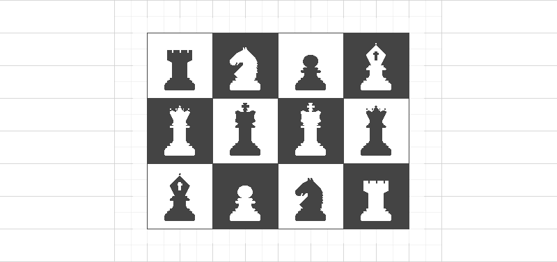
French Defence: chess dingbats.
When asked if he admires any other FontStructors, he replied, “Let me answer this without giving a particular list of names. I really don’t want to hurt anyone’s feelings. However, my Favorites [on FontStruct] are open to the public if someone is interested who’s works I valued the most. I closely follow other members’ activities and collect their best works (as permitted). These are extraordinary men and women, a few of them are professional artists. They create elegant typefaces effortlessly with new techniques the way I simply couldn’t do. Super intelligent, insightful people from different cultural backgrounds who taught me a lot. Exchanging ideas, opinions with them is always a delight.”
3 Triangle (Making fonts)
Connect any one end of any two line-segments to a single point at any two different angles. Connect the unconnected ends of the two line-segments with a third line-segment. The resulting shape is called a triangle. It is the simplest shape with distinct sides that contains an area.
What compels you to create fonts?
In the beginning, I thought making fonts was a quiet and peaceful hobby like writing poems, playing the guitar, painting, gardening, or angling. You find a way to express yourself, you don’t disturb others, and the whole world should leave you alone. Years later I realized that creating fonts was way more important. We are akin to fashion designers. We’ve been dressing up the same Latin letters for more than five centuries to exert influence on the reader. The straight lines, fine curves, tension, and balance convey a second layer of information on top of the literal one. It could be about anything: playfulness, joy, abundance, simplicity, strength, sophistication, elegance, sheer efficiency, or decay. We design costumes for the letters to make a visual impact.
Describe for us your general font-making process behind a shared font?
It starts with an idea, an early concept. I am deeply immersed in today’s turbulent culture. I see a lot of typography every day. Sometimes I see an interesting typeface, a logo, or just a single letter that makes me pause. I start thinking about whether I could make it better, turn it into something different, or build a whole character set around it. At this early stage, I make decisions about the scope and purpose of the project: who are the potential users, and what may be the function of the new font. I often make sketches on square paper or graph paper. Drawing by hand forces my brain to think differently. I can’t really explain why, but it feels different from working on a computer screen. It is this important phase when the overall size and proportions are determined.
The next stage, prototyping, takes place in the FontStructor. Usually, I start with the lower case, and with the most challenging letter: ‘s’. If I can’t fit a double curve into the given x-height I have to rework the whole concept. I build the basic character set and test it with text samples. I modify, squeeze, prune the letters until they work nicely together.
A good typeface is more than the collection of its characters. The letters, numbers, punctuation marks, and spaces have to work in concert so as to render the text legible and aesthetically pleasing. The printed text has an internal rhythm, it breathes, it has balance and symmetry. And this is the ultimate reason I keep making fonts: to find beauty, harmony, and balance in my letters.
I work slowly. Usually, it takes weeks or months to complete a project. I’m a perfectionist. Some fonts are never finished; I revisit them time and time again, and make small improvements. In case I can’t find a good design solution, I shelve the project for years. Later with a fresh look, and with help of new Fontstruct features, I can work out the problems easily. I don’t work under the influence of some sort of creative frenzy. Creativity is not a constant flow of ideas for me. It has ups and downs. I try to use the good periods the best I can, and just wait out the doldrums.
When I use the FontStructor, I try to keep things simple. I don’t attempt to make faux Bézier curves using a series of tricks and bespoke bricks. No. I’d rather build something coarse and rugged, using simple geometry, and take advantage of FontStruct’s real strength. Letters with polygonal contours have a rustic feel: they appear as being chiseled out of solid rock. (On the other hand, I admire those who are able to make sublime curves with FontStruct.)
The last stage is production. The final assembly, kerning, etc. takes place in Glyphs. I still have a lot to learn about this application, but I enjoy the ease I can add OpenType features, or handle diacritical marks with. Glyphs is a very powerful tool with lots of scripts, plug-ins to cater to all aspects of type design.

Esgaroth: a heavy slab serif.
While making a font, what frustrations do you face and how do you overcome them?
In the early days of Fontstruct, I faced technical problems on a daily basis. While working on large fontstructions, the system was sluggish, it often froze. My computer screen didn’t have enough horizontal and vertical space; I had to do a lot of scrolling so as to move around parts. A few times I lost my entire work due to some glitch. I was not happy, but it was part of the challenge. Those days are long gone. Rob Meek has done an excellent job by constantly upgrading and extending the program. The transition from Flash/ActionScript to HTML5 was very smooth. People don’t talk about it, yet it was a major achievement. And the new features are superb. Nowadays, I feel limitless; building a font feels like flying on wings.
4 Square (Portfolio)
Draw a line-segment from the very top of a perfect circle to the very bottom. Similarly, draw another line-segment on the same circle from the very left point to the very right. Both of these line-segments will intersect at the center of the circle, which will be divided into four pieces. Rotate the circle exactly 45 degrees. Leave the line-segments and remove the circle. Connect the open ends of the overlapping line-segments with new line-segments on the top, bottom, left, and the right end points. The resulting shape is called a square. The angle between any two connected edges is always 90 degrees and the length of each side is equal to any other.
If you had to categorize your fonts, what would they be?
My fonts tend to fall into a few categories: regular fonts, stencil fonts, pixel fonts, display fonts based on fractal patterns and geometric properties (e.g. isometric or other perspectives), other fonts (patterns, dingbats, chess). In terms of scripts, I focus on the Latin alphabet, where I feel at home. I also create Cyrillic sets when it seems practical. I’m very fond of Cyrillic letters and the cultural heritage they represent.
Stencil fonts are stunning, especially the heavy ones. They display brute force, masculinity, and utter disregard of classical propriety. (As we all know, typeface design is about tradition and rule-breaking at the same time.) When I create one, I try to reflect these qualities. I imagine my stencils sprayed over heavy machinery, large wooden containers, or rugged concrete walls.

Thorin Stencil (quote from Heartbreak Ridge, 1986)
I’m also a pixel font enthusiast. Pixels are still relevant, especially in the retro gaming world. What would we do without nostalgia? Last year during the pandemic I experimented with pixel fonts. I set out to learn more about symmetry, proportions, rhythm, and harmony in typography. Pixel fonts are ideal subjects for such experiments: they are simple, easy to create, and easy to test. You can modify them quickly by adding or subtracting single pixels, make slightly different versions, and see how they work with the sample text. I ended up with 20+ similar-looking fonts, not tremendously original ones, I should say, but all of them performed well in terms of balance and harmony. The humble pixel creations taught me a lot about the inner workings of typefaces, big and small.
Enlighten us with your source of inspiration.
I get plenty of inspiration (and solace) from nature. Geometry and chaos (fractal symmetry) are constant sources of my new ideas. Several works of mine are based on simple polygons, isometric projection, or optical illusions. I also designed a series of display fonts based on fractal patterns. Some color versions of these are still under construction in my digital workshop.
Needless to say, classic and contemporary typefaces have a great influence on my works (Atomic Media, Büro Destruct, Device, Emigre, Identical, T-26, Typotheque, to name a few). This brings us to the topic of originality. I’m not afraid of borrowing ideas from others. It’s part of the creative process. No artist works in a vacuum. We are all influenced by previous creative ideas, stimulated by the design community. Truly groundbreaking designs are rare.
The renaissance masters copied the works of antiquity. That’s how they learned sculpture, painting, and architecture. They’ve improved on classic Greek and Roman art by adding new knowledge of anatomy, perspective, and engineering (among other things). The history of type design tells a similar story. The first typefaces were designed to mimic the handwriting of scribes, carrying the long tradition of penmanship into the age of movable type. Likewise, Helvetica (a.k.a. Neue Haas Grotesk) did not come out of thin air. There was a line of sans serifs leading to it, each one bringing barely perceptible, small changes. Today the whole sans serif arena is so crowded and so competitive, even an expert has trouble distinguishing the countless nearly identical typefaces. The term original design means very little indeed from this perspective. Thus, we should embrace the cross-pollination of ideas, remix and reuse them, and add our own creative bits to move forward. (Nota bene, I was talking about creative ideas, not wholesale copying of finished works and releasing them under your name. That’s called rip-off. It has nothing to do with creativity.)

Mirkwood 3rd Iteration (unpublished). A pixel font showing self-similarity.
3 Dimension (Creativity)
Because humans possess intelligence and occupy a multi-dimension existence, dimensionality is not difficult to understand. Stand somewhere and extend your arms away from your body at shoulder height. The left-right extension of the arms is one dimension and is usually called the x-axis. The vertical aspect of you up and down is considered the y-axis. Perpendicular (a 90-degree angle) to this, looking straight ahead, the line of sight is termed the z-axis. If you consider your stomach as the origin of this dimensional space, every point to the left of this origin is the negative x-axis and positive to the right side; every point above this origin is positive y-axis and below as negative y-axis; every point in front of this imaginary point of origin is the positive z-axis and behind as negative z-axis;. This gives four quadrants in the positive y-axis and four in the negative y-axis for a total of eight octants. All shapes and forms imaginable (!) can be fit into and be represented in any combinations of these octants.

Sierpinski Black Initials: a font based on the Sierpiński triangle.
How does the current technology affect your creative output?
Technology is liberating. It has given me fantastic tools in my hands. I remember the time before we had computers, digital cameras, and laser printers. It was a great deal to put together a manuscript with photos and illustrations for (scientific) publication. I spent hours in the darkroom with a professional photographer to get my pictures right. Simple illustrations, diagrams were drawn by hand on tracing paper with black ink and technical pen. After the typewriter, selecting fonts, using bold and Italic, printing text at different sizes was a huge leap forward. When Photoshop 2.5 arrived in the early nineties, it came in a box with more than two dozen floppies for installation. Accessing information on the internet (before the Web was invented) was cumbersome and tedious.
Things have changed dramatically. Today I am infinitely more powerful and capable than kings were before the modern age. We have access to all information anytime, anywhere in the world for the first time in history. Modern software tools help me to write an essay, edit images and video, compose music, or design a typeface. Yes, we can create our own typefaces; that was unheard of just fifty years ago. Well, I could even start my own YouTube channel if I want to. I don’t have to go to university to learn new skills. All the knowledge, detailed tutorials are available online. The digital age is full of good news: everything is getting faster, better, and cheaper. Awesome. I am thrilled to live in this crucial period of time.
What are your thoughts on the popularization of typeface design?
Typography is still the dominant form of visual communication. Once belonged exclusively to professionals (punchcutters, printers, designers), today font creation is very popular among amateurs. One would rightfully ask: is it fitting to give all power to the masses? Allow them to mess with the sacred art of letters? Could any good come out of the democratization of type design? My answer is a big yes. After all, that’s exactly what FontStruct is about: it’s a simple tool that runs in the browser and brings the wonder of making fonts close to everybody. No previous training or experience is required. The learning curve is gentle. FontStructing is fun.
Not all FontStructions are masterpieces. The vast majority have plenty of room for improvement. Still, there was no harm done by creating less than perfect fonts. They may serve as stepping stones towards prowess, or as bad examples. At the same time, there are true gems among them. For those gems, it was already worth it (opening up typeface design). There are many examples in history when fresh ideas and change came from outside of the circle of professionals. Creativity could certainly flourish ‘unspoiled’ by education, doctrine, and tradition; unaffected by the rigidity of thought.

Gimli Minuscules
Could you explain the purpose and process of font samples?
Yes. Samples are very good to promote my new fonts. In a simple case, I make screenshots from the preview window. On special occasions, I take my time and create demo posters. This involves brainstorming, making pencil sketches, and using professional software (Adobe Illustrator, Photoshop, or lately Affinity Designer).
Is your creative output more artistic or commercial? Why?
This question implies that artistic and commercial qualities are the opposite, or mutually exclusive. I think they usually go very well together. For centuries almost all works of art were commissioned and paid for: paintings, sculptures, great buildings, compositions of music, and literary works. The most important patron was the Church, followed by kings and rulers, members of the aristocracy, and wealthy citizens. We have only to add the large and small corporations to the list to describe the present situation.
My whole portfolio is ‘artistic’. I’m yet to sell my first font. I never really had time to develop and refine my works to the level of professional typefaces. This is about to change when I retire. I’ve already made preparations to work full time on my fonts. A selection will go on sale next year on MyFonts.com.
Selling my fonts is important for one reason. It is the ultimate test of quality if people actually buy my work. I don’t really depend on that income. Yet, giving away them for free seems to be inappropriate. People don’t appreciate things that are free. Those works have virtually zero value.

Hommage à Escher, asterisks (*). The sample is rendered on the Poincaré hyperbolic disk.
2 Geometry (& Mathematics)
Geometry is the branch of mathematics that deals with points and lines, shapes and forms, angles and dimensions. It describes the rules governing their existence and interaction. It can be used to depict simple visualization or bewildering complexity without ever breaking even a single rule. It has the potential to describe the entire universe.
Your fonts usually are geometrically precise. What kind of mathematics/geometry education and training have you had?
Well, I had a very good math teacher in secondary school. I was very lucky to be a student in one of the best grammar schools in my country. It was a boarding school for boys only, and our teachers were Franciscan monks. We also had a math club there on Sundays. Our teachers planted the seeds of love for mathematics, physics, literature, history, and art in our young fertile brains. We were told many times: the only proper relationship with science was love.
Have you continued to learn more about mathematics since your formal education ended? If yes, how?
Yes. My university years started straight after the Rubik’s cube frenzy. It was a vibrant period of math puzzles and popular science. I read all the math and physics-related articles in Scientific American and several popular mathematics books (by Ian Steward, Martin Gardner, and others). I’ve learned a few missing chapters of math on my own: graph theory, polytopes, tilings. I designed a series of 3D puzzles too. Later I learned about chaos theory and fractals; later still about hyperbolic geometry. I’m not a mathematician, nor a geometer. My understanding of math is at the level of amateur enthusiasts. I consider mathematics to be the rulebook behind the beauty of nature. When I see a broccoli or cauliflower, I see the fractal symmetry in them. In the case of fresh salad, I consider the hyperbolic geometry of the green curvy leaves.
How did you visualize and work out the intricacies of the fractal fonts you have designed?
Fractals have the strange property of self-similarity: the same pattern is repeated at an ever-smaller scale. I work out the small details by trial and error. I also make pencil drawings. In the end, everything looks nice and tidy. Nobody can see the experimentation and false starts behind the scenes. I still have a fractal font with missing parts waiting to be finished. Because that particular pattern was so complex, I used Illustrator to make ‘sketches’ and experiment with them.

Sierpinski Chromatic: a color font based on an isometric fractal pattern.
Speaking of patterns, why do you think we find them pleasing and soothing?
A few months ago I saw a collection of art nouveau wallpaper designs of William Morris, and asked the same question myself. There must be something special, mesmerizing about patterns that people want to line their entire home with them. Patterns are based on some sort of symmetry and repetition. There are many patterns in nature that can be described using simple mathematical formulas, ratios, or a sequence of numbers (e.g. Fibonacci). Our brain has evolved to deal with all sorts of patterns. There are specialized neuronal networks for processing visual, auditory, tactile, kinetic, and other stimuli. Pattern recognition is a fundamental task of the cerebral cortex. Our very survival depends on it. It seems that we are hard-wired for natural patterns. We tend to find them pleasing or harmonious if they show mathematical proportions.
The best way to illustrate this is with music theory. Musical tones comprise a fundamental (frequency) and overtone series/harmonic series. The frequency of harmonics are integer multiples – 2×, 3×, 4×, … – of a tone’s fundamental. The harmonics are pure sine waves; they have no overtones. A scale is a set of musical notes ordered by fundamental frequency or pitch. The interval between two notes can be measured by the ratio of their frequencies. In the case of an octave, it is 2:1; that means, if one note has a frequency of 220 Hz, the note one octave above is at 440 Hz. Likewise, other intervals commonly used in Western music can be described by simple ratios of small integers: 3:2 (perfect fifth), 4:3 (perfect fourth), 5:4 ( major third), etc. It seems, what notes we find pleasing, and what notes go well together have been determined before us, before music and human culture were established, by the rules of nature. When we listen to music our brain just doing math.
You have also created fonts that are optical illusionary in nature. It seems to me your insight into how the brain works helps you create those. Tell us a bit about them.
Well, it’s tempting to give a retrospective explanation like that, but the reality is a lot more simple. I was captivated by some twentieth century op-art works. Is it possible, I wondered, to use the same optical tricks for making display fonts? After experimenting with the most promising effects in FontStruct, I created the first version of Optill. The optical illusion worked, but the font left much to be desired. Today I have its fourth version, called Slanted Type. Other sorts of optical illusions include isometric shapes with impossible geometry or double perspective – inspired by the works of M.C. Escher. It’s fascinating as our brain flip-flops between the two perspectives and tries to make sense of it. I also designed an op-art font based on the artworks of Victor Vasarely, using arrays of squares and rhombi (see Vasarely Squares). Op-art fonts, if carefully crafted, can make an exquisite visual punch.

Elendil Inverse (unpublished version of Elendil).
1 Algebra (Future)
While it gives people anxiety when algebra is mentioned, it is a branch of mathematics that helps in figuring out something unknown based on some other known things. Basic familiarity with algebra is the first step in uncovering the hidden.
Are there any changes you wish to see happen at fontstruct.com and in the FontStructor?
Only minor things. I’d like to see the Menu hierarchy flattened, so as to get easy access to deeply buried functions, such as Nudge Up, Rotate Right, etc.; Kerning: the same settings to be automatically applied to all accented versions of the letter; Layers: copy and paste between layers, duplicate layers. Most of the things I wished for have been already implemented.
Do you have any advice for the people just starting out in typeface design?
Yes. If you are new to font design, there are a few points to consider. We are not about making fancy stand-alone glyphs, but to devise legible smooth text. (Except for logotype, of course.) Our focus should always be on the reader. After creating the character set, your job is only half done. To make the characters work together takes the same amount of work, if not more. Please, test your new font in the preview window with different text samples. Don’t forget to set the space – the only invisible character – properly. Take your time and modify your letters until the text flows naturally. Use gimmicks in moderation. And don’t give up if your font is not an instant hit. Keep working, keep learning.

Frunze Stencil
At some distant future, what would you like to be remembered for?
I have no illusions about the future. After three generations nobody will remember that I ever existed. This is how it goes. The memory span of humans is notoriously short. Besides, I’m not very important. After only four decades very few remember who Max Miedinger was. (He designed Helvetica.) Our memory will be buried by mountains of new information. In the 25th century, Fontstruct may be an obscure research project of digital archeology. Loss of information is all but ensured in thermodynamics.
The same applies to our precious type designs. Fonts are – like the latest fashion – ephemeral creations. As the world changes faster and faster, their lifespan becomes even shorter. There is nothing we can do about it. We have to accept transience. (If you can’t, you’d better start building your pyramid, now.) Thinking about the future and you realize everything changes so swiftly. Already, there are programs or plug-ins for fully automated kerning. That’s a great relief and a time saver for many designers. With variable fonts, we are able to generate a desired weight in an instant. Previously, it took years to develop a series of weights for a typeface. Artificial intelligence and machine learning could take over typeface design in the coming decades. Digital fonts are basically software. Every step of font creation can be easily automated and done faster and better by computers. Machine learning will surpass human designers, and it will be cheaper too. Perhaps, we are the last generation of natural human designers. It sounds scary.
I’m sorry for not giving a cheerful, uplifting answer. Sadly, I’m totally devoid of positive bias. However, (according to Martin J. Rees, British cosmologist) being pessimistic about the future is no reason to be gloomy.

Voxelstorm Regular 03
That might be too far flung. Where do you see yourself in the next year? Next five years?
I am to retire early at the end of this year. I have enough savings and investments to afford a comfortable life without waiting for the state pension. I’d like to travel more, eat local food, do silly walks, and learn new languages. I plan to finish a couple of books I never had time for. There will be more time for creating new fonts, of course. I’m going to experiment with color/layer fonts and learn more about variable fonts. Learning Python is also on my list. Finally, I’d like to return to an old pastime, linocut: improve my skills, and make a lot of nice prints.
Those are certainly admirable goals. Have fun achieving them, Tibor.

Elbereth (letter O; unfinished work).
∞ Understanding (Postscript)
There are five levels of understanding (of anything): Simple, Complicated, Complex, Chaos, and Disarray. At Simple level, almost no conscious thought is required to understand it. Complicated information requires some active thought to comprehend. Complex stimulus needs deep and careful consideration to grasp its meaning. Chaos requires the perspective of distance to see the pattern that make up the whole. Disarray provides no discernable information and is beyond human comprehension.
If you take the time to look at Tibor’s shared FontStructions carefully, it will become clear very quickly that his portfolio of work embodies the qualities of good fonts he has described in this interview. The legibility of the glyphs, the evenness of the gray of a block of text, the sprinkling of uniqueness, etc. This aligns well with what Frederic Goudy said: “When a type design is good it is not because each individual letter of the alphabet is perfect in form, but because there is a feeling of harmony and unbroken rhythm that runs through the whole design, each letter kin to every other and to all.” We would all do well in designing typefaces if we are cognizant of this.
Thanks once more Ata and Tibor!
This is a guest post from Ata Syed AKA thalamic and minimum, the fifth in a summer series, continuing the “Focus on Fontstructors” tradition of interviews with members of FontStruct’s designer community. Ata has been FontStructing since 2008.
Zhalgas Kassymkulov—better known as architaraz around FontStruct—is a freelance graphic designer and lives in Almaty, Kazakhstan with his wife and two children. He has multiple qualification as a Chemical Engineer (2004 – Kazakh British Technical University), Chinese Language (2005 – Beijing Foreign Studies University), and Architecture (2011 – Shanghai Tongji University).

AT Esrever by architaraz
Organically speaking, design has always existed. What? Yes! What isn’t designed by intention is designed by incident. There’s no getting around it. We’ll get into what this means a little further on. To start with, it is sufficient to know that the entire process of getting an output right has a minimum of these steps: Ideate, Design, Create, Evaluate. Let’s see how these steps relate to architaraz.
Ideate
What is your daily life like?
“Routine :-) With kids it’s just a little different.”
What kind of music do you listen to you? How often? Why?
“Electronic/House/Trance (e.g., ASOT). Regularly. I like hearing synthesized sounds. And when you’re working you really need that extra energy that comes from listening to music.”
Apart from making fonts, what other creative/artistic things do you practice?
“Logo Design.”
Do you enjoy your work? Is it your ideal choice for work? If not, what would you like to be doing for earning a living?
“Yes, I enjoy my work. It’s an ideal choice for work because I don’t have a boss yelling at me to do things for him/her. I work for myself now, make my own decisions, and take full responsibility for my actions.”
What inspires you? How do the things that inspire you make it into your creative output?
“Minimalism, precision/accuracy, and geometry are things that inspire me so if you can see it in my works then that could be considered as an [inspired] output.”
 KD Anniversary X by architaraz
What do you dream of becoming?
“I dream of becoming someone like Paul Rand, Saul Bass or Rob Janoff.”
Have you already achieved it?
“Nope…”
Is recognition important to you?
“I will be lying if I say no. :-) For me recognition is like justice. It would be just (justice) to be recognized. But, one has to truly deserve it.”
What are some of the most significant aspects of your life these days?
“Family. I have two children (boys) who are not babies anymore (five and eight years old), so it’s all about them now. Kindergarten, school, courses, etc.
Work. I switched to freelance design in 2018 and I am still freelancing. Due to obvious reasons it’s remote work, work from home, etc., but I like it. It seems I finally have time to start some projects, e.g., a YouTube channel.
Reconnecting with friends. I went to China after graduation, got my bachelor’s degree in architecture there and worked in different jobs from sales manager to designer. Now that I am back in my homeland—Kazakhstan—I am reconnecting with friends and relatives.”

AT Ribbon by architaraz
I was reading the Kazakhstan article on Wikipedia. It seems that there has been a lot of Russian influence on your country in the past century. So, I’m guessing one of the five languages you speak is Russian. What are the other four?
“Kazakh, English, Chinese, Turkish.”
Which is the most interesting? Which is the most different?
“Well as a designer, I guess it’s Chinese because every letter comes from a drawing. Every character. And because it is not like any other language—no alphabet—so you kinda have to memorize every existing word.”
Ever think of doing a Chinese font? I know it is quite a challenge. At least with Japanese you can just do the hiragana and katakana and be reasonably done.
“Yes, I’d really like to design one, specifically because it’s one hell of a challenge.”
What does it mean to ‘design’ something? Surprisingly, a clear, precise, and universal definition of design does not exist. What? How can that be? Don’t know how, but it so be. If you look up the meaning of the word ‘love’, you will find something—and it will be correct as well—but it won’t be definitive. Someone else may choose to define ‘love’ some other way which may also be correct. Similarly, ‘design’ can be defined a number of different ways. I choose to define ‘design’ as the process of finding a solution to a problem, provided—at a minimum—it fulfills its purpose, satisfies the target market/audience, and stays within the imposed, implied, or assumed limitations.
Design, being the process, is over once a solution is realized. The output can said to be designed, but never the design itself. Since nothing can be accomplished without some process, therefore nothing does not go through design. Furthermore, the trifecta of purpose + target market/audience + limitations cannot be bypassed. What is design, then? Everything.
Two Interesting thing to realize are: 1. A problem is not an insurmountable obstacle, rather merely something that hasn’t been solved so far. 2. The use of the word finding. To find something, it first must exist. Finding a solution implies that the solution already exists even if the problem has not yet been identified. Therefore, everything is solvable.
Design
Architecture seems the most directly connected degree to your profession. What made you work as a graphic designer?
“Well, that’s life, you know. Most people I know are not working by their university degree. The second year of studying architecture, I worked on a small book for a friend of mine and that’s when I think something clicked. Just before graduation I was an intern at an architectural firm in Shanghai, China, but I found that it was boring to work on a software I have already been working for the previous two years, so I just chose to learn something new, like Photoshop and Illustrator. And I loved it. Only later I learned that it was connected to a different major called Graphic Design. But then after graduation I worked as a sales manager using my language skills (I speak five languages) for something like six years for different companies and different industries. It was during this time when I started FontStructing. Afterwards, I did work as a senior graphic designer for a home décor company—it was only for six months—but it was enough to understand what it was all about.”
Going through your fonts, I noticed that they are always very few bricks tall, like a challenge you create for yourself to do the most stylistically consistent font with as few bricks as possible? Which comes first for you, the idea of a font or experimentation to see what other font can be created with the available bricks?
“I use few bricks for different reasons, but I guess it’s just fun, and I enjoy it. I don’t think I would enjoy using Bezier curves. I almost never think of a font letter shapes beforehand; all shapes come from experimenting. There are rare cases when, for example, I take J of Juventus FC and build a font out of it (available on dafont) but all other font shapes are a result of experimentation. FontStructor is a great tool for experiments.”

AT Extrema by architaraz
It seems creating fonts is your fun graphic designing activity. I was going through the logos you have on your website. They did not seem like results of experimentation. Tell us about how you got to be a logo designer.
“Sometime in 2018, after working mainly as a sales manager, [I reached] a turning point in my life where I decided to (or had to) say no to having a salary and say no to having a boss who would tell me what to do. I was on my own then. I decided to pursue a (freelance) design career. Did I have much experience? No, but the fonts I created in FontStruct were a sign to me that I had at least something. I also made some simple logos for my friends, where one of them was actually a font. I just sent the font file to him and told him to install it and type out their company name because those were the only letters that font had and it was of course a vector, so why not?
So, starting as a freelancer I had to start earning money and font design was not an option because let’s face it, my fonts are no Proxima Nova. That’s when I took a shot at logos. Why logos? Because I kept seeing people sharing some letter logos they made for clients on Instagram and I thought that not only can I make those type of letters, I can also make the whole alphabet, if need be.
I came across 99designs.com and decided to participate in a logo contest. Fate was on my side I guess, and I won it. I took it as a sign. It’s still a very good platform, I am branded as a Top Level designer there and I visit it from time to time to see if I see something that interests me. To the reader: If you’re talented, experienced, and have a unique style, you should go for it. No doubt you’ll succeed there.

Some logos by architaraz
In 2019, I discovered logoground.com. I was sceptic about this platform at first because it didn’t seem like a good idea to share a unique unsold logo for everybody to see. Then I learned about copyright and how we can protect ourselves. Especially now that most social media platforms and hosting providers honor DMCA and help you protect your work if it gets stolen. Technology is constantly evolving and platforms like Yandex are really helpful when it comes to finding copyright infringements. It’s been two years and I am now branded as a Platinum Designer there, making sales both on and off site. It’s better than contest websites, if you see something you like just buy it. Simple as that. It’s just that there are so many ideas in my (or any other designer’s head) and it’s just hard to find someone who I could sell it to. Platforms like LogoGround help you do that. Just like I use FontStruct to get the idea out there.”
This is nice. It’s encouraging to those who will read it. Now can you talk about how you come up with the idea for a logo, what steps you take to get it to final stage, etc.? The designing aspect of it.
“With the logos, it’s almost always idea first in my head and then the design process. At first I would have an idea and then go straight to some digital creation platform. With time I started drawing because you can’t always simply imagine visual ideas. So, if it’s an iconic logo idea, I go straight to digital. If it’s a monogram, I brainstorm (explore) with pen and paper. The digital version almost always doesn’t look like the sketch.
AT Archaus.2 by architaraz
I love grids and most of my logos use some sort of a grid. Isometric grid is my favorite though. [Adobe] Illustrator is my choice of software for logo design. There are cases when I used SketchUp or Dimension for some 3D logos, but mostly it’s just Illustrator. Some ideas come to me when I’m outside looking at the surroundings. I think you can always come up with some sort of idea this way. Sometimes I surf the internet and see something and I get inspired by it. Now and then I look at logos other designers have created and this also generates ideas. For example, I randomly look at Logo Modernism book’s pages and get an idea for myself. I created a whole new YouTube series where I try to teach others how to draw a certain shape in an interesting way.” I think I need to watch that.
Can you please tell me more about the usage of grid in your design work?
“While studying architecture we didn’t use grids much, in AutoCAD and SketchUp or 3dsMax; you draw things pretty much in the air. I started using them regularly after [getting acclimated with] FontStruct. Grid is modularity and modularity is something that I apparently love. Once you get used to it, it is hard to let it go. In most cases, grid is enabled in my Illustrator (128px with 4 subdivisions). There are other grids like golden ratio, but I don’t use it ’cause I think it’s overrated. My current favorite grid is isometric grid because I like how the three axes have the same length and you can draw a 3D design immediately even if the perspective is not true. And it’s a perfect grid for logo design too. On Instagram, I draw famous logos that use isometry so as to show people to not get obsessed with golden ratio. I couldn’t find a sketchbook with isometric grid (they’re all either blank, dots, or squares) so had to custom order it at a nearby printshop.” I think I want that too.

Custom isometric grid notebook by architaraz
You mentioned Paul Rand and Saul Bass as someone you want to emulate. What it is about their work that is so inspirational to you?
“I guess simplicity. I like how shapes are simplified to their limits and still communicate a lot of things. These designers created many famous logos and for a reason. When it comes to fonts, there are just too many designers to mention, but off the top of my head I would mention Othmar Motter. Tom Hultgren’s Traffic is still one of my favs, and whoever designed the US Army Stencil typeface is a genius.
I like how Paul Rand told Steve Jobs that he will create only one logo version for his company, and that was it. You like it, you take it. Don’t like it? Go find someone else. In my experience, clients always want to see some alternative versions. Milton Glaser’s I♥NY logo and his Glaser Stencil font are some other favorites. I love how he created NY’s logo as a present for the city which says a lot about him. In fact, I don’t know, but something about stencil fonts gets to me. Even the first FontStruction I made was called Sliced. It’s a bad logo but it was stencil. And many more of my fonts are stencils. I can’t explain why, but I love that style.”
AT Baktera by architaraz
I get what you mean by being enamored by stencil fonts. I like them too. Probably something to do with the first introduction to fonts as a child and getting those cheap plastic sheets with letters cutout of them, which had to be stencil by necessity.
“Exactly! Maybe that’s how we were introduced to letter drawings.”
The Army stencil font is quite the definitive example of Form Follows Function. Are you a believer of the Bauhaus ideology?
“Well, I wouldn’t say a believer. I believe what Milton Glaser said: Art is whatever. Though I love that Bauhaus font.”
Bauhaus was more of a design school than art though.
“Well, I didn’t study Bauhaus that deep. We had it in my architecture classes, but it was something like 13 years ago :-) All I remember is there was this DVD of six disks about Bauhaus and architecture and I prepared sort of a small essay for which the teacher praised me. It’s just a big topic to discuss. Though anyone who can design a font like Bauhaus can consider himself a success, that I am sure of. It’s flawless.
Right now I don’t try to do what others have already done. I’m just discovering my own style. It may be with the fonts or with the logos. It’s a very hard thing to achieve—something unique—and there is still a long way ahead of me. What I really need to do is FINISH my fonts. :-) Currently they’re all like demos. Except for the ones I published commercially. Those ones I consider to be finished—a period [full stop] at the end of a sentence. Surely, font design is about perfection and no font can ever be finished, but I take that into account and stop at some point. I have to.”
So what would you say that your creative output is more artistic or commercial? Why?
“I think it’s more commercial because artist for me is like being Da Vinci. I’m a designer.”
As are you. A designer is someone who carries out a process with thought and intention while a non-designer’s intent is merely getting to the output, whatever that may be. Design happens in both situations. Who then is a designer? You and I. Him and her and them. Everyone is a designer. Anyone who pays heed to purpose, limitations and the person or group of people the output will affect—among other variables—is a designer.
Of course, we all design different things. Being a teacher, I design classes, courses, curriculum; being a graphic designer, I design fonts, posters, books, etc.; being alive and having weird dietary constraints, I design food; etc. As do you. Perhaps not courses, but maybe cars or curbs or cakes or camouflage or convenience or continuation or…. If a process is involved, design is taking place. And since we are all doing something with active thought and getting-the-correct-output intention—which can be said to the definition of ‘designing’—we are all designer of something or other.
Create
Why do you create fonts?
“This is a hard question that I don’t think I fully know the answer to. I guess I just love it, love the process of it and I could stare at the result indefinitely. Also, at this point certainly not for commercial reasons. I remember how I first got interested in typography – in my 2nd term at the university studying architecture I was commissioned to create a small book for students that mostly involved working with typography. That was when I had my first spark. In my last year at the university, while an intern in a local architecture firm, I put my focus not on architecture but on some other stuff. I then learned that other stuff had a name…and it was called graphic design. :-)”

AT Tugan by architaraz
What is your general font making process? What causes you to deviate from this process?
“The process keeps changing but it almost always starts from FontStruct. Before I switched to MacOS, I would redraw my FontStruct font in Font Creator Pro, either directly or with the help of Adobe Illustrator. After I switched to MacOS I would still take my font from FontStruct but this time I would use Glyphs. There are, of course, cases when I would create a font directly in Glyphs. For some reason I never sketch fonts by hand—it’s always a digital process for me. I wouldn’t use additional software, but FontStruct still needs additional features if one wants to create a professional font.”
Once you start creating a font, what keeps you going?
“Modularity. I think I can see a letter in any shape and I just develop other letters from it. And I want them to be geometric and not have many (better none) optical corrections because I don’t want my fonts to be used in text – they’re meant to be for display and for short words only.”
While making a font, what frustrations do you face and how do you overcome them?
“I want to stay true to modularity. Not finding consistencies is what frustrates me or maybe it’s that perfectionist syndrome. When it happens, I take a little time off. After that I come back and try to make a deal with modularity. I call that deal a compromise and try to control the urge for perfection that exists in every graphic designer.”
Why do you continue to make fonts?
“Not sure. Maybe ’cause it’s fun or maybe ’cause ideas keep coming and I just have to let them out. But once again, at this point, certainly not for commercial reasons. Hope it changes someday.”
How did you discover FontStruct?
“I remember asking my friend Kuanysh who is an IT geek if he knew how one can create a font. He suggested FontStruct. I don’t remember now why I needed to create a font then especially when I was working as a sales manager for a plastic pipes company. I’m just glad I did.”
How long have you been FontStructing?
“Since 2011 but I did take some time off due to…well, life. :-)”
How often do you visit fontstruct.com?
“There were times when I visited it every hour; there were times when I didn’t visit it for weeks. My activity there aren’t constant, but it is always in the back of my head.”
What keeps you coming back to FontStruct?
“The community. Internet is so cruel, but FontStruct is something else.”

Laffa by architaraz
Are there any changes you wish to see happen at fontstruct.com and in the FontStructor?
“Oh, there are many. :-) The ability to sell a font directly through the website; basic OpenType features; composite letters so that if we change a letter all its variants change automatically; kerning groups; customizable bricks; and many more. These are just to give you an idea. But, FontStruct has already come a long way and has many great features (e.g., color fonts now). It’s awesome and I truly believe in its future.”
Whether intentional or incidental, design will happen. Incidental design may even provide a perfectly reasonable output. What it lacks is the ability to eliminate the possibility of getting it wrong. Not that intentional design cannot also result in a fiasco. It can. The chances are lower though. Designing is a game of percentage of time you can be sure of creating the correct solution.
Evaluate
Do you admire any other FontStructors? Who and why?
“Of course! When my friend suggested this website, I went through it and one designer’s works caught my eye—it was Elmoyenique. You can say it was he who inspired me. There are plenty of others I admire including four, will.i.ૐ, thalamic, funk_king, geneus1, and Frodo7 to name a few. Why? Because their works are awesome. ;-)
However, specifically as a thank you to Elmoyenique, I approached him and I proposed that we create a commercial font together. I would take one of his fonts and edit it in Glyphs and make it suitable for commercial release. The font was finished but well life gets in the way, and we never got it published. It’s nothing great, but I liked the idea that we could do it. It’s his font Ziberia. It’s not over yet though. I have a surprise waiting for him.”
I’m sure Elmoyenique will be please to read this. Is there anything you wish to say that I haven’t asked?
“My website is a little outdated but my Instagram is most definitely up-to-date. I am constantly updating it and creating various stuff because I want to share my experience. Also, on my YouTube channel, I share logo design techniques. More font related content will be added to YouTube too (hopefully). It’s just that font design is much more complex and time consuming than logo design. ;-)”
OK, last three question: Where do you see yourself in the next year? Next five years? Next ten years?
I hope things will be little different for me next year because some projects of mine need time but are near completion. Next 5 to 10 years? That’s hard to say because 2020 showed us that we’re [all] vulnerable.
True. Vulnerabilities notwithstanding, be well, everyone. Take care.
Thank you once more, Ata and Zhalgas!
This is a guest post from Ata Syed AKA thalamic and minimum, the fourth in a summer series, continuing the “Focus on Fontstructors” tradition of interviews with members of FontStruct’s designer community. Ata has been FontStructing since 2008.
Hi.

Imagine this interview is a painting. This painting. The result is the combination of the base layer with details layer on top. While both the layers are meaningful on their own, the experience of viewing them together as a single entity is greater than the sum of its parts.
The painting above is created by the artist Paul Bokslag—better known as four around FontStruct—and he will be the focus in this four-th interview of the Gridfolk 2021 series.
 Connectivity and On The Dot by four. Illustration by Paul Bokslag.
Read on to find out how an artist’s mind works.
Base Layer
Tell us a bit about yourself. Where you live and work? What kind of training do you have? What do you do in everyday life beyond FontStructing?
I was born and raised in the Netherlands and moved to Ireland more than twenty years ago, after having studied in Leiden. I am a visual artist and designer and for many years I worked in an arts centre that I co-founded. In my job as a tutor and facilitator, I taught drawing, painting, printmaking, sculpture, and photography to inclusive groups of students and I was a facilitator in a supported studio. I am passionate about the creative process and love sharing that with others. I also worked for a children’s arts and health charity and currently I am juggling my time as a freelancer between my own arts practice, graphic design, giving workshops, mentoring and exhibition installs. When not at work, I enjoy spending time with my family and friends, making things with my hands, reading, playing games, canoeing, and going for long walks in the hills.
For a good few years, I had a healthy obsession with cutting paper. Starting with small, framed pieces, these grew into large scale space filling installations. I did not see the connection with type design until I accidentally used one of my fonts for an exhibition poster and realised that it is all visually related. More recently I have rediscovered the joy of painting and working on murals. I am interested in positive and negative space, and it plays a role in a lot of my work, both two- and three-dimensional.
 “An Exhibition of Papercuts” poster by Paul Bokslag
How did you become interested in type and typography? What was your first experience of font design?
I have designed a lot of publications, brochures, flyers, signs, posters, and logos, using Adobe software and I was always interested in the visual aspect of letters, but I never had a formal training in graphic design.
How did you start out on FontStruct?
I came across FontStruct by chance, when looking for a particular font. I was immediately impressed by the work in the gallery and wondered if I would ever be able to build something similar. It took a while before I started playing and experimenting with the tool myself, but then I quickly got hooked.
If you had to choose two (or three) of your own FontStructions as favorites, which would they be and why?
Most of my FontStructions are self-initiated projects. One of the exceptions is The Pattern Exchange, which was commissioned as the display typeface for a curated group exhibition of the same name in Temple Bar Gallery in Dublin in 2015. Each glyph is a permutated version of a pattern, made up of a limited number of geometric shapes. Although I love to have the freedom to develop free work, it was wonderful to see one of my creations in use: printed on the programme cover and in vinyl on the gallery windows. The font can still be downloaded for free from the gallery website.
Some of my fonts have also appeared in Typodarium, IDN v26n3 and Edo Smitshuijzen’s Mashrabiya fonts and it is still very exciting to see my work in print.
The FontStruct competitions are both a challenge and an opportunity to explore new avenues and to experiment with concepts. Counter Culture was developed as an entry for the reverse competition in 2017. The design is based around the idea of representing letters as three-dimensional negative space in a two-dimensional medium. The angle in the letters makes it possible to create words as a continuous wall.
 Counter Culture by four
What other work on FontStruct do you especially admire and why?
From the start I admired the fonts of some of the early adopters: elmoyenique’s aesthetic, that I feel a strong connection with; beate’s unique and beautiful approach to FontStructing; Frodo7’s possible and impossible 3D work; the theatrical quality of geneus1’s fonts; the fascinating experiments of thalamic and William Leverette; the perfection of fonts by architaraz and Yautja and the hard work of the Video Game Font Preservation Society. They were later joined by others who also developed their unique styles and visual language. Their support and advice have been very valuable over the years.
What are the aspects of FontStruct that make it appealing to you?
Although I have never met other site users in person, I have experienced FontStruct as a very supportive and inspiring creative community.
As a tool, FontStruct is accessible, intuitive, and self-explanatory. You can start using it from scratch and learn about its more complex possibilities and the larger world of type design as you go along. FontStruct instantly makes it possible to quickly compare two versions of a glyph side by side and to look at them as part of the larger family of glyphs. The preview window is an excellent way to quickly get a feeling for the rhythm of a variety of glyph combinations. Changing glyphs by cutting and pasting parts of other glyphs, rotating and flipping sections, it is all at the click of a mouse button.
I love working on a small grid using 2×2 filters. This allows for the use of all curved bricks at a maximum relative size. Features that the amazing Rob Meek has added over the years, such as stacking and the option to make your own composite bricks using up to 16 existing bricks, have hugely increased the possibilities of working on a small scale. In 2×2 filters every brick now occupies four gridcells, the bottom left is its anchorpoint. The other three cells become potential anchorpoints for other bricks that will overlap the original brick by a quarter or a half. The surrounding cells also become anchorpoints for bricks that can be nudged to overlap or fill spaces. Zephram created some tutorials that explain it all much better than I ever could.
The bricks themselves are often the starting point of new projects and they can dictate in which direction a font develops. I enjoy being immersed in the flow of that process: the frustration when I just can’t find the solution for one or two glyphs that refuse to become part of the bigger picture and the joyful and satisfying moment when things start falling into place. Sometimes that requires taking a bit of distance. Returning to a font in progress after weeks or even months can give a new perspective. Often a font develops in such a way that in the end I need to change the very glyph that started it all off and sometimes I can’t resist stripping down a font to its essentials.
 Oluna by four
Creating a modular font is trying to find a language that is consistent throughout all the glyphs. The challenge is to use variations of certain glyphs and combinations of elements and to repeat shapes and angles without it becoming to rigid. That occasionally requires consciously breaking a typographic rule or breaking the FontStruct grid itself and some FontStructors apply this very successfully.
Sometimes, working on a FontStruction becomes a visual warmup exercise that can feed into other art projects. Even brick shapes and the grid itself have found their way into other media.
If you could add or improve one thing on FontStruct, what would it be?
I think there is scope for a FontStruct foundry, through which the best and most complete FontStructions could be sold.
I also like the idea of a one-day online symposium on modular font design, with workshops and presentations. It could be a nice way to meet and collaborate with and to learn from other FontStructors and others in the field.
Ever wondered why a picture is worth a thousand words? If that is true, would paintings be worth ten thousand words then? The answer is symbolic condensation™. Not the convert-gas-into-liquid condensation, but of the meaning ‘make more concentrated using symbols and symbolism’. What is a symbol then? It is a representation of a physical thing or an idea. The letters of a language script are all symbols, each standing for a particular sound (or sounds in some cases, depending on the context). Look at the letter symbol B and try not to think of it as the letter ‘bee’ despite it being just some shape. It is next to impossible. The power of symbols is unrestrained.
Symbolic condensation is the reason a picture is worth a thousand words because it contains imagery that can stand for more than what is depicted. Furthermore, combinations of different symbols in close proximity to another can concentrate the information even more. It takes a thousand words to unpack all the information stored in pictures. Artistic paintings take this concept to the next level by using only symbols to convey vast amount of meaning as concisely as possible. They have to be worth ten thousand words at a minimum.
Details Layer
The following conversation took place on WhatsApp over 8 hours—edited for spelling, grammar, clarity, and privacy. Some words are spelled two different ways depending on who was using it.
(tm):
How complicated life is, right? Just getting time to WhatsApp now requires coordination.
(four):
Amazing though that we can communicate from different parts of the world…
(tm):
True. In the US, in early 90s, AT&T had these future prediction ads with the tag line ‘You will’. One of them was about video calls. It sounded so futuristic then. Now they are a few years old already.
I was going through all your published fonts and the thing that struck me the most was the sheer variety of the works you have produced on those teeny tiny grids. Mind-blowing. Please tell me about your font making process.
(four):
OK, I suppose I am always interested in trying new things, taking things a step further all the time keeps the process interesting. A small idea can grow into a full font, but fonts often develop organically. I try not to hold on to predetermined ideas, but to stay open-minded about how a font evolves. Not every project becomes a full font, sometimes it doesn’t go beyond the exploration phase, but that is fine.
 From A to B by four
(tm):
So, it starts and end with the FontStructor?
(four):
Occasionally I will do some quick sketches on paper, but a lot of the time it starts with moving some bricks around to see what happens. A few times I have taken files into Glyphs to refine them, but most of the time that isn’t necessary.
I do draw letters that never make it to FontStruct, simply because the medium doesn’t suit them.
The limitations of FontStruct are also its strength. In painting, working with a limited palette can help to make your work more harmonious. The same goes for fontstruct: working with a limited set of bricks adds to the consistency of the font. Working with solid brick shapes also helps to quickly get an understanding of positive and negative space.
(tm):
Why do you create fonts?
(four):
I create fonts because I enjoy the making process and it feeds my creative energy.
(tm):
How much time do you spend experimenting?
(four):
I go through phases in which I have more time to work with FontStruct and there are periods in which I am busy with other things and just check the livestream every couple of days.
Experimenting time varies. Sometimes the first letter dictates the form of a lot of the other glyphs. Other fonts go through different stages before they find their final form and changing one character may mean having to change all of them.
(tm):
I’ve had that happen to me a few times. You kinda don’t want to redo everything but also want to go with the better option.
(four):
Looking at your fonts, I know you have been in that same situation more than once.
(tm):
How did you get into art?
(four):
As a child I really enjoyed drawing and painting, playing with materials, building and making things. That never really changed.
 Phoenix Park by four
(tm):
Were you ever a struggling artist? The struggles, the frustrations, the rewards, etc.
(four):
I am lucky to live in a place that has a vibrant and supportive arts community, so there was always acceptance; recognition comes over time. I suppose I was struggling with the work itself more when I was younger. I am more confident now because I have learned to trust the process. I know that if I give that my time and full commitment, things will come together. It is exciting to be selected for an exhibition or commission, but that doesn’t last forever. The reward that remains lies in the enjoyment of that process. It also means there doesn’t always have to be a product or an outcome.
(tm):
Well, going through your stuff, I notice how intricate it is. It certainly takes a lot of commitment to do such detailed work. Papercutting art, for example. I’ve used x-acto knife to do paper cuttings, but that leaves my finger and thumb numb. Once that numbness lasted for several day. I thought I had done permanent damage.
(four):
A lot of my work is labour-intensive and I enjoy that part of it. Working with an x-acto knife has become easier over time, but coming back to it after a longer break, it can still make my fingers numb.
One frustrating part of working as a visual artist is receiving rejection letters after spending hours or days writing proposals.
(tm):
But isn’t that true for any field?
(four):
Yes, that happens in a lot of jobs and in hindsight it has often been a good way of organising my thoughts.
(tm):
What are your thoughts and opinions about failure?
(four):
Looking at my papercuts, people often ask if I never make mistakes. I do make mistakes, but they become part of the piece.
(tm):
That’s the mark of an artist.
(four):
People also comment that I must have a lot of patience to do this work, but it actually works the other way round: it gives me a lot of peace to spend time at the table cutting paper.
(tm):
What is your art making process? Do you have music playing while doing it? What’s your studio like? I imagine your work—or even your home—to be very pristine and organized.
(four):
My studio is a little strawbale house that was built by friends. There is a lot of work stored in it and it is a bit of a mess at the moment, I am not a very tidy person.
 Paul Bokslag’s studio (outside)
(four):
The process depends on the medium or the project. Some have to be planned out more than others.
Sometimes I listen to podcasts or music while working, other times I prefer the silence.
 Paul Bokslag’s studio (inside)
(tm):
Awesome. Your studio looks very much like a studio. But not what I imagined.
(four):
I am so grateful for that space. I just noticed the FontStruct poster in the photo.
(tm):
Oh yeah look at that. How cool!
(tm):
Can you work on the floor? I mean, does your body allow it? Because I can’t.
(four):
Yes, to work on larger pieces, I need to sit on the floor. I use a camping mat to keep it comfortable. The studio is too small for that though, so it means looking for space elsewhere.
(tm):
What does it mean to be an artist to you?
(four):
As a visual person I am very aware of and interested in what I see around me, both in nature and the manmade environment. I really notice it if I haven’t been in the studio for a while. Making is important to me and keeps me healthy. A few years ago, through work, I learned about the five creative habits of mind: inquisitive, collaborative, persistent, disciplined, and imaginative. It really sums it up for me: being curious, working with others, seeing a project through, improving skills, and working with intuition. Creativity isn’t just about art though; it also applies to a lot of other areas in life.
(tm):
What kind of books do you read?
(four):
Literature, artbooks, travel books and some psychology.
(tm):
What are some of your favorite books?
(four):
Some books I enjoyed reading recently: Talking to Strangers by Malcolm Gladwell, On Looking by Alexandra Horowitz, The Salt Path by Rainor Winn.
(tm):
Any fiction novels?
(four):
The Third Policeman by Flann O’Brien, Norwegian Wood by Haruki Murakami.
The recent events in Afghanistan made me think of a book for young people that a local animation company adapted for a film: The Breadwinner by Deborah Ellis.
Sorry, got lost in the bookshelves for a while.
 Velodrome by four
(tm):
I noticed one shelf of all yellow spines in your studio picture. National Geographic magazines?
(four):
Yes, that’s something I have been reading back to front for years every month. Someone gave me a subscription years ago and I have continued it ever since.
(tm):
Sounds educational.
What kind of music do you listen to?
(four):
Two weeks ago, I went to my first outdoor concert in a long time: Here’s an artist I want to share with you…MOXIE.
(tm):
What is your day like in general? Are you nocturnal or diurnal?
(four):
I need eight hours of sleep and get up reasonably early. The day very much depends on what projects I’m working on. And then there are always plenty of chores around the house.
(tm):
Chores never end. You only tell yourself these are all the chores that exist at any given time…and ignore the rest.
(four):
Which reminds me, I should check the washing machine. Again.
(tm):
:-) I always enjoy knowing other people also do mundane stuff that I have to do, like ironing. Makes me feel less weird.
(four):
Lots of mundane stuff here…
Ask anyone if they know what love is and most likely they will say yes instantaneously. Ask them to describe what love is and watch most falter in giving a clear answer. Some things are just too difficult to describe in words. This is not because the answer is not known but because as highly developed our languages are, they are not developed enough to convey esoteric information symbolically. In addition, there is further complication of trying to convey subjective understanding through a language that is not equipped to handle it. In fact, if it was at all possible, the brilliant writers and linguists over the centuries would have come up with it already.
Art is like that. It is too subjective and symbolic to be readily described in words. Its meaning is well understood though. We know something is art when we experience it. We can feel and understand its meaning (or at least a meaning) intrinsically, but cannot put it into words. What is more interesting to realize is that universal understanding of what art is is less important than realizing that there is a universal need for art. To be able to connect with something on a symbolic level that resonates within us is an innate need. In short, we cannot do without art.
(tm):
Your art is mostly abstract. Why do you choose to do such art? And so brilliant too. I think making abstract art people can connect with is way harder than organic art.
(four):
Thanks, I do some representational work as well, but there is so much more for me to explore in the world of abstraction.
(tm):
How do you come up with ideas for your art?
(four):
I could discover something in a painting and explore that a bit further in the next one. Some projects have a specific brief.
 Painting by Paul Bokslag
(tm):
OK, this is your painting from your website. The smallest and the simplest I saw. Tell me about how you created it. How did you decide the colors?
(four):
OK, this is a small work on deep edge canvas. The painting wraps around the edge. The first layer are three vertical bands of acrylic paint: purple, turquoise, and blue. The second layer are lines drawn with an acrylic marker. Posca is a popular brand. I use Molotow because they are refillable and have a better choice of colours. Here I used green, red, and orange . You can work with masking tape to mark the edge of the bands.
I select colours intuitively as I go along.
 Mural by Paul Bokslag
(tm):
Then there is this brilliant thing. It’s so modular yet so organic. I love it. How did you plan it? I can’t believe it was organically done. It’s like a multi-layer FontStruction.
(four):
This had to be planned out as a small sketch on paper, but I actually deviated from it when I applied the second layer. Sometimes on location things work out different from a sketch.
(tm):
How long did it take?
(four):
This took a good two weeks to complete.
(tm):
Is it paint or tape?
(four):
I used acrylic paint markers again, with a much wider tip. I made some templates using board, garden sticks and duct tape. They act as guides rather than a ruler, so the lines still have that hand drawn imperfect quality to them. There is a video on the internet in which you can see how it is done.
It is still strange to see myself on video and hear my voice…with Dutch accent…talking about creativity and process again.
(tm):
Awesome. Really.
(four):
This project was a wonderful opportunity that gave a huge boost to my practice.
(tm):
You deserve it, for sure.
Have you ever thought about doing art with letters?
(four):
Yes, I can’t wait to do a big lettering mural. I was thinking about it when I made Offstruct RGB, the colour pixel font.
(tm):
Is there one coming up?
(four):
No, no lettering mural coming up unfortunately. I am mentoring a group of young people who were asked to do a mural next month though, so I’ll probably end up with a brush in my hands as well.
 Offstruct RGB by four
The diversity of representing different scripts in consistent style, yet distinct from other styles, yet still recognizable as the same original script is a constant source of amazement and enjoyment for some. It is no wonder typefaces—specifically display typefaces—are so fascinating. They are design for sure, but they also soothe the soul. You can call them art as well.
Finished Painting
(tm):
I must say, Paul…this has been a most interesting conversation. Thank you for hanging out with me on WhatsApp today.
(four):
I really enjoyed it too, Ata! It certainly was the longest WhatsApp marathon ever. Now back to the laundry…
Thanks to Rob Meek for conducting the important Base Layer part of this interview.
Thank you once more, Ata and Paul!
This is a guest post from Ata Syed AKA thalamic and minimum, the third in a summer series, continuing the “Focus on Fontstructors” tradition of interviews with members of FontStruct’s designer community. Ata has been FontStructing since 2008.
In the pursuit of perfection there are no winners—the universe doesn’t allow it. It is an unattainable myth. Does that mean it is best not to seek it? This bears further exploration. Read on to find out why this odd intro makes sense.
The Fontstructor we focus on this third time around in the series “Gridfolk 2021” is the highly selective and consistently focused C. Jorgensen, better known around FontStruct as time.peace.

blueberry by time.peace
The global reach of FontStruct is undeniable. For example, this article was written in Pakistan; related to a website based in Germany; housed on some server who knows where—might as well be Antarctica; about a person (time.peace) from USA who currently lives in South Korea. Whew! And this is just one instance. FontStruct has users from all over the world [more on that in another interview down the road].
Regarding educational background, time.peace has a “BA in Hutchins, multiple subject teaching credential, TESOL teaching certification and TEFL teaching certification”. This explains why they live in S. Korea, where they are “currently working…as an English teacher.” What kind, I asked? “Definitely an energetic teacher. In the classroom I do my best to match energy with the students.” However, they further explained that “the teaching style at the moment is something not too unlike a wild-mouse roller coaster. It’s energetic, fun and just a little chaotic. Despite the chaotic energetic nature, there are clear boundaries and expectations. If those are broken in someway, things need to stop so they can be fixed. Similar to the wild mouse, this way of teaching is something that isn’t for everyone, but it’s something that’ll continue to be signed up for on behalf of myself. At this point in life, still being relatively young (only graduating a couple years ago) it seems important to use that energy while it’s still there.” Sounds like quite the commitment; the whole wrapped in an aura of perfection. If time.peace is so demanding of themselves, what do they expect of the students? “One major expectation is that students can be as imaginative as they want. Students should know that there’s nothing wrong with thinking outside the box. If the essay prompt is about their ideal vacation spot, they should have to option to write honestly about whatever that may be. They could write about time traveling to ancient Egypt, or exploring magic castles or just a relaxing time at home, it’s up to their imaginations. These ideas step outside the normal expectations of an ideal vacation spot but students should know that they have the creative freedom to write about whatever the prompt leads them to.” Gazing back into the haze of time, was being a teacher what they dreamed of becoming? “The goal from university was to become a teacher and that box has been checked off the list. All that’s left is to see what else the universe has to offer and explore whatever that may be.”

anubis by time.peace
It’s flashback backstory time. “Growing up in Generation Z, with parents who were both teachers, there was a strong connection made with books, specifically Harry Potter and Percy Jackson. Both offered such interesting worlds that they grabbed hold of the imagination. Old radio programs and jazz were played on cassette tapes which led to an odd childhood when compared to that of classmates. It was a cozy style though, the idea of being wrapped up in a book while some old, all-but-forgotten comedian tells jokes on a radio in the other room. It really did make for a bizarre mix of the vintage and modern. It’s that mix that led to the interest in swing punk and electro swing music. Coincidentally, the era of music and radio programs being listened to were not too far removed from the Art Deco era.”
In the story of getting to know time.peace, we’ve just learned of a key driving-force that impacts their life. After that build-up, if you were listening to a contemporary song, you would expect the drop to occur right about now. But no, here comes the bridge.
Just as the invention of photography did away with the need for realism in art (such as it was back then) and gave rise to the impressionism movement, similarly the end of WWI in the early part of the 20th century brought about the desire to get rid of the past and move forward. The dominant art style pre-war was Art Nouveau with its characteristic uses of stylized curves depicting nature. That had to go. What was needed was to show the future that embodied progress; to show a fast movement towards advancement; to show rebirth replete with possibilities. This was accomplished by replacing curves with straight lines, nature with geometry, asymmetry with symmetry, and—most importantly—ornate predilection with organized perfection. Although the term Art Deco didn’t really gain common acceptance until the 1960s—well beyond the end of the movement—its essence had permeated into every aspect of life. It certainly has had a profound impact on time.peace. As an aside, it should be noted here that the mid-century modernist movement was in full swing in the 60s, but that is a history lesson for another time. For now, think Art Deco.

night-lyfe by time.peace
As will become evident later, I suggested the title for this article as “The Pursuit of Perfection”. After a thoughtful pause, time.peace offered an alternative title of “West Egg, Looking East” as a “jumping off your suggestion about striving for perfection among the established FontStructors, just out of reach, while also connecting to Art Deco, and—being a bit of a former bookworm—a literary reference [as well].” Unsure what that meant, time.peace further explained, “It’s an allusion to the Great Gatsby. West Egg was where Gatsby lived, an area usually reserved for new wealth and East Egg was the area where the old money lived. Throughout the novel that East Egg idea is something that he’s reaching towards, symbolized as a green light [in the sample below].” Great Gatsby, as we know, is drenched with Art Deco imagery. Their suggested title is thoughtful and stylistically consistent. Like.

strawberry font and (inner) illustration by time.peace
Let’s talk fonts. What influences makes it into their fonts? “The big one is Art Deco, obviously. So many of its aspects are beautiful and have a multitude of ways to be incorporated in fonts.” Age undisclosed, but from the profile picture and bio above, you know time.peace is still a young person. How do they come to be influenced by an art movement a century removed from themselves? How would they describe themselves then? “The person behind time.peace is an eclectic amalgamation of Art Deco intrigue and imagination. Never afraid to fail, and always happy to better a font until it is—to quote Mary Poppins—practically perfect in every way.”

boxcar by time.peace
There’s that word perfect again. Clearly, the pursuit of perfection is strong with time.peace. What do they have to say about it? Does it have childhood roots? “Perfection wasn’t really demanded, but there was a hardworking mentality and the idea of taking pride in what you do. Perfection is something that will perpetually be out of reach, and there’s absolutely nothing wrong with being imperfect. There’s something to be said about loving imperfections. It’s more of a goal, an idea to work towards, using it to improve where you see fit.” Interesting. This coincides with what Vince Lombardi, the famous American football coach said, “Perfection is not attainable, but if we chase perfection, we can catch excellence.” Perhaps it is this desire to achieve excellence that is the driving force behind time.peace’s work.
With the perfection mystery solved, it brings us to this central question: Why does time.peace create fonts? “Fonts are just fun in their own bizarre little way. They are little projects that allow you to be as detail oriented and intricate as you see fit, with a ridiculous amount of endless possibilities.” So how do they go about making a font generally? Is the process always the same or do they sometime deviate from it? “The process is fairly random, tending to start with the more straight edged uppercase, then to the letters with more twists and turns, jumping around to different glyphs, often without much rhyme or reason. This process can often be thrown out the window depending on the intricacies of the font however.” And once started creating a font, what keeps them going? “Simply wanting to create an end product that is (optimistically) both visually appealing and functional.” Do they sometime get frustrated while making a font and what do they do to overcome those frustrations? “Eliminating imperfections is continually the most frustrating aspect. Many early fonts were riddled with imperfections and they are slowly but surely being fixed. It seems like the best way to overcome the frustrations is simply to be patient and keep trying new things.” It also seems that no obstacle is great enough in the pursuit of perfection excellence.
How does FontStruct help time.peace in this regard? “There’s always been in an interest in little things. FontStruct offered that so perfectly, combining both the familiar—of small meticulously crafted projects, previously explored through those small toys growing up—with the unfamiliar new realm of typography. That unfamiliarity with typography soon became familiar and led to the want to improve and get better and emulate the established FontStructors.”
pacific voyage by time.peace
Which of their own fonts are their favorites? “blueberry, anubis, and strawberry are some of my personal favorites. For anubis, it’s a font that kind of took anything goes Art Deco mindset and mixing in science fiction, possibly to see what Martian jazz may have looked like. blueberry is a favorite due to it’s shading. It takes the same Art Deco elements and mixes them with a style that reminds me of handwritten invitations for some reason. The design is something that I’ll often use when hand-drawing posters for projects or whatnot. strawberry is a favorite for its use of the [FontStruct’s] Twenties competition idea. The uppercase measuring twenty bricks tall, the lowercase measuring five bricks tall by four bricks wide, to multiply out to twenty, and the whole font incorporates exactly twenty different glyphs, while also incorporating Art Deco themes. Also, for strawberry, I’m proud of how well it did in the competition. While it didn’t win, the little notable mention was highly prized. It is interesting to see some clear similarities between blueberry and strawberry and how those end up as favorites.”
Any favorite fonts from some other FontStructors? “Tomorrow Never Comes by four and db Soda by beate are both mindboggling intricate and beautiful. G1 Decoreus by genius1 is such a unique take on the themes of Art Deco, actually incorporating the architecture stylings into the font with a magnificent end product. dm Eiros/aliens by demonics is such an odd yet endearing design that was a favorite of their dm Eiros series. zpacekowboy eYe/FS by elmoyenique mixed two genres to perfection the idea of a cowboy on the moon is a fantastic idea encapsulated in this beautiful font.”
Are there any interesting stories you can share about some of your fonts? “paper crane is font that has a rather interesting back story. [It] was a font that had been created back in 2014, but as with many other old fonts it was riddled with imperfections and got deleted. Paper folding is something that I found back in elementary school and became a rabbit hole that was then fully tumbled down. Specifically, the paper crafts were another small thing to create. Since that discovery, several thousand tiny cranes have been folded, scattered around houses, classrooms and university libraries with the added bonus of having a handful of spare wishes, if needed. Paper Crane was also the only font to be selected as a featured FonStruction—a little badge of honor, something I thought only the established FontStructors could achieve.”

paper crane by time.peace
If you scrolled up and reread the part where time.peace talks about their students, you will realize the importance they place on imagination. Like any self-respecting person, it seems their expectations of self are no less. Looking through the fonts time.peace has shared, the Art Deco influences are clear, yet the elements of imagination and creativity are also clear. Just look at the diversity of the fonts such as astro queen vs. twisted yarn; mad hatter vs. circuit breaker—all wrapped up in excellence.

astro queen & twisted yarn by time.peace
Once all the work is done and made public, does time.peace think recognition as important? “It would be a lie to say that recognition isn’t exciting, however it is far from important. Simply being able to create something that you are happy with, regardless of who sees it, would seem to be leaps and bounds more important. Some of the fonts that flew under the radar were some favorites, but that has done little to dampen the joy their little forgotten designs bring.” Quite the definition of an artist, that is.
Anything else that time.peace would like to say? “Thanks for including me in the series, it’s quite an honor.”
The honor is ours, time.peace. FontStructors who strive for excellence deserve recognition. You fit the bill perfectly.
Postscript
I thought I was done writing this article and was working on the samples, yet some nagging thought kept telling me that I have forgotten something. This is why I need to add a story here.
We live mere blocks from the beach. During the monsoon season, which is now, the wind picks up and displaces truckloads of fine, powdered, quartz-y beach sand and blows it inland. Buckets of this lands on the tiled space around our house. Daily cleanings become a necessity. About an hours worth of sweeping required. Normally I have music on headphones if I’m doing it, but not this morning. Mindless work and nothing to occupy itself, the mind wandered. Fragments of what time.peace said kept coming back to me. “emulating the established FontStructors”, “eliminating imperfections”, “meticulously crafted projects”, “improve where you see fit”, etc. Then it dawned on me what time.peace was really telling me. If we all strive towards excellence in whatever we do—and everyone does something different anyway “things can only get better” as Howard Jones said. Everywhere. In everything. We just need to take care of our little bit. How’s that not a philosophy to live by‽
Thank you for teaching me this, time.peace.
Thank you once more, Ata and time.peace!
This is a guest post from Ata Syed AKA thalamic and minimum, the second in a summer series, continuing the “Focus on Fontstructors” tradition of interviews with members of FontStruct’s designer community. Ata has been FontStructing since 2008.
Psychologists may have a definitive answer to the question, “why do we like anything?” Or not. I do not know. It goes without saying I am no psychologist. Will that prevent me from answering the question…without research? Absolutely not. Read on to find out how many ways I get that wrong. :-)
In between spouting psychological hearsay, what I hope to get right in this second interview of Gridfolk 2021 is the work, life, and times of Mr. V. Sarela, better known—to those of us who have been around FontStruct since the early days—as Yautja.

Memogo by Yautja
Born in 1989, Mr. V. Sarela hails from Raahe, Finland but calls “Oulu, Finland” home, “where I’ve lived for most of my life.” This is why it is completely easy to accept when he says, “I speak Finnish and English fluently, and a little bit of Swedish. My thoughts are half Finnish, half English. Been trying to learn Japanese lately.”
On his educational background, he explains, “In 2010, I graduated from Lybecker Institute of Crafts and Design, with a vocational qualification in audiovisual communication. That encompasses many kinds of multimedia fields, including graphic design.” As we all need to earn a living, for work, Yautja says, “I have my own small business, through which I do music production and graphic design. It’s the field that I most enjoy, but clients are scarce. Hopefully, I can also sell fonts in the future.”
Whether now or later, to sell fonts you have to make them first. Yautja discovered FontStruct.com “simply by looking for free font editors when I was itching to design my own fonts.” The need to create fonts was the driving force. Time flies and “recently I passed my ten-year anniversary, as I started in 2011!” and yet after all this time “I visit [FontStruct.com] pretty much every day.” These daily visits must mean something. So why does he keep coming back to FontStruct? “The friendly community and the wide variety of interesting fonts are very welcoming! I like to see what new designs people have come up with.” And of those friendly people, does he admire any other FontStructors? “There are many very skilled FontStructors, who have made amazing designs that either fit neatly into the grid or push the limits of what’s possible – beate for example has made many beautiful designs that I admire.” His reason for creating fonts is one that perhaps resonates with a lot of us as “making fonts is a good way to express creativity. It’s fun and relaxing. And seeing your idea take form is very rewarding.”
Rewarding and fun it must have been as creating two hundred and twenty-five fonts is no easy task. Quantity aside, his 126 Staff Picks is a testament to the quality of his work as well. 225 fonts are not a casual activity even to scroll through—imagine what it took to create, let alone visualize them! Impressive indeed.
While few of us would say they do not enjoy music, have you ever noticed how dependent any contemporary music is on the technology of the day? When you hear synth music or the saxophone in a song or the Gated Reverb audio effect which gave rise to the iconic snare drum sound, the 1980s come to mind; you think the 90s when you hear a particular kind of electronic music; hearing the Auto Tune sound effect calls to mind the music of the 2000s; etc. The examples are endless. The technology or technique used identifies the era to those who are paying attention.

Meco by Yautja
This long preamble does have a point. Going through all of Yautja’s FontStructions—all 7 pages of them—some fonts stand out as being striking in their appearance such as Chrominca (2015), or Evogativ (2017), or Meco (2013), or Siberiada (2013) to name but a few. Some have contemporary feel to them, others are retro-futuristic in appearance. Some fonts break the mold, but some fonts are distinctly FontStruct. It is the distinctly FontStruct fonts that are evocative of the technology behind them. The reason for this might be as Yautja says, “generally, when I have an idea, I just jump directly into the FontStructor, as it’s an efficient way to put my ideas down.” While we are affecting the FontStructor to do our bidding, the FontStructor is pulling its own strings. The synergy between the designer and the FontStructor is important to get the desired result. Sometimes you get what you want. Yet, “occasionally I’ll sketch something on paper, or if I have ideas for fonts that aren’t possible to make in FS, I’ll draw them in Inkscape.” It takes a skilled designer to know which tool is needed for the job at hand.
The better the tool, the more you want to engage with it. “FontStruct’s intuitive interface and ease of use makes me want to keep going.” The thought that occurs to him is, “I’ve done the letters here, might as well make the numbers now, why not the punctuation as well….” Speaking of the act of FontStructing, Yautja admits, “It’s very addictive!” I think most of us would agree.

Chromadeus by Yautja
FontStruct addiction aside, as nothing is perfect, FontStructor has its limitation too. FontStruct was specifically designed for modular, grid-based fonts. Thanks to the continuous dedication and effort of its creator—Rob Meek—it has evolved considerably since its inception, but one limitation persists, “generally regarding curves, which can be hard to get around.” As Yautja says, “I’ll keep [those limitations] in mind when I start designing, and I’ll try to keep the designs easily FontStructable.” To counter those limitations, Yautja says that “composites, nudging and 2×2 filters are the best tools for me.” Couldn’t agree more.
Speaking of limitations, a thought occurs: are limitations really a bad thing? When asked if he finds the grid-based brick setup of FontStruct limiting, he said, “No, [FontStruct] just clicked with me and seemed like an easy way to start making the kind of fonts I like. And limitations often feed creativity.” That limitations are not something to be upset by is a lesson we all need to understand…especially in design. When possibilities are infinite, making a decision can be daunting. With limited choices, the field of solutions come down to a manageable level. Output happens.

Rephyze by Yautja
Limitations notwithstanding, on what things would help improve FontStruct, Yautja thinks, “I have many ideas for the FontStructor that I’d like to see, most useful would probably be 3×3 circles. For the site itself, perhaps more ways to have active interactions, like more frequent competitions. I did help develop the unofficial forum and FontOuts!” Despite all the limitations of FontStruct, Yautja says, “I’d like to expand to other font editors, but I have yet to find one that feels as intuitive to me as FS.” Now that is an endorsement!
This brings us back to the question, “why do we like anything?” Perhaps the environment one grows up in influences it, or maybe it is genetic in nature, or our personality traits may tilt our likes towards one thing or another. When asked why he chooses to continue making fonts, Yautja says, “it’s something that I enjoy doing—I like to practice my designing skills, and it’s nice to create something that might be useful to people.” All of which makes sense, because why engage in an activity of your own volition if it is not pleasurable; and why not try and improve in ability whether theoretical or practical while you are at it; and then knowing that what you create (fonts!) is something others will use to produce yet other things is definitely a positive factor. The element of enjoyment and satisfaction are present in all three. I suspect we will see other FontStructors give similar reasons to this question.

Proma Rei by Yautja
Making fonts is not the only creative outlet for Yautja. “I have been making music for 17 years now, mostly working on a computer, but I also play keyboard and drums. Music is important to me, and I listen to a lot of different kinds. Mostly electronic, but also disco, funk, rock, metal, and soundtrack music. I have almost constantly something playing, if not out loud then in my head. It keeps me going.” Same, brother. Same. Furthermore, “I’ve been dabbling with photography, and I’ve been drawing since I was little—not much these days—but I have some ideas for comics that would be nice to actualize.” Which begs the question, which does he prefer, Marvel or DC? “Neither actually. I’m more interested in Japanese and European comics.” And of those, which aspect is more enticing, stories or the artwork? “Both are a big part. There’s a lot of variety in stories and art styles.” Speaking of his favorite artists, he says, “I really love Don Rosa’s Donald Duck comics, and Junji Ito’s horror manga.”

80s inspired illustration by Yautja
Does what we like, or even why we like it, somehow form the basis of our creative inspiration? Yautja says, “I take a lot of inspiration from the 80s and from sci-fi, in both fonts and music. It’s also apparent in my taste in fashion I guess.” And do those inspirations make it into his fonts? “My fonts and music definitely have a lot of retro-futuristic aesthetics from 80s sci-fi and such, which I love.”

Video Font System by Yautja
Looking at the artwork for Yautja’s albums on Bandcamp and the stuff on his Behance page, a lot of it seems to have a clear 80s influence, even though he did not live through that era. Speaking of what attracts him to that aesthetic style, he says, “A lot of 80s stuff was still around when I was a kid, so it’s partly nostalgia. I used plenty of cassette tapes, VHS, and floppy disks, and I watched many 80s movies. I started to listen to more 80s music and just fell in love with the style. Things were still analog, and not digitally perfect. The recent outrun/retrowave scene has further fueled the interest.” On an unrelated-yet-related note, we have probably all wondered if “Yautja” means anything…to which he says, “It is the name of the Predator* alien species.” The consistent thematic continuation is certainly an inspirational quality.
*Predator, the movie, 1987
Album covers of Starast by Yautja
Speaking of personal preferences, which of his own fonts does he like the most, he said, “Looking at my favorites of my own fonts: Modern Vision is one of the earliest ones I made, a revival of an older font that hasn’t been digitized. The first versions were pretty bad, but after updates it’s become one I’m proud of. Same with Future Earth—both were inspired by The Terminator, one of my favorite movies. I became kinda obsessed with the typography used in it, and I started researching those typefaces, which haven’t been properly digitized. That fueled my interest in making my own fonts. Other favorite fonts include Karakteristika, Rephyze, and Stratus, which are just designs that I really like.”
Karakteristika by Yautja
Others have liked his fonts too. Going through his own fonts, is he amazed at all that he has accomplished? “Yeah, I’m surprised how much I’ve actually done, and I’m glad they’ve been received well. And there are even more unpublished ones. I guess when I discovered FS it opened-up new possibilities for creative expression that I hadn’t even considered before.” Favorites aside, does he now find some of his own fonts that haven’t stood the test of time? “There are some that aren’t as good as they could be, especially older ones. I’ve updated some, hidden some, and left some just as a product of their time. I don’t really hate any. Some would need to be redesigned outside FS to get to their full potential.”
Of all Yautja’s work, the one that stands out the most for me is the album art font he created for his X.O.X. album. Speaking of the creative idea behind it, he said, “Yes, that one is pretty different since it’s not really a font. Originally it was inspired by an earlier illustration I had made just for fun, using a font called Recognition. I took that idea further and made the cover with that. Originally the album was released under the name Van Saarland, with a custom logo, but I renamed my music project to Starast and updated the cover with a logo based on my font Kiova Captura.” He was kind enough to provide the animation below which illustrates the layers of glyphs it took to create the final artwork. What’s most remarkable is the vision it took to imagine what each glyph should be like and what function it will play in the final output. Incredible achievement indeed.

The intricate process of creating the album cover of X.O.X. by Starast, originally published under the name Van Saarland by Yautja
Having discovered his music in 2013, his track Fractal Flow became an instant favorite of mine and I’ve listened to it at least a couple of hundred times. Upon learning this, Yautja said, “Thanks for listening. I didn’t really think much of that track, it’s funny how an artist and the audience often like different aspects of their work.” This brings up another related curiosity: Sometimes, the fonts I work really hard on and think I’ve done a good job on…generally gets ignored, and some fonts that I do out of boredom without much effort, people like a lot. Why is that, Yautja? “Yeah, that happens. But it’s good to know that anything you make can find its audience,” which is a comforting thought. “If you build it, they will come”* sorta thing.
*from the movie Field of Dreams, 1989
Speaking of building, does Yautja create samples for his FontStructions and what is that process like? “I make samples sometimes, if I have an idea or if it’s something I specifically want to show off. Generally, I like to keep to a square shape and try to fit text in a pleasing way, maybe add some simple shapes or illustrations. I have a bunch of color combinations that I like to use, mostly retro inspired.”
The word “retro” has a built-in element of the present. Any time of now has the added benefit of updated, improved, and new technology. Does this enhancement affect his creative output? “Technology is definitely important to what I do. I couldn’t live without it. I’m glad we have what we have now. But you can still do much with just pen and paper. [As for music] I use FL Studio as my main DAW [Digital Audio Workstation software], which I’ve been using since 2005. Occasionally I use Garageband for additional work. I also have a few hardware synths, which are fun to play with, but mostly I’m using software as it’s just faster to get the work done. I can do pretty much what I want with what I have now, though I’d like to use more guitars in my tracks. I don’t play guitar, which is the biggest limitation—I’ve been getting by with virtual guitars, but they’re not as good. Putting down ideas is fast but making them into complete tracks is harder and can take years. I have hundreds of unfinished tracks that I’m not sure what to do with. For fonts, it’s just FontStruct and Inkscape for now. Creating fonts by hand without precise digital tools would have at least annoyed the perfectionist in me, and would have been much more time-consuming. I like the freedom of creating vector shapes with Inkscape, but I still have to figure out how to make them into proper fonts.” Technology wins. Though that idea brings up this point of technology being mere tools. What we do with them is—still—user/craftsman/artist dependent. Intelligence is yet a human domain.

Tech Noir by Yautja
Of his three creative outlets of font making, music making, and graphic designing, which does he enjoy the most? “I enjoy making fonts and music equally much. Font design is easier and could be more suited to make as a job, if I had to choose one.” Making fonts for commercial use will require a more full-featured font creation software such as Glyphs or FontLab Studio. Has he experimented with them? “I’d like to make fonts outside of FontStruct, but I’ve yet to find a font editor that suits my workflow as well as FS. I’ve briefly tried a few free ones (on Windows), but they just don’t seem as intuitive, and would take some getting used to.” What about collaborating with someone to make fonts commercially? “Haven’t really thought about that, I think making fonts is well suited for solitary work, but I would be happy to try collaborating with someone.”
Font making is certainly a solitary work. I am, but does he think most FontStructors are introverts? “Same here. Don’t know if most people are, but I guess this sort of work suits introverts well.” Introverts are fine on their own most of the time, but even they need some social interactions. Should there be a fs WhatsApp group (or something similar) for occasional interactions? “That could be nice if people are interested. You could ask the other people you’re interviewing.” I suppose I just did. :-) Any name suggestion for this hypothetical group?
Regarding naming things, how does Yautja decides what to call his fonts? “I actually find naming the fonts the hardest part of the process, or the most time consuming. A lot of good names are already taken so you have to get creative. I keep a list of interesting words and names that I’ve come across or come up with and look at that for inspiration. Most of the names end up being something pretty unique, they almost make up their own language now. That has actually gotten me more interested in languages,” thereby learning Japanese, for instance. そうですね. So, is creating song titles easier than naming fonts? “Song names are easier, as they can have a wider variety and I already have a list of several ready to use names that I want to use, and it’s not as bad if they’re already taken.”
Speaking of song, what music does he currently listen to? Top three songs from his current playlist? “[How about] three songs that have influenced my font names: Edouard Artemiev’s La mort du héros (from Siberiade, which I named a font after), Ladytron’s High Rise, and Cerrone’s Supernature.” Not to forget Front Line Assembly’s Modus Operandi.

Waltraud by Yautja
Answering where he sees himself in the future, Yautja says, “Hopefully doing the same things as now, but as a full-time job.” And for the things he created, does he want to be recognized for them? “I don’t care to be famous, but I’d like for my works (my music and fonts) to be remembered.”
There’s that word ‘like’ again. As a final speculation to the question, “why do we like anything?”, let’s let Yautja have the last word. “My philosophy in life is that no matter what you do, there are people who like it and people who don’t.” So, it seems I have been asking the wrong question all along. Maybe it doesn’t matter why or how we have acquired our likes. What matters is what they are. There is no point in debating why we like anything as long as we are aware of what they are…and pursue the ethical ones. Progress will happen. Well done, Yautja. Carry on!
Yautja can be contacted through his website, Vignette Studio for music production or graphic design needs.
Thank you once more, Ata!
This is a guest post from Ata Syed AKA thalamic and minimum, the first of a summer series continuing the “Focus on Fontstructors” tradition of interviews with members of FontStruct’s designer community. Ata has been FontStructing since 2008.
We kick off this series with a highly prolific, eminently humble, consistently creative, and all-around nice guy: Antonio J. Morata, better known to all of us as elmoyenique.
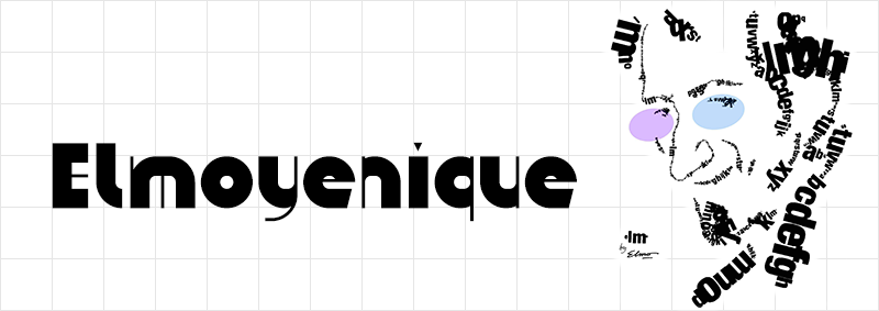
ztefan eYe/FS by Elmoyenique
Elmoyenique has been with FontStruct since September 2009. Time has done what it does best, which is to say it has passed in a twinkling when you reflect upon its passage, yet it has been 12 years that elmoyenique has been making FontStructions. In those intervening 141 months, Elmo has published THREE HUNDRED AND TWENTY-NINE FontStructions which is an incredible achievement by any standard. It would still be impressive if that were all. Of those 329 FontStructions, 196 are “staff picks”, which is to say they are “worthy of special mention” for either excelling in typeface design or using the FontStructor to do some brick magic not commonly seen. Yet, Elmoyenique has remained as humble as he has always been. “I still consider myself a simple learner” he writes, attributing his success to “perseverance rather than skill”. If only perseverance was all that it took. If you made a Venn diagram, the center-intersection of which says ‘Done’, there would be at least three circles involved: Resources, Effort, and Skills. To get anything done requires all three. To do something artistic such as creating typefaces, on a platform such as FontStruct, you need a ton of skills. What Elmo has done is an unparalleled achievement, surpassed by none other. We admire his great work at FontStruct but respect his humble nature even more.

züricher eYe/FS by Elmoyenique
12 years, 300+ fonts, 40,000+ glyphs must have taken him a long time, so it is natural to wonder: Why put in so much effort? The answer is to be found on his own profile page. He says that he has held a variety of professional positions, most of them creative in nature, yet “I always come back to draw letters”. His first steps towords becoming a typeface designer were with “calligraphy with ink and pen; then journal headers and lettering for posters made with a ruler” and “Rotring” pens. His subsequent foray into digital font design began with Aldus FreeHand. Elmo describes his discovery of FontStruct as “like Charlie holding the Golden Ticket in his hands.”
zong4U eYe/FS by Elmoyenique
Elmoyenique was born in 1968 “in wonderful Almería, in the southeast of surprising Spain, southern Europe. Interestingly, I [still] live close to where I was born.” He has “a college degree in teaching (major in mathematics), a bachelor’s in psychology, and a handful of other lower-ranking studies.” Impressive, yet again.
As if that was not enough, relating to work, Elmo says, “I am a teacher and freelance illustrator and graphic designer. At one stage in my life, I tried to orient my future exclusively within the field of graphic design. I’ve been working hard on it for more than nine years, but finally I didn’t get to live exclusively on it. I returned to teaching, and I am still here, mixing it with graphic works that bring me a different kind of joy.” When asked what his daily life is like, he said it’s “fascinating!” :-) “Teaching is living on a carousel (tiring yes, but never boring).” Furthermore, “I draw comics, I do illustrations for children’s books, I design posters, books and brochures, I write for the press about comics, I also write some science fiction and fantasy….Oh, and a few years ago I still I had time to play the saxophone in a group.” Whew!
Which brings us to the reason everyone is reading this.
Why do you create fonts?
“I started drawing letters a long time ago, during the 80’s (literally, I was a teenager). So, I began making the posters for the projections of the cinema-club of my high school, which I later continued when I entered the college [university, in US parlance]. I also started publishing other cultural posters and comics. In those years, personal computers were not as common as today and all kinds of stratagems had to be invented to obtain a good result: cut out previous texts, create them using self-adhesive letters—or in a private printing company, which was much more expensive—or basically draw all the letters by hand, with the help of some rules, a compass and little else and copying from the wonderful Letraset or Mecanorma catalogs. Now anyone can download a cool font and use it for a title or to fill in some texts on his poster or his comic, but in those years, you had to do all of that by hand, drawing letter by letter.”

zykowarfare eYe/FS by Elmoyenique
“The design has changed a lot since then, so much that those years now seem like the stone age to me. Even then, I solved many design problems for those posters by adapting the letters to the required space (it was very easy if you drew them by hand), and from there to the timid design of personal fonts there was only one step. Then I spent several years working as an art director in a famous advertising company in Madrid, and there I learned to use the first Macintosh computers that arrived in Spain (I’m talking about the early 90s). Later, my work was oriented more to posters and illustration, where I took the opportunity to frequently use the skills of creation and modification of letters that those new (at that time) computer technologies offered us.”
What is your font making process? What causes you to deviate from this process?
“My creative process is simple. I always carry a squared notebook [grid pad] with me, where I draw my ideas and things that catch my attention (in FontStruct I have eventually shown some of its pages). Many of those ideas never go beyond being simple sketches, but a large part of my typefaces emerges there. The Internet is also a great field for browsing and inspiration (but never copying).”
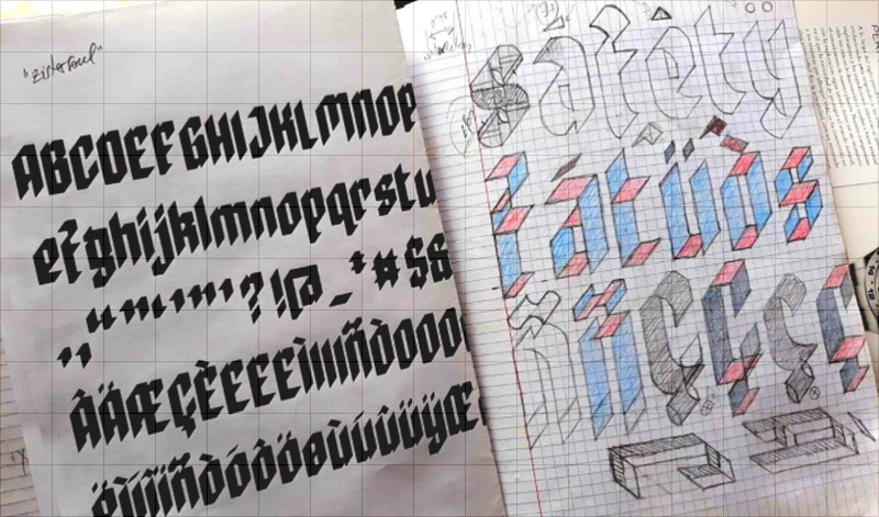
A sample page from Elmoyenique’s ubiquitous notebooks
“After choosing a letter design from my notebook (one I liked it because of something that I see as special), the real work begins. I usually use the FontStruct website to do it because it allows me to complete a font, display it, prepare it properly to show it to the world and download it. And it is also free (for now). Honey on flakes.
Designing a font is like entering a maze…. There are multiple tasks to do: create the glyphs for each of the uppercase and lowercase characters, create the numbers, expression signs and diacritics, special glyphs for languages other than English (Ñ, Ç, ß, etc.) and all those with accentuation. We must also take care of the separation between words and the slow and careful process of kerning (separation between pairs of letters).
But it is a neat maze. Just like when you want to get out of a real maze (you shouldn’t separate a hand from the wall, always the same wall), here some tricks allow you to get out. The one I usually choose is to start with capital letters. I always think of three basic shapes for letters that help me draw them: rectangle, circle, and triangle. The rectangle usually works for me for H, I, E, F, L, T, N and M; the circle for O, Q, C and G; the triangle helps with V, A, W, X, K, and Z; if you join rectangle and circle, you get the basis for B, D, P, U, J and S; and if you put all three together you get R. The above also applies to numbers.”

zoundbro eYe/FS by Elmoyenique
“Then, for the design of the lowercase letters I follow similar steps: rectangle, circle, and triangle. Combining these letters, we get others (j, h, b, d, p, q, k, y, f). For the end, the best are left: a, g and s; these are so special that many times they are the ones that give the typography the authentic personality. When I get to this point, I can usually already see the light at the end of the tunnel.
Despite everything said above, there are also times when a single letter is the one that gives me the idea for a whole typeface and developing it completely from there becomes a fascinating and very creative process.
The choice of name is usually left for last. All my fonts start with z, the simple reason is that my first fonts started like this, and I also like how that letter sounds. I always make sure that none of my fonts has a name similar to another that already exists, to avoid confusion with copyright and in search engines. Oh, and to top it off, the font is rounded off by making an image that is cool and striking— yes, I have used the most diverse methods for this: from photographing handmade designs to image editing and design programs, through screenshots and manual coloring—which reveals the best of the font, and publishing it to be enjoyed by friends who see it in FontStruct and the rest of the world. Et voilá!”
What keeps you going in making a font?
“I have created some of my fonts out of simple necessity, to be used immediately in a certain graphic work, but they have been only a small part of the total. What really drives me to build a typeface is the ability to shape something new and beautiful, something that didn’t exist before I started making it. It’s a fantastic thing.”

zpains eYe/FS by Elmoyenique
“How do these ideas come to mind? Well, they say that love is in the air…and inspiration too, I assure you. ‘May inspiration find you working,’ said the great Pablo Picasso. Everyday objects, store signs, magazines, shadows on the ground, the internet, the range of possibilities is almost infinite. The suggestions are there, you just have to go out and find them. Then comes the screening process. I discard 80% of the ideas that I draw in my notebooks, and of that remaining 20% only a third or fourth part will end up being a fairly viable font. I have dozens of notebooks to corroborate it. [Wouldn’t we love to see those!] The reasons for these discards are very varied (for example, there may be glyphs that resist entering within the general style of the font, or other times that cannot be done in FontStruct as I had drawn them, or they may also be too similar to an existing font, which I usually dislike if it is not searched on purpose…). But I do not want to stop pointing out here the curious feeling that sometimes occurs within me and that I find very striking and fascinating—and this has happened on a good handful of occasions—when I have returned to work years later old ideas because FontStruct has just implemented tools that were not available when I created the font in question. Those continuous advances on the website never fail to impress me.”
While making a font, what frustrations do you face and how do you overcome them?
“Legibility should be the most important thing when you doubt between unity and variety. If one letter is confused with another, it does not do its job. Pay particular attention to similarities between similar glyphs, such as I/l/1, y/g/q, S/8/5, U/V, and many other groups. When you see your font creating words you can observe (and correct) these possible dysfunctions. There are always (or at least in a very high percentage of cases) solutions to these problems, you just have to spend more time searching and finding them. Sometimes it is very frustrating, but it is the only way I trust to solve it.
On the other hand, if there are rules, they can also be broken. What will you use typography for? If it will be a display for headers or posters, you will have more freedom with those broken rules. If it is for writing text, you will need to specify the readability. And if it’s for pleasure, THERE ARE NO RULES. Despite everything, from time to time some fonts, once finished, simply do not work, and that, although it hurts our creative ego, there is no choice but to admit it.
zelemin eYe/FS by Elmoyenique
I would also like to state here that building a font like the ones I usually do, as original and complete as I can, takes a lot of time. You need 36-hour days and, since you don’t have them, you have to steal them from sleep, family or even breaks at work. Sometimes it is really complicated, but you have to try to make everything crimp and roll as smoothly as possible, without making anything squeak too much. And for this the support and understanding of the family is essential. It is not always easy, I assure you. There have been whole years in which I have barely been able to dedicate a few weeks to making letters due to unforeseen and continuous situations beyond my reach.”
Why do continue to make fonts?
“I keep creating fonts because I have so much fun and I have a great time doing it. Since I was young I have been passionate about graphic design, but that has not always given me enough money to make a living from it. And on many occasions, I have found myself drawing letters, in one way or another. It’s only been a few years since I’ve been able to take designing alphabets more seriously and I’ve been combining it with teaching and graphics in general. From all my various jobs I have learned good lessons and I think that an expert eye will be able to distinguish these features with ease when they are reflected in my fonts.”

zpells eYe/FS by Elmoyenique
“Designing a font that has not yet been created is still my next challenge. Before it was easier, but now it is increasingly difficult to find the originality and freshness that I look for in a source since there is more and more competition (well, that is also an incentive most of the time, hehehe).
I would not like to end without pointing out the great importance of the comments that I receive from colleagues through the FontStruct LiveFeed in my typographic creation process. That makes me see mistakes and appreciate successes, it brings me other points of view and solutions, it opens up paths for me. There I receive opinions from people of all ages who come from all over the world, with their different appreciations and points of view. That is usually very enriching for me. My fonts would never have been (and never will be) the same without you all. My heartfelt thanks to everyone who helps me this way. And a billion thanks to Rob Meek for the wonderful FontStruct he’s building.”
How did you discover FontStruct.com? How often do you visit FontStruct.com? What keeps you coming back to fontstruct?
“I discovered FontStruct by accident, searching the net for programs to build fonts, and I fell in love with it from the start. It was a love at first sight, which lasts until today and which I hope to keep as alive as it is now. [How often I visit fontstruct.com] depends on many variables, such as the free time available, the complexity of the font, the mood…. Obviously, I usually dedicate more time to it during weekends and holidays. [What keeps me coming back is that] FontStruct is very intuitive and easy to use, although it can be devilish when you mess with composite bricks and nudging (thanks for that, Rob, I love fighting at short distances). You can build a font in a relatively short time—always depending on the complexity of the font to be made—and then you can download, install and use it immediately. It’s fantastic!”
Do you admire any other FontStructors? Who and why?
“A lot of them. I quote the closest ones, they have all helped me a lot (also on a personal level) and I am very grateful to them for their friendship and kindness with my mistakes. The first is Frodo7 for his balance and knowledge of typography; beate is the second, for her freshness and elegance; my compañero four the third, for his creativity and styling; also the fantastic geneus1 for being artistic and novel; the enormous thalamic/minimum for his continuous originality, insight and innovation; will.i.ૐ for the unexpectedness and complexity of his fonts; architaraz for his freshness, order and cleanliness; Yautja for his simplicity and dedication; laynecom for his careful elegance and typographic knowledge…and anyone else who can teach me something, which are a lot, because I still consider myself a FontStruct apprentice.”
How does the current technology affect your creative output?
“All technological advances help a lot. The production and marketing tools we work with now have nothing to do with those used 20 years ago, they are vastly better. This on the one hand is heaven…but on the other it is hell. I’ve already lost two hard drives from my whole life jobs and one from backups. Unrecoverable. As of today, I have only 20% of the digital work I have done. Well, that could happen with paper jobs as well (a flood could ruin them), but it is much more difficult. Now I worry a lot about keeping copies of everything important, and printing and saving what I can.”
Which of your own fonts are you most proud of? Are there any interesting stories behind them?
“Which of my fonts am I most proud? It’s like asking a father which of his own children loves more. But I tend to remember first those who have been more laborious or difficult to face in their construction. Some have been especially complicated (e.g.: zigourny, zophyka, zapezipi, zugaroo, zizakurraf, zong4U, zergioleone, zharply, zykowarfare, zeamróg…), and finishing their design was a relief for me.”

zigourny eYe/FS by Elmoyenique
“Others, on the other hand, have only given me joy, such as the very used zilverstone and those chosen to appear published in the fantastic collective almanac Typodarium 2015 (there were viewed zlabyrinths, zyrens, zykedelic, zychotropic and zylone). But sometimes you look back and see those little jewels silent with bright eyes (zelemin, zoulskin, zygno, zinequal, zpheres, zilverbullet…). I really love all them.”
zilverstone eYe/FS by Elmoyenique
“Zilverstone also appeared on a double page in a fashionable Canadian magazine and was one of those chosen for the iPad application ‘Pattern Artist’, along with zapristi; zcloudy has appeared on several YouTube gaming pages; zcrapedium, zhadowlite and zfraktur have been used in posters; zendera has been the protagonist of the cover and interior texts of a book… I cannot complain of them.”
You have produced quite a few fonts that have the cowboy theme to it. What attracts you to that style?
“Actually, I don’t think I have built so many western (or Tuscan) style fonts, only 5% of the fonts that I have published in FontStruct carry that tag. The truth is that in my land we have a long relationship with the western film style. We have the only desert in Europe and hundreds of films on this subject have been filmed here (Almería appears as the 5th most filmed place in the world, according to IMDB appearances). Also, I especially like the letters with serifs.”
What inspires you? Is inspiration for creative work different than inspiration for other things in life?
“Life is the Big Idea! La joie de vivre, La Alegría de Vivir. The sun at dawn, the green of the grass (it’s not easy bein’ green! ;) ), the smile that looks at you from some eyes…. That always makes the heart move. The bad moments do not have to be looked for, they come by themselves, when they are least expected and without anyone calling them.” As Madonna said, “beauty’s where you find it.”

zpacekowboy eYe/FS by Elmoyenique
At some distant future, what would you like to be remembered for?
“Now I get quite sentimental. I would like to be remembered as a good grandson, a good son, a good brother, a good friend, a good husband, a good father, a good grandfather…. I know it is asking a lot, but I am doing everything I can. Well, if someone also remembered me for some of my graphic work, that would definitely be amazing. Better than better.”
What a beautiful sentiment. Nothing more need be said beyond this. Thank you for the insightful answers, Elmoyenique. It is a genuine pleasure to know you.
Thank you Ata!