Avowedly modular, graphically powerful, decorative and always playing at the fringes of the legible, Jiri’s designs are worked and re-worked through systematic variations determined by some elusive, cryptic logic. Is it possible to divine the nature of this logic? Can we discover its origins? Who is this Jiri Novak? We sent letters East, to Bohemia, in an effort to find out …
The following interview was conducted via email.
Where do you come from?
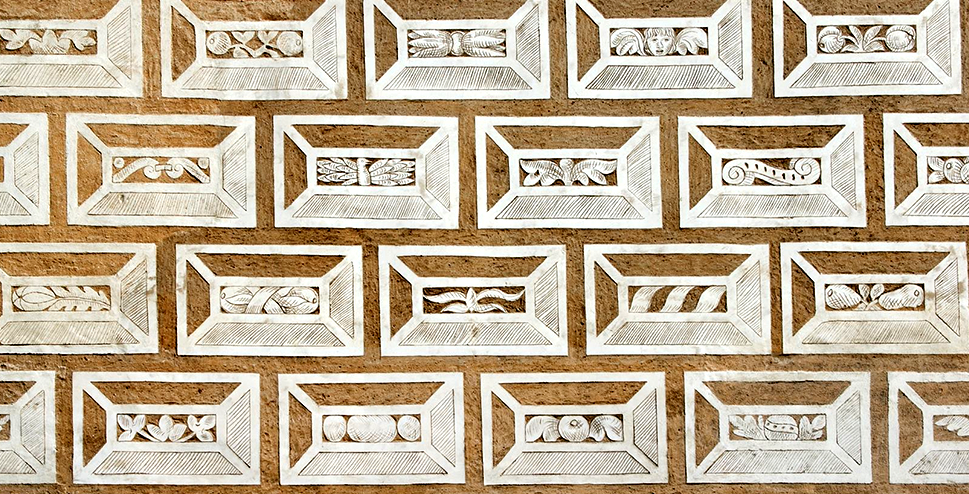
I was born in 1973 in Litomysl (Eastern Bohemia). Litomysl is a UNESCO heritage site due to the presence of a renaissance castle. The castle is extensively decorated with sgraffito — mostly in the form of envelope-like “letters” consisting of a uniform frame and unique central areas. There are approximately 8000 such sgraffito-letters covering the façade. Perhaps being exposed to this at an early age contributed to my mania for iterations with slight variations.
Sgraffitos from Litomyšl Castle façade
Where are you now?
I live in Prague now, but I inherited a small house where my grandparents used to live, in a village near my hometown, and so I regularly go there in my spare time.
In the countryside I have no internet. I can enjoy being disconnected and doing some gardening. I expect to spend my retirement there one day. So, basically I am split between (online, busy) Prague and (offline, lazy) East Bohemian countryside (I like contradictions).
Samples from Jiri’s hazelnut harvest, with mocholataAJ55
Your designs have architectural qualities. Where do they come from?
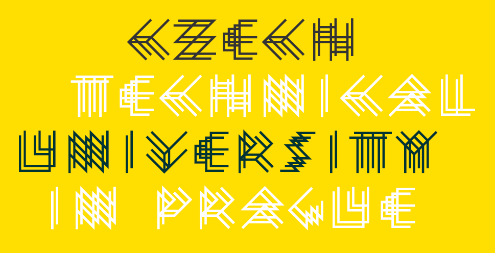
I studied architecture at the Technical University in Prague. I left after 3 years, without graduating.
I am still very interested in architecture but I have zero interest in making a living as an architect (and thus I don’t regret not graduating). Finding FontStruct and designing alphabets was a kind of substitute for abandoning designing houses.
After I terminated the phase of my education I had no permanent job for nearly a decade.
I embraced the life of an aimless drifter and was preoccupied with useless activities (e.g. making ornaments, which I am recreating on FontStruct at the moment).
After this irresponsible phase I settled in a menial job in the polygraphic industry (I was operating a folding machine — A machine that folds sheets of paper).
I did this for quite a long time.
At the moment I make my living by selling paints (Selling “colors” — i am quite a chromophiliac, so in a way i enjoy this dull commercial activity).
Chromophilia? You work with colour perhaps more than any other FS Patron …
If exposed to a complex combination of colors (be it a piece of colorist art, a colorful ornament, or colorful natural phenomena), it (usually) has a strong impact on me. For example, when I attended an exhibition of Raquib Shaw and saw his big format paintings, abundant with colors (nearly kitschy excess of color) I was completely out of my mind, was probably never closer to Stendhal Syndrom then, was almost mildly “tripping”.
Most of the people respond positively to colors (nothing unusual) — I can be (at times) jinxed/mesmerized.
Btw, while doing colorful ornaments on FontStruct I don’t really strive for a mesmerizing combination of colors.
In those ornaments, i use colors rather arbitrarily (color No.1, color No. 2., color No. 3, color No.4) — i.e. an ornament consisting of 4 colors, or of 3 colors, or of 5 colors, etc, etc.
I am doing just a template and expect that everyone will re-colorize those ornaments according to his/her likings.
Do you enjoy your work?
I try to strictly separate my passions and my occupation. I prefer to do as an occupation something that is not mentally engaging (Something I can do on autopilot — with not much mental endeavor) and spare my mental/creative powers for hobbies (I have plenty of hobbies).
I have zero interest in designing something for a client. I have zero interest in aiming at a larger target group and thus making the fruits of my creative efforts sellable — Thus I am absolutely avoiding “creative jobs” within the framework of capitalism.
Please tell us about your hobbies and interests, how they feed into your font design and FontStruct.
Besides making fonts on FontStruct, I am a passionate cinephile. I edit a film database “Kinometer” (conceived and started by my cinephile friend) and I’m a regular on the SCFZ cinephile forum. Occasionally I do English subtitles for Czech films. I guess watching a lot of experimental films has an impact on the way I create fonts (multiple-exposure techniques, the insertion of blank frames in structuralist films, etc.)
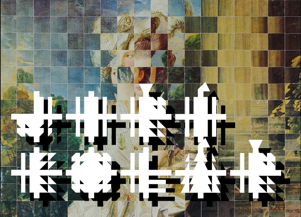
I am also a fervent visitor of art exhibitions (I am fond of art brut) and the collages of Jiří Kolář have had a substantial influence on some of my fonts (and the way I am cutting them into stripes, tearing them up, reassembling them, etc.) Kolář invented or helped to develop multiple new collage techniques – of confrontage, froissage, rollage, chiasmage etc.
Jiří Kolář, Lady in love (1967), rollage-cubomania (wikipedia) with jaubolAW42
I am interested in literature. I actually even compiled a book (it is in Czech but I translated the contents into English). In cinema terms, it is a “found footage” (I found the scribbles of a certain lady — viz the noteworthy handwriting — arranged everything into chapters, writing some fragments myself to make the whole story smooth). I also have a great interest in asemic writing. I would love to make more fonts on the margin between readable and asemic. I wish my fonts to be readable but not with ease.
I try to approach gardening (and also my other activities) with a great deal of irony, I would even say “romantic irony” (which is a part of “romantic aesthetics” which appeal to me).
I have written about blackcurrant and hazelnut harvests in my garden on the cinephile forum I mentioned before – these accounts are allusions to “Ogawa Productions” such as the Red Persimmons documentary.
Jiri’s frothing blackcurrant juice and duotwinAJ2416
Are you involved in broader creative discourse outwith FontStruct?
I am not really a social animal. I would even say I have certain misanthropic leanings.
However, despite my mild misanthropy, there are of course some people whom I do take pleasure to communicate with.
In such a cases, I tend to chat a lot about films (among my dear ones, cinephiles prevail.)
I am also not completely out of architectural discourse (my nephew is an architect).
But I don’t know any type-designer in real-life, and know only one person who is working as a graphic designer (he occasionally uses some of my fonts in his projects).
My attitude to graphic design is highly ambivalent (almost dismissive) because I perceive it as closely related to marketing (which I despise).
My fonts are thus not rooted in the discourse (or needs) of the graphic designers’ community.
I make font families as if making herbarium, or as if filling frames of a film strip (and I am unconcerned whether any graphic designer will find my fonts useful).
This relates to another outcome of my mild misanthropy: I am strongly self-motivated.
Of course it’s pleasing when somebody likes what i do, but I don’t need positive feedback as a stimulus for further work.
Generally speaking, is your mind at peace or hyperactive?
Whenever I am supposed to choose “either A, or B” I feel that both A and B are valid/relevant.
My mind is very often very busy, but I am also able to switch off (turn on, tune in, drop out) and be at peace.
I am a man of contradictions (I cherish contradictions).
I also have to say that due to my mind being very often very busy I am hardly ever bored.
Even when I am within a situation that could be easily described as boring, being busy in my mind, I don’t feel bored.
On the other hand, in an overly stimulating situation, I can easily get irritated — because those excessive external stimuli might interfere with my bursting inner thoughts.
Thus I tend to avoid situations that might be generally perceived as exciting, and I tend to delight in situations that might be generally perceived as boring (from an external point of view).
Today we’re adding many more letters (the entire Unicode 13 standard) to FontStruct.
For those of you unfamiliar with the term, Unicode is a huge long list of all the letters and letter-like things which are used by all kinds of writing systems from all parts of the world. This comprehensive list is maintained by an international group of experts. Every letter (or letter-like thing) is assigned a code number, and these numbers are used to help identify letters inside computer fonts.
Before today, FontStruct supported only parts of Unicode, but now we’re finally providing access to all of the “code blocks” (i.e. all the letters) defined in the most recently released standard (Unicode 13). Now you could design a FontStruction containing as many as 143,859 letters*! I wouldn’t recommend that though. Once you get over about 10,000, you will find that the site and editor will start struggling.
The main reason for expanding the number of letters available on FontStruct is to allow designers to access and design a greater variety of scripts, in particular writing systems – such as Chinese scripts – which use a large number of characters, and also scripts, such as Sogdian or Old Sogdian for example, which we’ve simply overlooked until now. You can also now access the Emoji slots.
There’s still a long way to go in order to fully support the variety of scripts we’d like to see on FontStruct, but supporting Unicode is, I hope, a good start.
You will find all the new letters by selecting “Expert Mode” and then “Menu”, “Advanced”, “Unicode Letter Sets”:
The letter-set select box in the bottom-left corner of the FontStructor has changed. There are many more options of course (360 letter sets), and also a handy new search box to quickly find what you are looking for (desktop only). Note that we broke up some of the huge code blocks, such as the CJK extensions, into smaller, numbered blocks.
Full unicode support has been a very frequent request over the years, so it’s great to finally be able to deliver.
Thanks go, as ever, to our Patrons, and to our sponsors GlyphsApp (the world’s leading desktop type-design software) whose continuing support makes the development of features like this possible.
Happy FontStructing!
(PS: We still don’t provide access to codepoints below 30 – control characters.)
*As @BWM pointed out in the comments, there is a technical limit for TrueType fonts of 65,535 characters, so there’s certainly no point in going beyond that.
Strictly speaking this is not a new feature, but hitherto it was Patron-only. From today, all FontStructors will be able to download any appropriately-licensed FontStruction in the OpenType/CFF format. You can read more about the format and its qualities in this earlier blog post.
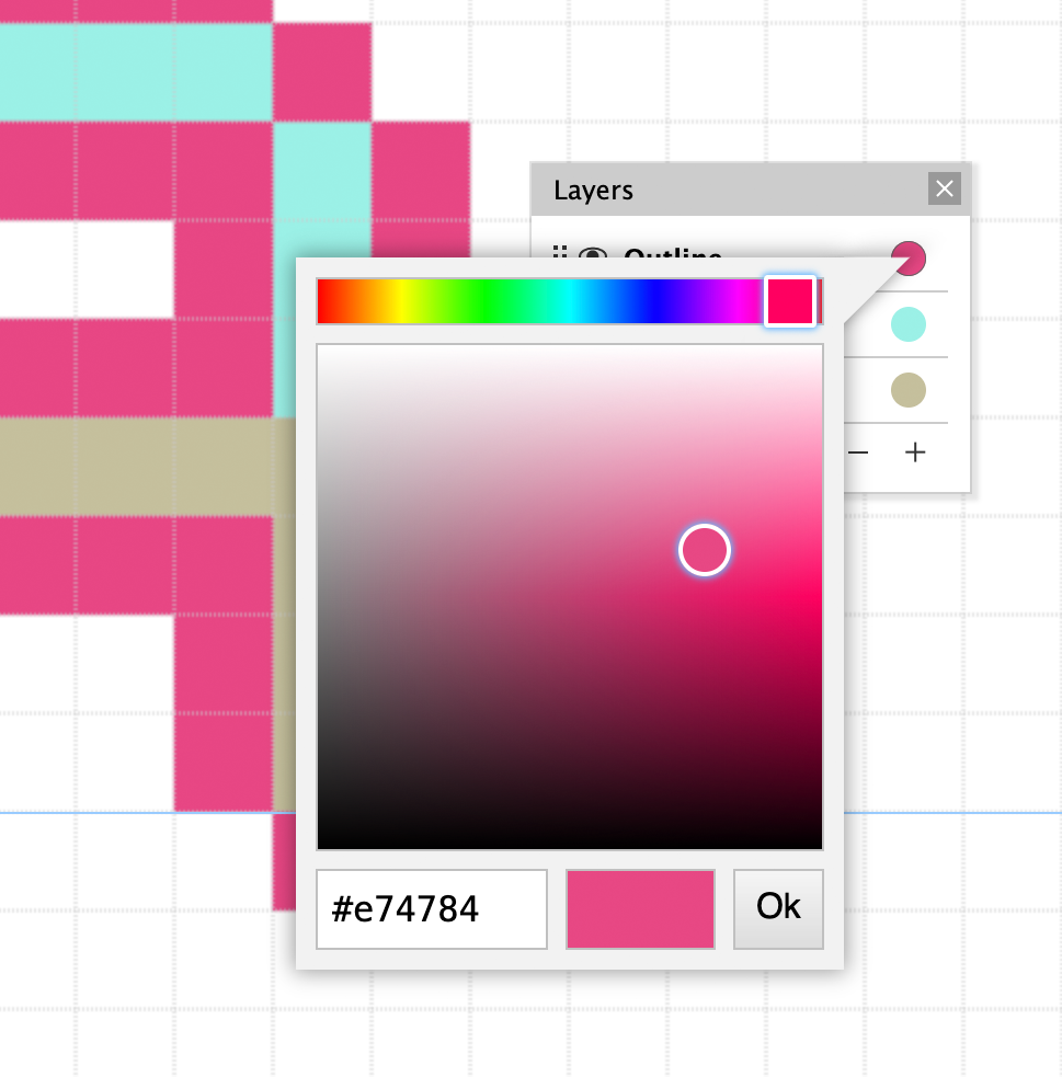
Layers were a part of the original FontStruct concept, and now, over 13 years later, we’re finally implementing them in the FontStructor.
To access the new Layers window, simply go into Expert Mode and then choose View->Layers from the Menu:
Each FontStruction starts with one default layer, but you can add up to a total of eight.
Layers can be sorted using drag and drop, renamed, and, of course deleted if they are empty.
Layer visibility can also be toggled, and invisible layers will be excluded from the download. This opens up the possibility of creating guide layers which you keep visible while designing but hide for download.
I’m confident that the our wily Patrons will come up with many ingenious uses for layers, but perhaps the main reason for introducing them is to allow us to introduce something else, something entirely new to FontStruct …
For good reasons, most real-world design employs only monochromatic glyphs. There is also plenty of scepticism in global design communities regarding the value of color fonts. Some see them as gimmicky, while others are frustrated that, up until now, for the most part, the colors are “baked-in”, and can’t be changed without editing the font itself.
But, polychromatic fonts do have clear uses: for icon sets for example, for emojis (yes, I know we don’t offer emojis as an option in the FontStructor yet) games and other custom projects.
Most importantly perhaps, color fonts are fun to create and use. I think they are a good match for FontStruct – already the birthplace of so many, wonderfully-extravagant display fonts.
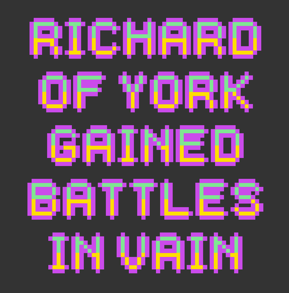
So, with up to eight layers in the FontStructor, you can now work with up to eight separate colors. Simply assign a color to each layer using the color-picker.
You can download your multicolored font from the FontStruction’s download page. The “Richard of York” image above was created using a color font built using FontStruct.
Note that only certain desktop software supports color fonts, and there are a number of competing formats.
The format we are offering initially is called “OpenType SVG”. This format is supported by Windows, OSX, by Sketch, the Affinity software, Adobe Photoshop, Illustrator and InDesign, by Paint.NET and by some (but not all!) browsers. Note that OpenType SVG fonts also always contain a monochromatic fallback version of each glyph, and you will always be able to download traditional TrueType and OpenType versions from FontStruct.
This is only the first step in our exploration of color fonts. We hope to add support for other color font formats (such as COLR) in the future to offer wider browser support. We may also add a multi-font download option whereby each layer can be downloaded as a separate font.
Become an FS Patron
As these are “niche” features, it’s likely that we will keep layers and color fonts as patron-only in the medium-term and possibly even long-term. If you are desperate to try out color designs in the FontStructor, remember that you can sign up to be a patron at any time to not only enjoy access to this feature, but also to directly support the ongoing development of FontStruct as a whole.
Thanks
Thanks, as always, to our wonderful sponsors GlyphsApp, and to our treasured Patrons.
Wow! That was amazing. I didn’t think it possible, but you have surpassed yourselves once again.
I’m sorry that it took an extra week to complete this blog post. One major difficulty was simply that there were so many competition entries worthy of recognition. Indeed, many entries merit a blog post all to themselves. I would encourage anyone reading this to browse all the entries directly because they simply cannot all be represented here.
Let’s have a look at a selection of the entries. You’ll find the prizewinners at the very end of the post, but everyone who entered is a champion. Well done!
– We start with four wonderful, intelligent designs, all of which were a delight to work with as installed fonts. I love the dot details in Codarte.
db Mangold leaves me speechless. I’m guessing the inspiration is Bernhard Antique but this seems to be a completely original and mature design that goes far beyond what I thought was possible with FontStruct. Amazing.
twentysomething is a lovely, light and playful thing which ended up being the FontStructor’s favourite this time around.
KD Dekorat with its maze-like panelling is a beautiful example of how diverse Deco typography can be.
I’m not sure what G1 Decoreus was inspired by, I’d love to know, but it certainly feels true to the architectural and decorative spirit of the 1920s. Stout and elegant at the same time. I love it.
KD Jermaine is an intricate and pretty multilined deco typeface, but note also the clever XX pun running right through the alphabet.
db Ventica: Um. What? How? ?? Another virtuoso re-FontStruction of an original ’20s typeface, this time, I believe, Fanfare. Amazing!
KD Xxies is yet another fine Deco typeface from architaraz. Note that although I have only used the caps here, there is also a lower case.
The inimitable jirinvk created an entire family of graphically strong bulbambuls for the competition, inspired by Gunta Stölzl (1897–1983), the Queen of Bauhaus. Note that the letters in the sample are rotated slightly from the original typeface.
TM RenMac, shown very much out of context here, cleverly takes the work of Charles Rennie Mackintosh, the Glaswegian Designer and Architect, and reinterprets it on the FontStruct grid. Thanks for this one miminum!
Caligari is a lovely, messy cutout design which inspired the sample as a whole, while Gilded Teatro forms another little family: A perfect articulation of deco style in two pixel fonts, both a pleasure to work with.
KEM Base is inspired by the work of designer Kem Weber. I enjoy the quirky asymmetry. For me the design is suggestive of early 20th century primitivism.
The beautiful leaf-like “briste” also has an organic character, belying the grid beneath, while right at the bottom you see the ambicase Moderto – a perfectly executed and very legible design inspired by Futura Display.
Some extravagant deco geometry in Baardusan, and then three FontStructions from elmoyenique. I really enjoyed the rich back story to his entries, connecting three art and design movements which marked the 1920s – Bauhaus, Deco and Contstructivism – with their three European capitals, and with three mysterious figures appearing in a series of period photos. When the novel comes out, I will read it. With Zandrine, as with beate’s entries we’re going back into typographic history, perhaps well beyond the 1920s in this case, to Rubens perhaps?
tm The XX caught the eye of our guest judge, Nick Sherman:
“I love type that pushes the boundaries of how type should work or how it even can be rendered with current digital rendering technology. This typeface does both of those things. In many typical typographic contexts of size and resolution, all the little details of the design turn to mush (the fact that there are specific instructions on how to zoom to see it properly on the FontStruct site is just one such example). But if you have the bravery to set it at gigantic sizes, you can really see how wonderfully bonkers it is. Between the underlying patterns and the variants of each letter, there is also all kinds of potential for cool effects with color and overlaid glyphs.”
Russian AG is an impeccable Rodchenko-inspired slab-serif with cyrillic support. Twenty-tmchty is a highly conceptual interpretation of the theme – a twenty-by-twenty grid and only twenty unique glyphs covering 66(?) different symbols. So for example, one glyph is used to represent l,u,v,L,U and V. Fascinating!
“This typeface occupies a spot among other halftone typefaces like Calypso, Tonal, and especially Process. I’ve always had a fondness for type that plays with halftones, and the fact that this one recreates the effect so effectively within the limitations of FontStruct is admirable. The play on the concept of 20/20 vision by creating a blurred effect is also a nice visual tie-in to the ‘twenties’ theme.”
He liked the “Mexico Olympics vibe” of db Questura and appreciated the full character set, and he also saw something special in NX Chaos:
“At first I was on the fence about including this typeface among the highlights of the ‘twenties’ competition. There were other designs that were executed with more skill, had more complete character support, etc. But I kept coming back to this one because it’s a rare embodiment of pure nihilism in the form of a typeface. It follows a style of glitchy digital graphics right to the brink of complete illegibility, as if to say: ‘Go to hell. I don’t even care if you can read this’. It’s like a font from a cyberpunk nightmare, and sometimes that’s the kind of energy you need when designing in the 2020s.”
To our guest judge for this competition: Nick Sherman. Nick runs HEX a typographic company that makes fonts and websites. He’s a founder and designer of v-fonts.com and Fonts In Use, and art director of the Typographics design festival. Nick is a graduate of the Type@Cooper Extended Program in typeface design and has served on the Type Directors Club board of directors, the Adobe Typography Customer Advisory Board, and the Hamilton Wood Type & Printing Museum artistic board.
To our patrons – those FontStructors who support the ongoing development of the project and help make events like this competition possible.
To our generous sponsors Glyphs producers of the world’s leading desktop font editor for OSX.
It’s been a while, too long, since we last raised the gates to unleash FontStructor versus FontStructor in mortal combat.
It’s also been a while since we had a competition, so
Let the bricks be levied!
Let the grid be burnished bright and the curtains drawn!
It’s time to compete.
Competition Brief
We would like you to build one or more FontStructions which are somehow connected to our competition theme.
The theme for this competition is “Twenties” (thank you beate!). We chose it from among many great suggestions, firstly because it’s suggestive of an exciting era in typography, but also because it can be interpreted in a much broader and abstract fashion.
So please interpret the theme as loosely as you wish – it’s there only to inspire, not to confine.
– You might well be inspired by the Art Deco and modernist typography of the 1920s, but you might also choose to work on a 20×20 grid, or you could look to any aspect of our own peculiar decade for inspiration. You could turn your thoughts to the 1820s, the 1720s, or even the first XXs CE.
So, the image at the top of this post is there only for decoration. It does not indicate any expectations or a given direction. You won’t be judged on how “twenties-ish ” your design is.
If you’re really struggling for ideas, you could explore some of our curated Sets, such as “Bauhaus Inspired”, or “Art Deco”.
Competition Time Period
Thursday, 25th March 2021 – Friday 9th April, 2021
Competition Rules
You must be a registered FontStruct user.
Your submission(s) must be posted and made “public” between 25th March 2021 and 9th April, 2021. Although you are encouraged to share your submission(s) at any time between these dates, your FontStruction submission(s) must be public (marked “share with everyone”) no later than 9th April, 2021 at 11pm PST. Additionally, your submission(s) must remain public at least until 17th April 2021 in order to give the judges enough time to review all qualifying entries.
Your submission(s) must be tagged with a “TwentiesComp” tag. (For fairness, during the competition time period, no FontStruction with the “TwentiesComp” tag will be awarded a Top Pick.)
Your submission(s) must be downloadable. If your FontStruction cannot be downloaded, the submission will not be including in the judging.
Your submission must be a newly published FontStruction. Simply adding the “TwentiesComp” tag to an already published font is not allowed.
For each submission, you must post at least one sample image in the comments of the FontStruction.
No letters in each submission can be MORE THAN 48 grid squares high.
FontStruct cloning is permitted but the judges will be looking for original work.
You may enter up to three FontStructions to the competition.
This is a friendly competition. Cheering, favoriting and fun banter is encouraged but cruel and uncivil behavior will not be tolerated.
No rules regarding licensing. You may choose any license you like for your FontStruction. (but it needs to be downloadable!)
Judging and announcing the winners
All qualifying FontStructions will by judged by the FontStruct staff and a guest judge* between April 10th and April 17th. Three prizewinners will be chosen. One of these will be the FontStructors’ Favourite. Winners will be announced in a FontStruct Blog post on Monday April 19th 2021.
*UPDATE: We’re delighted to confirm Nick Sherman as our guest judge for this competition. Nick runs HEX a typographic company that makes fonts and websites. He’s a founder and designer of v-fonts.com and Fonts In Use, and art director of the Typographics design festival. Nick is a graduate of the Type@Cooper Extended Program in typeface design and has served on the Type Directors Club board of directors, the Adobe Typography Customer Advisory Board, and the Hamilton Wood Type & Printing Museum artistic board.
Prizes
Each winner can choose a t-shirt printed with a FontStruction glyph of their choice.
FontStructors’ Favourite
The valid entry with the highest number of legitimate favourites (yes we check) at 11pm PST on 16th April 2021 will be one of the three prizewinners.
Questions?
If you have questions just add them as comments to this post.
FontStruct – our website, our modular font editor – has always been free to use, and FontStruct will remain free to use for everyone.
Thanks to our generous sponsors, past and present (thank you Glyphs App!), and to our advertisers, we have secure funding to keep the bricks flowing through 2021 and beyond.
But, as this blog post hopes to explain, we have reached a point where we need to look at how the project supports itself financially, in order to keep moving forward.
Today, to try and address our funding challenge, we’re introducing a new micro-sponsorship scheme called “FS Patrons”.
By contributing a small sum (5€ / month, or 55€ annually) you can become what we’re calling an “FS Patron”.
Sold already?! You can subscribe here. Unsure? Read on …
The benefits of being an FS Patron
As an FS Patron, aside from revelling in the happy knowledge that you are directly supporting the FontStruct, you will receive a few tangible and guaranteed benefits:
No adverts
No nag-screens (We are introducing these for certain FontStruct pages. They will remind you about FS Patrons. You will notice them soon).
Optionally, an initimable badge of honour for your avatar.
We also plan to reserve some new features exclusively for Patrons.
For example, from today, we will be offering new download settings, including the option of OpenType CFF downloads, for Patrons only (you can read more about this exciting development in a separate blog post).
As time goes on, and as additional new features are added, we hope that exclusive features will be opened up to the rest of the community. In this way, “FS Patrons” is intended to function as a kind of early-access/preview programme. You may be familiar with this kind of model if you use “Patreon” – where creators release material exclusively and early to their patrons, before a subsequent public release.
Why does FontStruct need FS Patrons?
– Asterias Fontstructi commonly known as “Staff pick stars”, pictured in their natural environment. Considered a delicacy by FontStructors, they are in fact a common species. While easy to find, they can prove perilous for staff to gather. Their brittle, razor-sharp points, and their preference for the slipperiest of rock pools necessitates the wearing of thick gloves and expensive footwear. Best harvested shortly after high-tide. Photo by Brian Yurasits
FontStruct is busy all year-round, 24/7, with FontStructors from all around the globe: from school and college students to budding amateur typographers and established designers.
Browsing through the amazing archive of modular typography that’s accumulated in the gallery is a daily joy. We are boundlessly proud of everything that the FontStruct community has achieved over the last 12+ years.
We have welcomed over 1.5 million registered users to the site, and there are over 1.8 million FontStructions great and small adorning the database. That’s a total of almost 50 million glyphs!
– These are some quite big numbers – A great crowd of people, and a great heap of data to administer and care for.
For the FontStruct staff there are always support mails waiting for an answer, servers to maintain and content to moderate. We have hosting and CDN bills to pay. We have bugs to fix.
In an ideal world, we would not only busy ourselves with maintenance and support. We would also spend time designing, developing and delivering new features, improving our users’ experience, writing new blog posts, updating our documentation, running competitions and investing time in moderating site content. We are doing all these things – but, because of our very limited resources, we can only do so slowly and patchily.
Pixel bricks are not a natural product. Mixed according to a secret recipe and baked each night in industrial trays, they need to cool to room temperature before being fed into through the precision cutting machines. Photo by Andrew Moca
The truth is that the “FontStruct Staff” does not really exist. While FontStruct has many kind friends who continue to help and support us in one way or another, and of course there is the wonderful “we” of the FontStructor community, there is no real “we” here at FontStruct towers. Since 2010, I (Rob Meek) have run FontStruct as a personal project from wherever I am, usually from a room in my flat. I’m sitting there now on a late Sunday afternoon, writing this blog post, having spent most of the day so far making some very silly pictures of imaginary brick harvests.
But FontStruct is not a one-person show. It’s less than that. Because FontStruct brings in no significant revenue, and in order to actually pay the bills, I need to spend the majority of my time doing work that has nothing directly to do with FontStruct. For example, working as the lead developer for the wonderful Fonts In Use, as well as for the excellent new type foundry Fontwerk. I also regularily work freelance for the design agency CDLX. – These are all great jobs which I enjoy but I have other clients as well and I could happily drop some of them. – So, in reality, the human resources available to this project are very thin indeed.
I’d like to work more for FontStruct, more frequently and I’d like to be paid for some of it. That’s why I’m launching “FS Patrons”.
– Circle bricks are actually a perfectly spherical fruit, best harvested in the early morning. Only the ripest, roundest examples are good enough for the FontStructor. Photo by Bambi Corro
But don’t worry!
All things considered, with or without “FS Patrons”, our project remains healthy. Technically we are in a reasonable place, and we will continue to manage well with the limited funding we currently enjoy. Personally I continue to love most of the work I am able to do on the project, so I’m not going to walk away …
… but, given more funding, I would be able to dedicate some more time to FontStruct, and work on more new features, such as, for example:
improving the way we present character sets
extending unicode support
adding layers
supporting colour fonts
supporting custom bricks
supporting some OpenType features
adding real support for non-latin scripts
sorting out the abysmal gallery search
updating the site design
– All these things will take a long time to implement, with or without additional funding, but your support can help to accelerate the process.
So, if you’d like and if you can (I know times are tough for many!), please consider becoming an FS Patron.
Note: This blog post is about a FontStruct feature which is currently exclusive to FS Patrons.
Today we’re excited to introduce a new kind of download for our Patron FontStructors: OpenType font files using CFF outlines with the .otf filename suffix.
All FontStruct downloads have been OpenType font files for quite a while now, but OpenType fonts can contain different kinds of “outline” (in FontStruct, the outlines are the actual brick shapes).
Hitherto, we have only offered downloads with TrueType outlines. From today, we’re also offering CFF outlines.
CFF outlines differ from TrueType in several ways, including:
(mostly) Smaller file sizes.
(often) More accurate and economical description of curves. For example, rounder circles.
(optionally and experimentally) “fixed point” coordinates, which may facilitate more accuracy of detail for certain downloads.
Smaller File Sizes
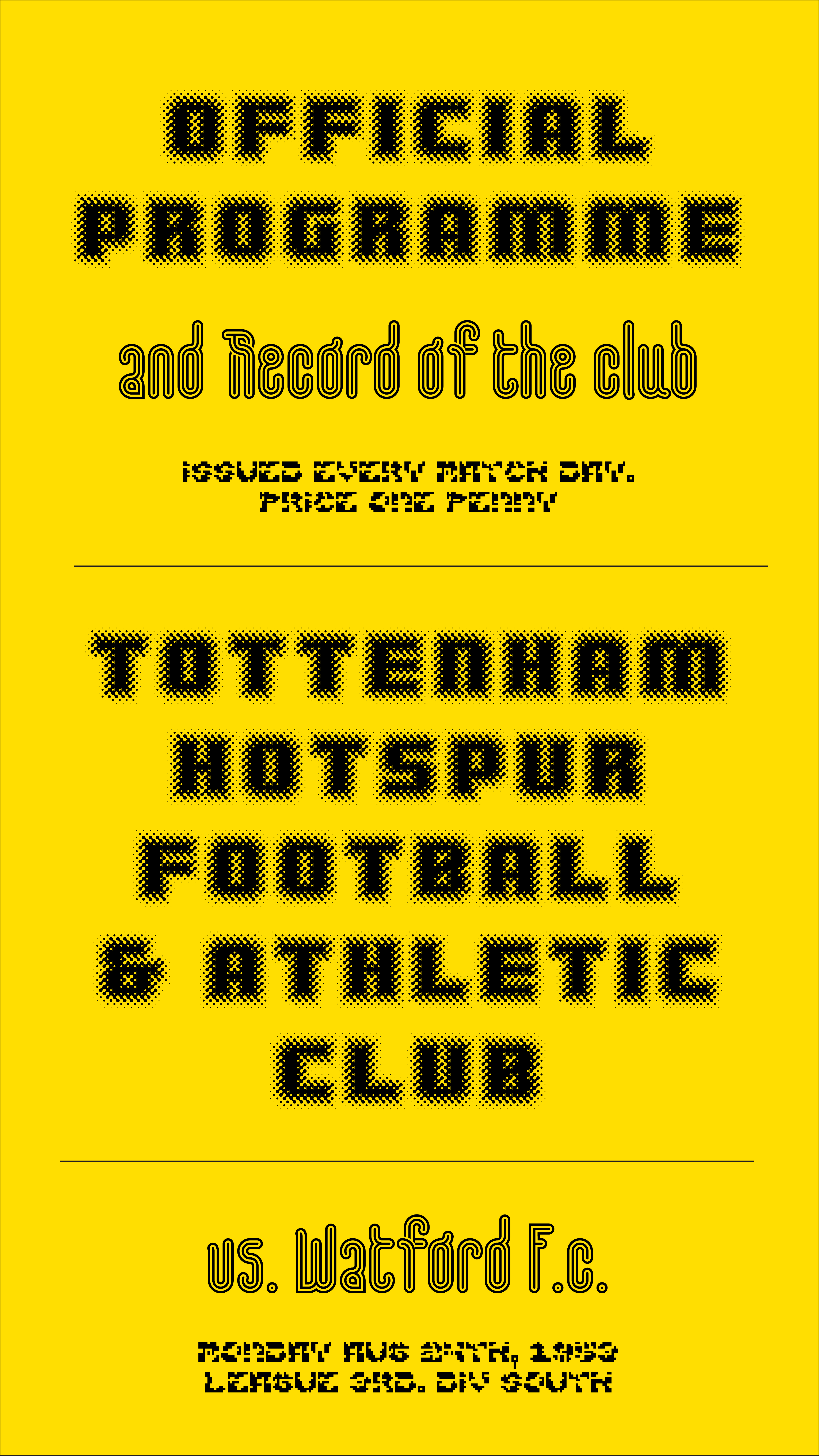
The new CFF downloads will often be smaller than their TrueType counterparts. For example, the illustration shown below uses the font “zporty eYe/FS” by elmoyenique. This has a font file size of 444K for the TrueType download, and only 162K for the CFF – that’s much less than half the size. File size is important, as fonts take up memory and large fonts can crash software. Some downloaded FontStructions are very large!
More Accurate and Economical Curves
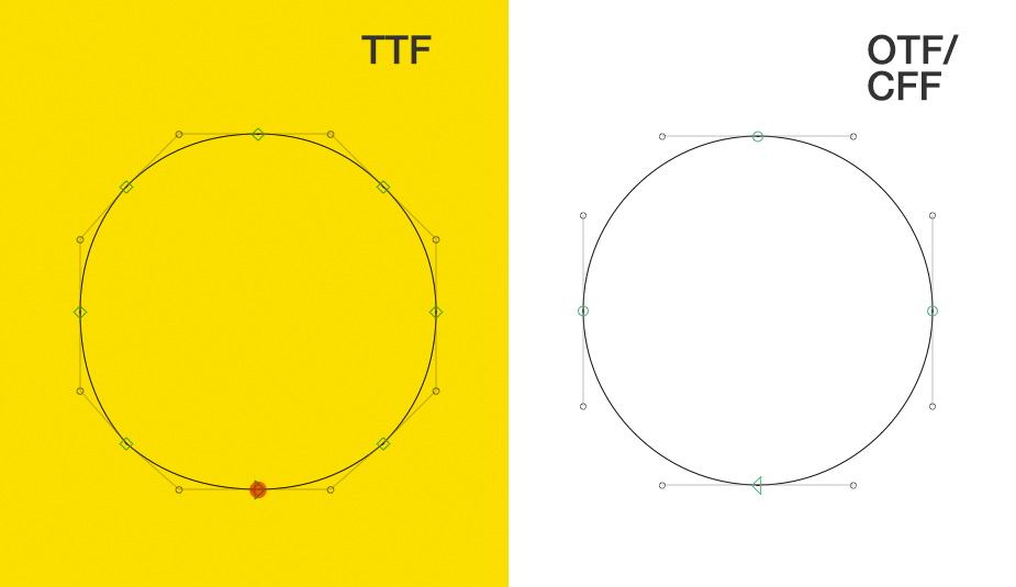
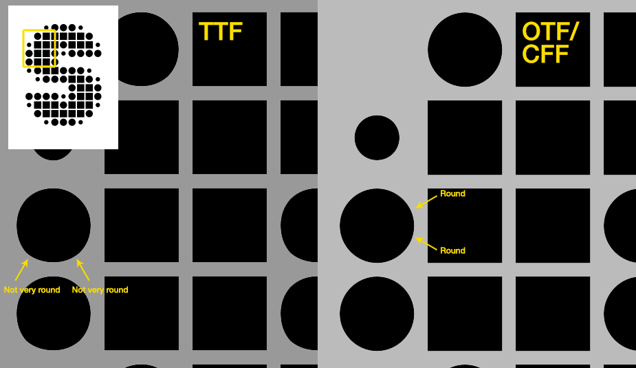
In a CFF file, curves are represented using two control points (these curves are called “cubic béziers”), as opposed to the TrueType outline format which represents curves using single control points (“quadratic béziers”). For many FontStructions this difference may not be noticeable, but in some cases you will find that CFF outlines are more accurate. For example, you can see the distinction clearly in the case of circular bricks, especially when you use a great number of small circles in your design:
Some of you may have noticed the dough-like melting which afflicts FontStruct’s circle bricks in TrueType downloads. Many years ago, Luc Devroye shamed FontStruct on this point, and quite right too! Things have improved in the intervening time, but CFF outlines now give us our best, and most reliable circles ever!
Fixed Point Coordinates
We’ve also added an option to create CFF outlines with “fixed point” coordinates. I’d like to stress that this is quite an unusual format variant. As far I as I know, it’s seldom employed in professional type production.
In a standard OpenType font, all the contour points are placed on a grid of possible positions, the resolution of which is called the “em square”. Roughly speaking, if you have an em square of 1000, then all your contour points must sit on a 1000 x 1000 unit grid. “Design with Fontforge” has a good page explaining the em square format.
OpenType fonts with TrueType outlines traditionally use an em square of 2048 or 1024 (the former is the default for FontStruct) while OpenType with CFF outlines generally have an em square of 1000 (Although it can be more. We’re trying 2000 as FontStruct’s default for CFF.)
Crucially, all the points in your designs have to sit exactly on the intersections of this notional grid. So, in a standard OpenType font, despite it being an infinitely-scalable vector format, there are very clear and finite limits as to where your points can sit. You can position a point at exactly a grid coordinate of (100,100), but not at (100.5, 100.5). i.e. You can only have integer (whole number) coordinates.
From today, FontStruct also gives you access to an option, allowed by CFF, which overcomes this limitation. You can choose to define your coordinates as “fixed point” numbers. This will not affect your design work the FontStructor, but it will affect accuracy when it comes to converting your design to a font file. Using fixed point numbers, the font generator can position points more “freely”, at 100.5, 100.5 or even 100.3333, 100.3333 etc. if it needs to.
To be honest, I’m not sure how useful this fixed-point coordinate option will prove to be, but considering how complex and detailed some FontStructions are, it may help in exceptional cases. We will see!
It’s important to note, that if you do opt for fixed-point coordinates, this will make your download sizes significantly larger.
To support our new download format, we’ve added some additional download configuration options to the FontStruction pages, and also one important option on your personal settings page.
On your personal settings page, you can opt to allow any of your shared designs to be downloaded by others as OpenType fonts. You can also override this setting on a FontStruction-by-FontStruction basis.
On the FontStruction page, you can access the new options by clicking on “Advanced Settings…”
– Here you will find a couple of familiar options along with some new ones.
You can now choose to:
Share alternate formats (i.e. OpenType CFF) with other users (only if you are sharing the FontStruction for download of course). This setting overrides the global setting from your personal settings page.
Choose an em Square for TrueType and CFF downloads from a list of sensible options.
Use fixed point coordinates. (experimental)
Interested in using CFF downloads today? Not a patron yet? Learn more …
As promised, today we’re introducing a series of new features, enhancements and bug fixes to FontStruct.
Line Height Control (Vertical Metrics)
Until now, FontStruct has automatically calculated the overall line-height and line-spacing for each downloaded font. This is usually fine, but every now and again people request manual control over these values.
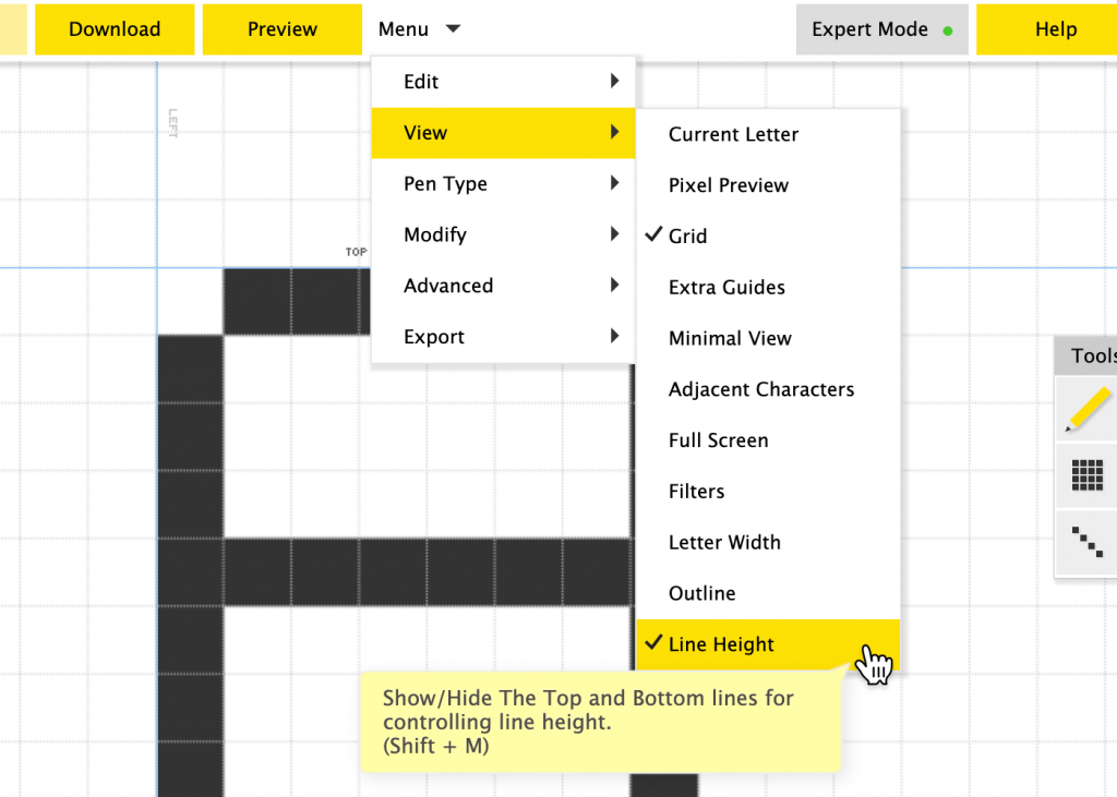
Today we’re giving FontStructors this option. To use it, first select “View” and then “Line Height” from the menu (You need to be in Expert Mode):
– Select Line Height from the Menu in Expert Mode
Two new lines labelled “top” and “bottom” appear on the canvas. You can simply drag these lines to specify a height for the font. The lines snap to 1/8 of a grid square when dragged and dropped and you can click on the little reset button to go back to the default, automatic calculation.
– Adjust and Reset the Line Height lines.
The values which you specify like this will be stored in your downloaded font file. In accordance with the first law of FontStruct – thou shalt not make things unnecessarily complicated – that’s all there is to it!
Please note that a lot of desktop software will still ignore or mangle whatever vertical metrics values are stored in a font file. So you may not always achieve the precise desired effect. For anyone interested, some souls braver than I have researched and documented the history of this mess elsewhere.
Anyway, I think FontStruct’s new feature will suffice to solve many line height problems, and you will find that some desktop software (Glyphs for example) will indeed respect your placement of the new lines.
Improved PhoneStructor (Touch Support in the Editor)
The FontStructor editor and the FontStruct website have been kind of usable on phones and tablets for quite a while now, but in reality, FontStructing on a touch devices has hitherto been cumbersome and impracticable.
With today’s update, we’re adding a series of interface optimisations to significantly improve FontStructing for users of touch devices and small displays, including …
1. Finally, a tap-friendly Menu!
The dropdown menu, which simply didn’t work on touch devices, now does. Note that the “Expert Mode” toggle now appears as part of this menu on small displays.
2. The Toolbar is docked and augmented
To keep it out of the way whilst drawing, the toolbar is now automatically docked to the top of the screen. Some commonly used actions (undo, redo and fullscreen) have also been added for ease of access. Note that the docked toolbar only appears on very small screens (phones in portrait mode), tablets are unaffected.
3. Improved Zoom
Pinch-to-zoom is now possible, making the zoom palette superfluous and so freeing up valuable screen space for drawing.
4. Brick Palette Toggle
The brick palette (My Bricks and All Bricks) can now be toggled with a single tap. This gives you swift access to your bricks while also freeing up more screen space for drawing.
5. Character Selector also works!
Something else which didn’t work properly on touch devices until now was the scroll functionality on the character selector. It does now. We’ve made the arrow buttons and the letter selectors themselves a bit bigger to suit your fingertips, and you can even swipe along the list of characters to scroll through them.
Miscellaneous Fixes and Improvements
In addition to Vertical Metrics controls and improved touch support we’ve also made a number of diverse tweaks to the site and the editor.
1. Spontaneous Brick Swap Fix
This will be familiar to some of you as the worst bug in FontStruct: You save your work, then after reloading it the following day, you find that “gremlins” have swapped out some of your bricks overnight and your design is corrupted.
– This has proved a very difficult bug to reproduce and fix, but we are introducing a change today which hopefully will improve matters. Fingers crossed!
If anyone does experience this problem again in the future, please let us know, especially if you can provide us with detailed steps to reproduce the problem.
2. Cyrillic in the Widget
Recently, more FontStructors have been adding Cyrillic letters to their fonts or making purely Cyrillic designs. We’ve added a Cyrillic preview option to the widget to support this trend. Suggestions for a better Cyrillic sample text are welcome.
3. Links in descriptions
The editor for writing FontStruction descriptions was broken, making it impossible to add proper links in descriptions. That should be fixed now.
4. Comment Removal
You can now remove your own comments for up to one hour after you have made them.
5. Improvements to Glyphs Export
We’ve made a few improvements to the Glyphs Export functionality.
Firstly, we updated the export to work with the latest version of Glyphs.
Secondly we added the FontStruct grid in every export, so you can now continue to reference the same grid in Glyphs.
Thirdly we have made the export behave differently when you are exporting a “pure” pixel font (i.e. one consisting only of pixel bricks and without any filters). When you export a pixel font like this, the exported file will be compatible with the official Glyphs Pixel font plugin, which is actually pretty cool. Now you can move seamlessly from working in FontStruct to working in Glyphs. Thanks to @gingerbreadman and @glyphsapp for encouraging and helping us get this one done.
6. Removal of the “Contribute to Google Fonts” Button.
We love Google Fonts and have benefited greatly from their support in recent years, but we’ve decided to remove this button from the site.
Unfortunately there were technical issues with keeping the functionality working consistently at our end, and overall it did not seem that this form of submission was working very well.
We continue to encourage designers whose work fulfils the Google Font criteria to submit their work for consideration to them, and we will keep the OFL license option (this is the principal requisite license for Google Fonts) as a permanent part of FontStruct.
Future submissions of FontStructions to Google Fonts will have to be made manually and independently of FontStruct.
7. Grid-coordinate Display
This is an experimental one. If you are in “Expert Mode” you will now see the current grid coordinates in the bottom right hand corner of the screen.
8. “Desert rescue” feature
Every now and again someone gets in touch having somehow panned off into the unmapped farther reaches of the grid. They’ve lost all orientation and have no idea where the baseline or origin is.
Clearing the browser cache was the old advice here, but now much more conveniently, you can simply double click or double tap on the “hand” panning tool to return the grid to its default position and find your way home.
Many thanks to all participants for another tremendous Structathon.
I hope everyone had as much enjoyment building their FontStructions as I did in seeing all your diverse and wonderful ideas land in the Gallery over the past few weeks.
There’s one thing I haven’t enjoyed so much: The judging. To those of you whose work is not mentioned in this post: I’m genuinely sorry! The selection included below is just a subjective sampling.
There were many, many other entries which could easily have won had the wind at FontStruct Towers swirled in a different direction on the day.
Anyway, let’s start with a review of some of the standout entries.
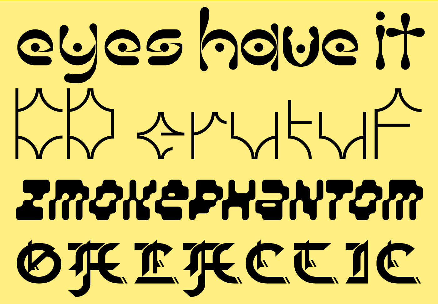
Alien Folk
I love the psychedelic, folk-horror connotations of “The Eyes Have It” from jonrgrover. When I retire to roam the hollow ways in my spooky carnival wagon, I’ll be daubing these glyphs on the side.
KD erutuF from architaraz also teasingly marries the primitive and the futuristic. If that black obelisk from “2001: A Space Odyssey” had some runes carved into its base, I believe they would look exactly like this.
zmokephantom eYe/FS from elmoyenique is an oddball amongst oddballs, a bizarre rippling italic, perhaps the first FontStruction to actually melt the bricks, while Galactic Gothic from bluemon is an ingenious attempt to hack blackletter and technoid features into a single font.
Techno Stencil
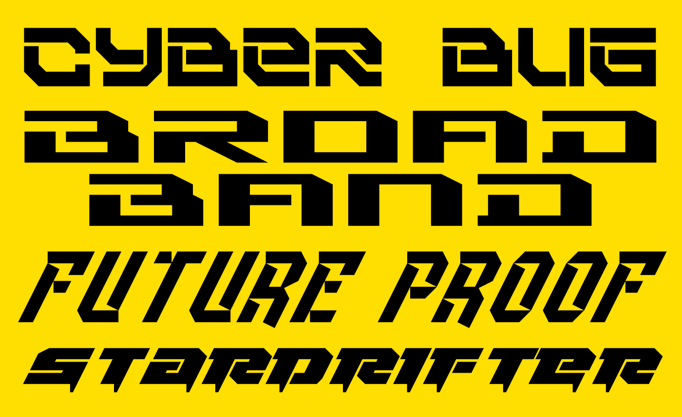
Quite a number of entries explored a classically technoid, futuristic trope with heavy, slabby designs – fonts all ready to be stencilled on the hull of a rusting, refurbished star-cruiser. Cyberbug from elzero, Broad Band Ultrawide from japanyoshi, Future Proof from four, Stardrifter, also from elzero and Rollerball_1 from JingYo are all examples for this genre and demonstrate the excitingly diverse possibilities within it.
Future Restraint
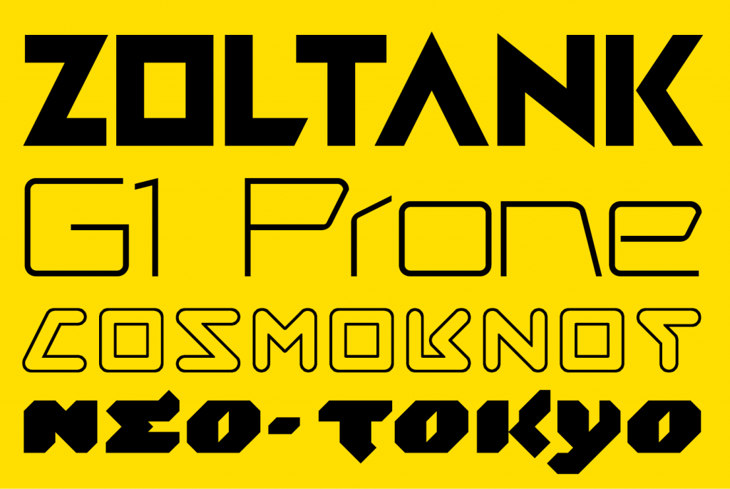
Some visions of the future were cleaner and more restrained.
Zoltank is a constructivist-flavoured, geometric display face from FontStruct’s long-time master of retro-futuristic typography, our very own Stanisław Lem, V.Sarela (I hope that’s a compliment. It’s intended as one).
Designed for “the future of Telerobotic medicine.” I recommend reading geneus1’s full explanation for the cool and elegant G1 Prone.
Like Zoltank, Cosmoknot by time.peace is expertly FontStructed and subtly complex. I believe it to be the only outline font among the entries. It’s full of fun glyph shapes, and makes a neat, oblique reference to the NASA worm.
I also really enjoyed Neo-Tokyo from Frodo7. Hints of flicking brushwork bring life to the otherwise technoid forms.
Catch and Patch
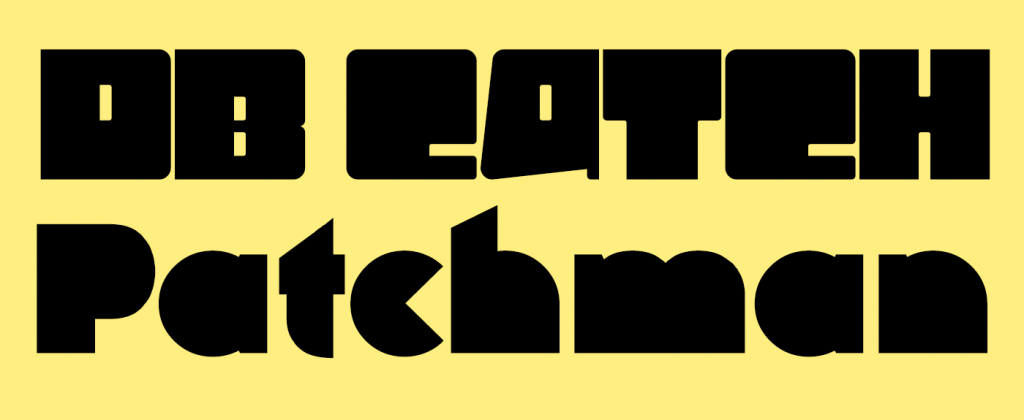
– Two leet entries from FontStructing legends. db Catch by beate has no obvious futuristic reference or connotation that I can see but it’s a fascinating and highly original entry. I love the internal dots on the i and j, and the umläute. Are they the “catch”?
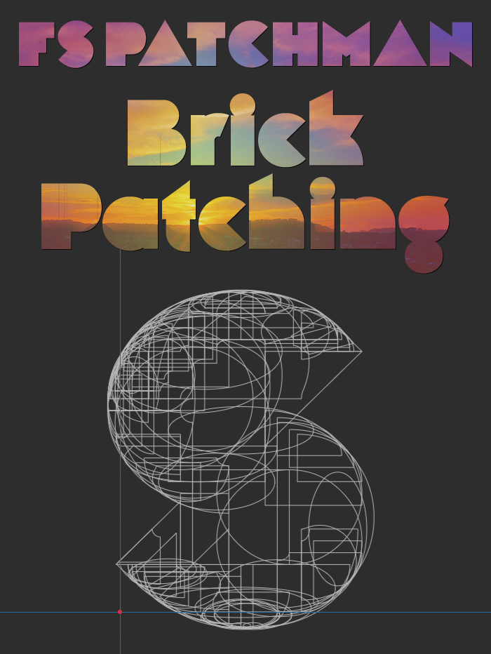
And then we come to the mysterious, the ominous FS Patchman.
From William Leverette, the designer who discovered and shared the original brick stack hack, we have the promise of a new technique called “brick patching”. This may not be the FontStruction of the future, but could it be the future of FontStructing? I’m mesmerised by the x-rayed ‘S’ in William’s sample:
The Prizewinners
– In no particular order, as chosen by you and by our guest judge Ivo Gabrowitsch. There are actually four rather than three prizewinners since I asked Ivo for one winner too many.
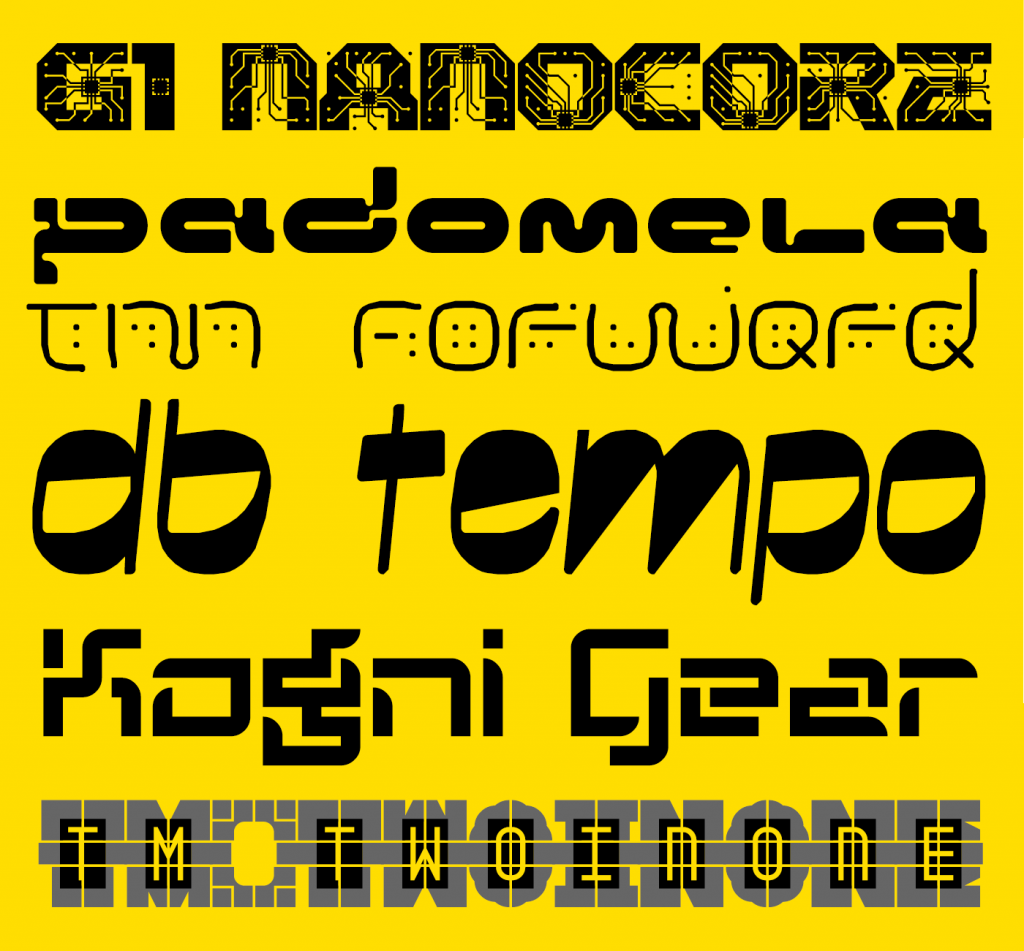
First up, “G1 Nanocore” by geneus1. Apparently inspired by certain whacky contemporary ideas, this is a really fun font and sensitive microscopes may reveal it to be in your bloodstream already. I recommend reading geneus1’s own description of his design.
Next, Padomela LDR from Neoqueto. This was actually Ivo’s number one choice – “the closest to my projection of the future.”
Thalamic wins twice over (only one prize though sorry!). Ivo chose tm Forward as a favourite (“I like the more organic projection of the future”) while the “people’s favourite” was the ingenious font-within-a-font “tm two in one”.
As with beate’s other entry, the relationship to the future is unclear, but Ivo could not resist the impressive qualities of db tempo.
Finally (number two on Ivo’s list) I’m really delighted that someone new has made it onto the podium for this competition. Congratulations to japanyoshi for kognigear – a simple but usable design, clearly addressing the theme with a well developed character set.
Prizewinners will be contacted by email over the next few days.
Watch this space!
We’ll be adding a few new features to FontStruct over the next couple of weeks, so please stay tuned for an announcement on that – or follow FontStruct on Twitter if that’s your kind of thing.
Thanks!
To Ivo Gabrowitsch for helping us out again with judging. Having worked for brands like FontShop, FontFont, MyFonts, Linotype, and Monotype, Ivo understands the type business like no other. His company Fontwerk is dedicated to help type designers and foundries making a living with their passion.
And, as always, thanks to our principal sponsor Glyphs.
Please remember that you can get 10% off the Glyphs desktop font editing software (OSX only) if you buy it from the FontStruct website. This is an exclusive offer and by taking it up, you will also help support the free FontStruct service.
Are you tired of looking to the past for inspiration? Feeling jaded by the present state of the world?
Perhaps it is time for something different; time to slip over into that unexplored and limitless country which borders happily on all of our heres and nows: The Future!
Let the bricks be levied …
Let the grid be burnished bright and the curtains drawn …
It is time for a new FontStruct competition.
Competition Brief
The theme of our competition is “Future”.
As always, feel free to interpret the term in any way you choose – literally, metaphorically, as tenuously as you dare … You could go sci-fi, sci-fact, techno, steam-punk, apocalyptic, retro-futuristic or utopian. Who knows what the future will bring?
If you’re struggling for ideas, you could try a FontStruct search, explore the Futuristic or Future Tags, or perhaps look at some of the curated Sets, such as “Techno”, or “Retro Computer”.
Competition Time Period
Friday, 10th April 2020 – Friday 1st May, 2020
Competition Rules
You must be a registered FontStruct user.
Your submission(s) must be posted and made “public” between 10th April 2020 and 1st May, 2020. Although you are encouraged to share your submission(s) at any time between these dates, your FontStruction submission(s) must be public (marked “share with everyone”) no later than 1st May, 2020 at 11pm PST. Additionally, your submission(s) must remain public at least until 8th May 2020 in order to give the judges enough time to review all qualifying entries.
Your submission(s) must be tagged with a “FutureComp” tag. (For fairness, during the competition time period, no FontStruction with the “FutureComp” tag will be awarded a Top Pick.)
Your submission(s) must be downloadable. If your FontStruction cannot be downloaded, the submission will not be including in the judging.
Your submission must be a newly published FontStruction. Simply adding the “FutureComp” tag to an already published font is not allowed.
For each submission, you must post at least one sample image in the comments of the FontStruction.
No letters in each submission can be MORE THAN 48 grid squares high.
FontStruct cloning is permitted but the judges will be looking for original work.
You may enter up to three FontStructions to the competition.
This is a friendly competition. Cheering, favoriting and fun banter is encouraged but cruel and uncivil behavior will not be tolerated.
No rules regarding licensing. You may choose any license you like for your FontStruction.
Judging and announcing the winners
All qualifying FontStructions will by judged by the FontStruct staff and guest judges between May 2nd and May 8th. Three prizewinners will be chosen. One of these will be the FontStructors’ Favourite. Winners will be announced in a FontStruct Blog post on Monday May 11th.
Prizes
Each winner can choose a t-shirt printed with a FontStruction glyph of their choice.
FontStructors’ Favourite
The valid entry with the greatest number of legitimate favourites at 11pm PST on 1st May 201820 will be one of the three prizewinners.
Questions?
If you have questions just add them as comments to this post.
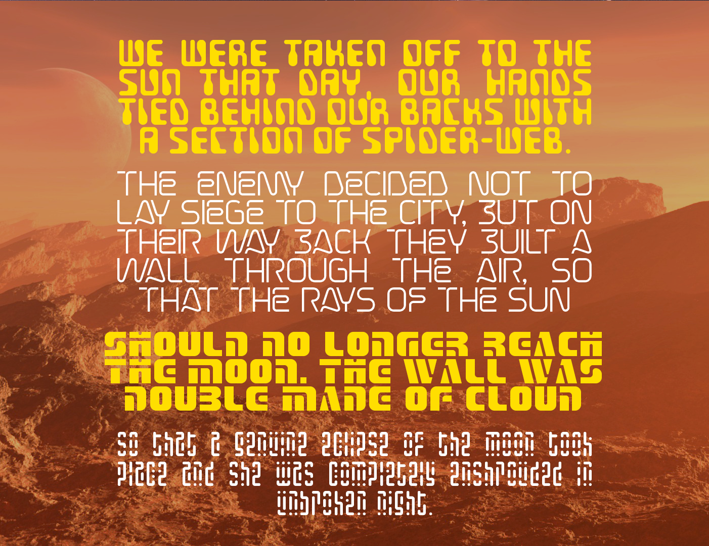
Text from what some have called the first science-fiction novel – Lucian’s “True History”
FontStruct would like to heartily thank our principal sponsor: Glyphs .
Please remember that you can get 10% off the Glyphs desktop font editing software (OSX only) if you buy it from the FontStruct website. This is an exclusive offer and by taking it up, you will also help support the free FontStruct service.