Posts from Rob Meek (meek)
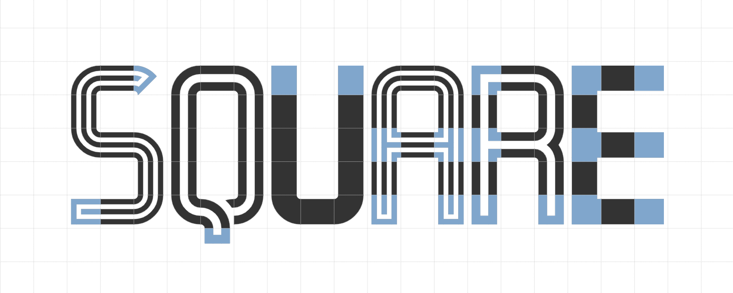
By popular demand, we’ve added squared corners and terminals to the “Connect” brick pack, a total of 27 new bricks.
Happy FontStructing!
Acknowledgements:
Many thanks, as always, to our current sponsors: Google Fonts and Glyphs App
Dear FontStructors,
From the very beginning, FontStruct has tried to be easy-to-use and avowedly non-technical for its font-designing users, but of course there is a great deal of technology behind our platform, and today we’re open-sourcing a small, but important part of it: the core of our font generation module.
There are several reasons for open-sourcing this code. It offers other developers an opportunity to contribute to the font-generation side of FontStruct. It also offers others a new tool to assist them in building their own font-generation tools.
But the main motivation for sharing the code is the desire to give something back – in the form of publicity and a software library – to an open-source project (Haxe) which has been extremely helpful to us in recent years.
If you are interested in software development and FontStruct, please read more about our new open-source library and the some of the history of FontStruct’s development on Medium.
Happy FontStructing!
– your FontStruct team
Acknowledgements:
Many thanks, as always, to our current sponsors: Google Fonts and Glyphs App
Dear FontStructors,
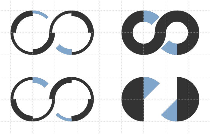
By popular demand we’ve added four new bricks to the core brick pack today.
They are half-arc shapes in three thicknesses to match the existing arc or “macaroni” bricks, plus the so-called “pizza-slice” brick. Thanks to everyone who proposed and argued for these additions.
Unlike other bricks we decided to include only a single orientation, rather than the usual set of four rotated variants.
Happy FontStructing!
Acknowledgements:
Many thanks, as always, to our current sponsors: Google Fonts and Glyphs App

Dear FontStructors,
Another fun-packed competition is complete, leaving us to celebrate a wonderful assembly of diversely-inspired and inspiring entries.
As so often in previous competitions, there are simply too many high-quality entries to give each and every one the attention which they merit, so I’d like to congratulate all participants on their creativity and skill, and encourage everyone to have a long look at all the entries to discover those many gems which are not featured in this post.
Some Honorable Mentions:

– I don’t entirely see how nocturnal addresses the “counter” theme, but, nevertheless, it’s a beautiful, clean design from FontStruct’s master of filigree, Art Deco design: time.peace.
architaraz’s KD Spaceband meanwhile is perhaps the most original and usable entry of all, cleverly exploring and reinventing the spaces enclosed within its glyphs.
Connect 42 by jonrgrover represents all those competitors who chose to explore the gaming counter metaphor, and it’s a simple but playful entry.

– I profoundly love the tattered geometry of zcrapedium. So much so, that you’ll find it lurking in the background of every sample within this post. The variants in the upper case are a great idea, and I can think of plenty of real-world applications for this one.
Below it: the mysterious N8Lite – but who is nightpegasus, its designer? I have my suspicions. Whoever they are, they demonstrate a highly idiosyncratic and expectation-confounding style, of which N8Lite is a great example – rule-bound yes, but how strange and elusive are those rules!
Serifia la printe represents a larger group of excellent, more “classical”, filled-counter entries. “Serifia” contains many surprising, and indeed inconsistent, design choices, but therein lies the strength of its oddball character.
– All three of these entries would likely have fared very well in the Inline Competition.
fs psyline and KD Hachure are examples of sophisticated and mature FontStructing – ready to be moved on into the character-set expansion phase and suitable for all kinds of design applications.
Below them. the charming and ingeniously entitled Owl Circle by Waturu Aiso has a more mannered, fantastical look.

Last, but not least, in this short and selective tour, we have a group of three diverse entries, beginning with NAL’s Zirconia – its glyphs like the aerial view of an extra-terrestrial base, revealing its intricate, bevelled construction only at larger point sizes.
Geometrica B&L turns out to be barely legible, so it’s probably best suited to a logo or short headline, but the patterns of its semaphore-like, cuneiform patternings are wonderful nevertheless.
And finally, geneus1 offered us an array of exceptional contributions to this competition– all expertly-crafted, things of beauty. You really have to install G1 Recoil and start playing with it, in order to fully appreciate the richness of its ornate strudel. Definitely a recommended download.
The Winners:

“breach” by four is a standout winner and the “FontStructor’s favourite” for the “Counter” competition. An ingenious warping and rupturing of the boundaries between interior and exterior space, it’s a thought-provoking work of art in itself, and invites extended contemplation.
UPDATE: Some twitter users have pointed out a similarity between “breach” and the very beautiful commercial release “Clip” from Setup (previously Urtd). Personally I suspect and see coincidental inspiration rather than imitation, but please visit the Setup site and make the comparison for yourself.

O yes! This was love at first sight. Starbird by V.Sarela (Yautja) is a perfect example of what one might call “groovy deco”, and I can easily imagine it gracing the worn cover of some favourite ’70s sci-fi paperback. The contrast of the fine circle with the smooth and heavy fill beneath it is quite sumptuous.
Elmoyenique’s zykowarfare reminds me of plastic letter stencils – incorrectly yet playfully filled out perhaps, at the back of a classroom on a hot afternoon. There are scores of intriguing nuggety forms to discover in this one, hidden away amongst its self-interlocking glyphs .
Thanks!
That’s it! Congratulations to all our winners and everyone who took part!
Winners will be contacted regarding their prizes over the next few days. But right now, I have an inexplicable urge to go and remodel the kitchen …
Happy FontStructing!

Acknowledgements:
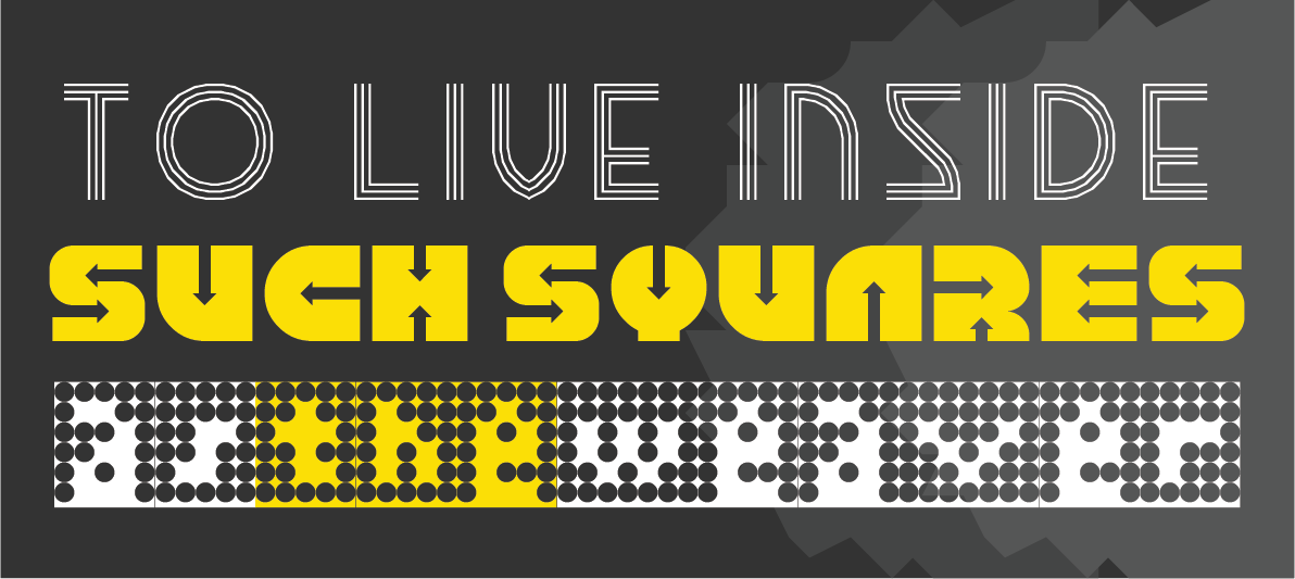
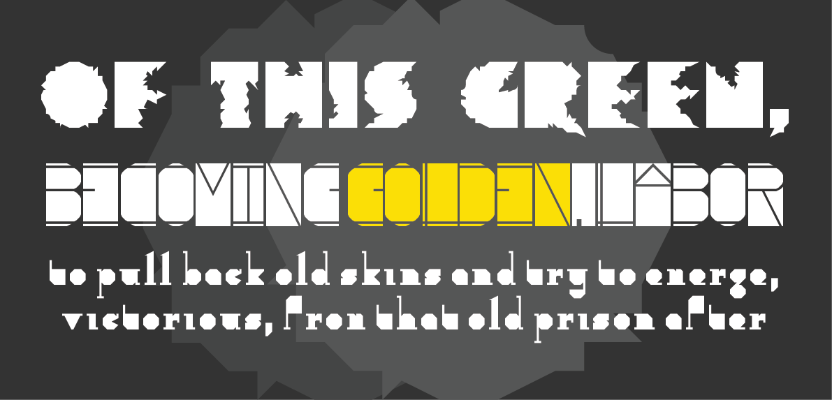
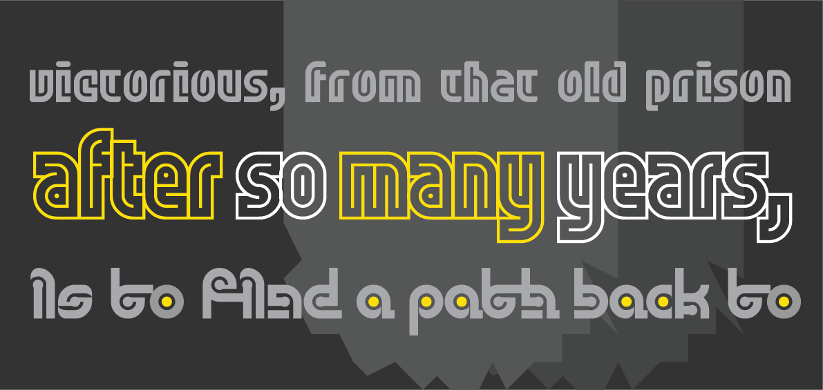
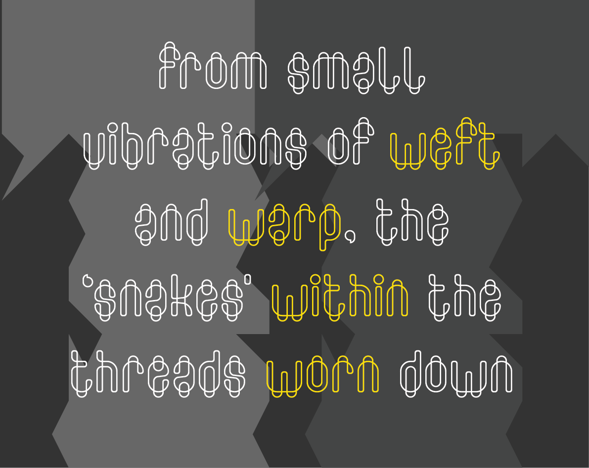
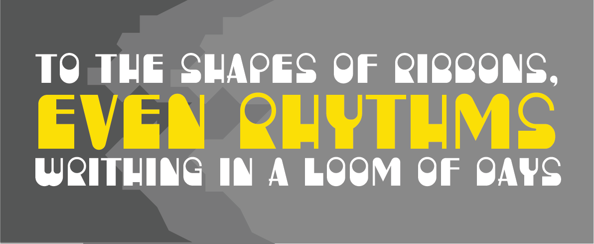
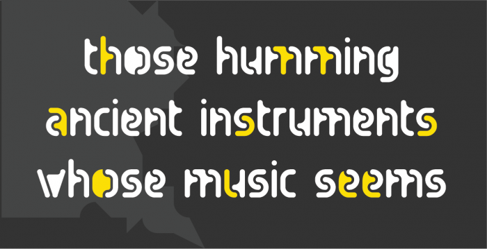
The rules at the head and foot of this post are built with “Counter Top” by geneus1.
The text in the samples is from “Figures in the Carpets” by David Schloss.
Many thanks, as always, to our current sponsors: Google Fonts.
Dear FontStructors,
Who says referendums are a threat to true democracy? In the perfect world of FontStruct, they work beautifully. Before we’ve even started, we have a winner!
The results of our recent Twitter poll:
Counter it is …
Competition Brief

Our theme is Counter: “the area of a letter that is entirely or partially enclosed by a letter form or a symbol (the counter-space/the hole of)” as wikipedia describes it.
What goes on within those little pools of nothingness inside your letters? Are they empty, or filled? Does their surface swallow all light, or shimmer or glow?
Of course you can choose any other sense of “Counter“ (arithmetical, political, military etc) if you wish. – You don’t have to pursue the typographic angle.
Potential sources of inspiration could be our sets: “Filled Counter”, or “Pattern Fill”.
Competition Time Period
Wednesday, 8th May 2018 – Saturday 1st June, 2018
Competition Rules
- You must be a registered FontStruct user.
- Your submission(s) must be posted and made “public” between 8th May 2018 and 1st June, 2018. Although you are encouraged to share your submission(s) at any time between these dates, your FontStruction submission(s) must be public (marked “share with everyone”) no later than 1st June, 2018 at 11pm PST. Additionally, your submission(s) must remain public at least until 10th June 2018 in order to give the judges enough time to review all qualifying entries.
- Your submission(s) must be tagged with a “CounterComp” tag. (For fairness, during the competition time period, no FontStruction with the “CounterComp” tag will be awarded a Top Pick.)
- Your submission(s) must be downloadable. If your FontStruction cannot be downloaded, the submission will not be including in the judging.
- Your submission must be a newly published FontStruction. Simply adding the “CounterComp” tag to an already published font is not allowed.
- For each submission, you must post at least one sample image in the comments of the FontStruction.
- No letters in each submission can be MORE THAN 48 grid squares high.
- FontStruct cloning is permitted but the judges will be looking for original work.
- You may enter up to three FontStructions to the competition.
- This is a friendly competition. Cheering, favoriting and fun banter is encouraged but cruel and uncivil behavior will not be tolerated.
- No rules regarding licensing. You may choose any license you like for your FontStruction.
Judging and announcing the winners
All qualifying FontStructions will by judged by the FontStruct staff and guest judges between June 2nd and June 9th. Three prizewinners will be chosen. One of these will be the FontStructors’ Favourite. Winners will be announced in a FontStruct Blog post on Monday June 11th.
Prizes
Each winner can choose a t-shirt printed with a FontStruction glyph of their choice.
FontStructors’ Favourite
The valid entry with the greatest number of legitimate favourites at 11pm PST on 8th June 2018 will be one of the three prizewinners.
Questions?
If you have questions just add them as comments to this post.
May the best FontStruction win.
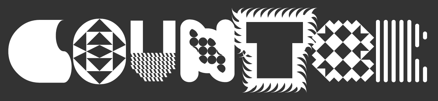
Fontstructions used in the image above, from left to right: zyrup eYe/FS by elmoyenique, the pattern exchange by four, Masthead Black by oliviajohnson, tm Bulba by thalamic, Dizz by geneus1, Sleepless by four, and soundwave by escaphandro.
FontStruct would like to thank our current principal sponsor: Google Fonts
Dear FontStructors,
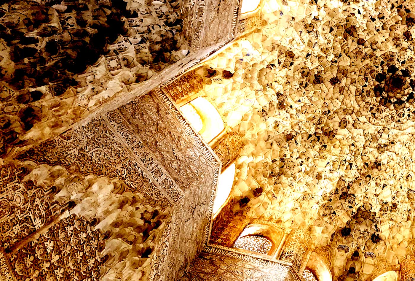
FontStruct is currently on tour in Granada, Spain. On a cool but bright spring morning, I’m sitting in a roof garden in the old Arab quarter, the Albayzín, staring at the magnificent medieval, hill-top palace of the Nasrid dynasty: the Alhambra.
About 700 years ago, the finest arab mathematicians and local craftspeople joined forces here and colluded to create the complex, honeycomb ceilings for the sultan’s private chambers. Selecting and arranging from a limited array of simple, geometric building-blocks the architects created a dizzying, recursive edifice, like a vast, heavenly city suspended over the visitor’s heads.

▲ Ceiling in the Palace of the Lions (the Alhambra)
Were these designers, perhaps, the first FontStructors? Did they love and curse their little prismatic “Muqurnas” shapes and their limitations just as we love and curse our bricks? Did they leap up and scream with joy when they discovered a hitherto unthought-of combination of forms? If you are a FontStructor who has visited the Alhambra yourself you may well feel empathy with its architects’ profound passion for geometry; their predilection for modular building techniques and their love of decorative scripts.
Continue reading…

Dear FontStructors,
Today, with FontStruct’s tenth anniversary imminent, we’re delighted to announce that Google Fonts will be our principal sponsor in 2018.
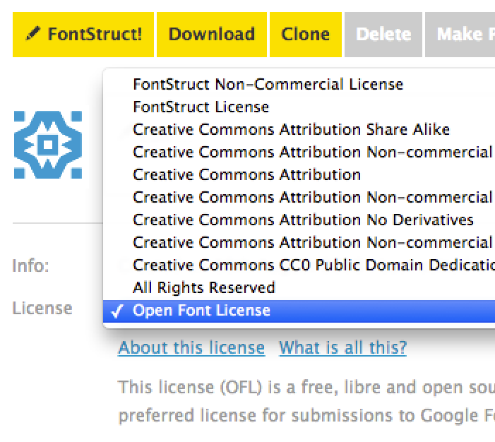
Introducing the SIL Open Font License
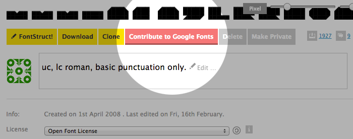
As part of their sponsorship, Google Fonts are helping us to implement a new open-source licensing option on FontStruct – The SIL Open Font License (OFL) – which we’re adding to FontStruct today:

The OFL is an open-source license, designed specifically for open-source fonts, and is suitable for designers who would like to make their work freely available with zero restrictions on use, modification or distribution.
Contribute to Google Fonts
But this is more than just another option in the licensing menu.
The OFL is the preferred license for contributions to Google Fonts’ renowned and robust directory of open-source, designer, web fonts; so it’s just become much, much easier to contribute your designs directly from FontStruct to Google Fonts.
At time of writing, there are few (if any?) modular, grid-based fonts on Google Fonts. We’re eager to see the first FontStructions appearing on fonts.google.com in 2018, and we hope that some of you will soon be enjoying the massive, global exposure and the state-of-the-art, zero-cost, webfont-delivery service that Google Fonts provides.
How can I contribute my FontStruction to Google Fonts?
To get started, your FontStruction needs to fulfil a few basic criteria, including:
- It must be an original design, and of good quality (the ultimate judges of this are the Google Fonts team).
- It must be licensed under the OFL.
- It must contain, as a minimum, the 215 glyphs listed by Google. (with the exception of the last 3). You’ll notice these glyphs are now listed as a special character set in the FontStructor.
- It must have a simple and unique name, with no copyright or trademark infringements, no initials and no abbreviations.
Once everything is ready, you can use the new “Contribute to Google Fonts” button on your FontStruction homepage to start the contribution process.
Helpful Resources
You will find a new section in our FAQ with a detailed, step-by-step guide to help you get started with contributing your FontStruction to Google fonts. Please read this guide thoroughly before proceeding. There’s also a dedicated contact channel for any further questions on this topic.
We’re looking forward to a very exciting year.
Happy FontStructing!
FontStruct would like to thank our sponsors: Google Fonts – Making the web more beautiful, fast, and open through great typography, and Creative Fabrica – your number #1 source for premium design elements.

Thanks to everyone for another fantastic year of FontStructing.
Special thanks to the FontStructors featured in our holiday sample above:
To funk_king for Ornaments – a wonderful collection of festive baubles.
To sorbilicious for “an old story by sorbilicious” – a magical blackletter
and to jirinvk for jaubolAC24 for an idiosyncratic A that’s also both a christmas tree and a wrapped present.
Happy Holidays Everyone!
FontStruct would like to thank our sponsor: Creative Fabrica – your number #1 source for premium design elements.
Oh FontStructors,
Will you ever disappoint? This time you were faced with what seemed, at first glance, a relatively staid and technical theme: “serif”. Nevertheless you rose to the challenge, with your inimitable imagination and energy – endlessly riffing, playing and transmogrifying to produce a magnificently rich and diverse array of 58 entries – a record haul for a FontStruct competition. Many thanks and congratulations to everyone who entered.
Judging was more difficult than ever, but, thanks to the excellent input of our guest judge beate, we finally reached consensus.
First up, and in no particular order, the four winning entrants:

G1 Radia was a unanimous choice of the judges. With it’s high-contrast strokes, ball-terminals and discreet little serifs this FontStruction genuinely radiates a curvesome beauty, although on closer inspection one also sees intriguing traces of its cruder, modular roots.
All four winners actually made multiple high-quality entries, some of which we couldn’t resist including in the samples, so below G1 Radia you can also marvel at the monumental G1 Valora – one of the serifiest serifs this side of the Pecos.
2. Hoek by four (shown in red)

Hoek was elected by the FontStruct community as the “people’s favorite” . It obviously stems from a clear and precise concept for a bevelled slab, thoughtfully executed in every perfect detail.
In fact, the judges were even more excited by the highly-inventive “elza” (the second design featured above) in which wiry strokes terminate in a questioning hook-shape rather than a traditional serif or terminal. Planetarium, also shown above, was another strong and popular slab entry.

The judges were enchanted by Cembrel B: a subtle, attractive, and eminently-usable, high-contrast serif, part of a developing new family. Nouveaumbre was another really excellent entry from yautja.
And last but not least …

A classifier’s nightmare: a slab serif concealed inside a sans! – what an innovative interpretation of the theme. Beyond the high concept, architaraz also succeeds in delivering a coherent and attractive typeface. Beneath AT Bals you can see the elegant inline ”AT Migdalia” with it’s hairline serifs.
Many, many congratulations to our four prizewinners.
Some Honorable Mentions:
– A classic serif with an unusual calligraphic twist, created on a pin-board matrix.

– A convivial, super-chunky slab-serif, given added character by the idiosyncratic snips in certain letter-tops.

– Actually I’m not sure whether this is (at least in any sense known to me) a serif, but a strong, clear design nevertheless.

– One of three strong entries from the master of the dotted font. Some really charming glyphs in this one.

– Ultra-high-contrast strokes and serifs in a stencil-flavoured entry.

– Calculated, cutout crudity. Shamelessly modular and yet also wonderfully imperfect.

This brutal disfiguration of an existing design by Sychoff came very close to a prize. Although tagged as punk, there’s also something quite primitive and ancient going on here. I can see these glyphs scratched into the base of an amphora, or perhaps arranged in the border of a mosaic. Compare the Jekyll to this Hyde.
Congratulations again to all winners, who will be contacted about their prizes in the next few days; thanks to our judges; and, most of all, thanks to everyone who took part. I look forward to our next competition.
Happy FontStructing!
Rob
FontStruct would like to thank our sponsor: Creative Fabrica – your number #1 source for premium design elements.
Many years have passed since I felt remotely able to answer the question “How did they do that?” in regard to most of the finest and complex designs on FontStruct. Our community of ingenious designers, the “FontStructors”, have long been the true adepts, the rightful owners of the grid and the brick. But who are they?
In 2009 Yves Peters tried to answer this question in his excellent series of 7 interviews “Focus on FontStructors”.
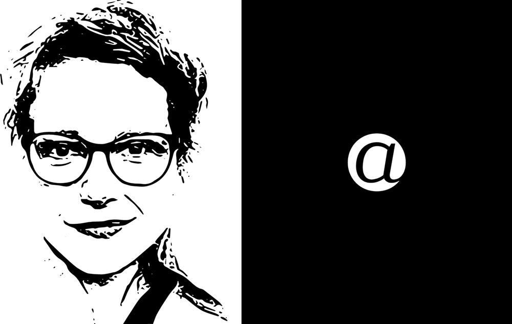
A resumption of his project, eight years on, is long overdue, and today we’re making a start by talking to one of FontStruct’s exceptional stars of recent years; record winner of no less than three FontStruct competitions, hoarder of staff picks, and designer of some of FontStruct’s most extraordinary fonts: Beate Limbach …

FS: Beate, please tell us a bit about yourself. Where do you live and work? What kind of training do you have? What do you do in everyday life beyond FontStructing?
I was brought up in Giessen, Germany.
After graduating from secondary school, I studied art theory and Romance studies in Kassel, Paris and Mainz.
In 2006, I completed my degree in communications design at the University of Applied Science Mainz, studying under Professor Johannes Bergerhausen, and focusing on book design (typography) and photography.
For a little more than 10 years, I’ve been living and working as a freelance designer in Lausanne in Switzerland. Typography is a passion that has gripped me since my schooldays, and in recent years I’ve shifted my professional focus from print design to type design.
How did you become interested in type and typography? What was your first experience of font design?

– The victor’s booty from three FontStruct competitions.
My first contact with the world of type and calligraphy was at primary school where I encountered various different forms of standardised handwriting, and learnt about the transition from the old “Sütterlin” form of handwriting to the latin form in German schools. Later, I had the opportunity to take part in a calligraphic drawing course. The posters we made on this course were screen-printed and so I learned about an additional design medium which, in turn, fuelled my interest in graphic design more generally.
During my studies I had the opportunity to work on Johannes Berghausen’s “decodeunicode” project as it was still in its very early stages. The project’s aim was the researching of all the characters and alphabets included within Unicode – their histories, significance and use. It’s since developed into a wonderful online platform for pure typographic research.
FS: How did you start out on FontStruct?

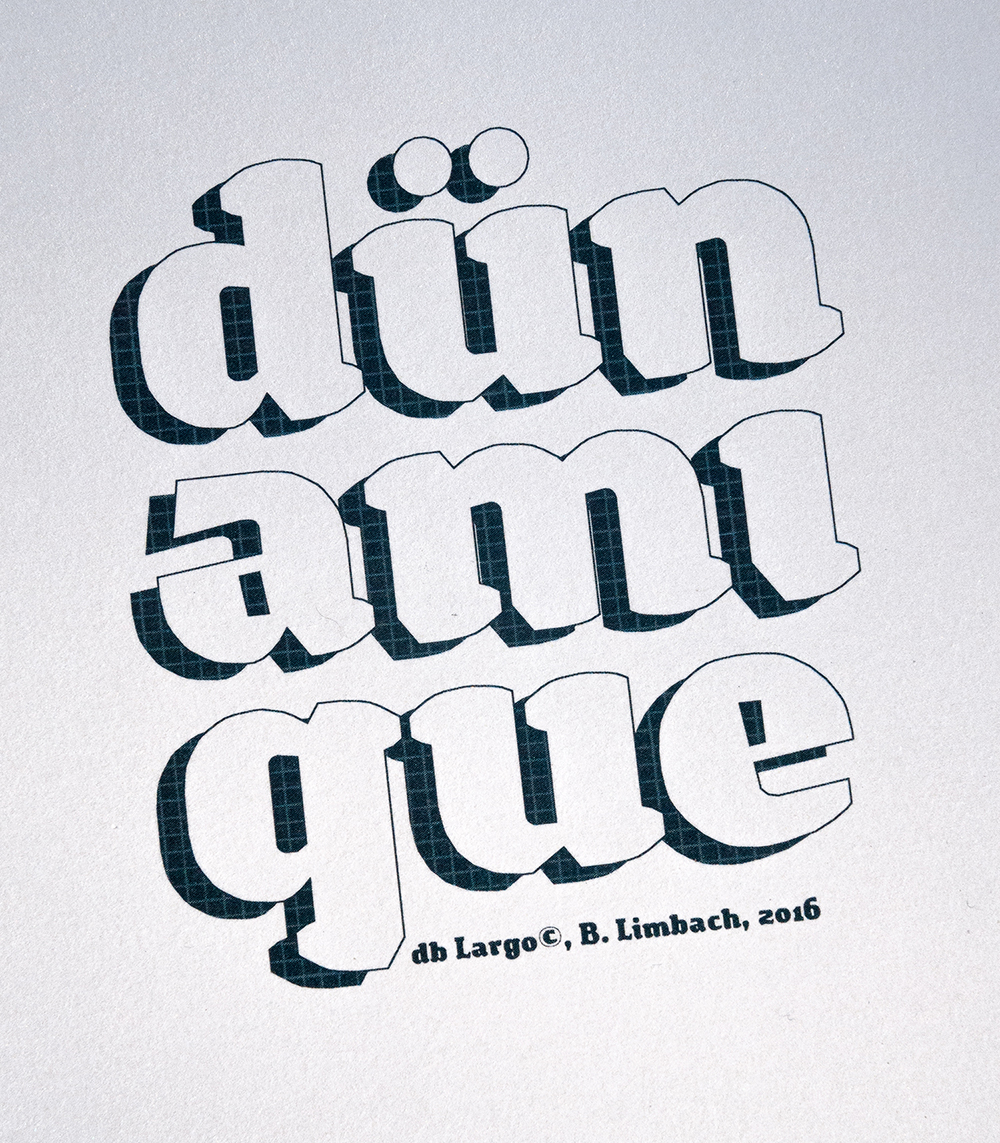
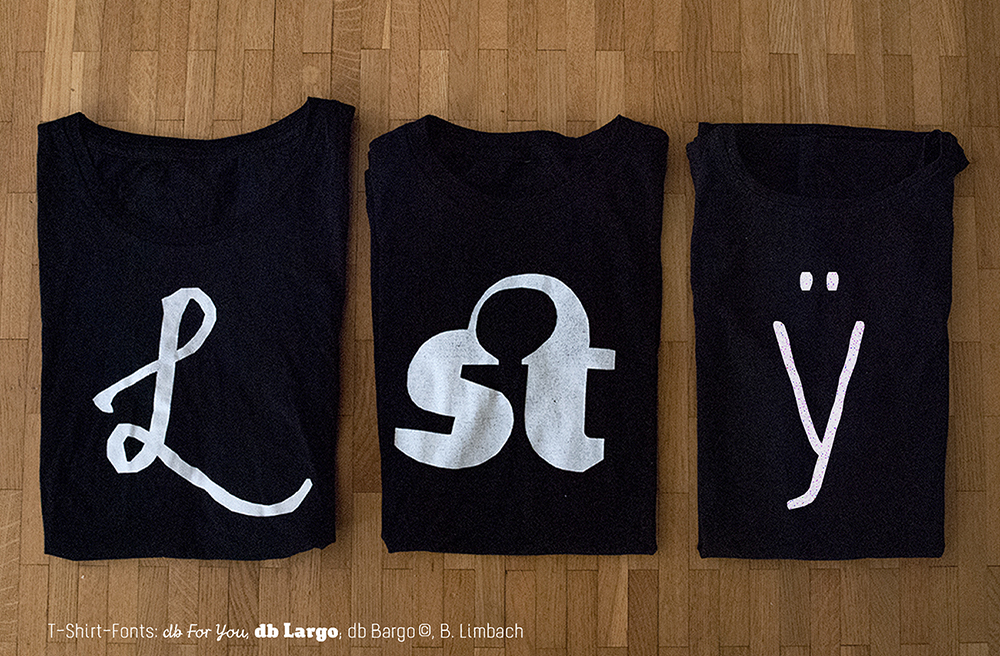
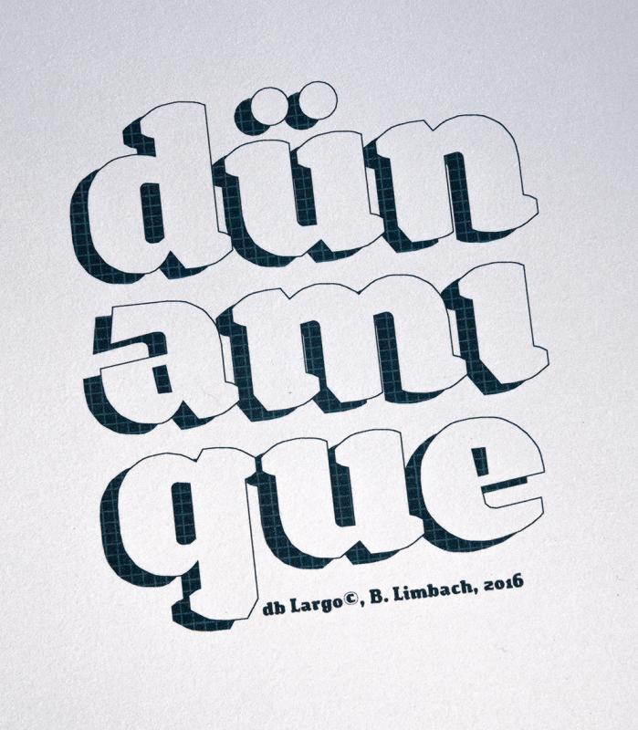
– db For You and db Largo in use
In 2008, while browsing for free fonts, I stumbled upon articles about FontStruct in Smashing Magazine and I Love Typography. I was excited by the idea of being able to design typefaces in a playful way and with a minimal toolset. I also liked the fact that one had control over how to license designs.
Before FontStruct I had experience with lettering and “analogue” type design, but I’d barely come into contact with digital, type-design software. FontStruct was a way-in for me to gradually start exploring this world.
I began to work with other type-design software, both in order to refine and extend my “FontStructions”, and to develop new fonts outside FontStruct. Several of my FontStruct fonts where published in the Typodariums between 2014 and 2016 and this led to interest and customers for fonts such as db Drops, db Soda, db Como Splitt and db Bargo.
FS: If you had to choose two (or three) of your own FontStructions as favourites, which would they be and why?
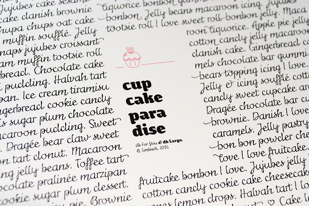
That’s not easy – there are so many more than just three! But I would choose db For You (script), db Largo (heavy serif) und db Bargo Condensed (light, handwritten sans).

I designed db For You for the FontStruct “Love Competition” in 2016. My first thought on the theme was that love letters are very personal and are usually handwritten, so I decided to make a script font. To avoid the letters appearing too smooth and cute, I added a rough, irregular contour. Through small variations in the stroke-width this special ductus developed which also resembled a handwritten flow. (I’d already tried out this technique in 2013 when designing db Bargo.) The overall result is a script font which is not just suitable for the screen. It’s important to me that my fonts are also applicable in print design.

db Largo was created at the same time as db For you in 2016. db Largo combines serifs and calligraphic elements. The font isn’t completely polished but it’s little imperfections lend it a relaxed, friendly appearance and dynamic. db Largo is eminently usable for short texts or headlines.
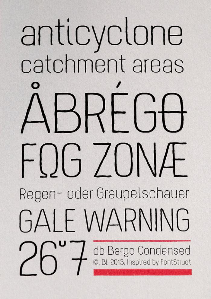
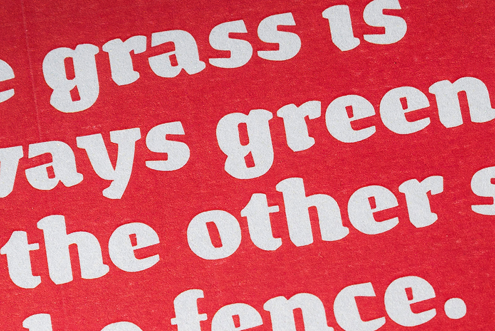
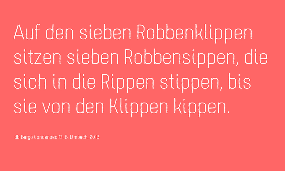
I built db Bargo in 2013. It’s based on a condensed grotesque, and combines geometry and optimised legibility with individual aspects of a handwritten sans. db Bargo is marked by it’s simple structure and low contrast. This font is also perfect suited to headlines, typographic posters, T-shirts and other print applications.
FS: What other work on FontStruct do you especially admire and why?
Spontaneously I think of Aphoria’s fonts. I really like the relaxed style of his ideas and designs on FontStruct. His work is marked by an incredibly assured, balanced and coherent formal language. I particularily like the San Serif fonts Uptake and Obleak, as well as the Blackletter Futility.
I’m also impressed by the fonts of Frodo7, thalamic/minimum and four. I find Frodos 3D series Rohan and the slab serif Esgaroth genuinely expressive and extremely well thought-through, as are the heavy sans fs Bored and tm Blooper from thalamic. I’m fascinated by four’s outline fonts which seem unsurpassable in the richness of their variation and subtle refinement; they demonstrate how little complexity one needs in order to give a font a unique character.
FS: What are the aspects of FontStruct that make it appealing to you?
I think FontStruct is a unique web-platform for free and creative font design. I never cease to be excited by the formal richness of some FontStructions – despite the fact that, at the end of the day, they’re all just combinations and arrangements of geometrical “bricks”. And then there are the additional tools and functionality in “expert mode” which have been added over the years and which have enhanced the creative possibilities.
Using FontStruct just never gets boring. From the very beginning, my curiosity has been piqued and my ambition stoked by the challenge of exploring new approaches and formal languages in FontStruct. What continues to stimulate me is the desire to look more closely and to pay more attention to those little, inconspicuous details which give a typeface its overall character, its “polish”.
FS: If you could add or improve one thing on FontStruct, what would it be?

I think the creation of some kind of FontStruct foundry would be interesting – a forum where the best Fontstructions could be promoted or even sold. From my own experience, I think the potential and demand are there. Perhaps it would be a new incentive for everyone working creatively and constructively on FontStruct, to allow them to market their designs on the same platform on which they were created.
Thanks beate! Please explore more of beate’s work on FontStruct or visit her design studio website.
All images copyright Beate Limbach.
Interview translated from German by Rob Meek.
FontStruct would like to thank our sponsor: Creative Fabrica – your number #1 source for premium design elements.