This is a guest post from Ata Syed AKA thalamic and minimum, the first of a summer series continuing the “Focus on Fontstructors” tradition of interviews with members of FontStruct’s designer community. Ata has been FontStructing since 2008.
We kick off this series with a highly prolific, eminently humble, consistently creative, and all-around nice guy: Antonio J. Morata, better known to all of us as elmoyenique.
ztefan eYe/FS by Elmoyenique
Elmoyenique has been with FontStruct since September 2009. Time has done what it does best, which is to say it has passed in a twinkling when you reflect upon its passage, yet it has been 12 years that elmoyenique has been making FontStructions. In those intervening 141 months, Elmo has published THREE HUNDRED AND TWENTY-NINE FontStructions which is an incredible achievement by any standard. It would still be impressive if that were all. Of those 329 FontStructions, 196 are “staff picks”, which is to say they are “worthy of special mention” for either excelling in typeface design or using the FontStructor to do some brick magic not commonly seen. Yet, Elmoyenique has remained as humble as he has always been. “I still consider myself a simple learner” he writes, attributing his success to “perseverance rather than skill”. If only perseverance was all that it took. If you made a Venn diagram, the center-intersection of which says ‘Done’, there would be at least three circles involved: Resources, Effort, and Skills. To get anything done requires all three. To do something artistic such as creating typefaces, on a platform such as FontStruct, you need a ton of skills. What Elmo has done is an unparalleled achievement, surpassed by none other. We admire his great work at FontStruct but respect his humble nature even more.

züricher eYe/FS by Elmoyenique
12 years, 300+ fonts, 40,000+ glyphs must have taken him a long time, so it is natural to wonder: Why put in so much effort? The answer is to be found on his own profile page. He says that he has held a variety of professional positions, most of them creative in nature, yet “I always come back to draw letters”. His first steps towords becoming a typeface designer were with “calligraphy with ink and pen; then journal headers and lettering for posters made with a ruler” and “Rotring” pens. His subsequent foray into digital font design began with Aldus FreeHand. Elmo describes his discovery of FontStruct as “like Charlie holding the Golden Ticket in his hands.”
zong4U eYe/FS by Elmoyenique
Elmoyenique was born in 1968 “in wonderful Almería, in the southeast of surprising Spain, southern Europe. Interestingly, I [still] live close to where I was born.” He has “a college degree in teaching (major in mathematics), a bachelor’s in psychology, and a handful of other lower-ranking studies.” Impressive, yet again.
As if that was not enough, relating to work, Elmo says, “I am a teacher and freelance illustrator and graphic designer. At one stage in my life, I tried to orient my future exclusively within the field of graphic design. I’ve been working hard on it for more than nine years, but finally I didn’t get to live exclusively on it. I returned to teaching, and I am still here, mixing it with graphic works that bring me a different kind of joy.” When asked what his daily life is like, he said it’s “fascinating!” :-) “Teaching is living on a carousel (tiring yes, but never boring).” Furthermore, “I draw comics, I do illustrations for children’s books, I design posters, books and brochures, I write for the press about comics, I also write some science fiction and fantasy….Oh, and a few years ago I still I had time to play the saxophone in a group.” Whew!
Which brings us to the reason everyone is reading this.
Why do you create fonts?
“I started drawing letters a long time ago, during the 80’s (literally, I was a teenager). So, I began making the posters for the projections of the cinema-club of my high school, which I later continued when I entered the college [university, in US parlance]. I also started publishing other cultural posters and comics. In those years, personal computers were not as common as today and all kinds of stratagems had to be invented to obtain a good result: cut out previous texts, create them using self-adhesive letters—or in a private printing company, which was much more expensive—or basically draw all the letters by hand, with the help of some rules, a compass and little else and copying from the wonderful Letraset or Mecanorma catalogs. Now anyone can download a cool font and use it for a title or to fill in some texts on his poster or his comic, but in those years, you had to do all of that by hand, drawing letter by letter.”

zykowarfare eYe/FS by Elmoyenique
“The design has changed a lot since then, so much that those years now seem like the stone age to me. Even then, I solved many design problems for those posters by adapting the letters to the required space (it was very easy if you drew them by hand), and from there to the timid design of personal fonts there was only one step. Then I spent several years working as an art director in a famous advertising company in Madrid, and there I learned to use the first Macintosh computers that arrived in Spain (I’m talking about the early 90s). Later, my work was oriented more to posters and illustration, where I took the opportunity to frequently use the skills of creation and modification of letters that those new (at that time) computer technologies offered us.”
What is your font making process? What causes you to deviate from this process?
“My creative process is simple. I always carry a squared notebook [grid pad] with me, where I draw my ideas and things that catch my attention (in FontStruct I have eventually shown some of its pages). Many of those ideas never go beyond being simple sketches, but a large part of my typefaces emerges there. The Internet is also a great field for browsing and inspiration (but never copying).”
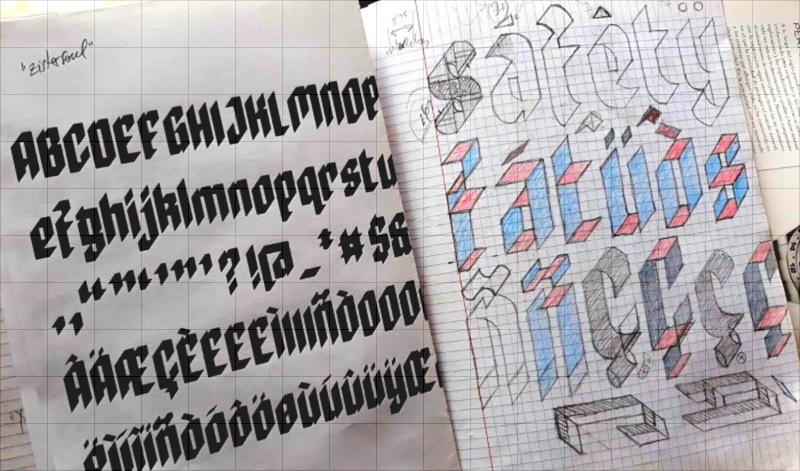
A sample page from Elmoyenique’s ubiquitous notebooks
“After choosing a letter design from my notebook (one I liked it because of something that I see as special), the real work begins. I usually use the FontStruct website to do it because it allows me to complete a font, display it, prepare it properly to show it to the world and download it. And it is also free (for now). Honey on flakes.
Designing a font is like entering a maze…. There are multiple tasks to do: create the glyphs for each of the uppercase and lowercase characters, create the numbers, expression signs and diacritics, special glyphs for languages other than English (Ñ, Ç, ß, etc.) and all those with accentuation. We must also take care of the separation between words and the slow and careful process of kerning (separation between pairs of letters).
But it is a neat maze. Just like when you want to get out of a real maze (you shouldn’t separate a hand from the wall, always the same wall), here some tricks allow you to get out. The one I usually choose is to start with capital letters. I always think of three basic shapes for letters that help me draw them: rectangle, circle, and triangle. The rectangle usually works for me for H, I, E, F, L, T, N and M; the circle for O, Q, C and G; the triangle helps with V, A, W, X, K, and Z; if you join rectangle and circle, you get the basis for B, D, P, U, J and S; and if you put all three together you get R. The above also applies to numbers.”

zoundbro eYe/FS by Elmoyenique
“Then, for the design of the lowercase letters I follow similar steps: rectangle, circle, and triangle. Combining these letters, we get others (j, h, b, d, p, q, k, y, f). For the end, the best are left: a, g and s; these are so special that many times they are the ones that give the typography the authentic personality. When I get to this point, I can usually already see the light at the end of the tunnel.
Despite everything said above, there are also times when a single letter is the one that gives me the idea for a whole typeface and developing it completely from there becomes a fascinating and very creative process.
The choice of name is usually left for last. All my fonts start with z, the simple reason is that my first fonts started like this, and I also like how that letter sounds. I always make sure that none of my fonts has a name similar to another that already exists, to avoid confusion with copyright and in search engines. Oh, and to top it off, the font is rounded off by making an image that is cool and striking— yes, I have used the most diverse methods for this: from photographing handmade designs to image editing and design programs, through screenshots and manual coloring—which reveals the best of the font, and publishing it to be enjoyed by friends who see it in FontStruct and the rest of the world. Et voilá!”
What keeps you going in making a font?
“I have created some of my fonts out of simple necessity, to be used immediately in a certain graphic work, but they have been only a small part of the total. What really drives me to build a typeface is the ability to shape something new and beautiful, something that didn’t exist before I started making it. It’s a fantastic thing.”

zpains eYe/FS by Elmoyenique
“How do these ideas come to mind? Well, they say that love is in the air…and inspiration too, I assure you. ‘May inspiration find you working,’ said the great Pablo Picasso. Everyday objects, store signs, magazines, shadows on the ground, the internet, the range of possibilities is almost infinite. The suggestions are there, you just have to go out and find them. Then comes the screening process. I discard 80% of the ideas that I draw in my notebooks, and of that remaining 20% only a third or fourth part will end up being a fairly viable font. I have dozens of notebooks to corroborate it. [Wouldn’t we love to see those!] The reasons for these discards are very varied (for example, there may be glyphs that resist entering within the general style of the font, or other times that cannot be done in FontStruct as I had drawn them, or they may also be too similar to an existing font, which I usually dislike if it is not searched on purpose…). But I do not want to stop pointing out here the curious feeling that sometimes occurs within me and that I find very striking and fascinating—and this has happened on a good handful of occasions—when I have returned to work years later old ideas because FontStruct has just implemented tools that were not available when I created the font in question. Those continuous advances on the website never fail to impress me.”
While making a font, what frustrations do you face and how do you overcome them?
“Legibility should be the most important thing when you doubt between unity and variety. If one letter is confused with another, it does not do its job. Pay particular attention to similarities between similar glyphs, such as I/l/1, y/g/q, S/8/5, U/V, and many other groups. When you see your font creating words you can observe (and correct) these possible dysfunctions. There are always (or at least in a very high percentage of cases) solutions to these problems, you just have to spend more time searching and finding them. Sometimes it is very frustrating, but it is the only way I trust to solve it.
On the other hand, if there are rules, they can also be broken. What will you use typography for? If it will be a display for headers or posters, you will have more freedom with those broken rules. If it is for writing text, you will need to specify the readability. And if it’s for pleasure, THERE ARE NO RULES. Despite everything, from time to time some fonts, once finished, simply do not work, and that, although it hurts our creative ego, there is no choice but to admit it.
zelemin eYe/FS by Elmoyenique
I would also like to state here that building a font like the ones I usually do, as original and complete as I can, takes a lot of time. You need 36-hour days and, since you don’t have them, you have to steal them from sleep, family or even breaks at work. Sometimes it is really complicated, but you have to try to make everything crimp and roll as smoothly as possible, without making anything squeak too much. And for this the support and understanding of the family is essential. It is not always easy, I assure you. There have been whole years in which I have barely been able to dedicate a few weeks to making letters due to unforeseen and continuous situations beyond my reach.”
Why do continue to make fonts?
“I keep creating fonts because I have so much fun and I have a great time doing it. Since I was young I have been passionate about graphic design, but that has not always given me enough money to make a living from it. And on many occasions, I have found myself drawing letters, in one way or another. It’s only been a few years since I’ve been able to take designing alphabets more seriously and I’ve been combining it with teaching and graphics in general. From all my various jobs I have learned good lessons and I think that an expert eye will be able to distinguish these features with ease when they are reflected in my fonts.”

zpells eYe/FS by Elmoyenique
“Designing a font that has not yet been created is still my next challenge. Before it was easier, but now it is increasingly difficult to find the originality and freshness that I look for in a source since there is more and more competition (well, that is also an incentive most of the time, hehehe).
I would not like to end without pointing out the great importance of the comments that I receive from colleagues through the FontStruct LiveFeed in my typographic creation process. That makes me see mistakes and appreciate successes, it brings me other points of view and solutions, it opens up paths for me. There I receive opinions from people of all ages who come from all over the world, with their different appreciations and points of view. That is usually very enriching for me. My fonts would never have been (and never will be) the same without you all. My heartfelt thanks to everyone who helps me this way. And a billion thanks to Rob Meek for the wonderful FontStruct he’s building.”
How did you discover FontStruct.com? How often do you visit FontStruct.com? What keeps you coming back to fontstruct?
“I discovered FontStruct by accident, searching the net for programs to build fonts, and I fell in love with it from the start. It was a love at first sight, which lasts until today and which I hope to keep as alive as it is now. [How often I visit fontstruct.com] depends on many variables, such as the free time available, the complexity of the font, the mood…. Obviously, I usually dedicate more time to it during weekends and holidays. [What keeps me coming back is that] FontStruct is very intuitive and easy to use, although it can be devilish when you mess with composite bricks and nudging (thanks for that, Rob, I love fighting at short distances). You can build a font in a relatively short time—always depending on the complexity of the font to be made—and then you can download, install and use it immediately. It’s fantastic!”
Do you admire any other FontStructors? Who and why?
“A lot of them. I quote the closest ones, they have all helped me a lot (also on a personal level) and I am very grateful to them for their friendship and kindness with my mistakes. The first is Frodo7 for his balance and knowledge of typography; beate is the second, for her freshness and elegance; my compañero four the third, for his creativity and styling; also the fantastic geneus1 for being artistic and novel; the enormous thalamic/minimum for his continuous originality, insight and innovation; will.i.ૐ for the unexpectedness and complexity of his fonts; architaraz for his freshness, order and cleanliness; Yautja for his simplicity and dedication; laynecom for his careful elegance and typographic knowledge…and anyone else who can teach me something, which are a lot, because I still consider myself a FontStruct apprentice.”
How does the current technology affect your creative output?
“All technological advances help a lot. The production and marketing tools we work with now have nothing to do with those used 20 years ago, they are vastly better. This on the one hand is heaven…but on the other it is hell. I’ve already lost two hard drives from my whole life jobs and one from backups. Unrecoverable. As of today, I have only 20% of the digital work I have done. Well, that could happen with paper jobs as well (a flood could ruin them), but it is much more difficult. Now I worry a lot about keeping copies of everything important, and printing and saving what I can.”
Which of your own fonts are you most proud of? Are there any interesting stories behind them?
“Which of my fonts am I most proud? It’s like asking a father which of his own children loves more. But I tend to remember first those who have been more laborious or difficult to face in their construction. Some have been especially complicated (e.g.: zigourny, zophyka, zapezipi, zugaroo, zizakurraf, zong4U, zergioleone, zharply, zykowarfare, zeamróg…), and finishing their design was a relief for me.”

zigourny eYe/FS by Elmoyenique
“Others, on the other hand, have only given me joy, such as the very used zilverstone and those chosen to appear published in the fantastic collective almanac Typodarium 2015 (there were viewed zlabyrinths, zyrens, zykedelic, zychotropic and zylone). But sometimes you look back and see those little jewels silent with bright eyes (zelemin, zoulskin, zygno, zinequal, zpheres, zilverbullet…). I really love all them.”
zilverstone eYe/FS by Elmoyenique
“Zilverstone also appeared on a double page in a fashionable Canadian magazine and was one of those chosen for the iPad application ‘Pattern Artist’, along with zapristi; zcloudy has appeared on several YouTube gaming pages; zcrapedium, zhadowlite and zfraktur have been used in posters; zendera has been the protagonist of the cover and interior texts of a book… I cannot complain of them.”
You have produced quite a few fonts that have the cowboy theme to it. What attracts you to that style?
“Actually, I don’t think I have built so many western (or Tuscan) style fonts, only 5% of the fonts that I have published in FontStruct carry that tag. The truth is that in my land we have a long relationship with the western film style. We have the only desert in Europe and hundreds of films on this subject have been filmed here (Almería appears as the 5th most filmed place in the world, according to IMDB appearances). Also, I especially like the letters with serifs.”
What inspires you? Is inspiration for creative work different than inspiration for other things in life?
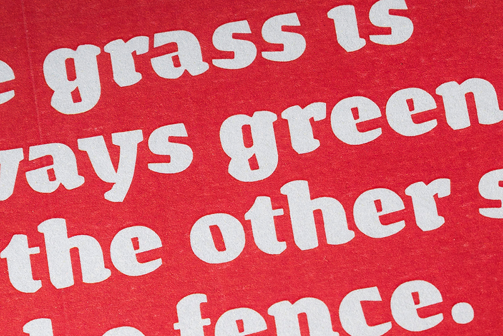
“Life is the Big Idea! La joie de vivre, La Alegría de Vivir. The sun at dawn, the green of the grass (it’s not easy bein’ green! ;) ), the smile that looks at you from some eyes…. That always makes the heart move. The bad moments do not have to be looked for, they come by themselves, when they are least expected and without anyone calling them.” As Madonna said, “beauty’s where you find it.”

zpacekowboy eYe/FS by Elmoyenique
At some distant future, what would you like to be remembered for?
“Now I get quite sentimental. I would like to be remembered as a good grandson, a good son, a good brother, a good friend, a good husband, a good father, a good grandfather…. I know it is asking a lot, but I am doing everything I can. Well, if someone also remembered me for some of my graphic work, that would definitely be amazing. Better than better.”
What a beautiful sentiment. Nothing more need be said beyond this. Thank you for the insightful answers, Elmoyenique. It is a genuine pleasure to know you.
Thank you Ata!
Many years have passed since I felt remotely able to answer the question “How did they do that?” in regard to most of the finest and complex designs on FontStruct. Our community of ingenious designers, the “FontStructors”, have long been the true adepts, the rightful owners of the grid and the brick. But who are they?
In 2009 Yves Peters tried to answer this question in his excellent series of 7 interviews “Focus on FontStructors”.
A resumption of his project, eight years on, is long overdue, and today we’re making a start by talking to one of FontStruct’s exceptional stars of recent years; record winner of no less than three FontStruct competitions, hoarder of staff picks, and designer of some of FontStruct’s most extraordinary fonts: Beate Limbach …

FS: Beate, please tell us a bit about yourself. Where do you live and work? What kind of training do you have? What do you do in everyday life beyond FontStructing?
I was brought up in Giessen, Germany.
After graduating from secondary school, I studied art theory and Romance studies in Kassel, Paris and Mainz.
In 2006, I completed my degree in communications design at the University of Applied Science Mainz, studying under Professor Johannes Bergerhausen, and focusing on book design (typography) and photography.
For a little more than 10 years, I’ve been living and working as a freelance designer in Lausanne in Switzerland. Typography is a passion that has gripped me since my schooldays, and in recent years I’ve shifted my professional focus from print design to type design.
How did you become interested in type and typography? What was your first experience of font design?

– The victor’s booty from three FontStruct competitions.
My first contact with the world of type and calligraphy was at primary school where I encountered various different forms of standardised handwriting, and learnt about the transition from the old “Sütterlin” form of handwriting to the latin form in German schools. Later, I had the opportunity to take part in a calligraphic drawing course. The posters we made on this course were screen-printed and so I learned about an additional design medium which, in turn, fuelled my interest in graphic design more generally.
During my studies I had the opportunity to work on Johannes Berghausen’s “decodeunicode” project as it was still in its very early stages. The project’s aim was the researching of all the characters and alphabets included within Unicode – their histories, significance and use. It’s since developed into a wonderful online platform for pure typographic research.
FS: How did you start out on FontStruct?

– db For You and db Largo in use
In 2008, while browsing for free fonts, I stumbled upon articles about FontStruct in Smashing Magazine and I Love Typography. I was excited by the idea of being able to design typefaces in a playful way and with a minimal toolset. I also liked the fact that one had control over how to license designs.
Before FontStruct I had experience with lettering and “analogue” type design, but I’d barely come into contact with digital, type-design software. FontStruct was a way-in for me to gradually start exploring this world.
I began to work with other type-design software, both in order to refine and extend my “FontStructions”, and to develop new fonts outside FontStruct. Several of my FontStruct fonts where published in the Typodariums between 2014 and 2016 and this led to interest and customers for fonts such as db Drops, db Soda, db Como Splitt and db Bargo.
FS: If you had to choose two (or three) of your own FontStructions as favourites, which would they be and why?
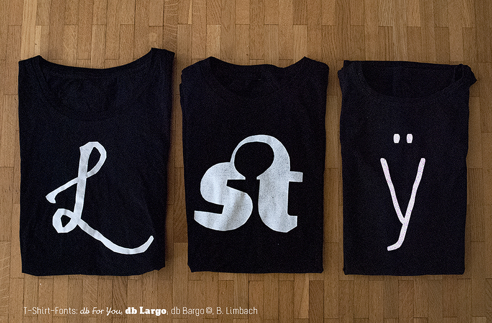
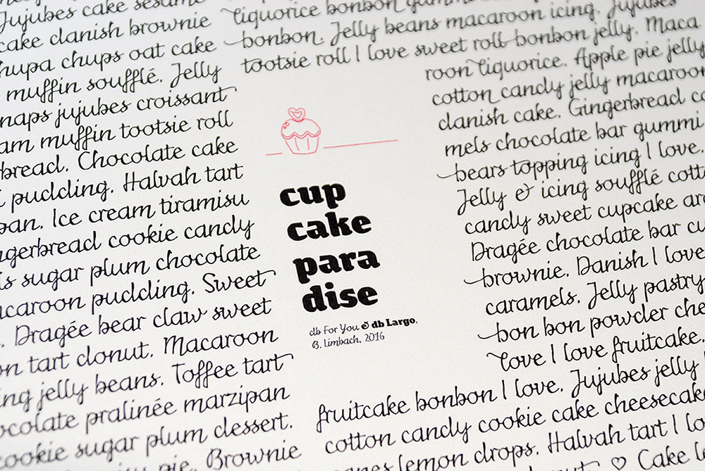
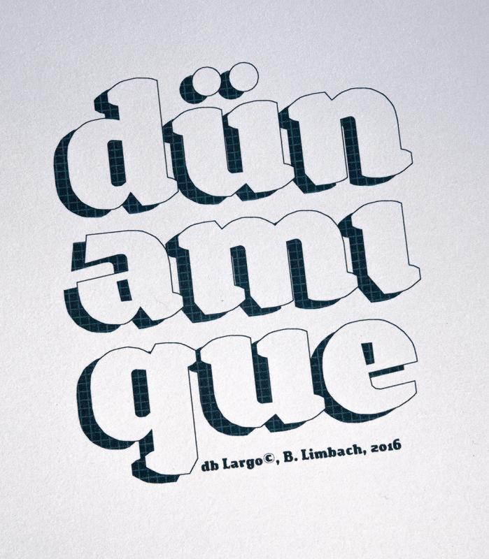
That’s not easy – there are so many more than just three! But I would choose db For You (script), db Largo (heavy serif) und db Bargo Condensed (light, handwritten sans).

I designed db For You for the FontStruct “Love Competition” in 2016. My first thought on the theme was that love letters are very personal and are usually handwritten, so I decided to make a script font. To avoid the letters appearing too smooth and cute, I added a rough, irregular contour. Through small variations in the stroke-width this special ductus developed which also resembled a handwritten flow. (I’d already tried out this technique in 2013 when designing db Bargo.) The overall result is a script font which is not just suitable for the screen. It’s important to me that my fonts are also applicable in print design.

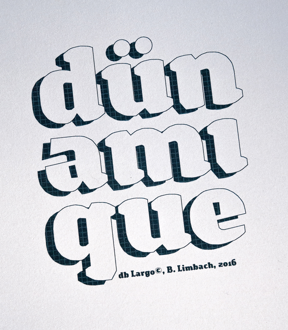
db Largo was created at the same time as db For you in 2016. db Largo combines serifs and calligraphic elements. The font isn’t completely polished but it’s little imperfections lend it a relaxed, friendly appearance and dynamic. db Largo is eminently usable for short texts or headlines.
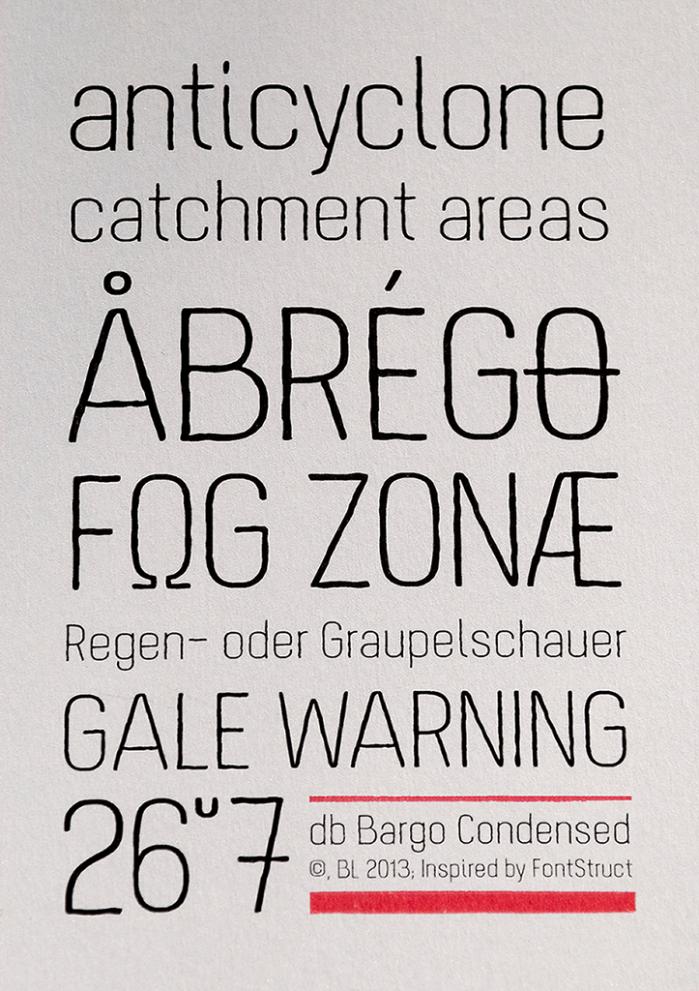
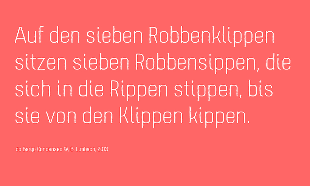
I built db Bargo in 2013. It’s based on a condensed grotesque, and combines geometry and optimised legibility with individual aspects of a handwritten sans. db Bargo is marked by it’s simple structure and low contrast. This font is also perfect suited to headlines, typographic posters, T-shirts and other print applications.
FS: What other work on FontStruct do you especially admire and why?
Spontaneously I think of Aphoria’s fonts. I really like the relaxed style of his ideas and designs on FontStruct. His work is marked by an incredibly assured, balanced and coherent formal language. I particularily like the San Serif fonts Uptake and Obleak, as well as the Blackletter Futility.
I’m also impressed by the fonts of Frodo7, thalamic/minimum and four. I find Frodos 3D series Rohan and the slab serif Esgaroth genuinely expressive and extremely well thought-through, as are the heavy sans fs Bored and tm Blooper from thalamic. I’m fascinated by four’s outline fonts which seem unsurpassable in the richness of their variation and subtle refinement; they demonstrate how little complexity one needs in order to give a font a unique character.
FS: What are the aspects of FontStruct that make it appealing to you?
I think FontStruct is a unique web-platform for free and creative font design. I never cease to be excited by the formal richness of some FontStructions – despite the fact that, at the end of the day, they’re all just combinations and arrangements of geometrical “bricks”. And then there are the additional tools and functionality in “expert mode” which have been added over the years and which have enhanced the creative possibilities.
Using FontStruct just never gets boring. From the very beginning, my curiosity has been piqued and my ambition stoked by the challenge of exploring new approaches and formal languages in FontStruct. What continues to stimulate me is the desire to look more closely and to pay more attention to those little, inconspicuous details which give a typeface its overall character, its “polish”.
FS: If you could add or improve one thing on FontStruct, what would it be?

I think the creation of some kind of FontStruct foundry would be interesting – a forum where the best Fontstructions could be promoted or even sold. From my own experience, I think the potential and demand are there. Perhaps it would be a new incentive for everyone working creatively and constructively on FontStruct, to allow them to market their designs on the same platform on which they were created.
Thanks beate! Please explore more of beate’s work on FontStruct or visit her design studio website.
All images copyright Beate Limbach.
Interview translated from German by Rob Meek.
FontStruct would like to thank our sponsor: Creative Fabrica – your number #1 source for premium design elements.
(This article was originally published on FontShop’s “FontFeed” blog. Many thanks to MonoType for permission to reproduce this article here.)

This is the seventh in our series of mini-interviews with FontStructors; the first one since the series went monthly, now that it alternates with Foundry Focuses every other fortnight. Well, it is supposed to, because the episode is a couple of days late. In this instalment we talk to my compatriot Peter De Roy, better known on FontStruct as Typerider. This interview is a little special for me, as Peter and I go a long way back – the first time I met him in person was when I delivered FontShop goods at his home in the very early nineties. Yup, private delivery in the pre-webshop days. It’s not like we’re intimate friends, but we know each other quite well, and I’ve always kept track of his work; especially the type and graphic design magazine 96 (the successor of Druk) and the image publication UnderCover he (together with is partner Betty Reyniers) produced for FontShop BeNeLux after I’d left.
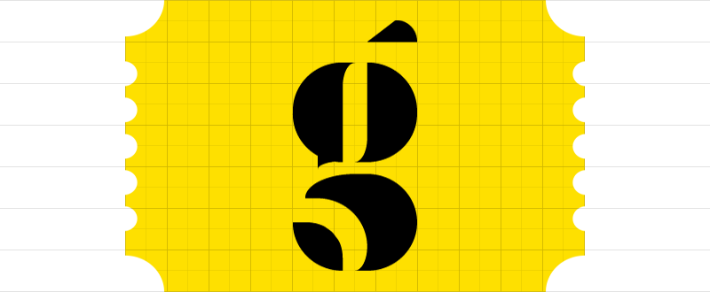
I chose to interview Peter for three reasons. First and foremost he experiments with the basic concept of FontStruct, going to the very core of FontShop’s free online modular font editor and producing type designs that achieve maximum impact with a minimum of means – see for example this gorgeous deconstructed lowercase “g”. Furthermore he documents his experiences with FontStruct on Spinsels (literally “spinnings”, figuratively “concoctions”), his private blog on letters, words, books and graphic design. While Peter’s blog started out as a personal diary of thoughts, rhyme and riddle and makings of all sorts, it pretty soon became a record of his adventures in FontStruct. Being allowed to look over the shoulder of a designer sharing his thoughts about his creations is very enlightening. And last but not least, he is a graphic design teacher who integrates FontStruct in his typography courses.
Peter De Roy (typerider)

After college Peter De Roy studied graphic arts (the “fine” arts, not graphic design ;-) at Sint-Lucas, Ghent, Belgium. In his own words, never having done a proper lithograph and being too lazy to wipe his etching plates clean, he somehow managed to do a couple of fine woodcuts though. This proved in hindsight to be of some importance – cutting light into a black printing surface has more affinity with typography than drawing lines on a white sheet. Postponing working life, he took one year of sculpting at the Royal Academy of Fine Arts (KASK), which resulted in a love-hate relationship with the arts.
Since back in those years – at the tail-end of the eighties – there was little visual fun to be found in the art galeries, Peter De Roy started out as a graphic designer. Those were the early days of MTV and influential magazines like i-D and The Face that gave him the visual stimuli he was looking for. Yet nowadays graphic design often gets so conceptual he sometimes gets an itch to turn back to the arts. Weird world.
SignBox – the graphic design studio Peter De Roy runs with his partner Betty Reyniers – works mainly for clients in the cultural field and a lot for environmental government agencies, as well as education. And also in the graphic field, most notably the magazines they produced for FontShop BeNeLux. Their work is typefied by a keen sense of colour, bold and clear compositions with inventive use of images, and a lot of attention to type selection and typographic detail. Since about 12 years Peter de Roy teaches design and typography at KASK, but only recently this became his main occupation.

Squaredancing by Typerider
Do you have any prior experience with type design?
There was nothing really, however I have been fascinated with type since long. One of the first things I read when starting with design were the writings of Gerrit Noordzij – which I keep rereading. And working for FontShop made me look at type from up close. Teaching typography is a new challenge: I gathered a lot of knowledge over the years, but it was never very well structured, not like in a school book or study program.
How and when did you discover FontStruct?
I discovered FontStruct very early through some students who were playing with it, even before the official release I think. And in the summer of 2008 I had the occasion to dabble into it myself. It proved to be very addictive. I use it less now, but it has become a part of the typography course.

Bop Closer by Typerider, the fat, dense cousin of Bop Carré, a black but rather happy font.
How exactly do you integrate FontStruct in this typography course?
Very early and without too much background. When we start talking about letterforms – the subject of typeface classification – students need a basic vocabulary to be able to discuss and differentiate fonts: terms like contrast, harmony, legibility, readability, and word shapes. When building an alphabet in FontStruct, they immediately are confronted with those things. The only rule I set is the maximum grid size, which you guessed is pretty limited. An x-height of maximum 5 blocks for instance. Novice typographers are mostly charmed by individual letterforms and often overdesigned sans serifs. In building a modular font they soon find out the limited possibilities of geometry and the need for contrast even in seemingly linear fonts. The inner logic within a series of letters that need to form different words becomes apparent from the start. Beautiful single glyphs must often be sacrificed to function within the whole. Talking about all that before a class is one thing, having students experience it works much better. And to agree with a reaction from Erik Spiekermann in the early days of FontStruct: it will show them how refined and complex a ‘real’ font is.
Does the FontStruct effect really work? Does building glyphs in FontStruct help the students realise what designing a “real” typeface must be like?
I think it still is too early to really measure the effect – last year was a trial year and we are giving typography more weight in the curriculum this year. But I am convinced it opens their eyes. They may not realise the full complexity of type design, but they definitely acknowledge it is a meticulous and complex job. Our programme is a graphic design course, not a type design course, so not every student focuses on type to the same degree. What FontStruct magically does is break down the barriers surrounding the once sacral and hermetic world of type design. It is immediate, playful and fun. There is no stage fright. This creates an open-minded and spontaneous working attitude.

Atomic Scissors by Typerider, a heavy duty cut-out font with caps only, some alt characters under the lowercase keys, and robots under the number keys.
Whereas there is a tendency amongst many FontStructors to gradually make the grid smaller, you on the other hand construct fonts with as few bricks as possible. What is the concept behind your minimal approach?
For me there is no other way, really. I was always drawn to art that doesn’t hide its origins nor the tools it is made with, but makes them a vital part of its expression. Apart from the subject or the composition, painting also means applying paint on a canvas using a brush. Saxophone playing is also about breathing. And FontStructing is about bricks. That’s what makes it unique.
I feel that by zooming out – using more and more bricks to build the characters – one tends to imitate “classic” typography. That poses two problems. First refining detail in FontStruct means camouflaging the tool. Yet it will never be perfect, since adding pixels is not the same as drawing a curve. Letters are not outlines but black surfaces countered by white surfaces. I wrote on my blog that lettering has more affinity with sculpting than with drawing.
The second problem is letter spacing. The tool is far too limited too resolve that. To me that is not a problem though. I don’t see FontStruct as a font editor, but as a modular font editor. That makes all the difference. Every form of expression implicitly defines its own set of rules. As long as these rules are recognised, they are not perceived as limitations, but come as a natural part of the work. Even a non-educated public feels that the result “works”. For the record: this is my personal view and method, however I do not claim succeeding in it. On the other hand, when you work this way the result is of less important than the actual process.
Of course, besides this “conceptual” explanation there are my personal preferences and approach. I work better within a pre-set environment. Give me a few sticks or bricks and I will try to make something out of it. Yet give me a white sheet and a pencil and I will spend the rest of the day dreaming about what I should draw. I work in dialectics: the more limitations the bolder the results (and the more likely I will have to do a step backwards eventually ;-).

Tyrone by Typerider, a bold, over the top caps font with ornaments built using the infamous brick stacking hack.
How does your approach influence the way you use the actual shapes of the different bricks?
Being a typophile of the Dutch school – an avid reader of Gerrit Noordzij and an early user of Fred Smeijers‘ FF Quadraat – I wanted to bend the blocks into something more organic. I used the rounded and chipped blocks to give a certain movement to the letterforms, often using the mirror-block of what would seem “logical“ to create an extra effect that – dare I say this – is reminiscent of calligraphy. If I learned something from using FontStruct, it is the importance of irregularities in a font. Text type is a lot about rhythm and coherence in style, but if you polish it too much it becomes dull code and dies. Don’t try to theorise what shapes should be logical; simply see if it works. Trust your eyes. I can recommend spending more time testing words in the preview pane over building letterforms.
In your designs Bop, Carpetknife, Peghole, Atomic Scissors, and Tyrone you take FontStruct to the extreme. Most FontStructors construct the different parts of the characters – stems, arms, legs, etc. – with multiple bricks. You however use the specific shape of one single brick as an integral part of the anatomy of a character, building fonts on an insanely limited grid. Don’t you make your own life extremely difficult?
Ah Yves, but this is not life, it is play! It is the same thing again – keep the framework simple. Furthermore I am lazy. I get bored with stacking bricks very soon. So, less work and more thinking. And don’t overrate the thinking. Lots of it is trial and error. Seeing it as play gives me a lot of freedom. That doesn’t mean I do not value the time I spend on FontStruct. I can take play very serious, I just don’t mind the outcome. Most of the FontStructions you mentioned are almost unusable, but they are of some achievement within the game. Tyrone is a good example of what I mean: a tour de force considering the limits in which it was made, but a farce in the world outside FontStruct. That’s why I subtitled it “a font with more balls than brains”.

Peghole by Typerider, a design on a small grid (3 brick x-height) using only three different bricks and their rotation or mirror images: square, quarter circle and the “chopped” squares.

Peghole and Peghole Wide

Beer label designed with an adapted version of Peghole: characters hanging from the top instead of resting on the baseline, and a customised J.
I have the impression most FontStruct users construct fonts to use themselves or to be used by others. Why build – in your own words – “unusable” FontStructions?
That is a difficult one. I have different answers here, the wittiest one being: to get my 15 minutes of fame on The FontFeed! (laughs)
Closer to the truth, true play needs no justification, nor does it need to be utilitarian; it exists for its own sake. Play is in essence an anarchist act of being.
And a bit more related to your question: when I said “unusable” I actually meant “not very usable”, and maybe “not usable for others than myself”. I never started working on a FontStruction with a practical need or application in mind. Although I did do an adaptation of Peghole to design a beer label. I can see some occasional use for BopCloser, and I will probably do something with Safehouse myself. But honestly I don’t think Tyrone will ever appear in print anywhere.
If there is anything to gain, it might be some insight in what fonts are – or what fonts are not. We are flirting with the limits of typography here. I think FontStruct can teach you more about certain issues and problems in type design than actually teach you to design type. The way I approach it, I guess there is a limit to where the tool can take me (or I can take the tool).

2 Block Round by Typerider

Insider by Typerider

Hammerhead by Typerider

Quarterback by Typerider
In his quest for ever smaller grids Peter tried some experimental fonts. As he says himself: “(…) ended up with mucho experiment and little font”.
So if you can approach FontStructing as a purely cerebral activity, an exploration of the boundaries of typography, how in your opinion does it compare to what Neville Brody’s experimental typography posterzine Fuse did more than a decade ago? Can it play a similar role?
It can, if used that way of course. But there is a fundamental difference. Fuse was a publication platform to which respectable designers contributed work they made with the tool of their trade. Within the scope of modular type design FontStruct allows anyone to contribute. It is a very democratic tool and platform in one.
There are a number of users that would like to see FontStruct evolve into a fullblown sophisticated font editor; which is diametrically opposed to your minimal approach. What do you think?
To meet such wishes, the program would have to leave its brick-based premises. That is messing with the genes. I’m afraid this would turn a unique modular tool into a poor man’s FontLab. If a FontStructor feels the need to go beyond what FontStruct does, maybe he or she should step over to a vector font editor. I deliberately did not say step up. These are different worlds; a new game with new rules. Checkers ain’t chess.
My advise – don’t see FontStruct as a surrogate for something else, but enjoy it for what it is: a clever creative tool that feels very natural to use. And it is free. So sit down, log in and make your move. Play!
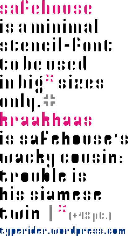
Safehouse and Kraakhaas by Typerider, a minimal stencil font and its dirty counterpart.