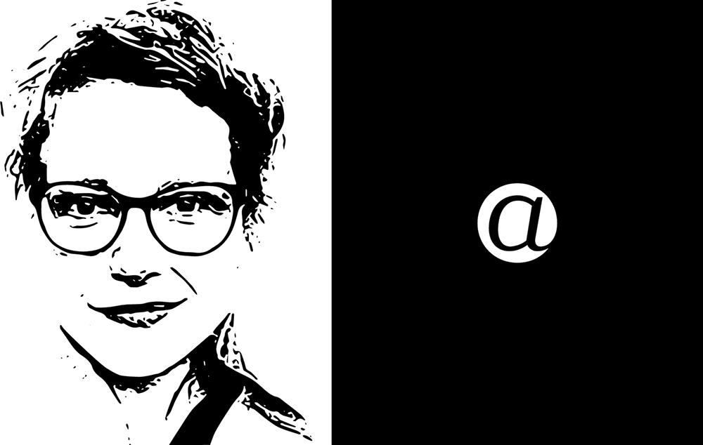
Gridfolk: Interview with Beate Limbach
Many years have passed since I felt remotely able to answer the question “How did they do that?” in regard to most of the finest and complex designs on FontStruct. Our community of ingenious designers, the “FontStructors”, have long been the true adepts, the rightful owners of the grid and the brick. But who are they?
In 2009 Yves Peters tried to answer this question in his excellent series of 7 interviews “Focus on FontStructors”.
A resumption of his project, eight years on, is long overdue, and today we’re making a start by talking to one of FontStruct’s exceptional stars of recent years; record winner of no less than three FontStruct competitions, hoarder of staff picks, and designer of some of FontStruct’s most extraordinary fonts: Beate Limbach …
FS: Beate, please tell us a bit about yourself. Where do you live and work? What kind of training do you have? What do you do in everyday life beyond FontStructing?
I was brought up in Giessen, Germany.
After graduating from secondary school, I studied art theory and Romance studies in Kassel, Paris and Mainz.
In 2006, I completed my degree in communications design at the University of Applied Science Mainz, studying under Professor Johannes Bergerhausen, and focusing on book design (typography) and photography.
For a little more than 10 years, I’ve been living and working as a freelance designer in Lausanne in Switzerland. Typography is a passion that has gripped me since my schooldays, and in recent years I’ve shifted my professional focus from print design to type design.
How did you become interested in type and typography? What was your first experience of font design?
My first contact with the world of type and calligraphy was at primary school where I encountered various different forms of standardised handwriting, and learnt about the transition from the old “Sütterlin” form of handwriting to the latin form in German schools. Later, I had the opportunity to take part in a calligraphic drawing course. The posters we made on this course were screen-printed and so I learned about an additional design medium which, in turn, fuelled my interest in graphic design more generally.
During my studies I had the opportunity to work on Johannes Berghausen’s “decodeunicode” project as it was still in its very early stages. The project’s aim was the researching of all the characters and alphabets included within Unicode – their histories, significance and use. It’s since developed into a wonderful online platform for pure typographic research.
FS: How did you start out on FontStruct?
In 2008, while browsing for free fonts, I stumbled upon articles about FontStruct in Smashing Magazine and I Love Typography. I was excited by the idea of being able to design typefaces in a playful way and with a minimal toolset. I also liked the fact that one had control over how to license designs.
Before FontStruct I had experience with lettering and “analogue” type design, but I’d barely come into contact with digital, type-design software. FontStruct was a way-in for me to gradually start exploring this world.
I began to work with other type-design software, both in order to refine and extend my “FontStructions”, and to develop new fonts outside FontStruct. Several of my FontStruct fonts where published in the Typodariums between 2014 and 2016 and this led to interest and customers for fonts such as db Drops, db Soda, db Como Splitt and db Bargo.
FS: If you had to choose two (or three) of your own FontStructions as favourites, which would they be and why?
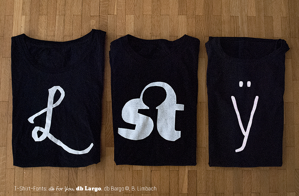
That’s not easy – there are so many more than just three! But I would choose db For You (script), db Largo (heavy serif) und db Bargo Condensed (light, handwritten sans).

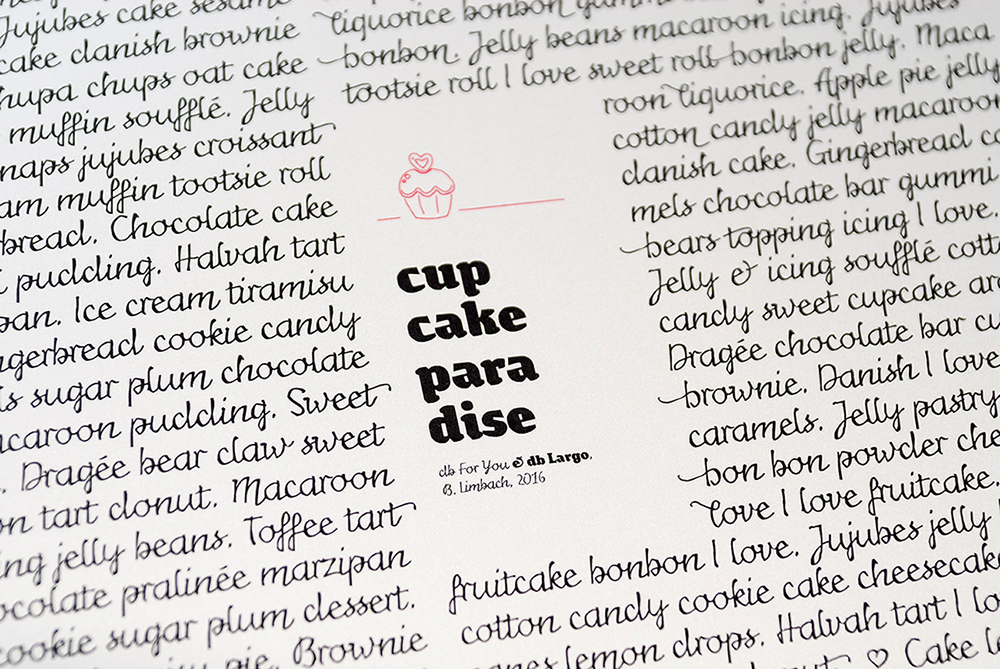
I designed db For You for the FontStruct “Love Competition” in 2016. My first thought on the theme was that love letters are very personal and are usually handwritten, so I decided to make a script font. To avoid the letters appearing too smooth and cute, I added a rough, irregular contour. Through small variations in the stroke-width this special ductus developed which also resembled a handwritten flow. (I’d already tried out this technique in 2013 when designing db Bargo.) The overall result is a script font which is not just suitable for the screen. It’s important to me that my fonts are also applicable in print design.
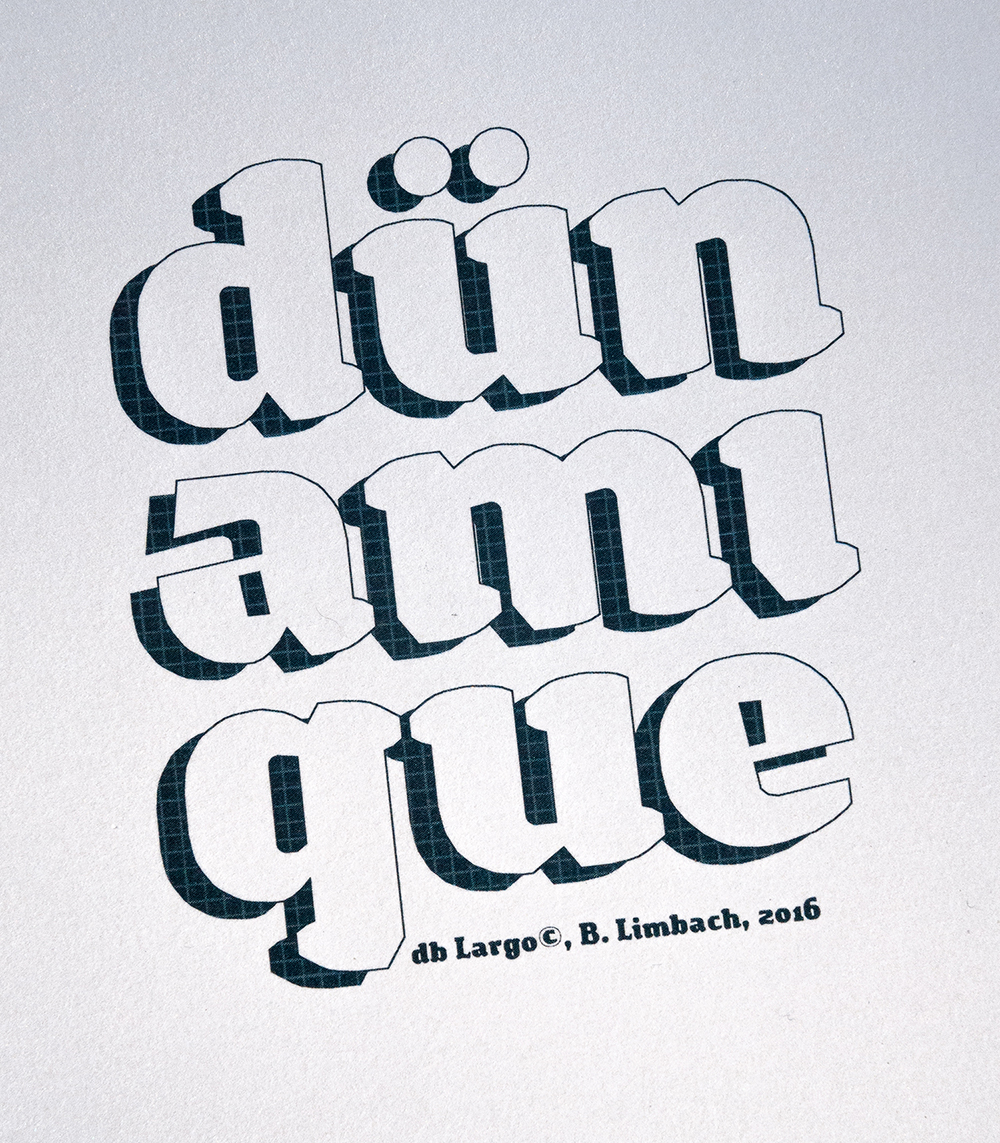
db Largo was created at the same time as db For you in 2016. db Largo combines serifs and calligraphic elements. The font isn’t completely polished but it’s little imperfections lend it a relaxed, friendly appearance and dynamic. db Largo is eminently usable for short texts or headlines.

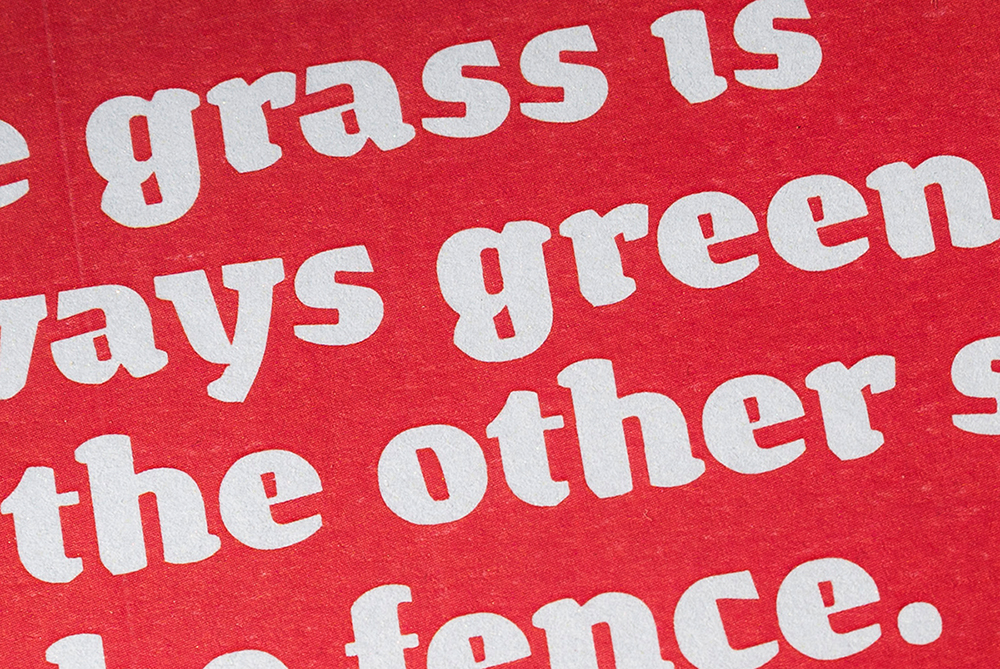
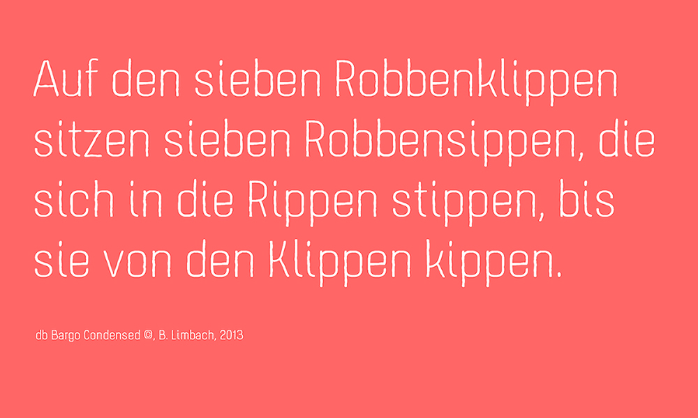
I built db Bargo in 2013. It’s based on a condensed grotesque, and combines geometry and optimised legibility with individual aspects of a handwritten sans. db Bargo is marked by it’s simple structure and low contrast. This font is also perfect suited to headlines, typographic posters, T-shirts and other print applications.
FS: What other work on FontStruct do you especially admire and why?
Spontaneously I think of Aphoria’s fonts. I really like the relaxed style of his ideas and designs on FontStruct. His work is marked by an incredibly assured, balanced and coherent formal language. I particularily like the San Serif fonts Uptake and Obleak, as well as the Blackletter Futility.
I’m also impressed by the fonts of Frodo7, thalamic/minimum and four. I find Frodos 3D series Rohan and the slab serif Esgaroth genuinely expressive and extremely well thought-through, as are the heavy sans fs Bored and tm Blooper from thalamic. I’m fascinated by four’s outline fonts which seem unsurpassable in the richness of their variation and subtle refinement; they demonstrate how little complexity one needs in order to give a font a unique character.
FS: What are the aspects of FontStruct that make it appealing to you?
I think FontStruct is a unique web-platform for free and creative font design. I never cease to be excited by the formal richness of some FontStructions – despite the fact that, at the end of the day, they’re all just combinations and arrangements of geometrical “bricks”. And then there are the additional tools and functionality in “expert mode” which have been added over the years and which have enhanced the creative possibilities.
Using FontStruct just never gets boring. From the very beginning, my curiosity has been piqued and my ambition stoked by the challenge of exploring new approaches and formal languages in FontStruct. What continues to stimulate me is the desire to look more closely and to pay more attention to those little, inconspicuous details which give a typeface its overall character, its “polish”.
FS: If you could add or improve one thing on FontStruct, what would it be?
I think the creation of some kind of FontStruct foundry would be interesting – a forum where the best Fontstructions could be promoted or even sold. From my own experience, I think the potential and demand are there. Perhaps it would be a new incentive for everyone working creatively and constructively on FontStruct, to allow them to market their designs on the same platform on which they were created.
Thanks beate! Please explore more of beate’s work on FontStruct or visit her design studio website.
All images copyright Beate Limbach.
Interview translated from German by Rob Meek.
FontStruct would like to thank our sponsor: Creative Fabrica – your number #1 source for premium design elements.
Focus on FontStructors | Rob Meek (meek) | November 15th, 2017 | 5 Comments