

Fontstructions tagged with “Stamp”
- Any License
- Commercial Use
- Downloadable
- Cloneable
- All Rights Reserved
- Creative Commons Attribution Non-commercial No Derivatives
- Creative Commons Attribution Non-commercial Share Alike
- Creative Commons Attribution Non-commercial
- Creative Commons Attribution No Derivatives
- Creative Commons Attribution Share Alike
- Creative Commons Attribution
- FontStruct Non-Commercial License
- FontStruct License
- Creative Commons CC0 Public Domain Dedication
- Open Font License
- Staff Picks (3)
- All (5)
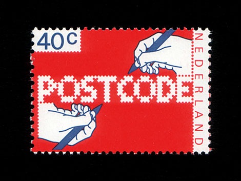
POSTCODE
by nitradaBalanced Rating: 7.55
Average Rating: 7.50
Click for more information about this rating. 26 votes You voted ? for this FontStruction. You may change your vote at any time.

Last edited: 4th January, 2009
Created: 6th June, 2008
This is still work in progress, a lot of characters missing. There are only UPPERCASE characters available, I filled the lowercase letters with random symbols/patterns. The design is based on this stamp design from 1978 by Gert Dumbar. Use font sizes 64, 128 or 256px. Set leading to 24 (for font size 64), 48 (for 128) and 96 (for 256). More information
Philatelligent
by AeolienBalanced Rating: 8.77
Average Rating: 10.00
Click for more information about this rating. 3 votes You voted ? for this FontStruction. You may change your vote at any time.
Might Chain
by zephramBalanced Rating: 8.67
Average Rating: 9.14
Click for more information about this rating. 7 votes You voted ? for this FontStruction. You may change your vote at any time.
Last edited: 4th May, 2019
Created: 10th September, 2018
Some kind of great big ol' chain.
In retrospect, I think it looks like a jewelry chain from a dwarven civilization. Perhaps the hypothetical jeweler cut and ground the stones in an imitation of some dwarven font!
When glyphs are used in isolation, they somewhat resemble carved signets or seals. Increasing the letter spacing allows you to create a variation of the design. (This is something that must be done in-software since the font will render as monospaced by default.)
*
12SEP2018: Added lowercase... the low resolution combined with the design method make it very difficult to render distinctive lowercase versions of every letter, but I'll keep working on it. There's a lot of similarity between pairs like S/5, Z/2, etc., so this font is most effectively used in forms of writing wherein context suffices to inform the reader as to the identity of each glyph (lists, prose, and technical writings). If you want to use this in a password system or something, I recommend using one case's glyphs only.
*
Design Rules:
1. Negative spaces will be areas of 0.5 bricks' effective length or width.
2. Negative spaces may exceed the 0.5 measurement only by increments of 0.5 and in only one dimension at a time.
3. Glyphs will fill their framed canvasses to the greatest extent possible while adhering to the other rules.
- Public Domain (811)
- Free (949)
- Cartoon (82)
- Blocky (519)
- Chain (24)
- Interwoven (1)
- Framed (29)
- 100% Constant Height (43)
- Stamp (42)
- Signet (3)
- Dense (46)
- Doodle (162)
- 10x10 (14)
- 10x10 HD Collection (6)
- Geometric (849)
- Sgraffito (7)
- Connected (190)
- Dwarf (15)
- Dwarven (21)
- Octagon (43)
- Octagonal (185)
- Display (3010)
- High Contrast (81)
- E5x5 (10)
- Fontspace (154)
- Tire (2)
- Tracks (10)
- Strong (112)
- Constant Width (11)
db catch
by beateBalanced Rating: 8.32
Average Rating: 8.44
Click for more information about this rating. 16 votes You voted ? for this FontStruction. You may change your vote at any time.
Ruth's Typewriter
by AeolienBalanced Rating: 9.03
Average Rating: 9.83
Click for more information about this rating. 6 votes You voted ? for this FontStruction. You may change your vote at any time.
Last edited: 25th July, 2022
Created: 5th November, 2013
When my mother was young (and specially after my birth) she supplemented the family's income from home by typing for students and businesses. When I was a student I used the same machine for my assignments, lesson plans and thesis. The years were not kind to the machine, the mechanics rusted or broke, the letters worn with frayed edges or disintegrating serifs and fine lines. Ruth's typewriter is a declaration of my appreciation of many years of service the brave little machine gave... As you can see I clearly didn't get the letters repaired ;) The font looks like I rearranged and glued down what was left of the raised surfaces, to continue using the typewriter and give my words a very modern look ;)) A "grunge-writer" ?? Did you notice that no typewriters were ever sold with this kind of modern destructured typefaces?! ;)
Since I started this font many years ago (Ruth was very amused and appreciated this hommage) this work has now become a memorial to her
- Circle (200)
- Round (597)
- Frame (18)
- Stencil (724)
- Type Writer (5)
- Decorative (661)
- Stamp (42)
- Distorted (40)
- Broken (117)
- Aeolien (114)