


Heavy Competition Results
Dear FontStructors,
The “Heavy” competition has ended and, once again, the staff at FontStruct Towers were overwhelmed by your creativity. Sixty amazing entries! I hope that everyone had fun taking part, and took pleasure in designing and sharing your work. I’m only sorry that we will feature only a few FontStructions in this post.
With judging a more daunting prospect than ever, we sought and found the assistance of a genuine typographical heavyweight. As well as being the managing editor at Fonts in Use and founding partner of design agency Kaune & Hardwig, Florian Hardwig has been a FontStruct supporter since its earliest days. (Of our 2.1 million+ registrations, he is number 99!) He’s also used FontStruct as a tool in his teaching practice in the past, even smuggling FontStruct right into the Bauhaus Archive itself!
Without further ado, Florian’s favourites:
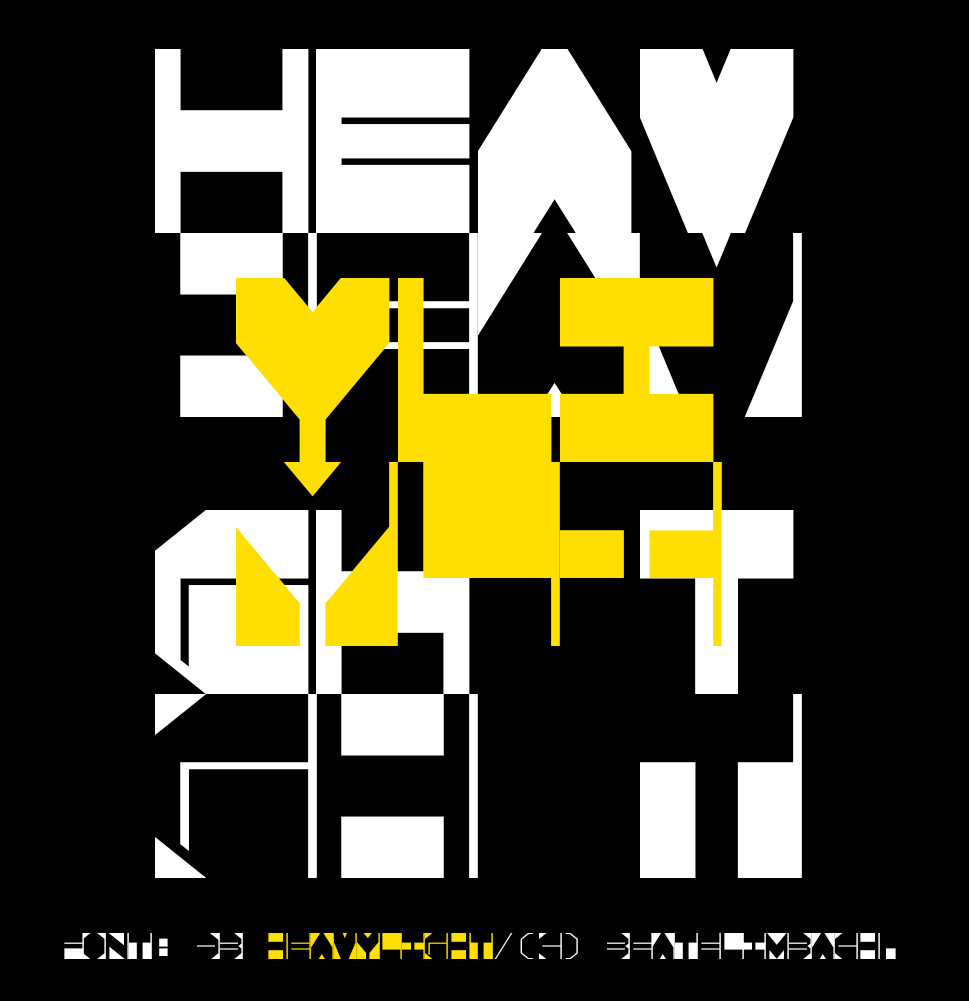
Winner #1 db HeavyLight by beate
Florian wrote:
I’m fond of FontStructions that embrace the limitations of the grid and explore an idea without dialing up the resolution endlessly. db HeavyLight is a great example. The square glyphs with their monospaced width and unconventional weight distribution seem to channel the lettering made by Chris Lebeau in the 1920s. In their playfulness, they also remind me of Ben Shahn’s work. The ingenious thing about db HeavyLight is that the lowercase holds alternate caps, shown white against black. By mixing positive and negative glyphs, one can unleash a fascinating play of figure and ground, of light and dark.
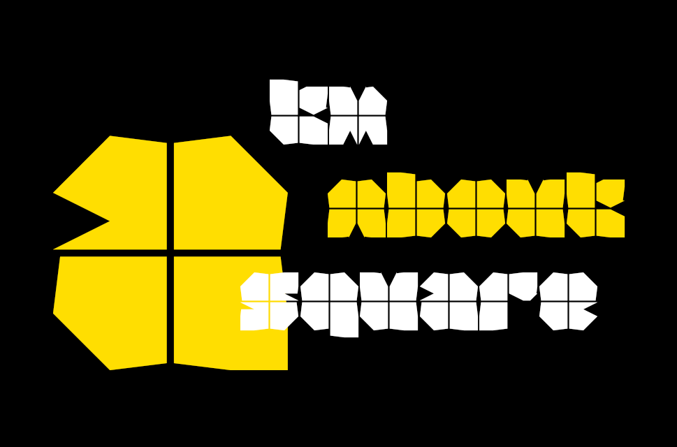
Winner #2 tm about a square by thalamic
Florian wrote:
Blocky typefaces of very heavy height tend to look clunky and boring. It helps to add a dash of white, to open up the black surface a little, and also to hint at counters and stem boundaries. One clever and minimalist way of doing so is to overlay the glyphs with fine lines. In True Cross Fire and Watzlcross, two film faces from the 1970s, this resembles cross hairs. In tm About a Square I see a more peaceful and pleasant analogy: each glyph looks like a gift, wrapped in paper and tied with a ribbon!
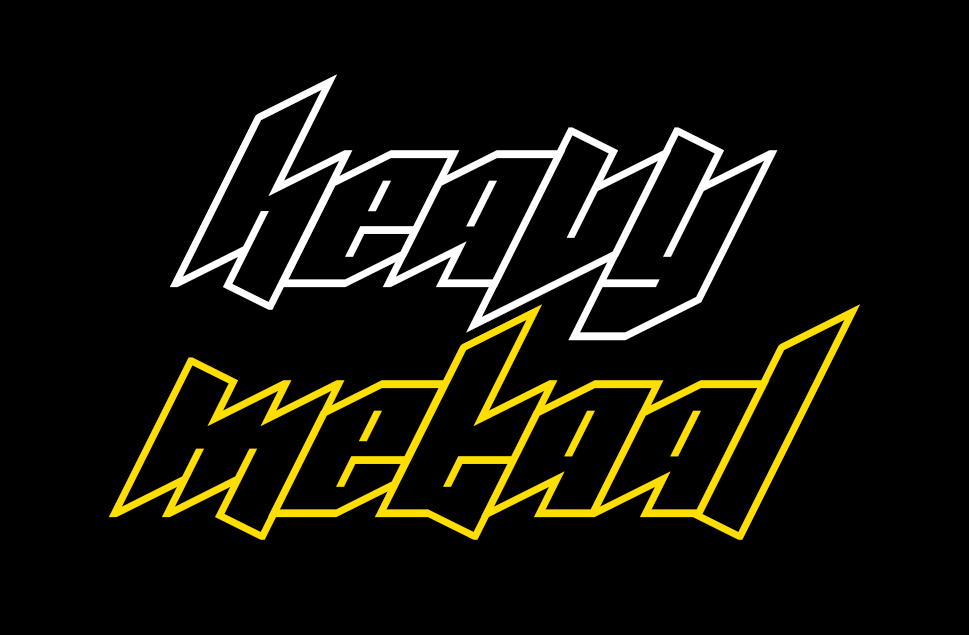
Winner #3 Metaal by four
Florian wrote:
I had a hard time deciding between Metaal and Zwaar, another compelling entry by the same contestant. In the end, Metaal’s fun and (seemingly) simple concept won me over. Basic letterforms defined by monolinear strokes for contours and counters, abutted against each other – just like we used to draw them on graph paper during lesson, while dreaming of the next festival weekend. What makes Metaal so cool is its steep angle. Together with the diagonal terminals that oscillate around the baseline and x-height, it yields a wicked look. This font is a machine for making instant band logos.
Colour Winner: KD Kalyn by architaraz
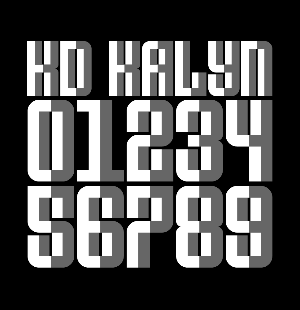
As it turned out, Florian’s choices were all monochromatic although he did admire the colour entries, picking out this one in particular. KD Kalyn by architaraz was also my favourite from among the polychromatics. It’s wonderful that it works, both as a plain single colour design, and as this chunky array of escheresque facets.
The People’s Choice
The People’s choice was Zwaar. So double well-done four!
Honorable Mentions
I seriously recommend that everyone takes a close look at each and every entry – ideally download them and try them out. But here are a few more which I particularily enjoyed:
G1 Defkhan by geneus1, cicmankaputAB4028ii by jirinvk, Moon Machine A by V. Sarela (Yautja), Tennessine Slab by Frodo7, corpus opulentia by tortoiseshell, Ailurophilia FS by Haley Wakamatsu.
Thank you!
Thanks again to everyone who took part.
Thanks to our generous sponsors Glyphs App, the world’s leading desktop font editor for OSX. Glyphs continues to quietly and kindly support FontStruct in 2022.
Last but not least, thanks to our guest judge Florian Hardwig, for gifting us his time and expertise.
Have an idea for our next competition theme? Please add it in the comments.
Happy FontStructing!
Competition Results, Competitions, News | Rob Meek (meek) | July 19th, 2022 | 22 Comments