Dear FontStructors,
Apart from a few minor problems, things seem to have gone well with the update to FontStruct 2.0. Thanks to everyone who has made us aware of the various glitches that did occur. Looking in the gallery we’re already seeing some fantastic creations taking advantage of the new possibilities.
Today we updated the site again with a few bug fixes, and one powerful enhancement to the composite bricks feature. Let’s talk about the enhancement first. Continue reading…
Dear FontStructors old and new,
Today, FontShop and the FontStruct team are proud to present one of the most significant updates to our site since the service launched. There’s a lot to cover, so let’s get straight to the new features.
New Feature: Brick Stacking

Some brave souls have been “stacking” (placing multiple bricks on a single grid square) for a long time. The long lost FontStructor “williaum” AKA will.i.ૐ first discovered a bug that made this esoteric technique possible, and pioneered its use.
Continue reading…
My, how you’ve grown!
On April 1st 2008, FontShop launched a free, online platform for building modular fonts called FontStruct. Over the intervening two years a community of over 270,000 typographic bricklayers has come together to create, share, download and discuss almost 260,000 modular type designs. Thanks to all of you for participating in this fantastic project so far.
Coming Soon
We want FontStruct to continue improving by adding new features and creative possibilities, and we’re currently preparing a significant update to the FontStructor font editor. We hope to release this update at some point this month.
Continue reading…
We’re going to need a bigger podium.
The first-ever FontStruct competition is a wrap and we, the FontStruct staff, think it was a huge success. Thanks to everyone who played, commented, cheered, favorited and judged. Everyone came together in the spirit of play to produce some outstanding results. The high level of quality FontStructions made this sports competition nearly impossible for the judges to pick just three winners. I think Rob Meek summed up the hard task facing the judges when he wrote in an email:
“People produced some incredible and diverse work and every entry needed to be looked at in detail in order to try and make a fair judgement. I’m only glad that there are other judges.”
Continue reading…
First up, don’t forget to get your entries in for the competition! You’ve got just under four days left.
We made some very small changes to the site today.
Firstly there is a new version of the FontStructor. There are a lot of technical changes under the hood, in preparation for future enhancements, but don’t get too excited, there are no new features in this version. A few minor bugs should be fixed though. In particular, an annoying issue where the FontStructor insisted that you had unsaved changes when in fact you didn’t should no longer occur.
There is also one tiny change to the preview widget. You can now look at fonts at multiple pixel resolutions. Click on the “PXL” button to go to pixel resolution, then shift-click to zoom x 2. Click again to zoom x 2 again etc. You can also alt-shift-click to get smaller (zoom x 0.5). You can use the same technique to zoom out further than was previously possible – useful for getting an overview of some of those giant FontStructions.
That’s about it.
As always if there are any problems with the changes, please let us know.
Welcome to the first-ever FontStruct competition
The 2010 Winter Olympics have come to a close but the memories of daring triple axles, stratosphere-surfing Double McTwists, and barnstorming bobsled runs are still fresh in our minds. In the spirit of Olympic world-wide fellowship we are thrilled to kick off our first-ever FontStruct competition.
Competition brief:
This is a friendly competition amongst FontStructors to see who can create the best sports themed FontStruction. To enter, you must create and publish a new FontStruction that plays into the world of sports, athletics and competition. You can draw inspiration from your favorite sport, your favorite team, your favorite athlete, your favorite jersey, — whatever! Whether you want to create a slab serif or a script, a dingbat or a pictogram, we’d love to see it. If you think your submission has any kind of sports application then GO FOR IT!
If sports isn’t your thing, don’t worry. We want to keep the competition broad and encourage all FontStructors to join in on the fun. Keep in mind there are numerous examples of typefaces in the world that are not specifically designed for sport but work well in that context. Look no further then the recent Winter Olympics, where the Vancouver Organizing Committee chose the stylish Neo® Sans and the modular BD Brick as their primary and secondary typefaces.
For more sport type inspiration, check out: the Sports tag on FontStruct and my recent blog post on FontStructors and their love of sport. You’d also do well to browse through a few of FontShop’s hand-picked lists. See: Sports, Collegiate Athletics, and Sports Scrips.
Competition time period:
March 1st – March 12th
Eligibility:
You must be a registered FontStruct user.
Competition rules:
1. Your submission(s) must be posted and made “public” between March 1st – March 12th. Although you are encouraged to share your submission(s) at any time between the 1st and the 12th, your FontStruction submission(s) must be public (marked “share with everyone”) no later then March 12th at 11pm PST. Additionally, your submission(s) must remain public until March 19th in order to give the judges enough time to review all qualifying entries.
2. Your submission(s) must be tagged with a “SportsComp” tag. (For fairness, during the competition time period (March 1st – March 12th) no FontStruction with the “SportsComp” tag will be awarded a Top Pick or be available for a Featured FontStruction pick)
3. Your submission(s) must be downloadable. If your FontStruction breaks the FontMortar, the submission will be disqualified.
4. Your submission must be a newly posted FontStruction. Simply adding the “SportsComp” tag to an already existing font is strictly prohibited.
5. For each submission, you must post at least one sample image in the comments of the FontStruction.
6. FontStruct cloning is permitted but the judges will be looking for original work.
7. You may enter as many FontStructions to the competition as you like.
8. This is a friendly competition. Cheering, favoriting and fun banter is encouraged but cruel and uncivil behavior will not be tolerated.
Licensing:
No rules regarding licensing. You may choose any Creative Commons license you like for your FontStruction.
Judging:
All qualifying FontStructions will by judged by the FontStruct staff.
Formal judging period:
March 13th – March 19th.
Winner announcement:
Winners will be announced in a FontStruct Blog post on Monday, March 22nd, 2010.
Awards:
Gold, silver, and bronze medals. Judges will determine winners and medal order.

Prizes:
Gold medal wins a copy of the coveted FontBook by FontShop International. An amazing prize this. FontBook is the most complete digital type reference in the world. Since 1991, “the big yellow book” has been the trusted friend of designers, typographers, advertisers, manufacturers, publishers, historians, and anyone else who uses type.
Silver & bronze medal win t-shirts from the FontStruct Shop. Winning this t-shirt will greatly simplify your wardrobe as you’ll never want to leave the house without wearing FontStruct close to your heart.
In addition, all medal winners will have their winning FontStructions posted as Featured FontStructions for two weeks starting March 22nd.
Have a question? Leave me a note in the comments and I’ll get it answered.
Ready…Set…FontStruct!
Sunday is Valentine’s day. Time to finally declare your love to that special someone dearest to your heart. But why wait two days? With the new “Favorites” feature on FontStruct, you can now easily start right now, sharing your affection for the work of fellow FontStructors.
Favorites, along with an improved and extended tagging system, are a core feature of today’s site update, which we think will really help you to organize and access your own work, and that of other designers, more easily.
People have been asking for these new features since the early days of FontStruct, and as the gallery has sprawled over countless pages, and individual FontStructors have found themselves working on hundreds of designs, there’s been an obvious need for new ways to organize and navigate through work on the site.
Favorites
You can now bookmark any shared FontStruction (other than your own) by clicking on the “Add Fave” icons which you can see all over the site.

All of your Favorites can be browsed on your My FontStruct page under the “Favorites” tab:
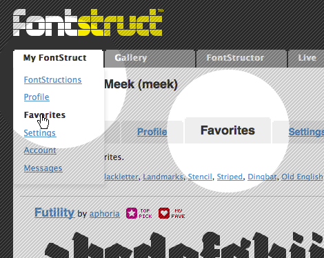
You can also browse other people’s favorites when you visit their FontStruct homepages.
Favorites can be used to collect and organize any FontStructions which you find interesting, or to collect designs for specific projects and purposes. Favorites will also function as a new way of sorting FontStructions in the gallery – with a new “Favorite Count” sort order. Next to every FontStruction in the gallery you will see a heart icon, indicating the number of users who have “Favoritized” that design.
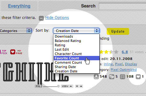
Not all love is eternal of course. Just click on the Favorite icon again to drop a favorite:

Tagging Favorites
You can now also tag other people’s work by tagging your Favorites. You can do this either on the respective FontStruction homepages, or on your Favorites pages under MyFontStruct:
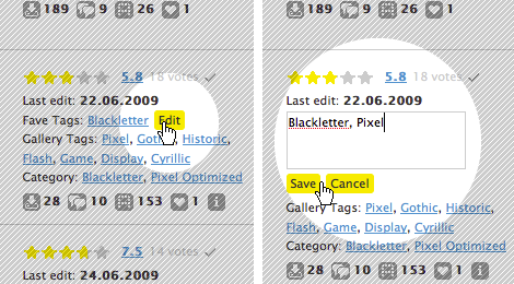
At the top of your Favorites pages you can access and browse all of your favorite tags.
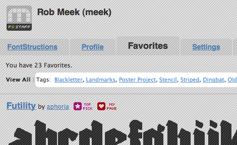
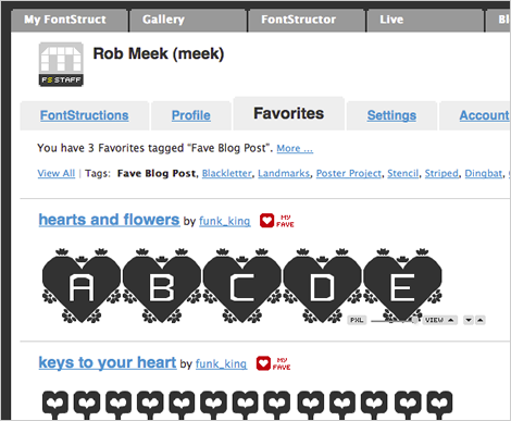
You can use these Favorite Tags to collect and group, for example, your favorite FontStruct pixel fonts, or your favorite western-style fonts, whatever you like. Or, if you’re interested in using a FontStruction for a specific project, you can use a favorite tag to collect some candidates:
Enhanced tagging of your own work
As well as adding Favorites and the ability to tag them, we’ve enhanced the way that existing gallery tags work. Gallery tags are the tags which FontStructors apply to their own designs and which have always been visible on the gallery pages.
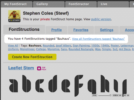
Designers going to their MyFontStruct page will now see an overview of all of their gallery tags at the top of their FontStruction listings:

If you click on any tag on your My FontStruct > FontStructions pages you will see only the work which you have tagged in this way. For those of you with hundreds of designs this should make it a lot easier to organize and navigate through them. Other users visiting your user homepage will also be able to use these user-specific tags to browse your work. If you click on the “View all FontStructions tagged with …” link you will be taken to the gallery and see all work tagged with the same tag.
You can use tags to organize your work into families of related fonts accessible via a single, unique and human-friendly URL such as “http://fontstruct.com/fontstructors/funk_king/tags/Track”

As with Favorites, you don’t need to go to the individual FontStruction page in order to add tags, you can now tag your work directly in your MyFontStruct > FontStruction listing pages.
Private Tagging
Your Favorites and your Favorite Tags are all visible to all FontStruct users. Tags which you apply to your own work are also visible to others with one exception: Any tags applied by you only to your own private FontStructions will also be visible only to you. So private tagging of your own private work is possible.
Known Issues
When trying out the feature we noticed that some FontStructors had already used a huge number of tags.The truly inimitable funk_king for example has almost 1000 tags already. This is wonderful, but it also means we will have to add some way of navigating through such very long lists of tags. Until then, you can create as many tags as you want but only the first 1024 will be appear at the top of your MyFontStruct/FontStructions pages. The tags are sorted according to how often they have been applied, so the most common tags should appear first.
Adieu Pink Dot
The most important and controversial change of all today! The old magenta “TOP PICK” sticker has been retired to a comfortable folder far away, to make way for a new star icon. The old girl had been through a lot, and deserves a rest from her many brick-bearing suitors. The new TOP PICK star is a bit more compact and should work better together with other icons such as the new favorite icons and future additions.
Other Changes
There are a number of other, smaller changes across the site:
There is now a comment form at the bottom of longer comment threads, so you don’t need to scroll back to the top of the thread if you want to say something.
Tag links in the gallery are now shorter, taking the form /gallery/tag/mytag, and clicking on them will really only show you FontStructions which have been tagged accordingly. (Until now clicking on a tag did a a search of tags, FontStruction names, designers, and FontStruction descriptions, which was slow and could produce confusing results).
There is a new category – “monospaced” which will show you all shared, monospaced FontStructions.
As always little bugs may appear when changes are made, so let us know in the comments or contact us if you notice anything wierd.
Enjoy!
Welcome FontStructors to my inaugural Brick by Brick installment. In the coming months I hope to use this space to showcase many of your incredible FontStructions and to shine a light on you, my fellow brick junkies, who work tirelessly to enrich the site and the community with your work.
To kick things off, I’d like to take a moment to talk sports.


Two Sundays ago, I watched with devilish glee as Brett Favre threw his final interception of the season – the final interception of his career perhaps – effectively closing the door on any chance the Minnesota Vikings had at making a late game rally to win the NFC Championship game against the New Orleans Saints. While watching the game, I couldn’t help but notice my eye (my mind!) returning time and again to the slab-serif number four on Favre’s jersey. What my mind kept returning too, was a question. A question that many of you out there in FontStruct Nation I’m sure have asked yourself from time to time: can I FontStruct it?
I find when I watch sports this “can I FontStruct it” question comes up frequently. It’s purely a hypothetical question – a mental exercise and a pastime – where, having internalized the limitations of FontStruct I can look at soccer jerseys, race car numbers, scoreboard displays and determine quickly whether the letters and numbers would map to FontStruct or not. It’s possible I’m going nuts. But if I am, there is certain to be a large group of FontStructors waiting with welcoming arms in that Cuckoo’s Nest.
In fact, sports or athletics seems to be a source of continued inspiration for many in the FontStruct community. Its influence runs deep and its breadth shoots wide.
Rooting for the home team
Some FontStructions wear their athletic influence (and their FontStructor’s team loyalties) proudly on their sleeve.
Sketchbook B was so jazzed after watching South Carolina defeat Clemson he had to create Scoreboard just to document the moment. Not to be outdone, p2pnut, his heart still racing after the success of Jenson Button‘s Formula 1 success, took a few laps around the grid and created Grand Prix. Kix, another Formula 1 fan created Pole Position – a raceway classic.
Saturday May 2nd, 2009, was a great day in Geneus1‘s sports book. That was the day Filipino boxer Manny Pacquiao a.k.a “PacMan” knocked out Ricky Hatton to win a light welterweight title. The next day Geneus1 created his amazing PacMan tribute FontStruction.




Inspired by Otl Aicher’s pictograms for the 1972 Olympics in Munich, Cam.ill built an extensive (and comical) set of his own Olympic icons in Pictales. Frodo7 has a set of his own competitive icons in French Defense – a chess font. And somewhere between icon and lettering, the Funk King introduced his own personal cheering section with Yay Team and Sports Wave. Oh hey, need a font made entirely of footballs or baseballs or golfballs? The Funk King’s got you covered there too. There seems to be no end to the games or the victories FontStructors will celebrate.
The winning style
There are no hard and fast rules about what constitutes a sporty typeface – script, sans, blackletter – they all work fine if done well and in the right context. Some FontStructions aren’t necessarily athletic specific but their style could be used successfully in a sports context.
Varsity, an athletic slab created by Stewf, would look as fly on that letterman jacket as it would on your home game jersey. Shasta‘s Teatral Stencil is a solidly built slab whose muscular strength makes it perfect for the gridiron or an MMA title fight.




Sector 017 by Neoqueto is a grungy modern display sans that could introduce a motocross rally as well as brand the Energy Drink™ sponsoring all the riders.
Letra Libre by nathancox, Corrida Evolved by jmarquez, and m.ove.r by minimum are all wonderful triline fonts that evoke the spirit of the lettering done for the 1968 Olympics in Mexico. Each would make strong candidates for lettering up some contemporary soccer (err…football) jerseys.




Mummification by the Funk King and Donna 85 by stigtafto are both intricate display fonts with no specific sports connection yet their details lend themselves to contemporary athletic usage. Likewise DJ Nippa‘s NCD Octangle 20 and p2spnut‘s RM Squarial are stylishly modern thin faces, perfect for when you want to stay light on your feet.
I’ve barely scratched the surface here. No doubt there are countless other FontStructions I’ve missed in this brief round up. Please use the comments to help fill in the gaps and sound off on what FontSructions you think make for good sport.
Good thing are coming our way
FontStructors…I can tell you right now that February is going to be an exciting month here in FontStructlandia. Mr. Meeks is cooking up a new feature that will have you all singing teary-eyed toasts to him down at your local pub. Sadly, I should warn you; this new feature will bring about the passing of one of our beloved keepsakes. But take comfort when I tell you that this passing will be followed by a Phoenix — a rebirth! Our collective mourning will be short.
Later this month we will also launch the first ever FontStruct competition. The Rules Committee is still hard at work fine-tuning the details of the contest but now is the time to sharpen your skates, wax up your skies, and start your mouse finger calisthenics. Did I mention prizes? Oh yes, there will be prizes! Stay tuned sports fans.
Happy new year everyone. I think it’s going to be an exciting one for FontStruct.
Here are the latest stats, hot from a bulging database:
238,849 FontStructions
244,930 registered FontStructors
400,796 Downloads,
1,437,963 Glyphs
This vast and rambling edifice just keeps on growing. If you’re FontStructing, you’re part of a phenomenon.
As you may have noticed, a new, yet familiar hand has been at work at FontStruct over the last few weeks – selecting top picks, featuring exceptional FontStructions and tweeting like a man with a beak and feathers. We’re delighted to announce that designer and long-time FontStructor John Skelton AKA Afrojet joined the FontStruct staff at the start of the year.

He’ll be working with the FontStruct community, FontShop and myself to continue to improve FontStruct and to raise the profile of the project and your work. If you haven’t done so already I recommend reading Yves Peter’s fascinating interview with John over on the FontFeed. It was the first in the wonderful Focus on FontStructors series.
Afrojet will also be posting on this blog about what’s happening in and around FontStructia, so welcome to the far side of the bricks John, and watch this space!
Before the year ends there is still time for a couple of last minute new items:
FontMortar update
As many of you know, a new version of the FontMortar – FontStruct’s font-generating software – is online since last week. There were some initial glitches with spacing and corrupted download files, but with help of many reports from FontStructors all problems have been fixed.
The main purpose of this update was to make font generation more efficient and save processor effort and time, consequently reducing server costs. We can now also proudly say that FontStruct’s carbon footprint is much smaller.
Font generation on FontStruct works as before, but a lot faster and more powerful: FontMortar should now handle those huge FontStructions which couldn’t be downloaded before.
If you happen to be the proud creator of one of such GigaStructions: please give it another try and let us know if they are working now.
Article about FontStruct workshop
In November I had the opportunity to teach a workshop using FontStruct at the HfG Schwäbisch Gmünd in Germany. During one week 14 students designed their own screen fonts using FontStruct. It was a great experience: observing FontStruct in action in a classroom was very valuable, and the final results were very, very good.
If you would like to know more, I’ve written a report about the workshop including some visual notes and results from students.
Logging off
After six months as FontStruct’s community manager I am logging off today to enjoy one month of vacation, far from email and internet connection.
It was a lot of fun to witness the day-by-day development of FontStruct over the last 6 months. I’ve seen amazing new designs emerging every week, and I’ve got to know lots of cool people with many different personalities and backgrounds.
It has truly been a great honor and pleasure for me to be a part of FontStruct during this time. I’ll be back in February – not as community manager, but as one more passionate FontStructor. ;-)
Until then, take care & and have a great start in 2010!


