Brick by Brick, the FontStruct Blog

The FontStruct Blog

Happy Holidays!

It’s amazing how fast time goes by when we are being creative.

The year 2009 is almost over, and we would like to thank all FontStructors for their great work.

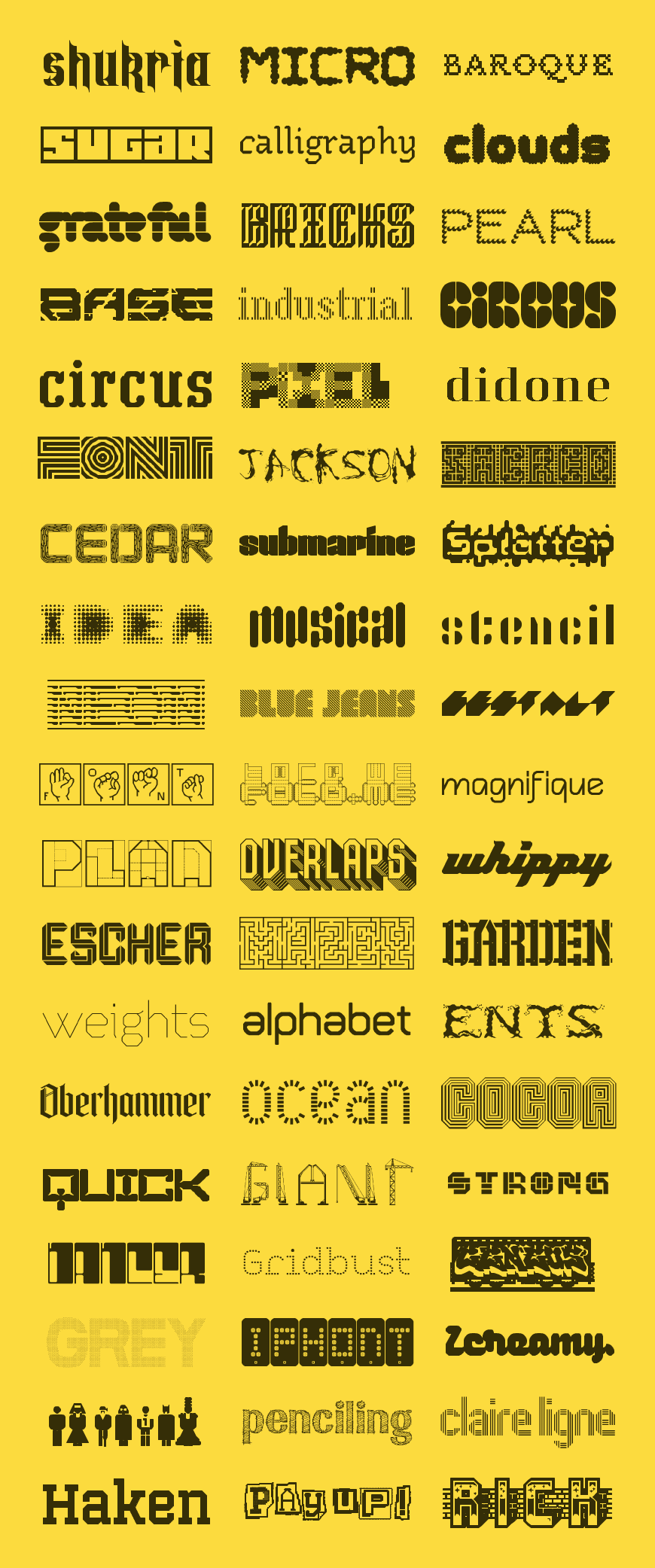
To celebrate this year’s fantastic production we are now displaying all Featured FontStructions of 2009 on the website.

And so you don’t have to reload your browser several times, we’ve also put them together in a single image as a small present for you:

Featured FontStructions 2009

Merry Christmas & happy holidays!

FontStruct Shop

The long awaited FontStruct t-shirts are finally available!

This week we are launching the new FontStruct Shop with a few classic FontStruct items to start. The initial range of products feature the original FontStruct logo. The designs are printed using our shop partner Spreadshirt’s high quality “flex” printing process which produces great results for vector graphics.

FontStruct T-Shirts

In the shop you can find not only t-shirts (for boys and girls, in different sizes) but also caps, bags and other items.

FontStruct Shop

Shipping is currently available for North America, Western Europe and some other parts of the world (see the full list of countries here). We hope we can add more countries to the list at some point.

All revenue will go to support the project.

Focus On FontStructors – Peter De Roy (typerider)

(This article was originally published on FontShop’s “FontFeed” blog. Many thanks to MonoType for permission to reproduce this article here.)

This is the seventh in our series of mini-​interviews with FontStruc­tors; the first one since the series went monthly, now that it alternates with Foundry Focuses every other fortnight. Well, it is supposed to, because the episode is a couple of days late. In this instalment we talk to my compatriot Peter De Roy, better known on FontStruct as Typerider. This interview is a little special for me, as Peter and I go a long way back – the first time I met him in person was when I delivered FontShop goods at his home in the very early nineties. Yup, private delivery in the pre-webshop days. It’s not like we’re intimate friends, but we know each other quite well, and I’ve always kept track of his work; especially the type and graphic design magazine 96 (the successor of Druk) and the image publication UnderCover he (together with is partner Betty Reyniers) produced for FontShop BeNeLux after I’d left.

I chose to interview Peter for three reasons. First and foremost he experiments with the basic concept of FontStruct, going to the very core of FontShop’s free online modular font editor and producing type designs that achieve maximum impact with a minimum of means – see for example this gorgeous deconstructed lowercase “g”. Furthermore he documents his experiences with FontStruct on Spinsels (literally “spinnings”, figuratively “concoctions”), his private blog on letters, words, books and graphic design. While Peter’s blog started out as a personal diary of thoughts, rhyme and riddle and makings of all sorts, it pretty soon became a record of his adventures in FontStruct. Being allowed to look over the shoulder of a designer sharing his thoughts about his creations is very enlightening. And last but not least, he is a graphic design teacher who integrates FontStruct in his typography courses.

Peter De Roy (typerider)

After college Peter De Roy studied graphic arts (the “fine” arts, not graphic design ;-) at Sint-Lucas, Ghent, Belgium. In his own words, never having done a proper lithograph and being too lazy to wipe his etching plates clean, he somehow managed to do a couple of fine woodcuts though. This proved in hindsight to be of some importance – cutting light into a black printing surface has more affinity with typography than drawing lines on a white sheet. Postponing working life, he took one year of sculpting at the Royal Academy of Fine Arts (KASK), which resulted in a love-hate relationship with the arts.

Since back in those years – at the tail-end of the eighties – there was little visual fun to be found in the art galeries, Peter De Roy started out as a graphic designer. Those were the early days of MTV and influential magazines like i-D and The Face that gave him the visual stimuli he was looking for. Yet nowadays graphic design often gets so conceptual he sometimes gets an itch to turn back to the arts. Weird world.

SignBox – the graphic design studio Peter De Roy runs with his partner Betty Reyniers – works mainly for clients in the cultural field and a lot for environmental government agencies, as well as education. And also in the graphic field, most notably the magazines they produced for FontShop BeNeLux. Their work is typefied by a keen sense of colour, bold and clear compositions with inventive use of images, and a lot of attention to type selection and typographic detail. Since about 12 years Peter de Roy teaches design and typography at KASK, but only recently this became his main occupation.


Squaredancing by Typerider

Do you have any prior experience with type design?

There was nothing really, however I have been fascinated with type since long. One of the first things I read when starting with design were the writings of Gerrit Noordzij – which I keep rereading. And working for FontShop made me look at type from up close. Teaching typography is a new challenge: I gathered a lot of knowledge over the years, but it was never very well structured, not like in a school book or study program.

How and when did you discover FontStruct?

I discovered FontStruct very early through some students who were playing with it, even before the official release I think. And in the summer of 2008 I had the occasion to dabble into it myself. It proved to be very addictive. I use it less now, but it has become a part of the typography course.


Bop Closer by Typerider, the fat, dense cousin of Bop Carré, a black but rather happy font.

How exactly do you integrate FontStruct in this typography course?

Very early and without too much background. When we start talking about letterforms – the subject of typeface classification – students need a basic vocabulary to be able to discuss and differentiate fonts: terms like contrast, harmony, legibility, readability, and word shapes. When building an alphabet in FontStruct, they immediately are confronted with those things. The only rule I set is the maximum grid size, which you guessed is pretty limited. An x-height of maximum 5 blocks for instance. Novice typographers are mostly charmed by individual letterforms and often overdesigned sans serifs. In building a modular font they soon find out the limited possibilities of geometry and the need for contrast even in seemingly linear fonts. The inner logic within a series of letters that need to form different words becomes apparent from the start. Beautiful single glyphs must often be sacrificed to function within the whole. Talking about all that before a class is one thing, having students experience it works much better. And to agree with a reaction from Erik Spiekermann in the early days of FontStruct: it will show them how refined and complex a ‘real’ font is.

Does the FontStruct effect really work? Does building glyphs in FontStruct help the students realise what designing a “real” typeface must be like?

I think it still is too early to really measure the effect – last year was a trial year and we are giving typography more weight in the curriculum this year. But I am convinced it opens their eyes. They may not realise the full complexity of type design, but they definitely acknowledge it is a meticulous and complex job. Our programme is a graphic design course, not a type design course, so not every student focuses on type to the same degree. What FontStruct magically does is break down the barriers surrounding the once sacral and hermetic world of type design. It is immediate, playful and fun. There is no stage fright. This creates an open-minded and spontaneous working attitude.


Atomic Scissors by Typerider, a heavy duty cut-out font with caps only, some alt characters under the lowercase keys, and robots under the number keys.

Whereas there is a tendency amongst many FontStructors to gradually make the grid smaller, you on the other hand construct fonts with as few bricks as possible. What is the concept behind your minimal approach?

For me there is no other way, really. I was always drawn to art that doesn’t hide its origins nor the tools it is made with, but makes them a vital part of its expression. Apart from the subject or the composition, painting also means applying paint on a canvas using a brush. Saxophone playing is also about breathing. And FontStructing is about bricks. That’s what makes it unique.

I feel that by zooming out – using more and more bricks to build the characters – one tends to imitate “classic” typography. That poses two problems. First refining detail in FontStruct means camouflaging the tool. Yet it will never be perfect, since adding pixels is not the same as drawing a curve. Letters are not outlines but black surfaces countered by white surfaces. I wrote on my blog that lettering has more affinity with sculpting than with drawing.

The second problem is letter spacing. The tool is far too limited too resolve that. To me that is not a problem though. I don’t see FontStruct as a font editor, but as a modular font editor. That makes all the difference. Every form of expression implicitly defines its own set of rules. As long as these rules are recognised, they are not perceived as limitations, but come as a natural part of the work. Even a non-educated public feels that the result “works”. For the record: this is my personal view and method, however I do not claim succeeding in it. On the other hand, when you work this way the result is of less important than the actual process.

Of course, besides this “conceptual” explanation there are my personal preferences and approach. I work better within a pre-set environment. Give me a few sticks or bricks and I will try to make something out of it. Yet give me a white sheet and a pencil and I will spend the rest of the day dreaming about what I should draw. I work in dialectics: the more limitations the bolder the results (and the more likely I will have to do a step backwards eventually ;-).


Tyrone by Typerider, a bold, over the top caps font with ornaments built using the infamous brick stacking hack.

How does your approach influence the way you use the actual shapes of the different bricks?

Being a typophile of the Dutch school – an avid reader of Gerrit Noordzij and an early user of Fred SmeijersFF Quadraat – I wanted to bend the blocks into something more organic. I used the rounded and chipped blocks to give a certain movement to the letterforms, often using the mirror-block of what would seem “logical“ to create an extra effect that – dare I say this – is reminiscent of calligraphy. If I learned something from using FontStruct, it is the importance of irregularities in a font. Text type is a lot about rhythm and coherence in style, but if you polish it too much it becomes dull code and dies. Don’t try to theorise what shapes should be logical; simply see if it works. Trust your eyes. I can recommend spending more time testing words in the preview pane over building letterforms.

In your designs Bop, Carpetknife, Peghole, Atomic Scissors, and Tyrone you take FontStruct to the extreme. Most FontStructors construct the different parts of the characters – stems, arms, legs, etc. – with multiple bricks. You however use the specific shape of one single brick as an integral part of the anatomy of a character, building fonts on an insanely limited grid. Don’t you make your own life extremely difficult?

Ah Yves, but this is not life, it is play! It is the same thing again – keep the framework simple. Furthermore I am lazy. I get bored with stacking bricks very soon. So, less work and more thinking. And don’t overrate the thinking. Lots of it is trial and error. Seeing it as play gives me a lot of freedom. That doesn’t mean I do not value the time I spend on FontStruct. I can take play very serious, I just don’t mind the outcome. Most of the FontStructions you mentioned are almost unusable, but they are of some achievement within the game. Tyrone is a good example of what I mean: a tour de force considering the limits in which it was made, but a farce in the world outside FontStruct. That’s why I subtitled it “a font with more balls than brains”.


Peghole by Typerider, a design on a small grid (3 brick x-height) using only three different bricks and their rotation or mirror images: square, quarter circle and the “chopped” squares.

Peghole and Peghole Wide

Beer label designed with an adapted version of Peghole: characters hanging from the top instead of resting on the baseline, and a customised J.

I have the impression most FontStruct users construct fonts to use themselves or to be used by others. Why build – in your own words – “unusable” FontStructions?

That is a difficult one. I have different answers here, the wittiest one being: to get my 15 minutes of fame on The FontFeed! (laughs)

Closer to the truth, true play needs no justification, nor does it need to be utilitarian; it exists for its own sake. Play is in essence an anarchist act of being.
And a bit more related to your question: when I said “unusable” I actually meant “not very usable”, and maybe “not usable for others than myself”. I never started working on a FontStruction with a practical need or application in mind. Although I did do an adaptation of Peghole to design a beer label. I can see some occasional use for BopCloser, and I will probably do something with Safehouse myself. But honestly I don’t think Tyrone will ever appear in print anywhere.

If there is anything to gain, it might be some insight in what fonts are – or what fonts are not. We are flirting with the limits of typography here. I think FontStruct can teach you more about certain issues and problems in type design than actually teach you to design type. The way I approach it, I guess there is a limit to where the tool can take me (or I can take the tool).


2 Block Round by Typerider

Insider by Typerider

Hammerhead by Typerider

Quarterback by Typerider
In his quest for ever smaller grids Peter tried some experimental fonts. As he says himself: “(…) ended up with mucho experiment and little font”.

So if you can approach FontStructing as a purely cerebral activity, an exploration of the boundaries of typography, how in your opinion does it compare to what Neville Brody’s experimental typography posterzine Fuse did more than a decade ago? Can it play a similar role?

It can, if used that way of course. But there is a fundamental difference. Fuse was a publication platform to which respectable designers contributed work they made with the tool of their trade. Within the scope of modular type design FontStruct allows anyone to contribute. It is a very democratic tool and platform in one.

There are a number of users that would like to see FontStruct evolve into a fullblown sophisticated font editor; which is diametrically opposed to your minimal approach. What do you think?

To meet such wishes, the program would have to leave its brick-based premises. That is messing with the genes. I’m afraid this would turn a unique modular tool into a poor man’s FontLab. If a FontStructor feels the need to go beyond what FontStruct does, maybe he or she should step over to a vector font editor. I deliberately did not say step up. These are different worlds; a new game with new rules. Checkers ain’t chess.

My advise – don’t see FontStruct as a surrogate for something else, but enjoy it for what it is: a clever creative tool that feels very natural to use. And it is free. So sit down, log in and make your move. Play!
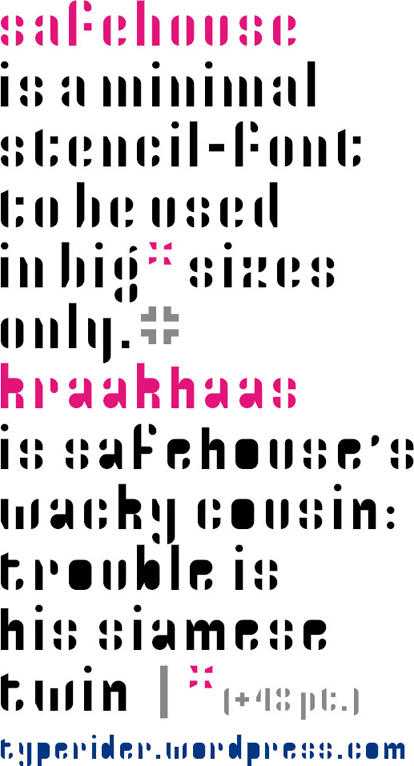

Safehouse and Kraakhaas by Typerider, a minimal stencil font and its dirty counterpart.

Main navigation improved

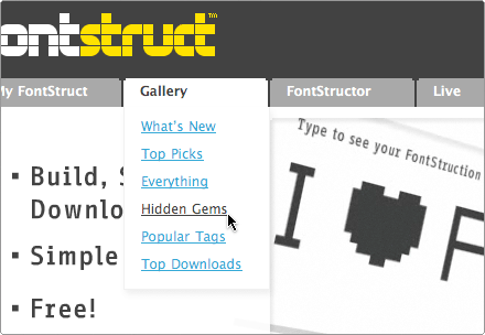
As some of you probably noticed, we have recently improved the main navigation of the FontStruct website.

The main menu now includes a link to FontStruct Live, and My FontStruct, Gallery and Support now show quick links to internal pages of the FontStruct website.

navigation

The latest FontStruct news, the Top Picks gallery and your own FontStructions are now just one click away!

Adjusting the rating system

We get a lot of positive feedback from FontStructors through email, on FontStruct threads and specially on Twitter. It feels great to give people something that makes them feel happy and creative. Thousands of FontStructors who voluntarily choose to share their work with the world are discovering this feeling too.

Of course, among all praises there are also feature requests, occasional bug reports and complaints. Interestingly, most complaints we get are targeted at one particular feature in FontStruct: the rating system.

Continue reading…

New: “Share” and “Remember Me”

Great achievements in type design demand a lot of work and concentration, but that doesn’t mean the design process needs to be solitary.

FontStruct is not just another font editor – it is special because it is built around the idea of sharing. FontStruct is a tool, but it is also a rich and lively community of designers who exchange ideas about type design and give feedback to each other.

The “Share” button

Today we are introducing a new “Share” button to make it even easier for FontStructors to share their creations with people outside the FontStruct community.

Popular social networking services – Facebook, Twitterdelicious, StumbleUpon, Reddit and Digg – are now just one click away, integrated into individual FontStruction pages.

social_01

Your friends and family are curious about what you have been doing all this time since you joined FontStruct? Now it’s easy to show them.

The “Remember me” check box

Preparing the ground for upcoming changes in the rating system, we are also introducing a small “Remember me” check box to the Sign In page.

Regular FontStructors can now use this feature to enter the website and start FontStructing (or voting ;-) right away, without having to sign in each time again. Note that we don’t recommend doing this on computers which you share with others — unless you want to share your account with them.

login_02

* * *

Enjoy, and let us know what you think.

Focus On FontStructors – Tobias Sommer (shasta)

(This article was originally published on FontShop’s “FontFeed” blog. Many thanks to MonoType for permission to reproduce this article here.)

This is the sixth in our series of mini-​interviews with FontStruc­tors. In this instalment we talk to Tobias Sommer, better known on FontStruct as Shasta. Now you have to realise that I am contacting most FontStructors to be inter­viewed blindly. See, I work from a list called “Top FontStructors” on the internal message board for FontShop projects. Origi­nally it only had the alias, URL, and a short description for all the potential inter­viewees each. For example Geneus is simply listed as “geneus1 – the master of complex, themed FontStruc­tions”, and Funk_​King as “funk_​king – purely prolific and versatile work”. You would expect from any self-​respecting journalist to at least check first who is the person he will contact, but hey, whoever said I take myself seriously? This is why I was surprised (and amused) to find out that – when I sent a request for an interview to Shasta on Monday July 20th – I actually had contacted the very same Tobias Summer who had commented on the Em42 interview just the day before. It was partic­u­larly funny that he ended his comment with: ”(…) A very well-​deserved article! They’re doing a great job picking out top FontStructors so far.” without him or me knowing he would receive an invitation himself the very next day. How’s that for a coinci­dence?


Tobias Sommer (shasta)

Tobias Sommer was born 23 years ago in St. Gallen, a small, quiet town in the east of Switzerland. Growing up drawing and scrawling a lot, he went through high school, discovered his interests for graphic design, photog­raphy, languages, music, politics, history, liter­ature, snowboarding, mountain biking, geography, creative writing and whatnot, and of course ended up not having a clue what the heck to choose of all these things to do profes­sionally. Thank­fully many of them “fell away due to lack of talent” (as he says so himself), and so he ended up having to choose between design or languages/politics/history. Tobias then started studying Inter­action Design at Zurich University of Arts, stopped after a year and switched to Inter­na­tional Affairs in Geneva. And that’s where he is now: studying and enjoying life in Geneva.

Tobias randomly ran into FontStruct on some web design award site, one or two weeks after it was released.


Punched Out and Punched Out Fill by Shasta

You started on Fontstruct very early after the launch. What were your first impressions?

Well, we fell in love at first sight. We’ve been a happy couple ever since. Of course we have our ups and downs at times, but it’s looking pretty good. :)

It was by the way very impressive to notice how many FontStructors and FontStruc­tions were already there when I first got on the site. I only realised how young the site actually was when they posted the “21 Days” post (The First Three Weeks) on the blog. Someone had done some good PR there!

You did one year of Inter­action Design, but did you have any actual experience with graphic or type design?

I think I’m one of the few regular FontStructors who don’t make a living with anything related to graphic design, typog­raphy, or other creative stuff. As a regular student, the only connection points to the design world in my profes­sional life are the eye cancer provoking Power­Point presen­ta­tions of our professors.


Great Depression by Shasta
Still I can’t deny having a past with design. First of all, my whole family’s pretty fond of design and visual arts in general. As I mentioned, I myself started studying design, but switched to Inter­na­tional Affairs after one year. That year at the University of Arts certainly was a big step ahead for my design skills, but it also made me realise that keeping design just as a hobby along the way might be enough. And that works great so far.

Type design on the other hand was pretty new to me. I had always been very inter­ested in the subject, right from my very first attempts with graphic design (drawing pixel logos for my own imaginary brand in Microsoft Paint at the age of 12… Yee-​hah!). Yet my sporadic and desperate attempts to find appro­priate software to put my ideas into practice always found a sudden and bitter end, either at the price of the program or the size of its manual. So discov­ering FontStruct was pure bliss, and the starting point of my type design “career”.


Cupra by Shasta

You mention the “eye cancer provoking Power­Point presen­ta­tions of our professors”. Do you remember when you started noticing such things? As I know the feeling, I was wondering inhowfar it distracts you from the actual content being presented, and how compelled you sometimes might feel to redesign the damn things? :)

(Laughs) Good question. I’m not sure when exactly I started noticing how bad some things are designed, but I guess the progressive sensi­ti­sation to this phenomenon is a key aspect in every designer’s devel­opment. It probably starts when as a child you realise for the first time that your black T-shirt adorned with dolphins jumping over orange Caribbean sunsets might not be the most beautiful thing in the world, and ends when you want to throw books at professors for using Times News Roman on their slides again. OK, it probably doesn’t end there, but you know what I mean. For me this moment was quite certainly the most intense after coming from Art University. There every­thing is sleek and beautiful and you get booed for not having your titles perfectly aligned on your presen­ta­tions, whereas at normal university most people only care about content, and not a second about form. Those were pretty painful moments for my retina. Especially when they force you to use typefaces that make you shiver just so they can compare the length of your essay to others. :)

Anyway, you mentioned the distracting aspect of bad design. The main problem is that poor design often goes hand in hand with poor structure. I think I could even live with Comic Sans and rainbow backgrounds, as long as the content was consis­tently struc­tured. But when they randomly use five different typefaces and seven different layout concepts within one single presen­tation, it becomes practi­cally impos­sible to under­stand the structure and the hierarchy of the content. This causes hours of additional work for every student, whereas a redesign and a good structure of these presen­ta­tions would probably take the same amount of time for one person only. I usually do redesigns whenever I get the raw Power­Point files from professors, and always insist on doing the collect-and-harmonise job when we have to do group assign­ments. Self-​flagellation in the service of aesthetics…


Disparador by Shasta

Which of your friends and/or co-​students know you now design type, and what was their reaction when they found out?

There’s only a few of them who know I do that, and even fewer who are actually inter­ested in it. I think the most common reactions are that they call me a freak or a nerd, tell me the exams are getting pretty close or ask if this is why I have these dark circles around my eyes. (laughs) But well, I can live with the fact that typog­raphy is a pretty specific hobby that you don’t share with every second person in the world.

How aware do you think they are of typog­raphy and fonts?

Most of my co-​students are either completely uninter­ested in the subject, or their interest goes as far as to replace the standard fonts with things like Papyrus in their essays, and then I often think they’d be better off with no interest in typog­raphy at all.

I’ve recently started exposing some of my FontStruc­tions on Facebook, to reach some of my more design-​interested friends, but there too the feedback is pretty lean. That’s by the way one of the slightly bitter things about FontStructing in my opinion: it mostly seems to rotate around itself and the amazing, but relatively small active community on the site. If you don’t have any means to show your work to a greater audience (like a well-​frequented blog or online portfolio), you’ll have to live with that.


Teatral and Teatral Stencil by Shasta

Talking about that relatively small active community, what are your thoughts on the voting system as opposed to the Top Picks selected by the FontStruct Staff?

Phew… Obviously the voting system as well as the Top Pick system have been subject to a lot of discus­sions recently. I under­stand why people are sometimes unhappy with any of the two systems. If you publish a font you’ve been working on for several hours or even days and then it either gets random 1’s or doesn’t get the pink badge even when you think it’d deserve it, it can be very frustrating and painful to see your work flushed away into oblivion among the 8,000 something mostly mediocre FontStruc­tions. I myself have in my opinion a few pretty solid designs that somehow slipped under the eyes of the admins, and I consider myself lucky if they get downloaded ten times like this, whereas the same typeface with a Top Pick would easily get twenty times as much.

Still I’ve recently come to the conclusion that the current system is probably not too bad after all. In the end it’s simple, doesn’t leave the admins with an insur­mountable amount of work, and even the despised font trolls somehow contribute to some justice when they downvote high-​rated typefaces: they constantly refresh the ranking, always giving new designs a chance to get some fame. I’m actually more worried by the “font fairies” that give 10’s to every halfway decent font. Though this is very well-​meaning and really shows the encour­aging atmos­phere on FontStruct, it tends to cement the upper regions of the ranking with typefaces are virtually imossible to surpass anymore, even with a true masterpiece.

But in the end all these things shouldn’t bother people too much. Constant good work always gets rewarded eventually. If it’s not by instant Top Picks and 9+ ratings, then it’s with a good reputation and the respect of your fellow FontStructors… Which in the end is worth more than any formal distinction.


Escheresk by Shasta

We were quite impressed by a recent Top Pick from you that we promoted to Featured FontStruction, your M.C. Escher tribute Escheresk. Where do you get your inspi­ration for creating new FontStructions?

I find it pretty hard to retrace how and where I got the inspi­ration for my fonts. Sometimes it’s a design I see somewhere or an existing font that inspires me, but mostly it just seems to come out of nowhere. In the case of Escheresk I couldn’t even tell you when or how I came upon that idea. It probably just started scrib­bling impos­sible polygons on my sheets during some boring lecture, and somehow turned them into letters.

I also have to admit that there isn’t any bigger theme or concept behind my work. I just take the ideas as they come and make the fonts I have in mind, but I simply wouldn’t have the patience and expertise to seek perfection within a certain genre. The only “concepts” I try to implement in every FontStruction I make are usability, consis­tency and completeness. Guess I’m pretty Swiss in this regard…


Exempla Slab Serif by Shasta
As a final note I think I partic­u­larly like FontStructing because creating a typeface to me sometimes feels more like “watching the face grow”: you have an initial idea for maybe two or three characters that you think would look cool (you could call that the seed), and in there is already an implicit set of rules for all the other characters (the DNA). Then you just go from letter to letter and see what the rules make it look like. In the end you have a full grown typeface and you find yourself pretty surprised by how great some of the characters look. That’s very rewarding, and the great thing about it is that you don’t have to be the full-​time ultra-​creative mutant brain to do it. One good idea now and then is enough.


Capitalia Rounded by Shasta


Updates to FontStruct Live and FontStructor

The FontStruct team is continuously adding new features to the website and to FontStructor, working hard to keep the demanding FontStruct community satisfied.

Today we are happy to announce three small but important updates: integration of Flickr and tweets from other users into FontStruct Live, expansion of the arabic character set and the long awaited implementation of copy & paste between different FontStructions

Integration of Flickr and Twitter into FontStruct Live

FontStruct Live has transformed the FontStruct experience. One month after its release, it is hard to imagine how we managed to keep track of all the updates in the community without it.

With a better communication infra-structure, FontStructors have been able to focus on what matters most: FontStructing. Every new week has brought more and better FontStructions, and we had to augment the capacity of Featured FontStruction from one to several fonts to acommodate all the amazing new work produced by the community.

Last week Rob silently plugged the FontStruct Flickr pool into FontStruct Live, so new images and comments on Flickr are automatically displayed on the feed.

This week we are introducing another addition to FontStruct Live: now not only our own FontStruct tweets, but any tweet including the magic #fontstruct tag is displayed in the feed. We hope this will bring even more integration to our community and bring FontStruct to even more people out there.

FontStructLive_00

FontStructors on Twitter – say hello!

Arabic glyph sets

Being online and free, FontStruct can be used by anyone anywhere in the world to build fonts. We are well aware of the importance and the challenge of supporting alphabets other than latin.

Today we are happy to announce the expansion of our arabic character set to support initial, medial and final variations necessary for high-quality arabic typography. This still doesn’t mean full support for arabic (read notes below), but it is an important step in this direction.

arabic_00

A few notes about current support for arabic in FontStruct:

  • The FontStructor uses fonts installed on your system to display the glyphs in the Character Selector bar. Users who don’t have unicode fonts installed on their systems might experience empty glyph slots, or slots filled with a placeholder glyph. We recommend users willing to access the full extended arabic character to install the free arabic unicode font Scheherazade.
  • There is currently no support for right-to-left text in the preview window.
  • Fonts generated by FontStruct don’t include OpenType shaping features for the arabic script (but these can be added with other tools such as FontLab Studio or MS VOLT).

We would greatly appreciate feedback from arabic designers – let us know what you think.

Copy and paste between FontStructions

And finally, the feature that all FontStructors have been waiting for – copy & paste between different FontStructions is finally possible!

It works as expected: simply open two FontStructions at once (in different tabs or windows), select and copy bricks from one glyph in the first FontStruction and paste them into another glyph in the second.

We believe this little feature will greatly improve the productivity of work with FontStructor – Enjoy!

Note: This update involved changes in the way FontStruct uses a sort of “cookie” that saves user preferences like palette positions, zoom factor, last letter edited etc. These changes mean that users will lose the current workspace snapshot.

Focus On FontStructors – Ata Syed (thalamic / minimum)

(This article was originally published on FontShop’s “FontFeed” blog. Many thanks to MonoType for permission to reproduce this article here.)

For the fifth in our series of mini-​interviews with FontStruc­tors, we are travelling halfway round the globe (if we start from FontShop International’s San Francisco office anyway). After having spent his childhood and youth in Pakistan, Ata Syed lived in the United States for 17 years before going back to the country of his birth. Living in a third-​world country – as he says himself – electricity is a scarce resource. In the monsoon season the extreme humidity has the effect of killing off one’s computer, and in summer unannounced power outages 2, 5, 8 times a day are standard operating procedure. Even while/when he has power, his ISP may not, so there are several internet outages on top of that. In the end, out of 24 hours Ata gets something like three to four hours of internet access on a good day. As he never knows when the computer might shut down or lose the internet connection, he has become “a master S-pusher” to contin­u­ously save his work. Yet these setbacks have not prevented him from creating a respectable body of work on FontStruct. He creates quality FontStruc­tions in a slightly schiz­o­phrenic manner – under the guise of thalamic he explores the bound­aries of display typog­raphy, while minimum reveals his more exper­i­mental side.

Ata Syed (thalamic/minimum)

Born in 1967 and raised in Karachi, Pakistan; Ata Syed moved to the United States at the age of 19. He attended Drexel University for a five-​year degree in Archi­tec­tural Engineering. Along the way discovered he didn’t want to sit and perform engineering calcu­la­tions for the rest of his life and quit school in the fourth year. What made Ata change his mind was the guidance of his mentor, Jim Shaffer, who saw that his aptitude lay in design. Shaffer allowed Ata the luxury to develop this in the form of numerous projects, ranging from purely graphic to purely technical (with a design bent on them) and every­where in between. As Ata was the only design person in an engineering department, there was never a shortage of design-​related projects. The challenge was to do the work required for each project while trying to push his own abilities further. Each project taught him some valuable lesson.

Before he realised it 17 years had passed, and in 2003 Ata Syed returned to Karachi. Few people get the chance to start life anew. This move presented a unique oppor­tunity to finally get that long-​forgotten degree. The difference this time was that Ata now knew what he wanted to do – he got a Bachelors degree in the Arts from Karachi University and a Masters degree in Adver­tising from Iqra University. A week after submitting his thesis in typog­raphy, he was hired as a teacher in the same university. He now mainly teaches graphic design basics and design software courses. Speaking about his profession he says that it is highly frustrating on a daily basis, yet overall it is very rewarding and can’t imagine doing anything else now.


SOSO by thalamic

Your aptitude for design revealed itself during your degree in Archi­tec­tural Engineering at Drexel University, but at what point did you get bitten by the typog­raphy bug?

I discovered fonts much earlier, when I got my first computer in 1983 – the Commodore 64. Before that, I didn’t even know that there was such a thing as more than one typeface or even something like graphic design. On that Commodore 64 I had a lot of games, yet I hardly ever played them because game play was not what I was inter­ested in. Only with hindsight I realise now that the fonts and graphics used in the different games were what impressed me so much and got me inter­ested in type. Back then, it was just something that occupied my time. Years later, I came across a Letraset catalogue at work. I was fasci­nated with it and used to sit and stare at the typefaces in it for hours at a stretch. I guess somewhere between the Commodore 64 and Letraset, I acquired what type was. The funny thing is I never thought about any of this until I answered this question. I really wonder what other unknown influ­ences I might uncover.


Dent by thalamic

And from there, what prompted you to make the next step to actually designing typefaces?

Since my degree is in adver­tising, the crux of the thesis lay in a complete marketing campaign for a product or service of our choice. Type design and typog­raphy had been a long-​standing interest of mine, and thus I chose to do an adver­tising campaign for a type foundry. Just like the management of VW likes to arrive at auto manufac­turers’ meetings in their own top-​end cars, similarly, I thought no self-​respecting graphic designer would use someone else’s typefaces for their thesis on typog­raphy, even though creating a font was not a requirement for it. The ad campaign of my thesis revolved around the promotion of a new typeface, so I found myself in the position that I needed to generate this font. It was the first time that I was forced to examine type and fonts from a technical perspective. Since I now live in Pakistan where Urdu is the main language, I decided to design an Urdu font.

The odd thing about Urdu is that it is almost always written in cursive, and having stylised fonts is neither a necessity nor an indul­gence of the local designers. The one thing that always struck me is the disparity in the design (the look-and-feel) between Urdu and English typefaces. While in the Latin alphabet thousands of different type designs are available, each with its own distinct style and atmos­phere, Urdu fonts are almost always devoid of any person­ality. Furthermore, as almost all commercial ad campaigns in Pakistan run in both English and Urdu, there is a clear discrepancy between the English and Urdu language versions. My idea was to try and design a typeface that comprised the character sets from both languages in a very similar, if not identical, design treatment. This would allow for a similar look and feel in both scripts, and the impact of the campaign would remain consistent in either language. Not only did the typeface prove to be a challenge to design, I also had to learn all the technical aspects involved in the creation of digital fonts in no time. This experience forever etched in my mind what an incredibly involved process type design is. As a result I now appre­ciate each typeface – even the really terrible ones – as an achievement by someone, at some stage of being a typophile.


Bilingual is the typeface with Latin and Urdu character set that Ata Syed created for the thesis for his degree in adver­tising.
Owing to the extreme shortage of time Bilingual – the typeface I designed for my thesis – ended up being modular in nature. I think it may have something to do with my engineering background that I always think in grids. After exper­i­menting with few of the characters on a quadrille pad, it became evident to me that there would be a lot of repeating elements in the characters and that they could be designed in smaller modules, or bricks, as it were. Not only did this save me time, but in the process it also gave the font the consis­tency between the two scripts that I was looking for. One could consider this first attempt to be a manual FontStruct, so to say. It is no wonder that I’ve loved FontStruct ever since I StumbledUpon! it in early April, 2008. Since then almost all of my free time is spent online building fonts with bricks.
thalamic-orfix
ORFIX by thalamic was cloned from FIROX, which in turn was inspired by the RÖFIX logo.

You design FontStructs under two different aliases – thalamic and minimum. Can you explain why?

Oh, you found us out! (laughs) Well, I am a bit of an obsessive-​compulsive person. There was a point when almost every other comment posted on the site was mine, or I should say, thalamic’s. It felt like I was monop­o­lising the site and considered stepping back a little – a sure case of easier said than done. That’s when I created another account to keep thalamic to a ‘minimum’. Without realising it myself, minimum evolved into my exper­i­mental FontStruc­tions account. Though I’ve tried to keep the two ‘person­al­ities’ distinct, the core type ideologies I embody are clearly visible in both. Observant and much respected fellow FontStructor DJNippa was quick to pick up on it. Frankly, I was flattered he paid such attention to my work and made me resolve to live up to such scrutiny. The beauty of FontStruct and its incredibly generous user community is that it makes one grow without even realising it. That is excep­tional for a website. And really, calling FontStruct a mere website is like calling the UN a mere organisation.


s-ookii by thalamic is the shaded version of ookii. Though it appears to be a simple clone of ookii, getting the shadows to look natural and line up properly in each character was a geometric challenge. Thalamic ended up redrawing the complete character set three times over, increasing the size in incre­mental steps.

How much do you flesh out your character sets?

It depends on the font. Some of my fonts only contain the lowercase set, some just the uppercase letters, and on rare occasions the extended latin characters as well. Most of my fonts are limited to the upper- and lowercase, numerals and basic punctu­ation. For me personally FontStructing in its current state is for exploring letter forms and not so much for devel­oping fonts for every typographic need. FontStruct is improving every day and I certainly don’t want to imply that it is not a proper font creation tool, which it truly is, especially for pixel fonts. FontStruct provides a quick and practical tool for exper­i­men­tation that would take a lot longer using Bézier curves with other font creation software.


Level by minimum is an exper­iment in eclec­ticism. Nothing goes with anything. Works best in mixed-​case settings. Or not.

The other languages in Pakistan are written in Arabic script. Have you designed Arabic characters as well in your FontStructions?

I would like to but I haven’t… yet. The reason is that languages using the Arabic script are almost always written in cursive. The Arabic characters currently supported in FontStruct are limited to the equiv­alent the uppercase characters in the Latin character set. Full cursive writing in Arabic and deriv­ative scripts, like Urdu, requires three additional forms – initial, medial, and terminal. I promised Rob Meek to provide him with the list of all characters required to write cursive Arabic a long time ago, and still I intend to get that done for him one of these days… if only I can tear myself away from FontStruct for a good block of time.


Fontsration (Refined) by thalamic started out as a “why not”. When it showed potential, thalamic added more glyphs to round out the character set.

The Arabic script is rooted in callig­raphy far more than Latin or Greek or Cyrillic. Does trans­lating swooping curves and small diacritic marks to the FontStruct grid present additional difficulties?

Yes, the Arabic script is certainly rooted in callig­raphy; deeply. Although modern Arabic script gradually becomes less calli­graphic. It is evolving with the times to better conform itself to the limita­tions of displaying type on the computer screen and the rules governing the creation process (say, OpenType standards). However, languages other than Arabic that started out with borrowed Arabic script, like Urdu, have been less willing to adapt to current standards, and still clearly betray their calli­graphic roots. Overcoming this requires font designers to use thousands of ligatures. Either Urdu script must evolve or OpenType standards must expand. The status quo does not suit.

Although I have not yet attempted to create an Arabic FontStruction, I can say this with some assurance that a curve is a curve. If a curve can be approx­i­mated for a Latin based script font, the same must hold true for any other script. Trans­lating them to FontStruct should not pose any signif­icant challenge beyond what countless users face – and overcome – every day. As is clearly evident by thousands of beautiful fonts already available on FontStruct, the limitation is not the medium but rather the imagi­nation of the user. Allow me to point you to Funk_​King’s 400+ currently shared FontStruc­tions as an example of diverse ideas converted into typefaces, or Intaglio’s 150+ currently shared FontStruc­tions as an example of exploring what a text typeface can be. As far as I can see – if you can imagine it, you can do it in FontStruct.

But this interview has taken a serious bent towards Arabic. There’s nothing wrong with that, but it is not what thalamic is about. The Arabic is just a minor aspect of my background and not visible at all in my FontStructions.


Permu­tation IV by thalamic

Now that you bring it up, what is thalamic about? Is there an overar­ching theme or research in your work? Are there specific things you are exper­i­menting with?

I had a feeling that was going to be the next question. (laughs)

It’s inter­esting that it is always easier to define what something isn’t then what something is. To say that thalamic is not an astronomer is a no-​brainer. What thalamic is, well, that’s a stumbling block. As anyone else, thalamic is an amalgam of all of my past experi­ences. Why, you might ask, do I want to involve (indulge, even) in type design as opposed to any of the other past experi­ences? For one thing, we all gravitate towards that which is pleasurable or stimu­lating somehow. For me, typefaces and type design are definitely a case of “and”, as in: pleasurable and stimu­lating. When you hit upon that winning combi­nation, it is hard to let go. After all, no one asks why they like ice cream, do they?


Helix by thalamic
Many years ago, a colleague of mine told me how he motivated himself to get up at 5am to go for a jog everyday. While getting up so early was as difficult for him as the next person, he did it because he knew how great he would feel having done it. And this is the key – you only work for how you will feel after having done it, any of it. Similarly, for me completing a FontStruction is always the goal. Having the whole set make sense in its own context is the requirement to reach that goal. Every­thing else on top of that is the icing. The trick is to see the icing as the bonus, and not to expect it to be an indis­pensable aspect in the process of completing a font.

In doing shapes, I’ve come to admire/dread the double reverse curves of the “S” or “s” for usually it is them that causes a font to reach an undue pause. And if you reverse the process, when you start with “S” or “s” other glyphs suffer. “A” and “V” are easier to design but tend to be on the wide side. This sometimes does not work with the style of the FontStruction and you end up making compro­mises. For every one shared font, there are three that refuse to be moulded. Sometimes you are the master, sometime FontStruct resists. But oh, when you and FontStruct are in sync, then it is sheer magic – the bricks just seem to fall into place. FontStruct really is the Tetris of this generation.


Mingle Co by minimum

Do you explore specific concepts in some of your FontStruc­tions, or are they primarily formal exper­i­ments in shapes and moods?

It’s been said many times that there are no original ideas left; everyone is influ­enced by something, be it natural or man-​made. Since my interests gravitate towards graphic design I come across thousands of images every day, and inevitably they have an impact on me. If I know what my inspi­ration source is for a specific FontStruction, I reveal it at the time of sharing. For example Grayscale was inspired by a single character I discovered on a submission for a poster design contest on Crowd­Spring. Most of the times though, shared FontStruc­tions start off as mere exper­i­men­ta­tions, by placing one brick next to another. If in doing so I get one letter done in some particular style, I can usually visualise the rest of the glyphs in my head. Then it simply becomes a matter of placing the rest of bricks where they need to be, like in hello.


hello by thalamic is a bold upright connected script.
Yet it also happens that I start with a vague concept in my head, for instance building a shadowed font like The I, creating a text face like fs_​tributary, conducting exper­i­ments double line design like Helix, or whatever crazy idea I may come up with, like abc etc. – all with varying degrees of success. It is rare for me to start off with a really distinct idea. That usually happens when I am bored in class and start doodling in my notebook. The lowercase of Penmanship came about that way.


fs_​tributary by thalamic was an exercise in trying to extract a serif typeface as standard as possible out of the FontStructor.
The inter­esting part is that – no matter what the starting point is – you always have to adjust your ideas to what the modularity of FontStruct is allowing you to do. In its own game, FontStruct usually wins. The challenge/fun is getting the match to a draw, learning from it, sharing the outcome, and then move on to the next match. Inter­est­ingly though, the ball seems to always end up in my court. What keeps me going is the question: “What do I do with it this time?”


Penmanship by thalamic

VERY BECOMING by thalamic

Subliminal by thalamic

Ceci n’est pas une vague/Ceci n’est pas une ligne by minimum


Focus on FontStructors – Goatmeal Recreates Classic Arcade Game Fonts

(This article was originally published on FontShop’s “FontFeed” blog. Many thanks to MonoType for permission to reproduce this article here.)

This is the fourth in our series of mini-​interviews with FontStruc­tors. In this instalment we talk to Goatmeal, a FontStruct user with a singular hobby – FontStructing classic arcade game fonts. Well, it’s more than a hobby; judging from his comment on the Bentley Bear 2 page it’s a calling:

After watching me push pixels around the FontStruct field last night to make another arcade game font, my wife asked, “Why are you doing this?”

I could only reply, “Because it has to be done!” :^)

I really appre­ciate the oppor­tunity that FontStruct provides to preserve these classic typefaces from my youth spent in the video arcades!

In reply to my invitation for the interview Goatmeal describes himself as “more of a typeface enthu­siast / fonta­holic; while I like to think I’m graphically-​inclined, I have no formal training – I’m just nuts about typefaces.” Well, as it turns out this is exactly what we are looking for for the mini-​interviews. While we certainly don’t mind having the odd profes­sional graphic artist or hotshot type designer, the common thread in this series is the dedication and the passion these FontStructors display in their work.

Goatmeal

Goatmeal is the Director of R&D for a small vinyl manufac­turing company in the South­eastern United States. He graduated from the University of Michigan-​Flint, majoring in chemistry with a mathe­matics minor. While he can draw quite well (wanting to be a cartoonist during childhood), he has no formal training in any of the graphic arts; so, he comes at this from a fan’s perspective: a typeface enthu­siast, a fonta­holic, enjoying typefaces for their purely aesthetic qualities.

What is your relationship to type and typography?

The first two font sets I bought were the Bitstream Font Packs “Star Trek” (1992) and “Star Trek: Next Gener­ation” (1993) – I still have the original diskettes (ed. Although the Font Packs were discon­tinued most of those fonts are still available). Aside from being a Star Trek fan, it was the first time I noticed typeface styles as art, as opposed to mere conveyances of ideas or thoughts.


Bentley Bear, font from Crystal Castles, © 1983 Atari
Having the same revelation as others in the type design industry, I began to wonder why I liked one type style, but not another? What was it about a certain typeface that did or did not appeal to me? Why did it matter? Should it even matter? A few simple typeface styles could be used for the vast majority of appli­ca­tions across the planet (differ­ences in language-​specific glyphs, notwith­standing), but instead, there are hundreds of thousands of different styles available. Most people notice, use them (i.e., read) and subse­quently ignore or forget them every day.

What most people aren’t realising is that typeface choice is as important to the meaning it conveys as the idea or thought being conveyed – associ­a­tions, if you will. When the marriage of form and meaning is expected or antic­i­pated, it works. Otherwise, the associ­a­tions can hinder the effec­tiveness of the message, even though it can be under­stood: grunge fonts appear out-of-place on wedding invita­tions, whereas calli­graphic styles are equally incon­gruous on rave/techno flyers; wide, angular sci-​fi display fonts do not imply “fantasy, medieval” themes any more than Celtic and Old English fonts imply “space, robots, futur­istic” themes; and don’t even try using Comic Sans MS on your resumé!


The Tron font series from Tron, © 1982 Bally Midway Mfg Co.

How did you start out on FontStruct?

Back in March 2009, I was looking for a dot matrix font to replicate an old high school paper I wrote in the mid-80s (a report for computers class on the state of computer animation, focusing heavily on the movie Tron). The perfo­rated paper was starting to deteri­orate, and the ink was fading. Since it was origi­nally written on a TRS-80 Color Computer, I couldn’t simply port it over to a modern day IBM-​clone (yes, I’m old enough to still refer to PCs as IBM-​clones).

Wanting to maintain the feel that it could have been ripped from an old tractor-​feed printer from 25 years ago, I searched for a font similar to the dot matrix print on the page. Unfor­tu­nately, most dot-​matrix fonts don’t truly capture the pin-​strike complexity that printers could achieve in the ’80s. That’s not to say most 7×5 fonts don’t achieve their intended purpose – they are quite good at simulating various visual displays – but none were what I was looking for on this project.


Zenny Coins, font from Black Tiger, © 1987 Capcom
That’s when I stumbled upon Fonstruct through Google. Seeing some of the pixel/dot matrix fonts others were sharing, I watched the FontStruct how-​to video and started making one myself; that eventually became my DMP-200 RS font. While I did not create an exact match, it does come close to my archived papers from the 1980s.

I once attempted to alter Tommy Cary/MarianFudges’ “Texas LED” True Type Font into what eventually became my CASIOpeia font, but it proved too difficult at the time. Having a vast, unstruc­tured field in something like the old Fontog­rapher can be quite daunting to a novice. Even the few copy-​protection dingbat/symbol fonts I managed to create to repli­cating old computer game manuals were all initially based on a grid of individual squares that I would subse­quently modify and shape…

That being said, I wasn’t crazy about pixel fonts, per se, before my experi­ences with FontStruct. They only had an inherent appeal to me if they were somehow related to video arcade games, computer games or had a science fiction feel. Now, thanks to FontStruct, minimalist pixel fonts are a category I am thoroughly enjoying.


Buzzard Bait, font from Joust, © 1982 Williams Electronics Inc., and its sequel,
Joust 2: Survival of the Fittest, © 1986 Williams Electronics Games, Inc.

Where did your fasci­nation for vintage arcade game typog­raphy originate?

Coming of age during the birth of video games was a tremendous influence on me, as it was for most of my generation.

Aside from typing tutorial computer games (pressing the correct key to blast the letter on the screen), typefaces aren’t front-and-center elements in 99.99% of video games – they are ancillary, yet necessary, compo­nents. They are mainly used for explaining the game’s “plot” or game play instruc­tions, keeping score, indicating level progression and entering initials/words for high-​score bragging rites.

Well before becoming a font enthu­siast, games that tried to do something different with the design of text appealed to me tremen­dously – especially those of a science fiction nature. For example, while I did not play Robotron: 2084 often, I was fasci­nated with the text because it looked “futuristic/computer-like” to me. With FontStruct, it just made sense: instead of using pixels to generate a video screen display, why not use FontStruct pixels to generate a font? The result was Genetic Engineering Error.


Genetic Engineering Error, font from Robotron: 2084, © 1982 Williams Electronics Inc.,
and its sequel, Blaster, © 1983 Williams Electronics Inc.

You seem quite obsessive (in a positive sense) in your efforts to catalogue all these fonts. How far do you want to take this project?

It’s an obsession borne from being a perfec­tionist with a penchant for collecting.

I’m afraid that it may be coming to an end pretty quickly. Most games used the design style repre­sented in The Video Arcade Game Font. Others used simple sans serif designs that aren’t terribly inter­esting. For numerous games, it’s difficult to get a full set of characters, and one of my goals was to make complete fonts for others to enjoy and use. Also, this is a rather selfish project – I’m only choosing fonts that appeal to me, rather than archive each and every available sample. Add to that, as graphics became more sophis­ti­cated in the mid-to-late ’80s, typeface design styles became less distinctive and more homog­e­nized. That’s not to say that there aren’t styles worth repli­cating, but they tended to become functional/utilitarian – very likely to avoid compe­tition with the enhanced graphics on the screen.

I have branched out into other categories, repli­cating existing fonts designs in pixel style (Material Electrons, OCR-A), and other types of LCD/video display fonts (CASIOpeia, Hand Aviator series).


Mag Not Mad, font from Mag Max, © 1985 Nichibutsu / Nihon­bussan Co., Ltd.

What are the aspects of FontStruct that make it so appealing?

  • Democracy – This is a ‘free’ program for everyone. While not every font may be a master­piece (the infinite monkey theorem), everyone with Internet access can use the program to implement their design.
  • Liber­ation – With limited shapes and strict placement on a pre-​set grid, this may seem paradoxical, but you don’t need to learn how to use profes­sional type design software, implement Beizier curves, worry about kerning, etc. If you have a type design idea, you can create it using FontStruct just as easy as using pencil and paper.
  • Thera­peutic – I have found pushing pixels around the FontStruct field to be quite relaxing.
  • Achievement – In as little as 20-30 minutes, you can complete an entire alphanu­meric set, giving a sense of accomplishment.
  • Ownership – The ability to display and explain your font creations for others to enjoy.
  • Community – The ability to share your creations with others and the ability to expand upon the ideas of other font designers creates a tremendous sense of community.


Son Of Zaxxon, font from Future Spy, © 1984 Sega; their second Zaxxon-like game.

Header image by Yves Peters