Posts from March, 2021
Dear FontStructors,

It’s been a while, too long, since we last raised the gates to unleash FontStructor versus FontStructor in mortal combat.
It’s also been a while since we had a competition, so
Let the bricks be levied!
Let the grid be burnished bright and the curtains drawn!
It’s time to compete.
Competition Brief
We would like you to build one or more FontStructions which are somehow connected to our competition theme.
The theme for this competition is “Twenties” (thank you beate!). We chose it from among many great suggestions, firstly because it’s suggestive of an exciting era in typography, but also because it can be interpreted in a much broader and abstract fashion.
So please interpret the theme as loosely as you wish – it’s there only to inspire, not to confine.
– You might well be inspired by the Art Deco and modernist typography of the 1920s, but you might also choose to work on a 20×20 grid, or you could look to any aspect of our own peculiar decade for inspiration. You could turn your thoughts to the 1820s, the 1720s, or even the first XXs CE.
So, the image at the top of this post is there only for decoration. It does not indicate any expectations or a given direction. You won’t be judged on how “twenties-ish ” your design is.
If you’re really struggling for ideas, you could explore some of our curated Sets, such as “Bauhaus Inspired”, or “Art Deco”.
Competition Time Period
Thursday, 25th March 2021 – Friday 9th April, 2021
Competition Rules
- You must be a registered FontStruct user.
- Your submission(s) must be posted and made “public” between 25th March 2021 and 9th April, 2021. Although you are encouraged to share your submission(s) at any time between these dates, your FontStruction submission(s) must be public (marked “share with everyone”) no later than 9th April, 2021 at 11pm PST. Additionally, your submission(s) must remain public at least until 17th April 2021 in order to give the judges enough time to review all qualifying entries.
- Your submission(s) must be tagged with a “TwentiesComp” tag. (For fairness, during the competition time period, no FontStruction with the “TwentiesComp” tag will be awarded a Top Pick.)
- Your submission(s) must be downloadable. If your FontStruction cannot be downloaded, the submission will not be including in the judging.
- Your submission must be a newly published FontStruction. Simply adding the “TwentiesComp” tag to an already published font is not allowed.
- For each submission, you must post at least one sample image in the comments of the FontStruction.
- No letters in each submission can be MORE THAN 48 grid squares high.
- FontStruct cloning is permitted but the judges will be looking for original work.
- You may enter up to three FontStructions to the competition.
- This is a friendly competition. Cheering, favoriting and fun banter is encouraged but cruel and uncivil behavior will not be tolerated.
- No rules regarding licensing. You may choose any license you like for your FontStruction. (but it needs to be downloadable!)
Judging and announcing the winners
All qualifying FontStructions will by judged by the FontStruct staff and a guest judge* between April 10th and April 17th. Three prizewinners will be chosen. One of these will be the FontStructors’ Favourite. Winners will be announced in a FontStruct Blog post on Monday April 19th 2021.
*UPDATE: We’re delighted to confirm Nick Sherman as our guest judge for this competition. Nick runs HEX a typographic company that makes fonts and websites. He’s a founder and designer of v-fonts.com and Fonts In Use, and art director of the Typographics design festival. Nick is a graduate of the Type@Cooper Extended Program in typeface design and has served on the Type Directors Club board of directors, the Adobe Typography Customer Advisory Board, and the Hamilton Wood Type & Printing Museum artistic board.
Prizes
Each winner can choose a t-shirt printed with a FontStruction glyph of their choice.
FontStructors’ Favourite
The valid entry with the highest number of legitimate favourites (yes we check) at 11pm PST on 16th April 2021 will be one of the three prizewinners.
Questions?
If you have questions just add them as comments to this post.
May the best FontStruction win.
FontStructions in the image at the top, from innermost to outermost: Cabaret by blu., Half Deco by Wataru Aiso, fs When We Were Young by thalamic and Folletto AllaModa by blu.
FontStruct would like to heartily thank our principal sponsor: Glyphs and our many FS Patrons for supporting FontStruct.
Dear FontStructors,
FontStruct – our website, our modular font editor – has always been free to use, and FontStruct will remain free to use for everyone.
Thanks to our generous sponsors, past and present (thank you Glyphs App!), and to our advertisers, we have secure funding to keep the bricks flowing through 2021 and beyond.
But, as this blog post hopes to explain, we have reached a point where we need to look at how the project supports itself financially, in order to keep moving forward.
Today, to try and address our funding challenge, we’re introducing a new micro-sponsorship scheme called “FS Patrons”.
By contributing a small sum (5€ / month, or 55€ annually) you can become what we’re calling an “FS Patron”.
Sold already?! You can subscribe here. Unsure? Read on …
The benefits of being an FS Patron
As an FS Patron, aside from revelling in the happy knowledge that you are directly supporting the FontStruct, you will receive a few tangible and guaranteed benefits:
- No adverts
- No nag-screens (We are introducing these for certain FontStruct pages. They will remind you about FS Patrons. You will notice them soon).
- Optionally, an initimable badge of honour for your avatar.
We also plan to reserve some new features exclusively for Patrons.
For example, from today, we will be offering new download settings, including the option of OpenType CFF downloads, for Patrons only (you can read more about this exciting development in a separate blog post).
As time goes on, and as additional new features are added, we hope that exclusive features will be opened up to the rest of the community. In this way, “FS Patrons” is intended to function as a kind of early-access/preview programme. You may be familiar with this kind of model if you use “Patreon” – where creators release material exclusively and early to their patrons, before a subsequent public release.
Why does FontStruct need FS Patrons?

– Asterias Fontstructi commonly known as “Staff pick stars”, pictured in their natural environment. Considered a delicacy by FontStructors, they are in fact a common species. While easy to find, they can prove perilous for staff to gather. Their brittle, razor-sharp points, and their preference for the slipperiest of rock pools necessitates the wearing of thick gloves and expensive footwear. Best harvested shortly after high-tide. Photo by Brian Yurasits
FontStruct is busy all year-round, 24/7, with FontStructors from all around the globe: from school and college students to budding amateur typographers and established designers.
Browsing through the amazing archive of modular typography that’s accumulated in the gallery is a daily joy. We are boundlessly proud of everything that the FontStruct community has achieved over the last 12+ years.
We have welcomed over 1.5 million registered users to the site, and there are over 1.8 million FontStructions great and small adorning the database. That’s a total of almost 50 million glyphs!
– These are some quite big numbers – A great crowd of people, and a great heap of data to administer and care for.
For the FontStruct staff there are always support mails waiting for an answer, servers to maintain and content to moderate. We have hosting and CDN bills to pay. We have bugs to fix.
In an ideal world, we would not only busy ourselves with maintenance and support. We would also spend time designing, developing and delivering new features, improving our users’ experience, writing new blog posts, updating our documentation, running competitions and investing time in moderating site content. We are doing all these things – but, because of our very limited resources, we can only do so slowly and patchily.

Pixel bricks are not a natural product. Mixed according to a secret recipe and baked each night in industrial trays, they need to cool to room temperature before being fed into through the precision cutting machines. Photo by Andrew Moca
The truth is that the “FontStruct Staff” does not really exist. While FontStruct has many kind friends who continue to help and support us in one way or another, and of course there is the wonderful “we” of the FontStructor community, there is no real “we” here at FontStruct towers. Since 2010, I (Rob Meek) have run FontStruct as a personal project from wherever I am, usually from a room in my flat. I’m sitting there now on a late Sunday afternoon, writing this blog post, having spent most of the day so far making some very silly pictures of imaginary brick harvests.
But FontStruct is not a one-person show. It’s less than that. Because FontStruct brings in no significant revenue, and in order to actually pay the bills, I need to spend the majority of my time doing work that has nothing directly to do with FontStruct. For example, working as the lead developer for the wonderful Fonts In Use, as well as for the excellent new type foundry Fontwerk. I also regularily work freelance for the design agency CDLX. – These are all great jobs which I enjoy but I have other clients as well and I could happily drop some of them. – So, in reality, the human resources available to this project are very thin indeed.
I’d like to work more for FontStruct, more frequently and I’d like to be paid for some of it. That’s why I’m launching “FS Patrons”.

– Circle bricks are actually a perfectly spherical fruit, best harvested in the early morning. Only the ripest, roundest examples are good enough for the FontStructor. Photo by Bambi Corro
But don’t worry!
All things considered, with or without “FS Patrons”, our project remains healthy. Technically we are in a reasonable place, and we will continue to manage well with the limited funding we currently enjoy. Personally I continue to love most of the work I am able to do on the project, so I’m not going to walk away …
… but, given more funding, I would be able to dedicate some more time to FontStruct, and work on more new features, such as, for example:
- improving the way we present character sets
- extending unicode support
- adding layers
- supporting colour fonts
- supporting custom bricks
- supporting some OpenType features
- adding real support for non-latin scripts
- sorting out the abysmal gallery search
- updating the site design
– All these things will take a long time to implement, with or without additional funding, but your support can help to accelerate the process.
So, if you’d like and if you can (I know times are tough for many!), please consider becoming an FS Patron.
Thank you!
Rob Meek
Founder and Lead Developer of FontStruct.
One Last Thing
If you haven’t done so yet, please read about our new OpenType download feature, exclusive to FS Patrons.
Note: This blog post is about a FontStruct feature which is currently exclusive to FS Patrons.
Today we’re excited to introduce a new kind of download for our Patron FontStructors: OpenType font files using CFF outlines with the .otf filename suffix.
All FontStruct downloads have been OpenType font files for quite a while now, but OpenType fonts can contain different kinds of “outline” (in FontStruct, the outlines are the actual brick shapes).
Hitherto, we have only offered downloads with TrueType outlines. From today, we’re also offering CFF outlines.
CFF outlines differ from TrueType in several ways, including:
- (mostly) Smaller file sizes.
- (often) More accurate and economical description of curves. For example, rounder circles.
- (optionally and experimentally) “fixed point” coordinates, which may facilitate more accuracy of detail for certain downloads.
Smaller File Sizes
The new CFF downloads will often be smaller than their TrueType counterparts. For example, the illustration shown below uses the font “zporty eYe/FS” by elmoyenique. This has a font file size of 444K for the TrueType download, and only 162K for the CFF – that’s much less than half the size. File size is important, as fonts take up memory and large fonts can crash software. Some downloaded FontStructions are very large!
More Accurate and Economical Curves
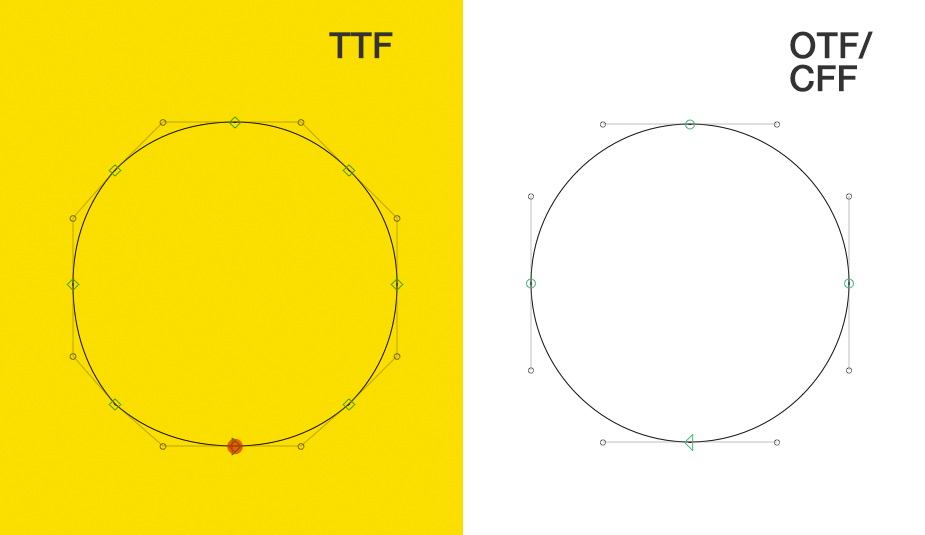
In a CFF file, curves are represented using two control points (these curves are called “cubic béziers”), as opposed to the TrueType outline format which represents curves using single control points (“quadratic béziers”). For many FontStructions this difference may not be noticeable, but in some cases you will find that CFF outlines are more accurate. For example, you can see the distinction clearly in the case of circular bricks, especially when you use a great number of small circles in your design:
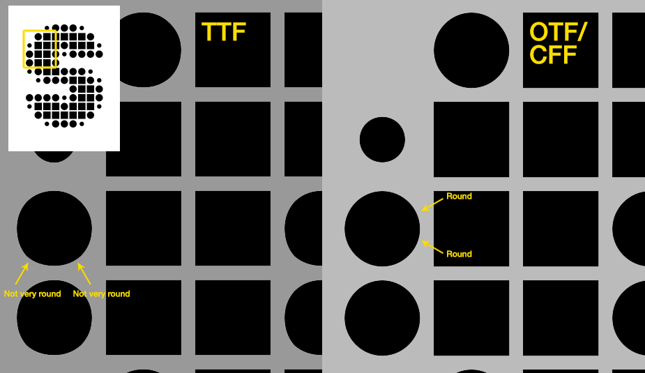
Some of you may have noticed the dough-like melting which afflicts FontStruct’s circle bricks in TrueType downloads. Many years ago, Luc Devroye shamed FontStruct on this point, and quite right too! Things have improved in the intervening time, but CFF outlines now give us our best, and most reliable circles ever!
Fixed Point Coordinates
We’ve also added an option to create CFF outlines with “fixed point” coordinates. I’d like to stress that this is quite an unusual format variant. As far I as I know, it’s seldom employed in professional type production.
In a standard OpenType font, all the contour points are placed on a grid of possible positions, the resolution of which is called the “em square”. Roughly speaking, if you have an em square of 1000, then all your contour points must sit on a 1000 x 1000 unit grid. “Design with Fontforge” has a good page explaining the em square format.
OpenType fonts with TrueType outlines traditionally use an em square of 2048 or 1024 (the former is the default for FontStruct) while OpenType with CFF outlines generally have an em square of 1000 (Although it can be more. We’re trying 2000 as FontStruct’s default for CFF.)
Crucially, all the points in your designs have to sit exactly on the intersections of this notional grid. So, in a standard OpenType font, despite it being an infinitely-scalable vector format, there are very clear and finite limits as to where your points can sit. You can position a point at exactly a grid coordinate of (100,100), but not at (100.5, 100.5). i.e. You can only have integer (whole number) coordinates.
From today, FontStruct also gives you access to an option, allowed by CFF, which overcomes this limitation. You can choose to define your coordinates as “fixed point” numbers. This will not affect your design work the FontStructor, but it will affect accuracy when it comes to converting your design to a font file. Using fixed point numbers, the font generator can position points more “freely”, at 100.5, 100.5 or even 100.3333, 100.3333 etc. if it needs to.
To be honest, I’m not sure how useful this fixed-point coordinate option will prove to be, but considering how complex and detailed some FontStructions are, it may help in exceptional cases. We will see!
It’s important to note, that if you do opt for fixed-point coordinates, this will make your download sizes significantly larger.
For background on this topic, I recommend the seminal article by Read Roberts at Typekit.
Download Configuration
To support our new download format, we’ve added some additional download configuration options to the FontStruction pages, and also one important option on your personal settings page.
On your personal settings page, you can opt to allow any of your shared designs to be downloaded by others as OpenType fonts. You can also override this setting on a FontStruction-by-FontStruction basis.
On the FontStruction page, you can access the new options by clicking on “Advanced Settings…”

– Here you will find a couple of familiar options along with some new ones.
You can now choose to:
- Share alternate formats (i.e. OpenType CFF) with other users (only if you are sharing the FontStruction for download of course). This setting overrides the global setting from your personal settings page.
- Choose an em Square for TrueType and CFF downloads from a list of sensible options.
- Use fixed point coordinates. (experimental)
Interested in using CFF downloads today? Not a patron yet? Learn more …
Happy FontStructing!