Vertical Metrics, Improved Touch Support and More
As promised, today we’re introducing a series of new features, enhancements and bug fixes to FontStruct.
Line Height Control (Vertical Metrics)
Until now, FontStruct has automatically calculated the overall line-height and line-spacing for each downloaded font. This is usually fine, but every now and again people request manual control over these values.
Today we’re giving FontStructors this option. To use it, first select “View” and then “Line Height” from the menu (You need to be in Expert Mode):
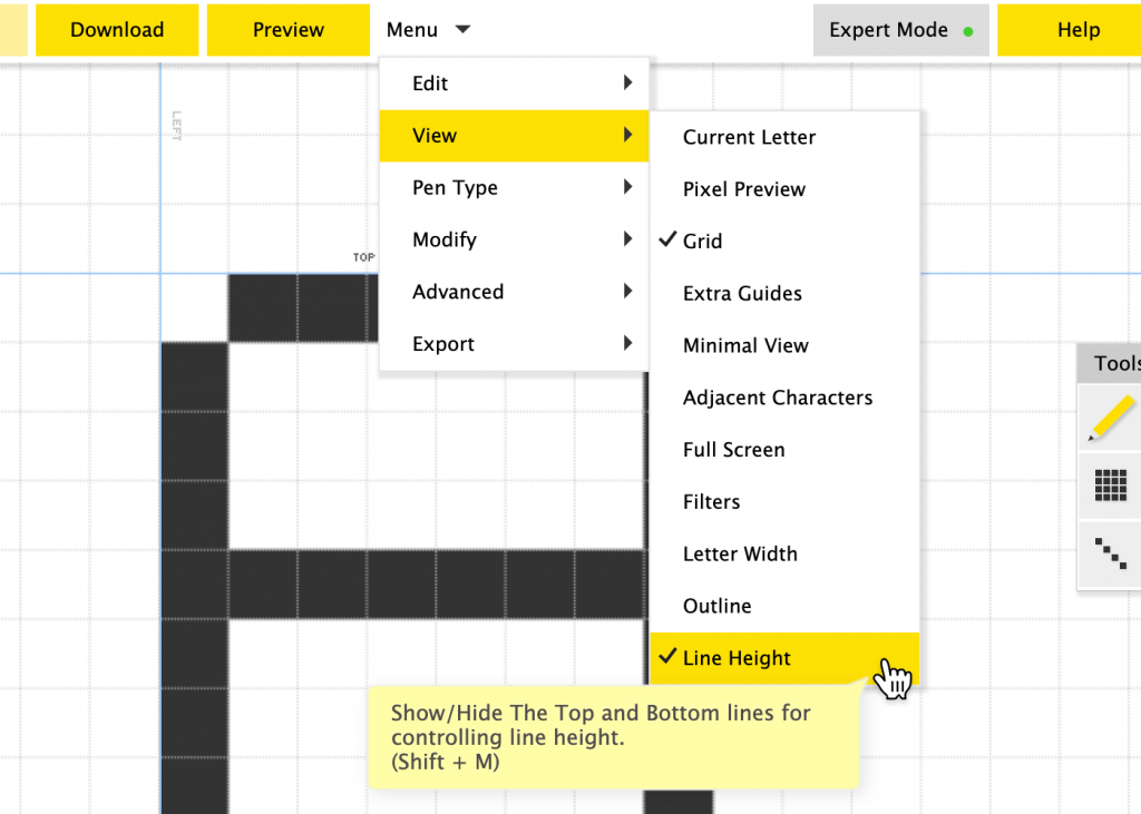
Two new lines labelled “top” and “bottom” appear on the canvas. You can simply drag these lines to specify a height for the font. The lines snap to 1/8 of a grid square when dragged and dropped and you can click on the little reset button to go back to the default, automatic calculation.

The values which you specify like this will be stored in your downloaded font file. In accordance with the first law of FontStruct – thou shalt not make things unnecessarily complicated – that’s all there is to it!
Please note that a lot of desktop software will still ignore or mangle whatever vertical metrics values are stored in a font file. So you may not always achieve the precise desired effect. For anyone interested, some souls braver than I have researched and documented the history of this mess elsewhere.
Anyway, I think FontStruct’s new feature will suffice to solve many line height problems, and you will find that some desktop software (Glyphs for example) will indeed respect your placement of the new lines.
Improved PhoneStructor (Touch Support in the Editor)
The FontStructor editor and the FontStruct website have been kind of usable on phones and tablets for quite a while now, but in reality, FontStructing on a touch devices has hitherto been cumbersome and impracticable.
With today’s update, we’re adding a series of interface optimisations to significantly improve FontStructing for users of touch devices and small displays, including …
1. Finally, a tap-friendly Menu!
The dropdown menu, which simply didn’t work on touch devices, now does. Note that the “Expert Mode” toggle now appears as part of this menu on small displays.
2. The Toolbar is docked and augmented
To keep it out of the way whilst drawing, the toolbar is now automatically docked to the top of the screen. Some commonly used actions (undo, redo and fullscreen) have also been added for ease of access. Note that the docked toolbar only appears on very small screens (phones in portrait mode), tablets are unaffected.
3. Improved Zoom
Pinch-to-zoom is now possible, making the zoom palette superfluous and so freeing up valuable screen space for drawing.
4. Brick Palette Toggle
The brick palette (My Bricks and All Bricks) can now be toggled with a single tap. This gives you swift access to your bricks while also freeing up more screen space for drawing.
5. Character Selector also works!
Something else which didn’t work properly on touch devices until now was the scroll functionality on the character selector. It does now. We’ve made the arrow buttons and the letter selectors themselves a bit bigger to suit your fingertips, and you can even swipe along the list of characters to scroll through them.
Miscellaneous Fixes and Improvements
In addition to Vertical Metrics controls and improved touch support we’ve also made a number of diverse tweaks to the site and the editor.
1. Spontaneous Brick Swap Fix
This will be familiar to some of you as the worst bug in FontStruct: You save your work, then after reloading it the following day, you find that “gremlins” have swapped out some of your bricks overnight and your design is corrupted.
– This has proved a very difficult bug to reproduce and fix, but we are introducing a change today which hopefully will improve matters. Fingers crossed!
If anyone does experience this problem again in the future, please let us know, especially if you can provide us with detailed steps to reproduce the problem.
2. Cyrillic in the Widget

Recently, more FontStructors have been adding Cyrillic letters to their fonts or making purely Cyrillic designs. We’ve added a Cyrillic preview option to the widget to support this trend. Suggestions for a better Cyrillic sample text are welcome.
3. Links in descriptions
The editor for writing FontStruction descriptions was broken, making it impossible to add proper links in descriptions. That should be fixed now.
4. Comment Removal
You can now remove your own comments for up to one hour after you have made them.
5. Improvements to Glyphs Export
We’ve made a few improvements to the Glyphs Export functionality.
Firstly, we updated the export to work with the latest version of Glyphs.
Secondly we added the FontStruct grid in every export, so you can now continue to reference the same grid in Glyphs.
Thirdly we have made the export behave differently when you are exporting a “pure” pixel font (i.e. one consisting only of pixel bricks and without any filters). When you export a pixel font like this, the exported file will be compatible with the official Glyphs Pixel font plugin, which is actually pretty cool. Now you can move seamlessly from working in FontStruct to working in Glyphs. Thanks to @gingerbreadman and @glyphsapp for encouraging and helping us get this one done.
6. Removal of the “Contribute to Google Fonts” Button.
We love Google Fonts and have benefited greatly from their support in recent years, but we’ve decided to remove this button from the site.
Unfortunately there were technical issues with keeping the functionality working consistently at our end, and overall it did not seem that this form of submission was working very well.
We continue to encourage designers whose work fulfils the Google Font criteria to submit their work for consideration to them, and we will keep the OFL license option (this is the principal requisite license for Google Fonts) as a permanent part of FontStruct.
Future submissions of FontStructions to Google Fonts will have to be made manually and independently of FontStruct.
7. Grid-coordinate Display
This is an experimental one. If you are in “Expert Mode” you will now see the current grid coordinates in the bottom right hand corner of the screen.
8. “Desert rescue” feature
Every now and again someone gets in touch having somehow panned off into the unmapped farther reaches of the grid. They’ve lost all orientation and have no idea where the baseline or origin is.
Clearing the browser cache was the old advice here, but now much more conveniently, you can simply double click or double tap on the “hand” panning tool to return the grid to its default position and find your way home.
That’s It!
Happy FontStructing!
News | Rob Meek (meek) | May 23rd, 2020 | 11 Comments