


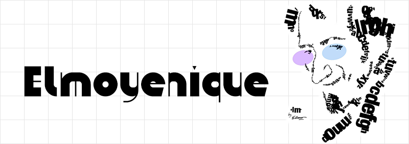
Gridfolk: Interview with Elmoyenique
Focus on FontStructors | Ata Syed | July 14th, 2021
This is a guest post from Ata Syed AKA thalamic and minimum, the first of a summer series continuing the “Focus on Fontstructors” tradition of interviews with members of FontStruct’s designer community. Ata has been FontStructing since 2008.
We kick off this series with a highly prolific, eminently humble, consistently creative, and all-around nice guy: Antonio J. Morata, better known to all of us as elmoyenique.
ztefan eYe/FS by Elmoyenique
Elmoyenique has been with FontStruct since September 2009. Time has done what it does best, which is to say it has passed in a twinkling when you reflect upon its passage, yet it has been 12 years that elmoyenique has been making FontStructions. In those intervening 141 months, Elmo has published THREE HUNDRED AND TWENTY-NINE FontStructions which is an incredible achievement by any standard. It would still be impressive if that were all. Of those 329 FontStructions, 196 are “staff picks”, which is to say they are “worthy of special mention” for either excelling in typeface design or using the FontStructor to do some brick magic not commonly seen. Yet, Elmoyenique has remained as humble as he has always been. “I still consider myself a simple learner” he writes, attributing his success to “perseverance rather than skill”. If only perseverance was all that it took. If you made a Venn diagram, the center-intersection of which says ‘Done’, there would be at least three circles involved: Resources, Effort, and Skills. To get anything done requires all three. To do something artistic such as creating typefaces, on a platform such as FontStruct, you need a ton of skills. What Elmo has done is an unparalleled achievement, surpassed by none other. We admire his great work at FontStruct but respect his humble nature even more.

züricher eYe/FS by Elmoyenique
12 years, 300+ fonts, 40,000+ glyphs must have taken him a long time, so it is natural to wonder: Why put in so much effort? The answer is to be found on his own profile page. He says that he has held a variety of professional positions, most of them creative in nature, yet “I always come back to draw letters”. His first steps towords becoming a typeface designer were with “calligraphy with ink and pen; then journal headers and lettering for posters made with a ruler” and “Rotring” pens. His subsequent foray into digital font design began with Aldus FreeHand. Elmo describes his discovery of FontStruct as “like Charlie holding the Golden Ticket in his hands.”
zong4U eYe/FS by Elmoyenique
Elmoyenique was born in 1968 “in wonderful Almería, in the southeast of surprising Spain, southern Europe. Interestingly, I [still] live close to where I was born.” He has “a college degree in teaching (major in mathematics), a bachelor’s in psychology, and a handful of other lower-ranking studies.” Impressive, yet again.
As if that was not enough, relating to work, Elmo says, “I am a teacher and freelance illustrator and graphic designer. At one stage in my life, I tried to orient my future exclusively within the field of graphic design. I’ve been working hard on it for more than nine years, but finally I didn’t get to live exclusively on it. I returned to teaching, and I am still here, mixing it with graphic works that bring me a different kind of joy.” When asked what his daily life is like, he said it’s “fascinating!” :-) “Teaching is living on a carousel (tiring yes, but never boring).” Furthermore, “I draw comics, I do illustrations for children’s books, I design posters, books and brochures, I write for the press about comics, I also write some science fiction and fantasy….Oh, and a few years ago I still I had time to play the saxophone in a group.” Whew!
Which brings us to the reason everyone is reading this.
Why do you create fonts?
“I started drawing letters a long time ago, during the 80’s (literally, I was a teenager). So, I began making the posters for the projections of the cinema-club of my high school, which I later continued when I entered the college [university, in US parlance]. I also started publishing other cultural posters and comics. In those years, personal computers were not as common as today and all kinds of stratagems had to be invented to obtain a good result: cut out previous texts, create them using self-adhesive letters—or in a private printing company, which was much more expensive—or basically draw all the letters by hand, with the help of some rules, a compass and little else and copying from the wonderful Letraset or Mecanorma catalogs. Now anyone can download a cool font and use it for a title or to fill in some texts on his poster or his comic, but in those years, you had to do all of that by hand, drawing letter by letter.”

zykowarfare eYe/FS by Elmoyenique
“The design has changed a lot since then, so much that those years now seem like the stone age to me. Even then, I solved many design problems for those posters by adapting the letters to the required space (it was very easy if you drew them by hand), and from there to the timid design of personal fonts there was only one step. Then I spent several years working as an art director in a famous advertising company in Madrid, and there I learned to use the first Macintosh computers that arrived in Spain (I’m talking about the early 90s). Later, my work was oriented more to posters and illustration, where I took the opportunity to frequently use the skills of creation and modification of letters that those new (at that time) computer technologies offered us.”
What is your font making process? What causes you to deviate from this process?
“My creative process is simple. I always carry a squared notebook [grid pad] with me, where I draw my ideas and things that catch my attention (in FontStruct I have eventually shown some of its pages). Many of those ideas never go beyond being simple sketches, but a large part of my typefaces emerges there. The Internet is also a great field for browsing and inspiration (but never copying).”
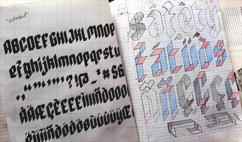
A sample page from Elmoyenique’s ubiquitous notebooks
“After choosing a letter design from my notebook (one I liked it because of something that I see as special), the real work begins. I usually use the FontStruct website to do it because it allows me to complete a font, display it, prepare it properly to show it to the world and download it. And it is also free (for now). Honey on flakes.
Designing a font is like entering a maze…. There are multiple tasks to do: create the glyphs for each of the uppercase and lowercase characters, create the numbers, expression signs and diacritics, special glyphs for languages other than English (Ñ, Ç, ß, etc.) and all those with accentuation. We must also take care of the separation between words and the slow and careful process of kerning (separation between pairs of letters).
But it is a neat maze. Just like when you want to get out of a real maze (you shouldn’t separate a hand from the wall, always the same wall), here some tricks allow you to get out. The one I usually choose is to start with capital letters. I always think of three basic shapes for letters that help me draw them: rectangle, circle, and triangle. The rectangle usually works for me for H, I, E, F, L, T, N and M; the circle for O, Q, C and G; the triangle helps with V, A, W, X, K, and Z; if you join rectangle and circle, you get the basis for B, D, P, U, J and S; and if you put all three together you get R. The above also applies to numbers.”

zoundbro eYe/FS by Elmoyenique
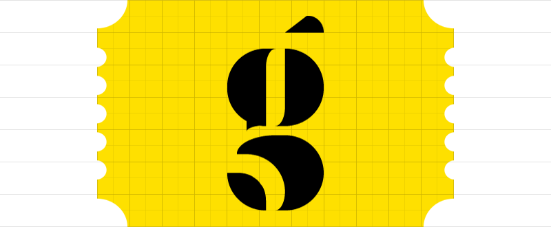
“Then, for the design of the lowercase letters I follow similar steps: rectangle, circle, and triangle. Combining these letters, we get others (j, h, b, d, p, q, k, y, f). For the end, the best are left: a, g and s; these are so special that many times they are the ones that give the typography the authentic personality. When I get to this point, I can usually already see the light at the end of the tunnel.
Despite everything said above, there are also times when a single letter is the one that gives me the idea for a whole typeface and developing it completely from there becomes a fascinating and very creative process.
The choice of name is usually left for last. All my fonts start with z, the simple reason is that my first fonts started like this, and I also like how that letter sounds. I always make sure that none of my fonts has a name similar to another that already exists, to avoid confusion with copyright and in search engines. Oh, and to top it off, the font is rounded off by making an image that is cool and striking— yes, I have used the most diverse methods for this: from photographing handmade designs to image editing and design programs, through screenshots and manual coloring—which reveals the best of the font, and publishing it to be enjoyed by friends who see it in FontStruct and the rest of the world. Et voilá!”
What keeps you going in making a font?
“I have created some of my fonts out of simple necessity, to be used immediately in a certain graphic work, but they have been only a small part of the total. What really drives me to build a typeface is the ability to shape something new and beautiful, something that didn’t exist before I started making it. It’s a fantastic thing.”

zpains eYe/FS by Elmoyenique
“How do these ideas come to mind? Well, they say that love is in the air…and inspiration too, I assure you. ‘May inspiration find you working,’ said the great Pablo Picasso. Everyday objects, store signs, magazines, shadows on the ground, the internet, the range of possibilities is almost infinite. The suggestions are there, you just have to go out and find them. Then comes the screening process. I discard 80% of the ideas that I draw in my notebooks, and of that remaining 20% only a third or fourth part will end up being a fairly viable font. I have dozens of notebooks to corroborate it. [Wouldn’t we love to see those!] The reasons for these discards are very varied (for example, there may be glyphs that resist entering within the general style of the font, or other times that cannot be done in FontStruct as I had drawn them, or they may also be too similar to an existing font, which I usually dislike if it is not searched on purpose…). But I do not want to stop pointing out here the curious feeling that sometimes occurs within me and that I find very striking and fascinating—and this has happened on a good handful of occasions—when I have returned to work years later old ideas because FontStruct has just implemented tools that were not available when I created the font in question. Those continuous advances on the website never fail to impress me.”
While making a font, what frustrations do you face and how do you overcome them?
“Legibility should be the most important thing when you doubt between unity and variety. If one letter is confused with another, it does not do its job. Pay particular attention to similarities between similar glyphs, such as I/l/1, y/g/q, S/8/5, U/V, and many other groups. When you see your font creating words you can observe (and correct) these possible dysfunctions. There are always (or at least in a very high percentage of cases) solutions to these problems, you just have to spend more time searching and finding them. Sometimes it is very frustrating, but it is the only way I trust to solve it.
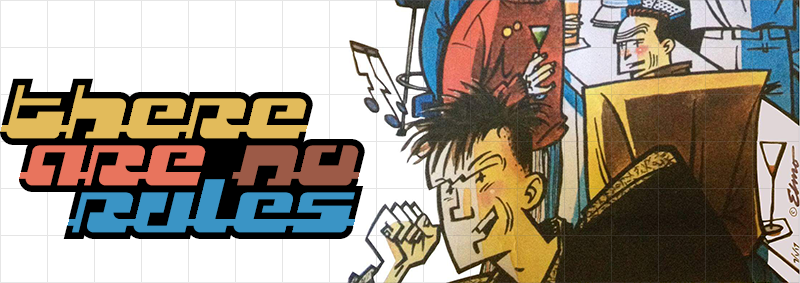
On the other hand, if there are rules, they can also be broken. What will you use typography for? If it will be a display for headers or posters, you will have more freedom with those broken rules. If it is for writing text, you will need to specify the readability. And if it’s for pleasure, THERE ARE NO RULES. Despite everything, from time to time some fonts, once finished, simply do not work, and that, although it hurts our creative ego, there is no choice but to admit it.
zelemin eYe/FS by Elmoyenique
I would also like to state here that building a font like the ones I usually do, as original and complete as I can, takes a lot of time. You need 36-hour days and, since you don’t have them, you have to steal them from sleep, family or even breaks at work. Sometimes it is really complicated, but you have to try to make everything crimp and roll as smoothly as possible, without making anything squeak too much. And for this the support and understanding of the family is essential. It is not always easy, I assure you. There have been whole years in which I have barely been able to dedicate a few weeks to making letters due to unforeseen and continuous situations beyond my reach.”
Why do continue to make fonts?
“I keep creating fonts because I have so much fun and I have a great time doing it. Since I was young I have been passionate about graphic design, but that has not always given me enough money to make a living from it. And on many occasions, I have found myself drawing letters, in one way or another. It’s only been a few years since I’ve been able to take designing alphabets more seriously and I’ve been combining it with teaching and graphics in general. From all my various jobs I have learned good lessons and I think that an expert eye will be able to distinguish these features with ease when they are reflected in my fonts.”

zpells eYe/FS by Elmoyenique
“Designing a font that has not yet been created is still my next challenge. Before it was easier, but now it is increasingly difficult to find the originality and freshness that I look for in a source since there is more and more competition (well, that is also an incentive most of the time, hehehe).
I would not like to end without pointing out the great importance of the comments that I receive from colleagues through the FontStruct LiveFeed in my typographic creation process. That makes me see mistakes and appreciate successes, it brings me other points of view and solutions, it opens up paths for me. There I receive opinions from people of all ages who come from all over the world, with their different appreciations and points of view. That is usually very enriching for me. My fonts would never have been (and never will be) the same without you all. My heartfelt thanks to everyone who helps me this way. And a billion thanks to Rob Meek for the wonderful FontStruct he’s building.”
How did you discover FontStruct.com? How often do you visit FontStruct.com? What keeps you coming back to fontstruct?
“I discovered FontStruct by accident, searching the net for programs to build fonts, and I fell in love with it from the start. It was a love at first sight, which lasts until today and which I hope to keep as alive as it is now. [How often I visit fontstruct.com] depends on many variables, such as the free time available, the complexity of the font, the mood…. Obviously, I usually dedicate more time to it during weekends and holidays. [What keeps me coming back is that] FontStruct is very intuitive and easy to use, although it can be devilish when you mess with composite bricks and nudging (thanks for that, Rob, I love fighting at short distances). You can build a font in a relatively short time—always depending on the complexity of the font to be made—and then you can download, install and use it immediately. It’s fantastic!”
Do you admire any other FontStructors? Who and why?
“A lot of them. I quote the closest ones, they have all helped me a lot (also on a personal level) and I am very grateful to them for their friendship and kindness with my mistakes. The first is Frodo7 for his balance and knowledge of typography; beate is the second, for her freshness and elegance; my compañero four the third, for his creativity and styling; also the fantastic geneus1 for being artistic and novel; the enormous thalamic/minimum for his continuous originality, insight and innovation; will.i.ૐ for the unexpectedness and complexity of his fonts; architaraz for his freshness, order and cleanliness; Yautja for his simplicity and dedication; laynecom for his careful elegance and typographic knowledge…and anyone else who can teach me something, which are a lot, because I still consider myself a FontStruct apprentice.”
How does the current technology affect your creative output?
“All technological advances help a lot. The production and marketing tools we work with now have nothing to do with those used 20 years ago, they are vastly better. This on the one hand is heaven…but on the other it is hell. I’ve already lost two hard drives from my whole life jobs and one from backups. Unrecoverable. As of today, I have only 20% of the digital work I have done. Well, that could happen with paper jobs as well (a flood could ruin them), but it is much more difficult. Now I worry a lot about keeping copies of everything important, and printing and saving what I can.”
Which of your own fonts are you most proud of? Are there any interesting stories behind them?
“Which of my fonts am I most proud? It’s like asking a father which of his own children loves more. But I tend to remember first those who have been more laborious or difficult to face in their construction. Some have been especially complicated (e.g.: zigourny, zophyka, zapezipi, zugaroo, zizakurraf, zong4U, zergioleone, zharply, zykowarfare, zeamróg…), and finishing their design was a relief for me.”

zigourny eYe/FS by Elmoyenique
“Others, on the other hand, have only given me joy, such as the very used zilverstone and those chosen to appear published in the fantastic collective almanac Typodarium 2015 (there were viewed zlabyrinths, zyrens, zykedelic, zychotropic and zylone). But sometimes you look back and see those little jewels silent with bright eyes (zelemin, zoulskin, zygno, zinequal, zpheres, zilverbullet…). I really love all them.”
zilverstone eYe/FS by Elmoyenique
“Zilverstone also appeared on a double page in a fashionable Canadian magazine and was one of those chosen for the iPad application ‘Pattern Artist’, along with zapristi; zcloudy has appeared on several YouTube gaming pages; zcrapedium, zhadowlite and zfraktur have been used in posters; zendera has been the protagonist of the cover and interior texts of a book… I cannot complain of them.”
You have produced quite a few fonts that have the cowboy theme to it. What attracts you to that style?
“Actually, I don’t think I have built so many western (or Tuscan) style fonts, only 5% of the fonts that I have published in FontStruct carry that tag. The truth is that in my land we have a long relationship with the western film style. We have the only desert in Europe and hundreds of films on this subject have been filmed here (Almería appears as the 5th most filmed place in the world, according to IMDB appearances). Also, I especially like the letters with serifs.”
What inspires you? Is inspiration for creative work different than inspiration for other things in life?
“Life is the Big Idea! La joie de vivre, La Alegría de Vivir. The sun at dawn, the green of the grass (it’s not easy bein’ green! ;) ), the smile that looks at you from some eyes…. That always makes the heart move. The bad moments do not have to be looked for, they come by themselves, when they are least expected and without anyone calling them.” As Madonna said, “beauty’s where you find it.”

zpacekowboy eYe/FS by Elmoyenique
At some distant future, what would you like to be remembered for?
“Now I get quite sentimental. I would like to be remembered as a good grandson, a good son, a good brother, a good friend, a good husband, a good father, a good grandfather…. I know it is asking a lot, but I am doing everything I can. Well, if someone also remembered me for some of my graphic work, that would definitely be amazing. Better than better.”
What a beautiful sentiment. Nothing more need be said beyond this. Thank you for the insightful answers, Elmoyenique. It is a genuine pleasure to know you.
Thank you Ata!
I really like his works, especially his recent font “zavantia eYe/FS”…
– BWM — July 23, 2021 #
It’s nice to see the FontStructor interviews return, and what a great (re-)start to the series! Congratulations to both Antonio (Elmoyenique) and Ata (Thalamic & Minimum). Looking forward to more in the near future. :^)
– Goatmeal — July 23, 2021 #
its very cool how he makes fonts it amazes me!
– Better Handwriting — July 23, 2021 #
Quite a lovely read on a fantastic fontstructor~
Congratulations on the summer series kick-off
– time.peace — July 23, 2021 #
Thank you Ata, for rekindling the Focus on FontStructors interview series in an excellent way. I really enjoyed reading this and the illustrations are wonderful too! Thank you Antonio, for giving us a sneak peek into your life, your making process and what inspires you.
– four — July 24, 2021 #
Wonderful interview, love to get to know you guys better!
– Yautja — July 24, 2021 #
Excellent interview! What a life full of experiences!
Thank you for the mention, makes me feel a little proud ;)
– architaraz — July 26, 2021 #