i mean you can use it for animating typing.
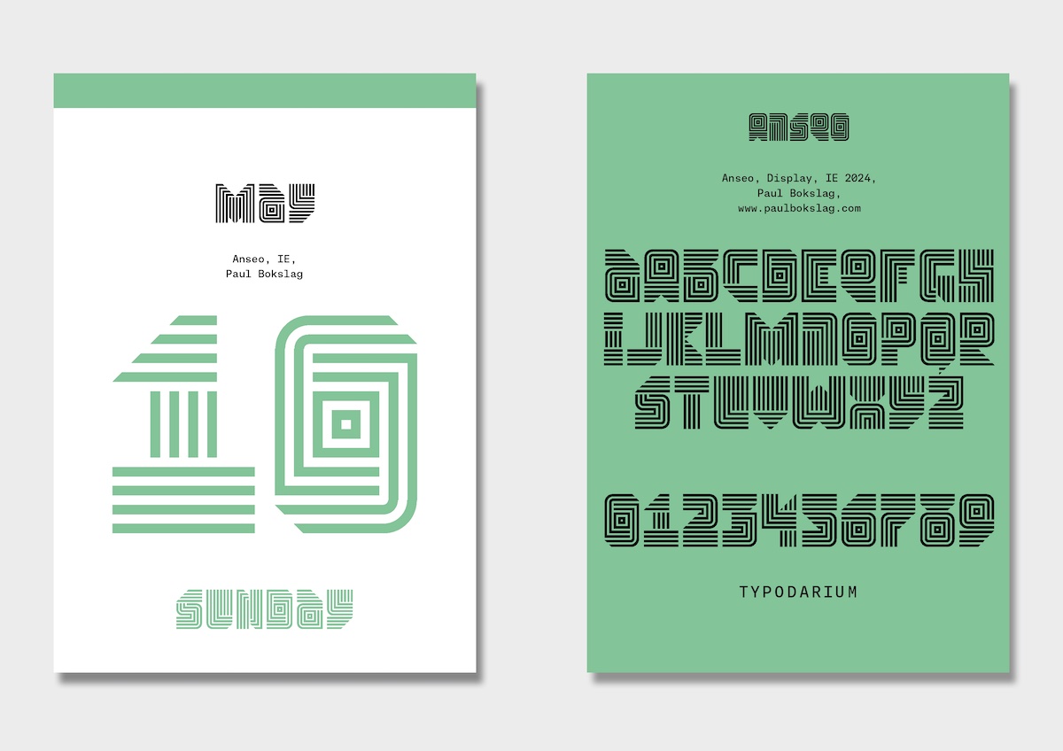
where are the digits?
this is for my conlang!
kubs*
@kusfonts maybe because missing glyphs
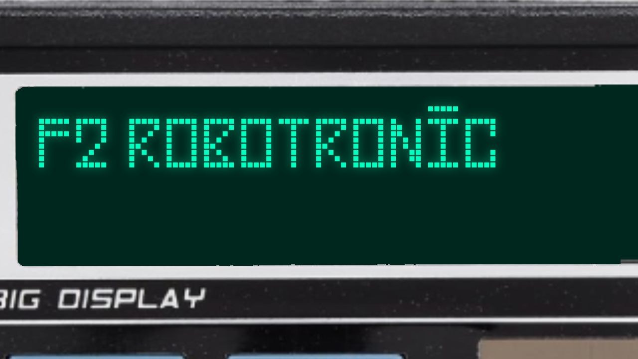
@azertyuiopqsdfgh can you remove the bar from uppercase annd lowercase I so that it doesn't look like Ī (macron (elongate vowel) + I)
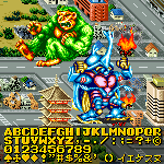
Good, but add more glyphs.
Yo, how do you add custom font previews instead of "AaBbCc Hamburgefonstiv 1234567890"?
vro ts aint lookin like Luckiest Guy 🥀
u Looks like ü
@Frodo7 what?
i'm so dumb bruh...
serbian letters talled up
Your portfolio is very impressive. The modular fonts, papercuts, and other visual artworks are silent testaments of a happy man. I wish you the best.
i had a road map that went:
quartile slab -> imisislab -> triplequartile slab -> slab
i made the first two, but realised that imisislab
i made the first two, but realised that imisislab was already
between versions 42 glyphs were added
version 2: 26X25, addition of lowercase letters, all remaining basic symbols and the creation of slab
@Can'tfind1usernamecanI? the font used changes width, probably to adapt to different screen ratios (such as 16:9 to 3:4 to 5:4 etc) i guess
How about this
This is what the font would look like on an actual EAS screen.
In Schools, Teachers Know What is the 1st grade
DiH🥀
Can you fix your font
Digits 0-9 are o
Strong and consistent. The serifs in the top left corner are a nice touch.
Powerful contrast between heavy strokes and small counters. The kerning lifts it to the next level.
Beautiful curves, a wonderful piece of work!
yay new update









i mean you can use it for animating typing.
»