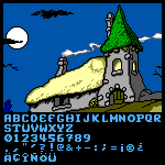
My suggestion would be to keep the height of the uppercase
letters as is. If you make them smaller to incorporate the accents
into the uppercase letters,
Nice bamboo font. I would increase the SPACE (between words) and swap the double-storey g for a single-storey one. The other letters and the numbers look great. 10/10
@faux_icing: Thank you for your kind words. You are right: I
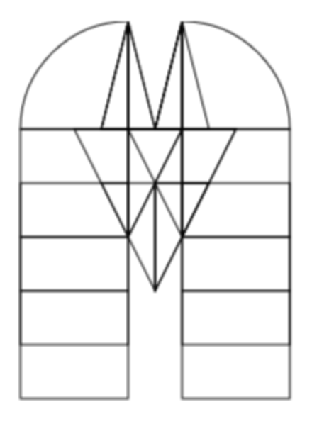
plan to build a font using one of these patterns. It won't be the
very first Truchet-tiles
The name db Como Mono would be just fine. It rhymes. The lack of optical correction (a little overshoot) of rounded letters is noticeable. Still a great work with numerous creative solutions. 10/10
@NZWStudios2024: I think the spacing is too tight. The leading is disproportional; it looks like double-spaced text on steroids. Why do you need so much empty space between lines?
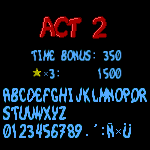
@beate: Thanks! I'm also interested in your opinion on the diacritic. I want to make it massive, but I'm not sure if it's better to make it separate (like with the letters E Ñ) or combined with the letter, like with the letter A.
So nice, Very constructivist. I would place the dot a little higher and the comma a little lower so that the effect of the slender white line comes through there as well.
Cool font, but it'll also be nice to add arrows into the font like you did with the samples. (I don't think it'll be too hard anyway with the current fontstruct features)
i found a stray brick on ꙰, Ꝁ and Ꝃ.
»