


Future Competition Results
Competition Results, Competitions, News | Rob Meek (meek) | May 12th, 2020
Many thanks to all participants for another tremendous Structathon.
I hope everyone had as much enjoyment building their FontStructions as I did in seeing all your diverse and wonderful ideas land in the Gallery over the past few weeks.
There’s one thing I haven’t enjoyed so much: The judging. To those of you whose work is not mentioned in this post: I’m genuinely sorry! The selection included below is just a subjective sampling.
There were many, many other entries which could easily have won had the wind at FontStruct Towers swirled in a different direction on the day.
Anyway, let’s start with a review of some of the standout entries.
Alien Folk
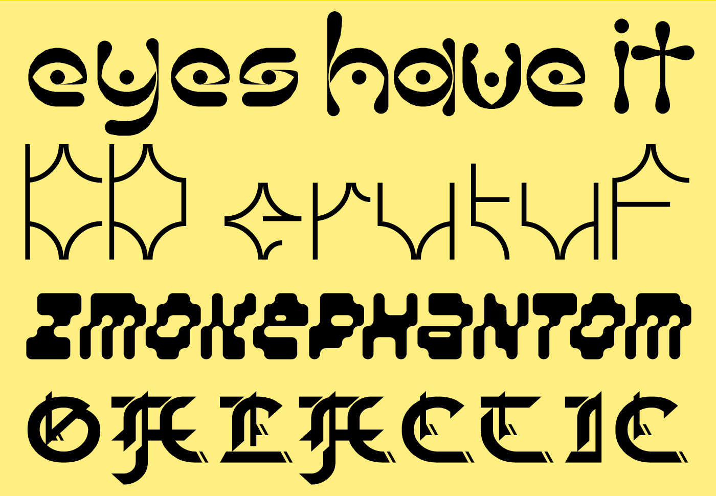
I love the psychedelic, folk-horror connotations of “The Eyes Have It” from jonrgrover. When I retire to roam the hollow ways in my spooky carnival wagon, I’ll be daubing these glyphs on the side.
KD erutuF from architaraz also teasingly marries the primitive and the futuristic. If that black obelisk from “2001: A Space Odyssey” had some runes carved into its base, I believe they would look exactly like this.
zmokephantom eYe/FS from elmoyenique is an oddball amongst oddballs, a bizarre rippling italic, perhaps the first FontStruction to actually melt the bricks, while Galactic Gothic from bluemon is an ingenious attempt to hack blackletter and technoid features into a single font.
Techno Stencil
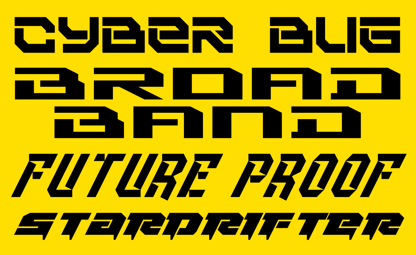
Quite a number of entries explored a classically technoid, futuristic trope with heavy, slabby designs – fonts all ready to be stencilled on the hull of a rusting, refurbished star-cruiser. Cyberbug from elzero, Broad Band Ultrawide from japanyoshi, Future Proof from four, Stardrifter, also from elzero and Rollerball_1 from JingYo are all examples for this genre and demonstrate the excitingly diverse possibilities within it.
Future Restraint
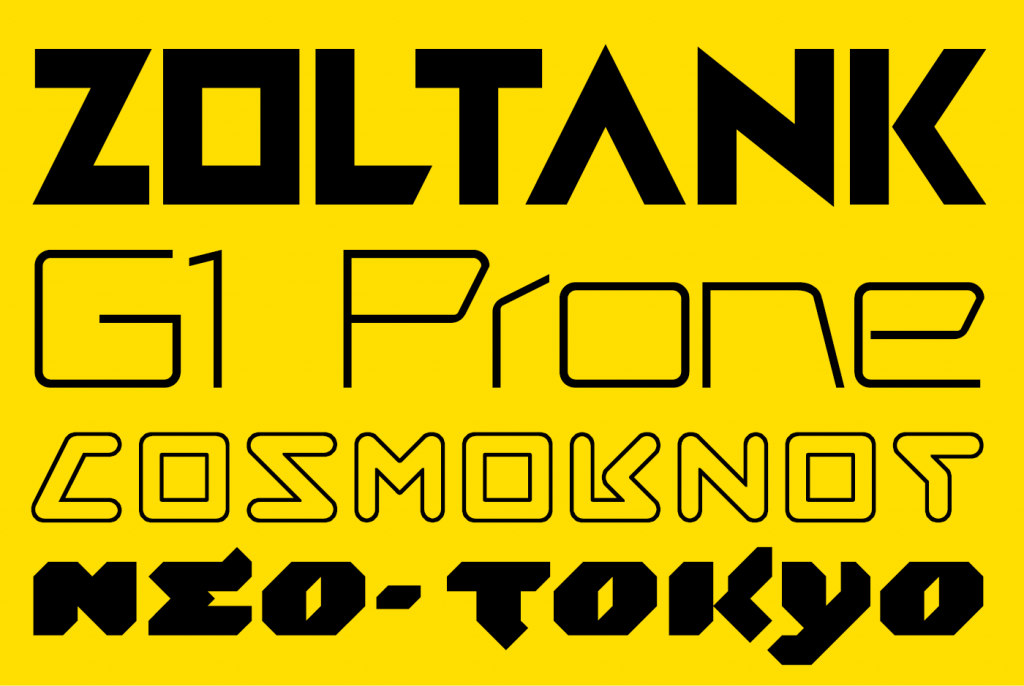
Some visions of the future were cleaner and more restrained.
Zoltank is a constructivist-flavoured, geometric display face from FontStruct’s long-time master of retro-futuristic typography, our very own Stanisław Lem, V.Sarela (I hope that’s a compliment. It’s intended as one).
Designed for “the future of Telerobotic medicine.” I recommend reading geneus1’s full explanation for the cool and elegant G1 Prone.
Like Zoltank, Cosmoknot by time.peace is expertly FontStructed and subtly complex. I believe it to be the only outline font among the entries. It’s full of fun glyph shapes, and makes a neat, oblique reference to the NASA worm.
I also really enjoyed Neo-Tokyo from Frodo7. Hints of flicking brushwork bring life to the otherwise technoid forms.
Catch and Patch
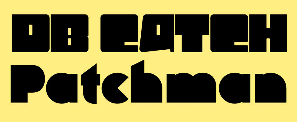
– Two leet entries from FontStructing legends. db Catch by beate has no obvious futuristic reference or connotation that I can see but it’s a fascinating and highly original entry. I love the internal dots on the i and j, and the umläute. Are they the “catch”?
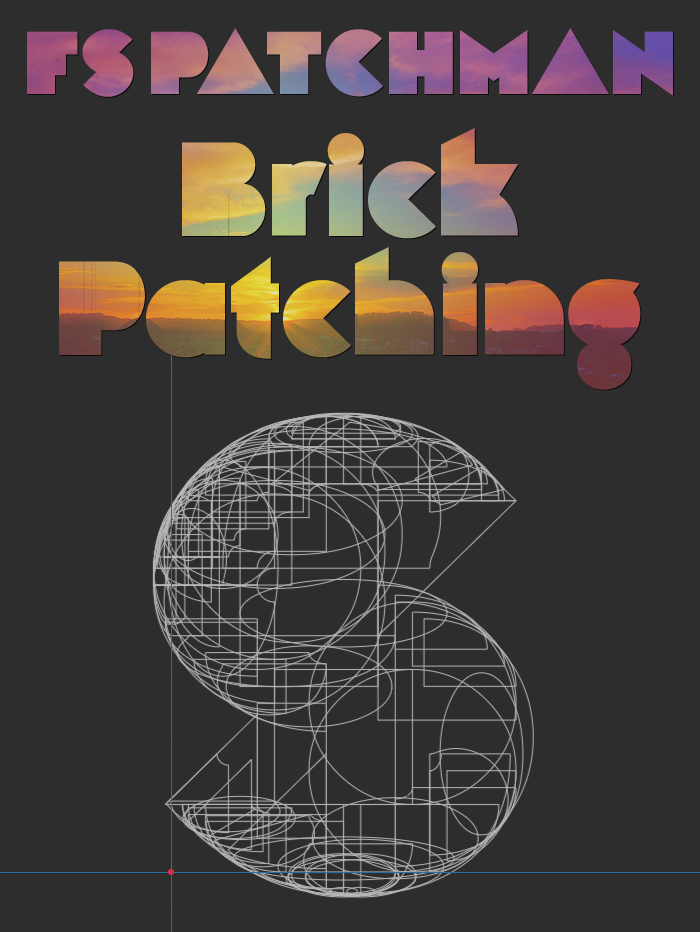
And then we come to the mysterious, the ominous FS Patchman.
From William Leverette, the designer who discovered and shared the original brick stack hack, we have the promise of a new technique called “brick patching”. This may not be the FontStruction of the future, but could it be the future of FontStructing? I’m mesmerised by the x-rayed ‘S’ in William’s sample:
The Prizewinners
– In no particular order, as chosen by you and by our guest judge Ivo Gabrowitsch. There are actually four rather than three prizewinners since I asked Ivo for one winner too many.
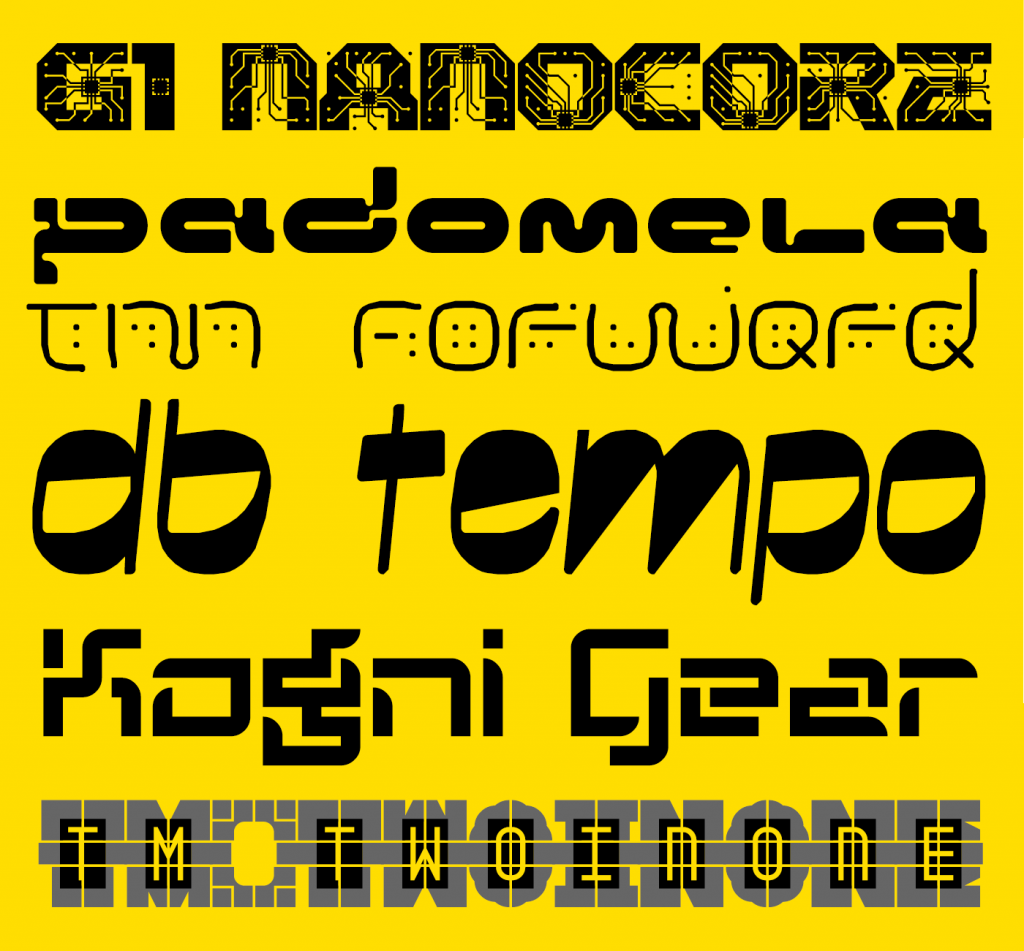
First up, “G1 Nanocore” by geneus1. Apparently inspired by certain whacky contemporary ideas, this is a really fun font and sensitive microscopes may reveal it to be in your bloodstream already. I recommend reading geneus1’s own description of his design.
Next, Padomela LDR from Neoqueto. This was actually Ivo’s number one choice – “the closest to my projection of the future.”
Thalamic wins twice over (only one prize though sorry!). Ivo chose tm Forward as a favourite (“I like the more organic projection of the future”) while the “people’s favourite” was the ingenious font-within-a-font “tm two in one”.
As with beate’s other entry, the relationship to the future is unclear, but Ivo could not resist the impressive qualities of db tempo.
Finally (number two on Ivo’s list) I’m really delighted that someone new has made it onto the podium for this competition. Congratulations to japanyoshi for kognigear – a simple but usable design, clearly addressing the theme with a well developed character set.
Prizewinners will be contacted by email over the next few days.
Watch this space!
We’ll be adding a few new features to FontStruct over the next couple of weeks, so please stay tuned for an announcement on that – or follow FontStruct on Twitter if that’s your kind of thing.
Thanks!
To Ivo Gabrowitsch for helping us out again with judging. Having worked for brands like FontShop, FontFont, MyFonts, Linotype, and Monotype, Ivo understands the type business like no other. His company Fontwerk is dedicated to help type designers and foundries making a living with their passion.
And, as always, thanks to our principal sponsor Glyphs.
Please remember that you can get 10% off the Glyphs desktop font editing software (OSX only) if you buy it from the FontStruct website. This is an exclusive offer and by taking it up, you will also help support the free FontStruct service.
Congratulations to the victors and all the competitors! Some truly grand fonts were created. Looking forward to the next “structathon”
– time.peace — May 12, 2020 #
Congrats to the winners, and thank you for the mention (and compliment!), and for another fun competition. Excited to see new features!
– Yautja — May 12, 2020 #
Congratulations to the winners: Geneus1, Neoqueto, Thalamic, Beate, and Japanyoshi (in no particular order). Well done. I wish to express my gratitude to the organizers and the jury for their important work. Thank you!
– Frodo7 — May 12, 2020 #
Congrats to the great 5 winners and all the incredibly creative nominees, from the hart. This was a very sparkling challenge for me, especially in these dark days. Thanks Rob Meek!
– elmoyenique — May 12, 2020 #
Very cool presentation of fonts, gestalt for futuristic fonts is closed (or not). I hope this is not the last competition (haha, it’s very impudent to ask for another competition when this one just ended).
It’s a little disappointing that not one of my fonts fell into the selection, but maybe that’s why I just stand out from the crowd, and in design it is very cool.
And thanks to everyone who voted stars for my fonts, this is very nice. In fact, this competition gave me new fonts and new thoughts, and this is more important than victory.
Congratulations to all the winners, these are really deserved victories. It’s a lot of work and cool, very complex font engineering in FS and cool ideas.
– Sychoff — May 12, 2020 #
@Sychoff Well said. You’re not the only talented and valued FontStructor to miss out. I also hope that there will be more competitions, or perhaps “Structathons”, in the future.
– Rob Meek (meek) — May 12, 2020 #
Extra congratulation to all winners and a big, big thank you to Rob and Ivo. It was once again fascinating to see the many ideas, the spontaneity and the potential that shows up in all the contributions. Brilliant!
– beate — May 12, 2020 #
Congrats to those not recognized above!
– TylerLongo — May 12, 2020 #
Well now that it’s over, I’d like to say that my personal favourite was: Synchronix.
– TH3_C0N-MAN — May 12, 2020 #
Congratulations to the futurecomp winners and to all who submitted their fabulous fonts! Thanks Rob and Ivo for organising and judging!
– four — May 12, 2020 #
It was a good competition… I had fun designing my entries…
– BWM — May 13, 2020 #
Thank you for such a cool topic and organization, Rob! Thank you Ivo as well, I feel honored. Everyone did such an amazing job. Futuristic typography is my jam, and this entire process was exactly what my soul longed for; from initial sketches on paper, to flexing the brain muscles over the oddities of brick stacking, and working on the sample image, but most importantly seeing all the cool creative works published by you lot. I hope everyone feels the same. Can’t wait for the upcoming features! There’s more coming from me really soon as well, lots of typefaces I’ve been working on for years now, some even way past the 1000 characters mark.
– Neoqueto — May 13, 2020 #
Beautiful entries by everybody! Congrats winners! Excited about the new features ;)
– architaraz — May 13, 2020 #
Thank you meek and Ivo for work put in for this successful competition. I think we’ve seen the highest number of entries there ever were for the competitions. Great theme! I’m in full alignment with Neoqueto. I revel in the opportunity to stretch creative muscles with each structathon. Congratulations to all of the talented entrants, and especially the winners.
– geneus1 — May 13, 2020 #
what competition next ?? meek
– alekoymostro — May 13, 2020 #
Thank you for this honor. As far as I am concerned, everyone is a winner who put in the effort and attained font designing growth.
My personal favorite entry was Padomela LDR by Neoqueto. Designisticly consistent and effortlessly futuristic.
– thalamic — May 13, 2020 #