


Counter Competition Results
Competition Results, Competitions, News | Rob Meek (meek) | June 12th, 2018
![]()
Dear FontStructors,
Another fun-packed competition is complete, leaving us to celebrate a wonderful assembly of diversely-inspired and inspiring entries.
As so often in previous competitions, there are simply too many high-quality entries to give each and every one the attention which they merit, so I’d like to congratulate all participants on their creativity and skill, and encourage everyone to have a long look at all the entries to discover those many gems which are not featured in this post.
Some Honorable Mentions:
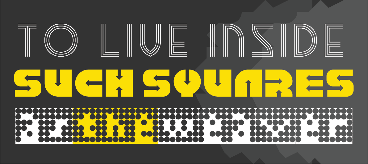
– I don’t entirely see how nocturnal addresses the “counter” theme, but, nevertheless, it’s a beautiful, clean design from FontStruct’s master of filigree, Art Deco design: time.peace.
architaraz’s KD Spaceband meanwhile is perhaps the most original and usable entry of all, cleverly exploring and reinventing the spaces enclosed within its glyphs.
Connect 42 by jonrgrover represents all those competitors who chose to explore the gaming counter metaphor, and it’s a simple but playful entry.
– I profoundly love the tattered geometry of zcrapedium. So much so, that you’ll find it lurking in the background of every sample within this post. The variants in the upper case are a great idea, and I can think of plenty of real-world applications for this one.
Below it: the mysterious N8Lite – but who is nightpegasus, its designer? I have my suspicions. Whoever they are, they demonstrate a highly idiosyncratic and expectation-confounding style, of which N8Lite is a great example – rule-bound yes, but how strange and elusive are those rules!
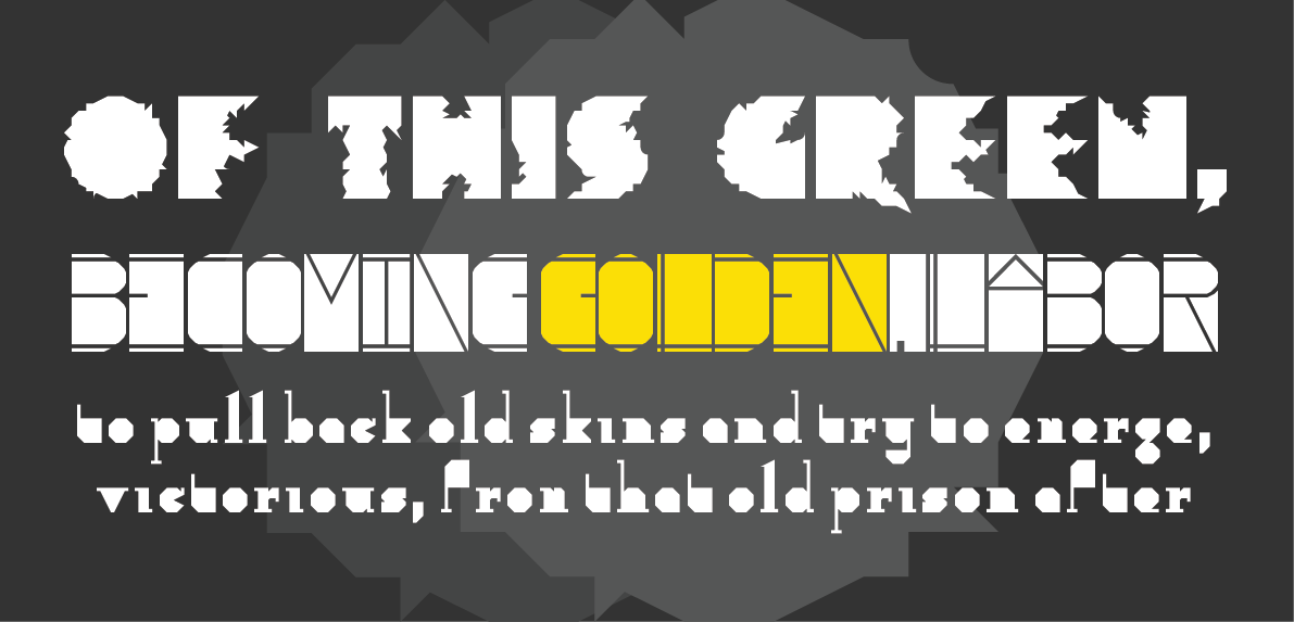
Serifia la printe represents a larger group of excellent, more “classical”, filled-counter entries. “Serifia” contains many surprising, and indeed inconsistent, design choices, but therein lies the strength of its oddball character.
– All three of these entries would likely have fared very well in the Inline Competition.
fs psyline and KD Hachure are examples of sophisticated and mature FontStructing – ready to be moved on into the character-set expansion phase and suitable for all kinds of design applications.
Below them. the charming and ingeniously entitled Owl Circle by Waturu Aiso has a more mannered, fantastical look.
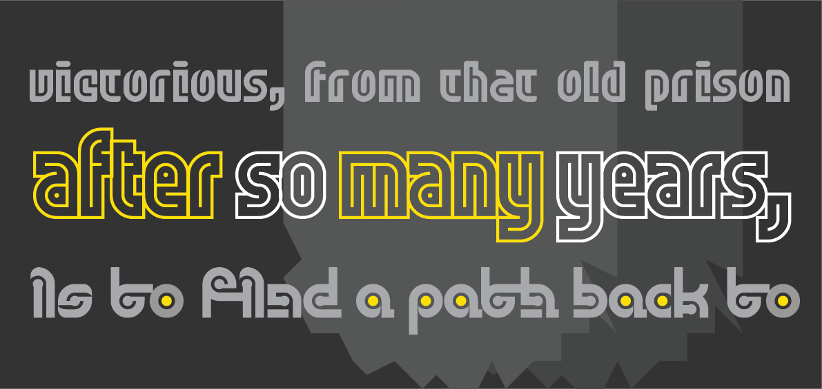
Last, but not least, in this short and selective tour, we have a group of three diverse entries, beginning with NAL’s Zirconia – its glyphs like the aerial view of an extra-terrestrial base, revealing its intricate, bevelled construction only at larger point sizes.
Geometrica B&L turns out to be barely legible, so it’s probably best suited to a logo or short headline, but the patterns of its semaphore-like, cuneiform patternings are wonderful nevertheless.
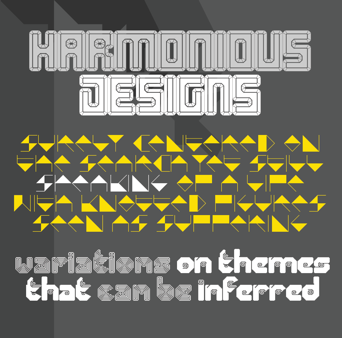
And finally, geneus1 offered us an array of exceptional contributions to this competition– all expertly-crafted, things of beauty. You really have to install G1 Recoil and start playing with it, in order to fully appreciate the richness of its ornate strudel. Definitely a recommended download.
The Winners:
“breach” by four is a standout winner and the “FontStructor’s favourite” for the “Counter” competition. An ingenious warping and rupturing of the boundaries between interior and exterior space, it’s a thought-provoking work of art in itself, and invites extended contemplation.
UPDATE: Some twitter users have pointed out a similarity between “breach” and the very beautiful commercial release “Clip” from Setup (previously Urtd). Personally I suspect and see coincidental inspiration rather than imitation, but please visit the Setup site and make the comparison for yourself.
O yes! This was love at first sight. Starbird by V.Sarela (Yautja) is a perfect example of what one might call “groovy deco”, and I can easily imagine it gracing the worn cover of some favourite ’70s sci-fi paperback. The contrast of the fine circle with the smooth and heavy fill beneath it is quite sumptuous.

Elmoyenique’s zykowarfare reminds me of plastic letter stencils – incorrectly yet playfully filled out perhaps, at the back of a classroom on a hot afternoon. There are scores of intriguing nuggety forms to discover in this one, hidden away amongst its self-interlocking glyphs .
Thanks!
That’s it! Congratulations to all our winners and everyone who took part!
Winners will be contacted regarding their prizes over the next few days. But right now, I have an inexplicable urge to go and remodel the kitchen …
Happy FontStructing!
![]()
Acknowledgements:
The rules at the head and foot of this post are built with “Counter Top” by geneus1.
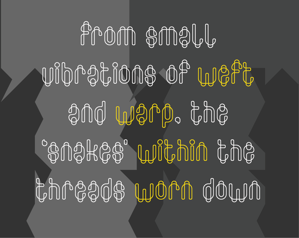
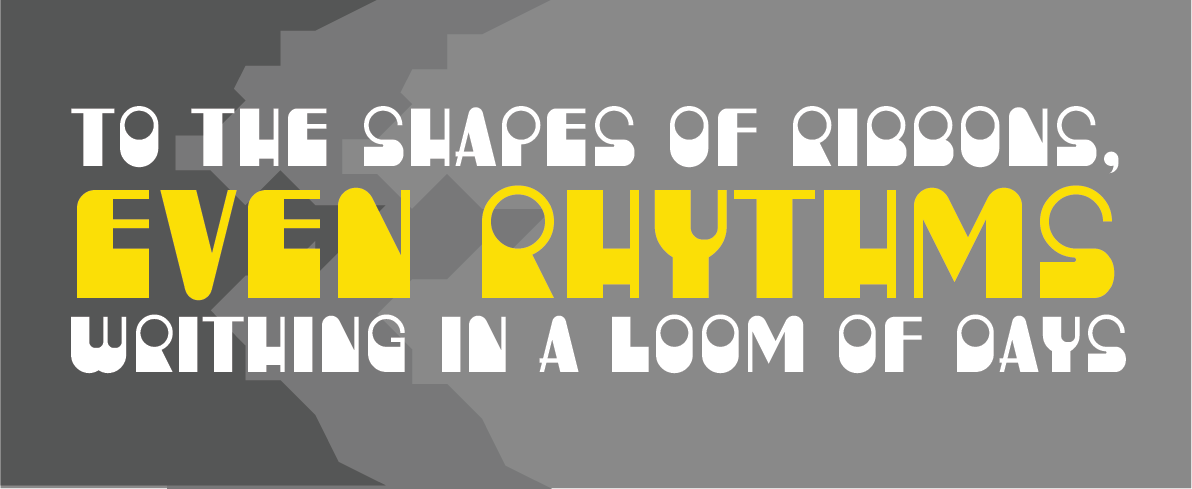
The text in the samples is from “Figures in the Carpets” by David Schloss.
Many thanks, as always, to our current sponsors: Google Fonts.
Congrats to all the winners (this might be the first time when I correctly guessed all the winners ;) )!
I’d also like to mention some of the new names like Jingyo, Se7enty-Se7en, Sed4Tives and Wataru Aiso, who I think are participating for the first time in FS comp. Keep up the good work!
– architaraz — June 12, 2018 #
that’s definitly the best thing to know! Serifia la Printe is one of my work that i’m satisfied with. Thanks! And congrats to all of these fontstructors who speand time and wills for the competition. :)
– JingYo — June 12, 2018 #
Congrats to everyone who participated!
– zephram — June 12, 2018 #
Congratulations to all the winners and honorable mentions! Great job, compañeros! Every day there is more and better level within the competitions of FontStruct and that makes it very pleasant to have to squeeze the brain to get fresh ideas at your high level. I’m with architaraz about the rookies: congratulations and keep going!
– elmoyenique — June 12, 2018 #
What a great competition, the entries show just how different your minds worked, what an incredible variety of interpretations of the aspect we don’t often talk about: the openly hidden counters of glyphs. Congratulations to the winners, as usual you’ve enriched Fontstruct with your visions. And “Well Done !” to all those members taking part for the first time. Your work is as impressive, well designed and inspired as those from older member … keep on (glyph-)rocking in FS!
– Aeolien — June 12, 2018 #
BTW, the letters in the background of the samples saids something…
– elmoyenique — June 12, 2018 #
Don’t worry people: only appears the word “Counter”.
@meek: This was an extra gratificant idea, boss, thank you FS.
– elmoyenique — June 12, 2018 #
Congrats four, Yautja, and elmo! Thank you for blessing us with your awesomeness! This was a fun one! (as usual).
– geneus1 — June 12, 2018 #
@meek Thank you for introducing my two fonts with great comments.
FS THE BEST!!
– Wataru Aiso — June 13, 2018 #
Congratulations to all participants, it is great to see so many wonderful entries. Thanks @meek for organising this challenge. Your words and samples make our efforts shine.
– four — June 13, 2018 #
Congratulations to all winners, some idea’s of you guys were amazing !!
– Sed4tives — June 13, 2018 #
Another fantastic competition in the books! Congrats to four, Yautja, and elmoyenique, all long-time FS masters and past competition winners. The variety of ideas displayed was incredible, as usual, and the post really does a great job of amplifying this. Already looking forward to the next comp :-)
– ETHproductions — June 13, 2018 #
I guess “Nocturnal” addresses inline counter?
– ThinkLogically — June 13, 2018 #
Yay! Thank you, and congrats to everyone for their good work!
– Yautja — June 14, 2018 #
That was a great competition. My compliments go to everyone who had great ideas for creative fontstructions here. My congratulations go to the well-deserved winners!
– beate — June 14, 2018 #
Very very interesting competition! Congratulations to all the winners, you all really deserved that. Glad to see the quality of the entries shown, I mean, twelve well-deserved honorable mentions, that’s amazing.
Quite sad I missed this one, looking forward for the next!
Keep your creative brains sweat, guys :)
– cablecomputer — June 14, 2018 #
I am not on twitter and wasn’t aware of any comments on ‘breach’ until now.
Amongst many other paperclip-style fonts, I did come across the beautiful ‘clip’ by ‘setup’, towards the end of my making process. I admired it and I studied it, to see if it could be helpful in solving issues I had with completing certain glyphs (such as Q). It wasn’t really helpful though, because although there are similarities between the two fonts, they are very different and were developed from very different ideas. If you study the two fonts side by side, you’ll see there isn’t a single character that is the same.
The concept behind ‘breach’ is simple and best illustrated by the letter o: a closed counter-outline that crosses and extends beyond the closed outline of its glyph. Applying the same idea to glyphs with open counters, I tried to keep closed looped shapes by connecting the counter-outlines with the glyph-outlines after crossing them. ‘breach’ plays with the limitations of fontstruct, while at the same time clearly remaining a modular font. I like to think that the vast majority of my fontstructions are original works that sometimes try to be inventive, but always stay true to their origin and don’t pretend to be something they are not.
In comparison, ‘clip’ is in a different league altogether. Its glyphs are constructed with vector software, using an elegant script-like single line that has a starting and ending point and is not looped. On the MyFonts clip page, the author of ‘clip’ actually describes the difference very clearly: “Clip is a display typeface inspired by the shape of a paperclip, but it’s not designed with the usual minimalistic modular approach. Instead, Clip mimics the construction, proportions and contrast of classic bold text typefaces and has one unique characteristic: each of its characters is drawn with only one single line.”
Clip and breach are both linear fonts with crossing lines that in some glyphs result in extended counters. In ‘breach’ that is the main design-concept, in ‘clip’ it is just one of its wonderful features.
I am very sorry if any of this caused anybody any hurt.
– four — June 14, 2018 #
@four No need to apologise four. I didn’t doubt you for a moment, and it would surprise me if anyone was meaningfully hurt by this. But thanks for the detailed background. I applaud your twitter abstinence ;-)
– Rob Meek (meek) — June 15, 2018 #
As always, the competitions bring out the best creativity in all of you. Congrats to the winners, very well deserved. I’m surprised (although not really…) at how many designs are possible with fontstruct that no one has thought of before.
– laynecom — June 15, 2018 #