Stencil Competition Results
The Stencil competition was a resounding success. We saw a record number of entries (70!), a great diversity and originality of approach, and overall an extremely high standard of FontStructing.
I was a bit unsure about the “Stencil” theme when we chose it for this competition. I thought people might find it hard to produce something fresh with so many great stencil designs on FontStruct already. How wrong I was to underestimate the creative energy of the FontStruct community. Well done everyone!
The Winners
Down to business. There was one standout winner which appeared in each judge’s top three, and was also chosen by the community as the “FontStructor’s Favorite”: “db Smoothie” by beate. db Smoothie is an unusual, but highly usable and technically-perfect stencil-FontStruction. Ray Larabie wrote:
db Smoothie bolsters the stencil cuts by lopping tops and bottoms strategically. But it does it in a way that accentuates the differences between letters. That’s something that a lot of other entries missed. You can minimize without making letters look uniform and overly modular.
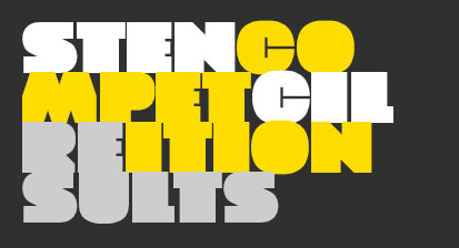
In fact beate could have won several times over. Ray also enthused over “db Karton” (seen in the image at the head of this post):
db Karton avoids the usual stencil cliches and goes with a counter-less style. I love how the C & G avoid the commonplace “Pac Man” deco pastiche. The squared sharps allow a tight fit, which makes it really useful as a poster or headline font.
So well done beate!
The second winner is Thorin by Frodo7. Ray was smitten by its subtle qualities:
Thorin was my favorite entry. There are a lot of soft stencils around that would fit with a classic military theme, but Thorin has a plausible, contemporary military style. The optimal cuts and low-res polygonal flavor evoke an eerie digital camouflage voice.
Congratulations Frodo7!
The third winner is the brilliantly named and executed Crazy Fredericka by four, a fun, legible and eminently usable form of insanity. High five four!
Winners will be contacted soon about their prizes.
If you entered and didn’t win, please don’t be sad. You were all amazing. And of course if you can’t wait for the next competition to win a poster, you can still order it.
Special Mentions and Thanks
In the course of the competition we were delighted to welcome back funk_king and geneus1 to public FontStructing. Their spectacular returns for the Stencilcomp are one more good reason to hold competitions more often.
We’ve also recently seen the welcome return of jmarquez and, assuming I haven’t been fooled by some nifty photoshopping, congratulations on the amazing knifework for the competition sample!
Finally thank you to will.i.ૐ for his truly incredible innovations most recently in this competition, his willingness to share and unsung, behind-the-scenes volunteer work on FontStruct.
The Judges
Protective hats off to our guest judge Ray Larabie, and honorary staff judge Stephen Coles who gave us a lot of their valuable time for free. As you can imagine it takes to long time to have a conscientious look at 70 FontStructions.
Ray Larabie is a Canadian font designer who has, for the past 15 years, created over 500 font families. He continues to create new fonts in his new home in Nagoya, Japan. More info about.me/raylarabie
Stephen Coles is an honorary FontStruct staff member, writer, typographer. Editor of Fonts In Use, Typographica, and The Mid-Century Modernist. He lives in Oakland & Berlin.
Rob Meek designs, develops and runs FontStruct.
And finally
Watch this space. We’ve got some new bricks coming soon.
In the meantime. Happy FontStructing!
Competitions, News | Rob Meek (meek) | October 26th, 2012 | 30 Comments


