


The Video Game Font Preservation Society
A few weeks ago we launched FontStruct’s first user-curated set of FontStructions – the “Game Recreations” set – highlighting a significant but often neglected corner of our typographic world. The set’s intrepid and expert curators have already amassed a fabulous collection of over 700 designs, and here they explain a little of the history behind their project and invite you to contribute. This is a guest post from Patrick H. Lauke (Redux) and Goatmeal …
What makes a video game memorable?
There are numerous answers to this question, each of them correct in its own way: gameplay, graphics, plot / story, characters, music, typefaces
… wait — typefaces ?
Yes, since their advent, video games — whether arcade, home console, computer, or mobile — have relied on text to inform the player of game play instruction, status, current inventory, possible decisions or action options which may be taken, and most importantly: story. As games became more elaborate (better graphics and sound, actual speech accompanying the game’s text, etc.), their typefaces became more refined and complex right alongside them. However, despite shedding their prior design limitations, they remain an integral and necessary component of the gameplay experience to this day.

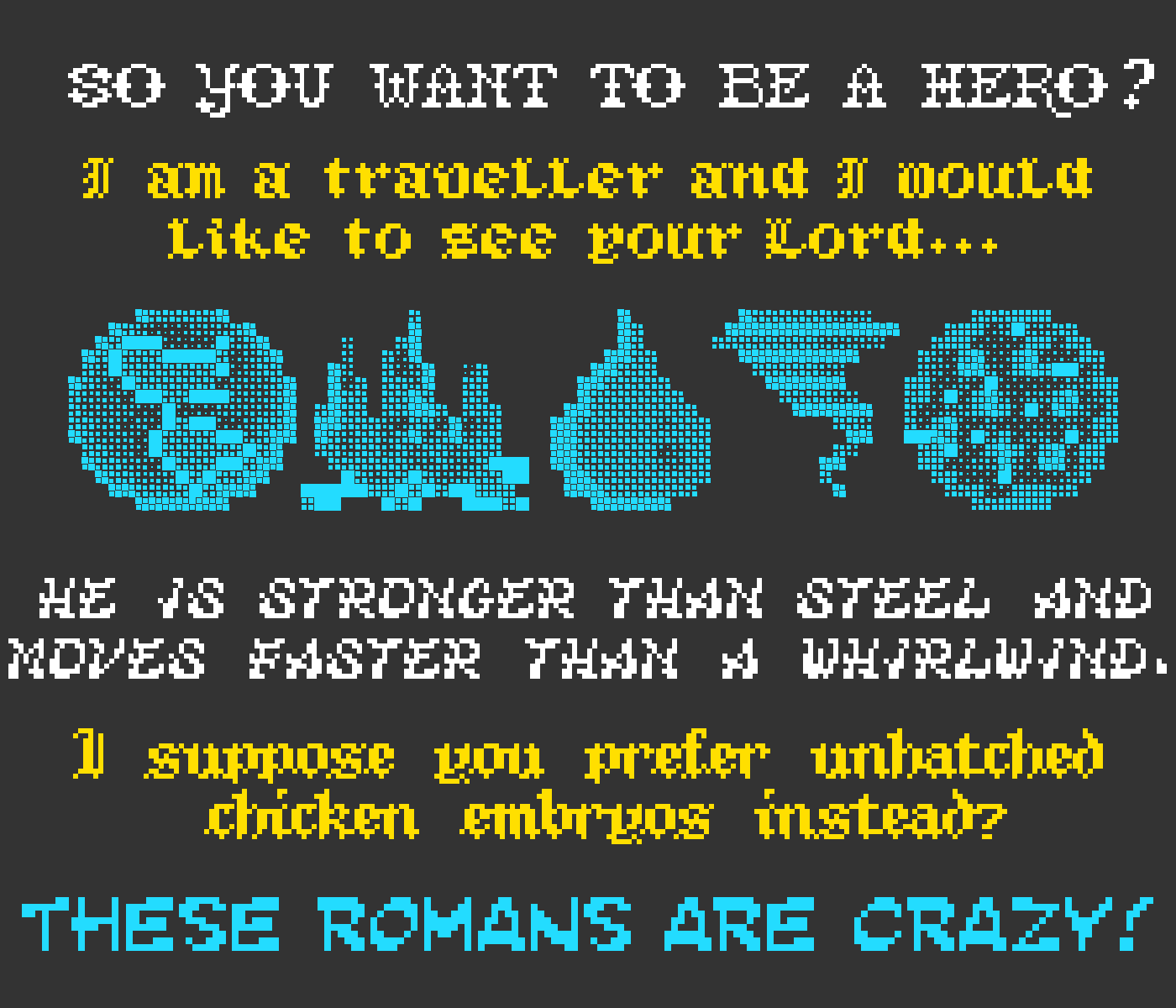
In the beginning — as was the case with so many video game elements — the technology of the day imposed limitations. Most early games typefaces used an 8×8 grid for each character (resulting in 64 possible pixels that could be used), but this did not stop creativity. Many arcade games simply chose to vary the ubiquitous typeface that Lyle Rains (of Atari fame) developed for “Sprint 2” (1976), while other game designers created a staggering number of unique typefaces for their games.

Looking at some of the very early games like “Night Driver” (1976) we can see that the font used was very minimal and utilitarian – likely the work of programmers/engineers rather than actual visual designers, so the emphasis was on readability rather than any expression of design sensibility. But there are already some early examples of fairly “distinctive” fonts like the one from “Phoenix” (1980), which first appeared – in a prototypical form – in “Safari Rally” (1979).

The typeface contributions to these games were often overlooked. But we typeface enthusiasts noticed. Although video game typefaces from so long ago may be forgotten to most, we find value in all typefaces — especially those unsung electronic designs of the early days.
Unlike books, posters, or other physical print media, video game typefaces are inherently transitory and ephemeral. They are not permanent and only exist during game play — or at least while the game has electrical power and is switched on. Due to the ageing technology of early gaming systems, the game typefaces from those early days are now unfortunately trapped on old coin-operated arcade game boards or outdated 20-to-40-year-old home consoles. However, we are more fortunate with certain computer systems that spanned roughly that same period; industrious amateur programmers have endeavoured to keep those games alive, regardless of however advanced their computer systems may have evolved.
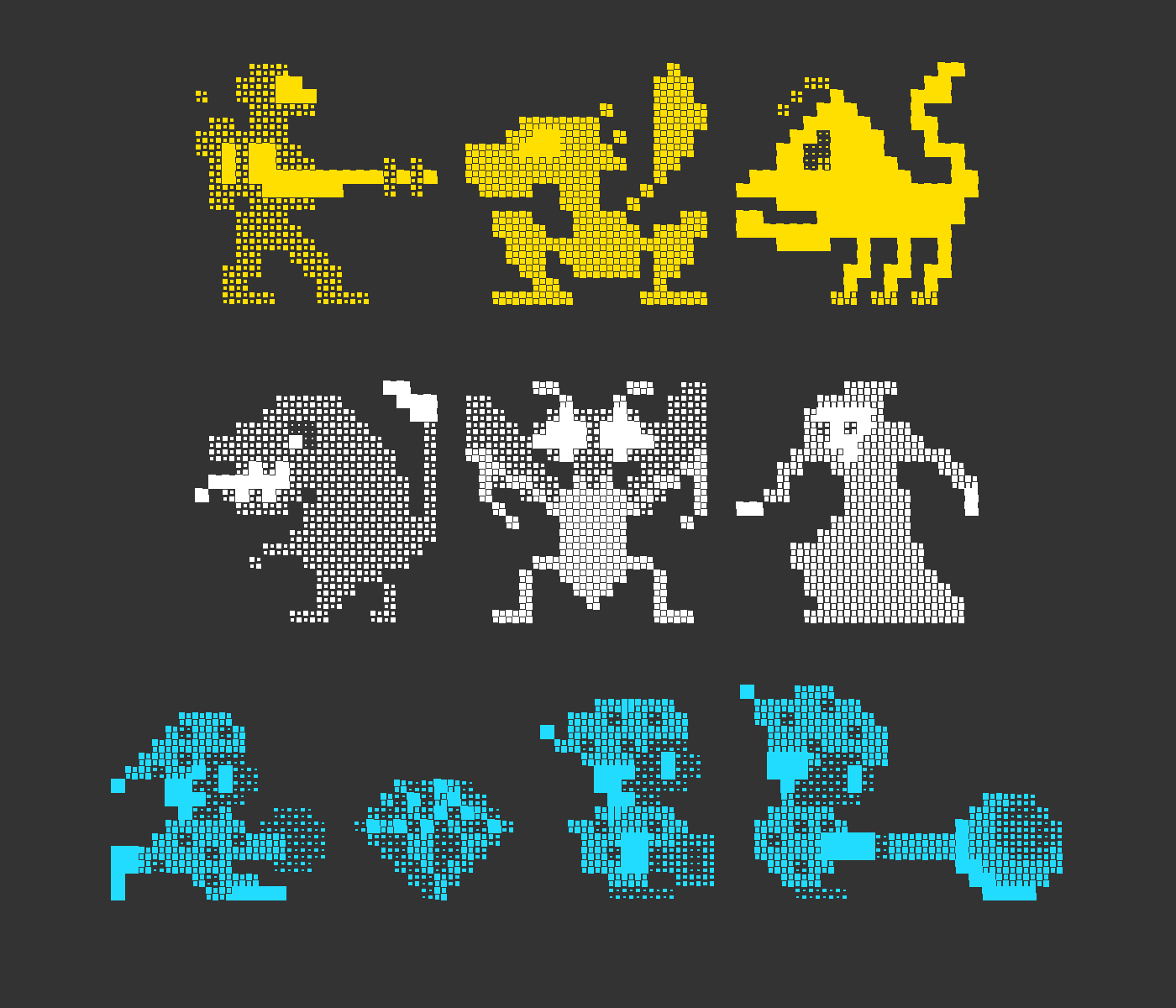
Because FontStruct utilizes a modular grid system with the simplest brick being a square block, it’s ideal for recreating (non-anti-aliased) video game pixel fonts. And there are many FontStructors who have made it their mission to rescue these lost and forgotten typefaces, to revel in a bit of nostalgia, and to allow others to experience the inherent beauty of these designs made concrete. And now, with the newly introduced “Game Recreations” archive, two veteran computer and game font recreation enthusiasts – Goatmeal (see our previous mini-interview) and Patrick H. Lauke (Redux) – aim to collect and showcase some of this work. The Video Game Font Preservation Society™ awaits your contributions!
Thanks Patrick H. Lauke (Redux) and Goatmeal!
Acknowledgements:
Many thanks, as always, to our current sponsors: Google Fonts and Glyphs App
Guest Posts | The Video Game Font Preservation Society | October 19th, 2018 | 5 Comments