


Inline Competition Results
Another fantastic competition is over, and the FontStructing community has once more surpassed itself in energy and invention.
Congratulations to everyone who took part. I hope it was as much fun to participate as it was to watch.
Judging was a pleasure, but also a painful process since we can only have three winners. Here they are.
The Prizewinners
1) fs lost by EthProductions
This was a clear winner for all judges, and also the “people’s favourite” as chosen by the community.

“[this was] my favorite … on all levels: creativity, execution, usability, and that x-factor: pure delight.” wrote Stephen Coles, while Paul Bokslag went into more detail:
There have been other maze-based fontstructions, such as zlabyrinths eYe/FS by elmoyenique and Mazey by lldaddy, but in fs lost ETHproductions has not only made a set of beautiful and interesting glyphs, reminiscent of seventies multiline fonts, he has also managed to create a very useable font for puzzle sections of magazines, newspapers and themed publications. Each glyph connects to the next, making it possible for editors to instantly generate unique customised mazes, every word being a new challenge.
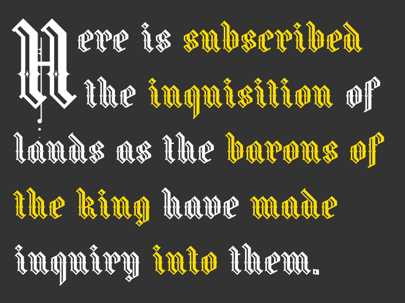
Exquisite and coherent attention to detail attracted the judges to this gothic gem. Stephen Coles wrote:
I’ve seen a lot of Blackletter on FontStruct because the angled bricks are so well-suited for Fraktur construction, but Fraline is one of the few beauties that takes the suitability of the tool to another level.
3) NCD Deconium SC Black Serif Inlines by djnippa

djnippa strikes a perfect jazz-age chord in this glimpse of a larger family. Stephen Coles wrote:
This is an excellent example of a historical typographic style (the Art Deco shaded inline) that is ideal for the FontStruct environment. Nothing is too forced here, and I like that.
Congratulations to all three prizewinners! They will be contacted about their prizes shortly.
Honorable Mentions
All the judges had very long shortlists and well over 20 other FontStructions were pushing hard for a place in the top 3. There will be many inline top picks in the coming weeks.
All the judges praised db TwoLines by beate. Paul Bokslag wrote:
The inline in this font is certainly not an afterthought that simply follows the shape of the glyph. Letterform and inline are two separate voices, each singing their own individual melody, but in perfect harmony with each other. This synthesis and the script-like character of the inline that connects certain glyphs, give this font a playful dynamic unlike any other and the samples illustrate that really well.
G1 Explo by geneus1, ztainless eye/FS by elmoyenique, RM Celtic Inline by p2pnut and AT Steglo by architaraz also all featured prominently in the judges’ feedback. Here is a collective showing of some of the judges’ favorites:

You can also download a printable version here.
The Judges
Stephen Coles is an honorary FontStruct staff member, writer, typographer. Editor of Fonts In Use, Typographica, and The Mid-Century Modernist. He lives in Oakland & Berlin.
Paul Bokslag is a Dutch-born artist living and working in Ireland. He specializes in papercuts and you can learn more about his fascinating work, including his use of FontStructions, on his website: paulbokslag.com. Paul is also known as the fontstructor four.
Rob Meek designs, develops and runs FontStruct. He is also the lead developer for Fonts In Use.
What Now?
I’m looking forward to the next competition already. As always, theme suggestions in the comments are welcome.
Competition Results, Competitions, News | Rob Meek (meek) | February 18th, 2014 | 27 Comments