Handmade Competition Results
Competitions, News | Rob Meek (meek) | October 19th, 2010
The results are in for the second FontStruct competition “Handmade”. It was a thrilling three weeks with some quite extraordinary FontStructing and offline handiwork appearing on the site. I hope all participants and everyone else had as much fun as I did. The standard of entries was extremely high, making the task of judging an extremely difficult. The judges came up with a very broad and diverse range of favorites, but once the votes had been added together, some clear winners emerged.
Particularly impressive overall was the diversity to be found in the interpretations of the handmade theme. Before announcing the winners, here’s a survey of some of the judge’s favorites, roughly organized by their general approach to the theme.
Handwritten Entries
From top: “NCD Edding 5.0” by djnippa, and “ambdx” by 3moDuD
Some FontStructors interpreted “Handmade” as “handwritten”, and created designs recreating the dynamic, irregular movements and forms of human script. djnippa‘s “NCD Edding 5.0” is a wonderful simulation of writing using a modern, square-cut calligraphy pen. Eminently usable, albeit with a limited character set, this is a beautifully-crafted design that belies its FontStructed nature, even at very large point sizes.
“ambdx” by 3moDuDe was another “handwritten” entry which featured prominently on the judges scorecards. It’s not easy to use the limited geometrical shapes available in FontStruct to emulate the flow and blot of ink and create something with a clear human personality like this. Well done, 3moDude!
“Digital Scribbles”
From top: “Memories” by softhunterdevil, “Scribblenot” by geneus1, and “00ne_Paraphilia” by neurone_error
Several FontStructors contributed entries which somehow played with the contradiction of the digital and the handmade. “Memories” by softhunterdevil for example is a powdery, dusty disintegration of pixels which somehow looks like the product of an imperfect human hand, but is also clearly digital. “Memories” also featured on a number of judges scorecards.
“Scribblenot” by geneus1 was “Digitally hand-scribbled over a hand-drawn typeface”. I suspect some sleepless nights were spent working on this one. It’s a very strong concept. I especially appreciated the extra thought that went in to creating the “zap” and “scribble” characters in the bracket slots – these kind of details make a font really fun to use.
neurone_error‘s entries, like “00ne_Paraphilia” above, are hard to categorize but are certainly not handmade in a literal sense. They continue to explore his signature digital-baroque style. Zoom in close to discover the graphical microcosm within.
Hand-cooked entries
From top: “Ziti” by Em42, “FS Croissant” by thalamic and “Scherenschnitt Französisch Frites” by funk_king
At this point, a special shout out to “nazlfrag” who first coined the term “macaroni bricks”. The phrase (describing the new quarter-ring bricks recently introduced to FontStruct) instantly became part of FontStruct community vocabulary and is part of the background-story to “Ziti” by Emilio Ignozza aka Em42. “Ziti” is not only a very tasty modular typeface but also the wittiest concept in the competition. Emilio is well-known in the community for his minimalism and his skepticism regarding new brick shapes, so there is a wonderful, playful logic to his design. Rather than using the new macaroni shapes, he builds letters out of broken pasta rods and forms rounded corners using straight lengths of pasta. The documentation of this project and the photography on FontStruct and on Emilio’s own website is really exemplary.
Two other food-related entries praised by the judges were “FS Croissant” by thalamic and “Scherenschnitt Französisch Frites” by funk_king. “FS Croissant” is another innovative and attractive modular typeface from Ata Syed. This one I would personally gladly eat for breakfast every morning with my coffee, while the deep-fried fun that is “Scherenschnitt Französisch Frites” should be enjoyed later in the day, with plenty of ketchup.
Woodcut Entries
From top: “Woodcut Banjo” by funk_king, “Stampede!” by will.i.ૐ, and “fs Ooki Woodcut” by thalamic
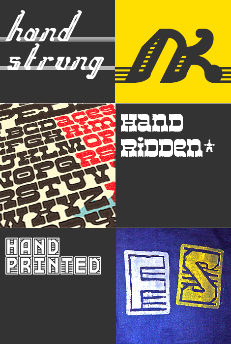
Several entries explored a woodcut interpretation of the handmade theme. “Woodcut Banjo” by funk_king is an unusual and characterful script with a handcarved (or burnt?) feeling. “fs Ooki Woodcut” by thalamic is a very neat and usable set of “wooden” printing stamps. Check out the comment thread for the entertaining story of how he hand-printed some of his letters using an inner tube, his kids’ old toys and his mother’s oil paints. Not everyone went to the trouble of making truly handmade samples but I get the sense that those who did really had a lot of fun.
“Stampede!” by will.i.ૐ should not be hiding away in the middle of a blog post. It really deserves a blog post to itself, and was singled out by several of the judges for its beauty and usability. Perhaps the only reason it is not one of the winners is that the handmade reference is not strong enough, I’m not sure. In any case, it is without doubt a brilliant piece of work and most probably the best FontStruction in the western genre to date.
Handcrafted Entries
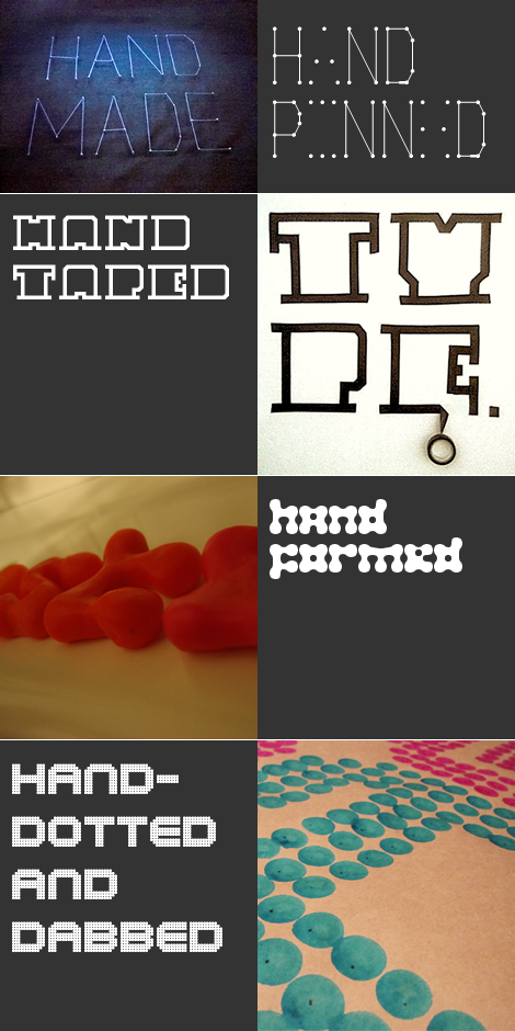
From top: “Pushpins” by aphoria, “zcell eYe/FS” by elmoyenique, “Plastelina” by Neoqueto, and “MELKO” by UPixel
– Some other excellent entries with fun handmade samples. I’d like to single out “Pushpins” by aphoria which appeared right at the top of one judge’s scorecard. It is a strong, clear and fun concept with a direct but unique interpretation of the theme. I love the way the upper and lower case were used. Kind of perfect really. The beautiful sample is from minimal AKA thalamic AKA Ata Syed.
Blackletter Entries
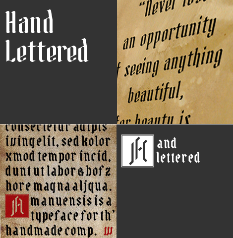
From top: “Calligraphique” by geneus1, and “Amanuensis” by riccard0
Also worthy of mention are those entries which fall within the favorite FontStruct genre of “Blackletter”. “Calligraphique” by geneus1 is simply a gorgeous, gently-gothic script. “Amanuensis” by riccard0 is a characterful blackletter notable for its inclusion of illuminated capitals. Perhaps a first in FontStruct?
Finally, the three prizewinning entries:
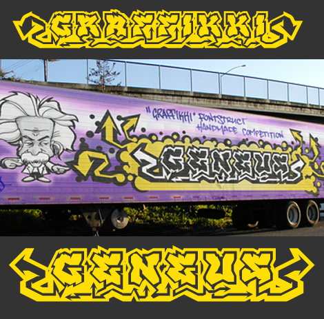
In third place, “Graffikki” by geneus1.
This is a technical and creative tour-de-force, packed with dynamic energy in the letter forms and in the movement of the arrows. The alternate characters in the two cases, and the variety of arrows in the bracket slots make this FontStruction extremely fun to work with and I strongly recommend taking it for a spin. I suspect this gem has been being polished in geneus’s secret treasure cave for some time. Thanks for sharing!
In second place, “Riba” by Em42.
A really original concept and typeface. Apparently simple, clear and logical in digital form, it comes to imperfect and complex life in the beautiful hand-folded samples. This is the work of someone who takes FontStruct seriously. I’m personally very grateful for that. Check out the documentation and folding-of video at House42.
And now, TADADA DADA DADAAA!!! the winner of the FontStruct “Handmade” challenge, and also winner of the inaugural people’s choice award is “NCD Embroidery Comp Size” by djnippa.
All of djnippa‘s entries were prizeworthy this time around. Even the FontStructions which didn’t make it through his own rigorous editing process could have been in contention, but “NCD Embroidery Comp Size” emerged as a clear favorite of the judges and of the community. Again, the concept was clear and addressed the theme directly. The font is attractive, legible, highly usable and thought-through to the last ingenious detail in the punctuation. Congratulations djnippa, and where can we buy a cushion cover?
Winners will be contacted regarding their prizes in the next few days.
Phew!
That was epic. Many (the majority) of the entries will be top-picked over the next days and weeks. The winners will be featured on the site for at least two weeks as the new featured downloads. All entries can be reviewed here. Thanks again to all participants for sharing all of your wonderful creations, and a special THANK YOU!!! to our eminent and conscientious jurors who gave so generously of their time.
The Jury
Gustavo Ferreira (hipertipo), John Skelton aka Afrojet, Peter de Roy aka typerider (signbox), Ivan Bettger (FontShop International) and Rob Meek.
Headline image set in “Scrawl” by aphoria






congratulations to all the winners and thanks to FS and staff for another fun event, and honorable mentions. i think the contests are a great way to keep the community motivated and spur new work. i always enjoy seeing new and amazing work from our cadre of designers, these comps seem to bring out the best in us and encourage us to keep going. and thanks to all the designers who participated. although only 3 were awarded, each one us contributed to the success of the event. till next time :)
– funk_king — October 19, 2010 #
My biggest congratulations to the three winners… and to the rest of you: You are greats, people! It’s an enviable fun for me share my time with you all. Thanks!
– elmoyenioque — October 19, 2010 #
Epic!
Heartiest congratulations to all the winners, especially DJ.
It is an honor to be part of this awesome set of people, event, tools, and outputs.
Thanks.
– thalamic — October 19, 2010 #
This blog post is really impressive: to see the different styles and samples submitted for the competition gathered together in one place makes you realize how versatile and powerful FontStruct is, and how each user expoit it in a different way to express his own point of view on (modular) type design.
I’m really honored to be part of the winners, but as Funk_king says above, each of the participants and of the submissions contributed to the success of the competition.
– Em — October 19, 2010 #
Congrats to everyone. It was a lot of fun…I can’t wait till the next one!
– aphoria — October 19, 2010 #
I totaly agree with the jury “NCD Embroidery Comp Size” is a strong creative work which respect the theme. Bravo DjNippa.
Congrats as well to Em42 and geneus1.
I wish there was more participants in the contest. Anyway, It was really a lot of fun.
Merci to FS team.
– Upixel — October 19, 2010 #
I want to thumbs-up aphoria’s comment!!!! This was really great fun and congratulations to all the winners, participants and judges who made this such an awesome competition! :D
– 3moDuDe — October 19, 2010 #
For those who are still in the HANDMADE mood
http://www.typographyserved.com/Gallery/Fashion-Punk-oder-Frickelmania/726101
– Upixel — October 20, 2010 #
Thank you for including me in the top three. It is an honor to be in such prestigious company among the winners of this typographic challenge. Congratulations DJ Nippa and Emilio for your well deserved accolades. My respect also goes out to all contributors. I really enjoyed the enormous amount of creative diversity from each participant. Thank you meek and staff for holding this contest and helping to bring out the best in all of us. The difficult task of hand-selecting the handmades was not envied.
Some font notes:
On Scribblenot, the main challenge was getting it to fit within 32 blocks. It was a remake of a much larger fontstruction. The new version was much easier and faster to do than the original.
Calligraphique was an attempt to make maximum usage of the curved bricks in order to achieve a natural penned look, avoiding faux bezier curves.
Graffikki was actually an updated FS 1.5 creation. I categorize it as a graffiti art font, rather than a graffiti tag font. And I can neither confirm nor deny the legality of the creation of the included sample image.
;-)
– geneus1 — October 20, 2010 #
Congratulations to all the winners! This competition was great. And we could see many great works.
:)
– naveenchandru — October 24, 2010 #
This was an AWESOME competition. I can’t believe that it is even possible to FontStruct these epic fonts. Thanks, and congratulations to all contestants, winner or not.
– Asup759 — October 30, 2010 #
OMG this is so close, I would of gone gaffikki by genius1, but…
– Travis98789 — January 9, 2011 #