


Focus On FontStructors – Peter De Roy (typerider)

This is the seventh in our series of mini-interviews with FontStructors; the first one since the series went monthly, now that it alternates with Foundry Focuses every other fortnight. Well, it is supposed to, because the episode is a couple of days late. In this instalment we talk to my compatriot Peter De Roy, better known on FontStruct as Typerider. This interview is a little special for me, as Peter and I go a long way back – the first time I met him in person was when I delivered FontShop goods at his home in the very early nineties. Yup, private delivery in the pre-webshop days. It’s not like we’re intimate friends, but we know each other quite well, and I’ve always kept track of his work; especially the type and graphic design magazine 96 (the successor of Druk) and the image publication UnderCover he (together with is partner Betty Reyniers) produced for FontShop BeNeLux after I’d left.
I chose to interview Peter for three reasons. First and foremost he experiments with the basic concept of FontStruct, going to the very core of FontShop’s free online modular font editor and producing type designs that achieve maximum impact with a minimum of means – see for example this gorgeous deconstructed lowercase “g”. Furthermore he documents his experiences with FontStruct on Spinsels (literally “spinnings”, figuratively “concoctions”), his private blog on letters, words, books and graphic design. While Peter’s blog started out as a personal diary of thoughts, rhyme and riddle and makings of all sorts, it pretty soon became a record of his adventures in FontStruct. Being allowed to look over the shoulder of a designer sharing his thoughts about his creations is very enlightening. And last but not least, he is a graphic design teacher who integrates FontStruct in his typography courses.
Peter De Roy (typerider)
![]()
After college Peter De Roy studied graphic arts (the “fine” arts, not graphic design ;-) at Sint-Lucas, Ghent, Belgium. In his own words, never having done a proper lithograph and being too lazy to wipe his etching plates clean, he somehow managed to do a couple of fine woodcuts though. This proved in hindsight to be of some importance – cutting light into a black printing surface has more affinity with typography than drawing lines on a white sheet. Postponing working life, he took one year of sculpting at the Royal Academy of Fine Arts (KASK), which resulted in a love-hate relationship with the arts.
Since back in those years – at the tail-end of the eighties – there was little visual fun to be found in the art galeries, Peter De Roy started out as a graphic designer. Those were the early days of MTV and influential magazines like i-D and The Face that gave him the visual stimuli he was looking for. Yet nowadays graphic design often gets so conceptual he sometimes gets an itch to turn back to the arts. Weird world.
SignBox – the graphic design studio Peter De Roy runs with his partner Betty Reyniers – works mainly for clients in the cultural field and a lot for environmental government agencies, as well as education. And also in the graphic field, most notably the magazines they produced for FontShop BeNeLux. Their work is typefied by a keen sense of colour, bold and clear compositions with inventive use of images, and a lot of attention to type selection and typographic detail. Since about 12 years Peter de Roy teaches design and typography at KASK, but only recently this became his main occupation.

Squaredancing by Typerider
Do you have any prior experience with type design?
There was nothing really, however I have been fascinated with type since long. One of the first things I read when starting with design were the writings of Gerrit Noordzij – which I keep rereading. And working for FontShop made me look at type from up close. Teaching typography is a new challenge: I gathered a lot of knowledge over the years, but it was never very well structured, not like in a school book or study program.
How and when did you discover FontStruct?
I discovered FontStruct very early through some students who were playing with it, even before the official release I think. And in the summer of 2008 I had the occasion to dabble into it myself. It proved to be very addictive. I use it less now, but it has become a part of the typography course.

Bop Closer by Typerider, the fat, dense cousin of Bop Carré, a black but rather happy font.
How exactly do you integrate FontStruct in this typography course?
Very early and without too much background. When we start talking about letterforms – the subject of typeface classification – students need a basic vocabulary to be able to discuss and differentiate fonts: terms like contrast, harmony, legibility, readability, and word shapes. When building an alphabet in FontStruct, they immediately are confronted with those things. The only rule I set is the maximum grid size, which you guessed is pretty limited. An x-height of maximum 5 blocks for instance. Novice typographers are mostly charmed by individual letterforms and often overdesigned sans serifs. In building a modular font they soon find out the limited possibilities of geometry and the need for contrast even in seemingly linear fonts. The inner logic within a series of letters that need to form different words becomes apparent from the start. Beautiful single glyphs must often be sacrificed to function within the whole. Talking about all that before a class is one thing, having students experience it works much better. And to agree with a reaction from Erik Spiekermann in the early days of FontStruct: it will show them how refined and complex a ‘real’ font is.
Does the FontStruct effect really work? Does building glyphs in FontStruct help the students realise what designing a “real” typeface must be like?
I think it still is too early to really measure the effect – last year was a trial year and we are giving typography more weight in the curriculum this year. But I am convinced it opens their eyes. They may not realise the full complexity of type design, but they definitely acknowledge it is a meticulous and complex job. Our programme is a graphic design course, not a type design course, so not every student focuses on type to the same degree. What FontStruct magically does is break down the barriers surrounding the once sacral and hermetic world of type design. It is immediate, playful and fun. There is no stage fright. This creates an open-minded and spontaneous working attitude.

Atomic Scissors by Typerider, a heavy duty cut-out font with caps only, some alt characters under the lowercase keys, and robots under the number keys.
Whereas there is a tendency amongst many FontStructors to gradually make the grid smaller, you on the other hand construct fonts with as few bricks as possible. What is the concept behind your minimal approach?
For me there is no other way, really. I was always drawn to art that doesn’t hide its origins nor the tools it is made with, but makes them a vital part of its expression. Apart from the subject or the composition, painting also means applying paint on a canvas using a brush. Saxophone playing is also about breathing. And FontStructing is about bricks. That’s what makes it unique.
I feel that by zooming out – using more and more bricks to build the characters – one tends to imitate “classic” typography. That poses two problems. First refining detail in FontStruct means camouflaging the tool. Yet it will never be perfect, since adding pixels is not the same as drawing a curve. Letters are not outlines but black surfaces countered by white surfaces. I wrote on my blog that lettering has more affinity with sculpting than with drawing.
The second problem is letter spacing. The tool is far too limited too resolve that. To me that is not a problem though. I don’t see FontStruct as a font editor, but as a modular font editor. That makes all the difference. Every form of expression implicitly defines its own set of rules. As long as these rules are recognised, they are not perceived as limitations, but come as a natural part of the work. Even a non-educated public feels that the result “works”. For the record: this is my personal view and method, however I do not claim succeeding in it. On the other hand, when you work this way the result is of less important than the actual process.
Of course, besides this “conceptual” explanation there are my personal preferences and approach. I work better within a pre-set environment. Give me a few sticks or bricks and I will try to make something out of it. Yet give me a white sheet and a pencil and I will spend the rest of the day dreaming about what I should draw. I work in dialectics: the more limitations the bolder the results (and the more likely I will have to do a step backwards eventually ;-).

Tyrone by Typerider, a bold, over the top caps font with ornaments built using the infamous brick stacking hack.
How does your approach influence the way you use the actual shapes of the different bricks?
Being a typophile of the Dutch school – an avid reader of Gerrit Noordzij and an early user of Fred Smeijers‘ FF Quadraat – I wanted to bend the blocks into something more organic. I used the rounded and chipped blocks to give a certain movement to the letterforms, often using the mirror-block of what would seem “logical“ to create an extra effect that – dare I say this – is reminiscent of calligraphy. If I learned something from using FontStruct, it is the importance of irregularities in a font. Text type is a lot about rhythm and coherence in style, but if you polish it too much it becomes dull code and dies. Don’t try to theorise what shapes should be logical; simply see if it works. Trust your eyes. I can recommend spending more time testing words in the preview pane over building letterforms.
In your designs Bop, Carpetknife, Peghole, Atomic Scissors, and Tyrone you take FontStruct to the extreme. Most FontStructors construct the different parts of the characters – stems, arms, legs, etc. – with multiple bricks. You however use the specific shape of one single brick as an integral part of the anatomy of a character, building fonts on an insanely limited grid. Don’t you make your own life extremely difficult?
Ah Yves, but this is not life, it is play! It is the same thing again – keep the framework simple. Furthermore I am lazy. I get bored with stacking bricks very soon. So, less work and more thinking. And don’t overrate the thinking. Lots of it is trial and error. Seeing it as play gives me a lot of freedom. That doesn’t mean I do not value the time I spend on FontStruct. I can take play very serious, I just don’t mind the outcome. Most of the FontStructions you mentioned are almost unusable, but they are of some achievement within the game. Tyrone is a good example of what I mean: a tour de force considering the limits in which it was made, but a farce in the world outside FontStruct. That’s why I subtitled it “a font with more balls than brains”.

Peghole by Typerider, a design on a small grid (3 brick x-height) using only three different bricks and their rotation or mirror images: square, quarter circle and the “chopped” squares.

Peghole and Peghole Wide

Beer label designed with an adapted version of Peghole: characters hanging from the top instead of resting on the baseline, and a customised J.
I have the impression most FontStruct users construct fonts to use themselves or to be used by others. Why build – in your own words – “unusable” FontStructions?
That is a difficult one. I have different answers here, the wittiest one being: to get my 15 minutes of fame on The FontFeed! (laughs)
Closer to the truth, true play needs no justification, nor does it need to be utilitarian; it exists for its own sake. Play is in essence an anarchist act of being.
And a bit more related to your question: when I said “unusable” I actually meant “not very usable”, and maybe “not usable for others than myself”. I never started working on a FontStruction with a practical need or application in mind. Although I did do an adaptation of Peghole to design a beer label. I can see some occasional use for BopCloser, and I will probably do something with Safehouse myself. But honestly I don’t think Tyrone will ever appear in print anywhere.
If there is anything to gain, it might be some insight in what fonts are – or what fonts are not. We are flirting with the limits of typography here. I think FontStruct can teach you more about certain issues and problems in type design than actually teach you to design type. The way I approach it, I guess there is a limit to where the tool can take me (or I can take the tool).

2 Block Round by Typerider

Insider by Typerider

Hammerhead by Typerider

Quarterback by Typerider
In his quest for ever smaller grids Peter tried some experimental fonts. As he says himself: “(…) ended up with mucho experiment and little font”.
So if you can approach FontStructing as a purely cerebral activity, an exploration of the boundaries of typography, how in your opinion does it compare to what Neville Brody’s experimental typography posterzine Fuse did more than a decade ago? Can it play a similar role?
It can, if used that way of course. But there is a fundamental difference. Fuse was a publication platform to which respectable designers contributed work they made with the tool of their trade. Within the scope of modular type design FontStruct allows anyone to contribute. It is a very democratic tool and platform in one.
There are a number of users that would like to see FontStruct evolve into a fullblown sophisticated font editor; which is diametrically opposed to your minimal approach. What do you think?
To meet such wishes, the program would have to leave its brick-based premises. That is messing with the genes. I’m afraid this would turn a unique modular tool into a poor man’s FontLab. If a FontStructor feels the need to go beyond what FontStruct does, maybe he or she should step over to a vector font editor. I deliberately did not say step up. These are different worlds; a new game with new rules. Checkers ain’t chess.
My advise – don’t see FontStruct as a surrogate for something else, but enjoy it for what it is: a clever creative tool that feels very natural to use. And it is free. So sit down, log in and make your move. Play!
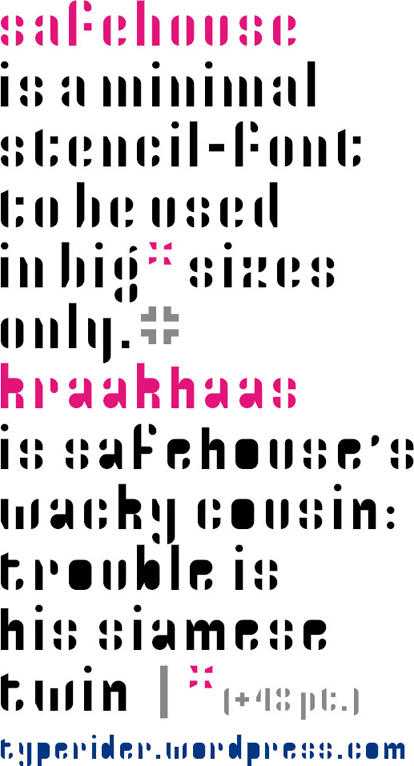
Safehouse and Kraakhaas by Typerider, a minimal stencil font and its dirty counterpart.
Focus on FontStructors, News | Yves Peters | October 10th, 2009 | Comments Off on Focus On FontStructors – Peter De Roy (typerider)