It is not nice to litter someone's font page with nonsense comments. This is an exemplary work of the highest quality. Well-documented and beautifully
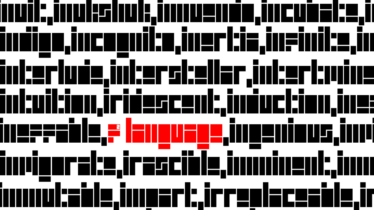
Multi-scale Truchet tiling.
new update coming soon
I should contact Sony right now.
It's not warning is disclaimer.
No more glyphs? You last edit was in 4 days (Monday 23rd March).
You guys need a psychologist... you seem crazy.
Can you also provide Unicode mappings for these characters?
Added Gothic.
Also added Roman symbols in Ancient Symbols, completing support for Roman fractional units.
Elmoyenique, TypoMan Foundry, Four, and Aphoria: thank you for your comments and ratings. I really appreciate them.
@aphoria: It's good to have you around.
update v.1.1.1 (27·III·26): added lutetium
idk if this'll be updated as frequently as before, everything is piling up because i just want to do more things...
woah argam cool
@frongile You're welcome.
In fact, I'm gonna try expanding another one of your old fonts
What? Bro. I didn't made it worse
you made it worse
Uhh…Excuse me, thank you for cloning/editing my font and giving me credit.
what even happened
wait a moment since when did i have more than 1150 chars
Great stuff Frodo7!
Totally agree with four.
I would add "mesmerizing" to it as well.
:))
Surprisingly legible. How about trying it with the uppercase?
@Maestro Frodo7: Thank you so much for your kind words about this little font. I'll also accept your suggestion to change its name (I initially thought
Also, why are these five comments left there the same?
I noticedd quite a few more unaltered/minimally altered clones of this font (and others).
Nothing changed there…
Looks like Mojang Craft...
So? Is she some sort of saint who's name can not be said?
Go back to your mommy!
i am almost surpassing the amount of back home’s glyphs!!! at the time of writing this, there are 246 glyphs left until i surpass back home!
genuinely tysm for taking my unfinished baby and unleashing its full potential
👍
The T is wrong
Also, your font's letters don't have a consistent width (e.g. Mg ≠ H)! 😆





It is not nice to litter someone's font page with nonsense comments. This is an exemplary work of the highest quality. Well-documented and beautifully
… more