Hey! I started too, but you faster. So please clone my letters Ф Д д л и й Ы. Also change uc У with lc у, i think it not necessary to make it different from latin y
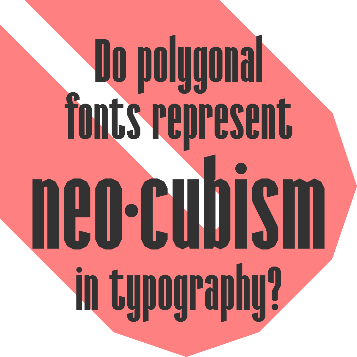
@Bryndan W. Meyerholt (BWM): Yes, I tested that version too. It didn't look good. Overall, the current design of Salice Sans is more consistent than Arial Narrow Bold or Impact.
@SquareOctent That's an affricate, which is usually written with a tie bar, but it can be omitted as long as it doesn't create ambiguity. Affricates were historically written as ligatures, but that was dropped in 1989.


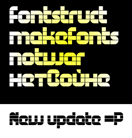


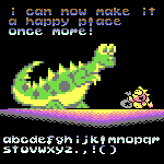


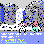
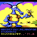


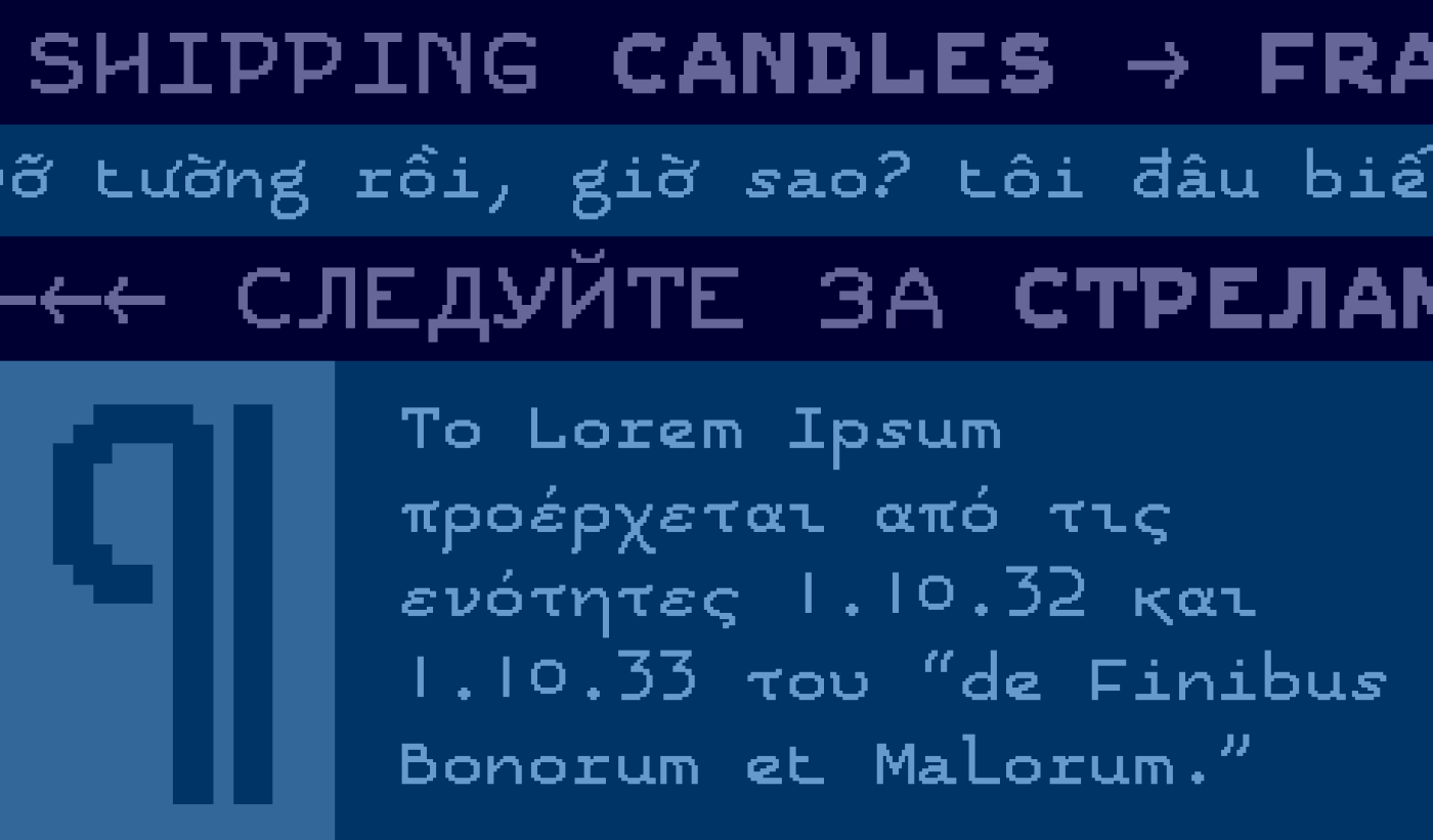




Hey! I started too, but you faster. So please clone my letters Ф Д д л и й Ы. Also change uc У with lc у, i think it not necessary to make it different from latin y
»