I regret having to draw out this argument, but you clearly
haven’t understood what I said. Can you please read carefully? I’m
not arguing about what you think I’m arguing about. It’s
@TH3_C0N-MAN: Your argument - although very detailed - doesn't
hold much water. Saying "art is subjective" and "the intentions of
the designer" are lame attempts
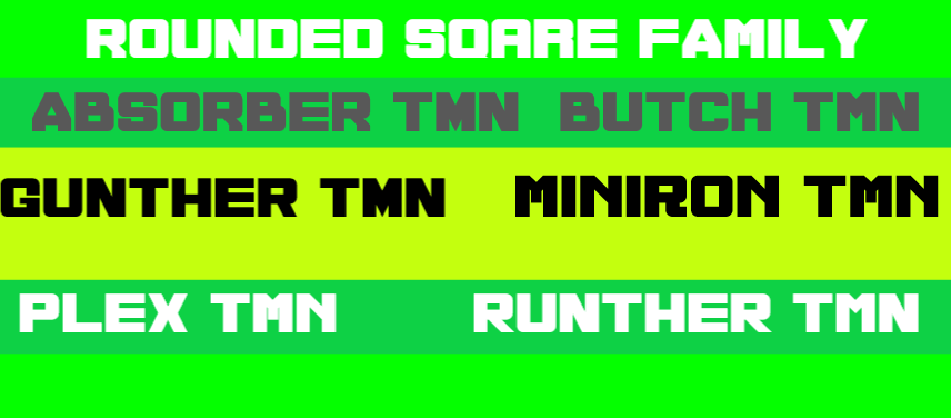
Letter A is Based On lambda 'Λ', Letter E is Based On Xi 'Ξ' Letter F is Also Based On Xi 'Ξ' but With 2 Lines Instad of 3, the third line is the hold the left side of the 2nd line.
Surely you are aware that art is subjective. You didn’t know the
intentions of the designer. You assumed they wanted to achieve
a technically accurate projection. Why? Even
cool font, in fact, i am ALSO recreating it for myself, and for the public. I will combine your font and Bluzdadude's font together. BUT, i am not finished yet.
Thank you all for the comments I am getting on this font. Constructive criticism is welcome. I know I am not a great font creator and I never compare myself to others. I will work on what has been shown to me.
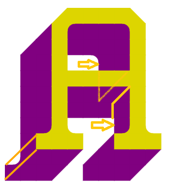
Earlier today, I noticed small defects in this work (magenta circles). Only a few glyphs were affected. See the corrected version in the Preview window.
@Peter (Petruuccio): Thank you for helping me out. I was ready
to illustrate what was wrong with the 3D effect, but you did it
sooner. Google says it's an oblique
I was reacting to the second sentence of both of you. The font
as is, does not look "perfectly fine" to me. While it may be
intentionally inconsistent,