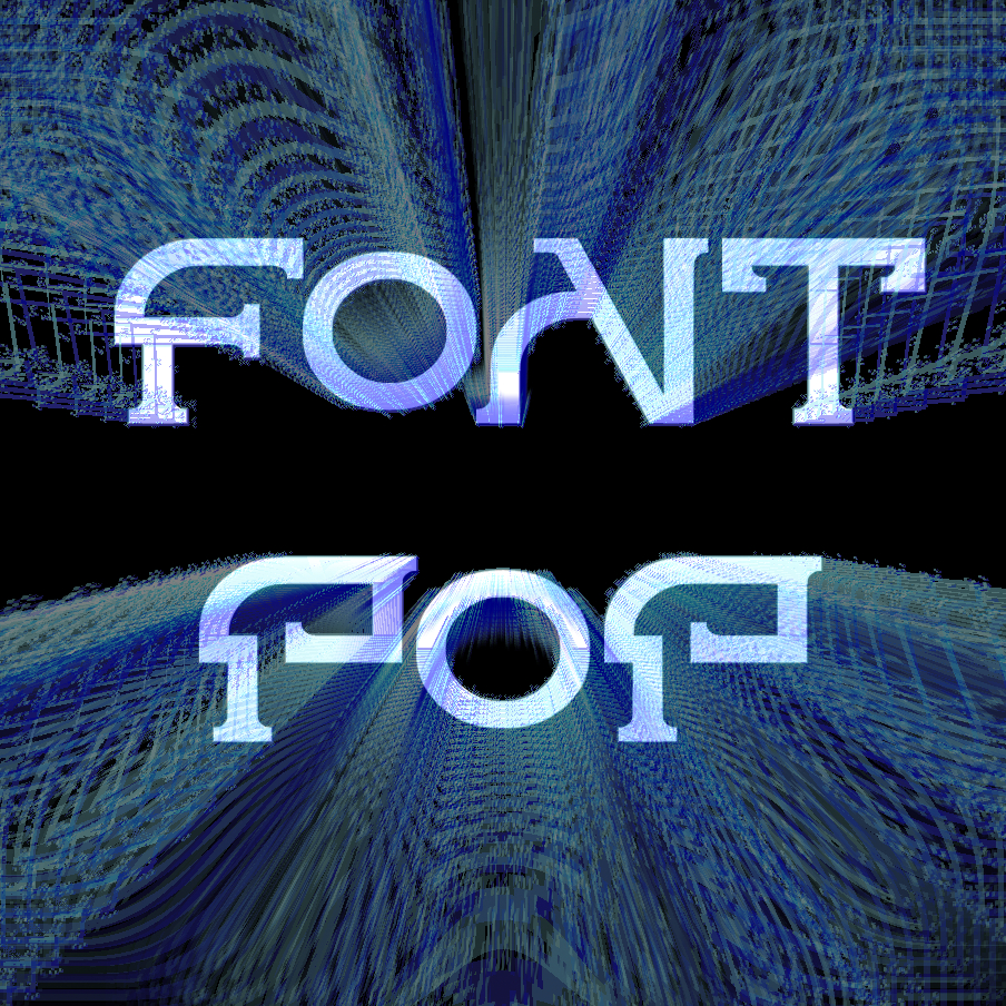
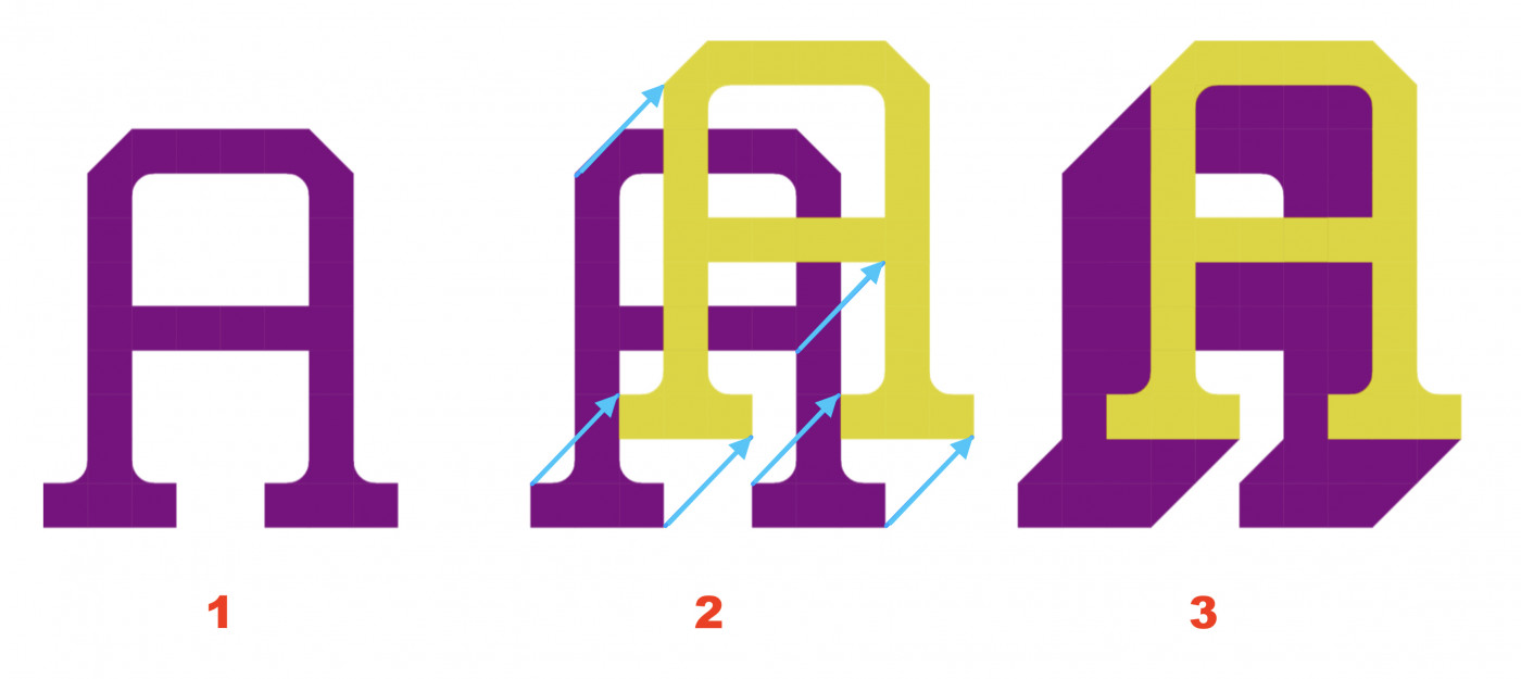
Without intending to delve deeper into the controversy, and simply in case it is useful to the author, this is how I think the shadows of this font should appear.
@TH3_C0N-MAN those tiny flicks were actually just because of the
limitations of the grid, and it wasn't intentional! initially i
thought those were flaws and i was like "whatever no one would
notice" but now i'm starting to like them actually
@thalamic: Thank you for joining. This is an open and public
discussion; there is no need for apology. You've made a very good
point by separating the two
My humble opinion is that typeface design is an interesting
convergence of art and design. It must visually take a stance and
perform the task as well.
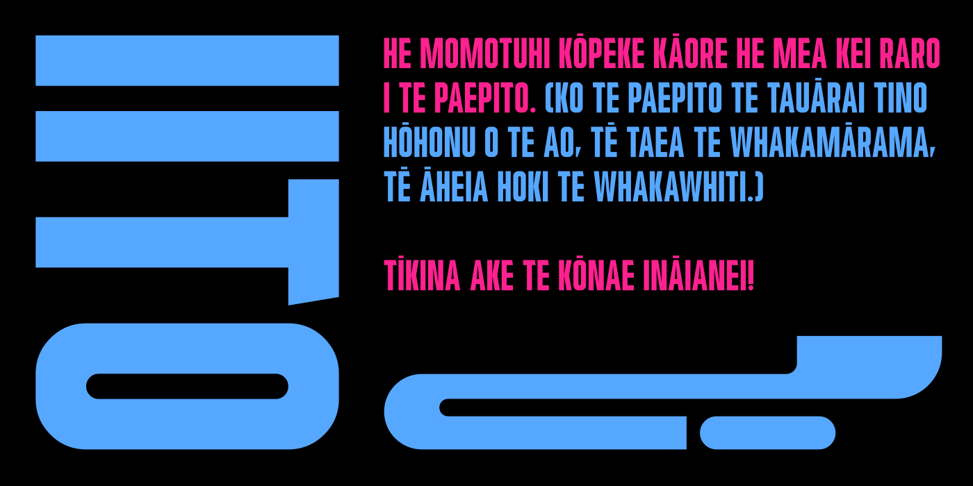
I really like this! This is a great usecase for compound diagonals. I especially like the tiny flicks on A, K, S, T, V, W, and X. I wonder if they were a natural product of the limitations of the grid, or if they were envisioned.
I’m relieved to hear you enjoyed it. I worried that I was
irritating you. When people see paragraphs, they usually get
emotional and shut off their ability
@Frodo7: Starts in about 8 hours! For me, it's going to be like entering the gym for the first time in a year. But it is sure to be fun, so, less painful. ;-)
Correction: when I said "nonchalantly ignorant", I meant
oblivious. I just couldn't find the right word. Nobody
uses words like nonchalantly in a regular
conversation.
The 2026 Font Pop Type Design Club and Workshop starts today! So excited! Sponsored by Rod Cavazos of PsyOps, T26, and FontStruct sponsor Glyphs (details on Glyphsapp Events page).







.png)