how is the q an even length of bricks?????
@doddwell
Not pixel. It was my first FontStruct creation—started when I joined the site.
Yes, it is. It’s from a ghost account now owned by me. Seriously, @ctcg_.
@NewCurvenBig
Is this a clone?
Animals from Heaven
Nice, what about the dithered font of the logo? :-)
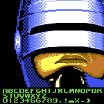
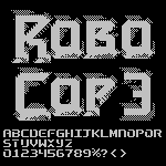
@Patrick H. Lauke (redux) - Very nice recreation. They almost had the logo '3' correct on the title screen. A few more angled tweeks and it would have been movie-accurate. ;^)
Sorry, you cheated on the ogoneks.
CLICK MA PROFILE PICTURE
ACCOUNT MOOOOOVED
Ah cool!!! Thanks!! I saw ur comment on my square script
two wrong (?) glyphs found! i will correct this
Yello ! Nice work on the square script !
If you want, i got the round script ready and working curently on the alterna one
Cool unique style.
Is almost look like a Pac-Man font, the N used for the Novo19 logo, and uppercase C is rotated.
the arabic diacritics look so awful... i’m redoing it later
Cool!
Just use a rot-13 converter...
What do you mean by ultimate?
This font is full of funky glyphs (G, S, W, Z, 2, 7, caron and circumflex), and I like it. Consider expanding unicode.
Reminds me of impact... Cool!
And by multiline, you mean Connect?
I don't live in the USA... but I live somewhere in Latin America that doesn't speak Spanish as an official language.
Higher quality pic (ignore the thingy at the right)









how is the q an even length of bricks?????
»