@elmoyenique: Very nice. It could be a Stylistic Alternate.
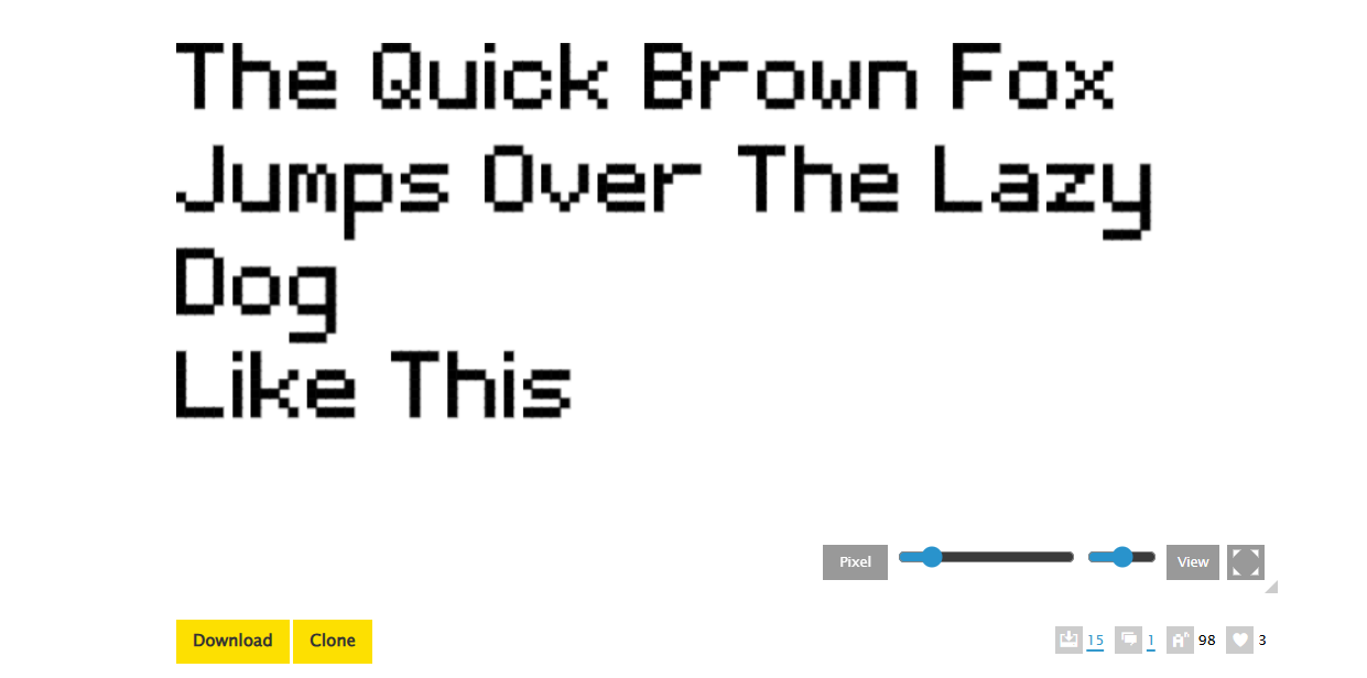
Again, your version is similar to the Q of Ortica Bold. I studied a
few similar low-poly fonts
@Bryndan W. Meyerholt (BWM): Thank you. I'll probably keep both
(number 4s), one for Alternate, as you said. I have another
workshop file for discarded versions of other glyphs.






Love it
»