


Introducing Sets
News | Rob Meek (meek) | November 2nd, 2017
Dear FontStructors,
How’s your typographic mood?
Looking to head West perhaps? Keen to explore the 1920s, the 1990s or the dark ages? Feeling dotty or groovy or dark? We have something for every temper and whim …
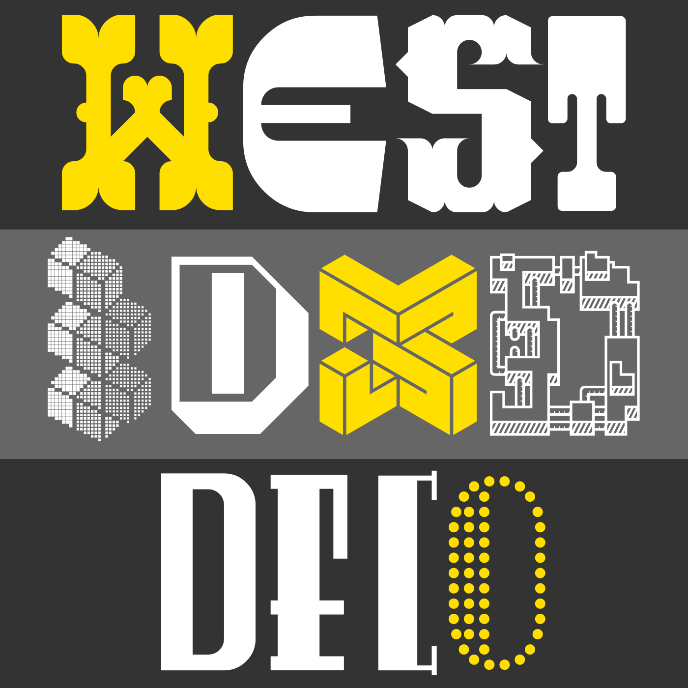
Today we’re launching a new kind of gallery feature called FontStruct Sets.
The first sets to be released include: “Wild West”, “3D”, “Art Deco”, “Dotted”, “Dot Matrix”, “Groovy”, “Grunge”, “Heavy”, “Lineal” and “Handwritten”
As our unique archive of modular creativity grows, we need to find new ways to curate it, so that we, and visitors to our site, can find the kind of fonts we’re looking for more easily.
Our broad categories (sans, serif etc) are a useful filter, as are the community-created tags, and of course the recently revamped search box; but as time has gone on we’ve noticed clear sets of related FontStructions emerging in the gallery which, until now, haven’t been adequately organised.
Sets are more specific than categories, and, because they’re manually curated by FontStruct staff, they’re more consistent than tags and search results. Until now we’ve prepared about 80 sets, and we’ll be gradually extending and releasing them over the next few months.
Sets are accessible via the little turquoise tags which appear next to the relevant FontStruction in the gallery.
Happy Exploration and FontStructing!
Stop Press: FontStruct would like to welcome and thank our new sponsor: Creative Fabrica – your number #1 source for premium design elements.
A great step toward making it easier to find the kind of fontstructions you’re looking for! The turquoise tags look amazing :-) Thanks once again for your constant improvements to the site, and thanks to Creative Fabrica for partnering with FS!
(As an aside, I noticed fs dot serif was placed in the Dot Matrix set, perhaps by accident? It’s not nearly as matrix-based as the other fontstructions in that set.)
– ETHproductions — November 2, 2017 #
Thanks @Eth. You’re right about fs dot serif – I’ve taken it out of that set.
– Rob Meek (meek) — November 2, 2017 #
That will help to give more search results, specially useful to find fonts with less ‘common’ tags. There are many wonderful novel unusual designs slipping through the search or drowning in a category.
– Aeolien — November 3, 2017 #
This is a great innovation. And a lot of work for those who will add fonts to the new categories. Neural networks, where are you when we need you? XD
Thanks to the new sponsor for any possible development.
– Sychoff — November 3, 2017 #
Great Work :) Love this website <3
– softhunterdevil — November 4, 2017 #
Will there be a list of all ‘key words’ to consult (in the FAQ or general info page) ? Will fonts belong to 2 or more sets? Like “45 italic” by blumon which is a left italic and a joined-up script and a broadnib calligraphic style.
– nightpegasus — November 7, 2017 #
@nightpegasus – there may well be a sets page where you get an overview of all sets.
Fonts can belong to multiple sets and some do already. Overall there is still going to be plenty of subjectivity in the compilation of sets – the key is that there should be more consistency in the subjective choices.
– Rob Meek (meek) — November 7, 2017 #
Yes, what a great feature! I’m especially liking the “26 Glyph Wonder” set :)
– architaraz — November 27, 2017 #