They've actually used two different 1s and I noticed a different G as well. I plan to do a couple of updates. The OTF file should work. I'm not where I can test it right now, but I'll see if I can figure out what's going on.
Style is really uniformed but the lower-case "x" is too thick. The tail on "Q" is too thick as well, although that doesn't stand out as much as the "x". Good job.
The current workaround I have seen is that users can either place alternate glyphs in other character slots of a different glyph. Otherwise, like what I have done, is to create a whole new font file
@TypoMan Foundry: Stylistic alternates let a single letter have
different design options. For example, the letter “a” can also
appear as a single-storey version (“ɑ”) that users can choose to
use instead. This feature is available in other font editors, but
FontStruct currently does not support it, as
I understand someone has already suggested this, but was wondering if the inclusion of stylistic sets and other alternates (i.e. lining/proportional/tabular/oldstyle figures, discretionary ligatures) are still on the table?
The OTF download has a bug regarding the em square size: It's 1000, but the glyphs are 2000 tall. Also, it messes up the position of some glyphs if side bearings are not zero.


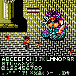
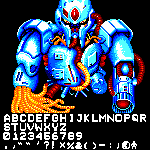


i approve
»