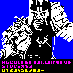
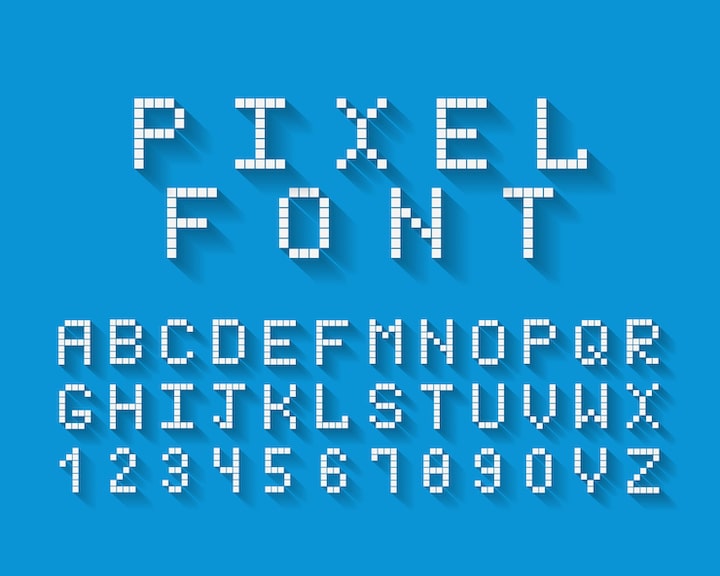
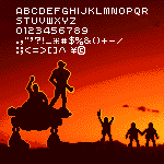
@Patrick H. Lauke (redux) - Odd choice for the M/m to be 8 pixels wide. It could have been 7 to match the T/t and Y/y, with the right side being only 1 pixel wide like other letters instead of 2 pixels...
Buttery Speakmeal (Pieza_Bot_2025) - Because Minecraft came out 16 years AFTER this game (2009 versus 1993), it's more accurate to say Minecraft looks like THIS text font. ;^)








Tip:enlarge your letter for better quality
»