And the internal counters for glyphs like "b"/"d"/"e"/etc. are a bit small, IMHO. Also, the base of the "T" should be "rounded" like other characters ("I" or "F", e.g.). Otherwise, I like these types of fonts. Go for it!
@Mythhand: @Peter (Petruuccio) is right. Here you are more info. Btw, my filter ratio here was 2:2, but it works the same way. Anyway, if you need me to be more specific about any of them, just ask.
You can make them as composites that have some dummy brick in the corners to set the ratio when creating them, and then remove the dummy bricks from composite by shift+clicking then and clicking on unvonted parts.
@thalamic: Wow, dear Master! Your words are like a spring rain to me, you know I appreciate them so much. I'm so flattered by such super-positive comments. Thank you again!


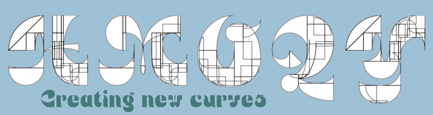


mockalith has no info? then what do you call this? The Mockalith Script: view language - ConWorkShop
»