@tortoiseshell & @Peter (Petruuccio): Thank you so much for your kind words and support! Glad you like this multi-curve font. It's hard to achieve
Wow...
Pretty one, I like it 10/10. I just somehow feel like dejavu, cant remember where or whether I have seen similar digits.
Cool font!
Congratulations to the instant pick
Very nice, I had to make me a clone right away :-)
Gente sou eu o criador,tô na minha 2 conta. Meu celular tá carregando, não posso fazer nada
It's so cute! I had never thought of it like this...
(This sentence uses Google Translate. There may be some mistranslation. Sorry!)
Original text:とてもかわいいです!この発想はありませんでした…
theres absolutely no info about mockalith script
i read tehe comment above with a i.i. nickel voice
you are genuineely underated
Mistakes happen...
HOLY SHIT BRO THIS IS AMAZING, Verdalon approves you
This font is pretty nice. Kind of reminds me of the same method that was used to make this font.
i guess this is the official full segment map for this font
Quite a truly excellent font~
Love the unicase look!
Forgive me. I've already corrected number 7 and improved it a bit. Thanks for the observation.
Trash dot at 7
@meek: Thank you very much, dear Boss!
@Frodo7: You makes me blush, querido Maestro. Thanks from the heart!
@Mythhand & @Yautja & JeycoMonge: Thanks a million, pals!
orange "U" is mine :D
@Dante (Dantemwalt) - This looks like a very interesting project.
Very your work hard making fonts here, keep on Elmo, you improved a lot! ❤️ 10/10 I see your oldest fonts here, are very good! Keep creating.
Oh yeah, I remembered that
Amazing work!
awesomee next u should make one inspired by kurokane :D
my first thought after seeing the [G] was the gotham font
Aren't the glyphs connected to each other? Just saying.
Stupid sample
Elmo has ascended to a higher plane
This font excels on so many levels. It feels organic, mimics the tradition of handwriting, and radiates genuine happiness. Your style and technique should be taught to young aspiring fontstructors. 10/10
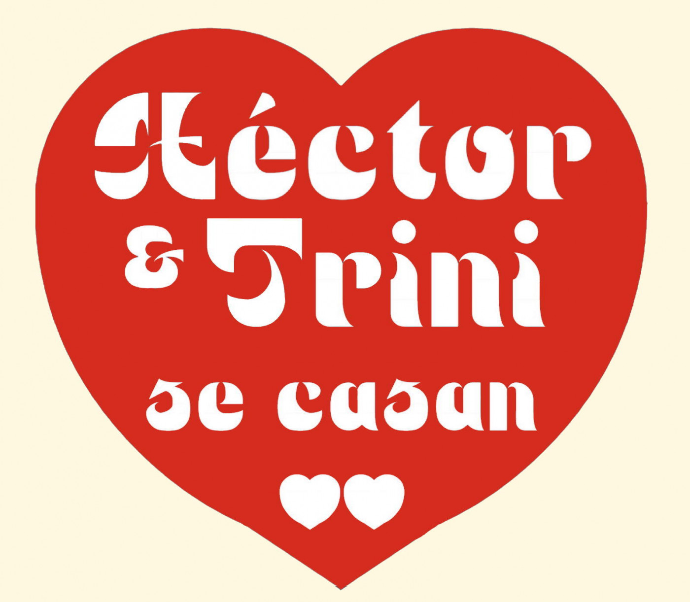
Not finisheŕd font (kern in progress). An extra "Q" has been added in place of the "©" glyph, and a nice heart symbol appears also at the "™" one. I'll fine-tune some details ASAP, I promise.
Thanks, everyone!
cool
Just a lil tester of the font at it's current state





@tortoiseshell & @Peter (Petruuccio): Thank you so much for your kind words and support! Glad you like this multi-curve font. It's hard to achieve
… more