@Frodo7 @Goatmeal, I tried fixing the angles of the M in my State font. I can clearly see the difference using the tutorial that was provided. I am very happy with the result.
@Frodo7 I always wondered why the angels were too thin or too
thick. I thought it was because of the bricks themselves and
how they are placed. Before constructing a new font, I use a
graph composition book to
Dear FontStructors. To counteract spam and other unfontstructive behaviour, we will be experimenting with comment moderation over the next few days. New users, please check out our commenting guidelines.
@Chris Burgess (maneman): You are an old-timer at FontStruct,
and remember, we used to help each other. I wanted to help you with
this project. I saw potential in it.
There is a second issue with the letters: the diagonal parts are
too thick (M, N, V, W) or too thin (X, Y, 4, 7). This problem was
solved many years ago. You may clone
@Th3_C0n-Man It trims off the decimals for individual brick scaling (sx and sy) from experience (clipboard manipulation for now, but having it added it as a feature would expand the range of possible slopes)
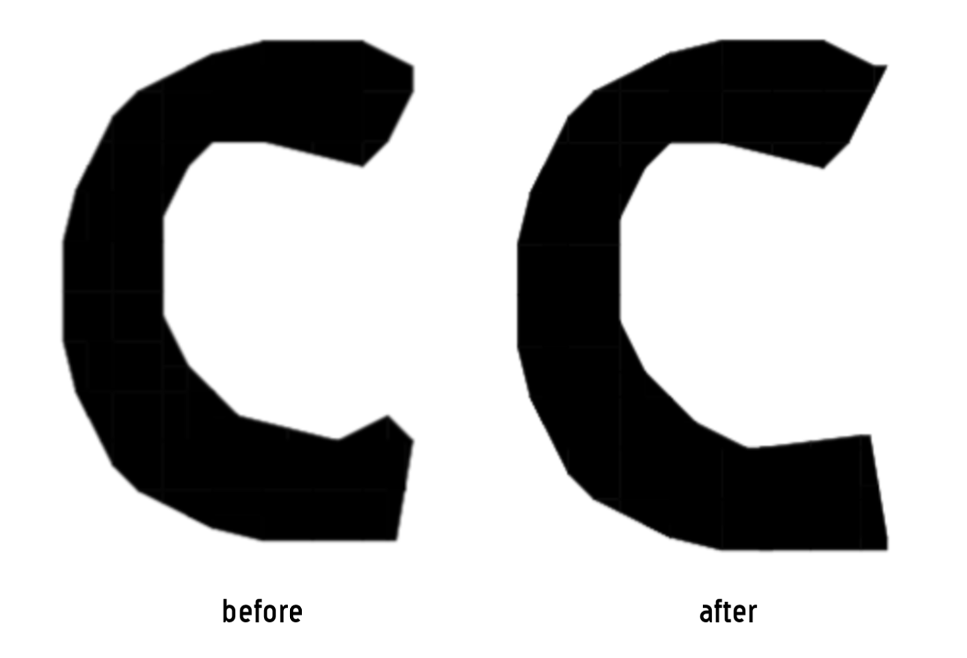
I really like this! It feels like C and G would look more in tune with the rest of the letterforms if they had a sharper upper tip (and in the case of C, maybe a lower tip of the same kind as the one on Q?). I dig the style a lot, good job!











@Chris Burgess (maneman) - I am happy that you are happy! Glad to have helped. :^)
»