not one but two others. all 3 with same number of glyphs. I dont mind, have as many you like, but keep them for your self and do not spam publishing them with zero added value.
Sorry for late comment, but this looks very good. Very pretty!
What if it's useful to draw irl? 🤔
you already have a clone of this font.
i fixed them
tweaked the incorrect "#"
Ur font is messed up because the spacing
oh i thouhgt that it was for the pronunciation of "inline" not "inlijn"
isn't dʒ for the letter "Y" sound in english?
the [©®Ææ] characters should be reshaped to fit in a 5 pixel width
the entire font got deleted lol


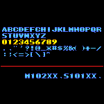


not one but two others. all 3 with same number of glyphs. I dont mind, have as many you like, but keep them for your self and do not spam publishing them with zero added value.
»