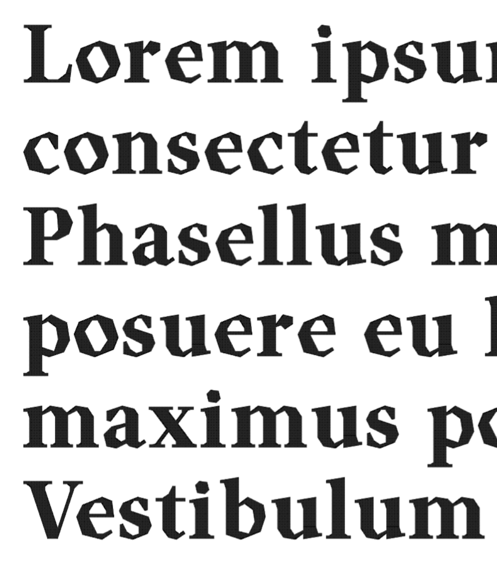
I don't know how to put it, but I'm not entirely convinced by
the letters with large curves here (C, D, G, O, c, e, p, q...). I
can understand that this might be the defining characteristic of
the font, but it just doesn't quite work for me. I tried a
similar
It's been a while since I've seen someone try to work with the
editor rather than against it. (Then again, I haven't been
around much as of late, so I probably




Rules are made to be broken.
»