


Inline Competition Results
News | Rob Meek (meek) | February 18th, 2014
Another fantastic competition is over, and the FontStructing community has once more surpassed itself in energy and invention.
Congratulations to everyone who took part. I hope it was as much fun to participate as it was to watch.
Judging was a pleasure, but also a painful process since we can only have three winners. Here they are.
The Prizewinners
1) fs lost by EthProductions
This was a clear winner for all judges, and also the “people’s favourite” as chosen by the community.

“[this was] my favorite … on all levels: creativity, execution, usability, and that x-factor: pure delight.” wrote Stephen Coles, while Paul Bokslag went into more detail:
There have been other maze-based fontstructions, such as zlabyrinths eYe/FS by elmoyenique and Mazey by lldaddy, but in fs lost ETHproductions has not only made a set of beautiful and interesting glyphs, reminiscent of seventies multiline fonts, he has also managed to create a very useable font for puzzle sections of magazines, newspapers and themed publications. Each glyph connects to the next, making it possible for editors to instantly generate unique customised mazes, every word being a new challenge.
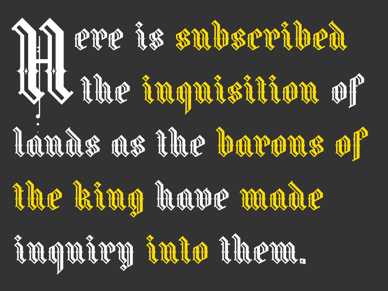
Exquisite and coherent attention to detail attracted the judges to this gothic gem. Stephen Coles wrote:
I’ve seen a lot of Blackletter on FontStruct because the angled bricks are so well-suited for Fraktur construction, but Fraline is one of the few beauties that takes the suitability of the tool to another level.
3) NCD Deconium SC Black Serif Inlines by djnippa

djnippa strikes a perfect jazz-age chord in this glimpse of a larger family. Stephen Coles wrote:
This is an excellent example of a historical typographic style (the Art Deco shaded inline) that is ideal for the FontStruct environment. Nothing is too forced here, and I like that.
Congratulations to all three prizewinners! They will be contacted about their prizes shortly.
Honorable Mentions
All the judges had very long shortlists and well over 20 other FontStructions were pushing hard for a place in the top 3. There will be many inline top picks in the coming weeks.
All the judges praised db TwoLines by beate. Paul Bokslag wrote:
The inline in this font is certainly not an afterthought that simply follows the shape of the glyph. Letterform and inline are two separate voices, each singing their own individual melody, but in perfect harmony with each other. This synthesis and the script-like character of the inline that connects certain glyphs, give this font a playful dynamic unlike any other and the samples illustrate that really well.
G1 Explo by geneus1, ztainless eye/FS by elmoyenique, RM Celtic Inline by p2pnut and AT Steglo by architaraz also all featured prominently in the judges’ feedback. Here is a collective showing of some of the judges’ favorites:

You can also download a printable version here.
The Judges
Stephen Coles is an honorary FontStruct staff member, writer, typographer. Editor of Fonts In Use, Typographica, and The Mid-Century Modernist. He lives in Oakland & Berlin.
Paul Bokslag is a Dutch-born artist living and working in Ireland. He specializes in papercuts and you can learn more about his fascinating work, including his use of FontStructions, on his website: paulbokslag.com. Paul is also known as the fontstructor four.
Rob Meek designs, develops and runs FontStruct. He is also the lead developer for Fonts In Use.
What Now?
I’m looking forward to the next competition already. As always, theme suggestions in the comments are welcome.
Congratulations to all winners and all mentioned!
– opipik — February 18, 2014 #
And all not mentioned!
– Rob Meek (meek) — February 18, 2014 #
Thanks!(because I was between the not mentioned)
– opipik — February 18, 2014 #
Hearty congratulations to EthProductions, Upixel and djnippa – worthy winners in a high quality contest.
– p2pnut — February 18, 2014 #
I should have taken my time, with FS InTown. Sloppy quality = less winworthy.
– Noahvbro — February 18, 2014 #
Congrats from me as well. All well deserved!
– laynecom — February 18, 2014 #
Congratulations! I had a feeling about Lost and Fraline, but wasn’t quite sure which one would be the 3rd. Congratulations, djnippa, hope to see you more frequently here :)
Thanks organizers for yet another interesting competition and for the honorable mention!
Suggestion to make a new poster, a new-era-poster of sorts, with the works of Four, Yautja, ETHproductions, Cablecomputer, Demonics, Time.Piece, Nal, Macossin, Minidonut, Opipik etc.
And some new t-shirts would be nice, or maybe even make a competition for fontstruct t-shirt design.
– architaraz — February 18, 2014 #
Wow thank you very much, It’s a big surprise for me because there was a lot of great inline fonts in this competition.
Congrats to everybody, participatin is more important thant winning.
I’m really happy. thank to this competition, otherwise I never had accomplish this blackletter the way it is design now. The inline comp force me to make my stem wider than my first draft and at the end of the process came out at my satisfaction.
this winning put pression on me to finish my numbers in Fraline :)
– Upixel — February 18, 2014 #
I don’t have words to describe what I’m feeling right now…. Thank you all very much! Congratulations to the other winners, and to everyone who participated!
– ETHproductions — February 18, 2014 #
Congrats to EthProductions and Upixel, you were both my favs along with beate, Frodo & layncom (folds) entry.
I’m shocked I got 3rd. I really thought that some of the others were much better. But I am very self critical, so it’s all good.
I did notice that a few of the participants (who shall remain nameless) didn’t actually add ANY FAVS, which is a shame, and it’s a bit unsporting. It’s their choice, but everyone’s vote is important. Let’s hope they change that for the next comp, which I’m really looking forward to. :)
– djnippa — February 18, 2014 #
Congrats to the winners, ETH, Upixel and djnippa!!! You’re the best, compañeros! And beate too. Congrats also to the rest! It was a pleasure to me participate in this amazing comp.
PS: I’m with architaraz about the new-era-poster suggestion.
– elmoyenique — February 18, 2014 #
YAY to all the winners!!. I’m just thrilled to be an honorable mention!
– time.peace — February 18, 2014 #
Excuse me, but I can’t view or donwload the images of this post (they appears to me like corrupted, incompletes……) Is this a problem of my computer or is more than this?
– elmoyenique — February 18, 2014 #
All my congrats to EthProductions, Upixel and djnippa ! Chapeau !
It was a great and fascinating competition with many genious contributions. My respect goes to the jury as they had the tough job to choose.
A big thank you also to the jury for the honorable mention; Paul many thanks for your wonderful statement regarding db TwoLines.
db
– beate — February 18, 2014 #
All OK, I’m I.
– elmoyenique — February 18, 2014 #
Aw, helllll no! Aye, if I don’t win, the FontStruct competition loses credibility.
Yo, Eth, I’m really happy for you, I’mma let you finish, but beate has one of the best fonts of all time. One of the best fonts of all time!
Just kidding of course. Wouldn’t that be something if I really meant these things. I just felt I had to equalize all of the positive comments with actual egotistical fontified rants from a rapper that shall remain nameless. One of the things I love about FS is how supportive everyone is of everyone. I applaud the FS community.
Congrats to all winners, and all contest entrants. Thank you Meek for the opportunity to uncage some of my creations. Judges: I do not envy your job. Eth: Your entry is a mature evolution of the labyrinthian work on FS with great design and functionality. Upixel: I was surprised this work came from you. Your first blackletter and my favorite of your library. You had me at “F.” DJ: The only thing transcending your gorgeous fonts are your gorgeous samples. You’ve really outdone yourself.
Bravo! Thanks for the honorable mention. It was great to be a part of the excitement.
gb
– geneus1 — February 18, 2014 #
Congratulations to the three winners, those with honourable mentions and all other participants for continuing to be such an inspiring and supportive community and for contributing to this outstanding collection of sixty inline fonts. It was an enjoyable experience to watch from the sideline and to follow the fonts and comments being added over the weeks.
– four — February 19, 2014 #
Congratulations to the winners: EthProductions, Upixel, and djnippa. Well deserved victory to you all. Out of the three I’ve got only Fraline right to select as MY FAVE. I’ve selected djnippa’s other entry, NCD Absolution Inline instead, and I won’t change it, because I like that font so much. The success of fs lost came as a little surprise to me, as I thought the judges might not consider its true value after having seen two other fontstructions of the labyrinth theme.
Congratulations to all those with honourable mentions: beate, geneus1, elmoyenique, p2pnut, and architaraz. It is a great recognition to your high quality designs. I might add, you’ve kept amaze us with excellent works for a long time. Well done.
Congratulations to all participants of this competition. To you I would tell the following: there is not much honour to compete with weak contestants, and poor designs. In this respect, this competition was quite the opposite. It was very strong from the start with entries of high standards (e.g. the early submissions of beate and architaraz). Therefore, it was a great honour to all of us to be part of this competition, no matter how small part.
Finally, I would like to thank Rob Meek and the other organizers, as well as the judges, for their work. It must have been a difficult task, for so many good works have been submitted this time.
Thank you.
– Frodo7 — February 19, 2014 #
Wow. Congrats to all winners and all participants. It was a great comp with great entries. And it was tough to pick 3 among them. Happy to be a part of this comp. Thanks!
– naveenchandru — February 19, 2014 #
Dear InlineComp jury:
Sorry!
I’m speachless! I beg your pardon about my bad manners here. Thank you veeeery much for consider my little font ztainless eYe/FS able for an Honorable Mention in this comp! I’m veeeery grateful, and I’m hopping waiting for the next comp. These things put new blood here at FS, IMHO! Thanks a million!
– elmoyenique — February 19, 2014 #
Great Competition, Congrats to everyone! :)
I’m not very good in making many words, so thank you Fontstruct, you’re so much more than a website.
– kix — February 20, 2014 #
Wow. Such a great competition! I learned many from here. Good job everybody.
Congrats to all the prizewinners and honorable-mentioners! You’ve done a great job. Unfortunately, I didn’t have a chance to submit any of my must-be-submitted submission. I went for a vacation on the last days and when I got back to open my lovely desktop computer this words had shown up:
(Something like this:)
“The competition has over. You can not enter any entries ANYMORE. This competition has a record of number of FontStruction submitted. Judges will have a hard time. The result would appear on February, 18th 2013.”
Lol, I’m still waiting for the next competition.
Anyway, good job everybody, I applaud the FS community :)
– cablecomputer — February 20, 2014 #
Congrats everyone! Great competition again.
And I’m with architaraz, would be nice to see new designs in the shop.
– Yautja — February 20, 2014 #
I have an idea for the next theme- an era of history. For instance, Western style or Middle Ages style. And not all Middle Ages fonts would have to be blackletter, because I think that other kinds- for instance some serif fonts- can evoke the Middle Ages.
– Cohnisgone — February 22, 2014 #
Text-face competition with this grand prize.
– will.i.ૐ — February 22, 2014 #
Congratulations to all the winners, awesome work!
– SymbioticDesign — February 24, 2014 #
Congratulations to all the well-deserved winners. You guys truly represent the best of what Fontstruct stands for and can ACHIEVE. Once again Mr Meek and staff put together a great competition that brought out the best in us–they deserve a big THANKS! And much thanks for the honorable mention. To my fellow participating Fontstructers, I wish you continued success. I hope you days are filled with bricks and you continue to build your dreams.
– funk_king — February 25, 2014 #