Posts from Rob Meek (meek)
First up, don’t forget to get your entries in for the competition! You’ve got just under four days left.
We made some very small changes to the site today.
Firstly there is a new version of the FontStructor. There are a lot of technical changes under the hood, in preparation for future enhancements, but don’t get too excited, there are no new features in this version. A few minor bugs should be fixed though. In particular, an annoying issue where the FontStructor insisted that you had unsaved changes when in fact you didn’t should no longer occur.
There is also one tiny change to the preview widget. You can now look at fonts at multiple pixel resolutions. Click on the “PXL” button to go to pixel resolution, then shift-click to zoom x 2. Click again to zoom x 2 again etc. You can also alt-shift-click to get smaller (zoom x 0.5). You can use the same technique to zoom out further than was previously possible – useful for getting an overview of some of those giant FontStructions.
That’s about it.
As always if there are any problems with the changes, please let us know.
Sunday is Valentine’s day. Time to finally declare your love to that special someone dearest to your heart. But why wait two days? With the new “Favorites” feature on FontStruct, you can now easily start right now, sharing your affection for the work of fellow FontStructors.
Favorites, along with an improved and extended tagging system, are a core feature of today’s site update, which we think will really help you to organize and access your own work, and that of other designers, more easily.
People have been asking for these new features since the early days of FontStruct, and as the gallery has sprawled over countless pages, and individual FontStructors have found themselves working on hundreds of designs, there’s been an obvious need for new ways to organize and navigate through work on the site.
Favorites
You can now bookmark any shared FontStruction (other than your own) by clicking on the “Add Fave” icons which you can see all over the site.

All of your Favorites can be browsed on your My FontStruct page under the “Favorites” tab:
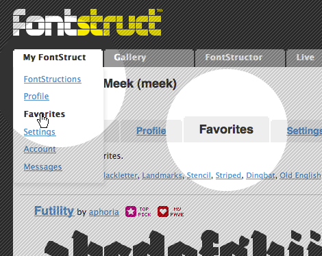
You can also browse other people’s favorites when you visit their FontStruct homepages.
Favorites can be used to collect and organize any FontStructions which you find interesting, or to collect designs for specific projects and purposes. Favorites will also function as a new way of sorting FontStructions in the gallery – with a new “Favorite Count” sort order. Next to every FontStruction in the gallery you will see a heart icon, indicating the number of users who have “Favoritized” that design.
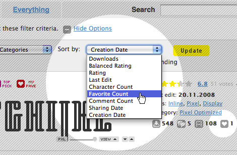
Not all love is eternal of course. Just click on the Favorite icon again to drop a favorite:

Tagging Favorites
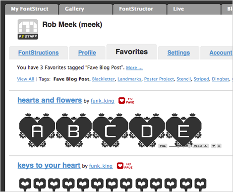
You can now also tag other people’s work by tagging your Favorites. You can do this either on the respective FontStruction homepages, or on your Favorites pages under MyFontStruct:
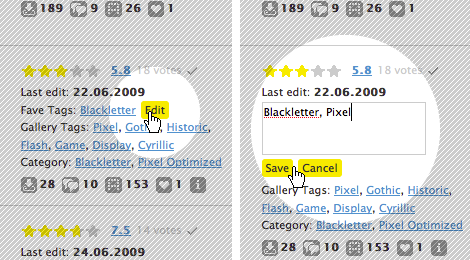
At the top of your Favorites pages you can access and browse all of your favorite tags.
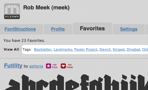
You can use these Favorite Tags to collect and group, for example, your favorite FontStruct pixel fonts, or your favorite western-style fonts, whatever you like. Or, if you’re interested in using a FontStruction for a specific project, you can use a favorite tag to collect some candidates:
Enhanced tagging of your own work
As well as adding Favorites and the ability to tag them, we’ve enhanced the way that existing gallery tags work. Gallery tags are the tags which FontStructors apply to their own designs and which have always been visible on the gallery pages.
Designers going to their MyFontStruct page will now see an overview of all of their gallery tags at the top of their FontStruction listings:

If you click on any tag on your My FontStruct > FontStructions pages you will see only the work which you have tagged in this way. For those of you with hundreds of designs this should make it a lot easier to organize and navigate through them. Other users visiting your user homepage will also be able to use these user-specific tags to browse your work. If you click on the “View all FontStructions tagged with …” link you will be taken to the gallery and see all work tagged with the same tag.
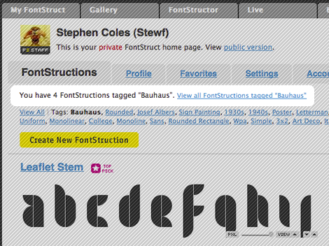
You can use tags to organize your work into families of related fonts accessible via a single, unique and human-friendly URL such as “http://fontstruct.com/fontstructors/funk_king/tags/Track”

As with Favorites, you don’t need to go to the individual FontStruction page in order to add tags, you can now tag your work directly in your MyFontStruct > FontStruction listing pages.
Private Tagging
Your Favorites and your Favorite Tags are all visible to all FontStruct users. Tags which you apply to your own work are also visible to others with one exception: Any tags applied by you only to your own private FontStructions will also be visible only to you. So private tagging of your own private work is possible.
Known Issues
When trying out the feature we noticed that some FontStructors had already used a huge number of tags.The truly inimitable funk_king for example has almost 1000 tags already. This is wonderful, but it also means we will have to add some way of navigating through such very long lists of tags. Until then, you can create as many tags as you want but only the first 1024 will be appear at the top of your MyFontStruct/FontStructions pages. The tags are sorted according to how often they have been applied, so the most common tags should appear first.
Adieu Pink Dot
The most important and controversial change of all today! The old magenta “TOP PICK” sticker has been retired to a comfortable folder far away, to make way for a new star icon. The old girl had been through a lot, and deserves a rest from her many brick-bearing suitors. The new TOP PICK star is a bit more compact and should work better together with other icons such as the new favorite icons and future additions.
Other Changes
There are a number of other, smaller changes across the site:
There is now a comment form at the bottom of longer comment threads, so you don’t need to scroll back to the top of the thread if you want to say something.
Tag links in the gallery are now shorter, taking the form /gallery/tag/mytag, and clicking on them will really only show you FontStructions which have been tagged accordingly. (Until now clicking on a tag did a a search of tags, FontStruction names, designers, and FontStruction descriptions, which was slow and could produce confusing results).
There is a new category – “monospaced” which will show you all shared, monospaced FontStructions.
As always little bugs may appear when changes are made, so let us know in the comments or contact us if you notice anything wierd.
Enjoy!
Happy new year everyone. I think it’s going to be an exciting one for FontStruct.
Here are the latest stats, hot from a bulging database:
238,849 FontStructions
244,930 registered FontStructors
400,796 Downloads,
1,437,963 Glyphs
This vast and rambling edifice just keeps on growing. If you’re FontStructing, you’re part of a phenomenon.
As you may have noticed, a new, yet familiar hand has been at work at FontStruct over the last few weeks – selecting top picks, featuring exceptional FontStructions and tweeting like a man with a beak and feathers. We’re delighted to announce that designer and long-time FontStructor John Skelton AKA Afrojet joined the FontStruct staff at the start of the year.

He’ll be working with the FontStruct community, FontShop and myself to continue to improve FontStruct and to raise the profile of the project and your work. If you haven’t done so already I recommend reading Yves Peter’s fascinating interview with John over on the FontFeed. It was the first in the wonderful Focus on FontStructors series.
Afrojet will also be posting on this blog about what’s happening in and around FontStructia, so welcome to the far side of the bricks John, and watch this space!
We did some maintenance work on the servers today.
During the first year of FontStructing, as the bricks piled up, our servers buckled a few times under the load. This sometimes happened without warning and for days at a time, and caused some understandable annoyance. We’re doing a lot of work at the moment to try and avoid this in the future. A large part of this work is now complete.
What’s changed? Hopefully nothing noticeable ;-) but let us know if you spot any glitches.
Download Problems
Many of you will have noticed problems with downloading more complex FontStructions recently. We’re aware of this and it is next on our list of things to work on.
Dear FontStructors,
We’ve updated the preview widget used on the gallery pages and elsewhere on the site:

(Above Example: “Penmanship” by “Thalamic” in the sample text mode.)
There are a number of new and improved features which we hope will help you to get a better overview of a FontStruction and to see how it works at different sizes.
Revised Menu
The preview widget now has a “VIEW” menu with three options:
- “All Letters” which is the default, displaying all characters within the FontStruction
- “Sample Text” which shows a standard sample text (for FontStructions with sufficient characters)
- “User Input” which turns the preview widget into a text entry field where you can try typing with the FontStruction
One-Click Pixel Preview
On the left there’s a “PXL” button which will give you a preview of your FontStruction at a one-brick-per-pixel resolution, whichever option you have chosen from the “VIEW” menu.
Interactive Zoom
Between the “PXL” button and the “VIEW” menu, there’s an interactive slider which you can use to view the FontStruction at a range of different sizes.
Vertical Scrolling
On the right, there are scroll buttons which you can use to scroll the text vertically line-by-line.
Larger Preview on FontStruction Homepages
On FontStruction home pages the widget is now taller and will usually show about four lines of letters. There is also an experimental feature: You can drag the bottom right-hand corner of the widget to resize it vertically.
Looking at FontStructions in the new widget is very revealing. The importance of setting an appropriate width for the space character quickly becomes clear. It’s also great to be able to see a more extensive character set more easily. Some designs which may have looked flawed or even dull as an “ABCDEF…” in the old sampler now reveal their true qualities more readily.
We’ve also simplified the embedded version of the widget. It doesn’t have a border anymore so it should be easier to integrate into the design of your blogs and webpages.
Please let us know what you think.
UPDATE: A few users have had problems with this latest upgrade to the FontStructor. The FontStructor doesn’t load properly and it is not possible to edit anything. The solution is to empty your browser cache and then reload the FontStructor page. Thanks to djnippa for pointing out a useful Google help page on how to empty your browser cache. Please get in touch if you have such problems and this solution does not help.
Keyboard shortcuts are now single keystrokes
Before we get to the new stuff, there’s been a change in the way the keyboard shortcuts work in the FontStructor editor. Until now, keyboard shortcuts where mostly in the form Ctrl-Key for Windows users and Shift-Key for Mac users. In some browsers like Internet Explorer they didn’t work at all. It would be nice to have standard keyboard shortcuts like those familiar from desktop software e.g. Ctrl or Cmd-C for copy, but this isn’t possible in many browsers, so we’ve decided to simply drop the extra “modifier” keys (Ctrl, Shift etc.).
Keyboard shortcuts are now single keystrokes e.g. “C” for copy, “V” for paste, “S” for save etc. Most of them haven’t changed, the extra modifier key has just been dropped, and most will continue to work even if you still use the modifier key. A few, like “V” to select the pointer tool have had to change (because of a conflict with “V” for paste). Here’s a full list of the updated keyboard shortcuts.
New Spacing Controls
If you just want to have fun with FontStruct and make a quick font, you can stop reading now. FontStruct is designed to be easy to use, and aims to hide away or simplify many of the things that can make creating a professional font complicated. FontStruct will space the letters you create automatically and add a space character for you.
If however you want more control and the automatic spacing isn’t good enough for your needs then read on.
We’ve added four new features related to control over the space between letters.
Global Spacing Control
First of all, you can now set a single value for the spacing between all letters in your FontStructions. You do this by going to Preview, then selecting “Spacing” from the “Advanced” dropdown menu. This brings up a new palette titled “Spacing”.

Simply drag the slider in this palette to set the spacing for your FontStruction. I think the control is intuitive but for those who want to know exactly what is going on, the numeric value is in grid squares and is added to the width of every letter which by default (see below) is one grid square wider than each drawn letter. A quick way to make all the letters in a font join together, e.g. for a script font, is to set the spacing to -1. Anyway, drag the slider and see.
Monospacing
Many people want to make monospaced FontStructions – font designs in which every letter has the same width, like Courier and other “Typewriter” fonts for example. You can set a single fixed width (monospacing) for every letter in your font by clicking on the “Mono” radio button in the “Spacing” palette and then adjusting the slider. Again the units are grid units. Sorry it’s taken so long fontcollector!
A Space Character
At last! An editable space character. Sometimes people want to actually draw something in the space character slot but many more will want to adjust the space character’s width. The width of the space character in downloaded FontStructions is determined by a formula which doesn’t always produce good results. Now you can set the width of the space and other letters manually using the final new feature:
Adjustable Letter Width

By default, there is an automatic 1-grid square space added to the width of each letter in FontStruct. Now you can set the width of each letter manually. Go to the “Advanced” Menu and choose “Show” and then “Letter Width”. This will make the width of the letter visible as a solid green line. Drag this line to set the width of the letter you are editing. If you want to go back to the default 1-grid square width, click on the little “R” icon to reset the guide and it will start adjusting automatically again. Note that there is a close relationship between the global spacing setting and the adjustable letter width. The global spacing setting value is basically added to the letter width.
There’s a new help page about all these new spacing control features.
Other Changes
Along with these changes, there have been a number of minor optimizations to the FontStructor. The performance of some of the tools and the Preview have been improved.
We’ve added eight new bricks to the FontStructor:

I know people have asked for others but these are the ones that have consistently been asked and argued for. We will add more bricks and brick functionality in a later update to FontStruct.
Building a fine FontStruction can be satisfying. Installing it and creating a sample image in your favorite layout software is exciting. But perhaps the greatest moment of all is when your FontStruction is set free from the monitor and finds its way into a real-world application. As FontStruct grows we are receiving more and more reports of FontStructions in use.
Three FontStructions on a huge LED Display
Last week the Technical University in Darmstadt, Germany revealed its “Welcome Platform”, a new, central forum and entrance point for students, staff, guests and the general public. A permanent part of the building is a huge LED-Display, almost 16 metres in length and on that display, three original FontStructions! They were designed by Daniel Schöps for Fuenfwerken Design AG You can see and read more on Fontblog, or if you’re German’s rusty, you can try a Google translation. View and download the FontStructions here. There are many great FontStructions inspired by LED and LCD display fonts, but it’s wonderful to see someone going the other way and designing an original one for a real client. Check out the hanging numerals.

Thanks to Jürgen Siebert from FontShop Germany for the tip and the blog post.
FontStructions you can pick up and hold
Other known examples of FontStructions in extra-digital use include Afrojet‘s wonderful Sawhorse beermats. Even the heraldic graphics are a dingbats FontStruction:

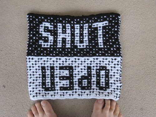
Then there’s Font Fairy‘s ingenious popup FontStruction “Solly PopTab” and the rubber stamps created for the Peecso Typographic project by nelloz. In the FontStruct Flickr Pool I even noticed a FontStruction being used as part of a knitting pattern:
Any more?
If you use (or spot) your own or another designer’s FontStruction in a print or otherwise non-screen-based project please upload a photo and let us know.
Dear FontStructors, We are adding a number of new features to the FontStruct website today.
Homepages
The first one is a homepage for every user. This is a public version of your MyFontStruct page with a list of your shared FontStructions, and some customizable information about yourself. When you click on a user’s name in the gallery or elsewhere, you will now be taken to this page. This is a much better and more reliable option than the page of search results which you currently see.

So now you have your own unique FontStruct internet address (http://fontstruct.com/fontstructors/yourusername) which you can use anywhere and everywhere as a reliable reference to your work on FontStruct.
As well as a listing of your FontStructions, the homepage also includes a ‘Profile’ page which by default shows some information about your participation in FontStruct. You can also place your own URL on this page to promote your private website, your business or another project, and there’s an option to display some additional information about yourself if you wish.
With the number of FontStructions in the gallery growing daily we hope that new features like this will help in allowing your work to stand out from the crowd.
Of course there are RSS news feeds for each user’s homepage. By subscribing to these feeds you can easily keep up to date with your favourite designers’ work.
Messaging
Registered users can now send short private text-only messages to other users. Many users have asked for such a feature which may be familiar from other social networking websites.
Some reasons people have given when requesting a feature like this are:
- To ask a designer whether their FontStruction can be used commercially.
- To contact designers because they are interested in working with them.
- To collaborate with other users on a FontStruction project.
To send a message to another FontStructor, go to their homepage (e.g. by clicking on their name next to one of their FontStructions) and click on the contact button next to their avatar. Then fill out the form to send the message.

You can configure the messaging system to suit your needs. For example, you can opt out of the system completely, or you can choose not to receive email notifications when messages arrive. Their is also a spam reporting mechanism which, along with other precautions, should help us prevent abuse of the system.
Redesign of MyFontStruct
Along with the new user homepages and the messaging system, MyFontStruct has been rearranged into a series of tabs.
There are also a few new settings. Under the “Profile” tab for example, there is a new option to show your “real name” instead of your FontStruct username on your user homepage. while under the “Settings” tab, and then “Messaging and Notifications” you’ll see the new settings for the messaging system.
Under “Profile” and then “Delete Profile” there is also now an option to delete your FontStruct profile completely. Yes, occasionally people really do ask for this!
What’s next?
The next feature to be added will almost certainly be additional control over spacing in the FontStructor (i.e. the right side-bearing and finally a space character).
Apart from that, keep your suggestions and bug reports coming. Even if they are not acted upon immediately or soon or ever, they are all taken seriously. The majority of them are turned into tickets in our internal tracking system where we plan and prioritize the development of FontStruct.
(teaser image on the front page features sweet home by mippo)
Our main server bit off one more brick than it could chew on Saturday, and gave up the ghost for good. This is why FontStruct has been unavailable for the last two days.
Anyway, we’re back up now on a shiny, new, wide-eyed, fresh-faced machine. So gather your bricks and tools, open your mind to the infinite mysteries of the grid, and let’s FontStruct!


